How to Build a Switch Profile and Sign Out Screen in Flutter (Full Code + Preview)
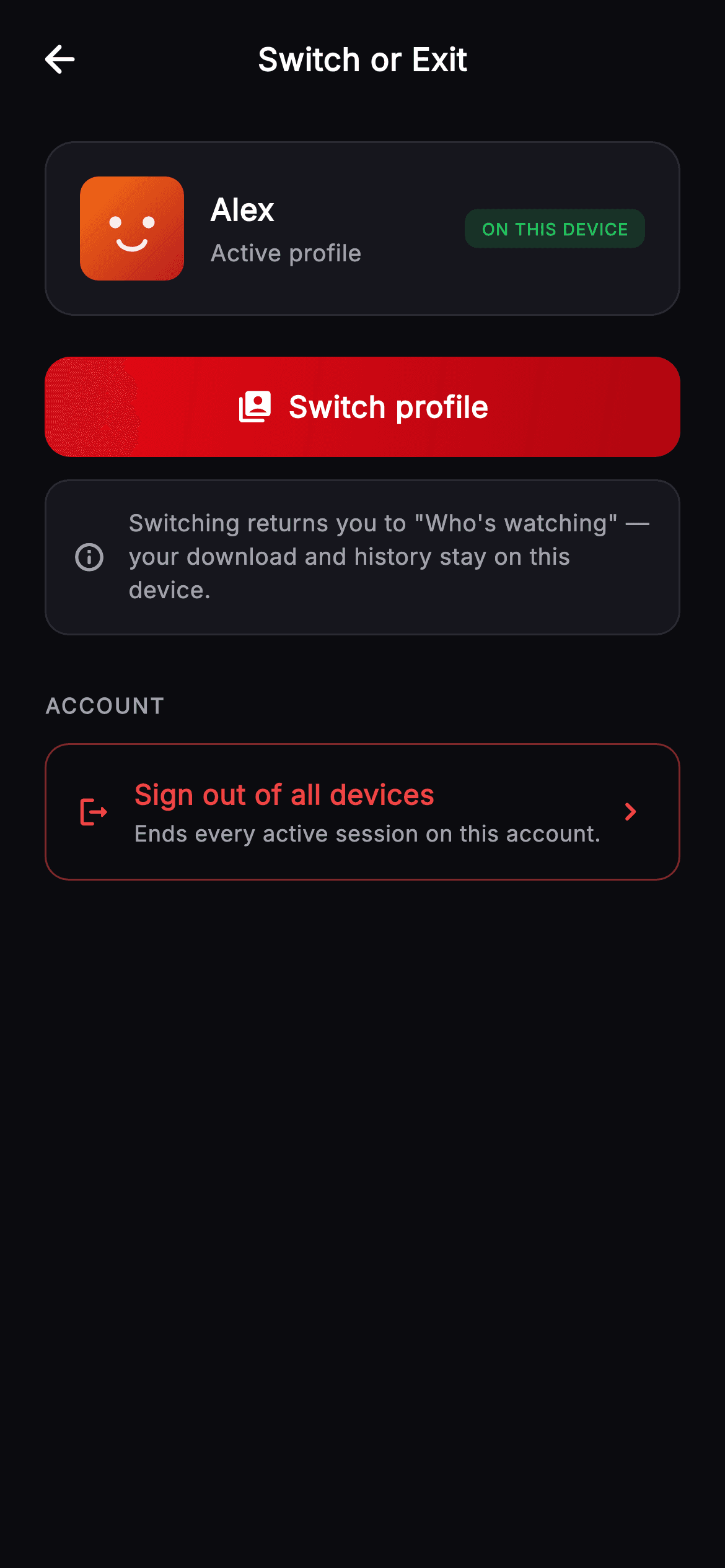
Leaving a profile has two different meanings: switching to another one, which loses nothing, and signing out everywhere, which ends every session on the account. This sheet carries both and makes them look nothing alike — a filled gradient button for the reversible action, a red outline with a consequence line for the irreversible one, and a note between them explaining that switching keeps downloads and history on the device. You'll build the profile card, a tinted device badge, and two actions weighted so the safe one is the obvious tap.
Watch the Flutter UI walkthrough
A short screen recording of Cineo · Switch or Exit running, if you'd rather see it before you read the code. The written tutorial below covers everything in it.
Can't see the video? Watch it on YouTube.
What you'll build
- ✓Two actions on one screen, weighted so their risk is visible before reading them
- ✓A destructive row built from an outline and a consequence subtitle, never a filled button
- ✓A tinted ON THIS DEVICE badge sized down to 9px with opened tracking
- ✓A reassurance card that states what switching does not destroy
- ✓A gradient CTA parameterised with an icon so one component serves several screens
Step-by-step build
Create the file
Add a new file at lib/stream_profile_transfer/stream_profile_transfer_screen.dart in your Flutter project.
Register the bundled fonts
No external packages — this is pure Flutter. It does bundle its design font (Inter), so drop the font file into fonts/ and declare it in pubspec.yaml:
flutter:
  fonts:
    - family: Inter
      fonts:
- asset: fonts/Inter-Regular.ttfBuild it, piece by piece
Here's how the screen goes together. Each block below is a real slice of the code with a plain-English explanation — paste them in order, or grab the whole file from the next section.
Three exits and a two-colour risk palette
import 'package:flutter/material.dart';

/// Transfer / Exit Profile — the profile-exit sheet for the **Cineo** streaming
/// app. Shows the active profile, a "Switch profile" action, a current-device
/// note, and a destructive "Sign out of all devices" action. Self-contained per
/// CONVENTIONS.md (pure Flutter, bundled Inter, own dark theme, painted avatar).
class StreamProfileTransferScreen extends StatelessWidget {
  const StreamProfileTransferScreen({
    super.key,
    this.onBack,
    this.onSwitch,
    this.onSignOutAll,
  });

  final VoidCallback? onBack;
  final VoidCallback? onSwitch;
  final VoidCallback? onSignOutAll;

  static const String _font = 'Inter';
  static const Color _bg = Color(0xFF0B0B0F);
  static const Color _surface = Color(0xFF16161D);
  static const Color _brand = Color(0xFFE50914);
  static const Color _brandDark = Color(0xFFB00610);
  static const Color _text = Color(0xFFFFFFFF);
  static const Color _muted = Color(0xFFA1A1AA);
  static const Color _hairline = Color(0xFF2A2A33);
  static const Color _danger = Color(0xFFEF4444);
  static const Color _success = Color(0xFF22C55E);
The widget is stateless with `onBack`, `onSwitch` and `onSignOutAll` — it decides nothing, it presents two doors. The palette is worth reading closely: the usual Cineo set plus `_danger` `0xFFEF4444` and `_success` `0xFF22C55E`. Brand red and danger red are deliberately different values, because the screen has to show a brand-coloured button and a destructive action at the same time; using one red for both would make the safe action look dangerous and the dangerous one look routine.
The active profile card
  @override
  Widget build(BuildContext context) {
    return Theme(
      data: ThemeData.dark(useMaterial3: true),
      child: Scaffold(
        backgroundColor: _bg,
        body: SafeArea(
          child: Column(
            children: <Widget>[
              _TopBar(title: 'Switch or Exit', onBack: onBack),
              Expanded(
                child: ListView(
                  padding: const EdgeInsets.fromLTRB(24, 12, 24, 24),
                  children: <Widget>[
                    Container(
                      padding: const EdgeInsets.all(18),
                      decoration: BoxDecoration(
                        color: _surface,
                        borderRadius: BorderRadius.circular(16),
                        border: Border.all(color: _hairline),
                      ),
                      child: Row(
                        children: <Widget>[
                          const _ProfileAvatar(variant: 0, size: 56),
                          const SizedBox(width: 14),
                          const Expanded(
                            child: Column(
                              crossAxisAlignment: CrossAxisAlignment.start,
                              children: <Widget>[
                                Text(
                                  'Alex',
                                  style: TextStyle(
                                    fontFamily: _font,
                                    fontSize: 16.5,
                                    fontWeight: FontWeight.w700,
                                    color: _text,
                                  ),
                                ),
                                SizedBox(height: 3),
                                Text(
                                  'Active profile',
                                  style: TextStyle(
                                    fontFamily: _font,
                                    fontSize: 12.5,
                                    fontWeight: FontWeight.w400,
                                    color: _muted,
                                  ),
                                ),
                              ],
                            ),
                          ),
                          Container(
                            padding: const EdgeInsets.symmetric(
                                horizontal: 9, vertical: 4),
                            decoration: BoxDecoration(
                              color: _success.withValues(alpha: 0.16),
                              borderRadius: BorderRadius.circular(7),
                            ),
                            child: const Text(
                              'ON THIS DEVICE',
                              style: TextStyle(
                                fontFamily: _font,
                                fontSize: 9,
                                fontWeight: FontWeight.w800,
                                letterSpacing: 0.5,
                                color: _success,
                              ),
                            ),
                          ),
                        ],
                      ),
                    ),
The card pairs the 56px painted avatar with the profile name at 16.5px and the words 'Active profile' beneath. On the right sits a badge reading 'ON THIS DEVICE' at 9px `w800` with `letterSpacing: 0.5`, tinted `_success.withValues(alpha: 0.16)` behind text in full green. Nine pixels is small enough that the tracking is doing the legibility work, and green rather than brand red is right because this badge is a status, not an action. Naming the device matters on a screen whose second action ends sessions everywhere — it establishes which one you are on before you consider signing all of them out.
The safe action, and what it does not cost
                    const SizedBox(height: 22),
                    _PrimaryButton(
                      icon: Icons.switch_account_rounded,
                      label: 'Switch profile',
                      onTap: onSwitch,
                    ),
                    const SizedBox(height: 12),
                    Container(
                      padding: const EdgeInsets.all(14),
                      decoration: BoxDecoration(
                        color: _surface,
                        borderRadius: BorderRadius.circular(13),
                        border: Border.all(color: _hairline),
                      ),
                      child: const Row(
                        children: <Widget>[
                          Icon(Icons.info_outline_rounded,
                              size: 18, color: _muted),
                          SizedBox(width: 12),
                          Expanded(
                            child: Text(
                              'Switching returns you to "Who\'s watching" — '
                              'your download and history stay on this device.',
                              style: TextStyle(
                                fontFamily: _font,
                                fontSize: 12.5,
                                height: 1.4,
                                fontWeight: FontWeight.w400,
                                color: _muted,
                              ),
                            ),
                          ),
                        ],
                      ),
                    ),
'Switch profile' gets the full-width gradient treatment with a `switch_account_rounded` glyph — the loudest element on the screen, because it is the one almost everyone came for and it is completely reversible. Directly under it, an info card answers the objection that stops people switching: `'Switching returns you to "Who\'s watching" — your download and history stay on this device.'` Note the escaping in that string; it is a single-quoted Dart literal containing a straight apostrophe, so `\'` is required, while the double quotes around the destination screen need none.
The destructive action, styled to slow you down
                    const SizedBox(height: 30),
                    const _SectionLabel('Account'),
                    const SizedBox(height: 12),
                    GestureDetector(
                      onTap: onSignOutAll,
                      child: Container(
                        padding: const EdgeInsets.symmetric(
                            horizontal: 16, vertical: 16),
                        decoration: BoxDecoration(
                          borderRadius: BorderRadius.circular(13),
                          border: Border.all(
                            color: _danger.withValues(alpha: 0.5),
                          ),
                        ),
                        child: Row(
                          children: <Widget>[
                            const Icon(Icons.logout_rounded,
                                size: 19, color: _danger),
                            const SizedBox(width: 12),
                            const Expanded(
                              child: Column(
                                crossAxisAlignment: CrossAxisAlignment.start,
                                children: <Widget>[
                                  Text(
                                    'Sign out of all devices',
                                    style: TextStyle(
                                      fontFamily: _font,
                                      fontSize: 15,
                                      fontWeight: FontWeight.w700,
                                      color: _danger,
                                    ),
                                  ),
                                  SizedBox(height: 2),
                                  Text(
                                    'Ends every active session on this account.',
                                    style: TextStyle(
                                      fontFamily: _font,
                                      fontSize: 12,
                                      fontWeight: FontWeight.w400,
                                      color: _muted,
                                    ),
                                  ),
                                ],
                              ),
                            ),
                            const Icon(Icons.chevron_right_rounded,
                                size: 20, color: _danger),
                          ],
                        ),
                      ),
                    ),
                  ],
                ),
              ),
            ],
          ),
        ),
      ),
    );
  }
}
'Sign out of all devices' sits under its own 'Account' label and is built as the visual opposite of the button above: no fill at all, only a border at `_danger.withValues(alpha: 0.5)` — half-strength, so the outline reads as a warning rather than an alarm. It carries a subtitle in muted grey, 'Ends every active session on this account', which is the sentence that stops the wrong tap; the title alone leaves 'all devices' open to interpretation. The trailing chevron signals that this leads somewhere else — a confirmation — rather than firing immediately, which is the right promise for an action of this weight.
The section label
class _SectionLabel extends StatelessWidget {
  const _SectionLabel(this.text);

  final String text;

  @override
  Widget build(BuildContext context) {
    return Text(
      text.toUpperCase(),
      style: const TextStyle(
        fontFamily: StreamProfileTransferScreen._font,
        fontSize: 11.5,
        fontWeight: FontWeight.w700,
        letterSpacing: 1,
        color: StreamProfileTransferScreen._muted,
      ),
    );
  }
}
`_SectionLabel` is a one-argument widget that upper-cases its text at 11.5px `w700` with `letterSpacing: 1`. It appears exactly once, before the account action, and that single use is the point: the switch controls above need no heading because they are the screen's purpose, whereas the destructive row belongs to a different category and the label is what draws that line without a divider or a spacer doing the job ambiguously.
One button component, two parameters
class _PrimaryButton extends StatelessWidget {
  const _PrimaryButton({required this.icon, required this.label, this.onTap});

  final IconData icon;
  final String label;
  final VoidCallback? onTap;

  @override
  Widget build(BuildContext context) {
    return SizedBox(
      width: double.infinity,
      height: 54,
      child: Material(
        color: Colors.transparent,
        borderRadius: BorderRadius.circular(14),
        child: InkWell(
          onTap: onTap,
          borderRadius: BorderRadius.circular(14),
          child: Ink(
            decoration: BoxDecoration(
              borderRadius: BorderRadius.circular(14),
              gradient: const LinearGradient(
                begin: Alignment.topLeft,
                end: Alignment.bottomRight,
                colors: <Color>[
                  StreamProfileTransferScreen._brand,
                  StreamProfileTransferScreen._brandDark,
                ],
              ),
            ),
            child: Row(
              mainAxisAlignment: MainAxisAlignment.center,
              children: <Widget>[
                Icon(icon, size: 20, color: Colors.white),
                const SizedBox(width: 8),
                Text(
                  label,
                  style: const TextStyle(
                    fontFamily: StreamProfileTransferScreen._font,
                    fontSize: 16,
                    fontWeight: FontWeight.w700,
                    letterSpacing: 0.3,
                    color: Colors.white,
                  ),
                ),
              ],
            ),
          ),
        ),
      ),
    );
  }
}
This screen's `_PrimaryButton` takes an `icon` as well as a `label`, so the same fixed 54px full-width component serves a plain confirm elsewhere in the kit and an icon-led action here. Inside, a centred `Row` puts a 20px glyph 8px before the text. What matters as much as the component is where it is *not* used: the sign-out row is hand-built instead, precisely so it cannot inherit the gradient fill that makes this button look inviting. Reaching for the shared component there would have flattened the difference between the two actions.
Full code
The complete, ready-to-paste source. Free to use in your projects — one click copies it all.
import 'package:flutter/material.dart';
/// Transfer / Exit Profile — the profile-exit sheet for the **Cineo** streaming
/// app. Shows the active profile, a "Switch profile" action, a current-device
/// note, and a destructive "Sign out of all devices" action. Self-contained per
/// CONVENTIONS.md (pure Flutter, bundled Inter, own dark theme, painted avatar).
class StreamProfileTransferScreen extends StatelessWidget {
const StreamProfileTransferScreen({
super.key,
this.onBack,
this.onSwitch,
this.onSignOutAll,
});
final VoidCallback? onBack;
final VoidCallback? onSwitch;
final VoidCallback? onSignOutAll;
static const String _font = 'Inter';
static const Color _bg = Color(0xFF0B0B0F);
static const Color _surface = Color(0xFF16161D);
static const Color _brand = Color(0xFFE50914);
static const Color _brandDark = Color(0xFFB00610);
static const Color _text = Color(0xFFFFFFFF);
static const Color _muted = Color(0xFFA1A1AA);
static const Color _hairline = Color(0xFF2A2A33);
static const Color _danger = Color(0xFFEF4444);
static const Color _success = Color(0xFF22C55E);
@override
Widget build(BuildContext context) {
return Theme(
data: ThemeData.dark(useMaterial3: true),
child: Scaffold(
backgroundColor: _bg,
body: SafeArea(
child: Column(
children: <Widget>[
_TopBar(title: 'Switch or Exit', onBack: onBack),
Expanded(
child: ListView(
padding: const EdgeInsets.fromLTRB(24, 12, 24, 24),
children: <Widget>[
Container(
padding: const EdgeInsets.all(18),
decoration: BoxDecoration(
color: _surface,
borderRadius: BorderRadius.circular(16),
border: Border.all(color: _hairline),
),
child: Row(
children: <Widget>[
const _ProfileAvatar(variant: 0, size: 56),
const SizedBox(width: 14),
const Expanded(
child: Column(
crossAxisAlignment: CrossAxisAlignment.start,
children: <Widget>[
Text(
'Alex',
style: TextStyle(
fontFamily: _font,
fontSize: 16.5,
fontWeight: FontWeight.w700,
color: _text,
),
),
SizedBox(height: 3),
Text(
'Active profile',
style: TextStyle(
fontFamily: _font,
fontSize: 12.5,
fontWeight: FontWeight.w400,
color: _muted,
),
),
],
),
),
Container(
padding: const EdgeInsets.symmetric(
horizontal: 9, vertical: 4),
decoration: BoxDecoration(
color: _success.withValues(alpha: 0.16),
borderRadius: BorderRadius.circular(7),
),
child: const Text(
'ON THIS DEVICE',
style: TextStyle(
fontFamily: _font,
fontSize: 9,
fontWeight: FontWeight.w800,
letterSpacing: 0.5,
color: _success,
),
),
),
],
),
),
const SizedBox(height: 22),
_PrimaryButton(
icon: Icons.switch_account_rounded,
label: 'Switch profile',
onTap: onSwitch,
),
const SizedBox(height: 12),
Container(
padding: const EdgeInsets.all(14),
decoration: BoxDecoration(
color: _surface,
borderRadius: BorderRadius.circular(13),
border: Border.all(color: _hairline),
),
child: const Row(
children: <Widget>[
Icon(Icons.info_outline_rounded,
size: 18, color: _muted),
SizedBox(width: 12),
Expanded(
child: Text(
'Switching returns you to "Who\'s watching" — '
'your download and history stay on this device.',
style: TextStyle(
fontFamily: _font,
fontSize: 12.5,
height: 1.4,
fontWeight: FontWeight.w400,
color: _muted,
),
),
),
],
),
),
const SizedBox(height: 30),
const _SectionLabel('Account'),
const SizedBox(height: 12),
GestureDetector(
onTap: onSignOutAll,
child: Container(
padding: const EdgeInsets.symmetric(
horizontal: 16, vertical: 16),
decoration: BoxDecoration(
borderRadius: BorderRadius.circular(13),
border: Border.all(
color: _danger.withValues(alpha: 0.5),
),
),
child: Row(
children: <Widget>[
const Icon(Icons.logout_rounded,
size: 19, color: _danger),
const SizedBox(width: 12),
const Expanded(
child: Column(
crossAxisAlignment: CrossAxisAlignment.start,
children: <Widget>[
Text(
'Sign out of all devices',
style: TextStyle(
fontFamily: _font,
fontSize: 15,
fontWeight: FontWeight.w700,
color: _danger,
),
),
SizedBox(height: 2),
Text(
'Ends every active session on this account.',
style: TextStyle(
fontFamily: _font,
fontSize: 12,
fontWeight: FontWeight.w400,
color: _muted,
),
),
],
),
),
const Icon(Icons.chevron_right_rounded,
size: 20, color: _danger),
],
),
),
),
],
),
),
],
),
),
),
);
}
}
class _SectionLabel extends StatelessWidget {
const _SectionLabel(this.text);
final String text;
@override
Widget build(BuildContext context) {
return Text(
text.toUpperCase(),
style: const TextStyle(
fontFamily: StreamProfileTransferScreen._font,
fontSize: 11.5,
fontWeight: FontWeight.w700,
letterSpacing: 1,
color: StreamProfileTransferScreen._muted,
),
);
}
}
class _PrimaryButton extends StatelessWidget {
const _PrimaryButton({required this.icon, required this.label, this.onTap});
final IconData icon;
final String label;
final VoidCallback? onTap;
@override
Widget build(BuildContext context) {
return SizedBox(
width: double.infinity,
height: 54,
child: Material(
color: Colors.transparent,
borderRadius: BorderRadius.circular(14),
child: InkWell(
onTap: onTap,
borderRadius: BorderRadius.circular(14),
child: Ink(
decoration: BoxDecoration(
borderRadius: BorderRadius.circular(14),
gradient: const LinearGradient(
begin: Alignment.topLeft,
end: Alignment.bottomRight,
colors: <Color>[
StreamProfileTransferScreen._brand,
StreamProfileTransferScreen._brandDark,
],
),
),
child: Row(
mainAxisAlignment: MainAxisAlignment.center,
children: <Widget>[
Icon(icon, size: 20, color: Colors.white),
const SizedBox(width: 8),
Text(
label,
style: const TextStyle(
fontFamily: StreamProfileTransferScreen._font,
fontSize: 16,
fontWeight: FontWeight.w700,
letterSpacing: 0.3,
color: Colors.white,
),
),
],
),
),
),
),
);
}
}
class _TopBar extends StatelessWidget {
const _TopBar({required this.title, this.onBack});
final String title;
final VoidCallback? onBack;
@override
Widget build(BuildContext context) {
return Padding(
padding: const EdgeInsets.fromLTRB(8, 8, 8, 8),
child: Row(
children: <Widget>[
IconButton(
onPressed: onBack,
icon: const Icon(Icons.arrow_back_rounded,
color: StreamProfileTransferScreen._text),
),
const Spacer(),
Text(
title,
style: const TextStyle(
fontFamily: StreamProfileTransferScreen._font,
fontSize: 17,
fontWeight: FontWeight.w700,
color: StreamProfileTransferScreen._text,
),
),
const Spacer(),
const SizedBox(width: 48),
],
),
);
}
}
/// Painted seeded profile avatar — vivid gradient rounded-square + friendly
/// geometric face. [variant] (0–5) selects colour + expression.
class _ProfileAvatar extends StatelessWidget {
const _ProfileAvatar({required this.variant, required this.size});
final int variant;
final double size;
static const List<List<Color>> _palettes = <List<Color>>[
<Color>[Color(0xFFF97316), Color(0xFFB91C1C)],
<Color>[Color(0xFF14B8A6), Color(0xFF0F766E)],
<Color>[Color(0xFFA855F7), Color(0xFF6D28D9)],
<Color>[Color(0xFF3B82F6), Color(0xFF1D4ED8)],
<Color>[Color(0xFFEC4899), Color(0xFFBE185D)],
<Color>[Color(0xFFF5C518), Color(0xFFD97706)],
];
@override
Widget build(BuildContext context) {
final List<Color> pal = _palettes[variant % _palettes.length];
return Container(
width: size,
height: size,
decoration: BoxDecoration(
borderRadius: BorderRadius.circular(size * 0.18),
gradient: LinearGradient(
begin: Alignment.topLeft,
end: Alignment.bottomRight,
colors: pal,
),
),
child: CustomPaint(
painter: _AvatarFacePainter(variant: variant % _palettes.length),
),
);
}
}
class _AvatarFacePainter extends CustomPainter {
const _AvatarFacePainter({required this.variant});
final int variant;
@override
void paint(Canvas canvas, Size size) {
final double w = size.width;
final double h = size.height;
final Paint ink = Paint()
..color = Colors.white.withValues(alpha: 0.92)
..style = PaintingStyle.fill;
final Paint stroke = Paint()
..color = Colors.white.withValues(alpha: 0.92)
..style = PaintingStyle.stroke
..strokeWidth = w * 0.045
..strokeCap = StrokeCap.round;
final double eyeY = h * 0.44;
final double eyeDx = w * 0.16;
final double eyeR = w * 0.058;
final Offset le = Offset(w * 0.5 - eyeDx, eyeY);
final Offset re = Offset(w * 0.5 + eyeDx, eyeY);
canvas.drawCircle(le, eyeR, ink);
canvas.drawCircle(re, eyeR, ink);
final Rect mouth = Rect.fromCenter(
center: Offset(w * 0.5, h * 0.6), width: w * 0.26, height: h * 0.2);
canvas.drawArc(mouth, 0.25, 2.64, false, stroke);
}
@override
bool shouldRepaint(covariant _AvatarFacePainter oldDelegate) =>
oldDelegate.variant != variant;
}
Plus bundled 1 binary asset (fonts/images). The CLI and MCP install those for you automatically.
Two faster ways to add it
Copy-paste works, but you can skip it entirely.
1. FlutterKit CLI
One command drops this screen — and its fonts — straight into your project.
$ flutterkit add stream-profile-transfer2. AI agent (MCP)
Connect FlutterKit's MCP server in Claude or Cursor and just ask your agent to install stream-profile-transfer — it fetches and writes the files for you.
FAQ
Should signing out of all devices ask for confirmation?
Yes, and the design assumes it — the chevron indicates it opens something rather than firing. Wire `onSignOutAll` to a confirmation sheet or dialog; this screen deliberately keeps that decision in the host so the confirmation can match the rest of your app.
Why is the destructive action an outline rather than a red button?
Because a filled red button competes with the gradient CTA above it and reads as a second primary action. An outline at half-strength red is clearly available and clearly not the default, which is the correct weighting when the safe action is the one nearly everyone wants.
How do I show the real profile and device?
The name, the avatar variant and the badge text are literals in `build`. Add parameters for them and pass the active profile in — the avatar takes an integer variant rather than an image, so the same value stored on the profile reproduces the same face here.
Does it need any packages or fonts?
No packages — every icon comes from the built-in Material set and the avatar is painted, so nothing is downloaded or bundled as an image. Inter ships with the screen and gets registered under `fonts:` in your pubspec.
Which Flutter version does this need?
Flutter 3.22 or newer, since the badge tint and the danger border both use `Color.withValues(alpha: ...)`. On an older SDK swap those calls for `withOpacity(...)` and expand the `super.key` constructors to `{Key? key, ...}) : super(key: key)`.


