How to Build an Add Profile Screen with Painted Avatars in Flutter (Full Code + Preview)
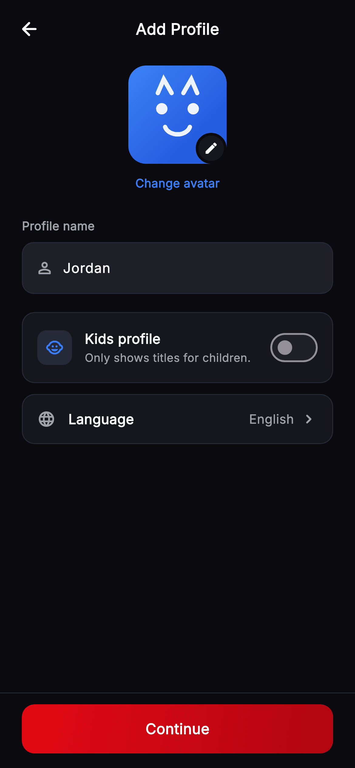
Streaming apps need a dozen distinct viewer avatars, and shipping a dozen PNGs at three densities is a lot of bytes for something so simple. This tutorial builds them in Flutter as pure vector: a `variant` integer picks one of six gradient palettes and one of six painted faces — cat ears, sunglasses, a visor, star eyes — drawn on a `Canvas`. Around that sit a name field, a kids-profile toggle with an explainer, and a language row.
Watch the Flutter UI walkthrough
A short screen recording of Cineo · Add Profile running, if you'd rather see it before you read the code. The written tutorial below covers everything in it.
Can't see the video? Watch it on YouTube.
What you'll build
- ✓Six distinct avatars from one `variant` int — gradient palette plus painted face
- ✓A `switch` in a `CustomPainter` that draws a different expression per variant
- ✓A five-point star drawn with trigonometry, alternating outer and inner radii
- ✓An edit badge ringed in the page background so it reads as cut out of the avatar
- ✓A kids-profile toggle whose subtitle states the actual consequence
- ✓A settings row that shows its current value beside the chevron
Step-by-step build
Create the file
Add a new file at lib/stream_profile_add/stream_profile_add_screen.dart in your Flutter project.
Register the bundled fonts
No external packages — this is pure Flutter. It does bundle its design font (Inter), so drop the font file into fonts/ and declare it in pubspec.yaml:
flutter:
  fonts:
    - family: Inter
      fonts:
- asset: fonts/Inter-Regular.ttfBuild it, piece by piece
Here's how the screen goes together. Each block below is a real slice of the code with a plain-English explanation — paste them in order, or grab the whole file from the next section.
One controller, one boolean
class _StreamProfileAddScreenState extends State<StreamProfileAddScreen> {
  static const String _font = 'Inter';
  static const Color _bg = Color(0xFF0B0B0F);
  static const Color _surface = Color(0xFF16161D);
  static const Color _surfaceAlt = Color(0xFF1F1F28);
  static const Color _brand = Color(0xFFE50914);
  static const Color _brandDark = Color(0xFFB00610);
  static const Color _text = Color(0xFFFFFFFF);
  static const Color _muted = Color(0xFFA1A1AA);
  static const Color _hairline = Color(0xFF2A2A33);
  static const Color _accent = Color(0xFF3B82F6);

  final TextEditingController _name = TextEditingController(text: 'Jordan');
  bool _kids = false;

  @override
  void dispose() {
    _name.dispose();
    super.dispose();
  }
State is a `TextEditingController` pre-filled with 'Jordan' and `bool _kids = false`. `dispose()` releases the controller — required for any controller you construct. Note the extra token here that the sibling Cineo screens don't have: `_accent` (#3B82F6, a blue). It's used for the 'Change avatar' link and the kids icon, deliberately *not* brand red, because on this screen red is reserved for the primary CTA and the profile controls shouldn't compete with it.
The avatar with its edit badge
  @override
  Widget build(BuildContext context) {
    return Theme(
      data: ThemeData.dark(useMaterial3: true),
      child: Scaffold(
        backgroundColor: _bg,
        body: SafeArea(
          child: Column(
            children: <Widget>[
              _TopBar(title: 'Add Profile', onBack: widget.onBack),
              Expanded(
                child: ListView(
                  padding: const EdgeInsets.fromLTRB(24, 8, 24, 24),
                  children: <Widget>[
                    Center(
                      child: GestureDetector(
                        onTap: widget.onChooseAvatar,
                        child: Column(
                          children: <Widget>[
                            Stack(
                              children: <Widget>[
                                const _ProfileAvatar(variant: 3, size: 108),
                                Positioned(
                                  right: 0,
                                  bottom: 0,
                                  child: Container(
                                    width: 34,
                                    height: 34,
                                    decoration: BoxDecoration(
                                      color: _surface,
                                      shape: BoxShape.circle,
                                      border:
                                          Border.all(color: _bg, width: 3),
                                    ),
                                    child: const Icon(Icons.edit_rounded,
                                        size: 16, color: _text),
                                  ),
                                ),
                              ],
                            ),
                            const SizedBox(height: 12),
                            const Text(
                              'Change avatar',
                              style: TextStyle(
                                fontFamily: _font,
                                fontSize: 13,
                                fontWeight: FontWeight.w600,
                                color: _accent,
                              ),
                            ),
                          ],
                        ),
                      ),
                    ),
A `Stack` layers a 108px `_ProfileAvatar` with a 34px circular badge `Positioned` at `right: 0, bottom: 0`. The badge's `Border.all(color: _bg, width: 3)` is the detail — ringing it in the *page background* colour rather than a neutral makes it look punched out of the avatar rather than pasted on top. The whole group, including the 'Change avatar' text below, sits inside one `GestureDetector`, so tapping the avatar or the label both trigger `onChooseAvatar`.
The name field
                    const SizedBox(height: 28),
                    const _FieldLabel('Profile name'),
                    const SizedBox(height: 8),
                    Container(
                      decoration: BoxDecoration(
                        color: _surfaceAlt,
                        borderRadius: BorderRadius.circular(13),
                        border: Border.all(color: _hairline),
                      ),
                      child: Row(
                        children: <Widget>[
                          const Padding(
                            padding: EdgeInsets.only(left: 14, right: 10),
                            child: Icon(Icons.person_outline_rounded,
                                size: 20, color: _muted),
                          ),
                          Expanded(
                            child: TextField(
                              controller: _name,
                              cursorColor: _brand,
                              style: const TextStyle(
                                fontFamily: _font,
                                fontSize: 15,
                                fontWeight: FontWeight.w500,
                                color: _text,
                              ),
                              decoration: const InputDecoration(
                                isCollapsed: true,
                                contentPadding:
                                    EdgeInsets.symmetric(vertical: 16),
                                border: InputBorder.none,
                                hintText: 'Enter a name',
                                hintStyle: TextStyle(
                                  fontFamily: _font,
                                  fontSize: 15,
                                  fontWeight: FontWeight.w400,
                                  color: _muted,
                                ),
                              ),
                            ),
                          ),
                          const SizedBox(width: 14),
                        ],
                      ),
                    ),
                    const SizedBox(height: 20),
Written inline rather than extracted, since it's the only text field on the screen. The `TextField` uses `isCollapsed: true` with an explicit `contentPadding: EdgeInsets.symmetric(vertical: 16)` — `isCollapsed` strips Material's built-in padding entirely, so that one value defines the field's height and it still grows correctly if the user scales up their text size. `border: InputBorder.none` hands all the chrome to the surrounding `Container`, and the trailing `SizedBox(width: 14)` mirrors the leading icon's inset so the text is symmetrically placed.
The kids toggle and the language row
                    Container(
                      padding: const EdgeInsets.fromLTRB(16, 14, 12, 14),
                      decoration: BoxDecoration(
                        color: _surface,
                        borderRadius: BorderRadius.circular(14),
                        border: Border.all(color: _hairline),
                      ),
                      child: Row(
                        children: <Widget>[
                          Container(
                            width: 38,
                            height: 38,
                            decoration: BoxDecoration(
                              color: _accent.withValues(alpha: 0.16),
                              borderRadius: BorderRadius.circular(10),
                            ),
                            child: const Icon(Icons.child_care_rounded,
                                size: 20, color: _accent),
                          ),
                          const SizedBox(width: 14),
                          const Expanded(
                            child: Column(
                              crossAxisAlignment: CrossAxisAlignment.start,
                              children: <Widget>[
                                Text(
                                  'Kids profile',
                                  style: TextStyle(
                                    fontFamily: _font,
                                    fontSize: 15,
                                    fontWeight: FontWeight.w700,
                                    color: _text,
                                  ),
                                ),
                                SizedBox(height: 2),
                                Text(
                                  'Only shows titles for children.',
                                  style: TextStyle(
                                    fontFamily: _font,
                                    fontSize: 12.5,
                                    fontWeight: FontWeight.w400,
                                    color: _muted,
                                  ),
                                ),
                              ],
                            ),
                          ),
                          Switch(
                            value: _kids,
                            onChanged: (bool v) => setState(() => _kids = v),
                            activeThumbColor: Colors.white,
                            activeTrackColor: _brand,
                            inactiveTrackColor: _surfaceAlt,
                          ),
                        ],
                      ),
                    ),
                    const SizedBox(height: 12),
                    _SettingRow(
                      icon: Icons.language_rounded,
                      label: 'Language',
                      value: 'English',
                      onTap: () {},
                    ),
The kids card pairs a 38px `_accent`-tinted tile with a title and — importantly — a subtitle stating the actual consequence: 'Only shows titles for children.' A toggle that changes what content appears needs to say so, not just be labelled. Its padding is asymmetric (`fromLTRB(16, 14, 12, 14)`) because `Switch` carries its own internal padding, so the right edge gets less. `_SettingRow` below follows the standard settings pattern: icon, label, `Spacer()`, current value in muted grey, then a chevron — showing 'English' inline means the user doesn't have to open the row to learn what it's set to.
Palettes plus a painted face
/// Painted seeded profile avatar — vivid gradient rounded-square + friendly
/// geometric face. [variant] (0–5) selects colour + expression.
class _ProfileAvatar extends StatelessWidget {
  const _ProfileAvatar({required this.variant, required this.size});

  final int variant;
  final double size;

  static const List<List<Color>> _palettes = <List<Color>>[
    <Color>[Color(0xFFF97316), Color(0xFFB91C1C)],
    <Color>[Color(0xFF14B8A6), Color(0xFF0F766E)],
    <Color>[Color(0xFFA855F7), Color(0xFF6D28D9)],
    <Color>[Color(0xFF3B82F6), Color(0xFF1D4ED8)],
    <Color>[Color(0xFFEC4899), Color(0xFFBE185D)],
    <Color>[Color(0xFFF5C518), Color(0xFFD97706)],
  ];

  @override
  Widget build(BuildContext context) {
    final List<Color> pal = _palettes[variant % _palettes.length];
    return Container(
      width: size,
      height: size,
      decoration: BoxDecoration(
        borderRadius: BorderRadius.circular(size * 0.18),
        gradient: LinearGradient(
          begin: Alignment.topLeft,
          end: Alignment.bottomRight,
          colors: pal,
        ),
      ),
      child: CustomPaint(
        painter: _AvatarFacePainter(variant: variant % _palettes.length),
      ),
    );
  }
}
`_ProfileAvatar` is the whole avatar system in 35 lines. Six two-colour gradient palettes live in a `const List<List<Color>>`, and `variant % _palettes.length` wraps any integer into range, so you can pass a user id straight in without bounds-checking. The container is a rounded square with `BorderRadius.circular(size * 0.18)` — deriving the radius from `size` keeps the squircle proportion identical whether it's rendered at 108px here or 40px in a profile switcher. `CustomPaint` then draws the face over the gradient.
A switch that draws six different faces
class _AvatarFacePainter extends CustomPainter {
  const _AvatarFacePainter({required this.variant});

  final int variant;

  @override
  void paint(Canvas canvas, Size size) {
    final double w = size.width;
    final double h = size.height;
    final Paint ink = Paint()
      ..color = Colors.white.withValues(alpha: 0.92)
      ..style = PaintingStyle.fill;
    final Paint stroke = Paint()
      ..color = Colors.white.withValues(alpha: 0.92)
      ..style = PaintingStyle.stroke
      ..strokeWidth = w * 0.045
      ..strokeCap = StrokeCap.round;

    final double eyeY = h * 0.44;
    final double eyeDx = w * 0.16;
    final double eyeR = w * 0.058;
    final Offset le = Offset(w * 0.5 - eyeDx, eyeY);
    final Offset re = Offset(w * 0.5 + eyeDx, eyeY);

    switch (variant) {
      case 1:
        canvas.drawCircle(le, eyeR * 1.7, stroke);
        canvas.drawCircle(re, eyeR * 1.7, stroke);
        canvas.drawLine(Offset(le.dx + eyeR * 1.7, eyeY),
            Offset(re.dx - eyeR * 1.7, eyeY), stroke);
        break;
      case 2:
        final Rect band = Rect.fromCenter(
            center: Offset(w * 0.5, h * 0.34), width: w * 0.5, height: h * 0.4);
        canvas.drawArc(band, math.pi, math.pi, false, stroke);
        canvas.drawRRect(
          RRect.fromRectAndRadius(
            Rect.fromCenter(
                center: Offset(w * 0.25, h * 0.44),
                width: w * 0.09,
                height: h * 0.14),
            Radius.circular(w * 0.03),
          ),
          ink,
        );
        canvas.drawRRect(
          RRect.fromRectAndRadius(
            Rect.fromCenter(
                center: Offset(w * 0.75, h * 0.44),
                width: w * 0.09,
                height: h * 0.14),
            Radius.circular(w * 0.03),
          ),
          ink,
        );
        break;
      case 3:
        final Path ears = Path()
          ..moveTo(w * 0.3, h * 0.28)
          ..lineTo(w * 0.36, h * 0.14)
          ..lineTo(w * 0.44, h * 0.28)
          ..moveTo(w * 0.7, h * 0.28)
          ..lineTo(w * 0.64, h * 0.14)
          ..lineTo(w * 0.56, h * 0.28);
        canvas.drawPath(ears, stroke);
        break;
      case 4:
        canvas.drawRRect(
          RRect.fromRectAndRadius(
            Rect.fromCenter(
                center: Offset(w * 0.5, eyeY),
                width: w * 0.46,
                height: h * 0.14),
            Radius.circular(w * 0.04),
          ),
          ink,
        );
        break;
      case 5:
        _star(canvas, Offset(w * 0.24, h * 0.56), w * 0.05, ink);
        _star(canvas, Offset(w * 0.76, h * 0.56), w * 0.05, ink);
        break;
      default:
        break;
    }

    if (variant != 4) {
      canvas.drawCircle(le, eyeR, ink);
      canvas.drawCircle(re, eyeR, ink);
    }

    final Rect mouth = Rect.fromCenter(
        center: Offset(w * 0.5, h * 0.6), width: w * 0.26, height: h * 0.2);
    canvas.drawArc(mouth, 0.25, 2.64, false, stroke);
  }
Two `Paint`s are set up first — a filled `ink` and a round-capped `stroke`, both white at 92% alpha, with the stroke width derived from `w` so line weight scales with the avatar. Then a `switch (variant)` adds the distinguishing feature: case 1 draws spectacles (two stroked circles joined by a bridge line), case 2 a headband arc plus two rounded rectangles for shades, case 3 cat ears as a two-triangle `Path` using `moveTo`/`lineTo`, case 4 a single visor bar, case 5 star eyes. After the switch, `if (variant != 4)` adds the two round eyes — skipped for the visor, which covers them. Every variant ends with the same smile: `drawArc` over a rect from 0.25 to 2.64 radians, so all six share one expression and read as a family.
Drawing a five-point star
  void _star(Canvas canvas, Offset c, double r, Paint p) {
    final Path path = Path();
    for (int i = 0; i < 5; i++) {
      final double a = -math.pi / 2 + i * (2 * math.pi / 5);
      final double x = c.dx + r * math.cos(a);
      final double y = c.dy + r * math.sin(a);
      if (i == 0) {
        path.moveTo(x, y);
      } else {
        path.lineTo(x, y);
      }
      final double a2 = a + math.pi / 5;
      path.lineTo(
          c.dx + r * 0.45 * math.cos(a2), c.dy + r * 0.45 * math.sin(a2));
    }
    path.close();
    canvas.drawPath(path, p);
  }

  @override
  bool shouldRepaint(covariant _AvatarFacePainter oldDelegate) =>
      oldDelegate.variant != variant;
The `_star` helper is standard star geometry worth keeping. It loops five times around the circle, stepping `2π/5` per point and starting at `-π/2` so the first point aims straight up. Each iteration adds the outer point at radius `r`, then immediately adds an inner point at `0.45 * r` rotated a further `π/5` — alternating outer and inner vertices is what produces the star rather than a pentagon. `path.close()` seals it. Change `0.45` to make the star fatter or spikier.
Full code
The complete, ready-to-paste source. Free to use in your projects — one click copies it all.
import 'dart:math' as math;
import 'package:flutter/material.dart';
/// Add Profile — create a new viewer profile for the **Cineo** streaming app. A
/// large painted avatar (tap to change), a name field, a "Kids profile" toggle
/// with explainer, a preferred-language row, and a pinned "Continue" CTA.
/// Self-contained per CONVENTIONS.md (pure Flutter, bundled Inter, own dark
/// theme, painted avatar — no raster, no network).
class StreamProfileAddScreen extends StatefulWidget {
const StreamProfileAddScreen({
super.key,
this.onBack,
this.onChooseAvatar,
this.onContinue,
});
final VoidCallback? onBack;
final VoidCallback? onChooseAvatar;
final VoidCallback? onContinue;
@override
State<StreamProfileAddScreen> createState() => _StreamProfileAddScreenState();
}
class _StreamProfileAddScreenState extends State<StreamProfileAddScreen> {
static const String _font = 'Inter';
static const Color _bg = Color(0xFF0B0B0F);
static const Color _surface = Color(0xFF16161D);
static const Color _surfaceAlt = Color(0xFF1F1F28);
static const Color _brand = Color(0xFFE50914);
static const Color _brandDark = Color(0xFFB00610);
static const Color _text = Color(0xFFFFFFFF);
static const Color _muted = Color(0xFFA1A1AA);
static const Color _hairline = Color(0xFF2A2A33);
static const Color _accent = Color(0xFF3B82F6);
final TextEditingController _name = TextEditingController(text: 'Jordan');
bool _kids = false;
@override
void dispose() {
_name.dispose();
super.dispose();
}
@override
Widget build(BuildContext context) {
return Theme(
data: ThemeData.dark(useMaterial3: true),
child: Scaffold(
backgroundColor: _bg,
body: SafeArea(
child: Column(
children: <Widget>[
_TopBar(title: 'Add Profile', onBack: widget.onBack),
Expanded(
child: ListView(
padding: const EdgeInsets.fromLTRB(24, 8, 24, 24),
children: <Widget>[
Center(
child: GestureDetector(
onTap: widget.onChooseAvatar,
child: Column(
children: <Widget>[
Stack(
children: <Widget>[
const _ProfileAvatar(variant: 3, size: 108),
Positioned(
right: 0,
bottom: 0,
child: Container(
width: 34,
height: 34,
decoration: BoxDecoration(
color: _surface,
shape: BoxShape.circle,
border:
Border.all(color: _bg, width: 3),
),
child: const Icon(Icons.edit_rounded,
size: 16, color: _text),
),
),
],
),
const SizedBox(height: 12),
const Text(
'Change avatar',
style: TextStyle(
fontFamily: _font,
fontSize: 13,
fontWeight: FontWeight.w600,
color: _accent,
),
),
],
),
),
),
const SizedBox(height: 28),
const _FieldLabel('Profile name'),
const SizedBox(height: 8),
Container(
decoration: BoxDecoration(
color: _surfaceAlt,
borderRadius: BorderRadius.circular(13),
border: Border.all(color: _hairline),
),
child: Row(
children: <Widget>[
const Padding(
padding: EdgeInsets.only(left: 14, right: 10),
child: Icon(Icons.person_outline_rounded,
size: 20, color: _muted),
),
Expanded(
child: TextField(
controller: _name,
cursorColor: _brand,
style: const TextStyle(
fontFamily: _font,
fontSize: 15,
fontWeight: FontWeight.w500,
color: _text,
),
decoration: const InputDecoration(
isCollapsed: true,
contentPadding:
EdgeInsets.symmetric(vertical: 16),
border: InputBorder.none,
hintText: 'Enter a name',
hintStyle: TextStyle(
fontFamily: _font,
fontSize: 15,
fontWeight: FontWeight.w400,
color: _muted,
),
),
),
),
const SizedBox(width: 14),
],
),
),
const SizedBox(height: 20),
Container(
padding: const EdgeInsets.fromLTRB(16, 14, 12, 14),
decoration: BoxDecoration(
color: _surface,
borderRadius: BorderRadius.circular(14),
border: Border.all(color: _hairline),
),
child: Row(
children: <Widget>[
Container(
width: 38,
height: 38,
decoration: BoxDecoration(
color: _accent.withValues(alpha: 0.16),
borderRadius: BorderRadius.circular(10),
),
child: const Icon(Icons.child_care_rounded,
size: 20, color: _accent),
),
const SizedBox(width: 14),
const Expanded(
child: Column(
crossAxisAlignment: CrossAxisAlignment.start,
children: <Widget>[
Text(
'Kids profile',
style: TextStyle(
fontFamily: _font,
fontSize: 15,
fontWeight: FontWeight.w700,
color: _text,
),
),
SizedBox(height: 2),
Text(
'Only shows titles for children.',
style: TextStyle(
fontFamily: _font,
fontSize: 12.5,
fontWeight: FontWeight.w400,
color: _muted,
),
),
],
),
),
Switch(
value: _kids,
onChanged: (bool v) => setState(() => _kids = v),
activeThumbColor: Colors.white,
activeTrackColor: _brand,
inactiveTrackColor: _surfaceAlt,
),
],
),
),
const SizedBox(height: 12),
_SettingRow(
icon: Icons.language_rounded,
label: 'Language',
value: 'English',
onTap: () {},
),
],
),
),
Container(
padding: const EdgeInsets.fromLTRB(24, 12, 24, 16),
decoration: const BoxDecoration(
border: Border(top: BorderSide(color: _hairline)),
),
child: _PrimaryButton(
label: 'Continue',
onTap: widget.onContinue,
),
),
],
),
),
),
);
}
}
class _SettingRow extends StatelessWidget {
const _SettingRow({
required this.icon,
required this.label,
required this.value,
this.onTap,
});
final IconData icon;
final String label;
final String value;
final VoidCallback? onTap;
@override
Widget build(BuildContext context) {
return GestureDetector(
onTap: onTap,
child: Container(
padding: const EdgeInsets.symmetric(horizontal: 16, vertical: 16),
decoration: BoxDecoration(
color: _StreamProfileAddScreenState._surface,
borderRadius: BorderRadius.circular(14),
border: Border.all(color: _StreamProfileAddScreenState._hairline),
),
child: Row(
children: <Widget>[
Icon(icon, size: 20, color: _StreamProfileAddScreenState._muted),
const SizedBox(width: 14),
Text(
label,
style: const TextStyle(
fontFamily: _StreamProfileAddScreenState._font,
fontSize: 15,
fontWeight: FontWeight.w600,
color: _StreamProfileAddScreenState._text,
),
),
const Spacer(),
Text(
value,
style: const TextStyle(
fontFamily: _StreamProfileAddScreenState._font,
fontSize: 14,
fontWeight: FontWeight.w500,
color: _StreamProfileAddScreenState._muted,
),
),
const SizedBox(width: 6),
const Icon(Icons.chevron_right_rounded,
size: 20, color: _StreamProfileAddScreenState._muted),
],
),
),
);
}
}
class _FieldLabel extends StatelessWidget {
const _FieldLabel(this.text);
final String text;
@override
Widget build(BuildContext context) {
return Text(
text,
style: const TextStyle(
fontFamily: _StreamProfileAddScreenState._font,
fontSize: 13,
fontWeight: FontWeight.w600,
color: _StreamProfileAddScreenState._muted,
),
);
}
}
class _TopBar extends StatelessWidget {
const _TopBar({required this.title, this.onBack});
final String title;
final VoidCallback? onBack;
@override
Widget build(BuildContext context) {
return Padding(
padding: const EdgeInsets.fromLTRB(8, 8, 8, 8),
child: Row(
children: <Widget>[
IconButton(
onPressed: onBack,
icon: const Icon(Icons.arrow_back_rounded,
color: _StreamProfileAddScreenState._text),
),
const Spacer(),
Text(
title,
style: const TextStyle(
fontFamily: _StreamProfileAddScreenState._font,
fontSize: 17,
fontWeight: FontWeight.w700,
color: _StreamProfileAddScreenState._text,
),
),
const Spacer(),
const SizedBox(width: 48),
],
),
);
}
}
class _PrimaryButton extends StatelessWidget {
const _PrimaryButton({required this.label, this.onTap});
final String label;
final VoidCallback? onTap;
@override
Widget build(BuildContext context) {
return SizedBox(
width: double.infinity,
height: 54,
child: Material(
color: Colors.transparent,
borderRadius: BorderRadius.circular(14),
child: InkWell(
onTap: onTap,
borderRadius: BorderRadius.circular(14),
child: Ink(
decoration: BoxDecoration(
borderRadius: BorderRadius.circular(14),
gradient: const LinearGradient(
begin: Alignment.topLeft,
end: Alignment.bottomRight,
colors: <Color>[
_StreamProfileAddScreenState._brand,
_StreamProfileAddScreenState._brandDark,
],
),
),
child: Center(
child: Text(
label,
style: const TextStyle(
fontFamily: _StreamProfileAddScreenState._font,
fontSize: 16,
fontWeight: FontWeight.w700,
letterSpacing: 0.3,
color: Colors.white,
),
),
),
),
),
),
);
}
}
/// Painted seeded profile avatar — vivid gradient rounded-square + friendly
/// geometric face. [variant] (0–5) selects colour + expression.
class _ProfileAvatar extends StatelessWidget {
const _ProfileAvatar({required this.variant, required this.size});
final int variant;
final double size;
static const List<List<Color>> _palettes = <List<Color>>[
<Color>[Color(0xFFF97316), Color(0xFFB91C1C)],
<Color>[Color(0xFF14B8A6), Color(0xFF0F766E)],
<Color>[Color(0xFFA855F7), Color(0xFF6D28D9)],
<Color>[Color(0xFF3B82F6), Color(0xFF1D4ED8)],
<Color>[Color(0xFFEC4899), Color(0xFFBE185D)],
<Color>[Color(0xFFF5C518), Color(0xFFD97706)],
];
@override
Widget build(BuildContext context) {
final List<Color> pal = _palettes[variant % _palettes.length];
return Container(
width: size,
height: size,
decoration: BoxDecoration(
borderRadius: BorderRadius.circular(size * 0.18),
gradient: LinearGradient(
begin: Alignment.topLeft,
end: Alignment.bottomRight,
colors: pal,
),
),
child: CustomPaint(
painter: _AvatarFacePainter(variant: variant % _palettes.length),
),
);
}
}
class _AvatarFacePainter extends CustomPainter {
const _AvatarFacePainter({required this.variant});
final int variant;
@override
void paint(Canvas canvas, Size size) {
final double w = size.width;
final double h = size.height;
final Paint ink = Paint()
..color = Colors.white.withValues(alpha: 0.92)
..style = PaintingStyle.fill;
final Paint stroke = Paint()
..color = Colors.white.withValues(alpha: 0.92)
..style = PaintingStyle.stroke
..strokeWidth = w * 0.045
..strokeCap = StrokeCap.round;
final double eyeY = h * 0.44;
final double eyeDx = w * 0.16;
final double eyeR = w * 0.058;
final Offset le = Offset(w * 0.5 - eyeDx, eyeY);
final Offset re = Offset(w * 0.5 + eyeDx, eyeY);
switch (variant) {
case 1:
canvas.drawCircle(le, eyeR * 1.7, stroke);
canvas.drawCircle(re, eyeR * 1.7, stroke);
canvas.drawLine(Offset(le.dx + eyeR * 1.7, eyeY),
Offset(re.dx - eyeR * 1.7, eyeY), stroke);
break;
case 2:
final Rect band = Rect.fromCenter(
center: Offset(w * 0.5, h * 0.34), width: w * 0.5, height: h * 0.4);
canvas.drawArc(band, math.pi, math.pi, false, stroke);
canvas.drawRRect(
RRect.fromRectAndRadius(
Rect.fromCenter(
center: Offset(w * 0.25, h * 0.44),
width: w * 0.09,
height: h * 0.14),
Radius.circular(w * 0.03),
),
ink,
);
canvas.drawRRect(
RRect.fromRectAndRadius(
Rect.fromCenter(
center: Offset(w * 0.75, h * 0.44),
width: w * 0.09,
height: h * 0.14),
Radius.circular(w * 0.03),
),
ink,
);
break;
case 3:
final Path ears = Path()
..moveTo(w * 0.3, h * 0.28)
..lineTo(w * 0.36, h * 0.14)
..lineTo(w * 0.44, h * 0.28)
..moveTo(w * 0.7, h * 0.28)
..lineTo(w * 0.64, h * 0.14)
..lineTo(w * 0.56, h * 0.28);
canvas.drawPath(ears, stroke);
break;
case 4:
canvas.drawRRect(
RRect.fromRectAndRadius(
Rect.fromCenter(
center: Offset(w * 0.5, eyeY),
width: w * 0.46,
height: h * 0.14),
Radius.circular(w * 0.04),
),
ink,
);
break;
case 5:
_star(canvas, Offset(w * 0.24, h * 0.56), w * 0.05, ink);
_star(canvas, Offset(w * 0.76, h * 0.56), w * 0.05, ink);
break;
default:
break;
}
if (variant != 4) {
canvas.drawCircle(le, eyeR, ink);
canvas.drawCircle(re, eyeR, ink);
}
final Rect mouth = Rect.fromCenter(
center: Offset(w * 0.5, h * 0.6), width: w * 0.26, height: h * 0.2);
canvas.drawArc(mouth, 0.25, 2.64, false, stroke);
}
void _star(Canvas canvas, Offset c, double r, Paint p) {
final Path path = Path();
for (int i = 0; i < 5; i++) {
final double a = -math.pi / 2 + i * (2 * math.pi / 5);
final double x = c.dx + r * math.cos(a);
final double y = c.dy + r * math.sin(a);
if (i == 0) {
path.moveTo(x, y);
} else {
path.lineTo(x, y);
}
final double a2 = a + math.pi / 5;
path.lineTo(
c.dx + r * 0.45 * math.cos(a2), c.dy + r * 0.45 * math.sin(a2));
}
path.close();
canvas.drawPath(path, p);
}
@override
bool shouldRepaint(covariant _AvatarFacePainter oldDelegate) =>
oldDelegate.variant != variant;
}
Plus bundled 1 binary asset (fonts/images). The CLI and MCP install those for you automatically.
Two faster ways to add it
Copy-paste works, but you can skip it entirely.
1. FlutterKit CLI
One command drops this screen — and its fonts — straight into your project.
$ flutterkit add stream-profile-add2. AI agent (MCP)
Connect FlutterKit's MCP server in Claude or Cursor and just ask your agent to install stream-profile-add — it fetches and writes the files for you.
FAQ
Is this add-profile screen free to use?
Yes. The complete Dart source on this page is free for personal and commercial apps. Copy it from the code block, install it with the FlutterKit CLI (flutterkit add stream-profile-add), or add it through an AI agent over MCP.
How do I show a different avatar?
Change the variant on _ProfileAvatar — 0 through 5 give six distinct combinations of palette and face. Because the painter uses variant % 6, you can pass a user id or hash straight in and always get a valid, stable avatar.
Why paint avatars instead of shipping images?
Six PNGs at three densities is eighteen files and a meaningful chunk of bundle size, all for simple geometry. The painter is one class, renders sharp at any size and pixel density, and recolours instantly — no asset pipeline at all.
Does it need any packages?
No. It imports dart:math for the star's trigonometry, which is part of the SDK. There are no third-party dependencies — the only asset is the bundled Inter font, which the CLI and MCP install for you.
Which Flutter version does it target?
Flutter 3.27+ is the target. Two things need it: the kids Switch's activeThumbColor (formerly activeColor) and the withValues(alpha: 0.92) the face painter uses for its white ink. Change those two and everything else — the gradients, the paths, the dart:math trigonometry — builds on much older SDKs.


