How to Build a Kids Profile Creation Screen in Flutter (Full Code + Preview)
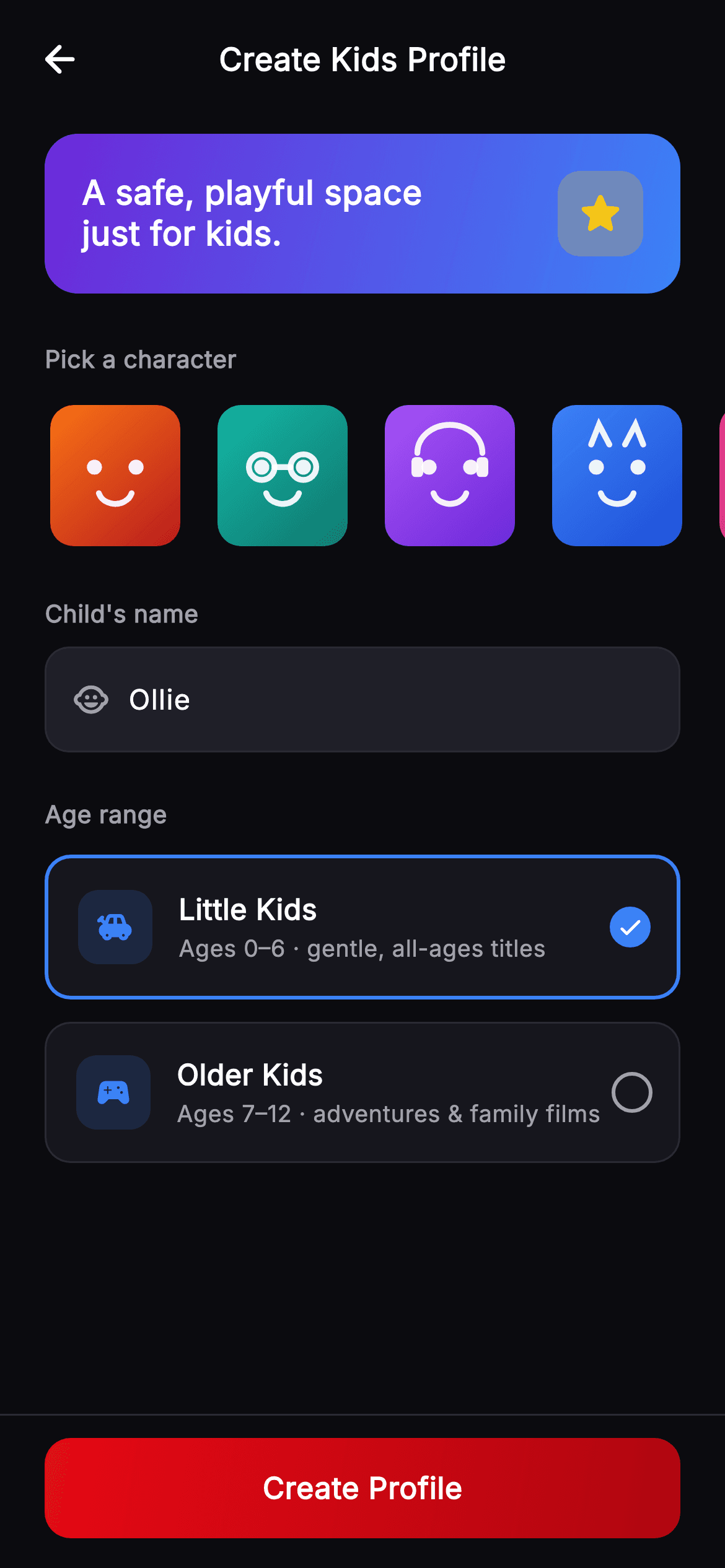
A kids profile is a parental control wearing a friendly costume, and the screen has to serve both. This tutorial builds Cineo's create-kids-profile form in Flutter — a purple-to-blue reassurance band, a horizontal picker of six painted character avatars with a gold selection ring, a name field, and two age-range cards that set the maturity cap. Each card states the ages it covers and the kind of titles it allows, so the choice is understood rather than guessed.
Watch the Flutter UI walkthrough
A short screen recording of Cineo · Create Kids Profile running, if you'd rather see it before you read the code. The written tutorial below covers everything in it.
Can't see the video? Watch it on YouTube.
What you'll build
- ✓A horizontal avatar picker where selection is a 3px gold border around the tile, not a badge
- ✓Age-range cards whose subtitles name both the ages and the content they unlock
- ✓A radio built from a Container border that fills and shows a check when chosen
- ✓A gradient reassurance band that sets a friendlier tone than the app's default dark chrome
Step-by-step build
Create the file
Add a new file at lib/stream_profile_kids_create/stream_profile_kids_create_screen.dart in your Flutter project.
Register the bundled fonts
No external packages — this is pure Flutter. It does bundle its design font (Inter), so drop the font file into fonts/ and declare it in pubspec.yaml:
flutter:
  fonts:
    - family: Inter
      fonts:
- asset: fonts/Inter-Regular.ttfBuild it, piece by piece
Here's how the screen goes together. Each block below is a real slice of the code with a plain-English explanation — paste them in order, or grab the whole file from the next section.
Three pieces of state and a broader palette
import 'dart:math' as math;

import 'package:flutter/material.dart';

/// Create Kids Profile — a playful profile-creation variant for the **Cineo**
/// streaming app. A bright header, a horizontal character-avatar picker, a name
/// field, an age-range choice (Little Kids / Older Kids) that sets the maturity
/// cap, and a pinned "Create Profile" CTA. Self-contained per CONVENTIONS.md
/// (pure Flutter, bundled Inter, own dark theme, painted avatars).
class StreamProfileKidsCreateScreen extends StatefulWidget {
  const StreamProfileKidsCreateScreen({
    super.key,
    this.onBack,
    this.onCreate,
  });

  final VoidCallback? onBack;
  final VoidCallback? onCreate;

  @override
  State<StreamProfileKidsCreateScreen> createState() =>
      _StreamProfileKidsCreateScreenState();
}

class _StreamProfileKidsCreateScreenState
    extends State<StreamProfileKidsCreateScreen> {
  static const String _font = 'Inter';
  static const Color _bg = Color(0xFF0B0B0F);
  static const Color _surface = Color(0xFF16161D);
  static const Color _surfaceAlt = Color(0xFF1F1F28);
  static const Color _brand = Color(0xFFE50914);
  static const Color _brandDark = Color(0xFFB00610);
  static const Color _text = Color(0xFFFFFFFF);
  static const Color _muted = Color(0xFFA1A1AA);
  static const Color _hairline = Color(0xFF2A2A33);
  static const Color _accent = Color(0xFF3B82F6);
  static const Color _gold = Color(0xFFF5C518);

  final TextEditingController _name = TextEditingController(text: 'Ollie');
  int _avatar = 5;
  int _age = 0; // 0 = Little Kids, 1 = Older Kids

  @override
  void dispose() {
    _name.dispose();
    super.dispose();
  }
The state is a name controller pre-filled with 'Ollie', an `int _avatar` starting at 5, and `int _age` where 0 is Little Kids and 1 is Older Kids. Note the palette is wider than its sibling profile screens — it adds `_accent` blue and `_gold` alongside the usual Cineo red. That's deliberate: this screen deliberately steps away from the brand's dark red, because a kids setup flow reading in the same aggressive palette as the rest of the app would feel wrong. Red stays only on the CTA. The controller is disposed, which is mandatory.
The reassurance band and avatar picker
  @override
  Widget build(BuildContext context) {
    return Theme(
      data: ThemeData.dark(useMaterial3: true),
      child: Scaffold(
        backgroundColor: _bg,
        body: SafeArea(
          child: Column(
            children: <Widget>[
              _TopBar(title: 'Create Kids Profile', onBack: widget.onBack),
              Expanded(
                child: ListView(
                  padding: const EdgeInsets.fromLTRB(0, 8, 0, 24),
                  children: <Widget>[
                    // Playful header band.
                    Container(
                      margin: const EdgeInsets.symmetric(horizontal: 24),
                      padding: const EdgeInsets.all(20),
                      decoration: BoxDecoration(
                        borderRadius: BorderRadius.circular(18),
                        gradient: const LinearGradient(
                          begin: Alignment.topLeft,
                          end: Alignment.bottomRight,
                          colors: <Color>[Color(0xFF6D28D9), Color(0xFF3B82F6)],
                        ),
                      ),
                      child: Row(
                        children: <Widget>[
                          const Expanded(
                            child: Text(
                              'A safe, playful space\njust for kids.',
                              style: TextStyle(
                                fontFamily: _font,
                                fontSize: 18,
                                height: 1.2,
                                fontWeight: FontWeight.w800,
                                color: Colors.white,
                              ),
                            ),
                          ),
                          _star(),
                        ],
                      ),
                    ),
                    const SizedBox(height: 26),
                    const Padding(
                      padding: EdgeInsets.symmetric(horizontal: 24),
                      child: _FieldLabel('Pick a character'),
                    ),
                    const SizedBox(height: 12),
                    SizedBox(
                      height: 82,
                      child: ListView.separated(
                        scrollDirection: Axis.horizontal,
                        padding: const EdgeInsets.symmetric(horizontal: 24),
                        itemCount: 6,
                        separatorBuilder:
                            (BuildContext context, int i) =>
                                const SizedBox(width: 14),
                        itemBuilder: (BuildContext context, int i) {
                          final bool sel = _avatar == i;
                          return GestureDetector(
                            onTap: () => setState(() => _avatar = i),
                            child: Container(
                              decoration: BoxDecoration(
                                borderRadius: BorderRadius.circular(18),
                                border: Border.all(
                                  color: sel ? _gold : Colors.transparent,
                                  width: 3,
                                ),
                              ),
                              child: _ProfileAvatar(variant: i, size: 70),
                            ),
                          );
                        },
                      ),
                    ),
                    const SizedBox(height: 24),
The ListView uses zero horizontal padding, with each section adding its own 24px margin — that's what lets the avatar rail scroll edge-to-edge while the text blocks stay inset. The band at the top is a gradient Container running purple to blue with 'A safe, playful space just for kids' and a gold star tile, setting a tone the dark chrome can't. Below it, the picker is an 82px-tall horizontal `ListView.separated` of six tiles. Selection is expressed as a 3px border that's `_gold` when picked and `Colors.transparent` when not — using a transparent border rather than none keeps every tile exactly the same size, so nothing shifts as the selection moves.
The name field and age cards
                    Padding(
                      padding: const EdgeInsets.symmetric(horizontal: 24),
                      child: Column(
                        crossAxisAlignment: CrossAxisAlignment.start,
                        children: <Widget>[
                          const _FieldLabel("Child's name"),
                          const SizedBox(height: 8),
                          Container(
                            decoration: BoxDecoration(
                              color: _surfaceAlt,
                              borderRadius: BorderRadius.circular(13),
                              border: Border.all(color: _hairline),
                            ),
                            child: Row(
                              children: <Widget>[
                                const Padding(
                                  padding:
                                      EdgeInsets.only(left: 14, right: 10),
                                  child: Icon(Icons.child_care_rounded,
                                      size: 20, color: _muted),
                                ),
                                Expanded(
                                  child: TextField(
                                    controller: _name,
                                    cursorColor: _brand,
                                    style: const TextStyle(
                                      fontFamily: _font,
                                      fontSize: 15,
                                      fontWeight: FontWeight.w500,
                                      color: _text,
                                    ),
                                    decoration: const InputDecoration(
                                      isCollapsed: true,
                                      contentPadding:
                                          EdgeInsets.symmetric(vertical: 16),
                                      border: InputBorder.none,
                                      hintText: 'Enter a name',
                                      hintStyle: TextStyle(
                                        fontFamily: _font,
                                        fontSize: 15,
                                        fontWeight: FontWeight.w400,
                                        color: _muted,
                                      ),
                                    ),
                                  ),
                                ),
                                const SizedBox(width: 14),
                              ],
                            ),
                          ),
                          const SizedBox(height: 24),
                          const _FieldLabel('Age range'),
                          const SizedBox(height: 12),
                          _AgeCard(
                            title: 'Little Kids',
                            subtitle: 'Ages 0–6 · gentle, all-ages titles',
                            icon: Icons.toys_rounded,
                            selected: _age == 0,
                            onTap: () => setState(() => _age = 0),
                          ),
                          const SizedBox(height: 12),
                          _AgeCard(
                            title: 'Older Kids',
                            subtitle: 'Ages 7–12 · adventures & family films',
                            icon: Icons.sports_esports_rounded,
                            selected: _age == 1,
                            onTap: () => setState(() => _age = 1),
                          ),
                        ],
                      ),
                    ),
                  ],
                ),
The name input is a bordered `_surfaceAlt` Container with a leading `child_care_rounded` icon and an `Expanded` TextField whose decoration sets `isCollapsed: true` and `border: InputBorder.none` — stripping Material's own sizing so the parent's 13px radius defines the shape. Below it the two `_AgeCard`s are the real parental control. Their subtitles do the work: 'Ages 0–6 · gentle, all-ages titles' and 'Ages 7–12 · adventures & family films' tell a parent both the age band and what it actually permits, which a bare 'Little Kids' label would leave them guessing about.
The pinned CTA and the star tile
              ),
              Container(
                padding: const EdgeInsets.fromLTRB(24, 12, 24, 16),
                decoration: const BoxDecoration(
                  border: Border(top: BorderSide(color: _hairline)),
                ),
                child: _PrimaryButton(
                  label: 'Create Profile',
                  onTap: widget.onCreate,
                ),
              ),
            ],
          ),
        ),
      ),
    );
  }

  Widget _star() {
    return Container(
      width: 46,
      height: 46,
      decoration: BoxDecoration(
        color: _gold.withValues(alpha: 0.25),
        borderRadius: BorderRadius.circular(12),
      ),
      child: const Icon(Icons.star_rounded, color: _gold, size: 28),
    );
  }
}
The Create Profile button sits outside the ListView in a Container with a top hairline border, so it stays visible while the form scrolls. `_star()` is a small helper building the band's 46px accent tile — filled `_gold.withValues(alpha: 0.25)` with a solid gold star on top. That 25% wash behind a full-strength glyph is the same tinted-tile pattern used across this kit, and here it works over a gradient rather than a flat surface because a translucent fill picks up whatever is behind it.
The age card and its radio
class _AgeCard extends StatelessWidget {
  const _AgeCard({
    required this.title,
    required this.subtitle,
    required this.icon,
    required this.selected,
    required this.onTap,
  });

  final String title;
  final String subtitle;
  final IconData icon;
  final bool selected;
  final VoidCallback onTap;

  @override
  Widget build(BuildContext context) {
    return GestureDetector(
      onTap: onTap,
      child: Container(
        padding: const EdgeInsets.fromLTRB(16, 16, 14, 16),
        decoration: BoxDecoration(
          color: _StreamProfileKidsCreateScreenState._surface,
          borderRadius: BorderRadius.circular(14),
          border: Border.all(
            color: selected
                ? _StreamProfileKidsCreateScreenState._accent
                : _StreamProfileKidsCreateScreenState._hairline,
            width: selected ? 2 : 1,
          ),
        ),
        child: Row(
          children: <Widget>[
            Container(
              width: 40,
              height: 40,
              decoration: BoxDecoration(
                color: _StreamProfileKidsCreateScreenState._accent
                    .withValues(alpha: 0.16),
                borderRadius: BorderRadius.circular(11),
              ),
              child: Icon(icon,
                  size: 21,
                  color: _StreamProfileKidsCreateScreenState._accent),
            ),
            const SizedBox(width: 14),
            Expanded(
              child: Column(
                crossAxisAlignment: CrossAxisAlignment.start,
                children: <Widget>[
                  Text(
                    title,
                    style: const TextStyle(
                      fontFamily: _StreamProfileKidsCreateScreenState._font,
                      fontSize: 15.5,
                      fontWeight: FontWeight.w700,
                      color: _StreamProfileKidsCreateScreenState._text,
                    ),
                  ),
                  const SizedBox(height: 2),
                  Text(
                    subtitle,
                    style: const TextStyle(
                      fontFamily: _StreamProfileKidsCreateScreenState._font,
                      fontSize: 12.5,
                      fontWeight: FontWeight.w400,
                      color: _StreamProfileKidsCreateScreenState._muted,
                    ),
                  ),
                ],
              ),
            ),
            _Radio(selected: selected),
          ],
        ),
      ),
    );
  }
}

class _Radio extends StatelessWidget {
  const _Radio({required this.selected});

  final bool selected;

  @override
  Widget build(BuildContext context) {
    return Container(
      width: 22,
      height: 22,
      decoration: BoxDecoration(
        shape: BoxShape.circle,
        border: Border.all(
          color: selected
              ? _StreamProfileKidsCreateScreenState._accent
              : _StreamProfileKidsCreateScreenState._muted,
          width: 2,
        ),
        color: selected
            ? _StreamProfileKidsCreateScreenState._accent
            : Colors.transparent,
      ),
      child: selected
          ? const Icon(Icons.check_rounded, size: 15, color: Colors.white)
          : null,
    );
  }
}
`_AgeCard` derives everything from one `selected` bool: the border switches from `_hairline` at 1px to `_accent` blue at 2px, and the whole card is tappable rather than just the radio, which is a far larger touch target. The 40px icon tile uses the accent at 16% opacity behind a full-strength glyph. `_Radio` is worth copying — a 22px circular Container that, when unselected, draws a 2px muted ring over a transparent fill and has no child at all; when selected it fills solid accent and puts a white check inside. Building it from a border and a fill rather than using Flutter's Radio means it inherits this screen's colours directly, with no RadioTheme to override.
Labels, top bar, and the painted avatars
class _FieldLabel extends StatelessWidget {
  const _FieldLabel(this.text);

  final String text;

  @override
  Widget build(BuildContext context) {
    return Text(
      text,
      style: const TextStyle(
        fontFamily: _StreamProfileKidsCreateScreenState._font,
        fontSize: 13,
        fontWeight: FontWeight.w600,
        color: _StreamProfileKidsCreateScreenState._muted,
      ),
    );
  }
}

class _TopBar extends StatelessWidget {
  const _TopBar({required this.title, this.onBack});

  final String title;
  final VoidCallback? onBack;

  @override
  Widget build(BuildContext context) {
    return Padding(
      padding: const EdgeInsets.fromLTRB(8, 8, 8, 8),
      child: Row(
        children: <Widget>[
          IconButton(
            onPressed: onBack,
            icon: const Icon(Icons.arrow_back_rounded,
                color: _StreamProfileKidsCreateScreenState._text),
          ),
          const Spacer(),
          Text(
            title,
            style: const TextStyle(
              fontFamily: _StreamProfileKidsCreateScreenState._font,
              fontSize: 17,
              fontWeight: FontWeight.w700,
              color: _StreamProfileKidsCreateScreenState._text,
            ),
          ),
          const Spacer(),
          const SizedBox(width: 48),
        ],
      ),
    );
  }
}

class _PrimaryButton extends StatelessWidget {
  const _PrimaryButton({required this.label, this.onTap});

  final String label;
  final VoidCallback? onTap;

  @override
  Widget build(BuildContext context) {
    return SizedBox(
      width: double.infinity,
      height: 54,
      child: Material(
        color: Colors.transparent,
        borderRadius: BorderRadius.circular(14),
        child: InkWell(
          onTap: onTap,
          borderRadius: BorderRadius.circular(14),
          child: Ink(
            decoration: BoxDecoration(
              borderRadius: BorderRadius.circular(14),
              gradient: const LinearGradient(
                begin: Alignment.topLeft,
                end: Alignment.bottomRight,
                colors: <Color>[
                  _StreamProfileKidsCreateScreenState._brand,
                  _StreamProfileKidsCreateScreenState._brandDark,
                ],
              ),
            ),
            child: Center(
              child: Text(
                label,
                style: const TextStyle(
                  fontFamily: _StreamProfileKidsCreateScreenState._font,
                  fontSize: 16,
                  fontWeight: FontWeight.w700,
                  letterSpacing: 0.3,
                  color: Colors.white,
                ),
              ),
            ),
          ),
        ),
      ),
    );
  }
}

/// Painted seeded profile avatar — vivid gradient rounded-square + friendly
/// geometric face. [variant] (0–5) selects colour + expression.
class _ProfileAvatar extends StatelessWidget {
  const _ProfileAvatar({required this.variant, required this.size});

  final int variant;
  final double size;

  static const List<List<Color>> _palettes = <List<Color>>[
    <Color>[Color(0xFFF97316), Color(0xFFB91C1C)],
    <Color>[Color(0xFF14B8A6), Color(0xFF0F766E)],
    <Color>[Color(0xFFA855F7), Color(0xFF6D28D9)],
    <Color>[Color(0xFF3B82F6), Color(0xFF1D4ED8)],
    <Color>[Color(0xFFEC4899), Color(0xFFBE185D)],
    <Color>[Color(0xFFF5C518), Color(0xFFD97706)],
  ];

  @override
  Widget build(BuildContext context) {
    final List<Color> pal = _palettes[variant % _palettes.length];
    return Container(
      width: size,
      height: size,
      decoration: BoxDecoration(
        borderRadius: BorderRadius.circular(size * 0.18),
        gradient: LinearGradient(
          begin: Alignment.topLeft,
          end: Alignment.bottomRight,
          colors: pal,
        ),
      ),
      child: CustomPaint(
        painter: _AvatarFacePainter(variant: variant % _palettes.length),
      ),
    );
  }
}

class _AvatarFacePainter extends CustomPainter {
  const _AvatarFacePainter({required this.variant});

  final int variant;

  @override
  void paint(Canvas canvas, Size size) {
    final double w = size.width;
    final double h = size.height;
    final Paint ink = Paint()
      ..color = Colors.white.withValues(alpha: 0.92)
      ..style = PaintingStyle.fill;
    final Paint stroke = Paint()
      ..color = Colors.white.withValues(alpha: 0.92)
      ..style = PaintingStyle.stroke
      ..strokeWidth = w * 0.045
      ..strokeCap = StrokeCap.round;

    final double eyeY = h * 0.44;
    final double eyeDx = w * 0.16;
    final double eyeR = w * 0.058;
    final Offset le = Offset(w * 0.5 - eyeDx, eyeY);
    final Offset re = Offset(w * 0.5 + eyeDx, eyeY);

    switch (variant) {
      case 1:
        canvas.drawCircle(le, eyeR * 1.7, stroke);
        canvas.drawCircle(re, eyeR * 1.7, stroke);
        canvas.drawLine(Offset(le.dx + eyeR * 1.7, eyeY),
            Offset(re.dx - eyeR * 1.7, eyeY), stroke);
        break;
      case 2:
        final Rect band = Rect.fromCenter(
            center: Offset(w * 0.5, h * 0.34), width: w * 0.5, height: h * 0.4);
        canvas.drawArc(band, math.pi, math.pi, false, stroke);
        canvas.drawRRect(
          RRect.fromRectAndRadius(
            Rect.fromCenter(
                center: Offset(w * 0.25, h * 0.44),
                width: w * 0.09,
                height: h * 0.14),
            Radius.circular(w * 0.03),
          ),
          ink,
        );
        canvas.drawRRect(
          RRect.fromRectAndRadius(
            Rect.fromCenter(
                center: Offset(w * 0.75, h * 0.44),
                width: w * 0.09,
                height: h * 0.14),
            Radius.circular(w * 0.03),
          ),
          ink,
        );
        break;
      case 3:
        final Path ears = Path()
          ..moveTo(w * 0.3, h * 0.28)
          ..lineTo(w * 0.36, h * 0.14)
          ..lineTo(w * 0.44, h * 0.28)
          ..moveTo(w * 0.7, h * 0.28)
          ..lineTo(w * 0.64, h * 0.14)
          ..lineTo(w * 0.56, h * 0.28);
        canvas.drawPath(ears, stroke);
        break;
      case 4:
        canvas.drawRRect(
          RRect.fromRectAndRadius(
            Rect.fromCenter(
                center: Offset(w * 0.5, eyeY),
                width: w * 0.46,
                height: h * 0.14),
            Radius.circular(w * 0.04),
          ),
          ink,
        );
        break;
      case 5:
        _star(canvas, Offset(w * 0.24, h * 0.56), w * 0.05, ink);
        _star(canvas, Offset(w * 0.76, h * 0.56), w * 0.05, ink);
        break;
      default:
        break;
    }

    if (variant != 4) {
      canvas.drawCircle(le, eyeR, ink);
      canvas.drawCircle(re, eyeR, ink);
    }

    final Rect mouth = Rect.fromCenter(
        center: Offset(w * 0.5, h * 0.6), width: w * 0.26, height: h * 0.2);
    canvas.drawArc(mouth, 0.25, 2.64, false, stroke);
  }

  void _star(Canvas canvas, Offset c, double r, Paint p) {
    final Path path = Path();
    for (int i = 0; i < 5; i++) {
      final double a = -math.pi / 2 + i * (2 * math.pi / 5);
      final double x = c.dx + r * math.cos(a);
      final double y = c.dy + r * math.sin(a);
      if (i == 0) {
        path.moveTo(x, y);
      } else {
        path.lineTo(x, y);
      }
      final double a2 = a + math.pi / 5;
      path.lineTo(
          c.dx + r * 0.45 * math.cos(a2), c.dy + r * 0.45 * math.sin(a2));
    }
    path.close();
    canvas.drawPath(path, p);
  }

  @override
  bool shouldRepaint(covariant _AvatarFacePainter oldDelegate) =>
      oldDelegate.variant != variant;
}
`_FieldLabel` is a one-line muted 13px w600 heading, and `_TopBar` centres its title using `Spacer()`, title, `Spacer()`, then a trailing `SizedBox(width: 48)` that offsets the leading IconButton's tap target so the title lands optically centred. The rest of the file is the shared avatar system: `_ProfileAvatar` picks one of six gradients with `variant % _palettes.length` so any integer is safe, and `_AvatarFacePainter` switches on the variant to add spectacles, a headband, ears, a visor or stars before drawing the common eyes and `drawArc` smile. That's what makes six visually distinct characters available to the picker from a single painter and zero image assets.
Full code
The complete, ready-to-paste source. Free to use in your projects — one click copies it all.
import 'dart:math' as math;
import 'package:flutter/material.dart';
/// Create Kids Profile — a playful profile-creation variant for the **Cineo**
/// streaming app. A bright header, a horizontal character-avatar picker, a name
/// field, an age-range choice (Little Kids / Older Kids) that sets the maturity
/// cap, and a pinned "Create Profile" CTA. Self-contained per CONVENTIONS.md
/// (pure Flutter, bundled Inter, own dark theme, painted avatars).
class StreamProfileKidsCreateScreen extends StatefulWidget {
const StreamProfileKidsCreateScreen({
super.key,
this.onBack,
this.onCreate,
});
final VoidCallback? onBack;
final VoidCallback? onCreate;
@override
State<StreamProfileKidsCreateScreen> createState() =>
_StreamProfileKidsCreateScreenState();
}
class _StreamProfileKidsCreateScreenState
extends State<StreamProfileKidsCreateScreen> {
static const String _font = 'Inter';
static const Color _bg = Color(0xFF0B0B0F);
static const Color _surface = Color(0xFF16161D);
static const Color _surfaceAlt = Color(0xFF1F1F28);
static const Color _brand = Color(0xFFE50914);
static const Color _brandDark = Color(0xFFB00610);
static const Color _text = Color(0xFFFFFFFF);
static const Color _muted = Color(0xFFA1A1AA);
static const Color _hairline = Color(0xFF2A2A33);
static const Color _accent = Color(0xFF3B82F6);
static const Color _gold = Color(0xFFF5C518);
final TextEditingController _name = TextEditingController(text: 'Ollie');
int _avatar = 5;
int _age = 0; // 0 = Little Kids, 1 = Older Kids
@override
void dispose() {
_name.dispose();
super.dispose();
}
@override
Widget build(BuildContext context) {
return Theme(
data: ThemeData.dark(useMaterial3: true),
child: Scaffold(
backgroundColor: _bg,
body: SafeArea(
child: Column(
children: <Widget>[
_TopBar(title: 'Create Kids Profile', onBack: widget.onBack),
Expanded(
child: ListView(
padding: const EdgeInsets.fromLTRB(0, 8, 0, 24),
children: <Widget>[
// Playful header band.
Container(
margin: const EdgeInsets.symmetric(horizontal: 24),
padding: const EdgeInsets.all(20),
decoration: BoxDecoration(
borderRadius: BorderRadius.circular(18),
gradient: const LinearGradient(
begin: Alignment.topLeft,
end: Alignment.bottomRight,
colors: <Color>[Color(0xFF6D28D9), Color(0xFF3B82F6)],
),
),
child: Row(
children: <Widget>[
const Expanded(
child: Text(
'A safe, playful space\njust for kids.',
style: TextStyle(
fontFamily: _font,
fontSize: 18,
height: 1.2,
fontWeight: FontWeight.w800,
color: Colors.white,
),
),
),
_star(),
],
),
),
const SizedBox(height: 26),
const Padding(
padding: EdgeInsets.symmetric(horizontal: 24),
child: _FieldLabel('Pick a character'),
),
const SizedBox(height: 12),
SizedBox(
height: 82,
child: ListView.separated(
scrollDirection: Axis.horizontal,
padding: const EdgeInsets.symmetric(horizontal: 24),
itemCount: 6,
separatorBuilder:
(BuildContext context, int i) =>
const SizedBox(width: 14),
itemBuilder: (BuildContext context, int i) {
final bool sel = _avatar == i;
return GestureDetector(
onTap: () => setState(() => _avatar = i),
child: Container(
decoration: BoxDecoration(
borderRadius: BorderRadius.circular(18),
border: Border.all(
color: sel ? _gold : Colors.transparent,
width: 3,
),
),
child: _ProfileAvatar(variant: i, size: 70),
),
);
},
),
),
const SizedBox(height: 24),
Padding(
padding: const EdgeInsets.symmetric(horizontal: 24),
child: Column(
crossAxisAlignment: CrossAxisAlignment.start,
children: <Widget>[
const _FieldLabel("Child's name"),
const SizedBox(height: 8),
Container(
decoration: BoxDecoration(
color: _surfaceAlt,
borderRadius: BorderRadius.circular(13),
border: Border.all(color: _hairline),
),
child: Row(
children: <Widget>[
const Padding(
padding:
EdgeInsets.only(left: 14, right: 10),
child: Icon(Icons.child_care_rounded,
size: 20, color: _muted),
),
Expanded(
child: TextField(
controller: _name,
cursorColor: _brand,
style: const TextStyle(
fontFamily: _font,
fontSize: 15,
fontWeight: FontWeight.w500,
color: _text,
),
decoration: const InputDecoration(
isCollapsed: true,
contentPadding:
EdgeInsets.symmetric(vertical: 16),
border: InputBorder.none,
hintText: 'Enter a name',
hintStyle: TextStyle(
fontFamily: _font,
fontSize: 15,
fontWeight: FontWeight.w400,
color: _muted,
),
),
),
),
const SizedBox(width: 14),
],
),
),
const SizedBox(height: 24),
const _FieldLabel('Age range'),
const SizedBox(height: 12),
_AgeCard(
title: 'Little Kids',
subtitle: 'Ages 0–6 · gentle, all-ages titles',
icon: Icons.toys_rounded,
selected: _age == 0,
onTap: () => setState(() => _age = 0),
),
const SizedBox(height: 12),
_AgeCard(
title: 'Older Kids',
subtitle: 'Ages 7–12 · adventures & family films',
icon: Icons.sports_esports_rounded,
selected: _age == 1,
onTap: () => setState(() => _age = 1),
),
],
),
),
],
),
),
Container(
padding: const EdgeInsets.fromLTRB(24, 12, 24, 16),
decoration: const BoxDecoration(
border: Border(top: BorderSide(color: _hairline)),
),
child: _PrimaryButton(
label: 'Create Profile',
onTap: widget.onCreate,
),
),
],
),
),
),
);
}
Widget _star() {
return Container(
width: 46,
height: 46,
decoration: BoxDecoration(
color: _gold.withValues(alpha: 0.25),
borderRadius: BorderRadius.circular(12),
),
child: const Icon(Icons.star_rounded, color: _gold, size: 28),
);
}
}
class _AgeCard extends StatelessWidget {
const _AgeCard({
required this.title,
required this.subtitle,
required this.icon,
required this.selected,
required this.onTap,
});
final String title;
final String subtitle;
final IconData icon;
final bool selected;
final VoidCallback onTap;
@override
Widget build(BuildContext context) {
return GestureDetector(
onTap: onTap,
child: Container(
padding: const EdgeInsets.fromLTRB(16, 16, 14, 16),
decoration: BoxDecoration(
color: _StreamProfileKidsCreateScreenState._surface,
borderRadius: BorderRadius.circular(14),
border: Border.all(
color: selected
? _StreamProfileKidsCreateScreenState._accent
: _StreamProfileKidsCreateScreenState._hairline,
width: selected ? 2 : 1,
),
),
child: Row(
children: <Widget>[
Container(
width: 40,
height: 40,
decoration: BoxDecoration(
color: _StreamProfileKidsCreateScreenState._accent
.withValues(alpha: 0.16),
borderRadius: BorderRadius.circular(11),
),
child: Icon(icon,
size: 21,
color: _StreamProfileKidsCreateScreenState._accent),
),
const SizedBox(width: 14),
Expanded(
child: Column(
crossAxisAlignment: CrossAxisAlignment.start,
children: <Widget>[
Text(
title,
style: const TextStyle(
fontFamily: _StreamProfileKidsCreateScreenState._font,
fontSize: 15.5,
fontWeight: FontWeight.w700,
color: _StreamProfileKidsCreateScreenState._text,
),
),
const SizedBox(height: 2),
Text(
subtitle,
style: const TextStyle(
fontFamily: _StreamProfileKidsCreateScreenState._font,
fontSize: 12.5,
fontWeight: FontWeight.w400,
color: _StreamProfileKidsCreateScreenState._muted,
),
),
],
),
),
_Radio(selected: selected),
],
),
),
);
}
}
class _Radio extends StatelessWidget {
const _Radio({required this.selected});
final bool selected;
@override
Widget build(BuildContext context) {
return Container(
width: 22,
height: 22,
decoration: BoxDecoration(
shape: BoxShape.circle,
border: Border.all(
color: selected
? _StreamProfileKidsCreateScreenState._accent
: _StreamProfileKidsCreateScreenState._muted,
width: 2,
),
color: selected
? _StreamProfileKidsCreateScreenState._accent
: Colors.transparent,
),
child: selected
? const Icon(Icons.check_rounded, size: 15, color: Colors.white)
: null,
);
}
}
class _FieldLabel extends StatelessWidget {
const _FieldLabel(this.text);
final String text;
@override
Widget build(BuildContext context) {
return Text(
text,
style: const TextStyle(
fontFamily: _StreamProfileKidsCreateScreenState._font,
fontSize: 13,
fontWeight: FontWeight.w600,
color: _StreamProfileKidsCreateScreenState._muted,
),
);
}
}
class _TopBar extends StatelessWidget {
const _TopBar({required this.title, this.onBack});
final String title;
final VoidCallback? onBack;
@override
Widget build(BuildContext context) {
return Padding(
padding: const EdgeInsets.fromLTRB(8, 8, 8, 8),
child: Row(
children: <Widget>[
IconButton(
onPressed: onBack,
icon: const Icon(Icons.arrow_back_rounded,
color: _StreamProfileKidsCreateScreenState._text),
),
const Spacer(),
Text(
title,
style: const TextStyle(
fontFamily: _StreamProfileKidsCreateScreenState._font,
fontSize: 17,
fontWeight: FontWeight.w700,
color: _StreamProfileKidsCreateScreenState._text,
),
),
const Spacer(),
const SizedBox(width: 48),
],
),
);
}
}
class _PrimaryButton extends StatelessWidget {
const _PrimaryButton({required this.label, this.onTap});
final String label;
final VoidCallback? onTap;
@override
Widget build(BuildContext context) {
return SizedBox(
width: double.infinity,
height: 54,
child: Material(
color: Colors.transparent,
borderRadius: BorderRadius.circular(14),
child: InkWell(
onTap: onTap,
borderRadius: BorderRadius.circular(14),
child: Ink(
decoration: BoxDecoration(
borderRadius: BorderRadius.circular(14),
gradient: const LinearGradient(
begin: Alignment.topLeft,
end: Alignment.bottomRight,
colors: <Color>[
_StreamProfileKidsCreateScreenState._brand,
_StreamProfileKidsCreateScreenState._brandDark,
],
),
),
child: Center(
child: Text(
label,
style: const TextStyle(
fontFamily: _StreamProfileKidsCreateScreenState._font,
fontSize: 16,
fontWeight: FontWeight.w700,
letterSpacing: 0.3,
color: Colors.white,
),
),
),
),
),
),
);
}
}
/// Painted seeded profile avatar — vivid gradient rounded-square + friendly
/// geometric face. [variant] (0–5) selects colour + expression.
class _ProfileAvatar extends StatelessWidget {
const _ProfileAvatar({required this.variant, required this.size});
final int variant;
final double size;
static const List<List<Color>> _palettes = <List<Color>>[
<Color>[Color(0xFFF97316), Color(0xFFB91C1C)],
<Color>[Color(0xFF14B8A6), Color(0xFF0F766E)],
<Color>[Color(0xFFA855F7), Color(0xFF6D28D9)],
<Color>[Color(0xFF3B82F6), Color(0xFF1D4ED8)],
<Color>[Color(0xFFEC4899), Color(0xFFBE185D)],
<Color>[Color(0xFFF5C518), Color(0xFFD97706)],
];
@override
Widget build(BuildContext context) {
final List<Color> pal = _palettes[variant % _palettes.length];
return Container(
width: size,
height: size,
decoration: BoxDecoration(
borderRadius: BorderRadius.circular(size * 0.18),
gradient: LinearGradient(
begin: Alignment.topLeft,
end: Alignment.bottomRight,
colors: pal,
),
),
child: CustomPaint(
painter: _AvatarFacePainter(variant: variant % _palettes.length),
),
);
}
}
class _AvatarFacePainter extends CustomPainter {
const _AvatarFacePainter({required this.variant});
final int variant;
@override
void paint(Canvas canvas, Size size) {
final double w = size.width;
final double h = size.height;
final Paint ink = Paint()
..color = Colors.white.withValues(alpha: 0.92)
..style = PaintingStyle.fill;
final Paint stroke = Paint()
..color = Colors.white.withValues(alpha: 0.92)
..style = PaintingStyle.stroke
..strokeWidth = w * 0.045
..strokeCap = StrokeCap.round;
final double eyeY = h * 0.44;
final double eyeDx = w * 0.16;
final double eyeR = w * 0.058;
final Offset le = Offset(w * 0.5 - eyeDx, eyeY);
final Offset re = Offset(w * 0.5 + eyeDx, eyeY);
switch (variant) {
case 1:
canvas.drawCircle(le, eyeR * 1.7, stroke);
canvas.drawCircle(re, eyeR * 1.7, stroke);
canvas.drawLine(Offset(le.dx + eyeR * 1.7, eyeY),
Offset(re.dx - eyeR * 1.7, eyeY), stroke);
break;
case 2:
final Rect band = Rect.fromCenter(
center: Offset(w * 0.5, h * 0.34), width: w * 0.5, height: h * 0.4);
canvas.drawArc(band, math.pi, math.pi, false, stroke);
canvas.drawRRect(
RRect.fromRectAndRadius(
Rect.fromCenter(
center: Offset(w * 0.25, h * 0.44),
width: w * 0.09,
height: h * 0.14),
Radius.circular(w * 0.03),
),
ink,
);
canvas.drawRRect(
RRect.fromRectAndRadius(
Rect.fromCenter(
center: Offset(w * 0.75, h * 0.44),
width: w * 0.09,
height: h * 0.14),
Radius.circular(w * 0.03),
),
ink,
);
break;
case 3:
final Path ears = Path()
..moveTo(w * 0.3, h * 0.28)
..lineTo(w * 0.36, h * 0.14)
..lineTo(w * 0.44, h * 0.28)
..moveTo(w * 0.7, h * 0.28)
..lineTo(w * 0.64, h * 0.14)
..lineTo(w * 0.56, h * 0.28);
canvas.drawPath(ears, stroke);
break;
case 4:
canvas.drawRRect(
RRect.fromRectAndRadius(
Rect.fromCenter(
center: Offset(w * 0.5, eyeY),
width: w * 0.46,
height: h * 0.14),
Radius.circular(w * 0.04),
),
ink,
);
break;
case 5:
_star(canvas, Offset(w * 0.24, h * 0.56), w * 0.05, ink);
_star(canvas, Offset(w * 0.76, h * 0.56), w * 0.05, ink);
break;
default:
break;
}
if (variant != 4) {
canvas.drawCircle(le, eyeR, ink);
canvas.drawCircle(re, eyeR, ink);
}
final Rect mouth = Rect.fromCenter(
center: Offset(w * 0.5, h * 0.6), width: w * 0.26, height: h * 0.2);
canvas.drawArc(mouth, 0.25, 2.64, false, stroke);
}
void _star(Canvas canvas, Offset c, double r, Paint p) {
final Path path = Path();
for (int i = 0; i < 5; i++) {
final double a = -math.pi / 2 + i * (2 * math.pi / 5);
final double x = c.dx + r * math.cos(a);
final double y = c.dy + r * math.sin(a);
if (i == 0) {
path.moveTo(x, y);
} else {
path.lineTo(x, y);
}
final double a2 = a + math.pi / 5;
path.lineTo(
c.dx + r * 0.45 * math.cos(a2), c.dy + r * 0.45 * math.sin(a2));
}
path.close();
canvas.drawPath(path, p);
}
@override
bool shouldRepaint(covariant _AvatarFacePainter oldDelegate) =>
oldDelegate.variant != variant;
}
Plus bundled 1 binary asset (fonts/images). The CLI and MCP install those for you automatically.
Two faster ways to add it
Copy-paste works, but you can skip it entirely.
1. FlutterKit CLI
One command drops this screen — and its fonts — straight into your project.
$ flutterkit add stream-profile-kids-create2. AI agent (MCP)
Connect FlutterKit's MCP server in Claude or Cursor and just ask your agent to install stream-profile-kids-create — it fetches and writes the files for you.
FAQ
Is this Flutter kids profile screen free to use?
Yes. The complete Dart source on this page is free for personal and commercial projects. Copy it directly, install it with the FlutterKit CLI (flutterkit add stream-profile-kids-create), or have an AI agent add it for you over MCP.
How do I get the chosen values out when Create Profile is tapped?
They're already in one place: `_name.text`, `_avatar` and `_age`. Widen `onCreate` from a VoidCallback to something like `ValueChanged<(String, int, int)>` and pass all three when it fires. It's also worth gating the button on a non-empty name — compute a `_canCreate` getter and pass it into `_PrimaryButton`, setting its InkWell `onTap` to null when false.
Why is the selection border transparent instead of absent when unselected?
Because a border occupies layout space. If the unselected tiles had no border and the selected one had a 3px gold border, the selected tile would be 6px larger and every tile after it would visibly shift as the selection moved. Keeping the border always present and only changing its colour holds the layout perfectly still.
Which Flutter version does it target?
It uses Color.withValues() and super parameters, so Flutter 3.22+ (Dart 3). On an older SDK, change the withValues(alpha: ...) calls — the star tile, the age-card icon tile and the two in the face painter — to withOpacity(...). The only bundled asset is the Inter font, registered in pubspec.yaml as shown in step 2; the avatars are drawn.


