How to Build an Avatar Picker Grid in Flutter (Full Code + Preview)
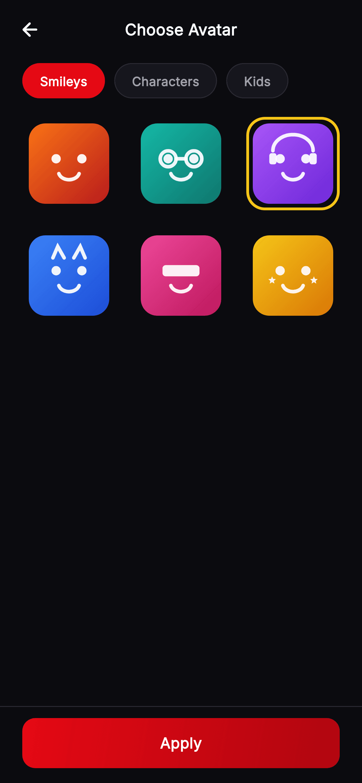
Letting someone choose an avatar usually means shipping a folder of PNGs at three densities, or wiring up an image upload. Cineo does neither: every character in this picker is drawn by a painter from an integer. You'll build a row of collection chips that swaps the on-screen set, a three-column grid where the chosen face gets a gold ring that animates in, and the geometry behind six expressions — glasses, headphones, cat ears, a visor and star eyes — all derived from the width of the box they land in.
Watch the Flutter UI walkthrough
A short screen recording of Cineo · Choose Avatar running, if you'd rather see it before you read the code. The written tutorial below covers everything in it.
Can't see the video? Watch it on YouTube.
What you'll build
- ✓A horizontal chip strip that switches the visible avatar collection
- ✓A three-column grid whose selection ring animates in over 140ms
- ✓An avatar widget that works both at a fixed size and stretched to fill a grid cell
- ✓Six painted expressions built from circles, arcs, paths and a hand-rolled star
- ✓Face geometry expressed as fractions of the canvas so it scales to any cell size
Step-by-step build
Create the file
Add a new file at lib/stream_profile_avatar_pick/stream_profile_avatar_pick_screen.dart in your Flutter project.
Register the bundled fonts
No external packages — this is pure Flutter. It does bundle its design font (Inter), so drop the font file into fonts/ and declare it in pubspec.yaml:
flutter:
  fonts:
    - family: Inter
      fonts:
- asset: fonts/Inter-Regular.ttfBuild it, piece by piece
Here's how the screen goes together. Each block below is a real slice of the code with a plain-English explanation — paste them in order, or grab the whole file from the next section.
Two integers hold the entire screen
import 'dart:math' as math;

import 'package:flutter/material.dart';

/// Choose Avatar — a painted character-avatar picker for the **Cineo** streaming
/// app. Collection chips switch the on-screen set; a grid of painted characters
/// shows the current collection with the selected one ringed in gold; a pinned
/// "Apply" bar confirms. Self-contained per CONVENTIONS.md (pure Flutter,
/// bundled Inter, own dark theme, painted avatars — no raster).
class StreamProfileAvatarPickScreen extends StatefulWidget {
  const StreamProfileAvatarPickScreen({
    super.key,
    this.onBack,
    this.onApply,
  });

  final VoidCallback? onBack;
  final VoidCallback? onApply;

  @override
  State<StreamProfileAvatarPickScreen> createState() =>
      _StreamProfileAvatarPickScreenState();
}

class _StreamProfileAvatarPickScreenState
    extends State<StreamProfileAvatarPickScreen> {
  static const String _font = 'Inter';
  static const Color _bg = Color(0xFF0B0B0F);
  static const Color _surface = Color(0xFF16161D);
  static const Color _brand = Color(0xFFE50914);
  static const Color _brandDark = Color(0xFFB00610);
  static const Color _text = Color(0xFFFFFFFF);
  static const Color _muted = Color(0xFFA1A1AA);
  static const Color _hairline = Color(0xFF2A2A33);
  static const Color _gold = Color(0xFFF5C518);

  static const List<String> _collections = <String>[
    'Smileys',
    'Characters',
    'Kids',
  ];

  int _collection = 0;
  int _selected = 2;
The state is `int _collection = 0` and `int _selected = 2` — which tab is active and which face is chosen. No controllers, no models, no image paths. `_collections` names three sets ('Smileys', 'Characters', 'Kids'), and `_gold` `0xFFF5C518` is declared alongside the brand red because it does a different job: red marks the active chip, gold marks the chosen avatar, and keeping them distinct means the two selections never look like the same control.
Chips that rotate the set
  Widget build(BuildContext context) {
    // Each collection rotates the character set so the grid feels distinct.
    final int base = _collection * 2;
    return Theme(
      data: ThemeData.dark(useMaterial3: true),
      child: Scaffold(
        backgroundColor: _bg,
        body: SafeArea(
          child: Column(
            children: <Widget>[
              _TopBar(title: 'Choose Avatar', onBack: widget.onBack),
              const SizedBox(height: 4),
              SizedBox(
                height: 38,
                child: ListView.separated(
                  scrollDirection: Axis.horizontal,
                  padding: const EdgeInsets.symmetric(horizontal: 24),
                  itemCount: _collections.length,
                  separatorBuilder: (BuildContext context, int i) =>
                      const SizedBox(width: 10),
                  itemBuilder: (BuildContext context, int i) {
                    final bool sel = _collection == i;
                    return GestureDetector(
                      onTap: () => setState(() => _collection = i),
                      child: Container(
                        padding: const EdgeInsets.symmetric(horizontal: 18),
                        alignment: Alignment.center,
                        decoration: BoxDecoration(
                          color: sel ? _brand : _surface,
                          borderRadius: BorderRadius.circular(20),
                          border: Border.all(
                            color: sel ? _brand : _hairline,
                          ),
                        ),
                        child: Text(
                          _collections[i],
                          style: TextStyle(
                            fontFamily: _font,
                            fontSize: 13.5,
                            fontWeight: FontWeight.w600,
                            color: sel ? Colors.white : _muted,
                          ),
                        ),
                      ),
                    );
                  },
                ),
              ),
The line `final int base = _collection * 2;` is the whole trick behind the collections. Rather than holding three separate lists of characters, switching a collection shifts the starting variant by two, and the grid below renders `base + i` — so each tab shows an overlapping but visibly different set out of the six available faces. The chips themselves are a horizontal `ListView.separated` in a fixed 38px box, with `separatorBuilder` supplying the 10px gaps so the first and last chips keep the list's own padding. A selected chip fills brand red and sets both its `color` and its `border` to the same value, which keeps its outer size identical to the unselected ones — a border-only change would make the chip jump by a pixel.
The grid and its gold ring
              Expanded(
                child: GridView.builder(
                  padding: const EdgeInsets.symmetric(horizontal: 24),
                  gridDelegate:
                      const SliverGridDelegateWithFixedCrossAxisCount(
                    crossAxisCount: 3,
                    mainAxisSpacing: 20,
                    crossAxisSpacing: 20,
                    childAspectRatio: 1,
                  ),
                  itemCount: 6,
                  itemBuilder: (BuildContext context, int i) {
                    final bool sel = _selected == i;
                    return GestureDetector(
                      onTap: () => setState(() => _selected = i),
                      child: AnimatedContainer(
                        duration: const Duration(milliseconds: 140),
                        padding: const EdgeInsets.all(4),
                        decoration: BoxDecoration(
                          borderRadius: BorderRadius.circular(20),
                          border: Border.all(
                            color: sel ? _gold : Colors.transparent,
                            width: 3,
                          ),
                        ),
                        child: _ProfileAvatar(
                          variant: base + i,
                          size: double.infinity,
                        ),
                      ),
                    );
                  },
                ),
              ),
              Container(
                padding: const EdgeInsets.fromLTRB(24, 12, 24, 16),
                decoration: const BoxDecoration(
                  border: Border(top: BorderSide(color: _hairline)),
                ),
                child: _PrimaryButton(label: 'Apply', onTap: widget.onApply),
              ),
            ],
          ),
        ),
      ),
    );
  }
`GridView.builder` with `SliverGridDelegateWithFixedCrossAxisCount(crossAxisCount: 3, ..., childAspectRatio: 1)` gives six square cells with 20px gutters. Each cell is an `AnimatedContainer` of 140ms whose border is `sel ? _gold : Colors.transparent` at a constant `width: 3`. Keeping the transparent border at the same width is what makes the animation a colour fade rather than a layout shift — drop the width to zero when unselected and every tap would resize the avatar by 6px. The 4px padding inside the border is the gap between ring and artwork, and the avatar is handed `size: double.infinity` so it fills whatever the grid allots.
Why the shared widgets are copied, not imported
class _TopBar extends StatelessWidget {
  const _TopBar({required this.title, this.onBack});

  final String title;
  final VoidCallback? onBack;

  @override
  Widget build(BuildContext context) {
    return Padding(
      padding: const EdgeInsets.fromLTRB(8, 8, 8, 8),
      child: Row(
        children: <Widget>[
          IconButton(
            onPressed: onBack,
            icon: const Icon(Icons.arrow_back_rounded,
                color: _StreamProfileAvatarPickScreenState._text),
          ),
          const Spacer(),
          Text(
            title,
            style: const TextStyle(
              fontFamily: _StreamProfileAvatarPickScreenState._font,
              fontSize: 17,
              fontWeight: FontWeight.w700,
              color: _StreamProfileAvatarPickScreenState._text,
            ),
          ),
          const Spacer(),
          const SizedBox(width: 48),
        ],
      ),
    );
  }
}

class _PrimaryButton extends StatelessWidget {
  const _PrimaryButton({required this.label, this.onTap});

  final String label;
  final VoidCallback? onTap;

  @override
  Widget build(BuildContext context) {
    return SizedBox(
      width: double.infinity,
      height: 54,
      child: Material(
        color: Colors.transparent,
        borderRadius: BorderRadius.circular(14),
        child: InkWell(
          onTap: onTap,
          borderRadius: BorderRadius.circular(14),
          child: Ink(
            decoration: BoxDecoration(
              borderRadius: BorderRadius.circular(14),
              gradient: const LinearGradient(
                begin: Alignment.topLeft,
                end: Alignment.bottomRight,
                colors: <Color>[
                  _StreamProfileAvatarPickScreenState._brand,
                  _StreamProfileAvatarPickScreenState._brandDark,
                ],
              ),
            ),
            child: Center(
              child: Text(
                label,
                style: const TextStyle(
                  fontFamily: _StreamProfileAvatarPickScreenState._font,
                  fontSize: 16,
                  fontWeight: FontWeight.w700,
                  letterSpacing: 0.3,
                  color: Colors.white,
                ),
              ),
            ),
          ),
        ),
      ),
    );
  }
}
`_TopBar` and `_PrimaryButton` are private classes defined at the bottom of this file, and the same two exist inside the other Cineo profile screens. That duplication is deliberate: each screen in this kit ships as a single self-contained file, so dropping it into a project never drags a shared library along with it. The button is the `Material` → `InkWell` → `Ink` sandwich that lets a gradient fill still show a ripple, and the top bar centres its title with two `Spacer`s and a 48px counterweight.
One avatar widget, two sizing modes
/// Painted seeded profile avatar — vivid gradient rounded-square + friendly
/// geometric face. [variant] selects colour + expression (mod 6).
class _ProfileAvatar extends StatelessWidget {
  const _ProfileAvatar({required this.variant, required this.size});

  final int variant;
  final double size;

  static const List<List<Color>> _palettes = <List<Color>>[
    <Color>[Color(0xFFF97316), Color(0xFFB91C1C)],
    <Color>[Color(0xFF14B8A6), Color(0xFF0F766E)],
    <Color>[Color(0xFFA855F7), Color(0xFF6D28D9)],
    <Color>[Color(0xFF3B82F6), Color(0xFF1D4ED8)],
    <Color>[Color(0xFFEC4899), Color(0xFFBE185D)],
    <Color>[Color(0xFFF5C518), Color(0xFFD97706)],
  ];

  @override
  Widget build(BuildContext context) {
    final int v = variant % _palettes.length;
    final List<Color> pal = _palettes[v];
    final Widget tile = AspectRatio(
      aspectRatio: 1,
      child: Container(
        decoration: BoxDecoration(
          borderRadius: BorderRadius.circular(18),
          gradient: LinearGradient(
            begin: Alignment.topLeft,
            end: Alignment.bottomRight,
            colors: pal,
          ),
        ),
        child: CustomPaint(painter: _AvatarFacePainter(variant: v)),
      ),
    );
    if (size == double.infinity) {
      return tile;
    }
    return SizedBox(width: size, height: size, child: tile);
  }
}
This version of `_ProfileAvatar` handles both callers. It builds the gradient tile wrapped in an `AspectRatio(aspectRatio: 1)`, then checks `if (size == double.infinity)` and returns that tile bare — letting the grid cell dictate the width while the aspect ratio keeps it square. Any other value gets wrapped in a `SizedBox`. Using infinity as the sentinel for 'fill your parent' avoids a nullable parameter and reads naturally at the call site, and the `AspectRatio` guarantees the face is never painted into a rectangle, which would skew the eye spacing.
The face's fixed points
class _AvatarFacePainter extends CustomPainter {
  const _AvatarFacePainter({required this.variant});

  final int variant;

  @override
  void paint(Canvas canvas, Size size) {
    final double w = size.width;
    final double h = size.height;
    final Paint ink = Paint()
      ..color = Colors.white.withValues(alpha: 0.92)
      ..style = PaintingStyle.fill;
    final Paint stroke = Paint()
      ..color = Colors.white.withValues(alpha: 0.92)
      ..style = PaintingStyle.stroke
      ..strokeWidth = w * 0.045
      ..strokeCap = StrokeCap.round;

    final double eyeY = h * 0.44;
    final double eyeDx = w * 0.16;
    final double eyeR = w * 0.058;
    final Offset le = Offset(w * 0.5 - eyeDx, eyeY);
    final Offset re = Offset(w * 0.5 + eyeDx, eyeY);

    switch (variant) {
      case 1:
        canvas.drawCircle(le, eyeR * 1.7, stroke);
        canvas.drawCircle(re, eyeR * 1.7, stroke);
        canvas.drawLine(Offset(le.dx + eyeR * 1.7, eyeY),
            Offset(re.dx - eyeR * 1.7, eyeY), stroke);
        break;
The painter starts by deriving everything from `w` and `h`: eyes at `h * 0.44`, offset `w * 0.16` either side of centre, radius `w * 0.058`, and a stroke width of `w * 0.045`. Because nothing is a fixed pixel value, one painter serves a 56px list thumbnail and a 100px grid cell with identical proportions. Variant 1 is the simplest accessory: two stroked circles at `eyeR * 1.7` for lenses, plus a bridge line drawn from the right edge of the left lens to the left edge of the right one, computed from the same radius so the three pieces always meet.
Headphones, ears and a visor
      case 2:
        final Rect band = Rect.fromCenter(
            center: Offset(w * 0.5, h * 0.34), width: w * 0.5, height: h * 0.4);
        canvas.drawArc(band, math.pi, math.pi, false, stroke);
        canvas.drawRRect(
          RRect.fromRectAndRadius(
            Rect.fromCenter(
                center: Offset(w * 0.25, h * 0.44),
                width: w * 0.09,
                height: h * 0.14),
            Radius.circular(w * 0.03),
          ),
          ink,
        );
        canvas.drawRRect(
          RRect.fromRectAndRadius(
            Rect.fromCenter(
                center: Offset(w * 0.75, h * 0.44),
                width: w * 0.09,
                height: h * 0.14),
            Radius.circular(w * 0.03),
          ),
          ink,
        );
        break;
      case 3:
        final Path ears = Path()
          ..moveTo(w * 0.3, h * 0.28)
          ..lineTo(w * 0.36, h * 0.14)
          ..lineTo(w * 0.44, h * 0.28)
          ..moveTo(w * 0.7, h * 0.28)
          ..lineTo(w * 0.64, h * 0.14)
          ..lineTo(w * 0.56, h * 0.28);
        canvas.drawPath(ears, stroke);
        break;
      case 4:
        canvas.drawRRect(
          RRect.fromRectAndRadius(
            Rect.fromCenter(
                center: Offset(w * 0.5, eyeY),
                width: w * 0.46,
                height: h * 0.14),
            Radius.circular(w * 0.04),
          ),
          ink,
        );
        break;
Variant 2 draws a headphone band with `drawArc(band, math.pi, math.pi, ...)` — starting at 180° and sweeping 180°, which is the top half of the rect — then replaces the round eyes with two tall rounded rectangles. Variant 3 is a single `Path` with two `moveTo`/`lineTo` triangles for cat ears, both open at the bottom so they read as ears rather than floating shapes. Variant 4 is one wide `RRect` across the eye line: a visor, and the reason for the `if (variant != 4)` guard further down that suppresses the round eyes behind it.
Star eyes and the shared mouth
      case 5:
        _star(canvas, Offset(w * 0.24, h * 0.56), w * 0.05, ink);
        _star(canvas, Offset(w * 0.76, h * 0.56), w * 0.05, ink);
        break;
      default:
        break;
    }

    if (variant != 4) {
      canvas.drawCircle(le, eyeR, ink);
      canvas.drawCircle(re, eyeR, ink);
    }

    final Rect mouth = Rect.fromCenter(
        center: Offset(w * 0.5, h * 0.6), width: w * 0.26, height: h * 0.2);
    canvas.drawArc(mouth, 0.25, 2.64, false, stroke);
  }

  void _star(Canvas canvas, Offset c, double r, Paint p) {
    final Path path = Path();
    for (int i = 0; i < 5; i++) {
      final double a = -math.pi / 2 + i * (2 * math.pi / 5);
      final double x = c.dx + r * math.cos(a);
      final double y = c.dy + r * math.sin(a);
      if (i == 0) {
        path.moveTo(x, y);
      } else {
        path.lineTo(x, y);
      }
      final double a2 = a + math.pi / 5;
      path.lineTo(
          c.dx + r * 0.45 * math.cos(a2), c.dy + r * 0.45 * math.sin(a2));
    }
    path.close();
    canvas.drawPath(path, p);
  }

  @override
  bool shouldRepaint(covariant _AvatarFacePainter oldDelegate) =>
      oldDelegate.variant != variant;
}
Variant 5 calls `_star` twice, and that helper is a compact five-point star: it steps five times around the circle from `-pi / 2` (so a point faces up), emitting an outer vertex at radius `r` and then an inner vertex at `r * 0.45` half a step later, before `close()` joins the last edge. After the switch, every face gets the same mouth — an arc through `Rect.fromCenter` at `h * 0.6` sweeping 2.64 radians from 0.25, which is a smile that stops short of the full half-circle so it curves rather than grins. `shouldRepaint` compares the variant, so a cell repaints only when its character actually changes.
Full code
The complete, ready-to-paste source. Free to use in your projects — one click copies it all.
import 'dart:math' as math;

import 'package:flutter/material.dart';

/// Choose Avatar — a painted character-avatar picker for the **Cineo** streaming
/// app. Collection chips switch the on-screen set; a grid of painted characters
/// shows the current collection with the selected one ringed in gold; a pinned
/// "Apply" bar confirms. Self-contained per CONVENTIONS.md (pure Flutter,
/// bundled Inter, own dark theme, painted avatars — no raster).
class StreamProfileAvatarPickScreen extends StatefulWidget {
  const StreamProfileAvatarPickScreen({
    super.key,
    this.onBack,
    this.onApply,
  });

  final VoidCallback? onBack;
  final VoidCallback? onApply;

  @override
  State<StreamProfileAvatarPickScreen> createState() =>
      _StreamProfileAvatarPickScreenState();
}

class _StreamProfileAvatarPickScreenState
    extends State<StreamProfileAvatarPickScreen> {
  static const String _font = 'Inter';
  static const Color _bg = Color(0xFF0B0B0F);
  static const Color _surface = Color(0xFF16161D);
  static const Color _brand = Color(0xFFE50914);
  static const Color _brandDark = Color(0xFFB00610);
  static const Color _text = Color(0xFFFFFFFF);
  static const Color _muted = Color(0xFFA1A1AA);
  static const Color _hairline = Color(0xFF2A2A33);
  static const Color _gold = Color(0xFFF5C518);

  static const List<String> _collections = <String>[
    'Smileys',
    'Characters',
    'Kids',
  ];

  int _collection = 0;
  int _selected = 2;

  @override
  Widget build(BuildContext context) {
    // Each collection rotates the character set so the grid feels distinct.
    final int base = _collection * 2;
    return Theme(
      data: ThemeData.dark(useMaterial3: true),
      child: Scaffold(
        backgroundColor: _bg,
        body: SafeArea(
          child: Column(
            children: <Widget>[
              _TopBar(title: 'Choose Avatar', onBack: widget.onBack),
              const SizedBox(height: 4),
              SizedBox(
                height: 38,
                child: ListView.separated(
                  scrollDirection: Axis.horizontal,
                  padding: const EdgeInsets.symmetric(horizontal: 24),
                  itemCount: _collections.length,
                  separatorBuilder: (BuildContext context, int i) =>
                      const SizedBox(width: 10),
                  itemBuilder: (BuildContext context, int i) {
                    final bool sel = _collection == i;
                    return GestureDetector(
                      onTap: () => setState(() => _collection = i),
                      child: Container(
                        padding: const EdgeInsets.symmetric(horizontal: 18),
                        alignment: Alignment.center,
                        decoration: BoxDecoration(
                          color: sel ? _brand : _surface,
                          borderRadius: BorderRadius.circular(20),
                          border: Border.all(
                            color: sel ? _brand : _hairline,
                          ),
                        ),
                        child: Text(
                          _collections[i],
                          style: TextStyle(
                            fontFamily: _font,
                            fontSize: 13.5,
                            fontWeight: FontWeight.w600,
                            color: sel ? Colors.white : _muted,
                          ),
                        ),
                      ),
                    );
                  },
                ),
              ),
              const SizedBox(height: 20),
              Expanded(
                child: GridView.builder(
                  padding: const EdgeInsets.symmetric(horizontal: 24),
                  gridDelegate:
                      const SliverGridDelegateWithFixedCrossAxisCount(
                    crossAxisCount: 3,
                    mainAxisSpacing: 20,
                    crossAxisSpacing: 20,
                    childAspectRatio: 1,
                  ),
                  itemCount: 6,
                  itemBuilder: (BuildContext context, int i) {
                    final bool sel = _selected == i;
                    return GestureDetector(
                      onTap: () => setState(() => _selected = i),
                      child: AnimatedContainer(
                        duration: const Duration(milliseconds: 140),
                        padding: const EdgeInsets.all(4),
                        decoration: BoxDecoration(
                          borderRadius: BorderRadius.circular(20),
                          border: Border.all(
                            color: sel ? _gold : Colors.transparent,
                            width: 3,
                          ),
                        ),
                        child: _ProfileAvatar(
                          variant: base + i,
                          size: double.infinity,
                        ),
                      ),
                    );
                  },
                ),
              ),
              Container(
                padding: const EdgeInsets.fromLTRB(24, 12, 24, 16),
                decoration: const BoxDecoration(
                  border: Border(top: BorderSide(color: _hairline)),
                ),
                child: _PrimaryButton(label: 'Apply', onTap: widget.onApply),
              ),
            ],
          ),
        ),
      ),
    );
  }
}

class _TopBar extends StatelessWidget {
  const _TopBar({required this.title, this.onBack});

  final String title;
  final VoidCallback? onBack;

  @override
  Widget build(BuildContext context) {
    return Padding(
      padding: const EdgeInsets.fromLTRB(8, 8, 8, 8),
      child: Row(
        children: <Widget>[
          IconButton(
            onPressed: onBack,
            icon: const Icon(Icons.arrow_back_rounded,
                color: _StreamProfileAvatarPickScreenState._text),
          ),
          const Spacer(),
          Text(
            title,
            style: const TextStyle(
              fontFamily: _StreamProfileAvatarPickScreenState._font,
              fontSize: 17,
              fontWeight: FontWeight.w700,
              color: _StreamProfileAvatarPickScreenState._text,
            ),
          ),
          const Spacer(),
          const SizedBox(width: 48),
        ],
      ),
    );
  }
}

class _PrimaryButton extends StatelessWidget {
  const _PrimaryButton({required this.label, this.onTap});

  final String label;
  final VoidCallback? onTap;

  @override
  Widget build(BuildContext context) {
    return SizedBox(
      width: double.infinity,
      height: 54,
      child: Material(
        color: Colors.transparent,
        borderRadius: BorderRadius.circular(14),
        child: InkWell(
          onTap: onTap,
          borderRadius: BorderRadius.circular(14),
          child: Ink(
            decoration: BoxDecoration(
              borderRadius: BorderRadius.circular(14),
              gradient: const LinearGradient(
                begin: Alignment.topLeft,
                end: Alignment.bottomRight,
                colors: <Color>[
                  _StreamProfileAvatarPickScreenState._brand,
                  _StreamProfileAvatarPickScreenState._brandDark,
                ],
              ),
            ),
            child: Center(
              child: Text(
                label,
                style: const TextStyle(
                  fontFamily: _StreamProfileAvatarPickScreenState._font,
                  fontSize: 16,
                  fontWeight: FontWeight.w700,
                  letterSpacing: 0.3,
                  color: Colors.white,
                ),
              ),
            ),
          ),
        ),
      ),
    );
  }
}

/// Painted seeded profile avatar — vivid gradient rounded-square + friendly
/// geometric face. [variant] selects colour + expression (mod 6).
class _ProfileAvatar extends StatelessWidget {
  const _ProfileAvatar({required this.variant, required this.size});

  final int variant;
  final double size;

  static const List<List<Color>> _palettes = <List<Color>>[
    <Color>[Color(0xFFF97316), Color(0xFFB91C1C)],
    <Color>[Color(0xFF14B8A6), Color(0xFF0F766E)],
    <Color>[Color(0xFFA855F7), Color(0xFF6D28D9)],
    <Color>[Color(0xFF3B82F6), Color(0xFF1D4ED8)],
    <Color>[Color(0xFFEC4899), Color(0xFFBE185D)],
    <Color>[Color(0xFFF5C518), Color(0xFFD97706)],
  ];

  @override
  Widget build(BuildContext context) {
    final int v = variant % _palettes.length;
    final List<Color> pal = _palettes[v];
    final Widget tile = AspectRatio(
      aspectRatio: 1,
      child: Container(
        decoration: BoxDecoration(
          borderRadius: BorderRadius.circular(18),
          gradient: LinearGradient(
            begin: Alignment.topLeft,
            end: Alignment.bottomRight,
            colors: pal,
          ),
        ),
        child: CustomPaint(painter: _AvatarFacePainter(variant: v)),
      ),
    );
    if (size == double.infinity) {
      return tile;
    }
    return SizedBox(width: size, height: size, child: tile);
  }
}

class _AvatarFacePainter extends CustomPainter {
  const _AvatarFacePainter({required this.variant});

  final int variant;

  @override
  void paint(Canvas canvas, Size size) {
    final double w = size.width;
    final double h = size.height;
    final Paint ink = Paint()
      ..color = Colors.white.withValues(alpha: 0.92)
      ..style = PaintingStyle.fill;
    final Paint stroke = Paint()
      ..color = Colors.white.withValues(alpha: 0.92)
      ..style = PaintingStyle.stroke
      ..strokeWidth = w * 0.045
      ..strokeCap = StrokeCap.round;

    final double eyeY = h * 0.44;
    final double eyeDx = w * 0.16;
    final double eyeR = w * 0.058;
    final Offset le = Offset(w * 0.5 - eyeDx, eyeY);
    final Offset re = Offset(w * 0.5 + eyeDx, eyeY);

    switch (variant) {
      case 1:
        canvas.drawCircle(le, eyeR * 1.7, stroke);
        canvas.drawCircle(re, eyeR * 1.7, stroke);
        canvas.drawLine(Offset(le.dx + eyeR * 1.7, eyeY),
            Offset(re.dx - eyeR * 1.7, eyeY), stroke);
        break;
      case 2:
        final Rect band = Rect.fromCenter(
            center: Offset(w * 0.5, h * 0.34), width: w * 0.5, height: h * 0.4);
        canvas.drawArc(band, math.pi, math.pi, false, stroke);
        canvas.drawRRect(
          RRect.fromRectAndRadius(
            Rect.fromCenter(
                center: Offset(w * 0.25, h * 0.44),
                width: w * 0.09,
                height: h * 0.14),
            Radius.circular(w * 0.03),
          ),
          ink,
        );
        canvas.drawRRect(
          RRect.fromRectAndRadius(
            Rect.fromCenter(
                center: Offset(w * 0.75, h * 0.44),
                width: w * 0.09,
                height: h * 0.14),
            Radius.circular(w * 0.03),
          ),
          ink,
        );
        break;
      case 3:
        final Path ears = Path()
          ..moveTo(w * 0.3, h * 0.28)
          ..lineTo(w * 0.36, h * 0.14)
          ..lineTo(w * 0.44, h * 0.28)
          ..moveTo(w * 0.7, h * 0.28)
          ..lineTo(w * 0.64, h * 0.14)
          ..lineTo(w * 0.56, h * 0.28);
        canvas.drawPath(ears, stroke);
        break;
      case 4:
        canvas.drawRRect(
          RRect.fromRectAndRadius(
            Rect.fromCenter(
                center: Offset(w * 0.5, eyeY),
                width: w * 0.46,
                height: h * 0.14),
            Radius.circular(w * 0.04),
          ),
          ink,
        );
        break;
      case 5:
        _star(canvas, Offset(w * 0.24, h * 0.56), w * 0.05, ink);
        _star(canvas, Offset(w * 0.76, h * 0.56), w * 0.05, ink);
        break;
      default:
        break;
    }

    if (variant != 4) {
      canvas.drawCircle(le, eyeR, ink);
      canvas.drawCircle(re, eyeR, ink);
    }

    final Rect mouth = Rect.fromCenter(
        center: Offset(w * 0.5, h * 0.6), width: w * 0.26, height: h * 0.2);
    canvas.drawArc(mouth, 0.25, 2.64, false, stroke);
  }

  void _star(Canvas canvas, Offset c, double r, Paint p) {
    final Path path = Path();
    for (int i = 0; i < 5; i++) {
      final double a = -math.pi / 2 + i * (2 * math.pi / 5);
      final double x = c.dx + r * math.cos(a);
      final double y = c.dy + r * math.sin(a);
      if (i == 0) {
        path.moveTo(x, y);
      } else {
        path.lineTo(x, y);
      }
      final double a2 = a + math.pi / 5;
      path.lineTo(
          c.dx + r * 0.45 * math.cos(a2), c.dy + r * 0.45 * math.sin(a2));
    }
    path.close();
    canvas.drawPath(path, p);
  }

  @override
  bool shouldRepaint(covariant _AvatarFacePainter oldDelegate) =>
      oldDelegate.variant != variant;
}
Plus bundled 1 binary asset (fonts/images). The CLI and MCP install those for you automatically.
Two faster ways to add it
Copy-paste works, but you can skip it entirely.
1. FlutterKit CLI
One command drops this screen — and its fonts — straight into your project.
$ flutterkit add stream-profile-avatar-pick2. AI agent (MCP)
Connect FlutterKit's MCP server in Claude or Cursor and just ask your agent to install stream-profile-avatar-pick — it fetches and writes the files for you.
FAQ
How do I add more avatars than the six built in?
Add a two-colour entry to `_palettes` and a matching `case` in the painter's switch, then raise the grid's `itemCount`. The modulo in the avatar widget means an out-of-range variant wraps rather than crashing, so the two can be extended independently.
Does the Apply button save the choice anywhere?
Not by itself — it calls `onApply`, and `_selected` lives in this screen's state. Change `onApply` to a `ValueChanged<int>` and pass the selected variant up, then store that integer with the profile; that number is all you need to reproduce the same face anywhere in the app.
Why draw avatars instead of shipping images?
An integer costs nothing to store or sync, scales to any size without a second asset, and adds no download weight. It also means a brand-new profile has a distinctive avatar the instant it is created, with no upload step and no default grey silhouette.
Does it need any packages or fonts?
No packages. The faces use `dart:math` for the arcs and the star's trigonometry, which is part of the SDK, and Inter ships bundled with the screen for registration under `fonts:` in your pubspec.
Which Flutter version does this need?
Flutter 3.22 or newer, because the face paints use `Colors.white.withValues(alpha: 0.92)`. On an older SDK swap that for `withOpacity(0.92)` and rewrite the `super.key` constructors as `{Key? key, ...}) : super(key: key)`.


