How to Build an Edit Profile Settings Screen in Flutter (Full Code + Preview)
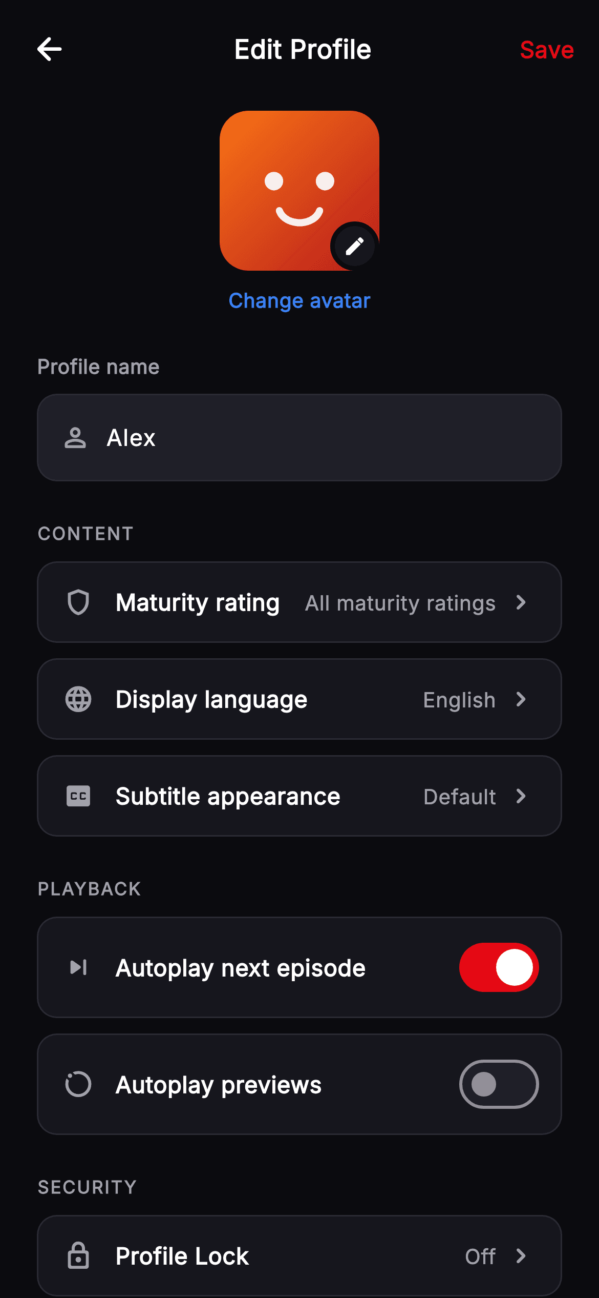
Profile settings screens are mostly rows, and the craft is in making two row types carry everything. This tutorial builds Cineo's edit-profile screen in Flutter — a 104px avatar with an edit badge notched into the dark background, a name field, then Content, Playback and Security sections built from just a navigation row and a toggle row, ending in an outlined red Delete Profile action that's deliberately styled unlike every other control on the page.
Watch the Flutter UI walkthrough
A short screen recording of Cineo · Edit Profile running, if you'd rather see it before you read the code. The written tutorial below covers everything in it.
Can't see the video? Watch it on YouTube.
What you'll build
- ✓An avatar edit badge that uses a background-coloured border to cut a notch out of the avatar beneath it
- ✓Two reusable row types — value-plus-chevron and label-plus-switch — covering every setting
- ✓Uppercase section labels grouping rows into Content, Playback and Security
- ✓A destructive action styled as an outlined red button so it can't be mistaken for a save
Step-by-step build
Create the file
Add a new file at lib/stream_profile_edit/stream_profile_edit_screen.dart in your Flutter project.
Register the bundled fonts
No external packages — this is pure Flutter. It does bundle its design font (Inter), so drop the font file into fonts/ and declare it in pubspec.yaml:
flutter:
  fonts:
    - family: Inter
      fonts:
- asset: fonts/Inter-Regular.ttfBuild it, piece by piece
Here's how the screen goes together. Each block below is a real slice of the code with a plain-English explanation — paste them in order, or grab the whole file from the next section.
Two toggles and a name controller
import 'dart:math' as math;

import 'package:flutter/material.dart';

/// Edit Profile — profile settings for the **Cineo** streaming app. A change-
/// avatar header, name field, maturity-rating row, autoplay toggles, language &
/// subtitle rows, a "Profile Lock" link, and a destructive "Delete Profile"
/// action. Self-contained per CONVENTIONS.md (pure Flutter, bundled Inter, own
/// dark theme, painted avatar).
class StreamProfileEditScreen extends StatefulWidget {
  const StreamProfileEditScreen({
    super.key,
    this.onBack,
    this.onSave,
    this.onChooseAvatar,
    this.onLock,
    this.onDelete,
  });

  final VoidCallback? onBack;
  final VoidCallback? onSave;
  final VoidCallback? onChooseAvatar;
  final VoidCallback? onLock;
  final VoidCallback? onDelete;

  @override
  State<StreamProfileEditScreen> createState() =>
      _StreamProfileEditScreenState();
}

class _StreamProfileEditScreenState extends State<StreamProfileEditScreen> {
  static const String _font = 'Inter';
  static const Color _bg = Color(0xFF0B0B0F);
  static const Color _surface = Color(0xFF16161D);
  static const Color _surfaceAlt = Color(0xFF1F1F28);
  static const Color _brand = Color(0xFFE50914);
  static const Color _text = Color(0xFFFFFFFF);
  static const Color _muted = Color(0xFFA1A1AA);
  static const Color _hairline = Color(0xFF2A2A33);
  static const Color _accent = Color(0xFF3B82F6);
  static const Color _danger = Color(0xFFEF4444);

  final TextEditingController _name = TextEditingController(text: 'Alex');
  bool _autoNext = true;
  bool _autoPreviews = false;

  @override
  void dispose() {
    _name.dispose();
    super.dispose();
  }
The screen exposes five callbacks — `onBack`, `onSave`, `onChooseAvatar`, `onLock` and `onDelete` — which is a good sign that a settings screen is doing its job as pure UI, delegating every consequence upward. State is minimal: a name controller and two booleans for the autoplay preferences. Everything else on the page is a navigation row whose value is display-only. The palette adds `_danger` (#EF4444) beyond the usual Cineo set, reserved entirely for the delete action so nothing else on the screen can borrow it.
The avatar and its notched edit badge
  @override
  Widget build(BuildContext context) {
    return Theme(
      data: ThemeData.dark(useMaterial3: true),
      child: Scaffold(
        backgroundColor: _bg,
        body: SafeArea(
          child: Column(
            children: <Widget>[
              _TopBar(
                title: 'Edit Profile',
                onBack: widget.onBack,
                onSave: widget.onSave,
              ),
              Expanded(
                child: ListView(
                  padding: const EdgeInsets.fromLTRB(24, 8, 24, 24),
                  children: <Widget>[
                    Center(
                      child: GestureDetector(
                        onTap: widget.onChooseAvatar,
                        child: Column(
                          children: <Widget>[
                            Stack(
                              children: <Widget>[
                                const _ProfileAvatar(variant: 0, size: 104),
                                Positioned(
                                  right: 0,
                                  bottom: 0,
                                  child: Container(
                                    width: 32,
                                    height: 32,
                                    decoration: BoxDecoration(
                                      color: _surface,
                                      shape: BoxShape.circle,
                                      border: Border.all(color: _bg, width: 3),
                                    ),
                                    child: const Icon(Icons.edit_rounded,
                                        size: 15, color: _text),
                                  ),
                                ),
                              ],
                            ),
                            const SizedBox(height: 10),
                            const Text(
                              'Change avatar',
                              style: TextStyle(
                                fontFamily: _font,
                                fontSize: 13,
                                fontWeight: FontWeight.w600,
                                color: _accent,
                              ),
                            ),
                          ],
                        ),
                      ),
                    ),
                    const SizedBox(height: 24),
                    const _FieldLabel('Profile name'),
                    const SizedBox(height: 8),
                    Container(
                      decoration: BoxDecoration(
                        color: _surfaceAlt,
                        borderRadius: BorderRadius.circular(13),
                        border: Border.all(color: _hairline),
                      ),
                      child: Row(
                        children: <Widget>[
                          const Padding(
                            padding: EdgeInsets.only(left: 14, right: 10),
                            child: Icon(Icons.person_outline_rounded,
                                size: 20, color: _muted),
                          ),
                          Expanded(
                            child: TextField(
                              controller: _name,
                              cursorColor: _brand,
                              style: const TextStyle(
                                fontFamily: _font,
                                fontSize: 15,
                                fontWeight: FontWeight.w500,
                                color: _text,
                              ),
                              decoration: const InputDecoration(
                                isCollapsed: true,
                                contentPadding:
                                    EdgeInsets.symmetric(vertical: 16),
                                border: InputBorder.none,
                              ),
                            ),
                          ),
                          const SizedBox(width: 14),
                        ],
                      ),
                    ),
The avatar group is a Stack: a 104px `_ProfileAvatar` with a 32px circular badge Positioned at its bottom-right. The detail worth stealing is the badge's `Border.all(color: _bg, width: 3)` — a border painted in the *page background* colour, which visually cuts a clean notch out of the avatar behind it and makes the badge read as floating above rather than stuck on. It's the same trick used for online-status dots and unread ring cutouts. The whole group plus its 'Change avatar' label sits in one GestureDetector, so the entire block is tappable rather than just the small badge. Below, the name field is a bordered container with a leading icon and a TextField stripped of Material's own decoration via `isCollapsed: true` and `border: InputBorder.none`.
Three sections from two row types
                    const SizedBox(height: 26),
                    const _SectionLabel('Content'),
                    const SizedBox(height: 10),
                    _NavRow(
                      icon: Icons.shield_outlined,
                      label: 'Maturity rating',
                      value: 'All maturity ratings',
                      onTap: () {},
                    ),
                    const SizedBox(height: 10),
                    _NavRow(
                      icon: Icons.language_rounded,
                      label: 'Display language',
                      value: 'English',
                      onTap: () {},
                    ),
                    const SizedBox(height: 10),
                    _NavRow(
                      icon: Icons.closed_caption_off_rounded,
                      label: 'Subtitle appearance',
                      value: 'Default',
                      onTap: () {},
                    ),
                    const SizedBox(height: 26),
                    const _SectionLabel('Playback'),
                    const SizedBox(height: 10),
                    _ToggleRow(
                      icon: Icons.skip_next_rounded,
                      label: 'Autoplay next episode',
                      value: _autoNext,
                      onChanged: (bool v) => setState(() => _autoNext = v),
                    ),
                    const SizedBox(height: 10),
                    _ToggleRow(
                      icon: Icons.motion_photos_on_outlined,
                      label: 'Autoplay previews',
                      value: _autoPreviews,
                      onChanged: (bool v) => setState(() => _autoPreviews = v),
                    ),
                    const SizedBox(height: 26),
                    const _SectionLabel('Security'),
                    const SizedBox(height: 10),
                    _NavRow(
                      icon: Icons.lock_outline_rounded,
                      label: 'Profile Lock',
                      value: 'Off',
                      onTap: widget.onLock,
                    ),
                    const SizedBox(height: 30),
This is the structure the whole screen rests on. Content gets three `_NavRow`s — maturity rating, display language, subtitle appearance — each showing its current value and a chevron. Playback gets two `_ToggleRow`s wired to the booleans. Security gets a single `_NavRow` for Profile Lock, whose `onTap` is the real `widget.onLock` while the Content rows pass empty closures, since those sub-screens aren't part of this kit. Grouping under uppercase labels rather than running twelve identical rows together is what makes a settings page scannable, and every section is a label, a gap, then rows — a rhythm you can extend without thinking.
The destructive action
                    GestureDetector(
                      onTap: widget.onDelete,
                      child: Container(
                        height: 52,
                        alignment: Alignment.center,
                        decoration: BoxDecoration(
                          borderRadius: BorderRadius.circular(13),
                          border: Border.all(
                            color: _danger.withValues(alpha: 0.5),
                          ),
                        ),
                        child: const Row(
                          mainAxisAlignment: MainAxisAlignment.center,
                          children: <Widget>[
                            Icon(Icons.delete_outline_rounded,
                                size: 19, color: _danger),
                            SizedBox(width: 8),
                            Text(
                              'Delete Profile',
                              style: TextStyle(
                                fontFamily: _font,
                                fontSize: 15,
                                fontWeight: FontWeight.w700,
                                color: _danger,
                              ),
                            ),
                          ],
                        ),
                      ),
                    ),
                  ],
                ),
              ),
            ],
          ),
        ),
      ),
    );
  }
}
Delete Profile is styled unlike anything else on the screen and that's the point. It's a 52px outlined Container with no fill, a border of `_danger.withValues(alpha: 0.5)`, and a red icon and label. Using a half-opacity border with full-strength text keeps it visible without shouting, and the outline-only treatment means it can never be mistaken for the filled Save action in the top bar. It also sits after a 30px gap, well below the last settings row, so it can't be hit by accident while scrolling. In production you'd add a confirmation dialog on top of the `onDelete` callback.
The navigation row
class _NavRow extends StatelessWidget {
  const _NavRow({
    required this.icon,
    required this.label,
    required this.value,
    this.onTap,
  });

  final IconData icon;
  final String label;
  final String value;
  final VoidCallback? onTap;

  @override
  Widget build(BuildContext context) {
    return GestureDetector(
      onTap: onTap,
      child: Container(
        padding: const EdgeInsets.symmetric(horizontal: 16, vertical: 15),
        decoration: BoxDecoration(
          color: _StreamProfileEditScreenState._surface,
          borderRadius: BorderRadius.circular(13),
          border: Border.all(color: _StreamProfileEditScreenState._hairline),
        ),
        child: Row(
          children: <Widget>[
            Icon(icon, size: 20, color: _StreamProfileEditScreenState._muted),
            const SizedBox(width: 14),
            Expanded(
              child: Text(
                label,
                style: const TextStyle(
                  fontFamily: _StreamProfileEditScreenState._font,
                  fontSize: 15,
                  fontWeight: FontWeight.w600,
                  color: _StreamProfileEditScreenState._text,
                ),
              ),
            ),
            Text(
              value,
              style: const TextStyle(
                fontFamily: _StreamProfileEditScreenState._font,
                fontSize: 13.5,
                fontWeight: FontWeight.w500,
                color: _StreamProfileEditScreenState._muted,
              ),
            ),
            const SizedBox(width: 6),
            const Icon(Icons.chevron_right_rounded,
                size: 20, color: _StreamProfileEditScreenState._muted),
          ],
        ),
      ),
    );
  }
}
`_NavRow` is the workhorse: a `_surface` Container with a hairline border holding a muted leading icon, an `Expanded` label, the current value in smaller muted text, and a chevron. The Expanded is what pushes the value and chevron to the trailing edge regardless of label length. Showing the current value inline — 'All maturity ratings', 'English', 'Off' — is what lets someone audit their settings at a glance instead of opening four sub-screens to check. Because the whole Container is inside the GestureDetector, the entire row is the tap target.
The toggle row and the section label
class _ToggleRow extends StatelessWidget {
  const _ToggleRow({
    required this.icon,
    required this.label,
    required this.value,
    required this.onChanged,
  });

  final IconData icon;
  final String label;
  final bool value;
  final ValueChanged<bool> onChanged;

  @override
  Widget build(BuildContext context) {
    return Container(
      padding: const EdgeInsets.fromLTRB(16, 8, 10, 8),
      decoration: BoxDecoration(
        color: _StreamProfileEditScreenState._surface,
        borderRadius: BorderRadius.circular(13),
        border: Border.all(color: _StreamProfileEditScreenState._hairline),
      ),
      child: Row(
        children: <Widget>[
          Icon(icon, size: 20, color: _StreamProfileEditScreenState._muted),
          const SizedBox(width: 14),
          Expanded(
            child: Text(
              label,
              style: const TextStyle(
                fontFamily: _StreamProfileEditScreenState._font,
                fontSize: 15,
                fontWeight: FontWeight.w600,
                color: _StreamProfileEditScreenState._text,
              ),
            ),
          ),
          Switch(
            value: value,
            onChanged: onChanged,
            activeThumbColor: Colors.white,
            activeTrackColor: _StreamProfileEditScreenState._brand,
            inactiveTrackColor: _StreamProfileEditScreenState._surfaceAlt,
          ),
        ],
      ),
    );
  }
}

class _SectionLabel extends StatelessWidget {
  const _SectionLabel(this.text);

  final String text;

  @override
  Widget build(BuildContext context) {
    return Text(
      text.toUpperCase(),
      style: const TextStyle(
        fontFamily: _StreamProfileEditScreenState._font,
        fontSize: 11.5,
        fontWeight: FontWeight.w700,
        letterSpacing: 1,
        color: _StreamProfileEditScreenState._muted,
      ),
    );
  }
}

class _FieldLabel extends StatelessWidget {
  const _FieldLabel(this.text);

  final String text;

  @override
  Widget build(BuildContext context) {
    return Text(
      text,
      style: const TextStyle(
        fontFamily: _StreamProfileEditScreenState._font,
        fontSize: 13,
        fontWeight: FontWeight.w600,
        color: _StreamProfileEditScreenState._muted,
      ),
    );
  }
}
`_ToggleRow` mirrors `_NavRow` exactly — same `_surface` fill, same 13px radius, same hairline border, same icon-then-Expanded-label — so the two types read as one family despite having different trailing controls. Its padding is `fromLTRB(16, 8, 10, 8)`: shorter vertically than the nav row's 15px because a Switch carries its own 48px tap height, and tighter on the right because the switch's own padding covers that edge. The Switch is restyled inline with brand red as the active track. `_SectionLabel` uppercases in code at 11.5px w700 with `letterSpacing: 1`, the wide tracking that keeps small caps legible.
The save-bearing top bar and painted avatar
class _TopBar extends StatelessWidget {
  const _TopBar({required this.title, this.onBack, this.onSave});

  final String title;
  final VoidCallback? onBack;
  final VoidCallback? onSave;

  @override
  Widget build(BuildContext context) {
    return Padding(
      padding: const EdgeInsets.fromLTRB(8, 8, 16, 8),
      child: Row(
        children: <Widget>[
          IconButton(
            onPressed: onBack,
            icon: const Icon(Icons.arrow_back_rounded,
                color: _StreamProfileEditScreenState._text),
          ),
          const Spacer(),
          Text(
            title,
            style: const TextStyle(
              fontFamily: _StreamProfileEditScreenState._font,
              fontSize: 17,
              fontWeight: FontWeight.w700,
              color: _StreamProfileEditScreenState._text,
            ),
          ),
          const Spacer(),
          GestureDetector(
            onTap: onSave,
            child: const Text(
              'Save',
              style: TextStyle(
                fontFamily: _StreamProfileEditScreenState._font,
                fontSize: 15,
                fontWeight: FontWeight.w700,
                color: _StreamProfileEditScreenState._brand,
              ),
            ),
          ),
        ],
      ),
    );
  }
}

/// Painted seeded profile avatar — vivid gradient rounded-square + friendly
/// geometric face. [variant] (0–5) selects colour + expression.
class _ProfileAvatar extends StatelessWidget {
  const _ProfileAvatar({required this.variant, required this.size});

  final int variant;
  final double size;

  static const List<List<Color>> _palettes = <List<Color>>[
    <Color>[Color(0xFFF97316), Color(0xFFB91C1C)],
    <Color>[Color(0xFF14B8A6), Color(0xFF0F766E)],
    <Color>[Color(0xFFA855F7), Color(0xFF6D28D9)],
    <Color>[Color(0xFF3B82F6), Color(0xFF1D4ED8)],
    <Color>[Color(0xFFEC4899), Color(0xFFBE185D)],
    <Color>[Color(0xFFF5C518), Color(0xFFD97706)],
  ];

  @override
  Widget build(BuildContext context) {
    final List<Color> pal = _palettes[variant % _palettes.length];
    return Container(
      width: size,
      height: size,
      decoration: BoxDecoration(
        borderRadius: BorderRadius.circular(size * 0.18),
        gradient: LinearGradient(
          begin: Alignment.topLeft,
          end: Alignment.bottomRight,
          colors: pal,
        ),
      ),
      child: CustomPaint(
        painter: _AvatarFacePainter(variant: variant % _palettes.length),
      ),
    );
  }
}

class _AvatarFacePainter extends CustomPainter {
  const _AvatarFacePainter({required this.variant});

  final int variant;

  @override
  void paint(Canvas canvas, Size size) {
    final double w = size.width;
    final double h = size.height;
    final Paint ink = Paint()
      ..color = Colors.white.withValues(alpha: 0.92)
      ..style = PaintingStyle.fill;
    final Paint stroke = Paint()
      ..color = Colors.white.withValues(alpha: 0.92)
      ..style = PaintingStyle.stroke
      ..strokeWidth = w * 0.045
      ..strokeCap = StrokeCap.round;

    final double eyeY = h * 0.44;
    final double eyeDx = w * 0.16;
    final double eyeR = w * 0.058;
    final Offset le = Offset(w * 0.5 - eyeDx, eyeY);
    final Offset re = Offset(w * 0.5 + eyeDx, eyeY);

    switch (variant) {
      case 1:
        canvas.drawCircle(le, eyeR * 1.7, stroke);
        canvas.drawCircle(re, eyeR * 1.7, stroke);
        canvas.drawLine(Offset(le.dx + eyeR * 1.7, eyeY),
            Offset(re.dx - eyeR * 1.7, eyeY), stroke);
        break;
      case 2:
        final Rect band = Rect.fromCenter(
            center: Offset(w * 0.5, h * 0.34), width: w * 0.5, height: h * 0.4);
        canvas.drawArc(band, math.pi, math.pi, false, stroke);
        canvas.drawRRect(
          RRect.fromRectAndRadius(
            Rect.fromCenter(
                center: Offset(w * 0.25, h * 0.44),
                width: w * 0.09,
                height: h * 0.14),
            Radius.circular(w * 0.03),
          ),
          ink,
        );
        canvas.drawRRect(
          RRect.fromRectAndRadius(
            Rect.fromCenter(
                center: Offset(w * 0.75, h * 0.44),
                width: w * 0.09,
                height: h * 0.14),
            Radius.circular(w * 0.03),
          ),
          ink,
        );
        break;
      case 3:
        final Path ears = Path()
          ..moveTo(w * 0.3, h * 0.28)
          ..lineTo(w * 0.36, h * 0.14)
          ..lineTo(w * 0.44, h * 0.28)
          ..moveTo(w * 0.7, h * 0.28)
          ..lineTo(w * 0.64, h * 0.14)
          ..lineTo(w * 0.56, h * 0.28);
        canvas.drawPath(ears, stroke);
        break;
      case 4:
        canvas.drawRRect(
          RRect.fromRectAndRadius(
            Rect.fromCenter(
                center: Offset(w * 0.5, eyeY),
                width: w * 0.46,
                height: h * 0.14),
            Radius.circular(w * 0.04),
          ),
          ink,
        );
        break;
      case 5:
        _star(canvas, Offset(w * 0.24, h * 0.56), w * 0.05, ink);
        _star(canvas, Offset(w * 0.76, h * 0.56), w * 0.05, ink);
        break;
      default:
        break;
    }

    if (variant != 4) {
      canvas.drawCircle(le, eyeR, ink);
      canvas.drawCircle(re, eyeR, ink);
    }

    final Rect mouth = Rect.fromCenter(
        center: Offset(w * 0.5, h * 0.6), width: w * 0.26, height: h * 0.2);
    canvas.drawArc(mouth, 0.25, 2.64, false, stroke);
  }

  void _star(Canvas canvas, Offset c, double r, Paint p) {
    final Path path = Path();
    for (int i = 0; i < 5; i++) {
      final double a = -math.pi / 2 + i * (2 * math.pi / 5);
      final double x = c.dx + r * math.cos(a);
      final double y = c.dy + r * math.sin(a);
      if (i == 0) {
        path.moveTo(x, y);
      } else {
        path.lineTo(x, y);
      }
      final double a2 = a + math.pi / 5;
      path.lineTo(
          c.dx + r * 0.45 * math.cos(a2), c.dy + r * 0.45 * math.sin(a2));
    }
    path.close();
    canvas.drawPath(path, p);
  }

  @override
  bool shouldRepaint(covariant _AvatarFacePainter oldDelegate) =>
      oldDelegate.variant != variant;
}
`_TopBar` here differs from its siblings in this kit — alongside the back button and title it carries a Save action, which is why this screen has no pinned bottom bar. The remainder of the file is the shared avatar system: `_ProfileAvatar` picks a gradient from six palettes using `variant % _palettes.length` so any seed is safe, with a corner radius of `size * 0.18` so the squircle holds at the 104px used here as well as the smaller sizes used elsewhere. `_AvatarFacePainter` draws the face with every dimension expressed as a fraction of the canvas, which is exactly why one painter serves a 40px list thumbnail and this 104px header without any per-size tuning.
Full code
The complete, ready-to-paste source. Free to use in your projects — one click copies it all.
import 'dart:math' as math;
import 'package:flutter/material.dart';
/// Edit Profile — profile settings for the **Cineo** streaming app. A change-
/// avatar header, name field, maturity-rating row, autoplay toggles, language &
/// subtitle rows, a "Profile Lock" link, and a destructive "Delete Profile"
/// action. Self-contained per CONVENTIONS.md (pure Flutter, bundled Inter, own
/// dark theme, painted avatar).
class StreamProfileEditScreen extends StatefulWidget {
const StreamProfileEditScreen({
super.key,
this.onBack,
this.onSave,
this.onChooseAvatar,
this.onLock,
this.onDelete,
});
final VoidCallback? onBack;
final VoidCallback? onSave;
final VoidCallback? onChooseAvatar;
final VoidCallback? onLock;
final VoidCallback? onDelete;
@override
State<StreamProfileEditScreen> createState() =>
_StreamProfileEditScreenState();
}
class _StreamProfileEditScreenState extends State<StreamProfileEditScreen> {
static const String _font = 'Inter';
static const Color _bg = Color(0xFF0B0B0F);
static const Color _surface = Color(0xFF16161D);
static const Color _surfaceAlt = Color(0xFF1F1F28);
static const Color _brand = Color(0xFFE50914);
static const Color _text = Color(0xFFFFFFFF);
static const Color _muted = Color(0xFFA1A1AA);
static const Color _hairline = Color(0xFF2A2A33);
static const Color _accent = Color(0xFF3B82F6);
static const Color _danger = Color(0xFFEF4444);
final TextEditingController _name = TextEditingController(text: 'Alex');
bool _autoNext = true;
bool _autoPreviews = false;
@override
void dispose() {
_name.dispose();
super.dispose();
}
@override
Widget build(BuildContext context) {
return Theme(
data: ThemeData.dark(useMaterial3: true),
child: Scaffold(
backgroundColor: _bg,
body: SafeArea(
child: Column(
children: <Widget>[
_TopBar(
title: 'Edit Profile',
onBack: widget.onBack,
onSave: widget.onSave,
),
Expanded(
child: ListView(
padding: const EdgeInsets.fromLTRB(24, 8, 24, 24),
children: <Widget>[
Center(
child: GestureDetector(
onTap: widget.onChooseAvatar,
child: Column(
children: <Widget>[
Stack(
children: <Widget>[
const _ProfileAvatar(variant: 0, size: 104),
Positioned(
right: 0,
bottom: 0,
child: Container(
width: 32,
height: 32,
decoration: BoxDecoration(
color: _surface,
shape: BoxShape.circle,
border: Border.all(color: _bg, width: 3),
),
child: const Icon(Icons.edit_rounded,
size: 15, color: _text),
),
),
],
),
const SizedBox(height: 10),
const Text(
'Change avatar',
style: TextStyle(
fontFamily: _font,
fontSize: 13,
fontWeight: FontWeight.w600,
color: _accent,
),
),
],
),
),
),
const SizedBox(height: 24),
const _FieldLabel('Profile name'),
const SizedBox(height: 8),
Container(
decoration: BoxDecoration(
color: _surfaceAlt,
borderRadius: BorderRadius.circular(13),
border: Border.all(color: _hairline),
),
child: Row(
children: <Widget>[
const Padding(
padding: EdgeInsets.only(left: 14, right: 10),
child: Icon(Icons.person_outline_rounded,
size: 20, color: _muted),
),
Expanded(
child: TextField(
controller: _name,
cursorColor: _brand,
style: const TextStyle(
fontFamily: _font,
fontSize: 15,
fontWeight: FontWeight.w500,
color: _text,
),
decoration: const InputDecoration(
isCollapsed: true,
contentPadding:
EdgeInsets.symmetric(vertical: 16),
border: InputBorder.none,
),
),
),
const SizedBox(width: 14),
],
),
),
const SizedBox(height: 26),
const _SectionLabel('Content'),
const SizedBox(height: 10),
_NavRow(
icon: Icons.shield_outlined,
label: 'Maturity rating',
value: 'All maturity ratings',
onTap: () {},
),
const SizedBox(height: 10),
_NavRow(
icon: Icons.language_rounded,
label: 'Display language',
value: 'English',
onTap: () {},
),
const SizedBox(height: 10),
_NavRow(
icon: Icons.closed_caption_off_rounded,
label: 'Subtitle appearance',
value: 'Default',
onTap: () {},
),
const SizedBox(height: 26),
const _SectionLabel('Playback'),
const SizedBox(height: 10),
_ToggleRow(
icon: Icons.skip_next_rounded,
label: 'Autoplay next episode',
value: _autoNext,
onChanged: (bool v) => setState(() => _autoNext = v),
),
const SizedBox(height: 10),
_ToggleRow(
icon: Icons.motion_photos_on_outlined,
label: 'Autoplay previews',
value: _autoPreviews,
onChanged: (bool v) => setState(() => _autoPreviews = v),
),
const SizedBox(height: 26),
const _SectionLabel('Security'),
const SizedBox(height: 10),
_NavRow(
icon: Icons.lock_outline_rounded,
label: 'Profile Lock',
value: 'Off',
onTap: widget.onLock,
),
const SizedBox(height: 30),
GestureDetector(
onTap: widget.onDelete,
child: Container(
height: 52,
alignment: Alignment.center,
decoration: BoxDecoration(
borderRadius: BorderRadius.circular(13),
border: Border.all(
color: _danger.withValues(alpha: 0.5),
),
),
child: const Row(
mainAxisAlignment: MainAxisAlignment.center,
children: <Widget>[
Icon(Icons.delete_outline_rounded,
size: 19, color: _danger),
SizedBox(width: 8),
Text(
'Delete Profile',
style: TextStyle(
fontFamily: _font,
fontSize: 15,
fontWeight: FontWeight.w700,
color: _danger,
),
),
],
),
),
),
],
),
),
],
),
),
),
);
}
}
class _NavRow extends StatelessWidget {
const _NavRow({
required this.icon,
required this.label,
required this.value,
this.onTap,
});
final IconData icon;
final String label;
final String value;
final VoidCallback? onTap;
@override
Widget build(BuildContext context) {
return GestureDetector(
onTap: onTap,
child: Container(
padding: const EdgeInsets.symmetric(horizontal: 16, vertical: 15),
decoration: BoxDecoration(
color: _StreamProfileEditScreenState._surface,
borderRadius: BorderRadius.circular(13),
border: Border.all(color: _StreamProfileEditScreenState._hairline),
),
child: Row(
children: <Widget>[
Icon(icon, size: 20, color: _StreamProfileEditScreenState._muted),
const SizedBox(width: 14),
Expanded(
child: Text(
label,
style: const TextStyle(
fontFamily: _StreamProfileEditScreenState._font,
fontSize: 15,
fontWeight: FontWeight.w600,
color: _StreamProfileEditScreenState._text,
),
),
),
Text(
value,
style: const TextStyle(
fontFamily: _StreamProfileEditScreenState._font,
fontSize: 13.5,
fontWeight: FontWeight.w500,
color: _StreamProfileEditScreenState._muted,
),
),
const SizedBox(width: 6),
const Icon(Icons.chevron_right_rounded,
size: 20, color: _StreamProfileEditScreenState._muted),
],
),
),
);
}
}
class _ToggleRow extends StatelessWidget {
const _ToggleRow({
required this.icon,
required this.label,
required this.value,
required this.onChanged,
});
final IconData icon;
final String label;
final bool value;
final ValueChanged<bool> onChanged;
@override
Widget build(BuildContext context) {
return Container(
padding: const EdgeInsets.fromLTRB(16, 8, 10, 8),
decoration: BoxDecoration(
color: _StreamProfileEditScreenState._surface,
borderRadius: BorderRadius.circular(13),
border: Border.all(color: _StreamProfileEditScreenState._hairline),
),
child: Row(
children: <Widget>[
Icon(icon, size: 20, color: _StreamProfileEditScreenState._muted),
const SizedBox(width: 14),
Expanded(
child: Text(
label,
style: const TextStyle(
fontFamily: _StreamProfileEditScreenState._font,
fontSize: 15,
fontWeight: FontWeight.w600,
color: _StreamProfileEditScreenState._text,
),
),
),
Switch(
value: value,
onChanged: onChanged,
activeThumbColor: Colors.white,
activeTrackColor: _StreamProfileEditScreenState._brand,
inactiveTrackColor: _StreamProfileEditScreenState._surfaceAlt,
),
],
),
);
}
}
class _SectionLabel extends StatelessWidget {
const _SectionLabel(this.text);
final String text;
@override
Widget build(BuildContext context) {
return Text(
text.toUpperCase(),
style: const TextStyle(
fontFamily: _StreamProfileEditScreenState._font,
fontSize: 11.5,
fontWeight: FontWeight.w700,
letterSpacing: 1,
color: _StreamProfileEditScreenState._muted,
),
);
}
}
class _FieldLabel extends StatelessWidget {
const _FieldLabel(this.text);
final String text;
@override
Widget build(BuildContext context) {
return Text(
text,
style: const TextStyle(
fontFamily: _StreamProfileEditScreenState._font,
fontSize: 13,
fontWeight: FontWeight.w600,
color: _StreamProfileEditScreenState._muted,
),
);
}
}
class _TopBar extends StatelessWidget {
const _TopBar({required this.title, this.onBack, this.onSave});
final String title;
final VoidCallback? onBack;
final VoidCallback? onSave;
@override
Widget build(BuildContext context) {
return Padding(
padding: const EdgeInsets.fromLTRB(8, 8, 16, 8),
child: Row(
children: <Widget>[
IconButton(
onPressed: onBack,
icon: const Icon(Icons.arrow_back_rounded,
color: _StreamProfileEditScreenState._text),
),
const Spacer(),
Text(
title,
style: const TextStyle(
fontFamily: _StreamProfileEditScreenState._font,
fontSize: 17,
fontWeight: FontWeight.w700,
color: _StreamProfileEditScreenState._text,
),
),
const Spacer(),
GestureDetector(
onTap: onSave,
child: const Text(
'Save',
style: TextStyle(
fontFamily: _StreamProfileEditScreenState._font,
fontSize: 15,
fontWeight: FontWeight.w700,
color: _StreamProfileEditScreenState._brand,
),
),
),
],
),
);
}
}
/// Painted seeded profile avatar — vivid gradient rounded-square + friendly
/// geometric face. [variant] (0–5) selects colour + expression.
class _ProfileAvatar extends StatelessWidget {
const _ProfileAvatar({required this.variant, required this.size});
final int variant;
final double size;
static const List<List<Color>> _palettes = <List<Color>>[
<Color>[Color(0xFFF97316), Color(0xFFB91C1C)],
<Color>[Color(0xFF14B8A6), Color(0xFF0F766E)],
<Color>[Color(0xFFA855F7), Color(0xFF6D28D9)],
<Color>[Color(0xFF3B82F6), Color(0xFF1D4ED8)],
<Color>[Color(0xFFEC4899), Color(0xFFBE185D)],
<Color>[Color(0xFFF5C518), Color(0xFFD97706)],
];
@override
Widget build(BuildContext context) {
final List<Color> pal = _palettes[variant % _palettes.length];
return Container(
width: size,
height: size,
decoration: BoxDecoration(
borderRadius: BorderRadius.circular(size * 0.18),
gradient: LinearGradient(
begin: Alignment.topLeft,
end: Alignment.bottomRight,
colors: pal,
),
),
child: CustomPaint(
painter: _AvatarFacePainter(variant: variant % _palettes.length),
),
);
}
}
class _AvatarFacePainter extends CustomPainter {
const _AvatarFacePainter({required this.variant});
final int variant;
@override
void paint(Canvas canvas, Size size) {
final double w = size.width;
final double h = size.height;
final Paint ink = Paint()
..color = Colors.white.withValues(alpha: 0.92)
..style = PaintingStyle.fill;
final Paint stroke = Paint()
..color = Colors.white.withValues(alpha: 0.92)
..style = PaintingStyle.stroke
..strokeWidth = w * 0.045
..strokeCap = StrokeCap.round;
final double eyeY = h * 0.44;
final double eyeDx = w * 0.16;
final double eyeR = w * 0.058;
final Offset le = Offset(w * 0.5 - eyeDx, eyeY);
final Offset re = Offset(w * 0.5 + eyeDx, eyeY);
switch (variant) {
case 1:
canvas.drawCircle(le, eyeR * 1.7, stroke);
canvas.drawCircle(re, eyeR * 1.7, stroke);
canvas.drawLine(Offset(le.dx + eyeR * 1.7, eyeY),
Offset(re.dx - eyeR * 1.7, eyeY), stroke);
break;
case 2:
final Rect band = Rect.fromCenter(
center: Offset(w * 0.5, h * 0.34), width: w * 0.5, height: h * 0.4);
canvas.drawArc(band, math.pi, math.pi, false, stroke);
canvas.drawRRect(
RRect.fromRectAndRadius(
Rect.fromCenter(
center: Offset(w * 0.25, h * 0.44),
width: w * 0.09,
height: h * 0.14),
Radius.circular(w * 0.03),
),
ink,
);
canvas.drawRRect(
RRect.fromRectAndRadius(
Rect.fromCenter(
center: Offset(w * 0.75, h * 0.44),
width: w * 0.09,
height: h * 0.14),
Radius.circular(w * 0.03),
),
ink,
);
break;
case 3:
final Path ears = Path()
..moveTo(w * 0.3, h * 0.28)
..lineTo(w * 0.36, h * 0.14)
..lineTo(w * 0.44, h * 0.28)
..moveTo(w * 0.7, h * 0.28)
..lineTo(w * 0.64, h * 0.14)
..lineTo(w * 0.56, h * 0.28);
canvas.drawPath(ears, stroke);
break;
case 4:
canvas.drawRRect(
RRect.fromRectAndRadius(
Rect.fromCenter(
center: Offset(w * 0.5, eyeY),
width: w * 0.46,
height: h * 0.14),
Radius.circular(w * 0.04),
),
ink,
);
break;
case 5:
_star(canvas, Offset(w * 0.24, h * 0.56), w * 0.05, ink);
_star(canvas, Offset(w * 0.76, h * 0.56), w * 0.05, ink);
break;
default:
break;
}
if (variant != 4) {
canvas.drawCircle(le, eyeR, ink);
canvas.drawCircle(re, eyeR, ink);
}
final Rect mouth = Rect.fromCenter(
center: Offset(w * 0.5, h * 0.6), width: w * 0.26, height: h * 0.2);
canvas.drawArc(mouth, 0.25, 2.64, false, stroke);
}
void _star(Canvas canvas, Offset c, double r, Paint p) {
final Path path = Path();
for (int i = 0; i < 5; i++) {
final double a = -math.pi / 2 + i * (2 * math.pi / 5);
final double x = c.dx + r * math.cos(a);
final double y = c.dy + r * math.sin(a);
if (i == 0) {
path.moveTo(x, y);
} else {
path.lineTo(x, y);
}
final double a2 = a + math.pi / 5;
path.lineTo(
c.dx + r * 0.45 * math.cos(a2), c.dy + r * 0.45 * math.sin(a2));
}
path.close();
canvas.drawPath(path, p);
}
@override
bool shouldRepaint(covariant _AvatarFacePainter oldDelegate) =>
oldDelegate.variant != variant;
}
Plus bundled 1 binary asset (fonts/images). The CLI and MCP install those for you automatically.
Two faster ways to add it
Copy-paste works, but you can skip it entirely.
1. FlutterKit CLI
One command drops this screen — and its fonts — straight into your project.
$ flutterkit add stream-profile-edit2. AI agent (MCP)
Connect FlutterKit's MCP server in Claude or Cursor and just ask your agent to install stream-profile-edit — it fetches and writes the files for you.
FAQ
Is this Flutter edit profile screen free to use?
Yes. The complete Dart source on this page is free for personal and commercial projects. Copy it directly, install it with the FlutterKit CLI (flutterkit add stream-profile-edit), or have an AI agent add it for you over MCP.
How do I make the Content rows open real sub-screens?
Those three `_NavRow`s pass empty `() {}` closures. Add callbacks to the screen's constructor — `onMaturity`, `onLanguage`, `onSubtitles` — and pass them through, exactly as `onLock` already is. Their `value` strings are hard-coded too, so lift those into constructor fields or state at the same time, otherwise the row will still read 'English' after the user picks something else.
Should Delete Profile show a confirmation first?
Yes — as written it fires `onDelete` on a single tap. Wrap the handler in a `showDialog` returning an AlertDialog with a cancel and a destructive confirm, both built into Flutter with no dependency. Requiring the profile name to be typed is worth considering too, since a mis-tap here is unrecoverable.
Which Flutter version does it target?
The Switch uses `activeThumbColor`, which replaced `activeColor` in Flutter 3.31 — use `activeColor` on an earlier SDK. It also uses Color.withValues() (3.22+); change those calls to withOpacity(...) below that. The only bundled asset is the Inter font, registered in pubspec.yaml as shown in step 2; the avatar is drawn, not loaded.


