How to Build a Set PIN Screen with Confirmation in Flutter (Full Code + Preview)
Setting a PIN needs two identical entries, and the awkward part is what happens when they don't match. This screen handles it in one small state machine: the first four digits are stashed, the dots clear, the title changes to 'Confirm your PIN', and a mismatch resets everything to the start with the reason in red under the heading. You'll build a painted four-dot indicator, a keypad laid out on a grid with an invisible key holding the corner, and a toggle that makes the lock optional.
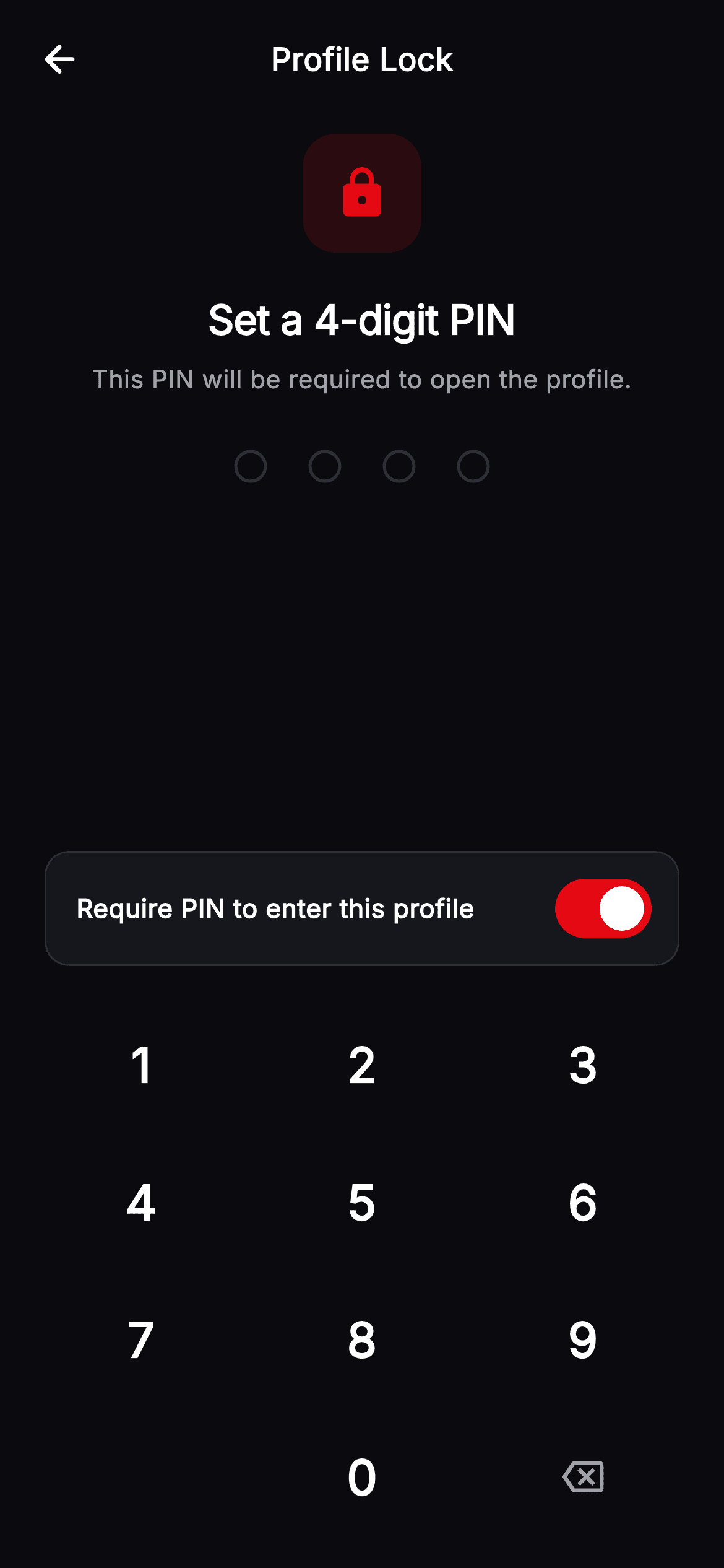
Watch the Flutter UI walkthrough
A short screen recording of Cineo · Profile Lock running, if you'd rather see it before you read the code. The written tutorial below covers everything in it.
Can't see the video? Watch it on YouTube.
What you'll build
- ✓A two-phase set-then-confirm PIN flow driven by four small state fields
- ✓A headline and subtitle that rewrite themselves for each phase and for the error
- ✓A painted four-dot indicator that centres itself from its own measurements
- ✓A numeric keypad where an empty-label key reserves the unused grid corner
- ✓An error state that clears itself on the next keypress rather than lingering
Step-by-step build
Create the file
Add a new file at lib/stream_profile_lock_setup/stream_profile_lock_setup_screen.dart in your Flutter project.
Register the bundled fonts
No external packages — this is pure Flutter. It does bundle its design font (Inter), so drop the font file into fonts/ and declare it in pubspec.yaml:
flutter:
  fonts:
    - family: Inter
      fonts:
- asset: fonts/Inter-Regular.ttfBuild it, piece by piece
Here's how the screen goes together. Each block below is a real slice of the code with a plain-English explanation — paste them in order, or grab the whole file from the next section.
Five fields, one flow
import 'package:flutter/material.dart';

/// Profile Lock — set a 4-digit PIN for a **Cineo** profile. An explainer, a
/// painted 4-dot PIN indicator, a two-step (set → confirm) numeric keypad, and a
/// "Require PIN to enter this profile" toggle. Self-contained per CONVENTIONS.md
/// (pure Flutter, bundled Inter, own dark theme, painted keypad/dots).
class StreamProfileLockSetupScreen extends StatefulWidget {
  const StreamProfileLockSetupScreen({super.key, this.onBack, this.onDone});

  final VoidCallback? onBack;
  final VoidCallback? onDone;

  @override
  State<StreamProfileLockSetupScreen> createState() =>
      _StreamProfileLockSetupScreenState();
}

class _StreamProfileLockSetupScreenState
    extends State<StreamProfileLockSetupScreen> {
  static const String _font = 'Inter';
  static const Color _bg = Color(0xFF0B0B0F);
  static const Color _surface = Color(0xFF16161D);
  static const Color _surfaceAlt = Color(0xFF1F1F28);
  static const Color _brand = Color(0xFFE50914);
  static const Color _text = Color(0xFFFFFFFF);
  static const Color _muted = Color(0xFFA1A1AA);
  static const Color _hairline = Color(0xFF2A2A33);

  String _pin = '';
  String _first = '';
  bool _confirming = false;
  bool _mismatch = false;
  bool _require = true;
The state is deliberately flat: `_pin` is what is being typed right now, `_first` stashes the initial attempt, `_confirming` says which phase we are in, `_mismatch` drives the error copy, and `_require` backs the toggle at the bottom. Keeping the two PINs in separate fields rather than a list is what makes the comparison later a single `==`. The palette adds `_surfaceAlt` on top of the usual Cineo set purely for the switch's inactive track, which needs to sit a step lighter than the card behind it to be visible at all.
The state machine in `_tap`
  void _tap(String d) {
    if (_pin.length >= 4) return;
    setState(() {
      _pin += d;
      _mismatch = false;
      if (_pin.length == 4) {
        if (!_confirming) {
          _first = _pin;
          _pin = '';
          _confirming = true;
        } else if (_pin == _first) {
          widget.onDone?.call();
        } else {
          _mismatch = true;
          _pin = '';
          _confirming = false;
          _first = '';
        }
      }
    });
  }

  void _back() {
    if (_pin.isEmpty) return;
    setState(() => _pin = _pin.substring(0, _pin.length - 1));
  }
Every keypress runs through here, and the first line — `if (_pin.length >= 4) return;` — is the guard that stops a fast tapper from pushing a fifth digit in before the comparison completes. Inside `setState`, appending the digit also clears `_mismatch`, so an old error message disappears the moment the user starts over rather than sitting there during the retry. When the fourth digit lands there are three outcomes: not confirming yet, so stash into `_first`, blank `_pin` and flip `_confirming`; confirming and equal, so call `onDone`; or confirming and different, which resets *all* of `_mismatch`, `_pin`, `_confirming` and `_first` back to the start. Sending the user to the beginning rather than just re-asking for the confirmation is the right call — after a mismatch, nobody knows which of the two entries was the typo.
Copy that reports the phase
  @override
  Widget build(BuildContext context) {
    return Theme(
      data: ThemeData.dark(useMaterial3: true),
      child: Scaffold(
        backgroundColor: _bg,
        body: SafeArea(
          child: Column(
            children: <Widget>[
              _TopBar(title: 'Profile Lock', onBack: widget.onBack),
              const SizedBox(height: 8),
              Container(
                width: 64,
                height: 64,
                decoration: BoxDecoration(
                  color: _brand.withValues(alpha: 0.14),
                  borderRadius: BorderRadius.circular(18),
                ),
                child: const Icon(Icons.lock_rounded, color: _brand, size: 30),
              ),
              const SizedBox(height: 20),
              Text(
                _confirming ? 'Confirm your PIN' : 'Set a 4-digit PIN',
                style: const TextStyle(
                  fontFamily: _font,
                  fontSize: 22,
                  fontWeight: FontWeight.w800,
                  letterSpacing: -0.3,
                  color: _text,
                ),
              ),
              const SizedBox(height: 8),
              Padding(
                padding: const EdgeInsets.symmetric(horizontal: 40),
                child: Text(
                  _mismatch
                      ? "PINs didn't match. Start again."
                      : 'This PIN will be required to open the profile.',
                  textAlign: TextAlign.center,
                  style: TextStyle(
                    fontFamily: _font,
                    fontSize: 13.5,
                    height: 1.4,
                    fontWeight: FontWeight.w400,
                    color: _mismatch ? _brand : _muted,
                  ),
                ),
              ),
              const SizedBox(height: 28),
              SizedBox(
                height: 18,
                child: CustomPaint(
                  painter: _PinDotsPainter(
                    filled: _pin.length,
                    error: _mismatch,
                  ),
                  size: const Size(132, 18),
                ),
              ),
The lock badge is a 64px rounded square filled `_brand.withValues(alpha: 0.14)` with the icon in full brand red — the same tint-and-solid pairing used across this kit. Both strings below it are conditional. The headline flips between 'Set a 4-digit PIN' and 'Confirm your PIN', and the subtitle swaps its instruction for "PINs didn't match. Start again." while also switching colour from `_muted` to `_brand`. Because the layout is identical in each state, the screen never jumps; only the words and one colour change. The dots sit in a fixed 18px-tall box with an explicit `size: const Size(132, 18)` so the `CustomPaint` has a definite width to centre within.
Making the lock optional
              Padding(
                padding: const EdgeInsets.symmetric(horizontal: 24),
                child: Container(
                  padding: const EdgeInsets.fromLTRB(16, 6, 10, 6),
                  decoration: BoxDecoration(
                    color: _surface,
                    borderRadius: BorderRadius.circular(13),
                    border: Border.all(color: _hairline),
                  ),
                  child: Row(
                    children: <Widget>[
                      const Expanded(
                        child: Text(
                          'Require PIN to enter this profile',
                          style: TextStyle(
                            fontFamily: _font,
                            fontSize: 14,
                            fontWeight: FontWeight.w600,
                            color: _text,
                          ),
                        ),
                      ),
                      Switch(
                        value: _require,
                        onChanged: (bool v) => setState(() => _require = v),
                        activeThumbColor: Colors.white,
                        activeTrackColor: _brand,
                        inactiveTrackColor: _surfaceAlt,
                      ),
                    ],
                  ),
                ),
              ),
              const SizedBox(height: 16),
              _Keypad(onDigit: _tap, onBack: _back),
              const SizedBox(height: 12),
            ],
          ),
        ),
      ),
    );
  }
The 'Require PIN to enter this profile' row is a bordered card whose padding is asymmetric — `fromLTRB(16, 6, 10, 6)` — because a Material `Switch` carries its own generous hit area, so matching the text's 16px inset on the right would push the control visibly off the edge. The `Switch` is themed with `activeThumbColor: Colors.white`, `activeTrackColor: _brand` and `inactiveTrackColor: _surfaceAlt`. Its placement above the keypad rather than after it matters: this is a setting, not a step, and putting it below the keys would strand it under the fold.
Painting and centring the dots
/// Painted 4-dot PIN indicator — filled dots glow brand-red (or danger on error).
class _PinDotsPainter extends CustomPainter {
  const _PinDotsPainter({required this.filled, required this.error});

  final int filled;
  final bool error;

  @override
  void paint(Canvas canvas, Size size) {
    const int count = 4;
    const double r = 8;
    const double gap = 24;
    final double totalW = count * (r * 2) + (count - 1) * gap;
    double x = (size.width - totalW) / 2 + r;
    final double cy = size.height / 2;
    final Color on = error ? const Color(0xFFEF4444) : const Color(0xFFE50914);
    for (int i = 0; i < count; i++) {
      final bool isFilled = i < filled;
      canvas.drawCircle(
        Offset(x, cy),
        r,
        Paint()
          ..style = isFilled ? PaintingStyle.fill : PaintingStyle.stroke
          ..strokeWidth = 1.6
          ..color = isFilled ? on : const Color(0xFF33333D),
      );
      x += r * 2 + gap;
    }
  }

  @override
  bool shouldRepaint(covariant _PinDotsPainter oldDelegate) =>
      oldDelegate.filled != filled || oldDelegate.error != error;
}
`_PinDotsPainter` computes its own layout rather than being positioned: `totalW = count * (r * 2) + (count - 1) * gap` gives the width of four 8px-radius dots with 24px gaps, and `x = (size.width - totalW) / 2 + r` centres that block inside whatever box it is given, offset by one radius because `drawCircle` takes a centre. Each dot is the same circle drawn two ways — `PaintingStyle.fill` in brand red once `i < filled`, or a 1.6px grey stroke when empty. `shouldRepaint` checks both `filled` and `error`, so a digit or a state change repaints and nothing else does.
A keypad with a hole in it
/// Numeric keypad — 1–9, 0 and a backspace, laid out on a 3-wide grid.
class _Keypad extends StatelessWidget {
  const _Keypad({required this.onDigit, required this.onBack});

  final ValueChanged<String> onDigit;
  final VoidCallback onBack;

  @override
  Widget build(BuildContext context) {
    return Padding(
      padding: const EdgeInsets.symmetric(horizontal: 40),
      child: Column(
        children: <Widget>[
          for (final List<String> row in <List<String>>[
            <String>['1', '2', '3'],
            <String>['4', '5', '6'],
            <String>['7', '8', '9'],
            <String>['', '0', '⌫'],
          ])
            Padding(
              padding: const EdgeInsets.symmetric(vertical: 7),
              child: Row(
                mainAxisAlignment: MainAxisAlignment.spaceBetween,
                children: <Widget>[
                  for (final String key in row) _Key(label: key, onDigit: onDigit, onBack: onBack),
                ],
              ),
            ),
        ],
      ),
    );
  }
}

class _Key extends StatelessWidget {
  const _Key({required this.label, required this.onDigit, required this.onBack});

  final String label;
  final ValueChanged<String> onDigit;
  final VoidCallback onBack;

  @override
  Widget build(BuildContext context) {
    if (label.isEmpty) {
      return const SizedBox(width: 72, height: 60);
    }
    final bool isBack = label == '⌫';
    return SizedBox(
      width: 72,
      height: 60,
      child: Material(
        color: Colors.transparent,
        borderRadius: BorderRadius.circular(16),
        child: InkWell(
          borderRadius: BorderRadius.circular(16),
          onTap: () => isBack ? onBack() : onDigit(label),
          child: Center(
            child: isBack
                ? const Icon(Icons.backspace_outlined,
                    size: 22, color: _StreamProfileLockSetupScreenState._muted)
                : Text(
                    label,
                    style: const TextStyle(
                      fontFamily: _StreamProfileLockSetupScreenState._font,
                      fontSize: 26,
                      fontWeight: FontWeight.w600,
                      color: _StreamProfileLockSetupScreenState._text,
                    ),
                  ),
          ),
        ),
      ),
    );
  }
}
`_Keypad` is a nested collection-for over four literal rows, the last being `['', '0', '⌫']`. Two sentinels do the work. The empty string makes `_Key` return `const SizedBox(width: 72, height: 60)` — an invisible key that occupies the bottom-left cell, which is why `MainAxisAlignment.spaceBetween` still lands the zero under the eight instead of shifting the row. The `⌫` label routes to `onBack` and renders as a backspace icon rather than the character. Each real key is a transparent `Material` with an `InkWell` clipped to a 16px radius, so a tap gives a rounded ripple with no visible button chrome at rest.
Full code
The complete, ready-to-paste source. Free to use in your projects — one click copies it all.
import 'package:flutter/material.dart';

/// Profile Lock — set a 4-digit PIN for a **Cineo** profile. An explainer, a
/// painted 4-dot PIN indicator, a two-step (set → confirm) numeric keypad, and a
/// "Require PIN to enter this profile" toggle. Self-contained per CONVENTIONS.md
/// (pure Flutter, bundled Inter, own dark theme, painted keypad/dots).
class StreamProfileLockSetupScreen extends StatefulWidget {
  const StreamProfileLockSetupScreen({super.key, this.onBack, this.onDone});

  final VoidCallback? onBack;
  final VoidCallback? onDone;

  @override
  State<StreamProfileLockSetupScreen> createState() =>
      _StreamProfileLockSetupScreenState();
}

class _StreamProfileLockSetupScreenState
    extends State<StreamProfileLockSetupScreen> {
  static const String _font = 'Inter';
  static const Color _bg = Color(0xFF0B0B0F);
  static const Color _surface = Color(0xFF16161D);
  static const Color _surfaceAlt = Color(0xFF1F1F28);
  static const Color _brand = Color(0xFFE50914);
  static const Color _text = Color(0xFFFFFFFF);
  static const Color _muted = Color(0xFFA1A1AA);
  static const Color _hairline = Color(0xFF2A2A33);

  String _pin = '';
  String _first = '';
  bool _confirming = false;
  bool _mismatch = false;
  bool _require = true;

  void _tap(String d) {
    if (_pin.length >= 4) return;
    setState(() {
      _pin += d;
      _mismatch = false;
      if (_pin.length == 4) {
        if (!_confirming) {
          _first = _pin;
          _pin = '';
          _confirming = true;
        } else if (_pin == _first) {
          widget.onDone?.call();
        } else {
          _mismatch = true;
          _pin = '';
          _confirming = false;
          _first = '';
        }
      }
    });
  }

  void _back() {
    if (_pin.isEmpty) return;
    setState(() => _pin = _pin.substring(0, _pin.length - 1));
  }

  @override
  Widget build(BuildContext context) {
    return Theme(
      data: ThemeData.dark(useMaterial3: true),
      child: Scaffold(
        backgroundColor: _bg,
        body: SafeArea(
          child: Column(
            children: <Widget>[
              _TopBar(title: 'Profile Lock', onBack: widget.onBack),
              const SizedBox(height: 8),
              Container(
                width: 64,
                height: 64,
                decoration: BoxDecoration(
                  color: _brand.withValues(alpha: 0.14),
                  borderRadius: BorderRadius.circular(18),
                ),
                child: const Icon(Icons.lock_rounded, color: _brand, size: 30),
              ),
              const SizedBox(height: 20),
              Text(
                _confirming ? 'Confirm your PIN' : 'Set a 4-digit PIN',
                style: const TextStyle(
                  fontFamily: _font,
                  fontSize: 22,
                  fontWeight: FontWeight.w800,
                  letterSpacing: -0.3,
                  color: _text,
                ),
              ),
              const SizedBox(height: 8),
              Padding(
                padding: const EdgeInsets.symmetric(horizontal: 40),
                child: Text(
                  _mismatch
                      ? "PINs didn't match. Start again."
                      : 'This PIN will be required to open the profile.',
                  textAlign: TextAlign.center,
                  style: TextStyle(
                    fontFamily: _font,
                    fontSize: 13.5,
                    height: 1.4,
                    fontWeight: FontWeight.w400,
                    color: _mismatch ? _brand : _muted,
                  ),
                ),
              ),
              const SizedBox(height: 28),
              SizedBox(
                height: 18,
                child: CustomPaint(
                  painter: _PinDotsPainter(
                    filled: _pin.length,
                    error: _mismatch,
                  ),
                  size: const Size(132, 18),
                ),
              ),
              const Spacer(),
              Padding(
                padding: const EdgeInsets.symmetric(horizontal: 24),
                child: Container(
                  padding: const EdgeInsets.fromLTRB(16, 6, 10, 6),
                  decoration: BoxDecoration(
                    color: _surface,
                    borderRadius: BorderRadius.circular(13),
                    border: Border.all(color: _hairline),
                  ),
                  child: Row(
                    children: <Widget>[
                      const Expanded(
                        child: Text(
                          'Require PIN to enter this profile',
                          style: TextStyle(
                            fontFamily: _font,
                            fontSize: 14,
                            fontWeight: FontWeight.w600,
                            color: _text,
                          ),
                        ),
                      ),
                      Switch(
                        value: _require,
                        onChanged: (bool v) => setState(() => _require = v),
                        activeThumbColor: Colors.white,
                        activeTrackColor: _brand,
                        inactiveTrackColor: _surfaceAlt,
                      ),
                    ],
                  ),
                ),
              ),
              const SizedBox(height: 16),
              _Keypad(onDigit: _tap, onBack: _back),
              const SizedBox(height: 12),
            ],
          ),
        ),
      ),
    );
  }
}

/// Painted 4-dot PIN indicator — filled dots glow brand-red (or danger on error).
class _PinDotsPainter extends CustomPainter {
  const _PinDotsPainter({required this.filled, required this.error});

  final int filled;
  final bool error;

  @override
  void paint(Canvas canvas, Size size) {
    const int count = 4;
    const double r = 8;
    const double gap = 24;
    final double totalW = count * (r * 2) + (count - 1) * gap;
    double x = (size.width - totalW) / 2 + r;
    final double cy = size.height / 2;
    final Color on = error ? const Color(0xFFEF4444) : const Color(0xFFE50914);
    for (int i = 0; i < count; i++) {
      final bool isFilled = i < filled;
      canvas.drawCircle(
        Offset(x, cy),
        r,
        Paint()
          ..style = isFilled ? PaintingStyle.fill : PaintingStyle.stroke
          ..strokeWidth = 1.6
          ..color = isFilled ? on : const Color(0xFF33333D),
      );
      x += r * 2 + gap;
    }
  }

  @override
  bool shouldRepaint(covariant _PinDotsPainter oldDelegate) =>
      oldDelegate.filled != filled || oldDelegate.error != error;
}

/// Numeric keypad — 1–9, 0 and a backspace, laid out on a 3-wide grid.
class _Keypad extends StatelessWidget {
  const _Keypad({required this.onDigit, required this.onBack});

  final ValueChanged<String> onDigit;
  final VoidCallback onBack;

  @override
  Widget build(BuildContext context) {
    return Padding(
      padding: const EdgeInsets.symmetric(horizontal: 40),
      child: Column(
        children: <Widget>[
          for (final List<String> row in <List<String>>[
            <String>['1', '2', '3'],
            <String>['4', '5', '6'],
            <String>['7', '8', '9'],
            <String>['', '0', '⌫'],
          ])
            Padding(
              padding: const EdgeInsets.symmetric(vertical: 7),
              child: Row(
                mainAxisAlignment: MainAxisAlignment.spaceBetween,
                children: <Widget>[
                  for (final String key in row) _Key(label: key, onDigit: onDigit, onBack: onBack),
                ],
              ),
            ),
        ],
      ),
    );
  }
}

class _Key extends StatelessWidget {
  const _Key({required this.label, required this.onDigit, required this.onBack});

  final String label;
  final ValueChanged<String> onDigit;
  final VoidCallback onBack;

  @override
  Widget build(BuildContext context) {
    if (label.isEmpty) {
      return const SizedBox(width: 72, height: 60);
    }
    final bool isBack = label == '⌫';
    return SizedBox(
      width: 72,
      height: 60,
      child: Material(
        color: Colors.transparent,
        borderRadius: BorderRadius.circular(16),
        child: InkWell(
          borderRadius: BorderRadius.circular(16),
          onTap: () => isBack ? onBack() : onDigit(label),
          child: Center(
            child: isBack
                ? const Icon(Icons.backspace_outlined,
                    size: 22, color: _StreamProfileLockSetupScreenState._muted)
                : Text(
                    label,
                    style: const TextStyle(
                      fontFamily: _StreamProfileLockSetupScreenState._font,
                      fontSize: 26,
                      fontWeight: FontWeight.w600,
                      color: _StreamProfileLockSetupScreenState._text,
                    ),
                  ),
          ),
        ),
      ),
    );
  }
}

class _TopBar extends StatelessWidget {
  const _TopBar({required this.title, this.onBack});

  final String title;
  final VoidCallback? onBack;

  @override
  Widget build(BuildContext context) {
    return Padding(
      padding: const EdgeInsets.fromLTRB(8, 8, 8, 8),
      child: Row(
        children: <Widget>[
          IconButton(
            onPressed: onBack,
            icon: const Icon(Icons.arrow_back_rounded,
                color: _StreamProfileLockSetupScreenState._text),
          ),
          const Spacer(),
          Text(
            title,
            style: const TextStyle(
              fontFamily: _StreamProfileLockSetupScreenState._font,
              fontSize: 17,
              fontWeight: FontWeight.w700,
              color: _StreamProfileLockSetupScreenState._text,
            ),
          ),
          const Spacer(),
          const SizedBox(width: 48),
        ],
      ),
    );
  }
}
Plus bundled 1 binary asset (fonts/images). The CLI and MCP install those for you automatically.
Two faster ways to add it
Copy-paste works, but you can skip it entirely.
1. FlutterKit CLI
One command drops this screen — and its fonts — straight into your project.
$ flutterkit add stream-profile-lock-setup2. AI agent (MCP)
Connect FlutterKit's MCP server in Claude or Cursor and just ask your agent to install stream-profile-lock-setup — it fetches and writes the files for you.
FAQ
Where does the PIN actually get saved?
Nowhere in this screen — on a successful confirmation it calls `onDone` and lets the host persist the value. For a real profile lock, hash the PIN and store it in secure storage rather than shared preferences, and read `_require` to decide whether the lock is enforced at all.
Why does a mismatch restart from the first entry?
Because after two different four-digit codes, neither the app nor the user knows which one was intended. Asking for the confirmation again would keep comparing against a first entry that may itself have been the typo, so the code clears `_first` and starts clean.
Can I use a PIN longer than four digits?
Yes — the length is hard-coded in three places: the `>= 4` guard, the `== 4` check in `_tap`, and `count` in the dots painter. Change those together and the rest of the screen adapts, since the painter derives its own width from the count.
Does it need any packages or fonts?
No packages — the dots are a `CustomPainter` and the keypad is built from `Material` and `InkWell`. Inter ships bundled with the screen for registration under `fonts:` in your pubspec.
Which Flutter version does this need?
This one needs a recent SDK: the toggle sets `Switch.activeThumbColor`, which replaced the older `activeColor` parameter, and the lock badge uses `Color.withValues(alpha: 0.14)`. On an older Flutter, rename that argument to `activeColor`, swap `withValues` for `withOpacity`, and expand the `super.key` constructor.


