How to Build a Download Progress Ring Onboarding Screen in Flutter (Full Code + Preview)
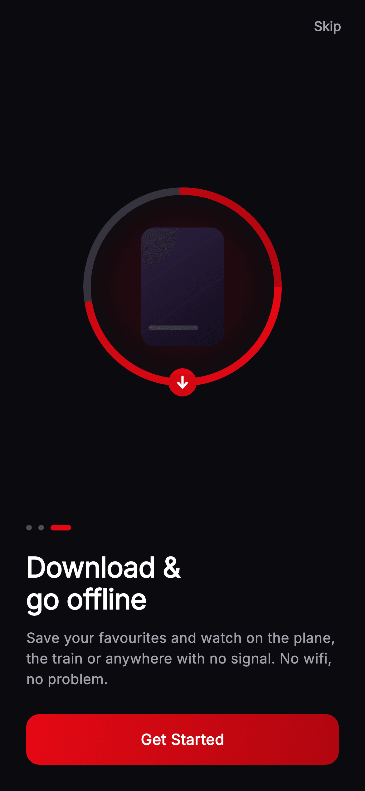
Offline downloads are a streaming app's least visible feature, so the onboarding page has to make one picture do the explaining. This tutorial builds the final page of Cineo's intro in Flutter — a 220px download motif with a poster tile inside a progress ring drawn to 72%, capped by a down-arrow badge sitting exactly on the circumference, plus a headline, page dots and a gradient Get Started button. The arc uses a SweepGradient shader and is about fifteen lines.
Watch the Flutter UI walkthrough
A short screen recording of Cineo · Onboarding — Offline running, if you'd rather see it before you read the code. The written tutorial below covers everything in it.
Can't see the video? Watch it on YouTube.
What you'll build
- ✓A circular progress arc drawn from a start angle and a sweep, tinted by a SweepGradient
- ✓A poster tile behind the ring with a clipped caption bar, all drawn on canvas
- ✓A badge positioned exactly on the ring's circumference using the same centre and radius
- ✓A gradient pill CTA built with Ink so the ripple renders over the gradient rather than under it
Step-by-step build
Create the file
Add a new file at lib/stream_onboarding_intro_3/stream_onboarding_intro_3_screen.dart in your Flutter project.
Register the bundled fonts
No external packages — this is pure Flutter. It does bundle its design font (Inter), so drop the font file into fonts/ and declare it in pubspec.yaml:
flutter:
  fonts:
    - family: Inter
      fonts:
- asset: fonts/Inter-Regular.ttfBuild it, piece by piece
Here's how the screen goes together. Each block below is a real slice of the code with a plain-English explanation — paste them in order, or grab the whole file from the next section.
The page and its self-sizing motif
import 'dart:math' as math;

import 'package:flutter/material.dart';

/// Onboarding 3 — "Download & go offline" for the **Cineo** streaming app. A
/// painted download-progress ring (`_DownloadRingPainter`) wrapped around a
/// poster tile, headline/blurb, page dots and a full-width brand-red "Get
/// Started" CTA. Self-contained per CONVENTIONS.md (pure Flutter, bundled Inter,
/// painted artwork, own dark theme, pinned CTA at a fixed height).
class StreamOnboardingIntroThreeScreen extends StatelessWidget {
  const StreamOnboardingIntroThreeScreen({
    super.key,
    this.onGetStarted,
    this.onSkip,
  });

  final VoidCallback? onGetStarted;
  final VoidCallback? onSkip;

  static const String _font = 'Inter';
  static const Color _bg = Color(0xFF0B0B0F);
  static const Color _brand = Color(0xFFE50914);
  static const Color _brandDark = Color(0xFFB00610);
  static const Color _text = Color(0xFFFFFFFF);
  static const Color _muted = Color(0xFFA1A1AA);

  @override
  Widget build(BuildContext context) {
    return Theme(
      data: ThemeData.dark(useMaterial3: true),
      child: Scaffold(
        backgroundColor: _bg,
        body: SafeArea(
          child: Column(
            children: <Widget>[
              Align(
                alignment: Alignment.topRight,
                child: Padding(
                  padding: const EdgeInsets.only(top: 4, right: 8),
                  child: TextButton(
                    onPressed: onSkip,
                    child: const Text(
                      'Skip',
                      style: TextStyle(
                        fontFamily: _font,
                        fontSize: 14,
                        fontWeight: FontWeight.w600,
                        color: _muted,
                      ),
                    ),
                  ),
                ),
              ),
              const Expanded(
                child: Center(
                  child: SizedBox(
                    width: 220,
                    height: 220,
                    child: CustomPaint(painter: _DownloadRingPainter(progress: 0.72)),
                  ),
                ),
              ),
The screen is stateless with `onGetStarted` and `onSkip` — the page index lives in the parent pager. Its palette is five tokens, with `_brand` (#E50914) and `_brandDark` (#B00610) forming the gradient used on both the arc and the button. Skip sits top-right in an Align, then the artwork takes an `Expanded` so it claims all height left after the fixed copy block below. The motif is a fixed 220×220 CustomPaint constructed with `progress: 0.72` — a hard-coded value, since this is an illustration of downloading rather than a live indicator. `dart:math` is imported at the top for the arc's angle maths.
Dots, headline, and the CTA block
              Padding(
                padding: const EdgeInsets.fromLTRB(28, 0, 28, 28),
                child: Column(
                  crossAxisAlignment: CrossAxisAlignment.start,
                  mainAxisSize: MainAxisSize.min,
                  children: <Widget>[
                    const SizedBox(
                      width: 56,
                      height: 6,
                      child: CustomPaint(
                        painter: _DotsPainter(index: 2, count: 3),
                      ),
                    ),
                    const SizedBox(height: 22),
                    const Text(
                      'Download &\ngo offline',
                      style: TextStyle(
                        fontFamily: _font,
                        fontSize: 30,
                        height: 1.12,
                        fontWeight: FontWeight.w800,
                        letterSpacing: -0.5,
                        color: _text,
                      ),
                    ),
                    const SizedBox(height: 14),
                    const Text(
                      'Save your favourites and watch on the plane, the '
                      'train or anywhere with no signal. No wifi, no problem.',
                      style: TextStyle(
                        fontFamily: _font,
                        fontSize: 15,
                        height: 1.45,
                        fontWeight: FontWeight.w400,
                        color: _muted,
                      ),
                    ),
                    const SizedBox(height: 26),
                    _PrimaryButton(label: 'Get Started', onTap: onGetStarted),
                  ],
                ),
              ),
            ],
          ),
        ),
      ),
    );
  }
}
Unlike the earlier onboarding pages, the dots sit *above* the headline here rather than in a row beside the Next button — because this final page swaps the circular arrow for a full-width Get Started, there's no trailing control to pair them with. The headline is 30px w800 with a manual `\n` break and a tight `height: 1.12`, since large display type needs less leading than body text; the blurb below uses `height: 1.45` for the opposite reason and is written as two adjacent string literals that Dart concatenates at compile time. The whole block uses `mainAxisSize: MainAxisSize.min` so it hugs its content and lets the Expanded above take the remainder.
A gradient button that still ripples
/// Full-width brand-red pill CTA at a fixed height (overflow-safe).
class _PrimaryButton extends StatelessWidget {
  const _PrimaryButton({required this.label, this.onTap});

  final String label;
  final VoidCallback? onTap;

  @override
  Widget build(BuildContext context) {
    return SizedBox(
      width: double.infinity,
      height: 54,
      child: Material(
        color: Colors.transparent,
        borderRadius: BorderRadius.circular(14),
        child: InkWell(
          onTap: onTap,
          borderRadius: BorderRadius.circular(14),
          child: Ink(
            decoration: BoxDecoration(
              borderRadius: BorderRadius.circular(14),
              gradient: const LinearGradient(
                begin: Alignment.topLeft,
                end: Alignment.bottomRight,
                colors: <Color>[
                  StreamOnboardingIntroThreeScreen._brand,
                  StreamOnboardingIntroThreeScreen._brandDark,
                ],
              ),
            ),
            child: Center(
              child: Text(
                label,
                style: const TextStyle(
                  fontFamily: StreamOnboardingIntroThreeScreen._font,
                  fontSize: 16,
                  fontWeight: FontWeight.w700,
                  letterSpacing: 0.3,
                  color: Colors.white,
                ),
              ),
            ),
          ),
        ),
      ),
    );
  }
}
This is the correct three-layer pattern for a gradient button with a working ink splash. A Material's own `color` can't be a gradient, and wrapping a gradient Container inside an InkWell paints it *over* the ripple so the splash never shows. `Ink` solves it by drawing its decoration onto the Material itself, letting the splash render above. So the structure is a transparent Material for the ink surface, an InkWell for the tap, then `Ink` carrying the BoxDecoration with the brand-to-brandDark LinearGradient — all three sharing the same 14px radius, which is what keeps the ripple clipped to the button's corners.
The glow and the poster tile
/// Circular download-progress ring around a seeded poster tile with a painted
/// down-arrow — the universal Cineo download motif.
class _DownloadRingPainter extends CustomPainter {
  const _DownloadRingPainter({required this.progress});

  final double progress;

  @override
  void paint(Canvas canvas, Size size) {
    final Offset center = Offset(size.width / 2, size.height / 2);
    final double radius = size.width / 2 - 8;

    // Soft brand glow.
    canvas.drawCircle(
      center,
      radius + 6,
      Paint()
        ..shader = RadialGradient(
          colors: <Color>[
            StreamOnboardingIntroThreeScreen._brand.withValues(alpha: 0.22),
            StreamOnboardingIntroThreeScreen._brand.withValues(alpha: 0.0),
          ],
        ).createShader(Rect.fromCircle(center: center, radius: radius + 6)),
    );

    // Poster tile behind the ring.
    final double tileR = radius * 0.62;
    final Rect tile = Rect.fromCenter(
      center: center,
      width: tileR * 1.4,
      height: tileR * 2.0,
    );
    final RRect tileRR =
        RRect.fromRectAndRadius(tile, const Radius.circular(14));
    canvas.drawRRect(
      tileRR,
      Paint()
        ..shader = const LinearGradient(
          begin: Alignment.topLeft,
          end: Alignment.bottomRight,
          colors: <Color>[Color(0xFF2E2140), Color(0xFF120C1E)],
        ).createShader(tile),
    );
    canvas.save();
    canvas.clipRRect(tileRR);
    final Paint bar = Paint()..color = Colors.white.withValues(alpha: 0.14);
    canvas.drawRRect(
      RRect.fromRectAndRadius(
        Rect.fromLTWH(tile.left + 8, tile.bottom - 22, tile.width * 0.6, 5),
        const Radius.circular(3),
      ),
      bar,
    );
    canvas.restore();
The painter insets its radius by 8 to leave room for the 8px-wide stroke drawn later. It starts with a glow — a circle filled with a RadialGradient running from the brand at 22% alpha to the same colour at 0 alpha; fading to zero alpha of the *same* hue rather than to transparent black is what avoids a muddy grey ring at the falloff. Then the poster: a rounded rect sized from `tileR` at a 1.4:2.0 width-to-height ratio, the standard portrait poster shape, filled with a dark purple gradient. `canvas.save()` and `clipRRect` bracket a faint white caption bar so it can't spill outside the tile's rounded corners, then `restore()` lifts the clip.
Drawing the progress arc
    // Track ring.
    final Paint track = Paint()
      ..style = PaintingStyle.stroke
      ..strokeWidth = 8
      ..color = const Color(0xFF33333D);
    canvas.drawCircle(center, radius, track);

    // Progress arc (brand red), starting at top.
    final Paint arc = Paint()
      ..style = PaintingStyle.stroke
      ..strokeCap = StrokeCap.round
      ..strokeWidth = 8
      ..shader = const SweepGradient(
        colors: <Color>[
          StreamOnboardingIntroThreeScreen._brand,
          StreamOnboardingIntroThreeScreen._brandDark,
        ],
      ).createShader(Rect.fromCircle(center: center, radius: radius));
    canvas.drawArc(
      Rect.fromCircle(center: center, radius: radius),
      -math.pi / 2,
      2 * math.pi * progress.clamp(0.0, 1.0),
      false,
      arc,
    );
The ring is two passes. First a full grey track circle stroked at 8px, so the unfilled portion is visible. Then the progress arc via `drawArc`, and its three numeric arguments are the whole technique: the start angle is `-math.pi / 2`, which is twelve o'clock since canvas angles begin at three o'clock and run clockwise; the sweep is `2 * math.pi * progress.clamp(0.0, 1.0)`, so 0.72 covers 72% of a full turn and a bad input can't wrap past the end; and `false` for `useCenter` means it draws an open arc rather than a filled pie slice. `strokeCap: StrokeCap.round` gives the arc a rounded leading end, and the paint uses a `SweepGradient` shader so the red deepens as it travels around.
The arrow badge and the page dots
    // Down-arrow badge at the bottom of the ring.
    final Offset badge = Offset(center.dx, center.dy + radius);
    canvas.drawCircle(
      badge,
      15,
      Paint()..color = StreamOnboardingIntroThreeScreen._brand,
    );
    final Paint arrow = Paint()
      ..color = Colors.white
      ..style = PaintingStyle.stroke
      ..strokeWidth = 2.4
      ..strokeCap = StrokeCap.round
      ..strokeJoin = StrokeJoin.round;
    canvas.drawLine(
      Offset(badge.dx, badge.dy - 6),
      Offset(badge.dx, badge.dy + 5),
      arrow,
    );
    final Path chevron = Path()
      ..moveTo(badge.dx - 4.5, badge.dy + 0.5)
      ..lineTo(badge.dx, badge.dy + 5.5)
      ..lineTo(badge.dx + 4.5, badge.dy + 0.5);
    canvas.drawPath(chevron, arrow);
  }

  @override
  bool shouldRepaint(covariant _DownloadRingPainter oldDelegate) =>
      oldDelegate.progress != progress;
}

/// Page-indicator dots — active dot elongates into a brand-red pill.
class _DotsPainter extends CustomPainter {
  const _DotsPainter({required this.index, required this.count});

  final int index;
  final int count;

  @override
  void paint(Canvas canvas, Size size) {
    const double dot = 6;
    const double gap = 7;
    const double activeW = 22;
    double x = 0;
    final double cy = size.height / 2;
    for (int i = 0; i < count; i++) {
      final bool active = i == index;
      final double wv = active ? activeW : dot;
      canvas.drawRRect(
        RRect.fromRectAndRadius(
          Rect.fromLTWH(x, cy - dot / 2, wv, dot),
          const Radius.circular(dot),
        ),
        Paint()
          ..color = active
              ? StreamOnboardingIntroThreeScreen._brand
              : Colors.white.withValues(alpha: 0.28),
      );
      x += wv + gap;
    }
  }

  @override
  bool shouldRepaint(covariant _DotsPainter oldDelegate) =>
      oldDelegate.index != index || oldDelegate.count != count;
}
The badge is placed at `Offset(center.dx, center.dy + radius)` — directly below the centre by exactly the ring's radius, which puts it precisely on the circumference at six o'clock. Deriving it from the same `center` and `radius` the arc uses means it stays anchored if the box size changes. It's a 15px solid red circle carrying a hand-drawn download glyph: one vertical line plus a three-point chevron Path, both round-capped and joined so the arrowhead's corner is soft. `_DotsPainter` closes the file, walking a running x cursor across three rounded rects — 6px wide when inactive, 22px for the active one at index 2, with the cursor advancing by `wv + gap` each time so the wider pill pushes its neighbours along without any measuring.
Full code
The complete, ready-to-paste source. Free to use in your projects — one click copies it all.
import 'dart:math' as math;

import 'package:flutter/material.dart';

/// Onboarding 3 — "Download & go offline" for the **Cineo** streaming app. A
/// painted download-progress ring (`_DownloadRingPainter`) wrapped around a
/// poster tile, headline/blurb, page dots and a full-width brand-red "Get
/// Started" CTA. Self-contained per CONVENTIONS.md (pure Flutter, bundled Inter,
/// painted artwork, own dark theme, pinned CTA at a fixed height).
class StreamOnboardingIntroThreeScreen extends StatelessWidget {
  const StreamOnboardingIntroThreeScreen({
    super.key,
    this.onGetStarted,
    this.onSkip,
  });

  final VoidCallback? onGetStarted;
  final VoidCallback? onSkip;

  static const String _font = 'Inter';
  static const Color _bg = Color(0xFF0B0B0F);
  static const Color _brand = Color(0xFFE50914);
  static const Color _brandDark = Color(0xFFB00610);
  static const Color _text = Color(0xFFFFFFFF);
  static const Color _muted = Color(0xFFA1A1AA);

  @override
  Widget build(BuildContext context) {
    return Theme(
      data: ThemeData.dark(useMaterial3: true),
      child: Scaffold(
        backgroundColor: _bg,
        body: SafeArea(
          child: Column(
            children: <Widget>[
              Align(
                alignment: Alignment.topRight,
                child: Padding(
                  padding: const EdgeInsets.only(top: 4, right: 8),
                  child: TextButton(
                    onPressed: onSkip,
                    child: const Text(
                      'Skip',
                      style: TextStyle(
                        fontFamily: _font,
                        fontSize: 14,
                        fontWeight: FontWeight.w600,
                        color: _muted,
                      ),
                    ),
                  ),
                ),
              ),
              const Expanded(
                child: Center(
                  child: SizedBox(
                    width: 220,
                    height: 220,
                    child: CustomPaint(painter: _DownloadRingPainter(progress: 0.72)),
                  ),
                ),
              ),
              Padding(
                padding: const EdgeInsets.fromLTRB(28, 0, 28, 28),
                child: Column(
                  crossAxisAlignment: CrossAxisAlignment.start,
                  mainAxisSize: MainAxisSize.min,
                  children: <Widget>[
                    const SizedBox(
                      width: 56,
                      height: 6,
                      child: CustomPaint(
                        painter: _DotsPainter(index: 2, count: 3),
                      ),
                    ),
                    const SizedBox(height: 22),
                    const Text(
                      'Download &\ngo offline',
                      style: TextStyle(
                        fontFamily: _font,
                        fontSize: 30,
                        height: 1.12,
                        fontWeight: FontWeight.w800,
                        letterSpacing: -0.5,
                        color: _text,
                      ),
                    ),
                    const SizedBox(height: 14),
                    const Text(
                      'Save your favourites and watch on the plane, the '
                      'train or anywhere with no signal. No wifi, no problem.',
                      style: TextStyle(
                        fontFamily: _font,
                        fontSize: 15,
                        height: 1.45,
                        fontWeight: FontWeight.w400,
                        color: _muted,
                      ),
                    ),
                    const SizedBox(height: 26),
                    _PrimaryButton(label: 'Get Started', onTap: onGetStarted),
                  ],
                ),
              ),
            ],
          ),
        ),
      ),
    );
  }
}

/// Full-width brand-red pill CTA at a fixed height (overflow-safe).
class _PrimaryButton extends StatelessWidget {
  const _PrimaryButton({required this.label, this.onTap});

  final String label;
  final VoidCallback? onTap;

  @override
  Widget build(BuildContext context) {
    return SizedBox(
      width: double.infinity,
      height: 54,
      child: Material(
        color: Colors.transparent,
        borderRadius: BorderRadius.circular(14),
        child: InkWell(
          onTap: onTap,
          borderRadius: BorderRadius.circular(14),
          child: Ink(
            decoration: BoxDecoration(
              borderRadius: BorderRadius.circular(14),
              gradient: const LinearGradient(
                begin: Alignment.topLeft,
                end: Alignment.bottomRight,
                colors: <Color>[
                  StreamOnboardingIntroThreeScreen._brand,
                  StreamOnboardingIntroThreeScreen._brandDark,
                ],
              ),
            ),
            child: Center(
              child: Text(
                label,
                style: const TextStyle(
                  fontFamily: StreamOnboardingIntroThreeScreen._font,
                  fontSize: 16,
                  fontWeight: FontWeight.w700,
                  letterSpacing: 0.3,
                  color: Colors.white,
                ),
              ),
            ),
          ),
        ),
      ),
    );
  }
}

/// Circular download-progress ring around a seeded poster tile with a painted
/// down-arrow — the universal Cineo download motif.
class _DownloadRingPainter extends CustomPainter {
  const _DownloadRingPainter({required this.progress});

  final double progress;

  @override
  void paint(Canvas canvas, Size size) {
    final Offset center = Offset(size.width / 2, size.height / 2);
    final double radius = size.width / 2 - 8;

    // Soft brand glow.
    canvas.drawCircle(
      center,
      radius + 6,
      Paint()
        ..shader = RadialGradient(
          colors: <Color>[
            StreamOnboardingIntroThreeScreen._brand.withValues(alpha: 0.22),
            StreamOnboardingIntroThreeScreen._brand.withValues(alpha: 0.0),
          ],
        ).createShader(Rect.fromCircle(center: center, radius: radius + 6)),
    );

    // Poster tile behind the ring.
    final double tileR = radius * 0.62;
    final Rect tile = Rect.fromCenter(
      center: center,
      width: tileR * 1.4,
      height: tileR * 2.0,
    );
    final RRect tileRR =
        RRect.fromRectAndRadius(tile, const Radius.circular(14));
    canvas.drawRRect(
      tileRR,
      Paint()
        ..shader = const LinearGradient(
          begin: Alignment.topLeft,
          end: Alignment.bottomRight,
          colors: <Color>[Color(0xFF2E2140), Color(0xFF120C1E)],
        ).createShader(tile),
    );
    canvas.save();
    canvas.clipRRect(tileRR);
    final Paint bar = Paint()..color = Colors.white.withValues(alpha: 0.14);
    canvas.drawRRect(
      RRect.fromRectAndRadius(
        Rect.fromLTWH(tile.left + 8, tile.bottom - 22, tile.width * 0.6, 5),
        const Radius.circular(3),
      ),
      bar,
    );
    canvas.restore();

    // Track ring.
    final Paint track = Paint()
      ..style = PaintingStyle.stroke
      ..strokeWidth = 8
      ..color = const Color(0xFF33333D);
    canvas.drawCircle(center, radius, track);

    // Progress arc (brand red), starting at top.
    final Paint arc = Paint()
      ..style = PaintingStyle.stroke
      ..strokeCap = StrokeCap.round
      ..strokeWidth = 8
      ..shader = const SweepGradient(
        colors: <Color>[
          StreamOnboardingIntroThreeScreen._brand,
          StreamOnboardingIntroThreeScreen._brandDark,
        ],
      ).createShader(Rect.fromCircle(center: center, radius: radius));
    canvas.drawArc(
      Rect.fromCircle(center: center, radius: radius),
      -math.pi / 2,
      2 * math.pi * progress.clamp(0.0, 1.0),
      false,
      arc,
    );

    // Down-arrow badge at the bottom of the ring.
    final Offset badge = Offset(center.dx, center.dy + radius);
    canvas.drawCircle(
      badge,
      15,
      Paint()..color = StreamOnboardingIntroThreeScreen._brand,
    );
    final Paint arrow = Paint()
      ..color = Colors.white
      ..style = PaintingStyle.stroke
      ..strokeWidth = 2.4
      ..strokeCap = StrokeCap.round
      ..strokeJoin = StrokeJoin.round;
    canvas.drawLine(
      Offset(badge.dx, badge.dy - 6),
      Offset(badge.dx, badge.dy + 5),
      arrow,
    );
    final Path chevron = Path()
      ..moveTo(badge.dx - 4.5, badge.dy + 0.5)
      ..lineTo(badge.dx, badge.dy + 5.5)
      ..lineTo(badge.dx + 4.5, badge.dy + 0.5);
    canvas.drawPath(chevron, arrow);
  }

  @override
  bool shouldRepaint(covariant _DownloadRingPainter oldDelegate) =>
      oldDelegate.progress != progress;
}

/// Page-indicator dots — active dot elongates into a brand-red pill.
class _DotsPainter extends CustomPainter {
  const _DotsPainter({required this.index, required this.count});

  final int index;
  final int count;

  @override
  void paint(Canvas canvas, Size size) {
    const double dot = 6;
    const double gap = 7;
    const double activeW = 22;
    double x = 0;
    final double cy = size.height / 2;
    for (int i = 0; i < count; i++) {
      final bool active = i == index;
      final double wv = active ? activeW : dot;
      canvas.drawRRect(
        RRect.fromRectAndRadius(
          Rect.fromLTWH(x, cy - dot / 2, wv, dot),
          const Radius.circular(dot),
        ),
        Paint()
          ..color = active
              ? StreamOnboardingIntroThreeScreen._brand
              : Colors.white.withValues(alpha: 0.28),
      );
      x += wv + gap;
    }
  }

  @override
  bool shouldRepaint(covariant _DotsPainter oldDelegate) =>
      oldDelegate.index != index || oldDelegate.count != count;
}
Plus bundled 1 binary asset (fonts/images). The CLI and MCP install those for you automatically.
Two faster ways to add it
Copy-paste works, but you can skip it entirely.
1. FlutterKit CLI
One command drops this screen — and its fonts — straight into your project.
$ flutterkit add stream-onboarding-intro-32. AI agent (MCP)
Connect FlutterKit's MCP server in Claude or Cursor and just ask your agent to install stream-onboarding-intro-3 — it fetches and writes the files for you.
FAQ
Is this Flutter onboarding screen free to use?
Yes. The complete Dart source on this page is free for personal and commercial projects. Copy it directly, install it with the FlutterKit CLI (flutterkit add stream-onboarding-intro-3), or have an AI agent add it for you over MCP.
How do I animate the ring from 0 to 72%?
The painter already takes `progress` as a field and its `shouldRepaint` compares it, so it's animation-ready. Convert the screen to a StatefulWidget with a SingleTickerProviderStateMixin, drive an AnimationController, and rebuild the CustomPaint with the controller's value — no changes to the paint code at all. That also makes it usable as a real download indicator rather than an illustration.
Why does the arc start at -pi/2 instead of 0?
Because Flutter's canvas measures angles from three o'clock, running clockwise, so a sweep starting at 0 would begin at the right-hand side. Subtracting a quarter turn (`-math.pi / 2`) rotates the start to twelve o'clock, which is where people expect a progress ring to begin. The same offset is used in the dashed and sweep-gradient rings elsewhere in this kit.
Which Flutter version does it target?
It uses Color.withValues() and super parameters, so Flutter 3.22+ (Dart 3). On an older SDK, replace the withValues(alpha: ...) calls in the two painters with withOpacity(...) — noting the glow's transparent stop becomes withOpacity(0.0). The only bundled asset is the Inter font, registered in pubspec.yaml as shown in step 2; all the artwork is drawn.


