How to Build a Multi-Device Onboarding Screen in Flutter (Full Code + Preview)
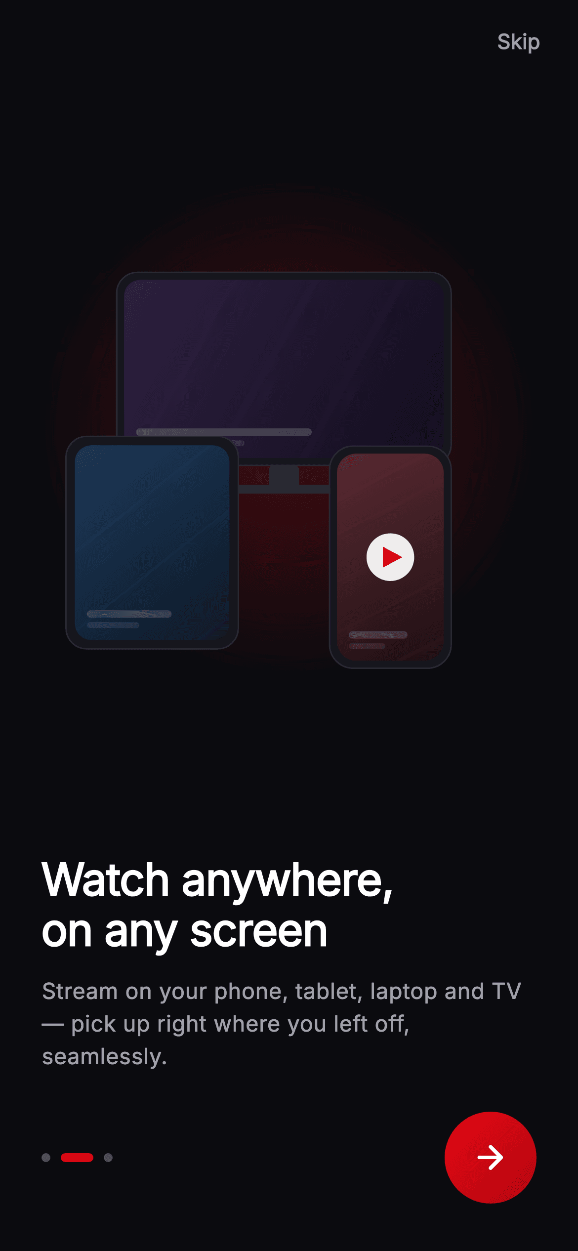
"Watch on any screen" is a claim best made by showing the screens. This tutorial builds page two of Cineo's onboarding in Flutter — a painted cluster of a TV, tablet and phone, each framing a gradient poster with faux caption bars, sitting over a radial red glow, beneath a two-line headline, painted page dots and a gradient circular Next button. Every pixel of the illustration is drawn on canvas, so there's no device mockup PNG to export or re-render per density.
Watch the Flutter UI walkthrough
A short screen recording of Cineo · Onboarding — Anywhere running, if you'd rather see it before you read the code. The written tutorial below covers everything in it.
Can't see the video? Watch it on YouTube.
What you'll build
- ✓A three-device cluster drawn entirely with canvas primitives — bodies, bezels, screens and a TV stand
- ✓A radial brand glow behind the artwork made from a RadialGradient shader fading to full transparency
- ✓Reusable device drawing through one helper that takes a rect, a corner radius and a bezel inset
- ✓A painted dots indicator and a 62px gradient Next button with its ripple clipped to a circle
Step-by-step build
Create the file
Add a new file at lib/stream_onboarding_intro_2/stream_onboarding_intro_2_screen.dart in your Flutter project.
Register the bundled fonts
No external packages — this is pure Flutter. It does bundle its design font (Inter), so drop the font file into fonts/ and declare it in pubspec.yaml:
flutter:
  fonts:
    - family: Inter
      fonts:
- asset: fonts/Inter-Regular.ttfBuild it, piece by piece
Here's how the screen goes together. Each block below is a real slice of the code with a plain-English explanation — paste them in order, or grab the whole file from the next section.
Cineo's palette and two callbacks
import 'package:flutter/material.dart';

/// Onboarding 2 — "Watch anywhere" for the **Cineo** streaming app. A painted
/// multi-device cluster (TV + tablet + phone, each showing a mini poster frame)
/// over a soft brand glow, headline/blurb, page dots and Skip/Next. Fully
/// self-contained per CONVENTIONS.md (pure Flutter, bundled Inter, painted art).
class StreamOnboardingIntroTwoScreen extends StatelessWidget {
  const StreamOnboardingIntroTwoScreen({
    super.key,
    this.onNext,
    this.onSkip,
  });

  final VoidCallback? onNext;
  final VoidCallback? onSkip;

  static const String _font = 'Inter';
  static const Color _bg = Color(0xFF0B0B0F);
  static const Color _brand = Color(0xFFE50914);
  static const Color _brandDark = Color(0xFFB00610);
  static const Color _text = Color(0xFFFFFFFF);
  static const Color _muted = Color(0xFFA1A1AA);
The screen is a StatelessWidget with `onNext` and `onSkip` — the page index lives in the parent pager, not here. The palette is deliberately tiny: `_bg` (#0B0B0F) near-black, `_brand` (#E50914) the familiar streaming red, `_brandDark` (#B00610) as its gradient partner, plus white and a muted grey. Five tokens for a whole screen is possible because the illustration mixes its own colours inline — each device screen gets its own two-stop gradient defined at the call site rather than pulled from the palette.
Skip, the self-sizing hero, and the copy block
  @override
  Widget build(BuildContext context) {
    return Theme(
      data: ThemeData.dark(useMaterial3: true),
      child: Scaffold(
        backgroundColor: _bg,
        body: SafeArea(
          child: Column(
            children: <Widget>[
              Align(
                alignment: Alignment.topRight,
                child: Padding(
                  padding: const EdgeInsets.only(top: 4, right: 8),
                  child: TextButton(
                    onPressed: onSkip,
                    child: const Text(
                      'Skip',
                      style: TextStyle(
                        fontFamily: _font,
                        fontSize: 14,
                        fontWeight: FontWeight.w600,
                        color: _muted,
                      ),
                    ),
                  ),
                ),
              ),
              const Expanded(
                child: Padding(
                  padding: EdgeInsets.symmetric(horizontal: 24),
                  child: Center(
                    child: AspectRatio(
                      aspectRatio: 1.05,
                      child: CustomPaint(painter: _DevicesPainter()),
                    ),
                  ),
                ),
              ),
              Padding(
                padding: const EdgeInsets.fromLTRB(28, 0, 28, 32),
                child: Column(
                  crossAxisAlignment: CrossAxisAlignment.start,
                  mainAxisSize: MainAxisSize.min,
                  children: <Widget>[
                    const Text(
                      'Watch anywhere,\non any screen',
                      style: TextStyle(
                        fontFamily: _font,
                        fontSize: 30,
                        height: 1.12,
                        fontWeight: FontWeight.w800,
                        letterSpacing: -0.5,
                        color: _text,
                      ),
                    ),
                    const SizedBox(height: 14),
                    const Text(
                      'Stream on your phone, tablet, laptop and TV — '
                      'pick up right where you left off, seamlessly.',
                      style: TextStyle(
                        fontFamily: _font,
                        fontSize: 15,
                        height: 1.45,
                        fontWeight: FontWeight.w400,
                        color: _muted,
                      ),
                    ),
                    const SizedBox(height: 26),
                    Row(
                      children: <Widget>[
                        const SizedBox(
                          width: 56,
                          height: 6,
                          child: CustomPaint(
                            painter: _DotsPainter(index: 1, count: 3),
                          ),
                        ),
                        const Spacer(),
                        _NextButton(onTap: onNext),
                      ],
                    ),
                  ],
                ),
              ),
            ],
          ),
        ),
      ),
    );
  }
The Column has three parts. Skip is pushed to the top-right by an Align. The hero is `Expanded` so it takes all height left after the fixed text below, and inside it `Center` plus `AspectRatio(aspectRatio: 1.05)` forces a slightly wide square that shrinks to fit rather than overflowing on short phones. The copy block below is left-aligned rather than centred — an editorial choice that suits a streaming brand — with a 30px w800 headline carrying a manual `\n` break and a tight `height: 1.12`, since large display type needs less leading than body text. The body copy underneath uses `height: 1.45` for the opposite reason. The bottom Row pairs the dots with a `Spacer()` and the Next button.
The gradient Next button
class _NextButton extends StatelessWidget {
  const _NextButton({this.onTap});

  final VoidCallback? onTap;

  @override
  Widget build(BuildContext context) {
    return Material(
      color: Colors.transparent,
      shape: const CircleBorder(),
      child: InkWell(
        onTap: onTap,
        customBorder: const CircleBorder(),
        child: Container(
          width: 62,
          height: 62,
          decoration: const BoxDecoration(
            shape: BoxShape.circle,
            gradient: LinearGradient(
              begin: Alignment.topLeft,
              end: Alignment.bottomRight,
              colors: <Color>[
                StreamOnboardingIntroTwoScreen._brand,
                StreamOnboardingIntroTwoScreen._brandDark,
              ],
            ),
          ),
          child: const Icon(
            Icons.arrow_forward_rounded,
            color: Colors.white,
            size: 26,
          ),
        ),
      ),
    );
  }
}
This is a clean pattern for a circular button with both a gradient and a ripple. `Material` is set to `Colors.transparent` with `shape: const CircleBorder()` — it exists purely to host the ink, not to paint anything. `InkWell` takes `customBorder: const CircleBorder()`, which is what clips the splash to a circle instead of the default rectangle. The visible button is the inner 62px Container with `shape: BoxShape.circle` and a LinearGradient running topLeft→bottomRight from `_brand` to `_brandDark`. You need this three-layer structure because a Material's own colour can't be a gradient, so the gradient goes on a child and the Material is made invisible.
The glow and placing the three devices
/// Paints a TV, tablet and phone, each framing a mini seeded poster, over a
/// radial brand glow. No raster assets — everything is drawn.
class _DevicesPainter extends CustomPainter {
  const _DevicesPainter();

  @override
  void paint(Canvas canvas, Size size) {
    final double w = size.width;
    final double h = size.height;

    // Radial brand glow behind the cluster.
    canvas.drawCircle(
      Offset(w * 0.5, h * 0.42),
      w * 0.5,
      Paint()
        ..shader = RadialGradient(
          colors: <Color>[
            StreamOnboardingIntroTwoScreen._brand.withValues(alpha: 0.28),
            StreamOnboardingIntroTwoScreen._brand.withValues(alpha: 0.0),
          ],
        ).createShader(
          Rect.fromCircle(center: Offset(w * 0.5, h * 0.42), radius: w * 0.5),
        ),
    );

    // ── TV (back, center-left) ──
    final Rect tv = Rect.fromLTWH(w * 0.16, h * 0.10, w * 0.66, h * 0.40);
    _drawScreen(
      canvas,
      tv,
      radius: 14,
      bezel: 5,
      screen: const <Color>[Color(0xFF2E2140), Color(0xFF120C1E)],
    );
    // TV stand.
    final Paint stand = Paint()..color = const Color(0xFF2A2A33);
    canvas.drawRRect(
      RRect.fromRectAndRadius(
        Rect.fromLTWH(w * 0.46, h * 0.50, w * 0.06, h * 0.05),
        const Radius.circular(3),
      ),
      stand,
    );
    canvas.drawRRect(
      RRect.fromRectAndRadius(
        Rect.fromLTWH(w * 0.38, h * 0.54, w * 0.22, 6),
        const Radius.circular(4),
      ),
      stand,
    );

    // ── Tablet (front-left) ──
    final Rect tablet = Rect.fromLTWH(w * 0.06, h * 0.44, w * 0.34, h * 0.44);
    _drawScreen(
      canvas,
      tablet,
      radius: 14,
      bezel: 6,
      screen: const <Color>[Color(0xFF1E3A5A), Color(0xFF0C1826)],
    );

    // ── Phone (front-right) ──
    final Rect phone = Rect.fromLTWH(w * 0.58, h * 0.46, w * 0.24, h * 0.46);
    _drawScreen(
      canvas,
      phone,
      radius: 16,
      bezel: 5,
      screen: const <Color>[Color(0xFF5A2A32), Color(0xFF1E0F13)],
      playMark: true,
    );
  }
paint() starts with the glow: a circle at 50% of the width, filled with a RadialGradient shader running from `_brand` at 28% alpha to the same colour at 0 alpha. Fading to zero alpha of the *same* hue rather than to transparent black is what avoids a muddy grey ring at the edge of the falloff. Then three devices are placed as fractions of the canvas — the TV largest and furthest back at 66% width, the tablet front-left, the phone front-right and only the phone getting `playMark: true`. Because every rect is expressed in `w` and `h` multiples, the whole cluster scales with the AspectRatio box. The TV stand is drawn separately as two rounded rects, a neck and a foot.
Drawing one device
  void _drawScreen(
    Canvas canvas,
    Rect rect, {
    required double radius,
    required double bezel,
    required List<Color> screen,
    bool playMark = false,
  }) {
    // Device body.
    canvas.drawRRect(
      RRect.fromRectAndRadius(rect, Radius.circular(radius)),
      Paint()..color = const Color(0xFF16161D),
    );
    canvas.drawRRect(
      RRect.fromRectAndRadius(rect, Radius.circular(radius)),
      Paint()
        ..style = PaintingStyle.stroke
        ..strokeWidth = 1
        ..color = const Color(0xFF2A2A33),
    );
    // Inner screen with seeded poster gradient.
    final Rect inner = rect.deflate(bezel);
    final RRect innerR =
        RRect.fromRectAndRadius(inner, Radius.circular(radius - 3));
    canvas.drawRRect(
      innerR,
      Paint()
        ..shader = LinearGradient(
          begin: Alignment.topLeft,
          end: Alignment.bottomRight,
          colors: screen,
        ).createShader(inner),
    );
    // Faux caption bars.
    canvas.save();
    canvas.clipRRect(innerR);
    final Paint bar = Paint()..color = Colors.white.withValues(alpha: 0.16);
    canvas.drawRRect(
      RRect.fromRectAndRadius(
        Rect.fromLTWH(inner.left + 8, inner.bottom - 20, inner.width * 0.55, 5),
        const Radius.circular(3),
      ),
      bar,
    );
    canvas.drawRRect(
      RRect.fromRectAndRadius(
        Rect.fromLTWH(inner.left + 8, inner.bottom - 12, inner.width * 0.34, 4),
        const Radius.circular(3),
      ),
      Paint()..color = Colors.white.withValues(alpha: 0.09),
    );
    canvas.restore();

    if (playMark) {
      final Offset c = inner.center;
      final double r = inner.width * 0.14;
      canvas.drawCircle(
        c,
        r + 6,
        Paint()..color = Colors.white.withValues(alpha: 0.92),
      );
      final Path tri = Path()
        ..moveTo(c.dx - r * 0.5, c.dy - r * 0.7)
        ..lineTo(c.dx + r * 0.8, c.dy)
        ..lineTo(c.dx - r * 0.5, c.dy + r * 0.7)
        ..close();
      canvas.drawPath(
        tri,
        Paint()..color = StreamOnboardingIntroTwoScreen._brand,
      );
    }
  }
`_drawScreen` is the reusable part. It fills the body as an RRect, strokes a 1px lighter outline for edge definition, then computes the display with `rect.deflate(bezel)` — deflate insets a Rect equally on all sides, which is exactly what a bezel is, and it's far cleaner than adjusting four coordinates. The inner radius is `radius - 3` so the screen's corners nest inside the body's rather than matching them. The screen is filled with the two-colour gradient passed in by the caller. Then `canvas.save()` and `clipRRect(innerR)` before drawing two faint white bars near the bottom — the clip is what guarantees those faux caption bars can't spill outside the rounded screen, and `restore()` lifts it again. The optional play mark is a white disc with a three-point triangle Path over it, all sized from `inner.width` so it scales with the device.
The painted page dots
/// Page-indicator dots — active dot elongates into a brand-red pill.
class _DotsPainter extends CustomPainter {
  const _DotsPainter({required this.index, required this.count});

  final int index;
  final int count;

  @override
  void paint(Canvas canvas, Size size) {
    const double dot = 6;
    const double gap = 7;
    const double activeW = 22;
    double x = 0;
    final double cy = size.height / 2;
    for (int i = 0; i < count; i++) {
      final bool active = i == index;
      final double wv = active ? activeW : dot;
      canvas.drawRRect(
        RRect.fromRectAndRadius(
          Rect.fromLTWH(x, cy - dot / 2, wv, dot),
          const Radius.circular(dot),
        ),
        Paint()
          ..color = active
              ? StreamOnboardingIntroTwoScreen._brand
              : Colors.white.withValues(alpha: 0.28),
      );
      x += wv + gap;
    }
  }

  @override
  bool shouldRepaint(covariant _DotsPainter oldDelegate) =>
      oldDelegate.index != index || oldDelegate.count != count;
}
_DotsPainter draws the indicator with a running x cursor rather than a layout. Each dot is a rounded rect 6px tall, 6px wide when inactive and 22px when active, with a 6px corner radius that fully rounds both. The cursor advances by `wv + gap` after each one, so the wider active pill automatically pushes its neighbours along without any measuring. The active dot is solid `_brand` red while the others are white at 28% alpha. Unlike the widget-based indicators elsewhere in this kit, this one won't animate between states — it's a painter, so a page change would snap. `shouldRepaint` compares both index and count, so it only redraws when the page actually moves.
Full code
The complete, ready-to-paste source. Free to use in your projects — one click copies it all.
import 'package:flutter/material.dart';

/// Onboarding 2 — "Watch anywhere" for the **Cineo** streaming app. A painted
/// multi-device cluster (TV + tablet + phone, each showing a mini poster frame)
/// over a soft brand glow, headline/blurb, page dots and Skip/Next. Fully
/// self-contained per CONVENTIONS.md (pure Flutter, bundled Inter, painted art).
class StreamOnboardingIntroTwoScreen extends StatelessWidget {
  const StreamOnboardingIntroTwoScreen({
    super.key,
    this.onNext,
    this.onSkip,
  });

  final VoidCallback? onNext;
  final VoidCallback? onSkip;

  static const String _font = 'Inter';
  static const Color _bg = Color(0xFF0B0B0F);
  static const Color _brand = Color(0xFFE50914);
  static const Color _brandDark = Color(0xFFB00610);
  static const Color _text = Color(0xFFFFFFFF);
  static const Color _muted = Color(0xFFA1A1AA);

  @override
  Widget build(BuildContext context) {
    return Theme(
      data: ThemeData.dark(useMaterial3: true),
      child: Scaffold(
        backgroundColor: _bg,
        body: SafeArea(
          child: Column(
            children: <Widget>[
              Align(
                alignment: Alignment.topRight,
                child: Padding(
                  padding: const EdgeInsets.only(top: 4, right: 8),
                  child: TextButton(
                    onPressed: onSkip,
                    child: const Text(
                      'Skip',
                      style: TextStyle(
                        fontFamily: _font,
                        fontSize: 14,
                        fontWeight: FontWeight.w600,
                        color: _muted,
                      ),
                    ),
                  ),
                ),
              ),
              const Expanded(
                child: Padding(
                  padding: EdgeInsets.symmetric(horizontal: 24),
                  child: Center(
                    child: AspectRatio(
                      aspectRatio: 1.05,
                      child: CustomPaint(painter: _DevicesPainter()),
                    ),
                  ),
                ),
              ),
              Padding(
                padding: const EdgeInsets.fromLTRB(28, 0, 28, 32),
                child: Column(
                  crossAxisAlignment: CrossAxisAlignment.start,
                  mainAxisSize: MainAxisSize.min,
                  children: <Widget>[
                    const Text(
                      'Watch anywhere,\non any screen',
                      style: TextStyle(
                        fontFamily: _font,
                        fontSize: 30,
                        height: 1.12,
                        fontWeight: FontWeight.w800,
                        letterSpacing: -0.5,
                        color: _text,
                      ),
                    ),
                    const SizedBox(height: 14),
                    const Text(
                      'Stream on your phone, tablet, laptop and TV — '
                      'pick up right where you left off, seamlessly.',
                      style: TextStyle(
                        fontFamily: _font,
                        fontSize: 15,
                        height: 1.45,
                        fontWeight: FontWeight.w400,
                        color: _muted,
                      ),
                    ),
                    const SizedBox(height: 26),
                    Row(
                      children: <Widget>[
                        const SizedBox(
                          width: 56,
                          height: 6,
                          child: CustomPaint(
                            painter: _DotsPainter(index: 1, count: 3),
                          ),
                        ),
                        const Spacer(),
                        _NextButton(onTap: onNext),
                      ],
                    ),
                  ],
                ),
              ),
            ],
          ),
        ),
      ),
    );
  }
}

class _NextButton extends StatelessWidget {
  const _NextButton({this.onTap});

  final VoidCallback? onTap;

  @override
  Widget build(BuildContext context) {
    return Material(
      color: Colors.transparent,
      shape: const CircleBorder(),
      child: InkWell(
        onTap: onTap,
        customBorder: const CircleBorder(),
        child: Container(
          width: 62,
          height: 62,
          decoration: const BoxDecoration(
            shape: BoxShape.circle,
            gradient: LinearGradient(
              begin: Alignment.topLeft,
              end: Alignment.bottomRight,
              colors: <Color>[
                StreamOnboardingIntroTwoScreen._brand,
                StreamOnboardingIntroTwoScreen._brandDark,
              ],
            ),
          ),
          child: const Icon(
            Icons.arrow_forward_rounded,
            color: Colors.white,
            size: 26,
          ),
        ),
      ),
    );
  }
}

/// Paints a TV, tablet and phone, each framing a mini seeded poster, over a
/// radial brand glow. No raster assets — everything is drawn.
class _DevicesPainter extends CustomPainter {
  const _DevicesPainter();

  @override
  void paint(Canvas canvas, Size size) {
    final double w = size.width;
    final double h = size.height;

    // Radial brand glow behind the cluster.
    canvas.drawCircle(
      Offset(w * 0.5, h * 0.42),
      w * 0.5,
      Paint()
        ..shader = RadialGradient(
          colors: <Color>[
            StreamOnboardingIntroTwoScreen._brand.withValues(alpha: 0.28),
            StreamOnboardingIntroTwoScreen._brand.withValues(alpha: 0.0),
          ],
        ).createShader(
          Rect.fromCircle(center: Offset(w * 0.5, h * 0.42), radius: w * 0.5),
        ),
    );

    // ── TV (back, center-left) ──
    final Rect tv = Rect.fromLTWH(w * 0.16, h * 0.10, w * 0.66, h * 0.40);
    _drawScreen(
      canvas,
      tv,
      radius: 14,
      bezel: 5,
      screen: const <Color>[Color(0xFF2E2140), Color(0xFF120C1E)],
    );
    // TV stand.
    final Paint stand = Paint()..color = const Color(0xFF2A2A33);
    canvas.drawRRect(
      RRect.fromRectAndRadius(
        Rect.fromLTWH(w * 0.46, h * 0.50, w * 0.06, h * 0.05),
        const Radius.circular(3),
      ),
      stand,
    );
    canvas.drawRRect(
      RRect.fromRectAndRadius(
        Rect.fromLTWH(w * 0.38, h * 0.54, w * 0.22, 6),
        const Radius.circular(4),
      ),
      stand,
    );

    // ── Tablet (front-left) ──
    final Rect tablet = Rect.fromLTWH(w * 0.06, h * 0.44, w * 0.34, h * 0.44);
    _drawScreen(
      canvas,
      tablet,
      radius: 14,
      bezel: 6,
      screen: const <Color>[Color(0xFF1E3A5A), Color(0xFF0C1826)],
    );

    // ── Phone (front-right) ──
    final Rect phone = Rect.fromLTWH(w * 0.58, h * 0.46, w * 0.24, h * 0.46);
    _drawScreen(
      canvas,
      phone,
      radius: 16,
      bezel: 5,
      screen: const <Color>[Color(0xFF5A2A32), Color(0xFF1E0F13)],
      playMark: true,
    );
  }

  void _drawScreen(
    Canvas canvas,
    Rect rect, {
    required double radius,
    required double bezel,
    required List<Color> screen,
    bool playMark = false,
  }) {
    // Device body.
    canvas.drawRRect(
      RRect.fromRectAndRadius(rect, Radius.circular(radius)),
      Paint()..color = const Color(0xFF16161D),
    );
    canvas.drawRRect(
      RRect.fromRectAndRadius(rect, Radius.circular(radius)),
      Paint()
        ..style = PaintingStyle.stroke
        ..strokeWidth = 1
        ..color = const Color(0xFF2A2A33),
    );
    // Inner screen with seeded poster gradient.
    final Rect inner = rect.deflate(bezel);
    final RRect innerR =
        RRect.fromRectAndRadius(inner, Radius.circular(radius - 3));
    canvas.drawRRect(
      innerR,
      Paint()
        ..shader = LinearGradient(
          begin: Alignment.topLeft,
          end: Alignment.bottomRight,
          colors: screen,
        ).createShader(inner),
    );
    // Faux caption bars.
    canvas.save();
    canvas.clipRRect(innerR);
    final Paint bar = Paint()..color = Colors.white.withValues(alpha: 0.16);
    canvas.drawRRect(
      RRect.fromRectAndRadius(
        Rect.fromLTWH(inner.left + 8, inner.bottom - 20, inner.width * 0.55, 5),
        const Radius.circular(3),
      ),
      bar,
    );
    canvas.drawRRect(
      RRect.fromRectAndRadius(
        Rect.fromLTWH(inner.left + 8, inner.bottom - 12, inner.width * 0.34, 4),
        const Radius.circular(3),
      ),
      Paint()..color = Colors.white.withValues(alpha: 0.09),
    );
    canvas.restore();

    if (playMark) {
      final Offset c = inner.center;
      final double r = inner.width * 0.14;
      canvas.drawCircle(
        c,
        r + 6,
        Paint()..color = Colors.white.withValues(alpha: 0.92),
      );
      final Path tri = Path()
        ..moveTo(c.dx - r * 0.5, c.dy - r * 0.7)
        ..lineTo(c.dx + r * 0.8, c.dy)
        ..lineTo(c.dx - r * 0.5, c.dy + r * 0.7)
        ..close();
      canvas.drawPath(
        tri,
        Paint()..color = StreamOnboardingIntroTwoScreen._brand,
      );
    }
  }

  @override
  bool shouldRepaint(covariant _DevicesPainter oldDelegate) => false;
}

/// Page-indicator dots — active dot elongates into a brand-red pill.
class _DotsPainter extends CustomPainter {
  const _DotsPainter({required this.index, required this.count});

  final int index;
  final int count;

  @override
  void paint(Canvas canvas, Size size) {
    const double dot = 6;
    const double gap = 7;
    const double activeW = 22;
    double x = 0;
    final double cy = size.height / 2;
    for (int i = 0; i < count; i++) {
      final bool active = i == index;
      final double wv = active ? activeW : dot;
      canvas.drawRRect(
        RRect.fromRectAndRadius(
          Rect.fromLTWH(x, cy - dot / 2, wv, dot),
          const Radius.circular(dot),
        ),
        Paint()
          ..color = active
              ? StreamOnboardingIntroTwoScreen._brand
              : Colors.white.withValues(alpha: 0.28),
      );
      x += wv + gap;
    }
  }

  @override
  bool shouldRepaint(covariant _DotsPainter oldDelegate) =>
      oldDelegate.index != index || oldDelegate.count != count;
}
Plus bundled 1 binary asset (fonts/images). The CLI and MCP install those for you automatically.
Two faster ways to add it
Copy-paste works, but you can skip it entirely.
1. FlutterKit CLI
One command drops this screen — and its fonts — straight into your project.
$ flutterkit add stream-onboarding-intro-22. AI agent (MCP)
Connect FlutterKit's MCP server in Claude or Cursor and just ask your agent to install stream-onboarding-intro-2 — it fetches and writes the files for you.
FAQ
Is this Flutter onboarding screen free to use?
Yes. The complete Dart source on this page is free for personal and commercial projects. Copy it directly, install it with the FlutterKit CLI (flutterkit add stream-onboarding-intro-2), or have an AI agent add it for you over MCP.
How do I wire this into a three-page onboarding pager?
Put this screen and its siblings in a PageView and let the pager own the index. Point `onNext` at `controller.nextPage(...)` and `onSkip` at your post-onboarding route. `_DotsPainter` already takes `index` and `count`, so pass the pager's current page down to each screen. If you want the dots to animate rather than snap, swap the painter for a Row of AnimatedContainers with the same widths.
Does the illustration need any image assets?
No. The TV, tablet, phone, their screens, the caption bars, the play button and the glow are all drawn by _DevicesPainter on Flutter's Canvas. That means no PNG to export at 1x/2x/3x, no SVG package, and the art stays perfectly sharp at any size. The only bundled asset in the whole screen is the Inter font, registered in pubspec.yaml as shown in step 2.
Which Flutter version does it target?
It uses Color.withValues() and super parameters, so Flutter 3.22+ (Dart 3). On an older SDK, replace the withValues(alpha: ...) calls in the two painters with withOpacity(...) — note the glow's transparent stop becomes withOpacity(0.0) — and everything else compiles unchanged.


