How to Build a Streaming App Onboarding Screen in Flutter (Full Code + Preview)
Streaming apps open with a full-screen poster wall that sells the catalog before anyone signs up. This tutorial builds exactly that in Flutter for a fictional 'Cineo' app — but with zero image assets. A CustomPainter draws a seeded, masonry-style grid of duotone movie posters, a second painter lays a dark gradient scrim over it so a bold white 'Unlimited movies, shows & more' headline stays readable, and a brand-red circular Next button plus a page-indicator pill finish the first onboarding page. Everything is pure Flutter, renders offline, and ships its own Netflix-dark theme.
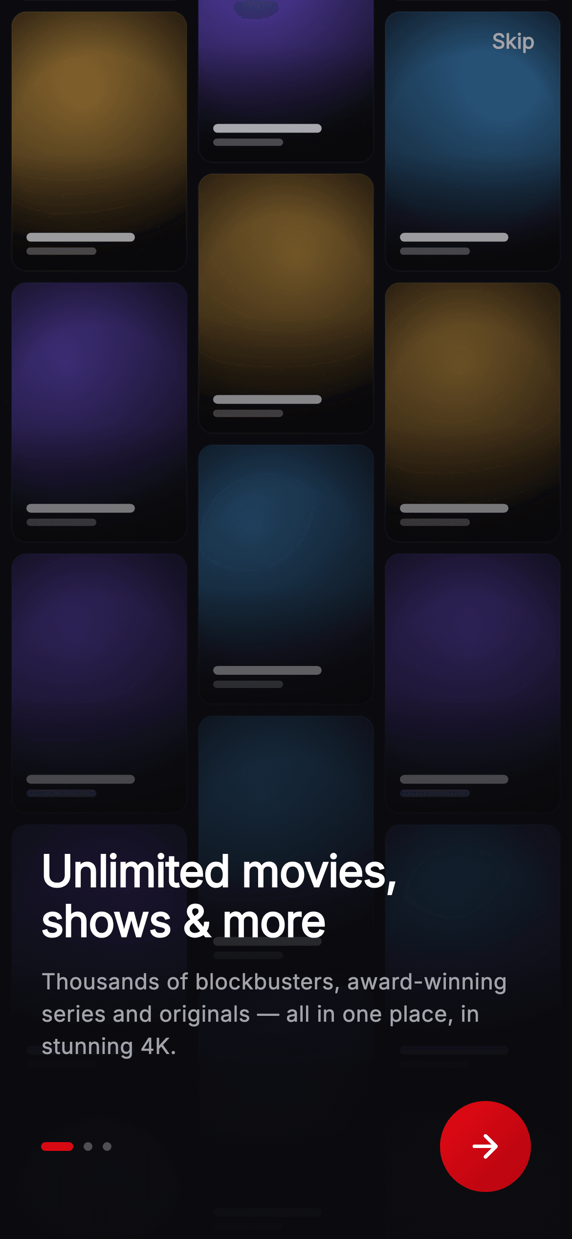
Watch the Flutter UI walkthrough
A short screen recording of Cineo · Onboarding — Unlimited running, if you'd rather see it before you read the code. The written tutorial below covers everything in it.
Can't see the video? Watch it on YouTube.
What you'll build
- ✓A full-bleed onboarding page with no image files — the entire poster wall is drawn in code by a CustomPainter
- ✓A seeded masonry grid of duotone 'movie posters' with a key-light pool, vignette, faux title bars, and film grain
- ✓A bottom-up gradient scrim that keeps the white headline and grey subtitle legible over busy artwork
- ✓A brand-red gradient circular Next button and an elongating active page-dot, both custom-painted
- ✓A self-contained dark theme using Netflix-style red (#E50914) and the bundled Inter font
Step-by-step build
Create the file
Add a new file at lib/stream_onboarding_intro_1/stream_onboarding_intro_1_screen.dart in your Flutter project.
Register the bundled fonts
No external packages — this is pure Flutter. It does bundle its design font (Inter), so drop the font file into fonts/ and declare it in pubspec.yaml:
flutter:
  fonts:
    - family: Inter
      fonts:
- asset: fonts/Inter-Regular.ttfBuild it, piece by piece
Here's how the screen goes together. Each block below is a real slice of the code with a plain-English explanation — paste them in order, or grab the whole file from the next section.
Imports, the stateless screen, and dark design tokens
import 'package:flutter/material.dart';

/// Onboarding 1 — "Unlimited movies & shows" for the **Cineo** streaming app.
/// Full-bleed painted poster collage grid (`_PosterPainter`) under a bottom hero
/// scrim (`_ScrimPainter`) so the white headline stays legible, page dots
/// (`_DotsPainter`), and a brand-red Next CTA. Self-contained per CONVENTIONS.md
/// (pure Flutter, bundled Inter font, own dark theme, painted artwork only).
class StreamOnboardingIntroOneScreen extends StatelessWidget {
  const StreamOnboardingIntroOneScreen({
    super.key,
    this.onNext,
    this.onSkip,
  });

  final VoidCallback? onNext;
  final VoidCallback? onSkip;

  static const String _font = 'Inter';
  static const Color _bg = Color(0xFF0B0B0F);
  static const Color _brand = Color(0xFFE50914);
  static const Color _brandDark = Color(0xFFB00610);
  static const Color _text = Color(0xFFFFFFFF);
  static const Color _muted = Color(0xFFA1A1AA);
The only import is Flutter's material library — this screen is pure Flutter. StreamOnboardingIntroOneScreen is a StatelessWidget because nothing on the page animates or changes; it just exposes two optional VoidCallback hooks, onNext and onSkip, so the parent decides what the buttons do. Everything below is a batch of static const design tokens: _font is 'Inter', _bg is the near-black #0B0B0F canvas, _brand is Netflix-style red #E50914 with _brandDark #B00610 for the button gradient, _text is pure white for the headline, and _muted #A1A1AA is the grey used for the Skip label and subtitle. Naming them once keeps the whole streaming palette in a single place.
Layering the artwork, scrim, and content in a Stack
  @override
  Widget build(BuildContext context) {
    return Theme(
      data: ThemeData.dark(useMaterial3: true),
      child: Scaffold(
        backgroundColor: _bg,
        body: Stack(
          fit: StackFit.expand,
          children: <Widget>[
            // Full-bleed painted poster collage.
            const Positioned.fill(
              child: CustomPaint(painter: _PosterCollagePainter()),
            ),
            // Bottom-up cinematic scrim for text legibility.
            const Positioned.fill(
              child: CustomPaint(painter: _ScrimPainter()),
            ),
            SafeArea(
              child: Column(
                children: <Widget>[
build() wraps everything in a Theme with ThemeData.dark(useMaterial3: true) so ripple and default colors read correctly on the dark canvas, then a Scaffold painted with _bg. The screen is a Stack with fit: StackFit.expand, and the layer order is what makes it work: first a Positioned.fill CustomPaint running _PosterCollagePainter (the poster wall), then a second Positioned.fill CustomPaint running _ScrimPainter (the darkening gradient) on top of it, and finally a SafeArea holding the actual UI Column above both. Painting the artwork and scrim as full-bleed siblings behind the text is the standard way to build a cinematic hero background.
The Skip link, headline, and subtitle
                  Align(
                    alignment: Alignment.topRight,
                    child: Padding(
                      padding: const EdgeInsets.only(top: 4, right: 8),
                      child: TextButton(
                        onPressed: onSkip,
                        child: const Text(
                          'Skip',
                          style: TextStyle(
                            fontFamily: _font,
                            fontSize: 14,
                            fontWeight: FontWeight.w600,
                            color: _muted,
                          ),
                        ),
                      ),
                    ),
                  ),
                  const Spacer(),
                  Padding(
                    padding: const EdgeInsets.fromLTRB(28, 0, 28, 32),
                    child: Column(
                      crossAxisAlignment: CrossAxisAlignment.start,
                      mainAxisSize: MainAxisSize.min,
                      children: <Widget>[
                        const Text(
                          'Unlimited movies,\nshows & more',
                          style: TextStyle(
                            fontFamily: _font,
                            fontSize: 30,
                            height: 1.12,
                            fontWeight: FontWeight.w800,
                            letterSpacing: -0.5,
                            color: _text,
                          ),
                        ),
                        const SizedBox(height: 14),
                        const Text(
                          'Thousands of blockbusters, award-winning '
                          'series and originals — all in one place, in '
                          'stunning 4K.',
                          style: TextStyle(
                            fontFamily: _font,
                            fontSize: 15,
                            height: 1.45,
                            fontWeight: FontWeight.w400,
                            color: _muted,
                          ),
                        ),
                        const SizedBox(height: 26),
Inside the SafeArea Column, an Align to Alignment.topRight parks a 'Skip' TextButton (14px Inter, w600, in _muted grey) in the corner, wired to onSkip. A Spacer() then pushes all remaining content to the bottom of the screen. That bottom block is a Padding of EdgeInsets.fromLTRB(28, 0, 28, 32) around a left-aligned Column: the headline Text reads 'Unlimited movies,\nshows & more' at 30px, weight w800, line height 1.12 and letterSpacing -0.5 in white — the \n forces the two-line break. A 14px SizedBox gap separates it from the grey 15px subtitle, whose string is split across three adjacent literals that Dart concatenates into one paragraph with height 1.45.
The progress dots and Next button row
                        Row(
                          children: <Widget>[
                            const SizedBox(
                              width: 56,
                              height: 6,
                              child: CustomPaint(
                                painter: _DotsPainter(index: 0, count: 3),
                              ),
                            ),
                            const Spacer(),
                            _NextButton(onTap: onNext),
                          ],
                        ),
                      ],
                    ),
                  ),
                ],
              ),
            ),
          ],
        ),
      ),
    );
  }
}
After a 26px SizedBox gap comes a Row that balances the bottom bar: on the left a fixed 56×6 SizedBox hosts a CustomPaint driving _DotsPainter(index: 0, count: 3) — three page dots with the first one active — then a Spacer() shoves the _NextButton hard to the right edge, passing onNext through as its tap handler. The remaining closing brackets finish the inner Column, the Padding, the outer Column, the SafeArea, the Stack, the Scaffold, and the Theme, ending the StatelessWidget's build method.
A gradient circular Next button
/// Brand-red circular Next button with a painted chevron.
class _NextButton extends StatelessWidget {
  const _NextButton({this.onTap});

  final VoidCallback? onTap;

  @override
  Widget build(BuildContext context) {
    return Material(
      color: Colors.transparent,
      shape: const CircleBorder(),
      child: InkWell(
        onTap: onTap,
        customBorder: const CircleBorder(),
        child: Container(
          width: 62,
          height: 62,
          decoration: const BoxDecoration(
            shape: BoxShape.circle,
            gradient: LinearGradient(
              begin: Alignment.topLeft,
              end: Alignment.bottomRight,
              colors: <Color>[
                StreamOnboardingIntroOneScreen._brand,
                StreamOnboardingIntroOneScreen._brandDark,
              ],
            ),
          ),
          child: const Icon(
            Icons.arrow_forward_rounded,
            color: Colors.white,
            size: 26,
          ),
        ),
      ),
    );
  }
}
_NextButton is a small private StatelessWidget so the CTA can be reused and kept tidy. It uses Material(color: Colors.transparent) with a CircleBorder shape wrapping an InkWell whose customBorder is also a CircleBorder — that pairing gives you a ripple that's clipped to the circle instead of a square. The visible button is a 62×62 Container with a BoxShape.circle decoration and a LinearGradient running topLeft→bottomRight from _brand to _brandDark, so the red has depth rather than being flat. A white Icons.arrow_forward_rounded at size 26 sits centered inside as the chevron.
Painting the poster wall, scrim, and dots by hand
/// Paints a seeded grid of poster tiles (gradient + inset title lines + grain)
/// so a cinematic wall of artwork always renders offline.
class _PosterCollagePainter extends CustomPainter {
  const _PosterCollagePainter();

  // Cinematic duotone genre grades: [shadow, midtone, highlight-tint].
  static const List<List<Color>> _palettes = <List<Color>>[
    <Color>[Color(0xFF0E0A1A), Color(0xFF3B2A6A), Color(0xFF7C5CFF)], // sci-fi
    <Color>[Color(0xFF160808), Color(0xFF6A1F22), Color(0xFFE8556B)], // thriller
    <Color>[Color(0xFF07131F), Color(0xFF1E466A), Color(0xFF4FA3E8)], // drama
    <Color>[Color(0xFF07160F), Color(0xFF1F5A42), Color(0xFF3FD79A)], // adventure
    <Color>[Color(0xFF1A1206), Color(0xFF6A4A1F), Color(0xFFE8B24F)], // classic
    <Color>[Color(0xFF120612), Color(0xFF52205A), Color(0xFFD86BE8)], // fantasy
  ];

  @override
  void paint(Canvas canvas, Size size) {
    const int cols = 3;
    const double gap = 8;
    final double tileW = (size.width - gap * (cols + 1)) / cols;
    final double tileH = tileW * 1.48;
    final int rows = (size.height / (tileH + gap)).ceil() + 1;
    int seed = 7;
    // Offset alternate columns for a masonry feel.
    for (int c = 0; c < cols; c++) {
      final double colShift = (c.isOdd) ? -tileH * 0.42 : 0;
      for (int r = -1; r < rows; r++) {
        final double x = gap + c * (tileW + gap);
        final double y = gap + r * (tileH + gap) + colShift;
        seed = (seed * 1103515245 + 12345) & 0x7fffffff;
        final List<Color> pal = _palettes[seed % _palettes.length];
        final Rect rect = Rect.fromLTWH(x, y, tileW, tileH);
        final RRect card =
            RRect.fromRectAndRadius(rect, const Radius.circular(10));
        canvas.save();
        canvas.clipRRect(card);
        // Base duotone: shadow → midtone, diagonally graded.
        canvas.drawRect(
          rect,
          Paint()
            ..shader = LinearGradient(
              begin: Alignment.topLeft,
              end: Alignment.bottomRight,
              colors: <Color>[pal[1], pal[0]],
            ).createShader(rect),
        );
        // Cinematic key light — an off-center highlight pool of the tint color.
        seed = (seed * 1103515245 + 12345) & 0x7fffffff;
        final double lx = x + tileW * (0.3 + (seed % 40) / 100);
        final double ly = y + tileH * 0.32;
        canvas.drawCircle(
          Offset(lx, ly),
          tileW * 0.9,
          Paint()
            ..shader = RadialGradient(
              colors: <Color>[
                pal[2].withValues(alpha: 0.55),
                pal[2].withValues(alpha: 0.0),
              ],
            ).createShader(
                Rect.fromCircle(center: Offset(lx, ly), radius: tileW * 0.9)),
        );
        // Vignette — darken all four edges for depth.
        canvas.drawRect(
          rect,
          Paint()
            ..shader = RadialGradient(
              radius: 0.9,
              colors: <Color>[
                Colors.black.withValues(alpha: 0.0),
                Colors.black.withValues(alpha: 0.55),
              ],
              stops: const <double>[0.55, 1.0],
            ).createShader(rect),
        );
        // Bottom scrim so the faux title reads.
        canvas.drawRect(
          Rect.fromLTWH(x, y + tileH * 0.55, tileW, tileH * 0.45),
          Paint()
            ..shader = LinearGradient(
              begin: Alignment.topCenter,
              end: Alignment.bottomCenter,
              colors: <Color>[
                Colors.black.withValues(alpha: 0.0),
                Colors.black.withValues(alpha: 0.7),
              ],
            ).createShader(
                Rect.fromLTWH(x, y + tileH * 0.55, tileW, tileH * 0.45)),
        );
        canvas.restore();
        // Hairline edge for a crisp poster border.
        canvas.drawRRect(
          card,
          Paint()
            ..style = PaintingStyle.stroke
            ..strokeWidth = 1
            ..color = Colors.white.withValues(alpha: 0.06),
        );
        // Faux title bars near the bottom of each poster.
        canvas.drawRRect(
          RRect.fromRectAndRadius(
            Rect.fromLTWH(x + 10, y + tileH - 26, tileW * 0.62, 6),
            const Radius.circular(3),
          ),
          Paint()..color = Colors.white.withValues(alpha: 0.85),
        );
        canvas.drawRRect(
          RRect.fromRectAndRadius(
            Rect.fromLTWH(x + 10, y + tileH - 16, tileW * 0.4, 5),
            const Radius.circular(3),
          ),
          Paint()..color = Colors.white.withValues(alpha: 0.35),
        );
      }
    }
    // Fine film grain across the whole wall.
    final Paint grain = Paint()..color = Colors.white.withValues(alpha: 0.035);
    for (int i = 0; i < 340; i++) {
      seed = (seed * 1103515245 + 12345) & 0x7fffffff;
      final double gx = (seed % 1000) / 1000 * size.width;
      seed = (seed * 1103515245 + 12345) & 0x7fffffff;
      final double gy = (seed % 1000) / 1000 * size.height;
      canvas.drawCircle(Offset(gx, gy), 0.6, grain);
    }
  }

  @override
  bool shouldRepaint(covariant _PosterCollagePainter oldDelegate) => false;
}

/// Bottom-up gradient scrim over artwork so white text stays legible.
class _ScrimPainter extends CustomPainter {
  const _ScrimPainter();

  @override
  void paint(Canvas canvas, Size size) {
    final Rect rect = Offset.zero & size;
    canvas.drawRect(
      rect,
      Paint()
        ..shader = LinearGradient(
          begin: Alignment.topCenter,
          end: Alignment.bottomCenter,
          colors: <Color>[
            const Color(0xFF0B0B0F).withValues(alpha: 0.15),
            const Color(0xFF0B0B0F).withValues(alpha: 0.55),
            const Color(0xFF0B0B0F).withValues(alpha: 0.98),
          ],
          stops: const <double>[0.0, 0.5, 0.86],
        ).createShader(rect),
    );
  }

  @override
  bool shouldRepaint(covariant _ScrimPainter oldDelegate) => false;
}

/// Page-indicator dots — the active dot elongates into a brand-red pill.
class _DotsPainter extends CustomPainter {
  const _DotsPainter({required this.index, required this.count});

  final int index;
  final int count;

  @override
  void paint(Canvas canvas, Size size) {
    const double dot = 6;
    const double gap = 7;
    const double activeW = 22;
    double x = 0;
    final double cy = size.height / 2;
    for (int i = 0; i < count; i++) {
      final bool active = i == index;
      final double w = active ? activeW : dot;
      final RRect r = RRect.fromRectAndRadius(
        Rect.fromLTWH(x, cy - dot / 2, w, dot),
        const Radius.circular(dot),
      );
      canvas.drawRRect(
        r,
        Paint()
          ..color = active
              ? StreamOnboardingIntroOneScreen._brand
              : Colors.white.withValues(alpha: 0.28),
      );
      x += w + gap;
    }
  }

  @override
  bool shouldRepaint(covariant _DotsPainter oldDelegate) =>
      oldDelegate.index != index || oldDelegate.count != count;
}
This is the heart of the screen — three CustomPainters that draw all the artwork with no images. _PosterCollagePainter lays out a 3-column grid of tileW×(tileW*1.48) poster cards with an 8px gap, offsetting odd columns by -0.42 of a tile for a masonry look. It uses a tiny linear-congruential generator (seed = (seed * 1103515245 + 12345) & 0x7fffffff) to pick, per tile, one of six duotone genre _palettes (sci-fi, thriller, drama, adventure, classic, fantasy). Each tile is clipped to a 10px RRect, then painted in layers: a diagonal duotone LinearGradient base, an off-center RadialGradient 'key light' pool in the palette's tint, a RadialGradient vignette darkening the edges, a bottom scrim, a 1px white hairline border at 6% opacity, and two rounded-rect faux title bars. Finally 340 tiny 0.6px white dots add film grain across the wall. _ScrimPainter draws a single bottom-up LinearGradient of _bg at 15% → 55% → 98% opacity (stops 0.0/0.5/0.86) so the headline never fights the artwork. _DotsPainter draws the three indicators, elongating the active one from a 6px dot into a 22px brand-red pill while inactive dots stay white at 28% opacity. Both scrim and poster painters return false from shouldRepaint since they never change.
Full code
The complete, ready-to-paste source. Free to use in your projects — one click copies it all.
import 'package:flutter/material.dart';

/// Onboarding 1 — "Unlimited movies & shows" for the **Cineo** streaming app.
/// Full-bleed painted poster collage grid (`_PosterPainter`) under a bottom hero
/// scrim (`_ScrimPainter`) so the white headline stays legible, page dots
/// (`_DotsPainter`), and a brand-red Next CTA. Self-contained per CONVENTIONS.md
/// (pure Flutter, bundled Inter font, own dark theme, painted artwork only).
class StreamOnboardingIntroOneScreen extends StatelessWidget {
  const StreamOnboardingIntroOneScreen({
    super.key,
    this.onNext,
    this.onSkip,
  });

  final VoidCallback? onNext;
  final VoidCallback? onSkip;

  static const String _font = 'Inter';
  static const Color _bg = Color(0xFF0B0B0F);
  static const Color _brand = Color(0xFFE50914);
  static const Color _brandDark = Color(0xFFB00610);
  static const Color _text = Color(0xFFFFFFFF);
  static const Color _muted = Color(0xFFA1A1AA);

  @override
  Widget build(BuildContext context) {
    return Theme(
      data: ThemeData.dark(useMaterial3: true),
      child: Scaffold(
        backgroundColor: _bg,
        body: Stack(
          fit: StackFit.expand,
          children: <Widget>[
            // Full-bleed painted poster collage.
            const Positioned.fill(
              child: CustomPaint(painter: _PosterCollagePainter()),
            ),
            // Bottom-up cinematic scrim for text legibility.
            const Positioned.fill(
              child: CustomPaint(painter: _ScrimPainter()),
            ),
            SafeArea(
              child: Column(
                children: <Widget>[
                  Align(
                    alignment: Alignment.topRight,
                    child: Padding(
                      padding: const EdgeInsets.only(top: 4, right: 8),
                      child: TextButton(
                        onPressed: onSkip,
                        child: const Text(
                          'Skip',
                          style: TextStyle(
                            fontFamily: _font,
                            fontSize: 14,
                            fontWeight: FontWeight.w600,
                            color: _muted,
                          ),
                        ),
                      ),
                    ),
                  ),
                  const Spacer(),
                  Padding(
                    padding: const EdgeInsets.fromLTRB(28, 0, 28, 32),
                    child: Column(
                      crossAxisAlignment: CrossAxisAlignment.start,
                      mainAxisSize: MainAxisSize.min,
                      children: <Widget>[
                        const Text(
                          'Unlimited movies,\nshows & more',
                          style: TextStyle(
                            fontFamily: _font,
                            fontSize: 30,
                            height: 1.12,
                            fontWeight: FontWeight.w800,
                            letterSpacing: -0.5,
                            color: _text,
                          ),
                        ),
                        const SizedBox(height: 14),
                        const Text(
                          'Thousands of blockbusters, award-winning '
                          'series and originals — all in one place, in '
                          'stunning 4K.',
                          style: TextStyle(
                            fontFamily: _font,
                            fontSize: 15,
                            height: 1.45,
                            fontWeight: FontWeight.w400,
                            color: _muted,
                          ),
                        ),
                        const SizedBox(height: 26),
                        Row(
                          children: <Widget>[
                            const SizedBox(
                              width: 56,
                              height: 6,
                              child: CustomPaint(
                                painter: _DotsPainter(index: 0, count: 3),
                              ),
                            ),
                            const Spacer(),
                            _NextButton(onTap: onNext),
                          ],
                        ),
                      ],
                    ),
                  ),
                ],
              ),
            ),
          ],
        ),
      ),
    );
  }
}

/// Brand-red circular Next button with a painted chevron.
class _NextButton extends StatelessWidget {
  const _NextButton({this.onTap});

  final VoidCallback? onTap;

  @override
  Widget build(BuildContext context) {
    return Material(
      color: Colors.transparent,
      shape: const CircleBorder(),
      child: InkWell(
        onTap: onTap,
        customBorder: const CircleBorder(),
        child: Container(
          width: 62,
          height: 62,
          decoration: const BoxDecoration(
            shape: BoxShape.circle,
            gradient: LinearGradient(
              begin: Alignment.topLeft,
              end: Alignment.bottomRight,
              colors: <Color>[
                StreamOnboardingIntroOneScreen._brand,
                StreamOnboardingIntroOneScreen._brandDark,
              ],
            ),
          ),
          child: const Icon(
            Icons.arrow_forward_rounded,
            color: Colors.white,
            size: 26,
          ),
        ),
      ),
    );
  }
}

/// Paints a seeded grid of poster tiles (gradient + inset title lines + grain)
/// so a cinematic wall of artwork always renders offline.
class _PosterCollagePainter extends CustomPainter {
  const _PosterCollagePainter();

  // Cinematic duotone genre grades: [shadow, midtone, highlight-tint].
  static const List<List<Color>> _palettes = <List<Color>>[
    <Color>[Color(0xFF0E0A1A), Color(0xFF3B2A6A), Color(0xFF7C5CFF)], // sci-fi
    <Color>[Color(0xFF160808), Color(0xFF6A1F22), Color(0xFFE8556B)], // thriller
    <Color>[Color(0xFF07131F), Color(0xFF1E466A), Color(0xFF4FA3E8)], // drama
    <Color>[Color(0xFF07160F), Color(0xFF1F5A42), Color(0xFF3FD79A)], // adventure
    <Color>[Color(0xFF1A1206), Color(0xFF6A4A1F), Color(0xFFE8B24F)], // classic
    <Color>[Color(0xFF120612), Color(0xFF52205A), Color(0xFFD86BE8)], // fantasy
  ];

  @override
  void paint(Canvas canvas, Size size) {
    const int cols = 3;
    const double gap = 8;
    final double tileW = (size.width - gap * (cols + 1)) / cols;
    final double tileH = tileW * 1.48;
    final int rows = (size.height / (tileH + gap)).ceil() + 1;
    int seed = 7;
    // Offset alternate columns for a masonry feel.
    for (int c = 0; c < cols; c++) {
      final double colShift = (c.isOdd) ? -tileH * 0.42 : 0;
      for (int r = -1; r < rows; r++) {
        final double x = gap + c * (tileW + gap);
        final double y = gap + r * (tileH + gap) + colShift;
        seed = (seed * 1103515245 + 12345) & 0x7fffffff;
        final List<Color> pal = _palettes[seed % _palettes.length];
        final Rect rect = Rect.fromLTWH(x, y, tileW, tileH);
        final RRect card =
            RRect.fromRectAndRadius(rect, const Radius.circular(10));
        canvas.save();
        canvas.clipRRect(card);
        // Base duotone: shadow → midtone, diagonally graded.
        canvas.drawRect(
          rect,
          Paint()
            ..shader = LinearGradient(
              begin: Alignment.topLeft,
              end: Alignment.bottomRight,
              colors: <Color>[pal[1], pal[0]],
            ).createShader(rect),
        );
        // Cinematic key light — an off-center highlight pool of the tint color.
        seed = (seed * 1103515245 + 12345) & 0x7fffffff;
        final double lx = x + tileW * (0.3 + (seed % 40) / 100);
        final double ly = y + tileH * 0.32;
        canvas.drawCircle(
          Offset(lx, ly),
          tileW * 0.9,
          Paint()
            ..shader = RadialGradient(
              colors: <Color>[
                pal[2].withValues(alpha: 0.55),
                pal[2].withValues(alpha: 0.0),
              ],
            ).createShader(
                Rect.fromCircle(center: Offset(lx, ly), radius: tileW * 0.9)),
        );
        // Vignette — darken all four edges for depth.
        canvas.drawRect(
          rect,
          Paint()
            ..shader = RadialGradient(
              radius: 0.9,
              colors: <Color>[
                Colors.black.withValues(alpha: 0.0),
                Colors.black.withValues(alpha: 0.55),
              ],
              stops: const <double>[0.55, 1.0],
            ).createShader(rect),
        );
        // Bottom scrim so the faux title reads.
        canvas.drawRect(
          Rect.fromLTWH(x, y + tileH * 0.55, tileW, tileH * 0.45),
          Paint()
            ..shader = LinearGradient(
              begin: Alignment.topCenter,
              end: Alignment.bottomCenter,
              colors: <Color>[
                Colors.black.withValues(alpha: 0.0),
                Colors.black.withValues(alpha: 0.7),
              ],
            ).createShader(
                Rect.fromLTWH(x, y + tileH * 0.55, tileW, tileH * 0.45)),
        );
        canvas.restore();
        // Hairline edge for a crisp poster border.
        canvas.drawRRect(
          card,
          Paint()
            ..style = PaintingStyle.stroke
            ..strokeWidth = 1
            ..color = Colors.white.withValues(alpha: 0.06),
        );
        // Faux title bars near the bottom of each poster.
        canvas.drawRRect(
          RRect.fromRectAndRadius(
            Rect.fromLTWH(x + 10, y + tileH - 26, tileW * 0.62, 6),
            const Radius.circular(3),
          ),
          Paint()..color = Colors.white.withValues(alpha: 0.85),
        );
        canvas.drawRRect(
          RRect.fromRectAndRadius(
            Rect.fromLTWH(x + 10, y + tileH - 16, tileW * 0.4, 5),
            const Radius.circular(3),
          ),
          Paint()..color = Colors.white.withValues(alpha: 0.35),
        );
      }
    }
    // Fine film grain across the whole wall.
    final Paint grain = Paint()..color = Colors.white.withValues(alpha: 0.035);
    for (int i = 0; i < 340; i++) {
      seed = (seed * 1103515245 + 12345) & 0x7fffffff;
      final double gx = (seed % 1000) / 1000 * size.width;
      seed = (seed * 1103515245 + 12345) & 0x7fffffff;
      final double gy = (seed % 1000) / 1000 * size.height;
      canvas.drawCircle(Offset(gx, gy), 0.6, grain);
    }
  }

  @override
  bool shouldRepaint(covariant _PosterCollagePainter oldDelegate) => false;
}

/// Bottom-up gradient scrim over artwork so white text stays legible.
class _ScrimPainter extends CustomPainter {
  const _ScrimPainter();

  @override
  void paint(Canvas canvas, Size size) {
    final Rect rect = Offset.zero & size;
    canvas.drawRect(
      rect,
      Paint()
        ..shader = LinearGradient(
          begin: Alignment.topCenter,
          end: Alignment.bottomCenter,
          colors: <Color>[
            const Color(0xFF0B0B0F).withValues(alpha: 0.15),
            const Color(0xFF0B0B0F).withValues(alpha: 0.55),
            const Color(0xFF0B0B0F).withValues(alpha: 0.98),
          ],
          stops: const <double>[0.0, 0.5, 0.86],
        ).createShader(rect),
    );
  }

  @override
  bool shouldRepaint(covariant _ScrimPainter oldDelegate) => false;
}

/// Page-indicator dots — the active dot elongates into a brand-red pill.
class _DotsPainter extends CustomPainter {
  const _DotsPainter({required this.index, required this.count});

  final int index;
  final int count;

  @override
  void paint(Canvas canvas, Size size) {
    const double dot = 6;
    const double gap = 7;
    const double activeW = 22;
    double x = 0;
    final double cy = size.height / 2;
    for (int i = 0; i < count; i++) {
      final bool active = i == index;
      final double w = active ? activeW : dot;
      final RRect r = RRect.fromRectAndRadius(
        Rect.fromLTWH(x, cy - dot / 2, w, dot),
        const Radius.circular(dot),
      );
      canvas.drawRRect(
        r,
        Paint()
          ..color = active
              ? StreamOnboardingIntroOneScreen._brand
              : Colors.white.withValues(alpha: 0.28),
      );
      x += w + gap;
    }
  }

  @override
  bool shouldRepaint(covariant _DotsPainter oldDelegate) =>
      oldDelegate.index != index || oldDelegate.count != count;
}
Plus bundled 1 binary asset (fonts/images). The CLI and MCP install those for you automatically.
Two faster ways to add it
Copy-paste works, but you can skip it entirely.
1. FlutterKit CLI
One command drops this screen — and its fonts — straight into your project.
$ flutterkit add stream-onboarding-intro-12. AI agent (MCP)
Connect FlutterKit's MCP server in Claude or Cursor and just ask your agent to install stream-onboarding-intro-1 — it fetches and writes the files for you.
FAQ
Is this streaming onboarding screen free to use?
Yes. The full Dart source on this page is free to copy into your own apps, personal or commercial. Paste it directly, install it with the FlutterKit CLI (flutterkit add stream-onboarding-intro-1), or have an AI agent add it for you via MCP.
Does it need any external packages or image assets?
No packages — it's pure Flutter on the material library, and there are no image files at all: the poster wall, scrim, and dots are all drawn by CustomPainters. The only asset is the bundled Inter font, which you register in pubspec.yaml as shown in step 2; the CLI and MCP copy the font file in for you.
Which Flutter version does it target?
It uses the modern Color.withValues() API (for example Colors.white.withValues(alpha: 0.06)) and super parameters, so it targets Flutter 3.22+ (Dart 3). On an older SDK, replace each withValues(alpha: x) call with withOpacity(x) and it will compile unchanged.


