How to Build a Streaming App Welcome Screen in Flutter (Full Code + Preview)
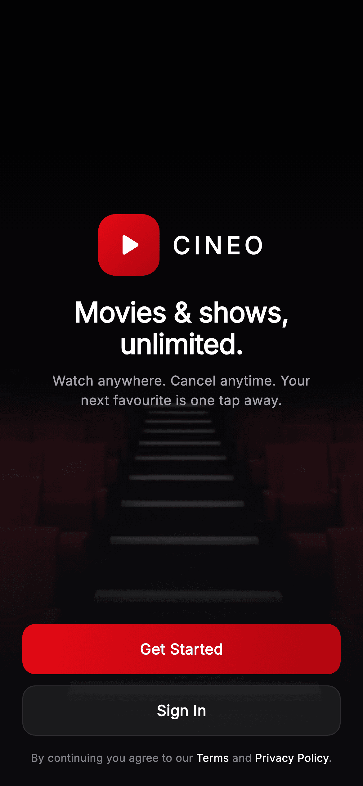
A streaming app's welcome screen is a photo, a promise and two buttons — and it has to look right even when the photo fails to load. This tutorial builds one in Flutter with a genuine safety net: `Image.asset` carries an `errorBuilder` that falls back to a fully painted cinematic backdrop, so a blank screen is impossible offline or mid-decode. Above it sits a three-stop scrim, the Cineo brandmark, a gradient CTA and a ghost secondary button.
Watch the Flutter UI walkthrough
A short screen recording of Cineo · Welcome running, if you'd rather see it before you read the code. The written tutorial below covers everything in it.
Can't see the video? Watch it on YouTube.
What you'll build
- ✓A hero image with a painted `CustomPainter` fallback via `errorBuilder` — never blank
- ✓A three-stop bottom scrim that guarantees white text stays legible over any frame
- ✓A gradient-filled `InkWell` button using `Ink` so the ripple still shows
- ✓A ghost secondary button at 6% white with a hairline border
- ✓`Spacer()` above and below the brand group to centre it without fixed offsets
- ✓A `Text.rich` terms line where only Terms and Privacy Policy brighten
Step-by-step build
Create the file
Add a new file at lib/stream_auth_welcome/stream_auth_welcome_screen.dart in your Flutter project.
Register the bundled fonts
No external packages — this is pure Flutter. It does bundle its design font (Inter), so drop the font file into fonts/ and declare it in pubspec.yaml:
flutter:
  fonts:
    - family: Inter
      fonts:
- asset: fonts/Inter-Regular.ttfBuild it, piece by piece
Here's how the screen goes together. Each block below is a real slice of the code with a plain-English explanation — paste them in order, or grab the whole file from the next section.
Layering the hero, its fallback, and the scrim
  @override
  Widget build(BuildContext context) {
    return Theme(
      data: ThemeData.dark(useMaterial3: true),
      child: Scaffold(
        backgroundColor: _bg,
        body: Stack(
          fit: StackFit.expand,
          children: <Widget>[
            // Real cinematic hero (bundled webp, license-clean Unsplash). The
            // painted backdrop stays as an offline/decode fallback so a blank
            // never renders — satisfies the golden screenshot harness.
            Positioned.fill(
              child: Image.asset(
                'lib/screens/streaming/stream_auth_welcome/images/hero_cinema.webp',
                fit: BoxFit.cover,
                alignment: Alignment.bottomCenter,
                errorBuilder: (BuildContext context, Object error,
                        StackTrace? stackTrace) =>
                    const CustomPaint(painter: _BackdropPainter()),
              ),
            ),
            const Positioned.fill(
              child: CustomPaint(painter: _ScrimPainter()),
            ),
The body is a `Stack` with `fit: StackFit.expand`. The bottom layer is `Positioned.fill` around an `Image.asset` at `BoxFit.cover` with `alignment: Alignment.bottomCenter` — bottom-aligning a cover-fit photo keeps the interesting part of a cinematic frame in view when the aspect ratio doesn't match. The `errorBuilder` is the part worth stealing: if the asset is missing or fails to decode, it returns `const CustomPaint(painter: _BackdropPainter())` instead, so the screen degrades to a painted backdrop rather than a void. On top, a second `Positioned.fill` paints the scrim.
Centring the brand group with Spacers
            SafeArea(
              child: Column(
                children: <Widget>[
                  const Spacer(),
                  const _CineoMark(size: 66),
                  const SizedBox(height: 22),
                  const Text(
                    'Movies & shows,\nunlimited.',
                    textAlign: TextAlign.center,
                    style: TextStyle(
                      fontFamily: _font,
                      fontSize: 30,
                      height: 1.14,
                      fontWeight: FontWeight.w800,
                      letterSpacing: -0.5,
                      color: _text,
                    ),
                  ),
                  const SizedBox(height: 12),
                  const Padding(
                    padding: EdgeInsets.symmetric(horizontal: 40),
                    child: Text(
                      'Watch anywhere. Cancel anytime. Your next '
                      'favourite is one tap away.',
                      textAlign: TextAlign.center,
                      style: TextStyle(
                        fontFamily: _font,
                        fontSize: 14.5,
                        height: 1.45,
                        fontWeight: FontWeight.w400,
                        color: _muted,
                      ),
                    ),
                  ),
                  const Spacer(),
Inside `SafeArea`, a `Column` uses `Spacer()` above and below the brand group, so the logo, headline and tagline sit centred in whatever space the buttons leave — no `MediaQuery`, no hard-coded offsets, and it adapts from a small phone to a tablet automatically. The headline breaks manually with `'Movies & shows,\nunlimited.'` rather than relying on wrapping, which guarantees the line break lands where the design wants it. `height: 1.14` tightens the leading so the two lines read as one block, and the tagline is inset 40px each side to keep its measure comfortable.
Buttons and the terms line
                  Padding(
                    padding: const EdgeInsets.fromLTRB(24, 0, 24, 22),
                    child: Column(
                      children: <Widget>[
                        _PrimaryButton(
                          label: 'Get Started',
                          onTap: onGetStarted,
                        ),
                        const SizedBox(height: 12),
                        _GhostButton(label: 'Sign In', onTap: onSignIn),
                        const SizedBox(height: 16),
                        Text.rich(
                          const TextSpan(
                            text: 'By continuing you agree to our ',
                            children: <TextSpan>[
                              TextSpan(
                                text: 'Terms',
                                style: TextStyle(color: _text),
                              ),
                              TextSpan(text: ' and '),
                              TextSpan(
                                text: 'Privacy Policy',
                                style: TextStyle(color: _text),
                              ),
                              TextSpan(text: '.'),
                            ],
                          ),
                          textAlign: TextAlign.center,
                          style: TextStyle(
                            fontFamily: _font,
                            fontSize: 11.5,
                            height: 1.4,
                            fontWeight: FontWeight.w400,
                            color: _muted.withValues(alpha: 0.8),
                          ),
                        ),
                      ],
                    ),
                  ),
                ],
              ),
            ),
          ],
        ),
      ),
    );
  }
The action stack is `_PrimaryButton`, a 12px gap, `_GhostButton`, then the terms. `Text.rich` is used so 'Terms' and 'Privacy Policy' can brighten to `_text` white while the surrounding sentence stays at `_muted.withValues(alpha: 0.8)` — the spans inherit the base style's font, size and line height and override only the colour. Because these spans aren't individually tappable, no `TapGestureRecognizer` is needed; they're emphasis, not links, which is a reasonable choice for a line most users never touch.
The brandmark
class _CineoMark extends StatelessWidget {
  const _CineoMark({required this.size});

  final double size;

  @override
  Widget build(BuildContext context) {
    return Row(
      mainAxisSize: MainAxisSize.min,
      children: <Widget>[
        Container(
          width: size,
          height: size,
          decoration: BoxDecoration(
            borderRadius: BorderRadius.circular(size * 0.28),
            gradient: const LinearGradient(
              begin: Alignment.topLeft,
              end: Alignment.bottomRight,
              colors: <Color>[
                StreamAuthWelcomeScreen._brand,
                StreamAuthWelcomeScreen._brandDark,
              ],
            ),
          ),
          child: const Icon(
            Icons.play_arrow_rounded,
            color: Colors.white,
            size: 40,
          ),
        ),
        const SizedBox(width: 12),
        const Text(
          'CINEO',
          style: TextStyle(
            fontFamily: StreamAuthWelcomeScreen._font,
            fontSize: 26,
            fontWeight: FontWeight.w800,
            letterSpacing: 4,
            color: StreamAuthWelcomeScreen._text,
          ),
        ),
      ],
    );
  }
}
`_CineoMark` takes a `size` and derives its corner radius from it — `BorderRadius.circular(size * 0.28)` — so the squircle proportion holds at any size, which matters because this same mark reappears smaller in the app bar of other screens. The tile is filled with the brand red-to-dark gradient and holds a plain `play_arrow_rounded` icon, so the whole logo needs no asset. Beside it, 'CINEO' at `letterSpacing: 4` is what turns five ordinary letters into a wordmark; wide tracking is the cheapest typographic trick for a logotype.
A gradient button that still ripples
class _PrimaryButton extends StatelessWidget {
  const _PrimaryButton({required this.label, this.onTap});

  final String label;
  final VoidCallback? onTap;

  @override
  Widget build(BuildContext context) {
    return SizedBox(
      width: double.infinity,
      height: 54,
      child: Material(
        color: Colors.transparent,
        borderRadius: BorderRadius.circular(14),
        child: InkWell(
          onTap: onTap,
          borderRadius: BorderRadius.circular(14),
          child: Ink(
            decoration: BoxDecoration(
              borderRadius: BorderRadius.circular(14),
              gradient: const LinearGradient(
                begin: Alignment.topLeft,
                end: Alignment.bottomRight,
                colors: <Color>[
                  StreamAuthWelcomeScreen._brand,
                  StreamAuthWelcomeScreen._brandDark,
                ],
              ),
            ),
            child: Center(
              child: Text(
                label,
                style: const TextStyle(
                  fontFamily: StreamAuthWelcomeScreen._font,
                  fontSize: 16,
                  fontWeight: FontWeight.w700,
                  letterSpacing: 0.3,
                  color: Colors.white,
                ),
              ),
            ),
          ),
        ),
      ),
    );
  }
}

class _GhostButton extends StatelessWidget {
  const _GhostButton({required this.label, this.onTap});

  final String label;
  final VoidCallback? onTap;

  @override
  Widget build(BuildContext context) {
    return SizedBox(
      width: double.infinity,
      height: 54,
      child: Material(
        color: Colors.white.withValues(alpha: 0.06),
        borderRadius: BorderRadius.circular(14),
        child: InkWell(
          onTap: onTap,
          borderRadius: BorderRadius.circular(14),
          child: Container(
            decoration: BoxDecoration(
              borderRadius: BorderRadius.circular(14),
              border: Border.all(color: StreamAuthWelcomeScreen._hairline),
            ),
            child: Center(
              child: Text(
                label,
                style: const TextStyle(
                  fontFamily: StreamAuthWelcomeScreen._font,
                  fontSize: 16,
                  fontWeight: FontWeight.w600,
                  color: StreamAuthWelcomeScreen._text,
                ),
              ),
            ),
          ),
        ),
      ),
    );
  }
}
You can't put a gradient on `Material`'s `color`, and painting one on a `Container` *inside* an `InkWell` would hide the ripple beneath it. The fix here is `Ink`: `Material(color: Colors.transparent)` → `InkWell` → `Ink(decoration: gradient)`. `Ink` paints its decoration on the `Material` itself, so the splash renders *above* the gradient instead of under it. All three widgets share `BorderRadius.circular(14)` so the ripple is clipped to the rounded rectangle. `_GhostButton` is simpler — `Colors.white.withValues(alpha: 0.06)` with a `_hairline` border, an almost-invisible fill that still separates it from the photo behind.
The painted backdrop and scrim
/// Painted cinematic backdrop — a large seeded hero frame with soft light
/// pooling so the welcome always renders offline.
class _BackdropPainter extends CustomPainter {
  const _BackdropPainter();

  @override
  void paint(Canvas canvas, Size size) {
    final Rect rect = Offset.zero & size;
    // Base cinematic gradient.
    canvas.drawRect(
      rect,
      Paint()
        ..shader = const LinearGradient(
          begin: Alignment.topCenter,
          end: Alignment.bottomCenter,
          colors: <Color>[
            Color(0xFF3A1C24),
            Color(0xFF1A0F16),
            Color(0xFF0B0B0F),
          ],
        ).createShader(rect),
    );
    // Warm key light pooling top-right.
    canvas.drawCircle(
      Offset(size.width * 0.82, size.height * 0.18),
      size.width * 0.7,
      Paint()
        ..shader = RadialGradient(
          colors: <Color>[
            const Color(0xFFE50914).withValues(alpha: 0.22),
            const Color(0xFFE50914).withValues(alpha: 0.0),
          ],
        ).createShader(
          Rect.fromCircle(
            center: Offset(size.width * 0.82, size.height * 0.18),
            radius: size.width * 0.7,
          ),
        ),
    );
    // A few soft light streaks.
    final Paint streak = Paint()
      ..color = Colors.white.withValues(alpha: 0.04)
      ..strokeWidth = 40
      ..strokeCap = StrokeCap.round;
    for (int i = 0; i < 3; i++) {
      final double x = size.width * (0.2 + i * 0.28);
      canvas.drawLine(
        Offset(x, -20),
        Offset(x + size.width * 0.2, size.height * 0.5),
        streak,
      );
    }
  }

  @override
  bool shouldRepaint(covariant _BackdropPainter oldDelegate) => false;
}

/// Bottom-up gradient scrim so white text stays legible over the backdrop.
class _ScrimPainter extends CustomPainter {
  const _ScrimPainter();

  @override
  void paint(Canvas canvas, Size size) {
    final Rect rect = Offset.zero & size;
    canvas.drawRect(
      rect,
      Paint()
        ..shader = LinearGradient(
          begin: Alignment.topCenter,
          end: Alignment.bottomCenter,
          colors: <Color>[
            const Color(0xFF0B0B0F).withValues(alpha: 0.1),
            const Color(0xFF0B0B0F).withValues(alpha: 0.5),
            const Color(0xFF0B0B0F).withValues(alpha: 0.96),
          ],
          stops: const <double>[0.0, 0.45, 0.8],
        ).createShader(rect),
    );
  }

  @override
  bool shouldRepaint(covariant _ScrimPainter oldDelegate) => false;
}
`_BackdropPainter` builds a cinematic frame in three passes: a vertical `LinearGradient` from warm maroon down to near-black, a `RadialGradient` circle at 82%/18% fading brand red from 22% alpha to zero (a warm key light pooling top-right), and three 40px-wide diagonal streaks at 4% white for atmosphere. `_ScrimPainter` is the one that does the real work — a `LinearGradient` at 10% → 50% → 96% alpha with stops at 0.0, 0.45 and 0.8, so the top stays nearly clear while the bottom fifth goes almost solid. That's what lets white 30px text sit safely over an unpredictable photograph.
Full code
The complete, ready-to-paste source. Free to use in your projects — one click copies it all.
import 'package:flutter/material.dart';

/// Welcome — the entry gate for the **Cineo** streaming app. A painted cinematic
/// backdrop collage under a bottom scrim, the Cineo brandmark + tagline, a
/// primary brand-red "Get Started" CTA, a ghost "Sign In" button, and a terms
/// line. Self-contained per CONVENTIONS.md (pure Flutter, bundled Inter, painted
/// artwork only, own dark theme, fixed-height pinned buttons).
class StreamAuthWelcomeScreen extends StatelessWidget {
  const StreamAuthWelcomeScreen({
    super.key,
    this.onGetStarted,
    this.onSignIn,
  });

  final VoidCallback? onGetStarted;
  final VoidCallback? onSignIn;

  static const String _font = 'Inter';
  static const Color _bg = Color(0xFF0B0B0F);
  static const Color _brand = Color(0xFFE50914);
  static const Color _brandDark = Color(0xFFB00610);
  static const Color _text = Color(0xFFFFFFFF);
  static const Color _muted = Color(0xFFA1A1AA);
  static const Color _hairline = Color(0xFF2A2A33);

  @override
  Widget build(BuildContext context) {
    return Theme(
      data: ThemeData.dark(useMaterial3: true),
      child: Scaffold(
        backgroundColor: _bg,
        body: Stack(
          fit: StackFit.expand,
          children: <Widget>[
            // Real cinematic hero (bundled webp, license-clean Unsplash). The
            // painted backdrop stays as an offline/decode fallback so a blank
            // never renders — satisfies the golden screenshot harness.
            Positioned.fill(
              child: Image.asset(
                'lib/screens/streaming/stream_auth_welcome/images/hero_cinema.webp',
                fit: BoxFit.cover,
                alignment: Alignment.bottomCenter,
                errorBuilder: (BuildContext context, Object error,
                        StackTrace? stackTrace) =>
                    const CustomPaint(painter: _BackdropPainter()),
              ),
            ),
            const Positioned.fill(
              child: CustomPaint(painter: _ScrimPainter()),
            ),
            SafeArea(
              child: Column(
                children: <Widget>[
                  const Spacer(),
                  const _CineoMark(size: 66),
                  const SizedBox(height: 22),
                  const Text(
                    'Movies & shows,\nunlimited.',
                    textAlign: TextAlign.center,
                    style: TextStyle(
                      fontFamily: _font,
                      fontSize: 30,
                      height: 1.14,
                      fontWeight: FontWeight.w800,
                      letterSpacing: -0.5,
                      color: _text,
                    ),
                  ),
                  const SizedBox(height: 12),
                  const Padding(
                    padding: EdgeInsets.symmetric(horizontal: 40),
                    child: Text(
                      'Watch anywhere. Cancel anytime. Your next '
                      'favourite is one tap away.',
                      textAlign: TextAlign.center,
                      style: TextStyle(
                        fontFamily: _font,
                        fontSize: 14.5,
                        height: 1.45,
                        fontWeight: FontWeight.w400,
                        color: _muted,
                      ),
                    ),
                  ),
                  const Spacer(),
                  Padding(
                    padding: const EdgeInsets.fromLTRB(24, 0, 24, 22),
                    child: Column(
                      children: <Widget>[
                        _PrimaryButton(
                          label: 'Get Started',
                          onTap: onGetStarted,
                        ),
                        const SizedBox(height: 12),
                        _GhostButton(label: 'Sign In', onTap: onSignIn),
                        const SizedBox(height: 16),
                        Text.rich(
                          const TextSpan(
                            text: 'By continuing you agree to our ',
                            children: <TextSpan>[
                              TextSpan(
                                text: 'Terms',
                                style: TextStyle(color: _text),
                              ),
                              TextSpan(text: ' and '),
                              TextSpan(
                                text: 'Privacy Policy',
                                style: TextStyle(color: _text),
                              ),
                              TextSpan(text: '.'),
                            ],
                          ),
                          textAlign: TextAlign.center,
                          style: TextStyle(
                            fontFamily: _font,
                            fontSize: 11.5,
                            height: 1.4,
                            fontWeight: FontWeight.w400,
                            color: _muted.withValues(alpha: 0.8),
                          ),
                        ),
                      ],
                    ),
                  ),
                ],
              ),
            ),
          ],
        ),
      ),
    );
  }
}

class _CineoMark extends StatelessWidget {
  const _CineoMark({required this.size});

  final double size;

  @override
  Widget build(BuildContext context) {
    return Row(
      mainAxisSize: MainAxisSize.min,
      children: <Widget>[
        Container(
          width: size,
          height: size,
          decoration: BoxDecoration(
            borderRadius: BorderRadius.circular(size * 0.28),
            gradient: const LinearGradient(
              begin: Alignment.topLeft,
              end: Alignment.bottomRight,
              colors: <Color>[
                StreamAuthWelcomeScreen._brand,
                StreamAuthWelcomeScreen._brandDark,
              ],
            ),
          ),
          child: const Icon(
            Icons.play_arrow_rounded,
            color: Colors.white,
            size: 40,
          ),
        ),
        const SizedBox(width: 12),
        const Text(
          'CINEO',
          style: TextStyle(
            fontFamily: StreamAuthWelcomeScreen._font,
            fontSize: 26,
            fontWeight: FontWeight.w800,
            letterSpacing: 4,
            color: StreamAuthWelcomeScreen._text,
          ),
        ),
      ],
    );
  }
}

class _PrimaryButton extends StatelessWidget {
  const _PrimaryButton({required this.label, this.onTap});

  final String label;
  final VoidCallback? onTap;

  @override
  Widget build(BuildContext context) {
    return SizedBox(
      width: double.infinity,
      height: 54,
      child: Material(
        color: Colors.transparent,
        borderRadius: BorderRadius.circular(14),
        child: InkWell(
          onTap: onTap,
          borderRadius: BorderRadius.circular(14),
          child: Ink(
            decoration: BoxDecoration(
              borderRadius: BorderRadius.circular(14),
              gradient: const LinearGradient(
                begin: Alignment.topLeft,
                end: Alignment.bottomRight,
                colors: <Color>[
                  StreamAuthWelcomeScreen._brand,
                  StreamAuthWelcomeScreen._brandDark,
                ],
              ),
            ),
            child: Center(
              child: Text(
                label,
                style: const TextStyle(
                  fontFamily: StreamAuthWelcomeScreen._font,
                  fontSize: 16,
                  fontWeight: FontWeight.w700,
                  letterSpacing: 0.3,
                  color: Colors.white,
                ),
              ),
            ),
          ),
        ),
      ),
    );
  }
}

class _GhostButton extends StatelessWidget {
  const _GhostButton({required this.label, this.onTap});

  final String label;
  final VoidCallback? onTap;

  @override
  Widget build(BuildContext context) {
    return SizedBox(
      width: double.infinity,
      height: 54,
      child: Material(
        color: Colors.white.withValues(alpha: 0.06),
        borderRadius: BorderRadius.circular(14),
        child: InkWell(
          onTap: onTap,
          borderRadius: BorderRadius.circular(14),
          child: Container(
            decoration: BoxDecoration(
              borderRadius: BorderRadius.circular(14),
              border: Border.all(color: StreamAuthWelcomeScreen._hairline),
            ),
            child: Center(
              child: Text(
                label,
                style: const TextStyle(
                  fontFamily: StreamAuthWelcomeScreen._font,
                  fontSize: 16,
                  fontWeight: FontWeight.w600,
                  color: StreamAuthWelcomeScreen._text,
                ),
              ),
            ),
          ),
        ),
      ),
    );
  }
}

/// Painted cinematic backdrop — a large seeded hero frame with soft light
/// pooling so the welcome always renders offline.
class _BackdropPainter extends CustomPainter {
  const _BackdropPainter();

  @override
  void paint(Canvas canvas, Size size) {
    final Rect rect = Offset.zero & size;
    // Base cinematic gradient.
    canvas.drawRect(
      rect,
      Paint()
        ..shader = const LinearGradient(
          begin: Alignment.topCenter,
          end: Alignment.bottomCenter,
          colors: <Color>[
            Color(0xFF3A1C24),
            Color(0xFF1A0F16),
            Color(0xFF0B0B0F),
          ],
        ).createShader(rect),
    );
    // Warm key light pooling top-right.
    canvas.drawCircle(
      Offset(size.width * 0.82, size.height * 0.18),
      size.width * 0.7,
      Paint()
        ..shader = RadialGradient(
          colors: <Color>[
            const Color(0xFFE50914).withValues(alpha: 0.22),
            const Color(0xFFE50914).withValues(alpha: 0.0),
          ],
        ).createShader(
          Rect.fromCircle(
            center: Offset(size.width * 0.82, size.height * 0.18),
            radius: size.width * 0.7,
          ),
        ),
    );
    // A few soft light streaks.
    final Paint streak = Paint()
      ..color = Colors.white.withValues(alpha: 0.04)
      ..strokeWidth = 40
      ..strokeCap = StrokeCap.round;
    for (int i = 0; i < 3; i++) {
      final double x = size.width * (0.2 + i * 0.28);
      canvas.drawLine(
        Offset(x, -20),
        Offset(x + size.width * 0.2, size.height * 0.5),
        streak,
      );
    }
  }

  @override
  bool shouldRepaint(covariant _BackdropPainter oldDelegate) => false;
}

/// Bottom-up gradient scrim so white text stays legible over the backdrop.
class _ScrimPainter extends CustomPainter {
  const _ScrimPainter();

  @override
  void paint(Canvas canvas, Size size) {
    final Rect rect = Offset.zero & size;
    canvas.drawRect(
      rect,
      Paint()
        ..shader = LinearGradient(
          begin: Alignment.topCenter,
          end: Alignment.bottomCenter,
          colors: <Color>[
            const Color(0xFF0B0B0F).withValues(alpha: 0.1),
            const Color(0xFF0B0B0F).withValues(alpha: 0.5),
            const Color(0xFF0B0B0F).withValues(alpha: 0.96),
          ],
          stops: const <double>[0.0, 0.45, 0.8],
        ).createShader(rect),
    );
  }

  @override
  bool shouldRepaint(covariant _ScrimPainter oldDelegate) => false;
}
Plus bundled 2 binary assets (fonts/images). The CLI and MCP install those for you automatically.
Two faster ways to add it
Copy-paste works, but you can skip it entirely.
1. FlutterKit CLI
One command drops this screen — and its fonts — straight into your project.
$ flutterkit add stream-auth-welcome2. AI agent (MCP)
Connect FlutterKit's MCP server in Claude or Cursor and just ask your agent to install stream-auth-welcome — it fetches and writes the files for you.
FAQ
Is this welcome screen free to use?
Yes. The complete Dart source on this page is free for personal and commercial apps. Copy it from the code block, install it with the FlutterKit CLI (flutterkit add stream-auth-welcome), or add it through an AI agent over MCP.
Why does the image need an errorBuilder?
So a missing or slow-decoding asset can never leave a blank screen. errorBuilder returns the painted _BackdropPainter instead, which means the welcome renders correctly offline, in tests, and in screenshot harnesses. It's a two-line safety net for the first screen users ever see.
How do I put a gradient on a button and keep the ripple?
Use Ink. Set Material's color to transparent, put the InkWell inside it, and give the Ink child the gradient decoration. Ink paints onto the Material itself, so the splash draws above the gradient — a Container with a gradient would cover it.
Can I use my own hero photo?
Yes — swap the asset path in Image.asset and register your image in pubspec.yaml. Keep bottom-centre alignment with BoxFit.cover and the scrim on top; the scrim is what guarantees the headline stays readable whatever the photo's brightness.
Which Flutter version does it target?
Flutter 3.27+ on Dart 3. The withValues(alpha:) calls in the two painters and the ghost button are the only recent APIs — swap them for withOpacity(x) and it builds on an older SDK. Ink, errorBuilder and Spacer have all been stable for many releases.


