How to Build a Dark Streaming App Sign-In Screen in Flutter (Full Code + Preview)
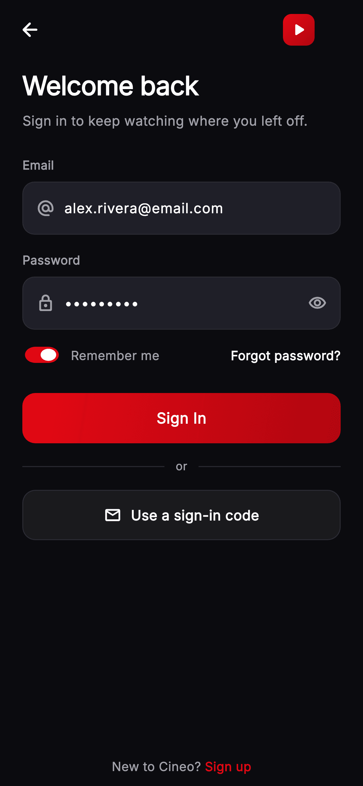
This tutorial builds the Cineo sign-in screen in Flutter — email and password fields on a near-black canvas, a remember-me switch, a forgot link, a gradient CTA and a passwordless alternative. Two details are worth the read: the remember-me `Switch` is shrunk to 26×42 by wrapping it in a `FittedBox`, which is the only reliable way to resize Material's fixed-size switch, and the primary button uses `Ink` so a gradient fill can still show a tap ripple.
Watch the Flutter UI walkthrough
A short screen recording of Cineo · Sign In running, if you'd rather see it before you read the code. The written tutorial below covers everything in it.
Can't see the video? Watch it on YouTube.
What you'll build
- ✓A compact `Switch` scaled down with `FittedBox(fit: BoxFit.fill)` — no custom toggle
- ✓A gradient primary button that keeps its `InkWell` ripple, via `Ink`
- ✓Dark-theme input fields with `isCollapsed` plus explicit `contentPadding`
- ✓A reusable field widget with an optional trailing widget and a fallback spacer
- ✓An 'or' divider separating password sign-in from a passwordless code
- ✓A pinned sign-up footer that never scrolls away
Step-by-step build
Create the file
Add a new file at lib/stream_auth_login/stream_auth_login_screen.dart in your Flutter project.
Register the bundled fonts
No external packages — this is pure Flutter. It does bundle its design font (Inter), so drop the font file into fonts/ and declare it in pubspec.yaml:
flutter:
  fonts:
    - family: Inter
      fonts:
- asset: fonts/Inter-Regular.ttfBuild it, piece by piece
Here's how the screen goes together. Each block below is a real slice of the code with a plain-English explanation — paste them in order, or grab the whole file from the next section.
Pre-filled controllers and two booleans
class _StreamAuthLoginScreenState extends State<StreamAuthLoginScreen> {
  static const String _font = 'Inter';
  static const Color _bg = Color(0xFF0B0B0F);
  static const Color _surfaceAlt = Color(0xFF1F1F28);
  static const Color _brand = Color(0xFFE50914);
  static const Color _brandDark = Color(0xFFB00610);
  static const Color _text = Color(0xFFFFFFFF);
  static const Color _muted = Color(0xFFA1A1AA);
  static const Color _hairline = Color(0xFF2A2A33);

  final TextEditingController _email =
      TextEditingController(text: 'alex.rivera@email.com');
  final TextEditingController _password =
      TextEditingController(text: 'cineo1234');
  bool _obscure = true;
  bool _remember = true;

  @override
  void dispose() {
    _email.dispose();
    _password.dispose();
    super.dispose();
  }
Both controllers are constructed *with* text — `TextEditingController(text: 'alex.rivera@email.com')` — so the screen demos as a returning user rather than an empty form; swap those to bare constructors for production. State is otherwise just `_obscure` and `_remember`, both defaulting sensibly (password hidden, remember on). `dispose()` releases both controllers; unlike the sign-up form there are no listeners here, because nothing on this screen validates as you type.
Header copy and the two fields
  @override
  Widget build(BuildContext context) {
    return Theme(
      data: ThemeData.dark(useMaterial3: true),
      child: Scaffold(
        backgroundColor: _bg,
        body: SafeArea(
          child: Column(
            children: <Widget>[
              _TopBar(onBack: widget.onBack),
              Expanded(
                child: ListView(
                  padding: const EdgeInsets.fromLTRB(24, 8, 24, 24),
                  children: <Widget>[
                    const Text(
                      'Welcome back',
                      style: TextStyle(
                        fontFamily: _font,
                        fontSize: 28,
                        fontWeight: FontWeight.w800,
                        letterSpacing: -0.5,
                        color: _text,
                      ),
                    ),
                    const SizedBox(height: 8),
                    const Text(
                      'Sign in to keep watching where you left off.',
                      style: TextStyle(
                        fontFamily: _font,
                        fontSize: 14.5,
                        height: 1.4,
                        fontWeight: FontWeight.w400,
                        color: _muted,
                      ),
                    ),
                    const SizedBox(height: 28),
                    const _FieldLabel('Email'),
                    const SizedBox(height: 8),
                    _InputField(
                      controller: _email,
                      hint: 'you@email.com',
                      keyboardType: TextInputType.emailAddress,
                      icon: Icons.alternate_email_rounded,
                    ),
                    const SizedBox(height: 18),
                    const _FieldLabel('Password'),
                    const SizedBox(height: 8),
                    _InputField(
                      controller: _password,
                      hint: 'Your password',
                      icon: Icons.lock_outline_rounded,
                      obscure: _obscure,
                      trailing: IconButton(
                        onPressed: () => setState(() => _obscure = !_obscure),
                        icon: Icon(
                          _obscure
                              ? Icons.visibility_outlined
                              : Icons.visibility_off_outlined,
                          color: _muted,
                          size: 20,
                        ),
                      ),
                    ),
The scrolling body opens with 'Welcome back' at 28px `w800` with `letterSpacing: -0.5` — negative tracking keeps a heavy weight from looking loose at display size — over a muted one-liner that names the benefit ('keep watching where you left off'). Each field is a `_FieldLabel` plus an `_InputField`. The password one passes `obscure: _obscure` and a `trailing` `IconButton` that flips it; using `IconButton` rather than a bare `GestureDetector` here gives the eye toggle Material's standard 48px touch target for free.
Shrinking a Material Switch
                    const SizedBox(height: 14),
                    Row(
                      children: <Widget>[
                        SizedBox(
                          height: 26,
                          width: 42,
                          child: FittedBox(
                            fit: BoxFit.fill,
                            child: Switch(
                              value: _remember,
                              onChanged: (bool v) =>
                                  setState(() => _remember = v),
                              activeThumbColor: Colors.white,
                              activeTrackColor: _brand,
                              inactiveTrackColor: _surfaceAlt,
                            ),
                          ),
                        ),
                        const SizedBox(width: 10),
                        const Text(
                          'Remember me',
                          style: TextStyle(
                            fontFamily: _font,
                            fontSize: 13.5,
                            fontWeight: FontWeight.w500,
                            color: _muted,
                          ),
                        ),
                        const Spacer(),
                        GestureDetector(
                          onTap: widget.onForgot,
                          child: const Text(
                            'Forgot password?',
                            style: TextStyle(
                              fontFamily: _font,
                              fontSize: 13.5,
                              fontWeight: FontWeight.w600,
                              color: _text,
                            ),
                          ),
                        ),
                      ],
                    ),
Material's `Switch` has a fixed intrinsic size and no scale property, so the trick is `SizedBox(height: 26, width: 42)` wrapping `FittedBox(fit: BoxFit.fill)` wrapping the `Switch`. `FittedBox` scales its child's rendered output to the box, giving a compact toggle that still behaves like a real `Switch` — accessibility semantics, animations and all — where a hand-rolled one wouldn't. The rest of the row is a label, a `Spacer()`, and the 'Forgot password?' link pushed hard right.
Primary CTA, divider, passwordless option
                    const SizedBox(height: 28),
                    _PrimaryButton(label: 'Sign In', onTap: widget.onSignIn),
                    const SizedBox(height: 16),
                    Row(
                      children: const <Widget>[
                        Expanded(child: Divider(color: _hairline, height: 1)),
                        Padding(
                          padding: EdgeInsets.symmetric(horizontal: 12),
                          child: Text(
                            'or',
                            style: TextStyle(
                              fontFamily: _font,
                              fontSize: 12.5,
                              fontWeight: FontWeight.w500,
                              color: _muted,
                            ),
                          ),
                        ),
                        Expanded(child: Divider(color: _hairline, height: 1)),
                      ],
                    ),
                    const SizedBox(height: 16),
                    _GhostButton(
                      label: 'Use a sign-in code',
                      icon: Icons.email_outlined,
                      onTap: widget.onSignIn,
                    ),
Below the CTA, the 'or' divider is two `Expanded` `Divider`s with padded text between them, so the rules fill whatever the word doesn't. Then `_GhostButton` offers 'Use a sign-in code' with a mail icon — the passwordless path, presented as a genuine alternative rather than buried in a link. Both buttons are 54px and full-width, so the choice reads as equal in effort even though the visual weight (gradient versus 6% white) makes clear which one is primary.
The pinned sign-up footer
              Padding(
                padding: const EdgeInsets.fromLTRB(24, 4, 24, 12),
                child: Row(
                  mainAxisAlignment: MainAxisAlignment.center,
                  children: <Widget>[
                    const Text(
                      "New to Cineo? ",
                      style: TextStyle(
                        fontFamily: _font,
                        fontSize: 13.5,
                        fontWeight: FontWeight.w400,
                        color: _muted,
                      ),
                    ),
                    GestureDetector(
                      onTap: widget.onSignUp,
                      child: const Text(
                        'Sign up',
                        style: TextStyle(
                          fontFamily: _font,
                          fontSize: 13.5,
                          fontWeight: FontWeight.w700,
                          color: _brand,
                        ),
                      ),
                    ),
                  ],
                ),
              ),
This `Padding` sits *outside* the `Expanded` `ListView`, which is what keeps 'New to Cineo? Sign up' visible no matter how far the form scrolls — important, because someone who lands here by mistake needs the exit without hunting for it. It's built as two widgets rather than one rich span: a plain muted `Text` and a `GestureDetector` around the brand-red 'Sign up'. When only the tail is interactive, that's simpler and more reliable than a `TapGestureRecognizer` inside a `TextSpan`.
The input field and the gradient button
class _InputField extends StatelessWidget {
  const _InputField({
    required this.controller,
    required this.hint,
    required this.icon,
    this.obscure = false,
    this.trailing,
    this.keyboardType,
  });

  final TextEditingController controller;
  final String hint;
  final IconData icon;
  final bool obscure;
  final Widget? trailing;
  final TextInputType? keyboardType;

  @override
  Widget build(BuildContext context) {
    return Container(
      decoration: BoxDecoration(
        color: _StreamAuthLoginScreenState._surfaceAlt,
        borderRadius: BorderRadius.circular(13),
        border: Border.all(color: _StreamAuthLoginScreenState._hairline),
      ),
      child: Row(
        children: <Widget>[
          Padding(
            padding: const EdgeInsets.only(left: 14, right: 10),
            child: Icon(icon,
                size: 20, color: _StreamAuthLoginScreenState._muted),
          ),
          Expanded(
            child: TextField(
              controller: controller,
              obscureText: obscure,
              keyboardType: keyboardType,
              cursorColor: _StreamAuthLoginScreenState._brand,
              style: const TextStyle(
                fontFamily: _StreamAuthLoginScreenState._font,
                fontSize: 15,
                fontWeight: FontWeight.w500,
                color: _StreamAuthLoginScreenState._text,
              ),
              decoration: InputDecoration(
                isCollapsed: true,
                contentPadding: const EdgeInsets.symmetric(vertical: 16),
                border: InputBorder.none,
                hintText: hint,
                hintStyle: const TextStyle(
                  fontFamily: _StreamAuthLoginScreenState._font,
                  fontSize: 15,
                  fontWeight: FontWeight.w400,
                  color: _StreamAuthLoginScreenState._muted,
                ),
              ),
            ),
          ),
          if (trailing != null) trailing! else const SizedBox(width: 14),
        ],
      ),
    );
  }
}

class _PrimaryButton extends StatelessWidget {
  const _PrimaryButton({required this.label, this.onTap});

  final String label;
  final VoidCallback? onTap;

  @override
  Widget build(BuildContext context) {
    return SizedBox(
      width: double.infinity,
      height: 54,
      child: Material(
        color: Colors.transparent,
        borderRadius: BorderRadius.circular(14),
        child: InkWell(
          onTap: onTap,
          borderRadius: BorderRadius.circular(14),
          child: Ink(
            decoration: BoxDecoration(
              borderRadius: BorderRadius.circular(14),
              gradient: const LinearGradient(
                begin: Alignment.topLeft,
                end: Alignment.bottomRight,
                colors: <Color>[
                  _StreamAuthLoginScreenState._brand,
                  _StreamAuthLoginScreenState._brandDark,
                ],
              ),
            ),
            child: Center(
              child: Text(
                label,
                style: const TextStyle(
                  fontFamily: _StreamAuthLoginScreenState._font,
                  fontSize: 16,
                  fontWeight: FontWeight.w700,
                  letterSpacing: 0.3,
                  color: Colors.white,
                ),
              ),
            ),
          ),
        ),
      ),
    );
  }
}
`_InputField` pairs `isCollapsed: true` with an explicit `contentPadding: EdgeInsets.symmetric(vertical: 16)`. `isCollapsed` strips Material's default padding entirely, and the explicit vertical padding then sets the field's height — that's how the container gets its size without a hard-coded `height`, so it still grows if the text scales up for accessibility. Line 341 is a neat touch: `if (trailing != null) trailing! else const SizedBox(width: 14)` — when there's no trailing widget, a spacer keeps the right inset matching the left. `_PrimaryButton` uses the `Material(transparent)` → `InkWell` → `Ink(gradient)` sandwich, which is the only way to have both a gradient fill and a visible ripple; a gradient `Container` inside the `InkWell` would paint over the splash.
Full code
The complete, ready-to-paste source. Free to use in your projects — one click copies it all.
import 'package:flutter/material.dart';
/// Sign In — email + password entry for the **Cineo** streaming app. Painted
/// brand header over a subtle glow, email/password fields with a show/hide
/// toggle, remember-me switch + forgot link, a pinned brand-red "Sign In" CTA, a
/// "Use a sign-in code" alternative, and a sign-up footer. Self-contained per
/// CONVENTIONS.md (pure Flutter, bundled Inter, own dark theme, real states).
class StreamAuthLoginScreen extends StatefulWidget {
const StreamAuthLoginScreen({
super.key,
this.onBack,
this.onSignIn,
this.onSignUp,
this.onForgot,
});
final VoidCallback? onBack;
final VoidCallback? onSignIn;
final VoidCallback? onSignUp;
final VoidCallback? onForgot;
@override
State<StreamAuthLoginScreen> createState() => _StreamAuthLoginScreenState();
}
class _StreamAuthLoginScreenState extends State<StreamAuthLoginScreen> {
static const String _font = 'Inter';
static const Color _bg = Color(0xFF0B0B0F);
static const Color _surfaceAlt = Color(0xFF1F1F28);
static const Color _brand = Color(0xFFE50914);
static const Color _brandDark = Color(0xFFB00610);
static const Color _text = Color(0xFFFFFFFF);
static const Color _muted = Color(0xFFA1A1AA);
static const Color _hairline = Color(0xFF2A2A33);
final TextEditingController _email =
TextEditingController(text: 'alex.rivera@email.com');
final TextEditingController _password =
TextEditingController(text: 'cineo1234');
bool _obscure = true;
bool _remember = true;
@override
void dispose() {
_email.dispose();
_password.dispose();
super.dispose();
}
@override
Widget build(BuildContext context) {
return Theme(
data: ThemeData.dark(useMaterial3: true),
child: Scaffold(
backgroundColor: _bg,
body: SafeArea(
child: Column(
children: <Widget>[
_TopBar(onBack: widget.onBack),
Expanded(
child: ListView(
padding: const EdgeInsets.fromLTRB(24, 8, 24, 24),
children: <Widget>[
const Text(
'Welcome back',
style: TextStyle(
fontFamily: _font,
fontSize: 28,
fontWeight: FontWeight.w800,
letterSpacing: -0.5,
color: _text,
),
),
const SizedBox(height: 8),
const Text(
'Sign in to keep watching where you left off.',
style: TextStyle(
fontFamily: _font,
fontSize: 14.5,
height: 1.4,
fontWeight: FontWeight.w400,
color: _muted,
),
),
const SizedBox(height: 28),
const _FieldLabel('Email'),
const SizedBox(height: 8),
_InputField(
controller: _email,
hint: 'you@email.com',
keyboardType: TextInputType.emailAddress,
icon: Icons.alternate_email_rounded,
),
const SizedBox(height: 18),
const _FieldLabel('Password'),
const SizedBox(height: 8),
_InputField(
controller: _password,
hint: 'Your password',
icon: Icons.lock_outline_rounded,
obscure: _obscure,
trailing: IconButton(
onPressed: () => setState(() => _obscure = !_obscure),
icon: Icon(
_obscure
? Icons.visibility_outlined
: Icons.visibility_off_outlined,
color: _muted,
size: 20,
),
),
),
const SizedBox(height: 14),
Row(
children: <Widget>[
SizedBox(
height: 26,
width: 42,
child: FittedBox(
fit: BoxFit.fill,
child: Switch(
value: _remember,
onChanged: (bool v) =>
setState(() => _remember = v),
activeThumbColor: Colors.white,
activeTrackColor: _brand,
inactiveTrackColor: _surfaceAlt,
),
),
),
const SizedBox(width: 10),
const Text(
'Remember me',
style: TextStyle(
fontFamily: _font,
fontSize: 13.5,
fontWeight: FontWeight.w500,
color: _muted,
),
),
const Spacer(),
GestureDetector(
onTap: widget.onForgot,
child: const Text(
'Forgot password?',
style: TextStyle(
fontFamily: _font,
fontSize: 13.5,
fontWeight: FontWeight.w600,
color: _text,
),
),
),
],
),
const SizedBox(height: 28),
_PrimaryButton(label: 'Sign In', onTap: widget.onSignIn),
const SizedBox(height: 16),
Row(
children: const <Widget>[
Expanded(child: Divider(color: _hairline, height: 1)),
Padding(
padding: EdgeInsets.symmetric(horizontal: 12),
child: Text(
'or',
style: TextStyle(
fontFamily: _font,
fontSize: 12.5,
fontWeight: FontWeight.w500,
color: _muted,
),
),
),
Expanded(child: Divider(color: _hairline, height: 1)),
],
),
const SizedBox(height: 16),
_GhostButton(
label: 'Use a sign-in code',
icon: Icons.email_outlined,
onTap: widget.onSignIn,
),
],
),
),
Padding(
padding: const EdgeInsets.fromLTRB(24, 4, 24, 12),
child: Row(
mainAxisAlignment: MainAxisAlignment.center,
children: <Widget>[
const Text(
"New to Cineo? ",
style: TextStyle(
fontFamily: _font,
fontSize: 13.5,
fontWeight: FontWeight.w400,
color: _muted,
),
),
GestureDetector(
onTap: widget.onSignUp,
child: const Text(
'Sign up',
style: TextStyle(
fontFamily: _font,
fontSize: 13.5,
fontWeight: FontWeight.w700,
color: _brand,
),
),
),
],
),
),
],
),
),
),
);
}
}
class _TopBar extends StatelessWidget {
const _TopBar({this.onBack});
final VoidCallback? onBack;
@override
Widget build(BuildContext context) {
return Padding(
padding: const EdgeInsets.fromLTRB(8, 8, 8, 8),
child: Row(
children: <Widget>[
IconButton(
onPressed: onBack,
icon: const Icon(Icons.arrow_back_rounded,
color: _StreamAuthLoginScreenState._text),
),
const Spacer(),
Container(
width: 34,
height: 34,
decoration: BoxDecoration(
borderRadius: BorderRadius.circular(9),
gradient: const LinearGradient(
begin: Alignment.topLeft,
end: Alignment.bottomRight,
colors: <Color>[
_StreamAuthLoginScreenState._brand,
_StreamAuthLoginScreenState._brandDark,
],
),
),
child: const Icon(Icons.play_arrow_rounded,
color: Colors.white, size: 22),
),
const SizedBox(width: 44),
],
),
);
}
}
class _FieldLabel extends StatelessWidget {
const _FieldLabel(this.text);
final String text;
@override
Widget build(BuildContext context) {
return Text(
text,
style: const TextStyle(
fontFamily: _StreamAuthLoginScreenState._font,
fontSize: 13,
fontWeight: FontWeight.w600,
color: _StreamAuthLoginScreenState._muted,
),
);
}
}
class _InputField extends StatelessWidget {
const _InputField({
required this.controller,
required this.hint,
required this.icon,
this.obscure = false,
this.trailing,
this.keyboardType,
});
final TextEditingController controller;
final String hint;
final IconData icon;
final bool obscure;
final Widget? trailing;
final TextInputType? keyboardType;
@override
Widget build(BuildContext context) {
return Container(
decoration: BoxDecoration(
color: _StreamAuthLoginScreenState._surfaceAlt,
borderRadius: BorderRadius.circular(13),
border: Border.all(color: _StreamAuthLoginScreenState._hairline),
),
child: Row(
children: <Widget>[
Padding(
padding: const EdgeInsets.only(left: 14, right: 10),
child: Icon(icon,
size: 20, color: _StreamAuthLoginScreenState._muted),
),
Expanded(
child: TextField(
controller: controller,
obscureText: obscure,
keyboardType: keyboardType,
cursorColor: _StreamAuthLoginScreenState._brand,
style: const TextStyle(
fontFamily: _StreamAuthLoginScreenState._font,
fontSize: 15,
fontWeight: FontWeight.w500,
color: _StreamAuthLoginScreenState._text,
),
decoration: InputDecoration(
isCollapsed: true,
contentPadding: const EdgeInsets.symmetric(vertical: 16),
border: InputBorder.none,
hintText: hint,
hintStyle: const TextStyle(
fontFamily: _StreamAuthLoginScreenState._font,
fontSize: 15,
fontWeight: FontWeight.w400,
color: _StreamAuthLoginScreenState._muted,
),
),
),
),
if (trailing != null) trailing! else const SizedBox(width: 14),
],
),
);
}
}
class _PrimaryButton extends StatelessWidget {
const _PrimaryButton({required this.label, this.onTap});
final String label;
final VoidCallback? onTap;
@override
Widget build(BuildContext context) {
return SizedBox(
width: double.infinity,
height: 54,
child: Material(
color: Colors.transparent,
borderRadius: BorderRadius.circular(14),
child: InkWell(
onTap: onTap,
borderRadius: BorderRadius.circular(14),
child: Ink(
decoration: BoxDecoration(
borderRadius: BorderRadius.circular(14),
gradient: const LinearGradient(
begin: Alignment.topLeft,
end: Alignment.bottomRight,
colors: <Color>[
_StreamAuthLoginScreenState._brand,
_StreamAuthLoginScreenState._brandDark,
],
),
),
child: Center(
child: Text(
label,
style: const TextStyle(
fontFamily: _StreamAuthLoginScreenState._font,
fontSize: 16,
fontWeight: FontWeight.w700,
letterSpacing: 0.3,
color: Colors.white,
),
),
),
),
),
),
);
}
}
class _GhostButton extends StatelessWidget {
const _GhostButton({required this.label, required this.icon, this.onTap});
final String label;
final IconData icon;
final VoidCallback? onTap;
@override
Widget build(BuildContext context) {
return SizedBox(
width: double.infinity,
height: 54,
child: Material(
color: Colors.white.withValues(alpha: 0.06),
borderRadius: BorderRadius.circular(14),
child: InkWell(
onTap: onTap,
borderRadius: BorderRadius.circular(14),
child: Container(
decoration: BoxDecoration(
borderRadius: BorderRadius.circular(14),
border: Border.all(color: _StreamAuthLoginScreenState._hairline),
),
child: Row(
mainAxisAlignment: MainAxisAlignment.center,
children: <Widget>[
Icon(icon, size: 19, color: _StreamAuthLoginScreenState._text),
const SizedBox(width: 10),
Text(
label,
style: const TextStyle(
fontFamily: _StreamAuthLoginScreenState._font,
fontSize: 15,
fontWeight: FontWeight.w600,
color: _StreamAuthLoginScreenState._text,
),
),
],
),
),
),
),
);
}
}
Plus bundled 1 binary asset (fonts/images). The CLI and MCP install those for you automatically.
Two faster ways to add it
Copy-paste works, but you can skip it entirely.
1. FlutterKit CLI
One command drops this screen — and its fonts — straight into your project.
$ flutterkit add stream-auth-login2. AI agent (MCP)
Connect FlutterKit's MCP server in Claude or Cursor and just ask your agent to install stream-auth-login — it fetches and writes the files for you.
FAQ
Is this sign-in screen free to use?
Yes. The complete Dart source on this page is free for personal and commercial apps. Copy it from the code block, install it with the FlutterKit CLI (flutterkit add stream-auth-login), or add it through an AI agent over MCP.
How do I make the Switch smaller?
Wrap it in a SizedBox of the size you want and a FittedBox(fit: BoxFit.fill). Switch has a fixed intrinsic size and no scale property, so FittedBox is the reliable way — and you keep the real widget's animations and accessibility semantics.
Why are the email and password pre-filled?
So the screen demos as a returning user rather than an empty form. For production, replace TextEditingController(text: '…') with a bare TextEditingController() in both places.
How do I add validation and a disabled button?
Add listeners to both controllers in initState (calling setState), then compute a bool valid getter and pass onTap: valid ? widget.onSignIn : null to _PrimaryButton. Give the button a dimmed variant for the null case so the disabled state reads clearly.
Which Flutter version does it target?
Switch's activeThumbColor and Color.withValues(alpha:) both need a recent SDK, so target Flutter 3.27+. On older versions use activeColor instead of activeThumbColor and withOpacity(x) instead of withValues(alpha: x).


