How to Build a Subscription Success Screen with Confetti in Flutter (Full Code + Preview)
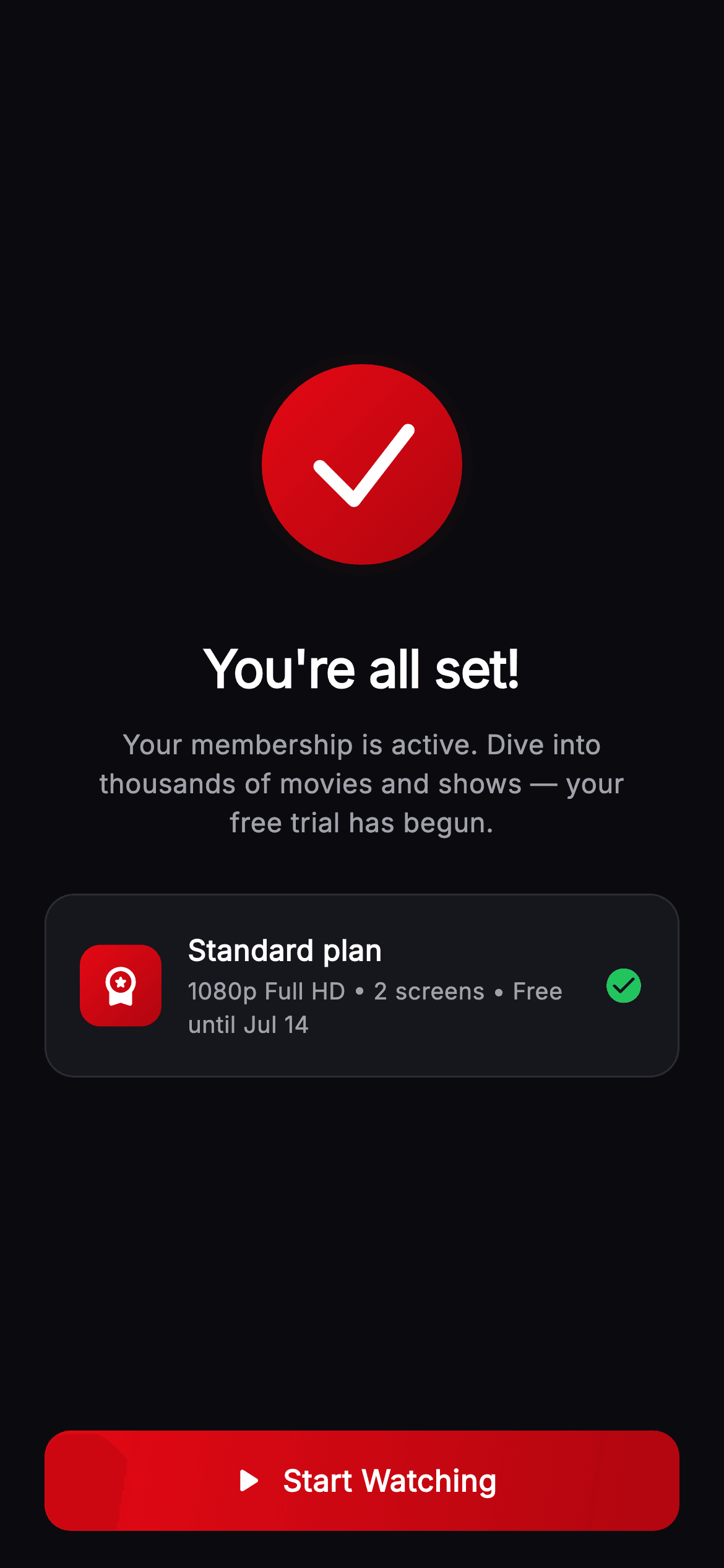
A signup ends the moment the payment clears, and the screen that follows decides whether the new member starts watching tonight or forgets they subscribed. Cineo's does three things: it celebrates with a painted confetti burst, restates exactly what was bought — plan, resolution, screens and trial end date — and offers one button. You'll build a one-shot animation that fades as it falls, a check mark painted inside a gradient ring, and a ripple that works over a gradient fill.
Watch the Flutter UI walkthrough
A short screen recording of Cineo · All Set running, if you'd rather see it before you read the code. The written tutorial below covers everything in it.
Can't see the video? Watch it on YouTube.
What you'll build
- ✓A confetti burst painted from deterministic pseudo-random seeds, with no packages
- ✓A celebration layer that ignores pointers so the button underneath stays tappable
- ✓A success check drawn as a three-point path inside a gradient ring with a radial glow
- ✓A plan card that restates resolution, screen count and the trial end date
- ✓A gradient CTA that still shows a proper Material ripple
Step-by-step build
Create the file
Add a new file at lib/stream_auth_welcome_success/stream_auth_welcome_success_screen.dart in your Flutter project.
Register the bundled fonts
No external packages — this is pure Flutter. It does bundle its design font (Inter), so drop the font file into fonts/ and declare it in pubspec.yaml:
flutter:
  fonts:
    - family: Inter
      fonts:
- asset: fonts/Inter-Regular.ttfBuild it, piece by piece
Here's how the screen goes together. Each block below is a real slice of the code with a plain-English explanation — paste them in order, or grab the whole file from the next section.
One controller, played once
import 'dart:math' as math;

import 'package:flutter/material.dart';

/// All Set — membership-success screen for the **Cineo** streaming app. A painted
/// success check inside a brand ring with a `_ConfettiPainter` burst, a plan
/// summary card and a full-width "Start Watching" CTA that drops the user into
/// the app. Self-contained per CONVENTIONS.md (pure Flutter, bundled Inter, own
/// dark theme, painted celebration, fixed-height CTA).
class StreamAuthWelcomeSuccessScreen extends StatefulWidget {
  const StreamAuthWelcomeSuccessScreen({super.key, this.onStartWatching});

  final VoidCallback? onStartWatching;

  @override
  State<StreamAuthWelcomeSuccessScreen> createState() =>
      _StreamAuthWelcomeSuccessScreenState();
}

class _StreamAuthWelcomeSuccessScreenState
    extends State<StreamAuthWelcomeSuccessScreen>
    with SingleTickerProviderStateMixin {
  static const String _font = 'Inter';
  static const Color _bg = Color(0xFF0B0B0F);
  static const Color _surface = Color(0xFF16161D);
  static const Color _brand = Color(0xFFE50914);
  static const Color _brandDark = Color(0xFFB00610);
  static const Color _text = Color(0xFFFFFFFF);
  static const Color _muted = Color(0xFFA1A1AA);
  static const Color _hairline = Color(0xFF2A2A33);
  static const Color _success = Color(0xFF22C55E);

  late final AnimationController _controller;

  @override
  void initState() {
    super.initState();
    _controller = AnimationController(
      vsync: this,
      duration: const Duration(milliseconds: 2200),
    )..forward();
  }

  @override
  void dispose() {
    _controller.dispose();
    super.dispose();
  }
The state mixes in `SingleTickerProviderStateMixin` for a single `AnimationController` of 2200ms started with `..forward()` — not `..repeat()`. That one character is the difference between a celebration and a distraction: the confetti falls once and stops, leaving a calm screen for the CTA. The palette pairs Cineo's `_brand` red `0xFFE50914` with a darker `_brandDark` for every gradient on the screen, plus a separate `_success` green used only on the plan card's tick.
Confetti behind, content in front
  @override
  Widget build(BuildContext context) {
    return Theme(
      data: ThemeData.dark(useMaterial3: true),
      child: Scaffold(
        backgroundColor: _bg,
        body: SafeArea(
          child: Stack(
            children: <Widget>[
              Positioned.fill(
                child: IgnorePointer(
                  child: AnimatedBuilder(
                    animation: _controller,
                    builder: (BuildContext context, Widget? child) {
                      return CustomPaint(
                        painter: _ConfettiPainter(progress: _controller.value),
                      );
                    },
                  ),
                ),
              ),
              Column(
                children: <Widget>[
                  const Spacer(),
                  const SizedBox(
                    width: 120,
                    height: 120,
                    child: CustomPaint(painter: _SuccessCheckPainter()),
                  ),
                  const SizedBox(height: 30),
The body is a `Stack`. The confetti sits in a `Positioned.fill` wrapped in `IgnorePointer`, which is the detail that matters — without it the full-screen `CustomPaint` would swallow taps meant for the Start Watching button beneath it. Only that layer is inside the `AnimatedBuilder`, so the animation repaints the confetti alone. The success check below it is a `const CustomPaint` in a fixed 120×120 box, deliberately outside the builder: it never changes, so it is painted once and left alone while 46 confetti pieces redraw every frame.
The headline and the promise
                  const Text(
                    "You're all set!",
                    style: TextStyle(
                      fontFamily: _font,
                      fontSize: 28,
                      fontWeight: FontWeight.w800,
                      letterSpacing: -0.5,
                      color: _text,
                    ),
                  ),
                  const SizedBox(height: 10),
                  const Padding(
                    padding: EdgeInsets.symmetric(horizontal: 44),
                    child: Text(
                      'Your membership is active. Dive into thousands of '
                      'movies and shows — your free trial has begun.',
                      textAlign: TextAlign.center,
                      style: TextStyle(
                        fontFamily: _font,
                        fontSize: 14.5,
                        height: 1.45,
                        fontWeight: FontWeight.w400,
                        color: _muted,
                      ),
                    ),
                  ),
                  const SizedBox(height: 28),
The headline is 28px `w800` at `letterSpacing: -0.5` — the largest type on the screen, tightened so the heavy weight does not look airy. The paragraph beneath is padded 44px on each side rather than sized by character count, which is what keeps it to two comfortable lines on a phone, and `height: 1.45` opens the leading for the muted grey. Its second clause, 'your free trial has begun', is doing real work: it tells the member the clock has started without making them go and check an email.
The plan card, and where the CTA sits
                  Padding(
                    padding: const EdgeInsets.symmetric(horizontal: 24),
                    child: Container(
                      padding: const EdgeInsets.all(18),
                      decoration: BoxDecoration(
                        color: _surface,
                        borderRadius: BorderRadius.circular(16),
                        border: Border.all(color: _hairline),
                      ),
                      child: Row(
                        children: <Widget>[
                          Container(
                            width: 44,
                            height: 44,
                            decoration: BoxDecoration(
                              borderRadius: BorderRadius.circular(11),
                              gradient: const LinearGradient(
                                begin: Alignment.topLeft,
                                end: Alignment.bottomRight,
                                colors: <Color>[_brand, _brandDark],
                              ),
                            ),
                            child: const Icon(Icons.workspace_premium_rounded,
                                color: Colors.white, size: 24),
                          ),
                          const SizedBox(width: 14),
                          const Expanded(
                            child: Column(
                              crossAxisAlignment: CrossAxisAlignment.start,
                              children: <Widget>[
                                Text(
                                  'Standard plan',
                                  style: TextStyle(
                                    fontFamily: _font,
                                    fontSize: 15.5,
                                    fontWeight: FontWeight.w700,
                                    color: _text,
                                  ),
                                ),
                                SizedBox(height: 3),
                                Text(
                                  '1080p Full HD • 2 screens • Free until Jul 14',
                                  style: TextStyle(
                                    fontFamily: _font,
                                    fontSize: 12.5,
                                    fontWeight: FontWeight.w500,
                                    color: _muted,
                                  ),
                                ),
                              ],
                            ),
                          ),
                          const Icon(Icons.check_circle_rounded,
                              color: _success, size: 22),
                        ],
                      ),
                    ),
                  ),
                  const Spacer(),
                  Padding(
                    padding: const EdgeInsets.fromLTRB(24, 0, 24, 20),
                    child: _PrimaryButton(
                      label: 'Start Watching',
                      onTap: widget.onStartWatching,
                    ),
                  ),
                ],
              ),
            ],
          ),
        ),
      ),
    );
  }
The plan card is a `_surface` panel with a hairline border holding a 44px gradient tile, two lines of copy and a green check. The subtitle — `'1080p Full HD • 2 screens • Free until Jul 14'` — packs the three facts a new subscriber actually wants into one bullet-separated line: what quality they get, how many people can watch, and when they start paying. Between the card and the button sits the second `Spacer()`; with one above the check mark too, the content group floats optically centred while the CTA is pushed to a fixed 20px above the safe-area edge.
A ripple over a gradient
class _PrimaryButton extends StatelessWidget {
  const _PrimaryButton({required this.label, this.onTap});

  final String label;
  final VoidCallback? onTap;

  @override
  Widget build(BuildContext context) {
    return SizedBox(
      width: double.infinity,
      height: 54,
      child: Material(
        color: Colors.transparent,
        borderRadius: BorderRadius.circular(14),
        child: InkWell(
          onTap: onTap,
          borderRadius: BorderRadius.circular(14),
          child: Ink(
            decoration: BoxDecoration(
              borderRadius: BorderRadius.circular(14),
              gradient: const LinearGradient(
                begin: Alignment.topLeft,
                end: Alignment.bottomRight,
                colors: <Color>[
                  _StreamAuthWelcomeSuccessScreenState._brand,
                  _StreamAuthWelcomeSuccessScreenState._brandDark,
                ],
              ),
            ),
            child: Row(
              mainAxisAlignment: MainAxisAlignment.center,
              children: <Widget>[
                const Icon(Icons.play_arrow_rounded,
                    color: Colors.white, size: 22),
                const SizedBox(width: 8),
                Text(
                  label,
                  style: const TextStyle(
                    fontFamily: _StreamAuthWelcomeSuccessScreenState._font,
                    fontSize: 16,
                    fontWeight: FontWeight.w700,
                    letterSpacing: 0.3,
                    color: Colors.white,
                  ),
                ),
              ],
            ),
          ),
        ),
      ),
    );
  }
}
`_PrimaryButton` solves a common Flutter problem: a `Container` with a gradient `decoration` inside an `InkWell` hides the splash, because the container paints over the Material that the ink is drawn on. The fix used here is the `Material` → `InkWell` → `Ink` sandwich. `Material` is transparent, the `InkWell` provides the gesture and clips the splash to a 14px radius, and `Ink` paints the gradient *into* the Material itself so the ripple renders above it. The label pairs a play glyph with the text at `letterSpacing: 0.3`, and the whole button is a fixed 54px tall.
Painting the check
/// Painted brand-red ring with a soft glow and a white check mark.
class _SuccessCheckPainter extends CustomPainter {
  const _SuccessCheckPainter();

  @override
  void paint(Canvas canvas, Size size) {
    final Offset c = Offset(size.width / 2, size.height / 2);
    final double r = size.width / 2 - 6;

    canvas.drawCircle(
      c,
      r + 8,
      Paint()
        ..shader = RadialGradient(
          colors: <Color>[
            _StreamAuthWelcomeSuccessScreenState._brand
                .withValues(alpha: 0.30),
            _StreamAuthWelcomeSuccessScreenState._brand.withValues(alpha: 0.0),
          ],
        ).createShader(Rect.fromCircle(center: c, radius: r + 8)),
    );

    canvas.drawCircle(
      c,
      r,
      Paint()
        ..shader = const LinearGradient(
          begin: Alignment.topLeft,
          end: Alignment.bottomRight,
          colors: <Color>[
            _StreamAuthWelcomeSuccessScreenState._brand,
            _StreamAuthWelcomeSuccessScreenState._brandDark,
          ],
        ).createShader(Rect.fromCircle(center: c, radius: r)),
    );

    final Paint check = Paint()
      ..color = Colors.white
      ..style = PaintingStyle.stroke
      ..strokeWidth = 7
      ..strokeCap = StrokeCap.round
      ..strokeJoin = StrokeJoin.round;
    final Path path = Path()
      ..moveTo(c.dx - r * 0.42, c.dy + r * 0.02)
      ..lineTo(c.dx - r * 0.08, c.dy + r * 0.36)
      ..lineTo(c.dx + r * 0.46, c.dy - r * 0.34);
    canvas.drawPath(path, check);
  }

  @override
  bool shouldRepaint(covariant _SuccessCheckPainter oldDelegate) => false;
}
`_SuccessCheckPainter` layers three things. A `RadialGradient` disc at `r + 8` running from brand red at `alpha: 0.30` out to fully transparent gives the ring a soft glow with no shadow or blur filter. Over it, a solid circle at `r` filled with the same topLeft→bottomRight brand gradient. The check itself is a three-point `Path` — down-left, to the elbow, up-right — stroked 7px with `StrokeCap.round` and `StrokeJoin.round`, so both ends and the corner are rounded. Every point is a fraction of `r`, and the elbow sits below centre at `c.dy + r * 0.36`, which is what makes it read as a tick rather than a checkmark-shaped V.
Deterministic confetti
/// A one-shot confetti burst — seeded pieces fall and fade as [progress] runs
/// 0→1. Colors pull from the Cineo accent palette.
class _ConfettiPainter extends CustomPainter {
  const _ConfettiPainter({required this.progress});

  final double progress;

  static const List<Color> _colors = <Color>[
    Color(0xFFE50914),
    Color(0xFFF5C518),
    Color(0xFF3B82F6),
    Color(0xFF22C55E),
    Color(0xFFFFFFFF),
  ];

  @override
  void paint(Canvas canvas, Size size) {
    if (progress <= 0) return;
    const int count = 46;
    for (int i = 0; i < count; i++) {
      final double seed = (i * 9301 + 49297) % 233280 / 233280;
      final double seed2 = (i * 4021 + 12763) % 233280 / 233280;
      final double startX = size.width * seed;
      final double drift = (seed2 - 0.5) * 60;
      final double fall = size.height * 0.75 * progress * (0.6 + seed2 * 0.8);
      final double y = size.height * 0.28 + fall;
      final double x = startX + drift * progress;
      final double opacity = (1.0 - progress).clamp(0.0, 1.0);
      final Color color =
          _colors[i % _colors.length].withValues(alpha: opacity);
      final double rot = seed * math.pi * 4 + progress * 6;
      canvas.save();
      canvas.translate(x, y);
      canvas.rotate(rot);
      final double w = 6 + seed2 * 4;
      canvas.drawRRect(
        RRect.fromRectAndRadius(
          Rect.fromCenter(center: Offset.zero, width: w, height: w * 0.5),
          const Radius.circular(1.5),
        ),
        Paint()..color = color,
      );
      canvas.restore();
    }
  }

  @override
  bool shouldRepaint(covariant _ConfettiPainter oldDelegate) =>
      oldDelegate.progress != progress;
}
The burst uses no `Random` at all. Each of the 46 pieces derives two values from its index with a linear congruential formula — `(i * 9301 + 49297) % 233280 / 233280` — giving a stable pseudo-random pair per piece. That determinism is the point: with a real RNG, every rebuild would reshuffle the confetti mid-flight. From those seeds it computes a horizontal start, a sideways `drift`, a `fall` scaled by `progress`, a rotation, and an opacity of `1.0 - progress` so the pieces fade out exactly as they land. Each piece is drawn by `save`/`translate`/`rotate` then an `RRect` half as tall as it is wide — a ribbon, not a dot — and `restore` returns the canvas for the next one.
Full code
The complete, ready-to-paste source. Free to use in your projects — one click copies it all.
import 'dart:math' as math;

import 'package:flutter/material.dart';

/// All Set — membership-success screen for the **Cineo** streaming app. A painted
/// success check inside a brand ring with a `_ConfettiPainter` burst, a plan
/// summary card and a full-width "Start Watching" CTA that drops the user into
/// the app. Self-contained per CONVENTIONS.md (pure Flutter, bundled Inter, own
/// dark theme, painted celebration, fixed-height CTA).
class StreamAuthWelcomeSuccessScreen extends StatefulWidget {
  const StreamAuthWelcomeSuccessScreen({super.key, this.onStartWatching});

  final VoidCallback? onStartWatching;

  @override
  State<StreamAuthWelcomeSuccessScreen> createState() =>
      _StreamAuthWelcomeSuccessScreenState();
}

class _StreamAuthWelcomeSuccessScreenState
    extends State<StreamAuthWelcomeSuccessScreen>
    with SingleTickerProviderStateMixin {
  static const String _font = 'Inter';
  static const Color _bg = Color(0xFF0B0B0F);
  static const Color _surface = Color(0xFF16161D);
  static const Color _brand = Color(0xFFE50914);
  static const Color _brandDark = Color(0xFFB00610);
  static const Color _text = Color(0xFFFFFFFF);
  static const Color _muted = Color(0xFFA1A1AA);
  static const Color _hairline = Color(0xFF2A2A33);
  static const Color _success = Color(0xFF22C55E);

  late final AnimationController _controller;

  @override
  void initState() {
    super.initState();
    _controller = AnimationController(
      vsync: this,
      duration: const Duration(milliseconds: 2200),
    )..forward();
  }

  @override
  void dispose() {
    _controller.dispose();
    super.dispose();
  }

  @override
  Widget build(BuildContext context) {
    return Theme(
      data: ThemeData.dark(useMaterial3: true),
      child: Scaffold(
        backgroundColor: _bg,
        body: SafeArea(
          child: Stack(
            children: <Widget>[
              Positioned.fill(
                child: IgnorePointer(
                  child: AnimatedBuilder(
                    animation: _controller,
                    builder: (BuildContext context, Widget? child) {
                      return CustomPaint(
                        painter: _ConfettiPainter(progress: _controller.value),
                      );
                    },
                  ),
                ),
              ),
              Column(
                children: <Widget>[
                  const Spacer(),
                  const SizedBox(
                    width: 120,
                    height: 120,
                    child: CustomPaint(painter: _SuccessCheckPainter()),
                  ),
                  const SizedBox(height: 30),
                  const Text(
                    "You're all set!",
                    style: TextStyle(
                      fontFamily: _font,
                      fontSize: 28,
                      fontWeight: FontWeight.w800,
                      letterSpacing: -0.5,
                      color: _text,
                    ),
                  ),
                  const SizedBox(height: 10),
                  const Padding(
                    padding: EdgeInsets.symmetric(horizontal: 44),
                    child: Text(
                      'Your membership is active. Dive into thousands of '
                      'movies and shows — your free trial has begun.',
                      textAlign: TextAlign.center,
                      style: TextStyle(
                        fontFamily: _font,
                        fontSize: 14.5,
                        height: 1.45,
                        fontWeight: FontWeight.w400,
                        color: _muted,
                      ),
                    ),
                  ),
                  const SizedBox(height: 28),
                  Padding(
                    padding: const EdgeInsets.symmetric(horizontal: 24),
                    child: Container(
                      padding: const EdgeInsets.all(18),
                      decoration: BoxDecoration(
                        color: _surface,
                        borderRadius: BorderRadius.circular(16),
                        border: Border.all(color: _hairline),
                      ),
                      child: Row(
                        children: <Widget>[
                          Container(
                            width: 44,
                            height: 44,
                            decoration: BoxDecoration(
                              borderRadius: BorderRadius.circular(11),
                              gradient: const LinearGradient(
                                begin: Alignment.topLeft,
                                end: Alignment.bottomRight,
                                colors: <Color>[_brand, _brandDark],
                              ),
                            ),
                            child: const Icon(Icons.workspace_premium_rounded,
                                color: Colors.white, size: 24),
                          ),
                          const SizedBox(width: 14),
                          const Expanded(
                            child: Column(
                              crossAxisAlignment: CrossAxisAlignment.start,
                              children: <Widget>[
                                Text(
                                  'Standard plan',
                                  style: TextStyle(
                                    fontFamily: _font,
                                    fontSize: 15.5,
                                    fontWeight: FontWeight.w700,
                                    color: _text,
                                  ),
                                ),
                                SizedBox(height: 3),
                                Text(
                                  '1080p Full HD • 2 screens • Free until Jul 14',
                                  style: TextStyle(
                                    fontFamily: _font,
                                    fontSize: 12.5,
                                    fontWeight: FontWeight.w500,
                                    color: _muted,
                                  ),
                                ),
                              ],
                            ),
                          ),
                          const Icon(Icons.check_circle_rounded,
                              color: _success, size: 22),
                        ],
                      ),
                    ),
                  ),
                  const Spacer(),
                  Padding(
                    padding: const EdgeInsets.fromLTRB(24, 0, 24, 20),
                    child: _PrimaryButton(
                      label: 'Start Watching',
                      onTap: widget.onStartWatching,
                    ),
                  ),
                ],
              ),
            ],
          ),
        ),
      ),
    );
  }
}

class _PrimaryButton extends StatelessWidget {
  const _PrimaryButton({required this.label, this.onTap});

  final String label;
  final VoidCallback? onTap;

  @override
  Widget build(BuildContext context) {
    return SizedBox(
      width: double.infinity,
      height: 54,
      child: Material(
        color: Colors.transparent,
        borderRadius: BorderRadius.circular(14),
        child: InkWell(
          onTap: onTap,
          borderRadius: BorderRadius.circular(14),
          child: Ink(
            decoration: BoxDecoration(
              borderRadius: BorderRadius.circular(14),
              gradient: const LinearGradient(
                begin: Alignment.topLeft,
                end: Alignment.bottomRight,
                colors: <Color>[
                  _StreamAuthWelcomeSuccessScreenState._brand,
                  _StreamAuthWelcomeSuccessScreenState._brandDark,
                ],
              ),
            ),
            child: Row(
              mainAxisAlignment: MainAxisAlignment.center,
              children: <Widget>[
                const Icon(Icons.play_arrow_rounded,
                    color: Colors.white, size: 22),
                const SizedBox(width: 8),
                Text(
                  label,
                  style: const TextStyle(
                    fontFamily: _StreamAuthWelcomeSuccessScreenState._font,
                    fontSize: 16,
                    fontWeight: FontWeight.w700,
                    letterSpacing: 0.3,
                    color: Colors.white,
                  ),
                ),
              ],
            ),
          ),
        ),
      ),
    );
  }
}

/// Painted brand-red ring with a soft glow and a white check mark.
class _SuccessCheckPainter extends CustomPainter {
  const _SuccessCheckPainter();

  @override
  void paint(Canvas canvas, Size size) {
    final Offset c = Offset(size.width / 2, size.height / 2);
    final double r = size.width / 2 - 6;

    canvas.drawCircle(
      c,
      r + 8,
      Paint()
        ..shader = RadialGradient(
          colors: <Color>[
            _StreamAuthWelcomeSuccessScreenState._brand
                .withValues(alpha: 0.30),
            _StreamAuthWelcomeSuccessScreenState._brand.withValues(alpha: 0.0),
          ],
        ).createShader(Rect.fromCircle(center: c, radius: r + 8)),
    );

    canvas.drawCircle(
      c,
      r,
      Paint()
        ..shader = const LinearGradient(
          begin: Alignment.topLeft,
          end: Alignment.bottomRight,
          colors: <Color>[
            _StreamAuthWelcomeSuccessScreenState._brand,
            _StreamAuthWelcomeSuccessScreenState._brandDark,
          ],
        ).createShader(Rect.fromCircle(center: c, radius: r)),
    );

    final Paint check = Paint()
      ..color = Colors.white
      ..style = PaintingStyle.stroke
      ..strokeWidth = 7
      ..strokeCap = StrokeCap.round
      ..strokeJoin = StrokeJoin.round;
    final Path path = Path()
      ..moveTo(c.dx - r * 0.42, c.dy + r * 0.02)
      ..lineTo(c.dx - r * 0.08, c.dy + r * 0.36)
      ..lineTo(c.dx + r * 0.46, c.dy - r * 0.34);
    canvas.drawPath(path, check);
  }

  @override
  bool shouldRepaint(covariant _SuccessCheckPainter oldDelegate) => false;
}

/// A one-shot confetti burst — seeded pieces fall and fade as [progress] runs
/// 0→1. Colors pull from the Cineo accent palette.
class _ConfettiPainter extends CustomPainter {
  const _ConfettiPainter({required this.progress});

  final double progress;

  static const List<Color> _colors = <Color>[
    Color(0xFFE50914),
    Color(0xFFF5C518),
    Color(0xFF3B82F6),
    Color(0xFF22C55E),
    Color(0xFFFFFFFF),
  ];

  @override
  void paint(Canvas canvas, Size size) {
    if (progress <= 0) return;
    const int count = 46;
    for (int i = 0; i < count; i++) {
      final double seed = (i * 9301 + 49297) % 233280 / 233280;
      final double seed2 = (i * 4021 + 12763) % 233280 / 233280;
      final double startX = size.width * seed;
      final double drift = (seed2 - 0.5) * 60;
      final double fall = size.height * 0.75 * progress * (0.6 + seed2 * 0.8);
      final double y = size.height * 0.28 + fall;
      final double x = startX + drift * progress;
      final double opacity = (1.0 - progress).clamp(0.0, 1.0);
      final Color color =
          _colors[i % _colors.length].withValues(alpha: opacity);
      final double rot = seed * math.pi * 4 + progress * 6;
      canvas.save();
      canvas.translate(x, y);
      canvas.rotate(rot);
      final double w = 6 + seed2 * 4;
      canvas.drawRRect(
        RRect.fromRectAndRadius(
          Rect.fromCenter(center: Offset.zero, width: w, height: w * 0.5),
          const Radius.circular(1.5),
        ),
        Paint()..color = color,
      );
      canvas.restore();
    }
  }

  @override
  bool shouldRepaint(covariant _ConfettiPainter oldDelegate) =>
      oldDelegate.progress != progress;
}
Plus bundled 1 binary asset (fonts/images). The CLI and MCP install those for you automatically.
Two faster ways to add it
Copy-paste works, but you can skip it entirely.
1. FlutterKit CLI
One command drops this screen — and its fonts — straight into your project.
$ flutterkit add stream-auth-welcome-success2. AI agent (MCP)
Connect FlutterKit's MCP server in Claude or Cursor and just ask your agent to install stream-auth-welcome-success — it fetches and writes the files for you.
FAQ
How do I show the real plan the member just bought?
The card's strings are literals in `build`. Add parameters for the plan name and the detail line, pass them from whatever completed the purchase, and format the trial end date there — the layout takes any two strings without changes.
Can I replay the confetti, or make it last longer?
Change the controller's `Duration` to slow the whole burst, or call `_controller.forward(from: 0)` to replay it. Avoid `..repeat()` here: the opacity is tied to `1.0 - progress`, so a looping controller would make the confetti flash back to full brightness on every cycle.
Why does the confetti layer need IgnorePointer?
Because it fills the screen. A `CustomPaint` of that size is still a hit-testable box, so without `IgnorePointer` it would sit between the user's finger and the Start Watching button. Wrapping it means taps fall straight through to the content behind.
Does it need any packages or fonts?
No packages — the confetti and the check are both `CustomPainter`s, and `dart:math` for the rotation is part of the SDK. Inter ships bundled with the screen; register it under `fonts:` in your pubspec.
Which Flutter version does this need?
Flutter 3.22 or newer, because both painters use `Color.withValues(alpha: ...)` for the glow and the fade. On an older SDK swap those for `withOpacity(...)` and expand `super.key` to the `{Key? key, ...}) : super(key: key)` form.


