How to Build a Streaming Plan Picker with Tier Cards in Flutter (Full Code + Preview)
Plan pickers convert on clarity: three tiers, the specs that actually differ, and one gold 'BEST VALUE' badge pointing at the middle. This tutorial builds that screen in Flutter. The detail worth copying is the sticky footer — it restates the selected plan's name and price above the Continue button, reading straight from `_plans[_selected]`, so the commitment is always visible even after the chosen card has scrolled out of view.
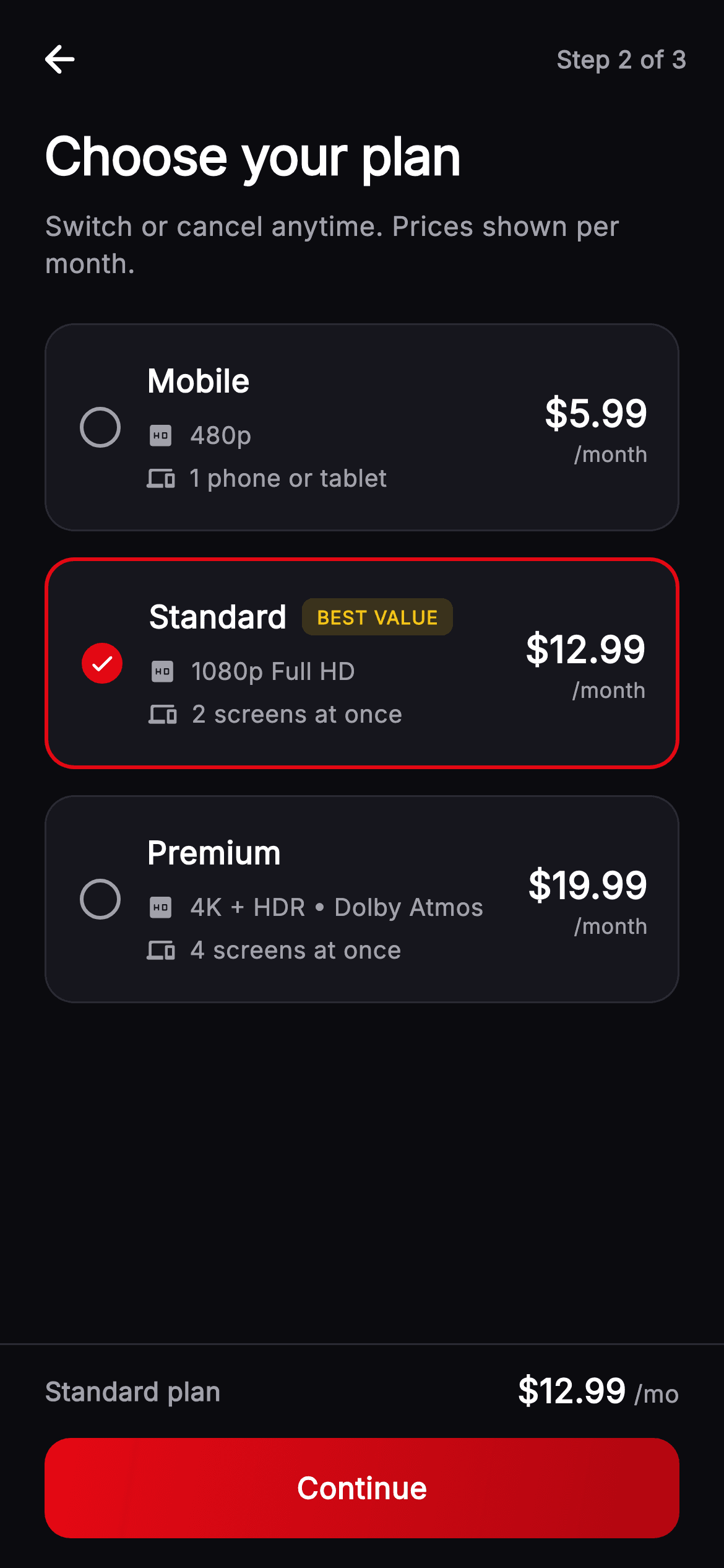
Watch the Flutter UI walkthrough
A short screen recording of Cineo · Choose Your Plan running, if you'd rather see it before you read the code. The written tutorial below covers everything in it.
Can't see the video? Watch it on YouTube.
What you'll build
- ✓Three selectable tier cards driven by a single `int _selected`
- ✓A footer summary that reads live from the selected plan — name and price always on screen
- ✓A gold 'BEST VALUE' badge that renders only on the flagged tier
- ✓A checkmark radio built from one `Container` — border plus fill plus icon
- ✓Spec lines pairing an icon with `Flexible` text so long specs wrap cleanly
- ✓A `Text.rich` price where '$12.99' and '/mo' carry different sizes on one line
Step-by-step build
Create the file
Add a new file at lib/stream_auth_plan_select/stream_auth_plan_select_screen.dart in your Flutter project.
Register the bundled fonts
No external packages — this is pure Flutter. It does bundle its design font (Inter), so drop the font file into fonts/ and declare it in pubspec.yaml:
flutter:
  fonts:
    - family: Inter
      fonts:
- asset: fonts/Inter-Regular.ttfBuild it, piece by piece
Here's how the screen goes together. Each block below is a real slice of the code with a plain-English explanation — paste them in order, or grab the whole file from the next section.
The plan model and a named-argument const list
class _Plan {
  const _Plan({
    required this.name,
    required this.quality,
    required this.resolution,
    required this.screens,
    required this.price,
    this.best = false,
  });

  final String name;
  final String quality;
  final String resolution;
  final String screens;
  final String price;
  final bool best;
}

class _StreamAuthPlanSelectScreenState
    extends State<StreamAuthPlanSelectScreen> {
  static const String _font = 'Inter';
  static const Color _bg = Color(0xFF0B0B0F);
  static const Color _surface = Color(0xFF16161D);
  static const Color _brand = Color(0xFFE50914);
  static const Color _brandDark = Color(0xFFB00610);
  static const Color _text = Color(0xFFFFFFFF);
  static const Color _muted = Color(0xFFA1A1AA);
  static const Color _hairline = Color(0xFF2A2A33);
  static const Color _gold = Color(0xFFF5C518);

  static const List<_Plan> _plans = <_Plan>[
    _Plan(
      name: 'Mobile',
      quality: 'Good',
      resolution: '480p',
      screens: '1 phone or tablet',
      price: '\$5.99',
    ),
    _Plan(
      name: 'Standard',
      quality: 'Great',
      resolution: '1080p Full HD',
      screens: '2 screens at once',
      price: '\$12.99',
      best: true,
    ),
    _Plan(
      name: 'Premium',
      quality: 'Best',
      resolution: '4K + HDR • Dolby Atmos',
      screens: '4 screens at once',
      price: '\$19.99',
    ),
  ];

  int _selected = 1;
`_Plan` uses `required` *named* parameters rather than positional ones — with five string fields that all look alike, named arguments are what stop `quality` and `resolution` being silently swapped at a call site. `best` defaults to `false`, so only Standard needs to declare it. Notice the model stores nothing numeric: `price` is the string `'\$12.99'` and `screens` is '2 screens at once', because nothing on this screen does arithmetic — it displays and compares. `int _selected = 1` pre-selects the middle, best-value tier, which is the standard nudge in tiered pricing.
Header and the card list
  @override
  Widget build(BuildContext context) {
    return Theme(
      data: ThemeData.dark(useMaterial3: true),
      child: Scaffold(
        backgroundColor: _bg,
        body: SafeArea(
          child: Column(
            children: <Widget>[
              _TopBar(onBack: widget.onBack),
              Expanded(
                child: ListView(
                  padding: const EdgeInsets.fromLTRB(24, 4, 24, 24),
                  children: <Widget>[
                    const Text(
                      'Choose your plan',
                      style: TextStyle(
                        fontFamily: _font,
                        fontSize: 28,
                        fontWeight: FontWeight.w800,
                        letterSpacing: -0.5,
                        color: _text,
                      ),
                    ),
                    const SizedBox(height: 8),
                    const Text(
                      'Switch or cancel anytime. Prices shown per month.',
                      style: TextStyle(
                        fontFamily: _font,
                        fontSize: 14.5,
                        height: 1.4,
                        fontWeight: FontWeight.w400,
                        color: _muted,
                      ),
                    ),
                    const SizedBox(height: 22),
                    for (int i = 0; i < _plans.length; i++) ...<Widget>[
                      _PlanCard(
                        plan: _plans[i],
                        selected: _selected == i,
                        onTap: () => setState(() => _selected = i),
                      ),
                      if (i != _plans.length - 1) const SizedBox(height: 14),
                    ],
                  ],
                ),
              ),
The scrolling body opens with a 28px `w800` title at `letterSpacing: -0.5` and a reassurance line ('Switch or cancel anytime') that removes the main objection before the prices appear. The cards are emitted with an indexed collection-for and a spread, and the gap is guarded: `if (i != _plans.length - 1) const SizedBox(height: 14)` — no trailing space after the last card, since the `ListView`'s own bottom padding already handles that. Each card is told whether it's `selected` and given an `onTap` that writes the index.
The footer that restates the choice
              Container(
                padding: const EdgeInsets.fromLTRB(24, 12, 24, 16),
                decoration: const BoxDecoration(
                  border: Border(top: BorderSide(color: _hairline)),
                ),
                child: Column(
                  mainAxisSize: MainAxisSize.min,
                  children: <Widget>[
                    Row(
                      mainAxisAlignment: MainAxisAlignment.spaceBetween,
                      children: <Widget>[
                        Text(
                          '${_plans[_selected].name} plan',
                          style: const TextStyle(
                            fontFamily: _font,
                            fontSize: 14,
                            fontWeight: FontWeight.w600,
                            color: _muted,
                          ),
                        ),
                        Text.rich(
                          TextSpan(
                            text: _plans[_selected].price,
                            style: const TextStyle(
                              fontFamily: _font,
                              fontSize: 18,
                              fontWeight: FontWeight.w800,
                              color: _text,
                            ),
                            children: const <TextSpan>[
                              TextSpan(
                                text: ' /mo',
                                style: TextStyle(
                                  fontSize: 13,
                                  fontWeight: FontWeight.w500,
                                  color: _muted,
                                ),
                              ),
                            ],
                          ),
                        ),
                      ],
                    ),
                    const SizedBox(height: 12),
                    _PrimaryButton(label: 'Continue', onTap: widget.onContinue),
                  ],
                ),
              ),
This is the screen's best idea. The footer sits outside the `Expanded` `ListView` with a top `_hairline` border, and its `Row` reads `_plans[_selected].name` and `_plans[_selected].price` directly — so scrolling the chosen card off screen never leaves the user wondering what they're about to buy. The price uses `Text.rich` so '\$12.99' at 18px `w800` and ' /mo' at 13px muted share a single line and baseline; two separate `Text` widgets in a `Row` would need explicit baseline alignment to look right.
The tier card
class _PlanCard extends StatelessWidget {
  const _PlanCard({
    required this.plan,
    required this.selected,
    required this.onTap,
  });

  final _Plan plan;
  final bool selected;
  final VoidCallback onTap;

  @override
  Widget build(BuildContext context) {
    final Color accent = _StreamAuthPlanSelectScreenState._brand;
    return GestureDetector(
      onTap: onTap,
      child: AnimatedContainer(
        duration: const Duration(milliseconds: 160),
        padding: const EdgeInsets.fromLTRB(18, 18, 16, 18),
        decoration: BoxDecoration(
          color: _StreamAuthPlanSelectScreenState._surface,
          borderRadius: BorderRadius.circular(16),
          border: Border.all(
            color: selected
                ? accent
                : _StreamAuthPlanSelectScreenState._hairline,
            width: selected ? 2 : 1,
          ),
        ),
        child: Row(
          children: <Widget>[
            _Radio(selected: selected),
            const SizedBox(width: 14),
            Expanded(
              child: Column(
                crossAxisAlignment: CrossAxisAlignment.start,
                children: <Widget>[
                  Row(
                    children: <Widget>[
                      Text(
                        plan.name,
                        style: const TextStyle(
                          fontFamily: _StreamAuthPlanSelectScreenState._font,
                          fontSize: 17,
                          fontWeight: FontWeight.w700,
                          color: _StreamAuthPlanSelectScreenState._text,
                        ),
                      ),
                      const SizedBox(width: 8),
                      if (plan.best) const _BestBadge(),
                    ],
                  ),
                  const SizedBox(height: 8),
                  _SpecLine(icon: Icons.hd_rounded, text: plan.resolution),
                  const SizedBox(height: 4),
                  _SpecLine(
                    icon: Icons.devices_rounded,
                    text: plan.screens,
                  ),
                ],
              ),
            ),
            const SizedBox(width: 8),
            Column(
              crossAxisAlignment: CrossAxisAlignment.end,
              children: <Widget>[
                Text(
                  plan.price,
                  style: const TextStyle(
                    fontFamily: _StreamAuthPlanSelectScreenState._font,
                    fontSize: 20,
                    fontWeight: FontWeight.w800,
                    color: _StreamAuthPlanSelectScreenState._text,
                  ),
                ),
                const Text(
                  '/month',
                  style: TextStyle(
                    fontFamily: _StreamAuthPlanSelectScreenState._font,
                    fontSize: 11.5,
                    fontWeight: FontWeight.w500,
                    color: _StreamAuthPlanSelectScreenState._muted,
                  ),
                ),
              ],
            ),
          ],
        ),
      ),
    );
  }
}
An `AnimatedContainer` at 160ms tweens the border between `_hairline` at 1px and brand red at 2px — changing width as well as colour is what makes selection obvious without relying on the red alone. The layout is three parts: the radio, an `Expanded` middle column, and a right-aligned price column. Because the middle is `Expanded`, the price stays pinned right whatever the plan name's length. The badge is spliced in with `if (plan.best) const _BestBadge()`, so it costs nothing on the other two cards — and because it sits inside the name `Row`, it reads as an annotation on 'Standard' rather than as a floating ribbon.
Spec lines, the radio, and the badge
class _SpecLine extends StatelessWidget {
  const _SpecLine({required this.icon, required this.text});

  final IconData icon;
  final String text;

  @override
  Widget build(BuildContext context) {
    return Row(
      children: <Widget>[
        Icon(icon, size: 15, color: _StreamAuthPlanSelectScreenState._muted),
        const SizedBox(width: 8),
        Flexible(
          child: Text(
            text,
            style: const TextStyle(
              fontFamily: _StreamAuthPlanSelectScreenState._font,
              fontSize: 13,
              fontWeight: FontWeight.w500,
              color: _StreamAuthPlanSelectScreenState._muted,
            ),
          ),
        ),
      ],
    );
  }
}

class _Radio extends StatelessWidget {
  const _Radio({required this.selected});

  final bool selected;

  @override
  Widget build(BuildContext context) {
    return Container(
      width: 22,
      height: 22,
      decoration: BoxDecoration(
        shape: BoxShape.circle,
        border: Border.all(
          color: selected
              ? _StreamAuthPlanSelectScreenState._brand
              : _StreamAuthPlanSelectScreenState._muted,
          width: 2,
        ),
        color: selected
            ? _StreamAuthPlanSelectScreenState._brand
            : Colors.transparent,
      ),
      child: selected
          ? const Icon(Icons.check_rounded, size: 15, color: Colors.white)
          : null,
    );
  }
}

class _BestBadge extends StatelessWidget {
  const _BestBadge();

  @override
  Widget build(BuildContext context) {
    return Container(
      padding: const EdgeInsets.symmetric(horizontal: 8, vertical: 3),
      decoration: BoxDecoration(
        color: _StreamAuthPlanSelectScreenState._gold.withValues(alpha: 0.16),
        borderRadius: BorderRadius.circular(6),
      ),
      child: const Text(
        'BEST VALUE',
        style: TextStyle(
          fontFamily: _StreamAuthPlanSelectScreenState._font,
          fontSize: 10,
          fontWeight: FontWeight.w800,
          letterSpacing: 0.5,
          color: _StreamAuthPlanSelectScreenState._gold,
        ),
      ),
    );
  }
}
`_SpecLine` pairs a 15px muted icon with `Flexible` text — `Flexible` rather than `Expanded` so the text takes only what it needs while still being allowed to wrap, which matters for Premium's long '4K + HDR • Dolby Atmos' string. The radio is a single 22px `Container` doing three things at once: a 2px border, a `color` that goes from transparent to brand, and a check `Icon` as its child when selected (otherwise `null`). Using a checkmark rather than the usual inner dot makes it read as confirmation rather than as a form control. `_BestBadge` uses gold at 16% alpha behind full-strength gold text — the same tint recipe as the rest of the design system, in the one colour reserved for 'recommended'.
Step indicator and gradient CTA
class _TopBar extends StatelessWidget {
  const _TopBar({this.onBack});

  final VoidCallback? onBack;

  @override
  Widget build(BuildContext context) {
    return Padding(
      padding: const EdgeInsets.fromLTRB(8, 8, 8, 4),
      child: Row(
        children: <Widget>[
          IconButton(
            onPressed: onBack,
            icon: const Icon(Icons.arrow_back_rounded,
                color: _StreamAuthPlanSelectScreenState._text),
          ),
          const Spacer(),
          const Text(
            'Step 2 of 3',
            style: TextStyle(
              fontFamily: _StreamAuthPlanSelectScreenState._font,
              fontSize: 13,
              fontWeight: FontWeight.w600,
              color: _StreamAuthPlanSelectScreenState._muted,
            ),
          ),
          const SizedBox(width: 12),
        ],
      ),
    );
  }
}

class _PrimaryButton extends StatelessWidget {
  const _PrimaryButton({required this.label, this.onTap});

  final String label;
  final VoidCallback? onTap;

  @override
  Widget build(BuildContext context) {
    return SizedBox(
      width: double.infinity,
      height: 54,
      child: Material(
        color: Colors.transparent,
        borderRadius: BorderRadius.circular(14),
        child: InkWell(
          onTap: onTap,
          borderRadius: BorderRadius.circular(14),
          child: Ink(
            decoration: BoxDecoration(
              borderRadius: BorderRadius.circular(14),
              gradient: const LinearGradient(
                begin: Alignment.topLeft,
                end: Alignment.bottomRight,
                colors: <Color>[
                  _StreamAuthPlanSelectScreenState._brand,
                  _StreamAuthPlanSelectScreenState._brandDark,
                ],
              ),
            ),
            child: Center(
              child: Text(
                label,
                style: const TextStyle(
                  fontFamily: _StreamAuthPlanSelectScreenState._font,
                  fontSize: 16,
                  fontWeight: FontWeight.w700,
                  letterSpacing: 0.3,
                  color: Colors.white,
                ),
              ),
            ),
          ),
        ),
      ),
    );
  }
}
`_TopBar` is a `Row` with a back button, a `Spacer()` and a plain 'Step 2 of 3' label — no progress bar, because a three-step flow reads faster as text than as a partially filled rule. `_PrimaryButton` uses the `Material(color: transparent)` → `InkWell` → `Ink(decoration: gradient)` sandwich: `Ink` paints its decoration onto the `Material` itself, so the tap ripple renders *above* the gradient. Painting the gradient on a `Container` inside the `InkWell` instead would cover the splash entirely. All three widgets repeat `BorderRadius.circular(14)` so the ripple clips to the button's shape.
Full code
The complete, ready-to-paste source. Free to use in your projects — one click copies it all.
import 'package:flutter/material.dart';

/// Choose Your Plan — plan-tier selection for the **Cineo** streaming app. Three
/// selectable tier cards (Mobile / Standard / Premium) each listing quality,
/// resolution, simultaneous screens and monthly price, with a "Best value"
/// ribbon on the recommended tier and a pinned "Continue" bar. Self-contained
/// per CONVENTIONS.md (pure Flutter, bundled Inter, own dark theme, real states).
class StreamAuthPlanSelectScreen extends StatefulWidget {
  const StreamAuthPlanSelectScreen({
    super.key,
    this.onBack,
    this.onContinue,
  });

  final VoidCallback? onBack;
  final VoidCallback? onContinue;

  @override
  State<StreamAuthPlanSelectScreen> createState() =>
      _StreamAuthPlanSelectScreenState();
}

class _Plan {
  const _Plan({
    required this.name,
    required this.quality,
    required this.resolution,
    required this.screens,
    required this.price,
    this.best = false,
  });

  final String name;
  final String quality;
  final String resolution;
  final String screens;
  final String price;
  final bool best;
}

class _StreamAuthPlanSelectScreenState
    extends State<StreamAuthPlanSelectScreen> {
  static const String _font = 'Inter';
  static const Color _bg = Color(0xFF0B0B0F);
  static const Color _surface = Color(0xFF16161D);
  static const Color _brand = Color(0xFFE50914);
  static const Color _brandDark = Color(0xFFB00610);
  static const Color _text = Color(0xFFFFFFFF);
  static const Color _muted = Color(0xFFA1A1AA);
  static const Color _hairline = Color(0xFF2A2A33);
  static const Color _gold = Color(0xFFF5C518);

  static const List<_Plan> _plans = <_Plan>[
    _Plan(
      name: 'Mobile',
      quality: 'Good',
      resolution: '480p',
      screens: '1 phone or tablet',
      price: '\$5.99',
    ),
    _Plan(
      name: 'Standard',
      quality: 'Great',
      resolution: '1080p Full HD',
      screens: '2 screens at once',
      price: '\$12.99',
      best: true,
    ),
    _Plan(
      name: 'Premium',
      quality: 'Best',
      resolution: '4K + HDR • Dolby Atmos',
      screens: '4 screens at once',
      price: '\$19.99',
    ),
  ];

  int _selected = 1;

  @override
  Widget build(BuildContext context) {
    return Theme(
      data: ThemeData.dark(useMaterial3: true),
      child: Scaffold(
        backgroundColor: _bg,
        body: SafeArea(
          child: Column(
            children: <Widget>[
              _TopBar(onBack: widget.onBack),
              Expanded(
                child: ListView(
                  padding: const EdgeInsets.fromLTRB(24, 4, 24, 24),
                  children: <Widget>[
                    const Text(
                      'Choose your plan',
                      style: TextStyle(
                        fontFamily: _font,
                        fontSize: 28,
                        fontWeight: FontWeight.w800,
                        letterSpacing: -0.5,
                        color: _text,
                      ),
                    ),
                    const SizedBox(height: 8),
                    const Text(
                      'Switch or cancel anytime. Prices shown per month.',
                      style: TextStyle(
                        fontFamily: _font,
                        fontSize: 14.5,
                        height: 1.4,
                        fontWeight: FontWeight.w400,
                        color: _muted,
                      ),
                    ),
                    const SizedBox(height: 22),
                    for (int i = 0; i < _plans.length; i++) ...<Widget>[
                      _PlanCard(
                        plan: _plans[i],
                        selected: _selected == i,
                        onTap: () => setState(() => _selected = i),
                      ),
                      if (i != _plans.length - 1) const SizedBox(height: 14),
                    ],
                  ],
                ),
              ),
              Container(
                padding: const EdgeInsets.fromLTRB(24, 12, 24, 16),
                decoration: const BoxDecoration(
                  border: Border(top: BorderSide(color: _hairline)),
                ),
                child: Column(
                  mainAxisSize: MainAxisSize.min,
                  children: <Widget>[
                    Row(
                      mainAxisAlignment: MainAxisAlignment.spaceBetween,
                      children: <Widget>[
                        Text(
                          '${_plans[_selected].name} plan',
                          style: const TextStyle(
                            fontFamily: _font,
                            fontSize: 14,
                            fontWeight: FontWeight.w600,
                            color: _muted,
                          ),
                        ),
                        Text.rich(
                          TextSpan(
                            text: _plans[_selected].price,
                            style: const TextStyle(
                              fontFamily: _font,
                              fontSize: 18,
                              fontWeight: FontWeight.w800,
                              color: _text,
                            ),
                            children: const <TextSpan>[
                              TextSpan(
                                text: ' /mo',
                                style: TextStyle(
                                  fontSize: 13,
                                  fontWeight: FontWeight.w500,
                                  color: _muted,
                                ),
                              ),
                            ],
                          ),
                        ),
                      ],
                    ),
                    const SizedBox(height: 12),
                    _PrimaryButton(label: 'Continue', onTap: widget.onContinue),
                  ],
                ),
              ),
            ],
          ),
        ),
      ),
    );
  }
}

class _PlanCard extends StatelessWidget {
  const _PlanCard({
    required this.plan,
    required this.selected,
    required this.onTap,
  });

  final _Plan plan;
  final bool selected;
  final VoidCallback onTap;

  @override
  Widget build(BuildContext context) {
    final Color accent = _StreamAuthPlanSelectScreenState._brand;
    return GestureDetector(
      onTap: onTap,
      child: AnimatedContainer(
        duration: const Duration(milliseconds: 160),
        padding: const EdgeInsets.fromLTRB(18, 18, 16, 18),
        decoration: BoxDecoration(
          color: _StreamAuthPlanSelectScreenState._surface,
          borderRadius: BorderRadius.circular(16),
          border: Border.all(
            color: selected
                ? accent
                : _StreamAuthPlanSelectScreenState._hairline,
            width: selected ? 2 : 1,
          ),
        ),
        child: Row(
          children: <Widget>[
            _Radio(selected: selected),
            const SizedBox(width: 14),
            Expanded(
              child: Column(
                crossAxisAlignment: CrossAxisAlignment.start,
                children: <Widget>[
                  Row(
                    children: <Widget>[
                      Text(
                        plan.name,
                        style: const TextStyle(
                          fontFamily: _StreamAuthPlanSelectScreenState._font,
                          fontSize: 17,
                          fontWeight: FontWeight.w700,
                          color: _StreamAuthPlanSelectScreenState._text,
                        ),
                      ),
                      const SizedBox(width: 8),
                      if (plan.best) const _BestBadge(),
                    ],
                  ),
                  const SizedBox(height: 8),
                  _SpecLine(icon: Icons.hd_rounded, text: plan.resolution),
                  const SizedBox(height: 4),
                  _SpecLine(
                    icon: Icons.devices_rounded,
                    text: plan.screens,
                  ),
                ],
              ),
            ),
            const SizedBox(width: 8),
            Column(
              crossAxisAlignment: CrossAxisAlignment.end,
              children: <Widget>[
                Text(
                  plan.price,
                  style: const TextStyle(
                    fontFamily: _StreamAuthPlanSelectScreenState._font,
                    fontSize: 20,
                    fontWeight: FontWeight.w800,
                    color: _StreamAuthPlanSelectScreenState._text,
                  ),
                ),
                const Text(
                  '/month',
                  style: TextStyle(
                    fontFamily: _StreamAuthPlanSelectScreenState._font,
                    fontSize: 11.5,
                    fontWeight: FontWeight.w500,
                    color: _StreamAuthPlanSelectScreenState._muted,
                  ),
                ),
              ],
            ),
          ],
        ),
      ),
    );
  }
}

class _SpecLine extends StatelessWidget {
  const _SpecLine({required this.icon, required this.text});

  final IconData icon;
  final String text;

  @override
  Widget build(BuildContext context) {
    return Row(
      children: <Widget>[
        Icon(icon, size: 15, color: _StreamAuthPlanSelectScreenState._muted),
        const SizedBox(width: 8),
        Flexible(
          child: Text(
            text,
            style: const TextStyle(
              fontFamily: _StreamAuthPlanSelectScreenState._font,
              fontSize: 13,
              fontWeight: FontWeight.w500,
              color: _StreamAuthPlanSelectScreenState._muted,
            ),
          ),
        ),
      ],
    );
  }
}

class _Radio extends StatelessWidget {
  const _Radio({required this.selected});

  final bool selected;

  @override
  Widget build(BuildContext context) {
    return Container(
      width: 22,
      height: 22,
      decoration: BoxDecoration(
        shape: BoxShape.circle,
        border: Border.all(
          color: selected
              ? _StreamAuthPlanSelectScreenState._brand
              : _StreamAuthPlanSelectScreenState._muted,
          width: 2,
        ),
        color: selected
            ? _StreamAuthPlanSelectScreenState._brand
            : Colors.transparent,
      ),
      child: selected
          ? const Icon(Icons.check_rounded, size: 15, color: Colors.white)
          : null,
    );
  }
}

class _BestBadge extends StatelessWidget {
  const _BestBadge();

  @override
  Widget build(BuildContext context) {
    return Container(
      padding: const EdgeInsets.symmetric(horizontal: 8, vertical: 3),
      decoration: BoxDecoration(
        color: _StreamAuthPlanSelectScreenState._gold.withValues(alpha: 0.16),
        borderRadius: BorderRadius.circular(6),
      ),
      child: const Text(
        'BEST VALUE',
        style: TextStyle(
          fontFamily: _StreamAuthPlanSelectScreenState._font,
          fontSize: 10,
          fontWeight: FontWeight.w800,
          letterSpacing: 0.5,
          color: _StreamAuthPlanSelectScreenState._gold,
        ),
      ),
    );
  }
}

class _TopBar extends StatelessWidget {
  const _TopBar({this.onBack});

  final VoidCallback? onBack;

  @override
  Widget build(BuildContext context) {
    return Padding(
      padding: const EdgeInsets.fromLTRB(8, 8, 8, 4),
      child: Row(
        children: <Widget>[
          IconButton(
            onPressed: onBack,
            icon: const Icon(Icons.arrow_back_rounded,
                color: _StreamAuthPlanSelectScreenState._text),
          ),
          const Spacer(),
          const Text(
            'Step 2 of 3',
            style: TextStyle(
              fontFamily: _StreamAuthPlanSelectScreenState._font,
              fontSize: 13,
              fontWeight: FontWeight.w600,
              color: _StreamAuthPlanSelectScreenState._muted,
            ),
          ),
          const SizedBox(width: 12),
        ],
      ),
    );
  }
}

class _PrimaryButton extends StatelessWidget {
  const _PrimaryButton({required this.label, this.onTap});

  final String label;
  final VoidCallback? onTap;

  @override
  Widget build(BuildContext context) {
    return SizedBox(
      width: double.infinity,
      height: 54,
      child: Material(
        color: Colors.transparent,
        borderRadius: BorderRadius.circular(14),
        child: InkWell(
          onTap: onTap,
          borderRadius: BorderRadius.circular(14),
          child: Ink(
            decoration: BoxDecoration(
              borderRadius: BorderRadius.circular(14),
              gradient: const LinearGradient(
                begin: Alignment.topLeft,
                end: Alignment.bottomRight,
                colors: <Color>[
                  _StreamAuthPlanSelectScreenState._brand,
                  _StreamAuthPlanSelectScreenState._brandDark,
                ],
              ),
            ),
            child: Center(
              child: Text(
                label,
                style: const TextStyle(
                  fontFamily: _StreamAuthPlanSelectScreenState._font,
                  fontSize: 16,
                  fontWeight: FontWeight.w700,
                  letterSpacing: 0.3,
                  color: Colors.white,
                ),
              ),
            ),
          ),
        ),
      ),
    );
  }
}
Plus bundled 1 binary asset (fonts/images). The CLI and MCP install those for you automatically.
Two faster ways to add it
Copy-paste works, but you can skip it entirely.
1. FlutterKit CLI
One command drops this screen — and its fonts — straight into your project.
$ flutterkit add stream-auth-plan-select2. AI agent (MCP)
Connect FlutterKit's MCP server in Claude or Cursor and just ask your agent to install stream-auth-plan-select — it fetches and writes the files for you.
FAQ
Is this plan selection screen free to use?
Yes. The complete Dart source on this page is free for personal and commercial apps. Copy it from the code block, install it with the FlutterKit CLI (flutterkit add stream-auth-plan-select), or add it through an AI agent over MCP.
How do I get the selected plan out of the screen?
The choice is _plans[_selected]. Change onContinue to a ValueChanged<_Plan> (or emit the plan's name) and pass it from the _PrimaryButton's onTap. The footer already reads the same expression, so there's one source of truth.
How do I add a fourth tier?
Add one _Plan to the const list. The card loop, the gap guard and the footer all derive from _plans, so nothing else changes. Move best: true if a different tier should carry the gold badge — only one should.
Why a checkmark instead of a radio dot?
Because on a pricing screen the control reads as confirmation of a decision rather than as a form input. It's built from one 22px Container whose border, fill and child icon all switch on the selected flag, so it costs no more than a dot would.
Which Flutter version does it target?
It uses Color.withValues(alpha:), super parameters and Material 3, so it targets Flutter 3.27+ (Dart 3). On an older SDK, replace the single withValues(alpha: 0.16) in _BestBadge with withOpacity(0.16).


