How to Build a Streaming Service Sign Up Screen in Flutter (Full Code + Preview)
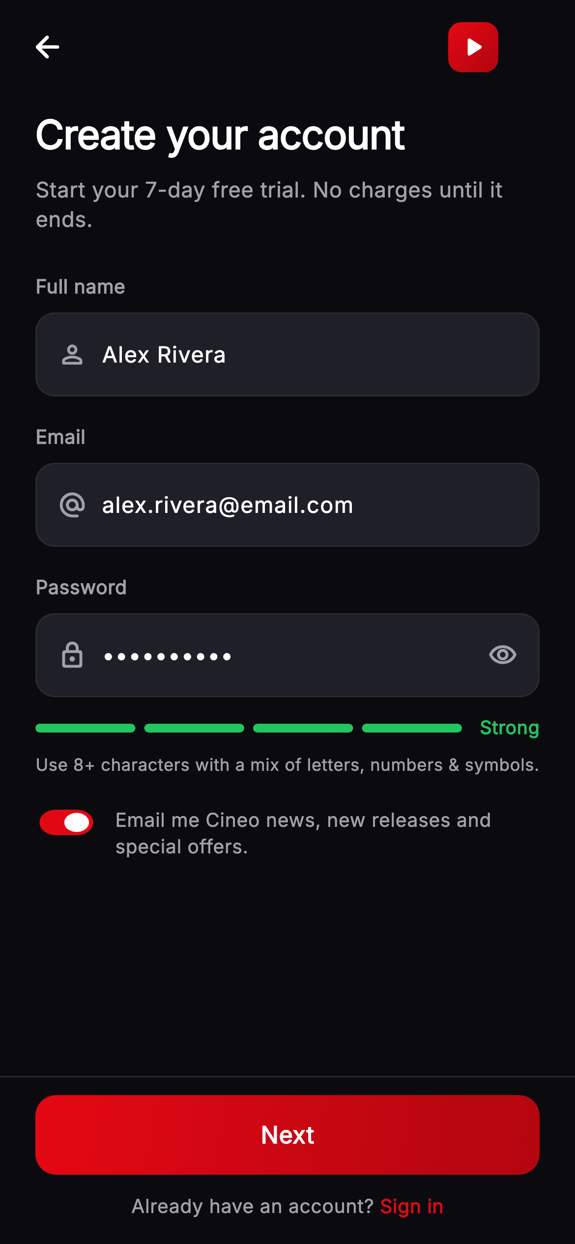
Signing up for a streaming trial is a low-commitment moment, and the form should feel that way. This tutorial builds Cineo's create-account screen in Flutter — three icon-led inputs, a show/hide password toggle, a four-segment strength meter that recolours from red through amber to green, a marketing opt-in scaled down with FittedBox, and a gradient Next button. The strength label and colour travel together in a Dart record, returned from a single getter.
Watch the Flutter UI walkthrough
A short screen recording of Cineo · Create Account running, if you'd rather see it before you read the code. The written tutorial below covers everything in it.
Can't see the video? Watch it on YouTube.
What you'll build
- ✓A password strength meter whose bar and label share one colour, returned as a Dart record
- ✓Icon-led input fields built from one reusable widget with an optional trailing slot
- ✓A Material Switch physically scaled down with FittedBox to suit a dense opt-in row
- ✓A gradient CTA drawn with Ink so its ripple renders above the gradient, not beneath it
Step-by-step build
Create the file
Add a new file at lib/stream_auth_signup/stream_auth_signup_screen.dart in your Flutter project.
Register the bundled fonts
No external packages — this is pure Flutter. It does bundle its design font (Inter), so drop the font file into fonts/ and declare it in pubspec.yaml:
flutter:
  fonts:
    - family: Inter
      fonts:
- asset: fonts/Inter-Regular.ttfBuild it, piece by piece
Here's how the screen goes together. Each block below is a real slice of the code with a plain-English explanation — paste them in order, or grab the whole file from the next section.
Scoring a password and naming the result
import 'package:flutter/material.dart';

/// Create Account — sign-up for the **Cineo** streaming app. Name/email/password
/// fields with a show/hide toggle, a live painted password strength meter, a
/// marketing-opt toggle, and a pinned brand-red "Next" CTA. Self-contained per
/// CONVENTIONS.md (pure Flutter, bundled Inter, own dark theme, real states).
class StreamAuthSignupScreen extends StatefulWidget {
  const StreamAuthSignupScreen({
    super.key,
    this.onBack,
    this.onNext,
    this.onSignIn,
  });

  final VoidCallback? onBack;
  final VoidCallback? onNext;
  final VoidCallback? onSignIn;

  @override
  State<StreamAuthSignupScreen> createState() => _StreamAuthSignupScreenState();
}

class _StreamAuthSignupScreenState extends State<StreamAuthSignupScreen> {
  static const String _font = 'Inter';
  static const Color _bg = Color(0xFF0B0B0F);
  static const Color _surfaceAlt = Color(0xFF1F1F28);
  static const Color _brand = Color(0xFFE50914);
  static const Color _brandDark = Color(0xFFB00610);
  static const Color _text = Color(0xFFFFFFFF);
  static const Color _muted = Color(0xFFA1A1AA);
  static const Color _hairline = Color(0xFF2A2A33);
  static const Color _warn = Color(0xFFF59E0B);
  static const Color _success = Color(0xFF22C55E);

  final TextEditingController _name = TextEditingController(text: 'Alex Rivera');
  final TextEditingController _email =
      TextEditingController(text: 'alex.rivera@email.com');
  final TextEditingController _password =
      TextEditingController(text: 'Cineo!2026');
  bool _obscure = true;
  bool _marketing = true;

  int get _strength {
    final String p = _password.text;
    int s = 0;
    if (p.length >= 8) s++;
    if (RegExp(r'[A-Z]').hasMatch(p) && RegExp(r'[a-z]').hasMatch(p)) s++;
    if (RegExp(r'[0-9]').hasMatch(p)) s++;
    if (RegExp(r'[^A-Za-z0-9]').hasMatch(p)) s++;
    return s;
  }

  ({String label, Color color}) get _strengthInfo {
    switch (_strength) {
      case 0:
      case 1:
        return (label: 'Weak', color: _brand);
      case 2:
        return (label: 'Fair', color: _warn);
      case 3:
        return (label: 'Good', color: _warn);
      default:
        return (label: 'Strong', color: _success);
    }
  }

  @override
  void dispose() {
    _name.dispose();
    _email.dispose();
    _password.dispose();
    super.dispose();
  }
Three controllers are pre-filled so the screen demonstrates a populated state on first paint. `_strength` scores the password out of four, adding a point for eight-plus characters, for mixed case, for a digit and for a symbol. The interesting piece is `_strengthInfo`, whose return type is `({String label, Color color})` — a Dart 3 record with named fields. It maps the 0–4 score onto a word and a colour together: red 'Weak' at 0 or 1, amber 'Fair' and 'Good', green 'Strong' at 4. Returning both in one value is what guarantees the bar and the label can never disagree, which two separate getters would eventually allow. All three controllers are disposed.
The form and its live strength row
  @override
  Widget build(BuildContext context) {
    final ({String label, Color color}) info = _strengthInfo;
    return Theme(
      data: ThemeData.dark(useMaterial3: true),
      child: Scaffold(
        backgroundColor: _bg,
        body: SafeArea(
          child: Column(
            children: <Widget>[
              _TopBar(onBack: widget.onBack),
              Expanded(
                child: ListView(
                  padding: const EdgeInsets.fromLTRB(24, 8, 24, 24),
                  children: <Widget>[
                    const Text(
                      'Create your account',
                      style: TextStyle(
                        fontFamily: _font,
                        fontSize: 27,
                        fontWeight: FontWeight.w800,
                        letterSpacing: -0.5,
                        color: _text,
                      ),
                    ),
                    const SizedBox(height: 8),
                    const Text(
                      'Start your 7-day free trial. No charges until it ends.',
                      style: TextStyle(
                        fontFamily: _font,
                        fontSize: 14.5,
                        height: 1.4,
                        fontWeight: FontWeight.w400,
                        color: _muted,
                      ),
                    ),
                    const SizedBox(height: 26),
                    const _FieldLabel('Full name'),
                    const SizedBox(height: 8),
                    _InputField(
                      controller: _name,
                      hint: 'Your name',
                      icon: Icons.person_outline_rounded,
                    ),
                    const SizedBox(height: 18),
                    const _FieldLabel('Email'),
                    const SizedBox(height: 8),
                    _InputField(
                      controller: _email,
                      hint: 'you@email.com',
                      icon: Icons.alternate_email_rounded,
                      keyboardType: TextInputType.emailAddress,
                    ),
                    const SizedBox(height: 18),
                    const _FieldLabel('Password'),
                    const SizedBox(height: 8),
                    _InputField(
                      controller: _password,
                      hint: 'Create a password',
                      icon: Icons.lock_outline_rounded,
                      obscure: _obscure,
                      onChanged: (_) => setState(() {}),
                      trailing: IconButton(
                        onPressed: () => setState(() => _obscure = !_obscure),
                        icon: Icon(
                          _obscure
                              ? Icons.visibility_outlined
                              : Icons.visibility_off_outlined,
                          color: _muted,
                          size: 20,
                        ),
                      ),
                    ),
                    const SizedBox(height: 12),
build() calls `_strengthInfo` once into a local and reuses it, rather than invoking the getter twice. The body is a top bar, an `Expanded` ListView and a pinned CTA bar. The three fields follow the same label-gap-input rhythm, each `_InputField` carrying a leading icon. Only the password field passes `onChanged: (_) => setState(() {})` — the name and email don't drive any derived UI, so rebuilding on their keystrokes would be wasted work. Its trailing slot holds the visibility IconButton, which flips `_obscure` in setState. Note the subtitle sells the terms up front: 'Start your 7-day free trial. No charges until it ends.'
The meter row and the pinned CTA
                    Row(
                      children: <Widget>[
                        Expanded(
                          child: SizedBox(
                            height: 6,
                            child: CustomPaint(
                              painter: _StrengthMeterPainter(
                                strength: _strength,
                                color: info.color,
                              ),
                            ),
                          ),
                        ),
                        const SizedBox(width: 12),
                        Text(
                          info.label,
                          style: TextStyle(
                            fontFamily: _font,
                            fontSize: 12.5,
                            fontWeight: FontWeight.w700,
                            color: info.color,
                          ),
                        ),
                      ],
                    ),
                    const SizedBox(height: 8),
                    const Text(
                      'Use 8+ characters with a mix of letters, numbers & symbols.',
                      style: TextStyle(
                        fontFamily: _font,
                        fontSize: 11.5,
                        height: 1.4,
                        fontWeight: FontWeight.w400,
                        color: _muted,
                      ),
                    ),
                    const SizedBox(height: 18),
                    _MarketingRow(
                      value: _marketing,
                      onChanged: (bool v) => setState(() => _marketing = v),
                    ),
                  ],
                ),
              ),
              // Pinned CTA bar at a fixed height.
              Container(
                padding: const EdgeInsets.fromLTRB(24, 12, 24, 16),
                decoration: const BoxDecoration(
                  border: Border(top: BorderSide(color: _hairline)),
                ),
                child: Column(
                  mainAxisSize: MainAxisSize.min,
                  children: <Widget>[
                    _PrimaryButton(label: 'Next', onTap: widget.onNext),
                    const SizedBox(height: 12),
                    Row(
                      mainAxisAlignment: MainAxisAlignment.center,
                      children: <Widget>[
                        const Text(
                          'Already have an account? ',
                          style: TextStyle(
                            fontFamily: _font,
                            fontSize: 13,
                            fontWeight: FontWeight.w400,
                            color: _muted,
                          ),
                        ),
                        GestureDetector(
                          onTap: widget.onSignIn,
                          child: const Text(
                            'Sign in',
                            style: TextStyle(
                              fontFamily: _font,
                              fontSize: 13,
                              fontWeight: FontWeight.w700,
                              color: _brand,
                            ),
                          ),
                        ),
                      ],
                    ),
                  ],
                ),
              ),
            ],
          ),
        ),
      ),
    );
  }
}
The strength row puts the 6px painted bar in an `Expanded` beside its label, so the bar takes all leftover width and the word sits flush right. Both read `info.color`, which is why they always agree. Below sits static guidance — 'Use 8+ characters with a mix of letters, numbers & symbols' — that states the rules rather than making people guess what raises the score. The pinned bar has a top hairline and holds the gradient Next button above a sign-in prompt. That prompt is a centred Row of two Texts with only the second wrapped in a GestureDetector, so the tap target is exactly the 'Sign in' link rather than the whole line.
Scaling down a Material Switch
class _MarketingRow extends StatelessWidget {
  const _MarketingRow({required this.value, required this.onChanged});

  final bool value;
  final ValueChanged<bool> onChanged;

  @override
  Widget build(BuildContext context) {
    return Row(
      crossAxisAlignment: CrossAxisAlignment.start,
      children: <Widget>[
        SizedBox(
          height: 26,
          width: 42,
          child: FittedBox(
            fit: BoxFit.fill,
            child: Switch(
              value: value,
              onChanged: onChanged,
              activeThumbColor: Colors.white,
              activeTrackColor: _StreamAuthSignupScreenState._brand,
              inactiveTrackColor: _StreamAuthSignupScreenState._surfaceAlt,
            ),
          ),
        ),
        const SizedBox(width: 12),
        const Expanded(
          child: Padding(
            padding: EdgeInsets.only(top: 2),
            child: Text(
              'Email me Cineo news, new releases and special offers.',
              style: TextStyle(
                fontFamily: _StreamAuthSignupScreenState._font,
                fontSize: 13,
                height: 1.4,
                fontWeight: FontWeight.w400,
                color: _StreamAuthSignupScreenState._muted,
              ),
            ),
          ),
        ),
      ],
    );
  }
}
Flutter's Switch has a fixed intrinsic size that's generously large for a dense consent row. `_MarketingRow` shrinks it by wrapping the Switch in a `SizedBox(height: 26, width: 42)` containing a `FittedBox(fit: BoxFit.fill)` — FittedBox scales its child to the box, so the whole control is rendered smaller rather than clipped. It's a genuinely useful trick for any Material widget whose size you can't otherwise set. The row is top-aligned with `CrossAxisAlignment.start` and the label carries `EdgeInsets.only(top: 2)`, a small nudge that lines the first line of text up with the scaled switch's centre. The opt-in defaults to true, so check your local consent rules before shipping it that way.
The four-segment meter
class _StrengthMeterPainter extends CustomPainter {
  const _StrengthMeterPainter({required this.strength, required this.color});

  final int strength;
  final Color color;

  @override
  void paint(Canvas canvas, Size size) {
    const int segments = 4;
    const double gap = 6;
    final double segW = (size.width - gap * (segments - 1)) / segments;
    for (int i = 0; i < segments; i++) {
      final bool filled = i < strength;
      final Rect r = Rect.fromLTWH(i * (segW + gap), 0, segW, size.height);
      canvas.drawRRect(
        RRect.fromRectAndRadius(r, Radius.circular(size.height / 2)),
        Paint()..color = filled ? color : const Color(0xFF33333D),
      );
    }
  }

  @override
  bool shouldRepaint(covariant _StrengthMeterPainter oldDelegate) =>
      oldDelegate.strength != strength || oldDelegate.color != color;
}
The painter divides the width into four segments with 6px gaps: `segW = (size.width - gap * (segments - 1)) / segments` subtracts the three gaps before dividing, which is the calculation that's easy to get wrong by one. It then loops, filling `i < strength` segments with the colour passed in and the rest with a dark `0xFF33333D`. Because the colour arrives as a field rather than being chosen here, every lit segment matches the label — the painter has no opinion about what 'Fair' looks like. The corner radius is `size.height / 2`, so the 6px-tall segments are fully rounded whatever height you give them. `shouldRepaint` compares both strength and colour.
The top bar, field shell, and gradient button
class _TopBar extends StatelessWidget {
  const _TopBar({this.onBack});

  final VoidCallback? onBack;

  @override
  Widget build(BuildContext context) {
    return Padding(
      padding: const EdgeInsets.fromLTRB(8, 8, 8, 8),
      child: Row(
        children: <Widget>[
          IconButton(
            onPressed: onBack,
            icon: const Icon(Icons.arrow_back_rounded,
                color: _StreamAuthSignupScreenState._text),
          ),
          const Spacer(),
          Container(
            width: 34,
            height: 34,
            decoration: BoxDecoration(
              borderRadius: BorderRadius.circular(9),
              gradient: const LinearGradient(
                begin: Alignment.topLeft,
                end: Alignment.bottomRight,
                colors: <Color>[
                  _StreamAuthSignupScreenState._brand,
                  _StreamAuthSignupScreenState._brandDark,
                ],
              ),
            ),
            child: const Icon(Icons.play_arrow_rounded,
                color: Colors.white, size: 22),
          ),
          const SizedBox(width: 44),
        ],
      ),
    );
  }
}

class _FieldLabel extends StatelessWidget {
  const _FieldLabel(this.text);

  final String text;

  @override
  Widget build(BuildContext context) {
    return Text(
      text,
      style: const TextStyle(
        fontFamily: _StreamAuthSignupScreenState._font,
        fontSize: 13,
        fontWeight: FontWeight.w600,
        color: _StreamAuthSignupScreenState._muted,
      ),
    );
  }
}

class _InputField extends StatelessWidget {
  const _InputField({
    required this.controller,
    required this.hint,
    required this.icon,
    this.obscure = false,
    this.trailing,
    this.keyboardType,
    this.onChanged,
  });

  final TextEditingController controller;
  final String hint;
  final IconData icon;
  final bool obscure;
  final Widget? trailing;
  final TextInputType? keyboardType;
  final ValueChanged<String>? onChanged;

  @override
  Widget build(BuildContext context) {
    return Container(
      decoration: BoxDecoration(
        color: _StreamAuthSignupScreenState._surfaceAlt,
        borderRadius: BorderRadius.circular(13),
        border: Border.all(color: _StreamAuthSignupScreenState._hairline),
      ),
      child: Row(
        children: <Widget>[
          Padding(
            padding: const EdgeInsets.only(left: 14, right: 10),
            child: Icon(icon,
                size: 20, color: _StreamAuthSignupScreenState._muted),
          ),
          Expanded(
            child: TextField(
              controller: controller,
              obscureText: obscure,
              keyboardType: keyboardType,
              onChanged: onChanged,
              cursorColor: _StreamAuthSignupScreenState._brand,
              style: const TextStyle(
                fontFamily: _StreamAuthSignupScreenState._font,
                fontSize: 15,
                fontWeight: FontWeight.w500,
                color: _StreamAuthSignupScreenState._text,
              ),
              decoration: InputDecoration(
                isCollapsed: true,
                contentPadding: const EdgeInsets.symmetric(vertical: 16),
                border: InputBorder.none,
                hintText: hint,
                hintStyle: const TextStyle(
                  fontFamily: _StreamAuthSignupScreenState._font,
                  fontSize: 15,
                  fontWeight: FontWeight.w400,
                  color: _StreamAuthSignupScreenState._muted,
                ),
              ),
            ),
          ),
          if (trailing != null) trailing! else const SizedBox(width: 14),
        ],
      ),
    );
  }
}

class _PrimaryButton extends StatelessWidget {
  const _PrimaryButton({required this.label, this.onTap});

  final String label;
  final VoidCallback? onTap;

  @override
  Widget build(BuildContext context) {
    return SizedBox(
      width: double.infinity,
      height: 54,
      child: Material(
        color: Colors.transparent,
        borderRadius: BorderRadius.circular(14),
        child: InkWell(
          onTap: onTap,
          borderRadius: BorderRadius.circular(14),
          child: Ink(
            decoration: BoxDecoration(
              borderRadius: BorderRadius.circular(14),
              gradient: const LinearGradient(
                begin: Alignment.topLeft,
                end: Alignment.bottomRight,
                colors: <Color>[
                  _StreamAuthSignupScreenState._brand,
                  _StreamAuthSignupScreenState._brandDark,
                ],
              ),
            ),
            child: Center(
              child: Text(
                label,
                style: const TextStyle(
                  fontFamily: _StreamAuthSignupScreenState._font,
                  fontSize: 16,
                  fontWeight: FontWeight.w700,
                  letterSpacing: 0.3,
                  color: Colors.white,
                ),
              ),
            ),
          ),
        ),
      ),
    );
  }
}
`_TopBar` centres the app's play-triangle logo using a `Spacer()` plus a trailing `SizedBox(width: 44)` to offset the leading IconButton. `_InputField` is the reusable shell: a bordered `_surfaceAlt` Container holding a leading icon, an `Expanded` TextField and an optional trailing widget. Its decoration sets `isCollapsed: true` with `border: InputBorder.none`, stripping Material's own sizing so the parent Container's 13px radius defines the shape. The final line is neat — `if (trailing != null) trailing! else const SizedBox(width: 14)` — an if-else inside a children list that substitutes right-hand padding when there's no trailing widget, so fields with and without a toggle have matching inner margins. `_PrimaryButton` uses the transparent-Material, InkWell, `Ink` stack that lets a gradient button still show its ripple.
Full code
The complete, ready-to-paste source. Free to use in your projects — one click copies it all.
import 'package:flutter/material.dart';
/// Create Account — sign-up for the **Cineo** streaming app. Name/email/password
/// fields with a show/hide toggle, a live painted password strength meter, a
/// marketing-opt toggle, and a pinned brand-red "Next" CTA. Self-contained per
/// CONVENTIONS.md (pure Flutter, bundled Inter, own dark theme, real states).
class StreamAuthSignupScreen extends StatefulWidget {
const StreamAuthSignupScreen({
super.key,
this.onBack,
this.onNext,
this.onSignIn,
});
final VoidCallback? onBack;
final VoidCallback? onNext;
final VoidCallback? onSignIn;
@override
State<StreamAuthSignupScreen> createState() => _StreamAuthSignupScreenState();
}
class _StreamAuthSignupScreenState extends State<StreamAuthSignupScreen> {
static const String _font = 'Inter';
static const Color _bg = Color(0xFF0B0B0F);
static const Color _surfaceAlt = Color(0xFF1F1F28);
static const Color _brand = Color(0xFFE50914);
static const Color _brandDark = Color(0xFFB00610);
static const Color _text = Color(0xFFFFFFFF);
static const Color _muted = Color(0xFFA1A1AA);
static const Color _hairline = Color(0xFF2A2A33);
static const Color _warn = Color(0xFFF59E0B);
static const Color _success = Color(0xFF22C55E);
final TextEditingController _name = TextEditingController(text: 'Alex Rivera');
final TextEditingController _email =
TextEditingController(text: 'alex.rivera@email.com');
final TextEditingController _password =
TextEditingController(text: 'Cineo!2026');
bool _obscure = true;
bool _marketing = true;
int get _strength {
final String p = _password.text;
int s = 0;
if (p.length >= 8) s++;
if (RegExp(r'[A-Z]').hasMatch(p) && RegExp(r'[a-z]').hasMatch(p)) s++;
if (RegExp(r'[0-9]').hasMatch(p)) s++;
if (RegExp(r'[^A-Za-z0-9]').hasMatch(p)) s++;
return s;
}
({String label, Color color}) get _strengthInfo {
switch (_strength) {
case 0:
case 1:
return (label: 'Weak', color: _brand);
case 2:
return (label: 'Fair', color: _warn);
case 3:
return (label: 'Good', color: _warn);
default:
return (label: 'Strong', color: _success);
}
}
@override
void dispose() {
_name.dispose();
_email.dispose();
_password.dispose();
super.dispose();
}
@override
Widget build(BuildContext context) {
final ({String label, Color color}) info = _strengthInfo;
return Theme(
data: ThemeData.dark(useMaterial3: true),
child: Scaffold(
backgroundColor: _bg,
body: SafeArea(
child: Column(
children: <Widget>[
_TopBar(onBack: widget.onBack),
Expanded(
child: ListView(
padding: const EdgeInsets.fromLTRB(24, 8, 24, 24),
children: <Widget>[
const Text(
'Create your account',
style: TextStyle(
fontFamily: _font,
fontSize: 27,
fontWeight: FontWeight.w800,
letterSpacing: -0.5,
color: _text,
),
),
const SizedBox(height: 8),
const Text(
'Start your 7-day free trial. No charges until it ends.',
style: TextStyle(
fontFamily: _font,
fontSize: 14.5,
height: 1.4,
fontWeight: FontWeight.w400,
color: _muted,
),
),
const SizedBox(height: 26),
const _FieldLabel('Full name'),
const SizedBox(height: 8),
_InputField(
controller: _name,
hint: 'Your name',
icon: Icons.person_outline_rounded,
),
const SizedBox(height: 18),
const _FieldLabel('Email'),
const SizedBox(height: 8),
_InputField(
controller: _email,
hint: 'you@email.com',
icon: Icons.alternate_email_rounded,
keyboardType: TextInputType.emailAddress,
),
const SizedBox(height: 18),
const _FieldLabel('Password'),
const SizedBox(height: 8),
_InputField(
controller: _password,
hint: 'Create a password',
icon: Icons.lock_outline_rounded,
obscure: _obscure,
onChanged: (_) => setState(() {}),
trailing: IconButton(
onPressed: () => setState(() => _obscure = !_obscure),
icon: Icon(
_obscure
? Icons.visibility_outlined
: Icons.visibility_off_outlined,
color: _muted,
size: 20,
),
),
),
const SizedBox(height: 12),
Row(
children: <Widget>[
Expanded(
child: SizedBox(
height: 6,
child: CustomPaint(
painter: _StrengthMeterPainter(
strength: _strength,
color: info.color,
),
),
),
),
const SizedBox(width: 12),
Text(
info.label,
style: TextStyle(
fontFamily: _font,
fontSize: 12.5,
fontWeight: FontWeight.w700,
color: info.color,
),
),
],
),
const SizedBox(height: 8),
const Text(
'Use 8+ characters with a mix of letters, numbers & symbols.',
style: TextStyle(
fontFamily: _font,
fontSize: 11.5,
height: 1.4,
fontWeight: FontWeight.w400,
color: _muted,
),
),
const SizedBox(height: 18),
_MarketingRow(
value: _marketing,
onChanged: (bool v) => setState(() => _marketing = v),
),
],
),
),
// Pinned CTA bar at a fixed height.
Container(
padding: const EdgeInsets.fromLTRB(24, 12, 24, 16),
decoration: const BoxDecoration(
border: Border(top: BorderSide(color: _hairline)),
),
child: Column(
mainAxisSize: MainAxisSize.min,
children: <Widget>[
_PrimaryButton(label: 'Next', onTap: widget.onNext),
const SizedBox(height: 12),
Row(
mainAxisAlignment: MainAxisAlignment.center,
children: <Widget>[
const Text(
'Already have an account? ',
style: TextStyle(
fontFamily: _font,
fontSize: 13,
fontWeight: FontWeight.w400,
color: _muted,
),
),
GestureDetector(
onTap: widget.onSignIn,
child: const Text(
'Sign in',
style: TextStyle(
fontFamily: _font,
fontSize: 13,
fontWeight: FontWeight.w700,
color: _brand,
),
),
),
],
),
],
),
),
],
),
),
),
);
}
}
class _MarketingRow extends StatelessWidget {
const _MarketingRow({required this.value, required this.onChanged});
final bool value;
final ValueChanged<bool> onChanged;
@override
Widget build(BuildContext context) {
return Row(
crossAxisAlignment: CrossAxisAlignment.start,
children: <Widget>[
SizedBox(
height: 26,
width: 42,
child: FittedBox(
fit: BoxFit.fill,
child: Switch(
value: value,
onChanged: onChanged,
activeThumbColor: Colors.white,
activeTrackColor: _StreamAuthSignupScreenState._brand,
inactiveTrackColor: _StreamAuthSignupScreenState._surfaceAlt,
),
),
),
const SizedBox(width: 12),
const Expanded(
child: Padding(
padding: EdgeInsets.only(top: 2),
child: Text(
'Email me Cineo news, new releases and special offers.',
style: TextStyle(
fontFamily: _StreamAuthSignupScreenState._font,
fontSize: 13,
height: 1.4,
fontWeight: FontWeight.w400,
color: _StreamAuthSignupScreenState._muted,
),
),
),
),
],
);
}
}
class _StrengthMeterPainter extends CustomPainter {
const _StrengthMeterPainter({required this.strength, required this.color});
final int strength;
final Color color;
@override
void paint(Canvas canvas, Size size) {
const int segments = 4;
const double gap = 6;
final double segW = (size.width - gap * (segments - 1)) / segments;
for (int i = 0; i < segments; i++) {
final bool filled = i < strength;
final Rect r = Rect.fromLTWH(i * (segW + gap), 0, segW, size.height);
canvas.drawRRect(
RRect.fromRectAndRadius(r, Radius.circular(size.height / 2)),
Paint()..color = filled ? color : const Color(0xFF33333D),
);
}
}
@override
bool shouldRepaint(covariant _StrengthMeterPainter oldDelegate) =>
oldDelegate.strength != strength || oldDelegate.color != color;
}
class _TopBar extends StatelessWidget {
const _TopBar({this.onBack});
final VoidCallback? onBack;
@override
Widget build(BuildContext context) {
return Padding(
padding: const EdgeInsets.fromLTRB(8, 8, 8, 8),
child: Row(
children: <Widget>[
IconButton(
onPressed: onBack,
icon: const Icon(Icons.arrow_back_rounded,
color: _StreamAuthSignupScreenState._text),
),
const Spacer(),
Container(
width: 34,
height: 34,
decoration: BoxDecoration(
borderRadius: BorderRadius.circular(9),
gradient: const LinearGradient(
begin: Alignment.topLeft,
end: Alignment.bottomRight,
colors: <Color>[
_StreamAuthSignupScreenState._brand,
_StreamAuthSignupScreenState._brandDark,
],
),
),
child: const Icon(Icons.play_arrow_rounded,
color: Colors.white, size: 22),
),
const SizedBox(width: 44),
],
),
);
}
}
class _FieldLabel extends StatelessWidget {
const _FieldLabel(this.text);
final String text;
@override
Widget build(BuildContext context) {
return Text(
text,
style: const TextStyle(
fontFamily: _StreamAuthSignupScreenState._font,
fontSize: 13,
fontWeight: FontWeight.w600,
color: _StreamAuthSignupScreenState._muted,
),
);
}
}
class _InputField extends StatelessWidget {
const _InputField({
required this.controller,
required this.hint,
required this.icon,
this.obscure = false,
this.trailing,
this.keyboardType,
this.onChanged,
});
final TextEditingController controller;
final String hint;
final IconData icon;
final bool obscure;
final Widget? trailing;
final TextInputType? keyboardType;
final ValueChanged<String>? onChanged;
@override
Widget build(BuildContext context) {
return Container(
decoration: BoxDecoration(
color: _StreamAuthSignupScreenState._surfaceAlt,
borderRadius: BorderRadius.circular(13),
border: Border.all(color: _StreamAuthSignupScreenState._hairline),
),
child: Row(
children: <Widget>[
Padding(
padding: const EdgeInsets.only(left: 14, right: 10),
child: Icon(icon,
size: 20, color: _StreamAuthSignupScreenState._muted),
),
Expanded(
child: TextField(
controller: controller,
obscureText: obscure,
keyboardType: keyboardType,
onChanged: onChanged,
cursorColor: _StreamAuthSignupScreenState._brand,
style: const TextStyle(
fontFamily: _StreamAuthSignupScreenState._font,
fontSize: 15,
fontWeight: FontWeight.w500,
color: _StreamAuthSignupScreenState._text,
),
decoration: InputDecoration(
isCollapsed: true,
contentPadding: const EdgeInsets.symmetric(vertical: 16),
border: InputBorder.none,
hintText: hint,
hintStyle: const TextStyle(
fontFamily: _StreamAuthSignupScreenState._font,
fontSize: 15,
fontWeight: FontWeight.w400,
color: _StreamAuthSignupScreenState._muted,
),
),
),
),
if (trailing != null) trailing! else const SizedBox(width: 14),
],
),
);
}
}
class _PrimaryButton extends StatelessWidget {
const _PrimaryButton({required this.label, this.onTap});
final String label;
final VoidCallback? onTap;
@override
Widget build(BuildContext context) {
return SizedBox(
width: double.infinity,
height: 54,
child: Material(
color: Colors.transparent,
borderRadius: BorderRadius.circular(14),
child: InkWell(
onTap: onTap,
borderRadius: BorderRadius.circular(14),
child: Ink(
decoration: BoxDecoration(
borderRadius: BorderRadius.circular(14),
gradient: const LinearGradient(
begin: Alignment.topLeft,
end: Alignment.bottomRight,
colors: <Color>[
_StreamAuthSignupScreenState._brand,
_StreamAuthSignupScreenState._brandDark,
],
),
),
child: Center(
child: Text(
label,
style: const TextStyle(
fontFamily: _StreamAuthSignupScreenState._font,
fontSize: 16,
fontWeight: FontWeight.w700,
letterSpacing: 0.3,
color: Colors.white,
),
),
),
),
),
),
);
}
}
Plus bundled 1 binary asset (fonts/images). The CLI and MCP install those for you automatically.
Two faster ways to add it
Copy-paste works, but you can skip it entirely.
1. FlutterKit CLI
One command drops this screen — and its fonts — straight into your project.
$ flutterkit add stream-auth-signup2. AI agent (MCP)
Connect FlutterKit's MCP server in Claude or Cursor and just ask your agent to install stream-auth-signup — it fetches and writes the files for you.
FAQ
Is this Flutter sign up screen free to use?
Yes. The complete Dart source on this page is free for personal and commercial projects. Copy it directly, install it with the FlutterKit CLI (flutterkit add stream-auth-signup), or have an AI agent add it for you over MCP.
Should the Next button be disabled until the form is valid?
As written it always fires `onNext`, with no email format check and no minimum strength. Add a `_canSubmit` getter combining an email regex with `_strength >= 2`, pass it into `_PrimaryButton` as an `enabled` field, and set the InkWell's `onTap` to null when false — passing null is what actually makes it inert, so also swap the gradient for a flat muted fill in that state.
What is the `({String label, Color color})` return type?
That's a Dart 3 record with named fields — a lightweight anonymous tuple, no class declaration needed. It lets `_strengthInfo` return two related values as one, so the caller writes `info.label` and `info.color`. It's ideal for exactly this case: a small, local, always-used-together pair that doesn't justify defining a type.
Which Flutter version does it target?
The Switch uses `activeThumbColor`, which replaced `activeColor` in Flutter 3.31 — use `activeColor` on an earlier SDK. Records need Dart 3 (Flutter 3.10+). There are no Color.withValues calls in this file. The only bundled asset is the Inter font, registered in pubspec.yaml as shown in step 2.


