How to Build an Empty Wishlist Screen in Flutter (Full Code + Preview)
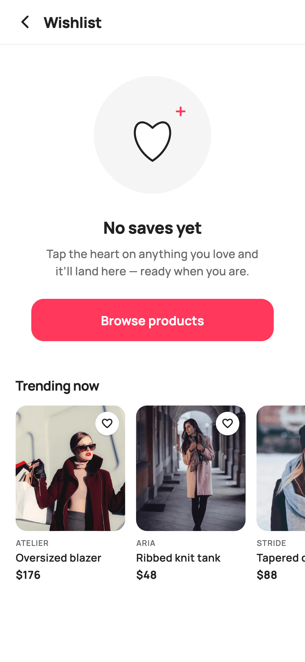
A wishlist tab with nothing in it is the moment a shopper decides whether saving items is worth the effort. This tutorial builds StyleCart's empty wishlist screen in Flutter: a 150px painted heart illustration with a pink spark, a 'No saves yet' headline, a line that teaches the heart-tap gesture in one sentence, a full-width Browse products button, and a horizontal Trending now rail whose cards each carry a heart badge — four real products to make the first save one tap away.
Watch the Flutter UI walkthrough
A short screen recording of Empty Wishlist running, if you'd rather see it before you read the code. The written tutorial below covers everything in it.
Can't see the video? Watch it on YouTube.
What you'll build
- ✓A CustomPainter heart — white fill, 2.6px dark outline, pink spark glint — that reads as unfilled rather than broken
- ✓Subline copy that names the heart control instead of apologising for the empty tab
- ✓A 54px 'Browse products' FilledButton in StyleCart's #FF385C brand pink
- ✓A 226px horizontal 'Trending now' rail of four tappable product cards, each wearing an outlined heart badge
- ✓A scrollable zero-state that survives a small phone without a single overflow stripe
Step-by-step build
Create the file
Add a new file at lib/ecom_wishlist_empty/ecom_wishlist_empty_screen.dart in your Flutter project.
Register the bundled fonts
No external packages — this is pure Flutter. It does bundle its design font (Manrope), so drop the font file into fonts/ and declare it in pubspec.yaml:
flutter:
  fonts:
    - family: Manrope
      fonts:
- asset: fonts/Manrope-Regular.ttfBuild it, piece by piece
Here's how the screen goes together. Each block below is a real slice of the code with a plain-English explanation — paste them in order, or grab the whole file from the next section.
Callbacks, tokens and the trending products as data
import 'package:flutter/material.dart';

/// StyleCart — Empty Wishlist.
///
/// The zero-state for the Wishlist tab: a painted broken-heart illustration, a
/// nudge to start saving, a "Browse products" CTA and a trending rail to seed
/// the first save.
///
/// Self-contained per CONVENTIONS.md: pure Flutter, bundled Manrope, inline
/// Airbnb-style tokens, own light theme + SafeArea, bundled webp. The
/// illustration is a CustomPainter (no emoji glyph). Exposes callbacks only.
class EcomWishlistEmptyScreen extends StatelessWidget {
  const EcomWishlistEmptyScreen({
    super.key,
    this.onBack,
    this.onBrowse,
    this.onProduct,
  });

  final VoidCallback? onBack;
  final VoidCallback? onBrowse;
  final ValueChanged<String>? onProduct;

  static const String _font = 'Manrope';
  static const Color _canvas = Color(0xFFFFFFFF);
  static const Color _ink = Color(0xFF222222);
  static const Color _muted = Color(0xFF6A6A6A);
  static const Color _brand = Color(0xFFFF385C);
  static const Color _imageBg = Color(0xFFF5F5F5);
  static const Color _hairline = Color(0xFFEBEBEB);

  static const String _dir = 'lib/screens/ecommerce/ecom_wishlist_empty/images';

  static const List<_P> _trending = <_P>[
    _P('Oversized blazer', 'Atelier', 176, 'p07.webp'),
    _P('Ribbed knit tank', 'Aria', 48, 'p08.webp'),
    _P('Tapered chino', 'Stride', 88, 'p09.webp'),
    _P('Suede loafers', 'Stride', 124, 'p10.webp'),
  ];
The screen is a `StatelessWidget` with three optional callbacks — `onBack`, `onBrowse`, `onProduct` — because a wishlist holding zero items has no state of its own to mutate; every tap leaves for somewhere else. `_brand` (#FF385C) is spent in exactly two places, the Browse button and the painter's spark, so the pink always means 'act here'. `_imageBg` (#F5F5F5) does double duty as the rail's thumbnail backing and the illustration's disc. The four trending items live in a `static const List<_P>`, each a title, brand, price and webp filename, with `_dir` holding the shared asset folder so a card only names its own file.
A scrolling zero-state, not a centred one
  @override
  Widget build(BuildContext context) {
    return Theme(
      data: ThemeData.light(useMaterial3: true),
      child: Scaffold(
        backgroundColor: _canvas,
        body: SafeArea(
          child: Column(
            children: <Widget>[
              _header(),
              const Divider(height: 1, color: _hairline),
              Expanded(
                child: ListView(
                  padding: const EdgeInsets.only(bottom: 28),
                  children: <Widget>[
                    const SizedBox(height: 40),
                    Center(
                      child: SizedBox(
                        width: 150,
                        height: 150,
                        child: CustomPaint(painter: _HeartArtPainter()),
                      ),
                    ),
`Theme(data: ThemeData.light(useMaterial3: true))` pins the light look regardless of the host app, then a white `Scaffold` and `SafeArea` wrap a Column of header, a 1px `Divider` in `_hairline`, and an `Expanded` `ListView`. Scrolling matters here: the illustration, headline, subline, CTA and a 226px rail together exceed a small phone, and a `Column` with `Spacer`s would overflow the moment the rail appeared. The list's `EdgeInsets.only(bottom: 28)` keeps the last row clear of the home indicator. A 40px gap, then a `Center` holding a fixed 150×150 `SizedBox` — the painter works in fractions of `size`, so the box is what sets the artwork's scale.
Copy that names the heart, and the browse CTA
                    const SizedBox(height: 28),
                    const Text(
                      'No saves yet',
                      textAlign: TextAlign.center,
                      style: TextStyle(
                        fontFamily: _font,
                        fontSize: 21,
                        fontWeight: FontWeight.w800,
                        letterSpacing: -0.3,
                        color: _ink,
                      ),
                    ),
                    const SizedBox(height: 8),
                    const Padding(
                      padding: EdgeInsets.symmetric(horizontal: 48),
                      child: Text(
                        'Tap the heart on anything you love and it’ll '
                        'land here — ready when you are.',
                        textAlign: TextAlign.center,
                        style: TextStyle(
                          fontFamily: _font,
                          fontSize: 14.5,
                          fontWeight: FontWeight.w500,
                          height: 1.5,
                          color: _muted,
                        ),
                      ),
                    ),
                    const SizedBox(height: 24),
                    Padding(
                      padding: const EdgeInsets.symmetric(horizontal: 40),
                      child: SizedBox(
                        height: 54,
                        child: FilledButton(
                          onPressed: onBrowse,
                          style: FilledButton.styleFrom(
                            backgroundColor: _brand,
                            foregroundColor: _canvas,
                            shape: RoundedRectangleBorder(
                              borderRadius: BorderRadius.circular(16),
                            ),
                          ),
                          child: const Text(
                            'Browse products',
                            style: TextStyle(
                              fontFamily: _font,
                              fontSize: 16,
                              fontWeight: FontWeight.w700,
                            ),
                          ),
                        ),
                      ),
                    ),
'No saves yet' lands at 21px `w800` with `letterSpacing: -0.3`, and 8px under it the subline reads 'Tap the heart on anything you love and it'll land here — ready when you are.' That sentence is the whole job of the screen: a wishlist is empty because the shopper hasn't noticed the heart, so the copy points at the control rather than apologising. `EdgeInsets.symmetric(horizontal: 48)` forces a comfortable two-line wrap at 14.5px with `height: 1.5` in `_muted`. After 24px, the `FilledButton` sits in 40px side padding at a fixed `height: 54` with a 16px radius and brand fill, firing `onBrowse`.
Handing off to the trending rail
                    const SizedBox(height: 44),
                    const Padding(
                      padding: EdgeInsets.fromLTRB(20, 0, 20, 14),
                      child: Text(
                        'Trending now',
                        style: TextStyle(
                          fontFamily: _font,
                          fontSize: 17,
                          fontWeight: FontWeight.w700,
                          letterSpacing: -0.3,
                          color: _ink,
                        ),
                      ),
                    ),
                    _rail(),
                  ],
                ),
              ),
            ],
          ),
        ),
      ),
    );
  }
A deliberate 44px gap — the largest on the screen — separates the zero-state block from what follows, so the rail reads as a second offer rather than part of the illustration. 'Trending now' is set at 17px `w700` with `EdgeInsets.fromLTRB(20, 0, 20, 14)`, its 20px left inset matching the rail's own padding so title and first card share an edge. Both the heading and `_rail()` are children of the same `ListView`, which means the section scrolls away with the artwork instead of pinning; the rail's own horizontal scrolling is nested inside that vertical list without conflict, since the axes differ.
A header that keeps the tab's identity
  Widget _header() {
    return Padding(
      padding: const EdgeInsets.fromLTRB(8, 4, 20, 4),
      child: Row(
        children: <Widget>[
          IconButton(
            onPressed: onBack,
            icon: const Icon(Icons.arrow_back_ios_new_rounded,
                size: 20, color: _ink),
          ),
          const Expanded(
            child: Text(
              'Wishlist',
              style: TextStyle(
                fontFamily: _font,
                fontSize: 19,
                fontWeight: FontWeight.w800,
                letterSpacing: -0.3,
                color: _ink,
              ),
            ),
          ),
        ],
      ),
    );
  }
`EdgeInsets.fromLTRB(8, 4, 20, 4)` uses only 8px on the left because the `IconButton` already carries a 48px touch target that would otherwise push the arrow too far inboard. The glyph is `Icons.arrow_back_ios_new_rounded` at 20px in `_ink`. The 'Wishlist' title sits inside an `Expanded` rather than being centred, so it reads as a left-aligned screen name beside the arrow and the row's width is claimed in one widget. There is no trailing action — a wishlist with zero saves has nothing to edit, share or clear, so an overflow menu would open onto disabled items.
The Trending now rail
  Widget _rail() {
    return SizedBox(
      height: 226,
      child: ListView.separated(
        scrollDirection: Axis.horizontal,
        padding: const EdgeInsets.symmetric(horizontal: 20),
        itemCount: _trending.length,
        separatorBuilder: (_, _) => const SizedBox(width: 14),
        itemBuilder: (BuildContext context, int i) {
          final _P p = _trending[i];
          return GestureDetector(
            onTap: () => onProduct?.call(p.title),
            child: SizedBox(
              width: 140,
              child: Column(
                crossAxisAlignment: CrossAxisAlignment.start,
                children: <Widget>[
                  Expanded(
                    child: ClipRRect(
                      borderRadius: BorderRadius.circular(14),
                      child: Stack(
                        fit: StackFit.expand,
                        children: <Widget>[
                          Container(color: _imageBg),
                          Image.asset('$_dir/${p.asset}', fit: BoxFit.cover),
                          const Positioned(top: 8, right: 8, child: _Heart()),
                        ],
                      ),
                    ),
                  ),
                  const SizedBox(height: 8),
                  Text(
                    p.brand.toUpperCase(),
                    style: const TextStyle(
                      fontFamily: _font,
                      fontSize: 10,
                      fontWeight: FontWeight.w600,
                      letterSpacing: 0.6,
                      color: _muted,
                    ),
                  ),
                  const SizedBox(height: 2),
                  Text(
                    p.title,
                    maxLines: 1,
                    overflow: TextOverflow.ellipsis,
                    style: const TextStyle(
                      fontFamily: _font,
                      fontSize: 13.5,
                      fontWeight: FontWeight.w600,
                      color: _ink,
                    ),
                  ),
                  const SizedBox(height: 3),
                  Text(
                    '\$${p.price}',
                    style: const TextStyle(
                      fontFamily: _font,
                      fontSize: 14,
                      fontWeight: FontWeight.w700,
                      color: _ink,
                    ),
                  ),
                ],
              ),
            ),
          );
        },
      ),
    );
  }
A fixed `SizedBox(height: 226)` gives the horizontal `ListView.separated` a bound, which lets each card's `Column` hand the image an `Expanded` while the four text lines take their intrinsic heights. Separators are 14px; each card is 140 wide. The whole card is a `GestureDetector` calling `onProduct?.call(p.title)`. Inside a `ClipRRect` with a 14px radius, a `Stack` layers `Container(color: _imageBg)` beneath `Image.asset` so a decoding frame shows grey rather than white flash, with the `_Heart` badge pinned at `top: 8, right: 8`. Brand is uppercased at 10px with `letterSpacing: 0.6`, the title clipped to one line with `TextOverflow.ellipsis`, and the price bolded at `w700`.
The heart badge and the product record
class _Heart extends StatelessWidget {
  const _Heart();

  @override
  Widget build(BuildContext context) {
    return Container(
      width: 30,
      height: 30,
      decoration: const BoxDecoration(
        color: Color(0xFFFFFFFF),
        shape: BoxShape.circle,
        boxShadow: <BoxShadow>[
          BoxShadow(
            color: Color(0x14000000),
            blurRadius: 5,
            offset: Offset(0, 2),
          ),
        ],
      ),
      child: const Icon(Icons.favorite_border_rounded,
          size: 16, color: Color(0xFF222222)),
    );
  }
}

class _P {
  const _P(this.title, this.brand, this.price, this.asset);
  final String title;
  final String brand;
  final int price;
  final String asset;
}
`_Heart` is a 30px white circle carrying `Icons.favorite_border_rounded` at 16px, lifted off the photo by a single `BoxShadow` at `Color(0x14000000)`, `blurRadius: 5`, `offset: Offset(0, 2)` — enough separation to stay legible over a busy garment shot without a hard ring. The glyph is the *outline* variant on every card, which is the point: nothing here is saved yet, so the badge shows the shopper the exact control the subline just described. Note it has no `onTap` of its own — the enclosing `GestureDetector` sends taps to `onProduct` instead. `_P` is a four-field const record holding title, brand, price and asset name.
Painting the heart and its spark
/// Paints a soft outlined heart with a brand spark, the wishlist zero-state
/// motif — empty but inviting.
class _HeartArtPainter extends CustomPainter {
  @override
  void paint(Canvas canvas, Size size) {
    final double w = size.width;
    final double h = size.height;

    // Rounded backdrop.
    canvas.drawCircle(
      Offset(w / 2, h / 2),
      w / 2,
      Paint()..color = const Color(0xFFF5F5F5),
    );

    // Heart outline, centred.
    final Path heart = _heartPath(
      Offset(w / 2, h * 0.52),
      w * 0.42,
      h * 0.40,
    );
    canvas.drawPath(heart, Paint()..color = const Color(0xFFFFFFFF));
    canvas.drawPath(
      heart,
      Paint()
        ..style = PaintingStyle.stroke
        ..strokeWidth = 2.6
        ..strokeJoin = StrokeJoin.round
        ..color = const Color(0xFF222222),
    );

    // Brand spark — a tiny plus glint to the upper-right.
    final Paint spark = Paint()
      ..color = const Color(0xFFFF385C)
      ..strokeWidth = 2.4
      ..strokeCap = StrokeCap.round;
    final Offset s = Offset(w * 0.74, h * 0.30);
    canvas.drawLine(s.translate(-5, 0), s.translate(5, 0), spark);
    canvas.drawLine(s.translate(0, -5), s.translate(0, 5), spark);
  }

  Path _heartPath(Offset c, double width, double height) {
    final double l = c.dx - width / 2;
    final double t = c.dy - height / 2;
    final Path p = Path();
    p.moveTo(c.dx, t + height);
    p.cubicTo(
      l - width * 0.05, t + height * 0.62,
      l + width * 0.10, t - height * 0.10,
      c.dx, t + height * 0.30,
    );
    p.cubicTo(
      l + width * 0.90, t - height * 0.10,
      l + width * 1.05, t + height * 0.62,
      c.dx, t + height,
    );
    p.close();
    return p;
  }

  @override
  bool shouldRepaint(_HeartArtPainter oldDelegate) => false;
}
Despite the 'broken heart' label in the docs, `_HeartArtPainter` draws a whole one — unfilled, not broken, a friendlier read of zero saves. A #F5F5F5 disc at radius `w / 2` fills the box, then the heart sits at `(w / 2, h * 0.52)` — below true centre so the lobes clear the disc edge — sized `w * 0.42` by `h * 0.40`, filled white then stroked at 2.6px in #222. The pink spark is two crossed 10px `drawLine` calls at `(w * 0.74, h * 0.30)`. `_heartPath` starts at the bottom point and runs two mirrored cubics whose control points overshoot the box to bulge each lobe, meeting at the cleft at `t + height * 0.30`.
Full code
The complete, ready-to-paste source. Free to use in your projects — one click copies it all.
import 'package:flutter/material.dart';

/// StyleCart — Empty Wishlist.
///
/// The zero-state for the Wishlist tab: a painted broken-heart illustration, a
/// nudge to start saving, a "Browse products" CTA and a trending rail to seed
/// the first save.
///
/// Self-contained per CONVENTIONS.md: pure Flutter, bundled Manrope, inline
/// Airbnb-style tokens, own light theme + SafeArea, bundled webp. The
/// illustration is a CustomPainter (no emoji glyph). Exposes callbacks only.
class EcomWishlistEmptyScreen extends StatelessWidget {
  const EcomWishlistEmptyScreen({
    super.key,
    this.onBack,
    this.onBrowse,
    this.onProduct,
  });

  final VoidCallback? onBack;
  final VoidCallback? onBrowse;
  final ValueChanged<String>? onProduct;

  static const String _font = 'Manrope';
  static const Color _canvas = Color(0xFFFFFFFF);
  static const Color _ink = Color(0xFF222222);
  static const Color _muted = Color(0xFF6A6A6A);
  static const Color _brand = Color(0xFFFF385C);
  static const Color _imageBg = Color(0xFFF5F5F5);
  static const Color _hairline = Color(0xFFEBEBEB);

  static const String _dir = 'lib/screens/ecommerce/ecom_wishlist_empty/images';

  static const List<_P> _trending = <_P>[
    _P('Oversized blazer', 'Atelier', 176, 'p07.webp'),
    _P('Ribbed knit tank', 'Aria', 48, 'p08.webp'),
    _P('Tapered chino', 'Stride', 88, 'p09.webp'),
    _P('Suede loafers', 'Stride', 124, 'p10.webp'),
  ];

  @override
  Widget build(BuildContext context) {
    return Theme(
      data: ThemeData.light(useMaterial3: true),
      child: Scaffold(
        backgroundColor: _canvas,
        body: SafeArea(
          child: Column(
            children: <Widget>[
              _header(),
              const Divider(height: 1, color: _hairline),
              Expanded(
                child: ListView(
                  padding: const EdgeInsets.only(bottom: 28),
                  children: <Widget>[
                    const SizedBox(height: 40),
                    Center(
                      child: SizedBox(
                        width: 150,
                        height: 150,
                        child: CustomPaint(painter: _HeartArtPainter()),
                      ),
                    ),
                    const SizedBox(height: 28),
                    const Text(
                      'No saves yet',
                      textAlign: TextAlign.center,
                      style: TextStyle(
                        fontFamily: _font,
                        fontSize: 21,
                        fontWeight: FontWeight.w800,
                        letterSpacing: -0.3,
                        color: _ink,
                      ),
                    ),
                    const SizedBox(height: 8),
                    const Padding(
                      padding: EdgeInsets.symmetric(horizontal: 48),
                      child: Text(
                        'Tap the heart on anything you love and it’ll '
                        'land here — ready when you are.',
                        textAlign: TextAlign.center,
                        style: TextStyle(
                          fontFamily: _font,
                          fontSize: 14.5,
                          fontWeight: FontWeight.w500,
                          height: 1.5,
                          color: _muted,
                        ),
                      ),
                    ),
                    const SizedBox(height: 24),
                    Padding(
                      padding: const EdgeInsets.symmetric(horizontal: 40),
                      child: SizedBox(
                        height: 54,
                        child: FilledButton(
                          onPressed: onBrowse,
                          style: FilledButton.styleFrom(
                            backgroundColor: _brand,
                            foregroundColor: _canvas,
                            shape: RoundedRectangleBorder(
                              borderRadius: BorderRadius.circular(16),
                            ),
                          ),
                          child: const Text(
                            'Browse products',
                            style: TextStyle(
                              fontFamily: _font,
                              fontSize: 16,
                              fontWeight: FontWeight.w700,
                            ),
                          ),
                        ),
                      ),
                    ),
                    const SizedBox(height: 44),
                    const Padding(
                      padding: EdgeInsets.fromLTRB(20, 0, 20, 14),
                      child: Text(
                        'Trending now',
                        style: TextStyle(
                          fontFamily: _font,
                          fontSize: 17,
                          fontWeight: FontWeight.w700,
                          letterSpacing: -0.3,
                          color: _ink,
                        ),
                      ),
                    ),
                    _rail(),
                  ],
                ),
              ),
            ],
          ),
        ),
      ),
    );
  }

  Widget _header() {
    return Padding(
      padding: const EdgeInsets.fromLTRB(8, 4, 20, 4),
      child: Row(
        children: <Widget>[
          IconButton(
            onPressed: onBack,
            icon: const Icon(Icons.arrow_back_ios_new_rounded,
                size: 20, color: _ink),
          ),
          const Expanded(
            child: Text(
              'Wishlist',
              style: TextStyle(
                fontFamily: _font,
                fontSize: 19,
                fontWeight: FontWeight.w800,
                letterSpacing: -0.3,
                color: _ink,
              ),
            ),
          ),
        ],
      ),
    );
  }

  Widget _rail() {
    return SizedBox(
      height: 226,
      child: ListView.separated(
        scrollDirection: Axis.horizontal,
        padding: const EdgeInsets.symmetric(horizontal: 20),
        itemCount: _trending.length,
        separatorBuilder: (_, _) => const SizedBox(width: 14),
        itemBuilder: (BuildContext context, int i) {
          final _P p = _trending[i];
          return GestureDetector(
            onTap: () => onProduct?.call(p.title),
            child: SizedBox(
              width: 140,
              child: Column(
                crossAxisAlignment: CrossAxisAlignment.start,
                children: <Widget>[
                  Expanded(
                    child: ClipRRect(
                      borderRadius: BorderRadius.circular(14),
                      child: Stack(
                        fit: StackFit.expand,
                        children: <Widget>[
                          Container(color: _imageBg),
                          Image.asset('$_dir/${p.asset}', fit: BoxFit.cover),
                          const Positioned(top: 8, right: 8, child: _Heart()),
                        ],
                      ),
                    ),
                  ),
                  const SizedBox(height: 8),
                  Text(
                    p.brand.toUpperCase(),
                    style: const TextStyle(
                      fontFamily: _font,
                      fontSize: 10,
                      fontWeight: FontWeight.w600,
                      letterSpacing: 0.6,
                      color: _muted,
                    ),
                  ),
                  const SizedBox(height: 2),
                  Text(
                    p.title,
                    maxLines: 1,
                    overflow: TextOverflow.ellipsis,
                    style: const TextStyle(
                      fontFamily: _font,
                      fontSize: 13.5,
                      fontWeight: FontWeight.w600,
                      color: _ink,
                    ),
                  ),
                  const SizedBox(height: 3),
                  Text(
                    '\$${p.price}',
                    style: const TextStyle(
                      fontFamily: _font,
                      fontSize: 14,
                      fontWeight: FontWeight.w700,
                      color: _ink,
                    ),
                  ),
                ],
              ),
            ),
          );
        },
      ),
    );
  }
}

class _Heart extends StatelessWidget {
  const _Heart();

  @override
  Widget build(BuildContext context) {
    return Container(
      width: 30,
      height: 30,
      decoration: const BoxDecoration(
        color: Color(0xFFFFFFFF),
        shape: BoxShape.circle,
        boxShadow: <BoxShadow>[
          BoxShadow(
            color: Color(0x14000000),
            blurRadius: 5,
            offset: Offset(0, 2),
          ),
        ],
      ),
      child: const Icon(Icons.favorite_border_rounded,
          size: 16, color: Color(0xFF222222)),
    );
  }
}

class _P {
  const _P(this.title, this.brand, this.price, this.asset);
  final String title;
  final String brand;
  final int price;
  final String asset;
}

/// Paints a soft outlined heart with a brand spark, the wishlist zero-state
/// motif — empty but inviting.
class _HeartArtPainter extends CustomPainter {
  @override
  void paint(Canvas canvas, Size size) {
    final double w = size.width;
    final double h = size.height;

    // Rounded backdrop.
    canvas.drawCircle(
      Offset(w / 2, h / 2),
      w / 2,
      Paint()..color = const Color(0xFFF5F5F5),
    );

    // Heart outline, centred.
    final Path heart = _heartPath(
      Offset(w / 2, h * 0.52),
      w * 0.42,
      h * 0.40,
    );
    canvas.drawPath(heart, Paint()..color = const Color(0xFFFFFFFF));
    canvas.drawPath(
      heart,
      Paint()
        ..style = PaintingStyle.stroke
        ..strokeWidth = 2.6
        ..strokeJoin = StrokeJoin.round
        ..color = const Color(0xFF222222),
    );

    // Brand spark — a tiny plus glint to the upper-right.
    final Paint spark = Paint()
      ..color = const Color(0xFFFF385C)
      ..strokeWidth = 2.4
      ..strokeCap = StrokeCap.round;
    final Offset s = Offset(w * 0.74, h * 0.30);
    canvas.drawLine(s.translate(-5, 0), s.translate(5, 0), spark);
    canvas.drawLine(s.translate(0, -5), s.translate(0, 5), spark);
  }

  Path _heartPath(Offset c, double width, double height) {
    final double l = c.dx - width / 2;
    final double t = c.dy - height / 2;
    final Path p = Path();
    p.moveTo(c.dx, t + height);
    p.cubicTo(
      l - width * 0.05, t + height * 0.62,
      l + width * 0.10, t - height * 0.10,
      c.dx, t + height * 0.30,
    );
    p.cubicTo(
      l + width * 0.90, t - height * 0.10,
      l + width * 1.05, t + height * 0.62,
      c.dx, t + height,
    );
    p.close();
    return p;
  }

  @override
  bool shouldRepaint(_HeartArtPainter oldDelegate) => false;
}
Plus bundled 9 binary assets (fonts/images). The CLI and MCP install those for you automatically.
Two faster ways to add it
Copy-paste works, but you can skip it entirely.
1. FlutterKit CLI
One command drops this screen — and its fonts — straight into your project.
$ flutterkit add ecom-wishlist-empty2. AI agent (MCP)
Connect FlutterKit's MCP server in Claude or Cursor and just ask your agent to install ecom-wishlist-empty — it fetches and writes the files for you.
FAQ
Is this empty wishlist screen free to use commercially?
Yes — free, with nothing paid behind it. Copy the Dart from this page, install it with the CLI, or pull it through MCP, and ship it in a real shopping app. No sign-up, no licence key, no attribution line.
Which packages, fonts and images does it need?
No pub packages at all — `material.dart` only. Text uses bundled Manrope via `fontFamily: 'Manrope'`, and the four rail cards load webp files from `lib/screens/ecommerce/ecom_wishlist_empty/images`. Point `_dir` at your own asset folder, or replace `Image.asset` with `Image.network` for a live catalogue; the grey `_imageBg` layer beneath already covers the loading frame.
How do I make the heart badge actually save a product?
`_Heart` is decorative today — it has no `onTap`, and the card's `GestureDetector` routes every tap to `onProduct`. Convert the screen to a `StatefulWidget`, hold a `Set<String>` of saved titles, wrap `_Heart` in its own `GestureDetector`, and pass a `saved` flag so it swaps `Icons.favorite_border_rounded` for `Icons.favorite_rounded` in `_brand`.
Why put a trending rail on a screen about having nothing saved?
Because the only fix for an empty wishlist is a first save, and the Browse button costs a navigation before the shopper sees a single product. Four real cards with prices and heart badges put a candidate item on this screen, so the tab can go from zero to one without leaving it.
Which Flutter version does this need?
Flutter 3.29 or newer, because `separatorBuilder: (_, _) =>` uses Dart 3.7 wildcard parameters. On an older SDK rename them to `(_, __)`, and if you are below 3.22 also expand the constructor from `super.key` to the `{Key? key, ...}) : super(key: key)` form.


