How to Build a Wishlist Collections Screen in Flutter (Full Code + Preview)
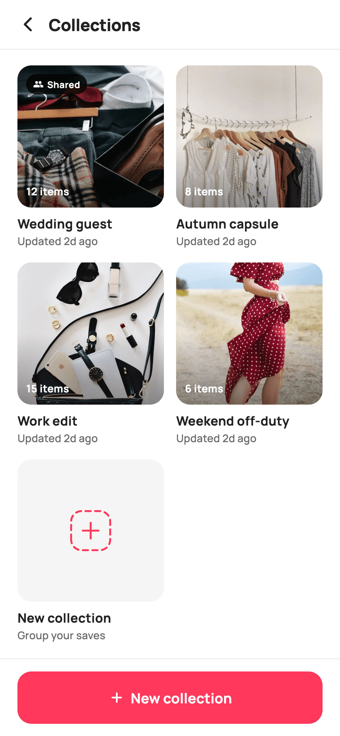
A wishlist that is one long list of everything a shopper ever tapped the heart on stops being useful around item thirty. This tutorial builds StyleCart's Collections screen in Flutter — the folder level above saved items, where products live inside named boards like 'Wedding guest' or 'Autumn capsule'. You get a two-column grid of cover-photo cards carrying an item count over a gradient scrim, a Shared badge on collaborative boards, a hand-painted dashed New collection tile, and a pinned create button.
Watch the Flutter UI walkthrough
A short screen recording of Wishlist Collections running, if you'd rather see it before you read the code. The written tutorial below covers everything in it.
Can't see the video? Watch it on YouTube.
What you'll build
- ✓A `_Board` record — name, item count, shared flag, cover asset — driving a two-column grid
- ✓Cover cards where the item count sits on a bottom scrim so it survives a bright photo
- ✓A Shared pill that only renders on boards flagged `shared`, so private boards stay unlabelled
- ✓A dashed rounded-square New collection tile drawn by a `CustomPainter`, not an icon font
- ✓Two entry points to creation — the grid's trailing tile and a pinned coral button — sharing one callback
Step-by-step build
Create the file
Add a new file at lib/ecom_wishlist_collections/ecom_wishlist_collections_screen.dart in your Flutter project.
Register the bundled fonts
No external packages — this is pure Flutter. It does bundle its design font (Manrope), so drop the font file into fonts/ and declare it in pubspec.yaml:
flutter:
  fonts:
    - family: Manrope
      fonts:
- asset: fonts/Manrope-Regular.ttfBuild it, piece by piece
Here's how the screen goes together. Each block below is a real slice of the code with a plain-English explanation — paste them in order, or grab the whole file from the next section.
The board model as const data, and the token palette
import 'package:flutter/material.dart';

/// StyleCart — Wishlist Collections.
///
/// The shopper's saved products organised into named boards ("Wedding guest",
/// "Autumn capsule"…), each a cover-photo card with an item count and a small
/// stacked-thumb hint. A pinned bar creates a new collection.
///
/// Self-contained per CONVENTIONS.md: pure Flutter, bundled Manrope, inline
/// Airbnb-style tokens, own light theme + SafeArea, bundled webp. The new-board
/// tile art is a CustomPainter (no emoji glyph). Exposes callbacks only.
class EcomWishlistCollectionsScreen extends StatelessWidget {
  const EcomWishlistCollectionsScreen({
    super.key,
    this.onBack,
    this.onOpen,
    this.onNewCollection,
  });

  final VoidCallback? onBack;
  final ValueChanged<String>? onOpen;
  final VoidCallback? onNewCollection;

  static const String _font = 'Manrope';
  static const Color _canvas = Color(0xFFFFFFFF);
  static const Color _ink = Color(0xFF222222);
  static const Color _muted = Color(0xFF6A6A6A);
  static const Color _brand = Color(0xFFFF385C);
  static const Color _imageBg = Color(0xFFF5F5F5);
  static const Color _hairline = Color(0xFFEBEBEB);

  static const String _dir =
      'lib/screens/ecommerce/ecom_wishlist_collections/images';

  static const List<_Board> _boards = <_Board>[
    _Board('Wedding guest', 12, true, 'p11.webp'),
    _Board('Autumn capsule', 8, false, 'p12.webp'),
    _Board('Work edit', 15, false, 'p13.webp'),
    _Board('Weekend off-duty', 6, false, 'p14.webp'),
  ];
The screen is a `StatelessWidget` exposing `onBack`, `onOpen` and `onNewCollection`. `onOpen` is a `ValueChanged<String>` rather than a `VoidCallback` — it hands back `b.name`, so the host router knows which board was tapped without the screen owning any selection state. The four demo boards live in a `static const List<_Board>`, each a name, an item count, a shared flag and a webp filename. Keeping them const means the whole grid is compile-time data you swap for your API model in one place. The palette is Airbnb-flavoured: `_brand` `#FF385C` for actions only, `_imageBg` `#F5F5F5` as the placeholder behind covers, `_hairline` `#EBEBEB` for dividers.
Grid maths and the trailing create tile
  @override
  Widget build(BuildContext context) {
    return Theme(
      data: ThemeData.light(useMaterial3: true),
      child: Scaffold(
        backgroundColor: _canvas,
        body: SafeArea(
          child: Column(
            children: <Widget>[
              _header(),
              const Divider(height: 1, color: _hairline),
              Expanded(
                child: GridView.builder(
                  padding: const EdgeInsets.fromLTRB(20, 18, 20, 24),
                  gridDelegate:
                      const SliverGridDelegateWithFixedCrossAxisCount(
                    crossAxisCount: 2,
                    crossAxisSpacing: 14,
                    mainAxisSpacing: 16,
                    childAspectRatio: 0.80,
                  ),
                  itemCount: _boards.length + 1,
                  itemBuilder: (BuildContext context, int i) {
                    if (i == _boards.length) return _newTile();
                    return _boardCard(_boards[i]);
                  },
                ),
              ),
              _newBar(),
            ],
          ),
        ),
      ),
    );
  }
The body is a `Column` of header, hairline `Divider`, an `Expanded` grid and a pinned bar — so the bar never scrolls away. `SliverGridDelegateWithFixedCrossAxisCount` fixes `crossAxisCount: 2` with 14px across and 16px down; the vertical gap is larger because each cell carries two text lines under its image and needs the extra breathing room. `childAspectRatio: 0.80` makes every cell taller than it is wide, which is what leaves room for the cover plus the name and 'Updated' lines. The clever bit is `itemCount: _boards.length + 1`: the builder returns `_newTile()` on the last index, so creation is a grid cell rather than a special case bolted on.
A title-only header
  Widget _header() {
    return Padding(
      padding: const EdgeInsets.fromLTRB(8, 4, 20, 4),
      child: Row(
        children: <Widget>[
          IconButton(
            onPressed: onBack,
            icon: const Icon(Icons.arrow_back_ios_new_rounded,
                size: 20, color: _ink),
          ),
          const Expanded(
            child: Text(
              'Collections',
              style: TextStyle(
                fontFamily: _font,
                fontSize: 19,
                fontWeight: FontWeight.w800,
                letterSpacing: -0.3,
                color: _ink,
              ),
            ),
          ),
        ],
      ),
    );
  }
The header is a `Row` with a back `IconButton` and the word 'Collections' in an `Expanded`. Padding is asymmetric — `fromLTRB(8, 4, 20, 4)` — because `IconButton` already carries its own 8px of internal padding on the left, so a small outer value keeps the arrow optically aligned with the grid's 20px gutter while the right side matches it directly. The title is 19px `w800` with `letterSpacing: -0.3`; tightening the tracking on a heavy weight stops the two words from looking loose at display size. No search field and no sort control here — a shopper with four boards scans them faster than they could filter them.
The cover card: photo, scrim, count
  Widget _boardCard(_Board b) {
    return GestureDetector(
      onTap: () => onOpen?.call(b.name),
      child: Column(
        crossAxisAlignment: CrossAxisAlignment.start,
        children: <Widget>[
          Expanded(
            child: ClipRRect(
              borderRadius: BorderRadius.circular(16),
              child: Stack(
                fit: StackFit.expand,
                children: <Widget>[
                  Container(color: _imageBg),
                  Image.asset('$_dir/${b.asset}', fit: BoxFit.cover),
                  // Bottom scrim so the count chip stays legible on any photo.
                  const DecoratedBox(
                    decoration: BoxDecoration(
                      gradient: LinearGradient(
                        begin: Alignment.bottomCenter,
                        end: Alignment.center,
                        colors: <Color>[Color(0x66000000), Color(0x00000000)],
                      ),
                    ),
                  ),
                  if (b.shared)
                    Positioned(
                      top: 10,
                      left: 10,
                      child: _chip(Icons.group_rounded, 'Shared'),
                    ),
                  Positioned(
                    left: 10,
                    bottom: 10,
                    child: Text(
                      '${b.count} items',
                      style: const TextStyle(
                        fontFamily: _font,
                        fontSize: 12,
                        fontWeight: FontWeight.w700,
                        color: Color(0xFFFFFFFF),
                      ),
                    ),
                  ),
                ],
              ),
            ),
          ),
          const SizedBox(height: 8),
          Text(
            b.name,
            maxLines: 1,
            overflow: TextOverflow.ellipsis,
            style: const TextStyle(
              fontFamily: _font,
              fontSize: 14.5,
              fontWeight: FontWeight.w700,
              color: _ink,
            ),
          ),
          const SizedBox(height: 1),
          Text(
            'Updated 2d ago',
            style: const TextStyle(
              fontFamily: _font,
              fontSize: 12,
              fontWeight: FontWeight.w500,
              color: _muted,
            ),
          ),
        ],
      ),
    );
  }
Each card is a `GestureDetector` wrapping a `Column` whose image sits in an `Expanded`, so the cover absorbs whatever height the aspect ratio leaves after the two text lines — the labels never get squeezed. Inside a 16px `ClipRRect` a `Stack` with `StackFit.expand` layers four things: a `_imageBg` container as the colour behind a slow-loading asset, the `Image.asset` at `BoxFit.cover`, then a `DecoratedBox` running `#66000000` at the bottom to transparent at centre. That scrim is what lets the white '12 items' label stay readable on a pale linen photo. The name uses `maxLines: 1` with `TextOverflow.ellipsis`, and 'Updated 2d ago' sits 1px below in `_muted`.
The Shared badge pill
  Widget _chip(IconData icon, String label) {
    return Container(
      padding: const EdgeInsets.symmetric(horizontal: 8, vertical: 4),
      decoration: BoxDecoration(
        color: const Color(0xCC000000),
        borderRadius: BorderRadius.circular(20),
      ),
      child: Row(
        children: <Widget>[
          Icon(icon, size: 12, color: const Color(0xFFFFFFFF)),
          const SizedBox(width: 4),
          Text(
            label,
            style: const TextStyle(
              fontFamily: _font,
              fontSize: 10.5,
              fontWeight: FontWeight.w700,
              color: Color(0xFFFFFFFF),
            ),
          ),
        ],
      ),
    );
  }
`_chip` builds a fully-rounded `Container` at `#CC000000` — 80% black rather than a brand colour, because it floats over unpredictable photography and a translucent dark pill reads on every one of them. It carries a 12px `Icons.group_rounded` and a 10.5px `w700` label with a 4px gap. It is only mounted behind `if (b.shared)` inside the Stack, positioned 10px from the top-left, which is the important product decision: a private board shows nothing at all rather than a 'Private' counter-badge. Absence is a cleaner default than labelling the majority case, and it keeps the covers uncluttered when most boards are personal.
The New collection tile
  Widget _newTile() {
    return GestureDetector(
      onTap: onNewCollection,
      child: Column(
        crossAxisAlignment: CrossAxisAlignment.start,
        children: <Widget>[
          Expanded(
            child: DecoratedBox(
              decoration: BoxDecoration(
                color: _imageBg,
                borderRadius: BorderRadius.circular(16),
              ),
              child: const Center(
                child: SizedBox(
                  width: 56,
                  height: 56,
                  child: CustomPaint(painter: _NewBoardPainter()),
                ),
              ),
            ),
          ),
          const SizedBox(height: 8),
          const Text(
            'New collection',
            style: TextStyle(
              fontFamily: _font,
              fontSize: 14.5,
              fontWeight: FontWeight.w700,
              color: _ink,
            ),
          ),
          const SizedBox(height: 1),
          const Text(
            'Group your saves',
            style: TextStyle(
              fontFamily: _font,
              fontSize: 12,
              fontWeight: FontWeight.w500,
              color: _muted,
            ),
          ),
        ],
      ),
    );
  }
The trailing cell mirrors the board card's structure exactly — `Expanded` art block, 8px gap, 14.5px `w700` title, 1px gap, 12px `_muted` subtitle — so it lands on the same baselines as its neighbours instead of looking like a floating button. Where a photo would go there is a `_imageBg` `DecoratedBox` with the same 16px radius, holding a 56×56 `CustomPaint`. The copy does real work: 'New collection' names the action and 'Group your saves' explains why anyone would want one, which matters most on the empty-ish state where a shopper has never made a board. Its `onTap` is the same `onNewCollection` the pinned button fires.
The pinned create bar
  Widget _newBar() {
    return Container(
      decoration: const BoxDecoration(
        color: _canvas,
        border: Border(top: BorderSide(color: _hairline)),
      ),
      child: SafeArea(
        top: false,
        child: SizedBox(
          height: 88,
          child: Padding(
            padding: const EdgeInsets.fromLTRB(20, 14, 20, 14),
            child: SizedBox(
              height: 56,
              child: FilledButton(
                onPressed: onNewCollection,
                style: FilledButton.styleFrom(
                  backgroundColor: _brand,
                  foregroundColor: _canvas,
                  shape: RoundedRectangleBorder(
                    borderRadius: BorderRadius.circular(16),
                  ),
                ),
                child: const Row(
                  mainAxisAlignment: MainAxisAlignment.center,
                  children: <Widget>[
                    Icon(Icons.add_rounded, size: 20),
                    SizedBox(width: 6),
                    Text(
                      'New collection',
                      style: TextStyle(
                        fontFamily: _font,
                        fontSize: 16,
                        fontWeight: FontWeight.w700,
                      ),
                    ),
                  ],
                ),
              ),
            ),
          ),
        ),
      ),
    );
  }
The bar is a `Container` with a top `BorderSide` hairline wrapping `SafeArea(top: false)` — the SafeArea is inside the Container, so the white fill runs under the home indicator while the button stays above it. An 88px `SizedBox` with 14px vertical padding yields the 56px `FilledButton`, tinted `_brand` with a 16px radius that echoes the card corners. Its child is a `const Row` of `Icons.add_rounded` and a 16px label, centred via `MainAxisAlignment.center`. Duplicating the grid tile's action here is deliberate: the tile is discoverable while scrolling, the bar is reachable with a thumb at any scroll position.
The board record and the dashed-square painter
class _Board {
  const _Board(this.name, this.count, this.shared, this.asset);
  final String name;
  final int count;
  final bool shared;
  final String asset;
}

/// Paints a dashed-square "new board" glyph with a centred plus — the
/// add-a-collection affordance.
class _NewBoardPainter extends CustomPainter {
  const _NewBoardPainter();

  @override
  void paint(Canvas canvas, Size size) {
    final double w = size.width;
    final double h = size.height;
    final Paint stroke = Paint()
      ..style = PaintingStyle.stroke
      ..strokeWidth = 2.2
      ..strokeCap = StrokeCap.round
      ..color = const Color(0xFFFF385C);

    // Dashed rounded square.
    final RRect frame = RRect.fromRectAndRadius(
      Rect.fromLTWH(w * 0.10, h * 0.10, w * 0.80, h * 0.80),
      const Radius.circular(12),
    );
    final Path framePath = Path()..addRRect(frame);
    _drawDashed(canvas, framePath, stroke, dash: 6, gap: 5);

    // Centred plus.
    final Offset c = Offset(w / 2, h / 2);
    canvas.drawLine(c.translate(-9, 0), c.translate(9, 0), stroke);
    canvas.drawLine(c.translate(0, -9), c.translate(0, 9), stroke);
  }

  void _drawDashed(Canvas canvas, Path path, Paint paint,
      {required double dash, required double gap}) {
    for (final ui in path.computeMetrics()) {
      double dist = 0;
      while (dist < ui.length) {
        final double next = dist + dash;
        canvas.drawPath(
          ui.extractPath(dist, next.clamp(0, ui.length)),
          paint,
        );
        dist = next + gap;
      }
    }
  }

  @override
  bool shouldRepaint(_NewBoardPainter oldDelegate) => false;
}
`_Board` is a four-field const class — the smallest thing that can describe a row of this grid. `_NewBoardPainter` draws the add glyph with one 2.2px round-capped stroke in `#FF385C`. It builds an `RRect` inset 10% on each side with a 12px radius, converts it to a `Path`, and feeds it to `_drawDashed`, which walks `path.computeMetrics()` extracting 6px segments separated by 5px gaps, clamping the final segment to `ui.length` so the dash never runs past the corner. A plus is then two `drawLine` calls ±9px from centre. Flutter has no dashed-border primitive, which is exactly why this is painted rather than styled.
Full code
The complete, ready-to-paste source. Free to use in your projects — one click copies it all.
import 'package:flutter/material.dart';

/// StyleCart — Wishlist Collections.
///
/// The shopper's saved products organised into named boards ("Wedding guest",
/// "Autumn capsule"…), each a cover-photo card with an item count and a small
/// stacked-thumb hint. A pinned bar creates a new collection.
///
/// Self-contained per CONVENTIONS.md: pure Flutter, bundled Manrope, inline
/// Airbnb-style tokens, own light theme + SafeArea, bundled webp. The new-board
/// tile art is a CustomPainter (no emoji glyph). Exposes callbacks only.
class EcomWishlistCollectionsScreen extends StatelessWidget {
  const EcomWishlistCollectionsScreen({
    super.key,
    this.onBack,
    this.onOpen,
    this.onNewCollection,
  });

  final VoidCallback? onBack;
  final ValueChanged<String>? onOpen;
  final VoidCallback? onNewCollection;

  static const String _font = 'Manrope';
  static const Color _canvas = Color(0xFFFFFFFF);
  static const Color _ink = Color(0xFF222222);
  static const Color _muted = Color(0xFF6A6A6A);
  static const Color _brand = Color(0xFFFF385C);
  static const Color _imageBg = Color(0xFFF5F5F5);
  static const Color _hairline = Color(0xFFEBEBEB);

  static const String _dir =
      'lib/screens/ecommerce/ecom_wishlist_collections/images';

  static const List<_Board> _boards = <_Board>[
    _Board('Wedding guest', 12, true, 'p11.webp'),
    _Board('Autumn capsule', 8, false, 'p12.webp'),
    _Board('Work edit', 15, false, 'p13.webp'),
    _Board('Weekend off-duty', 6, false, 'p14.webp'),
  ];

  @override
  Widget build(BuildContext context) {
    return Theme(
      data: ThemeData.light(useMaterial3: true),
      child: Scaffold(
        backgroundColor: _canvas,
        body: SafeArea(
          child: Column(
            children: <Widget>[
              _header(),
              const Divider(height: 1, color: _hairline),
              Expanded(
                child: GridView.builder(
                  padding: const EdgeInsets.fromLTRB(20, 18, 20, 24),
                  gridDelegate:
                      const SliverGridDelegateWithFixedCrossAxisCount(
                    crossAxisCount: 2,
                    crossAxisSpacing: 14,
                    mainAxisSpacing: 16,
                    childAspectRatio: 0.80,
                  ),
                  itemCount: _boards.length + 1,
                  itemBuilder: (BuildContext context, int i) {
                    if (i == _boards.length) return _newTile();
                    return _boardCard(_boards[i]);
                  },
                ),
              ),
              _newBar(),
            ],
          ),
        ),
      ),
    );
  }

  Widget _header() {
    return Padding(
      padding: const EdgeInsets.fromLTRB(8, 4, 20, 4),
      child: Row(
        children: <Widget>[
          IconButton(
            onPressed: onBack,
            icon: const Icon(Icons.arrow_back_ios_new_rounded,
                size: 20, color: _ink),
          ),
          const Expanded(
            child: Text(
              'Collections',
              style: TextStyle(
                fontFamily: _font,
                fontSize: 19,
                fontWeight: FontWeight.w800,
                letterSpacing: -0.3,
                color: _ink,
              ),
            ),
          ),
        ],
      ),
    );
  }

  Widget _boardCard(_Board b) {
    return GestureDetector(
      onTap: () => onOpen?.call(b.name),
      child: Column(
        crossAxisAlignment: CrossAxisAlignment.start,
        children: <Widget>[
          Expanded(
            child: ClipRRect(
              borderRadius: BorderRadius.circular(16),
              child: Stack(
                fit: StackFit.expand,
                children: <Widget>[
                  Container(color: _imageBg),
                  Image.asset('$_dir/${b.asset}', fit: BoxFit.cover),
                  // Bottom scrim so the count chip stays legible on any photo.
                  const DecoratedBox(
                    decoration: BoxDecoration(
                      gradient: LinearGradient(
                        begin: Alignment.bottomCenter,
                        end: Alignment.center,
                        colors: <Color>[Color(0x66000000), Color(0x00000000)],
                      ),
                    ),
                  ),
                  if (b.shared)
                    Positioned(
                      top: 10,
                      left: 10,
                      child: _chip(Icons.group_rounded, 'Shared'),
                    ),
                  Positioned(
                    left: 10,
                    bottom: 10,
                    child: Text(
                      '${b.count} items',
                      style: const TextStyle(
                        fontFamily: _font,
                        fontSize: 12,
                        fontWeight: FontWeight.w700,
                        color: Color(0xFFFFFFFF),
                      ),
                    ),
                  ),
                ],
              ),
            ),
          ),
          const SizedBox(height: 8),
          Text(
            b.name,
            maxLines: 1,
            overflow: TextOverflow.ellipsis,
            style: const TextStyle(
              fontFamily: _font,
              fontSize: 14.5,
              fontWeight: FontWeight.w700,
              color: _ink,
            ),
          ),
          const SizedBox(height: 1),
          Text(
            'Updated 2d ago',
            style: const TextStyle(
              fontFamily: _font,
              fontSize: 12,
              fontWeight: FontWeight.w500,
              color: _muted,
            ),
          ),
        ],
      ),
    );
  }

  Widget _chip(IconData icon, String label) {
    return Container(
      padding: const EdgeInsets.symmetric(horizontal: 8, vertical: 4),
      decoration: BoxDecoration(
        color: const Color(0xCC000000),
        borderRadius: BorderRadius.circular(20),
      ),
      child: Row(
        children: <Widget>[
          Icon(icon, size: 12, color: const Color(0xFFFFFFFF)),
          const SizedBox(width: 4),
          Text(
            label,
            style: const TextStyle(
              fontFamily: _font,
              fontSize: 10.5,
              fontWeight: FontWeight.w700,
              color: Color(0xFFFFFFFF),
            ),
          ),
        ],
      ),
    );
  }

  Widget _newTile() {
    return GestureDetector(
      onTap: onNewCollection,
      child: Column(
        crossAxisAlignment: CrossAxisAlignment.start,
        children: <Widget>[
          Expanded(
            child: DecoratedBox(
              decoration: BoxDecoration(
                color: _imageBg,
                borderRadius: BorderRadius.circular(16),
              ),
              child: const Center(
                child: SizedBox(
                  width: 56,
                  height: 56,
                  child: CustomPaint(painter: _NewBoardPainter()),
                ),
              ),
            ),
          ),
          const SizedBox(height: 8),
          const Text(
            'New collection',
            style: TextStyle(
              fontFamily: _font,
              fontSize: 14.5,
              fontWeight: FontWeight.w700,
              color: _ink,
            ),
          ),
          const SizedBox(height: 1),
          const Text(
            'Group your saves',
            style: TextStyle(
              fontFamily: _font,
              fontSize: 12,
              fontWeight: FontWeight.w500,
              color: _muted,
            ),
          ),
        ],
      ),
    );
  }

  Widget _newBar() {
    return Container(
      decoration: const BoxDecoration(
        color: _canvas,
        border: Border(top: BorderSide(color: _hairline)),
      ),
      child: SafeArea(
        top: false,
        child: SizedBox(
          height: 88,
          child: Padding(
            padding: const EdgeInsets.fromLTRB(20, 14, 20, 14),
            child: SizedBox(
              height: 56,
              child: FilledButton(
                onPressed: onNewCollection,
                style: FilledButton.styleFrom(
                  backgroundColor: _brand,
                  foregroundColor: _canvas,
                  shape: RoundedRectangleBorder(
                    borderRadius: BorderRadius.circular(16),
                  ),
                ),
                child: const Row(
                  mainAxisAlignment: MainAxisAlignment.center,
                  children: <Widget>[
                    Icon(Icons.add_rounded, size: 20),
                    SizedBox(width: 6),
                    Text(
                      'New collection',
                      style: TextStyle(
                        fontFamily: _font,
                        fontSize: 16,
                        fontWeight: FontWeight.w700,
                      ),
                    ),
                  ],
                ),
              ),
            ),
          ),
        ),
      ),
    );
  }
}

class _Board {
  const _Board(this.name, this.count, this.shared, this.asset);
  final String name;
  final int count;
  final bool shared;
  final String asset;
}

/// Paints a dashed-square "new board" glyph with a centred plus — the
/// add-a-collection affordance.
class _NewBoardPainter extends CustomPainter {
  const _NewBoardPainter();

  @override
  void paint(Canvas canvas, Size size) {
    final double w = size.width;
    final double h = size.height;
    final Paint stroke = Paint()
      ..style = PaintingStyle.stroke
      ..strokeWidth = 2.2
      ..strokeCap = StrokeCap.round
      ..color = const Color(0xFFFF385C);

    // Dashed rounded square.
    final RRect frame = RRect.fromRectAndRadius(
      Rect.fromLTWH(w * 0.10, h * 0.10, w * 0.80, h * 0.80),
      const Radius.circular(12),
    );
    final Path framePath = Path()..addRRect(frame);
    _drawDashed(canvas, framePath, stroke, dash: 6, gap: 5);

    // Centred plus.
    final Offset c = Offset(w / 2, h / 2);
    canvas.drawLine(c.translate(-9, 0), c.translate(9, 0), stroke);
    canvas.drawLine(c.translate(0, -9), c.translate(0, 9), stroke);
  }

  void _drawDashed(Canvas canvas, Path path, Paint paint,
      {required double dash, required double gap}) {
    for (final ui in path.computeMetrics()) {
      double dist = 0;
      while (dist < ui.length) {
        final double next = dist + dash;
        canvas.drawPath(
          ui.extractPath(dist, next.clamp(0, ui.length)),
          paint,
        );
        dist = next + gap;
      }
    }
  }

  @override
  bool shouldRepaint(_NewBoardPainter oldDelegate) => false;
}
Plus bundled 9 binary assets (fonts/images). The CLI and MCP install those for you automatically.
Two faster ways to add it
Copy-paste works, but you can skip it entirely.
1. FlutterKit CLI
One command drops this screen — and its fonts — straight into your project.
$ flutterkit add ecom-wishlist-collections2. AI agent (MCP)
Connect FlutterKit's MCP server in Claude or Cursor and just ask your agent to install ecom-wishlist-collections — it fetches and writes the files for you.
FAQ
Can I use this wishlist collections screen in a commercial app?
Yes. FlutterKit is free — there is no paid tier, no licence key and no sign-up. Copy the Dart from this page, install it with the CLI, or pull it through MCP, and ship it in a store app. Attribution is not required.
How do I replace the demo boards with data from my backend?
Swap the `static const List<_Board> _boards` for a constructor parameter of your own model, and change `Image.asset` to `Image.network(b.coverUrl)` with a `loadingBuilder` — the `_imageBg` container already sits behind it as the placeholder colour. `itemCount: _boards.length + 1` and the `_newTile()` branch keep working unchanged.
Why is the item count drawn over the photo instead of under the title?
Because the count is a property of the cover, not of the name. Putting it on the image keeps the text block to two tidy lines, and the bottom scrim gradient guarantees the white numerals stay legible whether the cover is a dark leather bag or an overexposed white shirt.
Do I need extra packages or an icon pack for the dashed tile?
No. The only dependency is `flutter/material.dart`. The dashed square and plus come from `_NewBoardPainter` using `Path.computeMetrics()` and `extractPath`, the badge and button glyphs are built-in Material icons, and the single font is bundled Manrope declared in your `pubspec.yaml`.
Which Flutter version does this screen need?
Flutter 3.16 or newer covers the `const Row` inside `FilledButton` and the super-parameter constructor. On an older SDK, expand the constructor to the `{Key? key, ...}) : super(key: key)` form; there is no `Color.withValues` call here, so no `withOpacity` swap is needed.


