How to Build an E-commerce Product Detail Page in Flutter (Full Code + Preview)
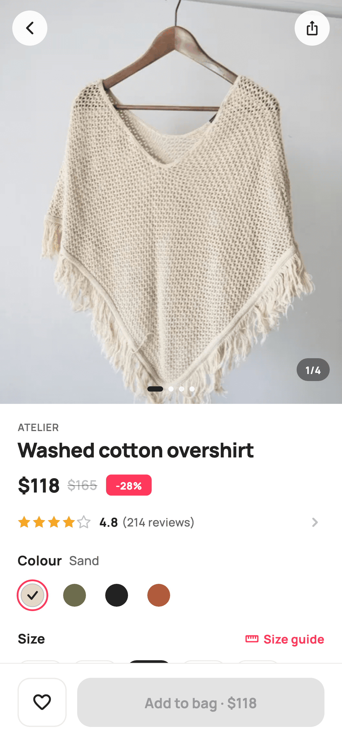
The product page is the highest-stakes screen in any shopping app, and this one is the full build: a 460px swipeable photo header with dots and an n/4 counter, price with a struck-through original and a painted discount badge, colour swatches, a size grid where sold-out sizes are struck through and unselectable, a bounded quantity stepper, delivery meta, highlights, a review preview and a related rail — all above a sticky bar whose CTA reads 'Add to bag · $236' and recalculates as you change quantity.
Watch the Flutter UI walkthrough
A short screen recording of Product Detail running, if you'd rather see it before you read the code. The written tutorial below covers everything in it.
Can't see the video? Watch it on YouTube.
What you'll build
- ✓A `PageView` photo header with floating circular back/share buttons, stretching page dots, and a live '2/4' counter pill
- ✓A size grid that disables sold-out options by passing `null` to `onTap` and strikes their labels through
- ✓A quantity stepper clamped between 1 and 9 by handing `null` to the buttons at each end
- ✓Colour swatches painted with a luminance-aware checkmark so pale and dark colours both stay readable
- ✓A sticky 88px bottom bar with a wishlist toggle and a total that recomputes from quantity
Step-by-step build
Create the file
Add a new file at lib/ecom_product_detail/ecom_product_detail_screen.dart in your Flutter project.
Register the bundled fonts
No external packages — this is pure Flutter. It does bundle its design font (Manrope), so drop the font file into fonts/ and declare it in pubspec.yaml:
flutter:
  fonts:
    - family: Manrope
      fonts:
- asset: fonts/Manrope-Regular.ttfBuild it, piece by piece
Here's how the screen goes together. Each block below is a real slice of the code with a plain-English explanation — paste them in order, or grab the whole file from the next section.
Nine callbacks, the catalogue data, and five pieces of state
class EcomProductDetailScreen extends StatefulWidget {
  const EcomProductDetailScreen({
    super.key,
    this.onBack,
    this.onShare,
    this.onWishlist,
    this.onOpenGallery,
    this.onSelectVariant,
    this.onSizeGuide,
    this.onAllReviews,
    this.onAddToBag,
    this.onProduct,
  });

  final VoidCallback? onBack;
  final VoidCallback? onShare;
  final VoidCallback? onWishlist;

  /// Tapping the photo header opens the full-screen gallery.
  final VoidCallback? onOpenGallery;

  /// Opens the colour × size variant sheet.
  final VoidCallback? onSelectVariant;
  final VoidCallback? onSizeGuide;
  final VoidCallback? onAllReviews;
  final VoidCallback? onAddToBag;
  final ValueChanged<String>? onProduct;

  @override
  State<EcomProductDetailScreen> createState() =>
      _EcomProductDetailScreenState();
}

class _EcomProductDetailScreenState extends State<EcomProductDetailScreen> {
  static const String _font = 'Manrope';
  static const Color _canvas = Color(0xFFFFFFFF);
  static const Color _ink = Color(0xFF222222);
  static const Color _muted = Color(0xFF6A6A6A);
  static const Color _faint = Color(0xFFC1C1C1);
  static const Color _brand = Color(0xFFFF385C);
  static const Color _surface = Color(0xFFF2F2F2);
  static const Color _imageBg = Color(0xFFF5F5F5);
  static const Color _success = Color(0xFF2E9E5B);
  static const Color _hairline = Color(0xFFEBEBEB);

  static const String _dir = 'lib/screens/ecommerce/ecom_product_detail/images';
  static const List<String> _gallery = <String>[
    'p01.webp',
    'p02.webp',
    'p03.webp',
    'p04.webp',
  ];
  static const List<_Sw> _colors = <_Sw>[
    _Sw('Sand', Color(0xFFE3D9C6)),
    _Sw('Olive', Color(0xFF6B6F4B)),
    _Sw('Black', Color(0xFF222222)),
    _Sw('Rust', Color(0xFFB05B3B)),
  ];
  static const List<String> _sizes = <String>['XS', 'S', 'M', 'L', 'XL'];
  static const List<String> _soldOut = <String>['XS'];
  static const List<_Rel> _related = <_Rel>[
    _Rel('Boxy denim jacket', 'Stride', 134, 'p05.webp'),
    _Rel('Belted wool coat', 'Atelier', 198, 'p06.webp'),
    _Rel('Silk slip dress', 'Aria', 138, 'p07.webp'),
    _Rel('Court sneakers', 'Stride', 95, 'p08.webp'),
  ];

  final PageController _pager = PageController();
  int _page = 0;
  int _color = 0;
  int _size = 2;
  int _qty = 1;
  bool _wished = false;

  @override
  void dispose() {
    _pager.dispose();
    super.dispose();
  }
The widget exposes nine callbacks because a product page is a hub — gallery, variant sheet, size guide, reviews, add-to-bag, and related products all leave the screen. Below the tokens sit the sample data: four gallery images, four `_Sw` colour swatches, five sizes, and crucially `_soldOut = ['XS']`, a separate list rather than a flag on each size, which keeps availability easy to swap for a server response. The state is five fields — `_page`, `_color`, `_size` (defaulting to 2, i.e. 'M'), `_qty`, and `_wished` — plus a `PageController` disposed in `dispose()`. Everything else on the screen is static content.
Scrolling body above a sticky bar
  @override
  Widget build(BuildContext context) {
    return Theme(
      data: ThemeData.light(useMaterial3: true),
      child: Scaffold(
        backgroundColor: _canvas,
        body: SafeArea(
          bottom: false,
          child: Column(
            children: <Widget>[
              Expanded(
                child: ListView(
                  padding: EdgeInsets.zero,
                  children: <Widget>[
                    _header(),
                    Padding(
                      padding: const EdgeInsets.fromLTRB(20, 18, 20, 0),
                      child: Column(
                        crossAxisAlignment: CrossAxisAlignment.start,
                        children: <Widget>[
                          _titleBlock(),
                          const SizedBox(height: 16),
                          _ratingRow(),
                          const SizedBox(height: 22),
                          _swatches(),
                          const SizedBox(height: 22),
                          _sizeRow(),
                          const SizedBox(height: 14),
                          _sizePills(),
                          const SizedBox(height: 22),
                          _qtyRow(),
                          const SizedBox(height: 20),
                          _meta(),
                          const SizedBox(height: 24),
                          _section('Description'),
                          const SizedBox(height: 8),
                          const Text(
                            'A relaxed-fit overshirt cut from washed organic '
                            'cotton twill. Drop shoulders, horn buttons and a '
                            'boxy hem make it the easy layer over everything.',
                            style: TextStyle(
                              fontFamily: _font,
                              fontSize: 14,
                              fontWeight: FontWeight.w500,
                              height: 1.5,
                              color: _muted,
                            ),
                          ),
                          const SizedBox(height: 18),
                          _highlights(),
                          const SizedBox(height: 26),
                          _reviewsPreview(),
                          const SizedBox(height: 26),
                          _section('You may also like'),
                        ],
                      ),
                    ),
                    const SizedBox(height: 12),
                    _relatedRail(),
                    const SizedBox(height: 24),
                  ],
                ),
              ),
              _bottomBar(),
            ],
          ),
        ),
      ),
    );
  }
The familiar shape: `SafeArea(bottom: false)` so the bottom bar owns the home-indicator inset, then `Expanded(child: ListView(...))` above `_bottomBar()`. Note `padding: EdgeInsets.zero` on the `ListView` and that `_header()` is the first child — the photo needs to run edge-to-edge, so the 20px horizontal padding is applied by a separate `Padding` wrapping only the text sections below it. `_relatedRail()` then sits back outside that padding so its cards can scroll off the screen edge rather than stopping 20px short. Reading the children top-to-bottom gives you the whole page order in about forty lines.
The photo header, dots, and counter
  Widget _header() {
    return SizedBox(
      height: 460,
      child: Stack(
        children: <Widget>[
          GestureDetector(
            onTap: widget.onOpenGallery,
            child: PageView.builder(
              controller: _pager,
              itemCount: _gallery.length,
              onPageChanged: (int i) => setState(() => _page = i),
              itemBuilder: (BuildContext context, int i) => Container(
                color: _imageBg,
                child: Image.asset('$_dir/${_gallery[i]}', fit: BoxFit.cover),
              ),
            ),
          ),
          Positioned(
            left: 8,
            top: 6,
            child: _circleBtn(Icons.arrow_back_ios_new_rounded, widget.onBack),
          ),
          Positioned(
            right: 8,
            top: 6,
            child: _circleBtn(Icons.ios_share_rounded, widget.onShare),
          ),
          Positioned(
            left: 0,
            right: 0,
            bottom: 14,
            child: Row(
              mainAxisAlignment: MainAxisAlignment.center,
              children: List<Widget>.generate(_gallery.length, (int i) {
                final bool on = i == _page;
                return AnimatedContainer(
                  duration: const Duration(milliseconds: 200),
                  margin: const EdgeInsets.symmetric(horizontal: 3),
                  width: on ? 18 : 6,
                  height: 6,
                  decoration: BoxDecoration(
                    color: on ? _ink : _canvas.withValues(alpha: 0.85),
                    borderRadius: BorderRadius.circular(3),
                  ),
                );
              }),
            ),
          ),
          Positioned(
            right: 14,
            bottom: 26,
            child: Container(
              padding:
                  const EdgeInsets.symmetric(horizontal: 10, vertical: 5),
              decoration: BoxDecoration(
                color: _ink.withValues(alpha: 0.55),
                borderRadius: BorderRadius.circular(20),
              ),
              child: Text(
                '${_page + 1}/${_gallery.length}',
                style: const TextStyle(
                  fontFamily: _font,
                  fontSize: 11.5,
                  fontWeight: FontWeight.w700,
                  color: _canvas,
                ),
              ),
            ),
          ),
        ],
      ),
    );
  }

  Widget _circleBtn(IconData icon, VoidCallback? onTap) {
    return GestureDetector(
      onTap: onTap,
      child: Container(
        width: 40,
        height: 40,
        margin: const EdgeInsets.all(6),
        alignment: Alignment.center,
        decoration: BoxDecoration(
          color: _canvas.withValues(alpha: 0.92),
          shape: BoxShape.circle,
        ),
        child: Icon(icon, size: 18, color: _ink),
      ),
    );
  }
A fixed 460px `SizedBox` holds a `Stack`. The `PageView.builder` fills it and writes `_page` on every swipe; wrapping it in a `GestureDetector` means a tap (as opposed to a swipe) opens the full-screen gallery. Three overlays are positioned on top: circular back and share buttons at the corners, `AnimatedContainer` dots at the bottom that stretch from 6px to 18px over 200ms, and a counter pill on a `_ink.withValues(alpha: 0.55)` scrim showing `'${_page + 1}/${_gallery.length}'`. Both the buttons and the pill rely on translucent backgrounds rather than solid ones, so they read as floating over the photo. `_circleBtn` uses `_canvas.withValues(alpha: 0.92)` — just short of opaque, which keeps the icon legible on any image.
Price row with a painted badge and the rating line
  Widget _titleBlock() {
    return Column(
      crossAxisAlignment: CrossAxisAlignment.start,
      children: <Widget>[
        const Text(
          'ATELIER',
          style: TextStyle(
            fontFamily: _font,
            fontSize: 11.5,
            fontWeight: FontWeight.w600,
            letterSpacing: 0.5,
            color: _muted,
          ),
        ),
        const SizedBox(height: 5),
        const Text(
          'Washed cotton overshirt',
          style: TextStyle(
            fontFamily: _font,
            fontSize: 23,
            fontWeight: FontWeight.w800,
            letterSpacing: -0.4,
            height: 1.15,
            color: _ink,
          ),
        ),
        const SizedBox(height: 12),
        Row(
          crossAxisAlignment: CrossAxisAlignment.center,
          children: <Widget>[
            const Text(
              '\$118',
              style: TextStyle(
                fontFamily: _font,
                fontSize: 22,
                fontWeight: FontWeight.w800,
                color: _ink,
              ),
            ),
            const SizedBox(width: 8),
            const Text(
              '\$165',
              style: TextStyle(
                fontFamily: _font,
                fontSize: 15,
                fontWeight: FontWeight.w500,
                color: _faint,
                decoration: TextDecoration.lineThrough,
              ),
            ),
            const SizedBox(width: 10),
            SizedBox(
              width: 52,
              height: 24,
              child: CustomPaint(
                painter: const _BadgePainter(),
                child: const Center(
                  child: Text(
                    '-28%',
                    style: TextStyle(
                      fontFamily: _font,
                      fontSize: 11.5,
                      fontWeight: FontWeight.w800,
                      color: _canvas,
                    ),
                  ),
                ),
              ),
            ),
          ],
        ),
      ],
    );
  }

  Widget _ratingRow() {
    return GestureDetector(
      onTap: widget.onAllReviews,
      child: Row(
        children: <Widget>[
          ...List<Widget>.generate(
            5,
            (int i) => Padding(
              padding: const EdgeInsets.only(right: 2),
              child: SizedBox(
                width: 15,
                height: 15,
                child: CustomPaint(painter: _StarPainter(filled: i < 4)),
              ),
            ),
          ),
          const SizedBox(width: 8),
          const Text(
            '4.8',
            style: TextStyle(
              fontFamily: _font,
              fontSize: 14,
              fontWeight: FontWeight.w700,
              color: _ink,
            ),
          ),
          const SizedBox(width: 4),
          const Text(
            '(214 reviews)',
            style: TextStyle(
              fontFamily: _font,
              fontSize: 13,
              fontWeight: FontWeight.w500,
              color: _muted,
            ),
          ),
          const Spacer(),
          const Icon(Icons.chevron_right_rounded, size: 22, color: _faint),
        ],
      ),
    );
  }
The title block runs brand → name → prices, with the headline at 23px `w800`, `letterSpacing: -0.4` and `height: 1.15` so a two-line product name stays tight. The price row puts the live \$118 next to a struck-through \$165 and then a 52×24 discount badge. That badge is a `CustomPaint` with a `child`, which is worth noting: the painter draws the red rounded rect *behind*, and the `-28%` `Text` is a normal child widget on top — you get a painted shape without giving up real text layout. `_ratingRow` generates five `_StarPainter`s with `filled: i < 4`, so four are amber and the fifth is a grey outline, and a `Spacer()` pushes a chevron to the right to signal the whole row is tappable.
Colour swatches and the sold-out size grid
  Widget _swatches() {
    return Column(
      crossAxisAlignment: CrossAxisAlignment.start,
      children: <Widget>[
        Row(
          children: <Widget>[
            const Text(
              'Colour',
              style: TextStyle(
                fontFamily: _font,
                fontSize: 15,
                fontWeight: FontWeight.w700,
                color: _ink,
              ),
            ),
            const SizedBox(width: 8),
            Text(
              _colors[_color].name,
              style: const TextStyle(
                fontFamily: _font,
                fontSize: 14,
                fontWeight: FontWeight.w500,
                color: _muted,
              ),
            ),
          ],
        ),
        const SizedBox(height: 12),
        Row(
          children: List<Widget>.generate(_colors.length, (int i) {
            return GestureDetector(
              onTap: () => setState(() => _color = i),
              child: Padding(
                padding: const EdgeInsets.only(right: 14),
                child: SizedBox(
                  width: 34,
                  height: 34,
                  child: CustomPaint(
                    painter: _SwatchPainter(
                      color: _colors[i].color,
                      selected: i == _color,
                    ),
                  ),
                ),
              ),
            );
          }),
        ),
      ],
    );
  }

  // ── Size ──────────────────────────────────────────────────────────────────
  Widget _sizeRow() {
    return Row(
      children: <Widget>[
        const Text(
          'Size',
          style: TextStyle(
            fontFamily: _font,
            fontSize: 15,
            fontWeight: FontWeight.w700,
            color: _ink,
          ),
        ),
        const Spacer(),
        GestureDetector(
          onTap: widget.onSizeGuide,
          child: const Row(
            children: <Widget>[
              Icon(Icons.straighten_rounded, size: 16, color: _brand),
              SizedBox(width: 5),
              Text(
                'Size guide',
                style: TextStyle(
                  fontFamily: _font,
                  fontSize: 13.5,
                  fontWeight: FontWeight.w700,
                  color: _brand,
                ),
              ),
            ],
          ),
        ),
      ],
    );
  }

  Widget _sizePills() {
    return Wrap(
      spacing: 10,
      runSpacing: 10,
      children: List<Widget>.generate(_sizes.length, (int i) {
        final String s = _sizes[i];
        final bool out = _soldOut.contains(s);
        final bool on = i == _size && !out;
        return GestureDetector(
          onTap: out ? null : () => setState(() => _size = i),
          child: Container(
            width: 52,
            height: 46,
            alignment: Alignment.center,
            decoration: BoxDecoration(
              color: on ? _ink : _canvas,
              borderRadius: BorderRadius.circular(12),
              border: Border.all(
                color: on ? _ink : _hairline,
                width: on ? 1 : 1.2,
              ),
            ),
            child: Text(
              s,
              style: TextStyle(
                fontFamily: _font,
                fontSize: 14,
                fontWeight: FontWeight.w700,
                color: out
                    ? _faint
                    : on
                        ? _canvas
                        : _ink,
                decoration:
                    out ? TextDecoration.lineThrough : TextDecoration.none,
              ),
            ),
          ),
        );
      }),
    );
  }
The swatch header pairs the static label 'Colour' with `_colors[_color].name`, so the selected colour is named in words as well as shown — important when two swatches are close in hue. The size pills are where the real logic is: for each size, `out = _soldOut.contains(s)` and `on = i == _size && !out`. A sold-out pill gets `onTap: out ? null : ...` — passing `null` to a `GestureDetector` makes it inert — plus `TextDecoration.lineThrough` and the faint grey, so it's visibly and functionally unavailable. The selected pill inverts to a solid `_ink` fill with white text, and the unselected border is 1.2px against the selected 1px so the pill's total footprint stays constant when you tap between them.
The clamped quantity stepper
  Widget _qtyRow() {
    return Row(
      children: <Widget>[
        const Text(
          'Quantity',
          style: TextStyle(
            fontFamily: _font,
            fontSize: 15,
            fontWeight: FontWeight.w700,
            color: _ink,
          ),
        ),
        const Spacer(),
        Container(
          decoration: BoxDecoration(
            color: _surface,
            borderRadius: BorderRadius.circular(12),
          ),
          child: Row(
            children: <Widget>[
              _stepBtn(Icons.remove_rounded,
                  _qty > 1 ? () => setState(() => _qty--) : null),
              SizedBox(
                width: 40,
                child: Text(
                  '$_qty',
                  textAlign: TextAlign.center,
                  style: const TextStyle(
                    fontFamily: _font,
                    fontSize: 16,
                    fontWeight: FontWeight.w800,
                    color: _ink,
                  ),
                ),
              ),
              _stepBtn(Icons.add_rounded,
                  _qty < 9 ? () => setState(() => _qty++) : null),
            ],
          ),
        ),
      ],
    );
  }

  Widget _stepBtn(IconData icon, VoidCallback? onTap) {
    return GestureDetector(
      onTap: onTap,
      child: Container(
        width: 44,
        height: 44,
        alignment: Alignment.center,
        child: Icon(icon, size: 20, color: onTap == null ? _faint : _ink),
      ),
    );
  }
The stepper is three widgets in a grey rounded `Container`: minus, a fixed-width number, plus. The clamping is done by the callback, not by an `if` inside it — `_qty > 1 ? () => setState(() => _qty--) : null` hands `null` to `_stepBtn` at the lower bound, and `_qty < 9 ? ... : null` at the upper. `_stepBtn` then reads `onTap == null ? _faint : _ink` for its icon colour, so the button greys itself out automatically. That single source of truth is why the visual state can never disagree with what's tappable. The count sits in a `SizedBox(width: 40)` with centred text so going from 9 to 10 wouldn't shift the buttons.
Meta card, highlights, and the review preview
  Widget _meta() {
    return Container(
      padding: const EdgeInsets.all(16),
      decoration: BoxDecoration(
        color: _surface,
        borderRadius: BorderRadius.circular(16),
      ),
      child: Column(
        children: <Widget>[
          _metaRow(Icons.local_shipping_outlined, 'Free delivery',
              'Arrives Thu, Jun 18 — Sat, Jun 20'),
          const SizedBox(height: 14),
          _metaRow(Icons.autorenew_rounded, 'Free 30-day returns',
              'Easy returns, no questions asked'),
          const SizedBox(height: 14),
          _metaRow(Icons.verified_outlined, 'In stock',
              'Ships from StyleCart within 24h', _success),
        ],
      ),
    );
  }

  Widget _metaRow(IconData icon, String title, String sub, [Color? tint]) {
    return Row(
      crossAxisAlignment: CrossAxisAlignment.start,
      children: <Widget>[
        Icon(icon, size: 20, color: tint ?? _ink),
        const SizedBox(width: 12),
        Expanded(
          child: Column(
            crossAxisAlignment: CrossAxisAlignment.start,
            children: <Widget>[
              Text(
                title,
                style: TextStyle(
                  fontFamily: _font,
                  fontSize: 13.5,
                  fontWeight: FontWeight.w700,
                  color: tint ?? _ink,
                ),
              ),
              const SizedBox(height: 1),
              Text(
                sub,
                style: const TextStyle(
                  fontFamily: _font,
                  fontSize: 12.5,
                  fontWeight: FontWeight.w500,
                  color: _muted,
                ),
              ),
            ],
          ),
        ),
      ],
    );
  }

  Widget _highlights() {
    const List<String> items = <String>[
      '100% organic washed cotton twill',
      'Drop shoulder, boxy relaxed fit',
      'Corozo horn buttons',
      'Machine wash cold, line dry',
    ];
    return Column(
      crossAxisAlignment: CrossAxisAlignment.start,
      children: items
          .map(
            (String t) => Padding(
              padding: const EdgeInsets.only(bottom: 8),
              child: Row(
                crossAxisAlignment: CrossAxisAlignment.start,
                children: <Widget>[
                  const Padding(
                    padding: EdgeInsets.only(top: 2),
                    child: Icon(Icons.check_rounded, size: 17, color: _brand),
                  ),
                  const SizedBox(width: 10),
                  Expanded(
                    child: Text(
                      t,
                      style: const TextStyle(
                        fontFamily: _font,
                        fontSize: 13.5,
                        fontWeight: FontWeight.w500,
                        color: _ink,
                      ),
                    ),
                  ),
                ],
              ),
            ),
          )
          .toList(),
    );
  }

  // ── Reviews preview ───────────────────────────────────────────────────────
  Widget _reviewsPreview() {
    return Container(
      padding: const EdgeInsets.all(16),
      decoration: BoxDecoration(
        borderRadius: BorderRadius.circular(16),
        border: Border.all(color: _hairline),
      ),
      child: Column(
        crossAxisAlignment: CrossAxisAlignment.start,
        children: <Widget>[
          Row(
            children: <Widget>[
              const Text(
                '4.8',
                style: TextStyle(
                  fontFamily: _font,
                  fontSize: 30,
                  fontWeight: FontWeight.w800,
                  height: 1,
                  color: _ink,
                ),
              ),
              const SizedBox(width: 12),
              Column(
                crossAxisAlignment: CrossAxisAlignment.start,
                children: <Widget>[
                  Row(
                    children: List<Widget>.generate(
                      5,
                      (int i) => Padding(
                        padding: const EdgeInsets.only(right: 2),
                        child: SizedBox(
                          width: 14,
                          height: 14,
                          child:
                              CustomPaint(painter: _StarPainter(filled: i < 4)),
                        ),
                      ),
                    ),
                  ),
                  const SizedBox(height: 3),
                  const Text(
                    'Based on 214 reviews',
                    style: TextStyle(
                      fontFamily: _font,
                      fontSize: 12.5,
                      fontWeight: FontWeight.w500,
                      color: _muted,
                    ),
                  ),
                ],
              ),
              const Spacer(),
              GestureDetector(
                onTap: widget.onAllReviews,
                child: const Text(
                  'See all',
                  style: TextStyle(
                    fontFamily: _font,
                    fontSize: 13.5,
                    fontWeight: FontWeight.w700,
                    color: _brand,
                  ),
                ),
              ),
            ],
          ),
          const SizedBox(height: 14),
          const Divider(height: 1, color: _hairline),
          const SizedBox(height: 14),
          _reviewSnippet('Maya R.', 5,
              'Perfect weight — drapes beautifully and the colour is exactly as shown. True to size.'),
        ],
      ),
    );
  }
`_metaRow` takes an optional fourth positional `[Color? tint]` and applies it to both the icon and the title via `tint ?? _ink` — that's how the 'In stock' row turns green while delivery and returns stay neutral, with one helper. `crossAxisAlignment: CrossAxisAlignment.start` keeps the icon aligned to the first line when the subtitle wraps. `_highlights` maps four strings to check-icon rows, nudging each icon down 2px with a `Padding` so it optically aligns with the text baseline. The review preview card leads with a 30px '4.8' at `height: 1` — collapsing the line height is what lets a large number sit flush against the stars beside it — followed by a single `_reviewSnippet` whose avatar is just `name.substring(0, 1)` in a grey circle, an initial-avatar with no image needed.
The sticky bar and its live total
  Widget _bottomBar() {
    return Container(
      decoration: const BoxDecoration(
        color: _canvas,
        border: Border(top: BorderSide(color: _hairline)),
      ),
      child: SafeArea(
        top: false,
        child: SizedBox(
          height: 88,
          child: Padding(
            padding: const EdgeInsets.symmetric(horizontal: 20),
            child: Row(
              children: <Widget>[
                GestureDetector(
                  onTap: () {
                    setState(() => _wished = !_wished);
                    widget.onWishlist?.call();
                  },
                  child: Container(
                    width: 56,
                    height: 56,
                    alignment: Alignment.center,
                    decoration: BoxDecoration(
                      borderRadius: BorderRadius.circular(14),
                      border: Border.all(color: _hairline, width: 1.4),
                    ),
                    child: Icon(
                      _wished
                          ? Icons.favorite_rounded
                          : Icons.favorite_border_rounded,
                      size: 24,
                      color: _wished ? _brand : _ink,
                    ),
                  ),
                ),
                const SizedBox(width: 12),
                Expanded(
                  child: SizedBox(
                    height: 56,
                    child: FilledButton(
                      onPressed: widget.onAddToBag,
                      style: FilledButton.styleFrom(
                        backgroundColor: _brand,
                        foregroundColor: _canvas,
                        shape: RoundedRectangleBorder(
                          borderRadius: BorderRadius.circular(16),
                        ),
                      ),
                      child: Text(
                        'Add to bag · \$${118 * _qty}',
                        style: const TextStyle(
                          fontFamily: _font,
                          fontSize: 16,
                          fontWeight: FontWeight.w700,
                        ),
                      ),
                    ),
                  ),
                ),
              ],
            ),
          ),
        ),
      ),
    );
  }
The bar is a hairline-topped `Container` wrapping `SafeArea(top: false)` and a fixed 88px row. The wishlist button does two things on tap: flips `_wished` locally so the heart fills immediately, and calls `widget.onWishlist` so the parent can persist it — optimistic UI plus a real report. The CTA is `Expanded`, so it absorbs all remaining width, and its label is `'Add to bag · \$${118 * _qty}'` — recomputed on every build, which is why bumping the stepper updates the price without any extra wiring. Unlike the other CTAs in this set it uses `RoundedRectangleBorder(16)` rather than a `StadiumBorder`, matching the squarer 14px wishlist tile next to it.
Three painters: badge, star, swatch
class _BadgePainter extends CustomPainter {
  const _BadgePainter();

  @override
  void paint(Canvas canvas, Size size) {
    final RRect r = RRect.fromRectAndRadius(
      Offset.zero & size,
      const Radius.circular(6),
    );
    canvas.drawRRect(r, Paint()..color = const Color(0xFFFF385C));
  }

  @override
  bool shouldRepaint(_BadgePainter oldDelegate) => false;
}

/// Paints a five-point star, filled (amber) or outlined (faint).
class _StarPainter extends CustomPainter {
  const _StarPainter({required this.filled});
  final bool filled;

  @override
  void paint(Canvas canvas, Size size) {
    final Path star = _starPath(
        size.width / 2, size.height / 2, size.width / 2, size.width / 4);
    if (filled) {
      canvas.drawPath(star, Paint()..color = const Color(0xFFF5A623));
    } else {
      canvas.drawPath(
        star,
        Paint()
          ..style = PaintingStyle.stroke
          ..strokeWidth = 1.3
          ..strokeJoin = StrokeJoin.round
          ..color = const Color(0xFFC1C1C1),
      );
    }
  }

  Path _starPath(double cx, double cy, double outer, double inner) {
    final Path p = Path();
    const double step = math.pi / 5;
    double a = -math.pi / 2;
    for (int i = 0; i < 10; i++) {
      final double r = i.isEven ? outer : inner;
      final double x = cx + r * math.cos(a);
      final double y = cy + r * math.sin(a);
      if (i == 0) {
        p.moveTo(x, y);
      } else {
        p.lineTo(x, y);
      }
      a += step;
    }
    p.close();
    return p;
  }

  @override
  bool shouldRepaint(_StarPainter old) => old.filled != filled;
}

/// Paints a colour swatch with a selected ring + check, and a hairline edge for
/// light fills so they read on white.
class _SwatchPainter extends CustomPainter {
  _SwatchPainter({required this.color, required this.selected});
  final Color color;
  final bool selected;

  @override
  void paint(Canvas canvas, Size size) {
    final Offset c = Offset(size.width / 2, size.height / 2);
    final double r = size.width / 2;

    if (selected) {
      canvas.drawCircle(
        c,
        r,
        Paint()
          ..style = PaintingStyle.stroke
          ..strokeWidth = 2
          ..color = const Color(0xFFFF385C),
      );
    }
    canvas.drawCircle(c, r - 4, Paint()..color = color);

    final double lum = color.computeLuminance();
    if (lum > 0.7) {
      canvas.drawCircle(
        c,
        r - 4,
        Paint()
          ..style = PaintingStyle.stroke
          ..strokeWidth = 1
          ..color = const Color(0xFFC1C1C1),
      );
    }
    if (selected) {
      final Paint check = Paint()
        ..style = PaintingStyle.stroke
        ..strokeWidth = 2.2
        ..strokeCap = StrokeCap.round
        ..strokeJoin = StrokeJoin.round
        ..color = lum > 0.55 ? const Color(0xFF222222) : Colors.white;
      final Path p = Path()
        ..moveTo(c.dx - r * 0.28, c.dy)
        ..lineTo(c.dx - r * 0.06, c.dy + r * 0.24)
        ..lineTo(c.dx + r * 0.30, c.dy - r * 0.22);
      canvas.drawPath(p, check);
    }
  }

  @override
  bool shouldRepaint(_SwatchPainter old) =>
      old.color != color || old.selected != selected;
}
`_BadgePainter` is the simplest useful painter there is — one `drawRRect` over `Offset.zero & size`, that `&` operator being Dart shorthand for building a `Rect` from an origin and a size. `_StarPainter` walks ten polar points with `step = math.pi / 5`, alternating outer and inner radius, and branches on `filled`: an amber fill or a 1.3px grey stroke, which is what gives you partial ratings from one class. `_SwatchPainter` draws the selection ring at radius `r` and the colour at `r - 4`, then uses `color.computeLuminance()` twice — above 0.7 it adds a grey hairline so pale colours like Sand stay visible on white, and it picks a black or white checkmark at the 0.55 threshold so the tick always contrasts with the swatch beneath it.
Full code
The complete, ready-to-paste source. Free to use in your projects — one click copies it all.
import 'dart:math' as math;
import 'package:flutter/material.dart';
/// StyleCart — Product Detail.
///
/// The flagship product page: a swipeable photo header with page dots, brand +
/// title, a price row with a painted discount badge, a painted rating capsule,
/// colour swatches, a size selector with a size-guide link, a quantity stepper,
/// delivery / returns meta, highlights, a reviews preview and a "you may also
/// like" rail — plus a sticky 88px wishlist + add-to-bag bar.
///
/// Self-contained per CONVENTIONS.md: pure Flutter, bundled Manrope, inline
/// Airbnb-style tokens, own light theme + SafeArea, bundled webp photos. The
/// badge, stars and swatches are CustomPainters (no emoji glyph). Exposes
/// callbacks only; the registry wires navigation.
class EcomProductDetailScreen extends StatefulWidget {
const EcomProductDetailScreen({
super.key,
this.onBack,
this.onShare,
this.onWishlist,
this.onOpenGallery,
this.onSelectVariant,
this.onSizeGuide,
this.onAllReviews,
this.onAddToBag,
this.onProduct,
});
final VoidCallback? onBack;
final VoidCallback? onShare;
final VoidCallback? onWishlist;
/// Tapping the photo header opens the full-screen gallery.
final VoidCallback? onOpenGallery;
/// Opens the colour × size variant sheet.
final VoidCallback? onSelectVariant;
final VoidCallback? onSizeGuide;
final VoidCallback? onAllReviews;
final VoidCallback? onAddToBag;
final ValueChanged<String>? onProduct;
@override
State<EcomProductDetailScreen> createState() =>
_EcomProductDetailScreenState();
}
class _EcomProductDetailScreenState extends State<EcomProductDetailScreen> {
static const String _font = 'Manrope';
static const Color _canvas = Color(0xFFFFFFFF);
static const Color _ink = Color(0xFF222222);
static const Color _muted = Color(0xFF6A6A6A);
static const Color _faint = Color(0xFFC1C1C1);
static const Color _brand = Color(0xFFFF385C);
static const Color _surface = Color(0xFFF2F2F2);
static const Color _imageBg = Color(0xFFF5F5F5);
static const Color _success = Color(0xFF2E9E5B);
static const Color _hairline = Color(0xFFEBEBEB);
static const String _dir = 'lib/screens/ecommerce/ecom_product_detail/images';
static const List<String> _gallery = <String>[
'p01.webp',
'p02.webp',
'p03.webp',
'p04.webp',
];
static const List<_Sw> _colors = <_Sw>[
_Sw('Sand', Color(0xFFE3D9C6)),
_Sw('Olive', Color(0xFF6B6F4B)),
_Sw('Black', Color(0xFF222222)),
_Sw('Rust', Color(0xFFB05B3B)),
];
static const List<String> _sizes = <String>['XS', 'S', 'M', 'L', 'XL'];
static const List<String> _soldOut = <String>['XS'];
static const List<_Rel> _related = <_Rel>[
_Rel('Boxy denim jacket', 'Stride', 134, 'p05.webp'),
_Rel('Belted wool coat', 'Atelier', 198, 'p06.webp'),
_Rel('Silk slip dress', 'Aria', 138, 'p07.webp'),
_Rel('Court sneakers', 'Stride', 95, 'p08.webp'),
];
final PageController _pager = PageController();
int _page = 0;
int _color = 0;
int _size = 2;
int _qty = 1;
bool _wished = false;
@override
void dispose() {
_pager.dispose();
super.dispose();
}
@override
Widget build(BuildContext context) {
return Theme(
data: ThemeData.light(useMaterial3: true),
child: Scaffold(
backgroundColor: _canvas,
body: SafeArea(
bottom: false,
child: Column(
children: <Widget>[
Expanded(
child: ListView(
padding: EdgeInsets.zero,
children: <Widget>[
_header(),
Padding(
padding: const EdgeInsets.fromLTRB(20, 18, 20, 0),
child: Column(
crossAxisAlignment: CrossAxisAlignment.start,
children: <Widget>[
_titleBlock(),
const SizedBox(height: 16),
_ratingRow(),
const SizedBox(height: 22),
_swatches(),
const SizedBox(height: 22),
_sizeRow(),
const SizedBox(height: 14),
_sizePills(),
const SizedBox(height: 22),
_qtyRow(),
const SizedBox(height: 20),
_meta(),
const SizedBox(height: 24),
_section('Description'),
const SizedBox(height: 8),
const Text(
'A relaxed-fit overshirt cut from washed organic '
'cotton twill. Drop shoulders, horn buttons and a '
'boxy hem make it the easy layer over everything.',
style: TextStyle(
fontFamily: _font,
fontSize: 14,
fontWeight: FontWeight.w500,
height: 1.5,
color: _muted,
),
),
const SizedBox(height: 18),
_highlights(),
const SizedBox(height: 26),
_reviewsPreview(),
const SizedBox(height: 26),
_section('You may also like'),
],
),
),
const SizedBox(height: 12),
_relatedRail(),
const SizedBox(height: 24),
],
),
),
_bottomBar(),
],
),
),
),
);
}
// ── Photo header ──────────────────────────────────────────────────────────
Widget _header() {
return SizedBox(
height: 460,
child: Stack(
children: <Widget>[
GestureDetector(
onTap: widget.onOpenGallery,
child: PageView.builder(
controller: _pager,
itemCount: _gallery.length,
onPageChanged: (int i) => setState(() => _page = i),
itemBuilder: (BuildContext context, int i) => Container(
color: _imageBg,
child: Image.asset('$_dir/${_gallery[i]}', fit: BoxFit.cover),
),
),
),
Positioned(
left: 8,
top: 6,
child: _circleBtn(Icons.arrow_back_ios_new_rounded, widget.onBack),
),
Positioned(
right: 8,
top: 6,
child: _circleBtn(Icons.ios_share_rounded, widget.onShare),
),
Positioned(
left: 0,
right: 0,
bottom: 14,
child: Row(
mainAxisAlignment: MainAxisAlignment.center,
children: List<Widget>.generate(_gallery.length, (int i) {
final bool on = i == _page;
return AnimatedContainer(
duration: const Duration(milliseconds: 200),
margin: const EdgeInsets.symmetric(horizontal: 3),
width: on ? 18 : 6,
height: 6,
decoration: BoxDecoration(
color: on ? _ink : _canvas.withValues(alpha: 0.85),
borderRadius: BorderRadius.circular(3),
),
);
}),
),
),
Positioned(
right: 14,
bottom: 26,
child: Container(
padding:
const EdgeInsets.symmetric(horizontal: 10, vertical: 5),
decoration: BoxDecoration(
color: _ink.withValues(alpha: 0.55),
borderRadius: BorderRadius.circular(20),
),
child: Text(
'${_page + 1}/${_gallery.length}',
style: const TextStyle(
fontFamily: _font,
fontSize: 11.5,
fontWeight: FontWeight.w700,
color: _canvas,
),
),
),
),
],
),
);
}
Widget _circleBtn(IconData icon, VoidCallback? onTap) {
return GestureDetector(
onTap: onTap,
child: Container(
width: 40,
height: 40,
margin: const EdgeInsets.all(6),
alignment: Alignment.center,
decoration: BoxDecoration(
color: _canvas.withValues(alpha: 0.92),
shape: BoxShape.circle,
),
child: Icon(icon, size: 18, color: _ink),
),
);
}
// ── Title + price ─────────────────────────────────────────────────────────
Widget _titleBlock() {
return Column(
crossAxisAlignment: CrossAxisAlignment.start,
children: <Widget>[
const Text(
'ATELIER',
style: TextStyle(
fontFamily: _font,
fontSize: 11.5,
fontWeight: FontWeight.w600,
letterSpacing: 0.5,
color: _muted,
),
),
const SizedBox(height: 5),
const Text(
'Washed cotton overshirt',
style: TextStyle(
fontFamily: _font,
fontSize: 23,
fontWeight: FontWeight.w800,
letterSpacing: -0.4,
height: 1.15,
color: _ink,
),
),
const SizedBox(height: 12),
Row(
crossAxisAlignment: CrossAxisAlignment.center,
children: <Widget>[
const Text(
'\$118',
style: TextStyle(
fontFamily: _font,
fontSize: 22,
fontWeight: FontWeight.w800,
color: _ink,
),
),
const SizedBox(width: 8),
const Text(
'\$165',
style: TextStyle(
fontFamily: _font,
fontSize: 15,
fontWeight: FontWeight.w500,
color: _faint,
decoration: TextDecoration.lineThrough,
),
),
const SizedBox(width: 10),
SizedBox(
width: 52,
height: 24,
child: CustomPaint(
painter: const _BadgePainter(),
child: const Center(
child: Text(
'-28%',
style: TextStyle(
fontFamily: _font,
fontSize: 11.5,
fontWeight: FontWeight.w800,
color: _canvas,
),
),
),
),
),
],
),
],
);
}
Widget _ratingRow() {
return GestureDetector(
onTap: widget.onAllReviews,
child: Row(
children: <Widget>[
...List<Widget>.generate(
5,
(int i) => Padding(
padding: const EdgeInsets.only(right: 2),
child: SizedBox(
width: 15,
height: 15,
child: CustomPaint(painter: _StarPainter(filled: i < 4)),
),
),
),
const SizedBox(width: 8),
const Text(
'4.8',
style: TextStyle(
fontFamily: _font,
fontSize: 14,
fontWeight: FontWeight.w700,
color: _ink,
),
),
const SizedBox(width: 4),
const Text(
'(214 reviews)',
style: TextStyle(
fontFamily: _font,
fontSize: 13,
fontWeight: FontWeight.w500,
color: _muted,
),
),
const Spacer(),
const Icon(Icons.chevron_right_rounded, size: 22, color: _faint),
],
),
);
}
// ── Colour swatches ───────────────────────────────────────────────────────
Widget _swatches() {
return Column(
crossAxisAlignment: CrossAxisAlignment.start,
children: <Widget>[
Row(
children: <Widget>[
const Text(
'Colour',
style: TextStyle(
fontFamily: _font,
fontSize: 15,
fontWeight: FontWeight.w700,
color: _ink,
),
),
const SizedBox(width: 8),
Text(
_colors[_color].name,
style: const TextStyle(
fontFamily: _font,
fontSize: 14,
fontWeight: FontWeight.w500,
color: _muted,
),
),
],
),
const SizedBox(height: 12),
Row(
children: List<Widget>.generate(_colors.length, (int i) {
return GestureDetector(
onTap: () => setState(() => _color = i),
child: Padding(
padding: const EdgeInsets.only(right: 14),
child: SizedBox(
width: 34,
height: 34,
child: CustomPaint(
painter: _SwatchPainter(
color: _colors[i].color,
selected: i == _color,
),
),
),
),
);
}),
),
],
);
}
// ── Size ──────────────────────────────────────────────────────────────────
Widget _sizeRow() {
return Row(
children: <Widget>[
const Text(
'Size',
style: TextStyle(
fontFamily: _font,
fontSize: 15,
fontWeight: FontWeight.w700,
color: _ink,
),
),
const Spacer(),
GestureDetector(
onTap: widget.onSizeGuide,
child: const Row(
children: <Widget>[
Icon(Icons.straighten_rounded, size: 16, color: _brand),
SizedBox(width: 5),
Text(
'Size guide',
style: TextStyle(
fontFamily: _font,
fontSize: 13.5,
fontWeight: FontWeight.w700,
color: _brand,
),
),
],
),
),
],
);
}
Widget _sizePills() {
return Wrap(
spacing: 10,
runSpacing: 10,
children: List<Widget>.generate(_sizes.length, (int i) {
final String s = _sizes[i];
final bool out = _soldOut.contains(s);
final bool on = i == _size && !out;
return GestureDetector(
onTap: out ? null : () => setState(() => _size = i),
child: Container(
width: 52,
height: 46,
alignment: Alignment.center,
decoration: BoxDecoration(
color: on ? _ink : _canvas,
borderRadius: BorderRadius.circular(12),
border: Border.all(
color: on ? _ink : _hairline,
width: on ? 1 : 1.2,
),
),
child: Text(
s,
style: TextStyle(
fontFamily: _font,
fontSize: 14,
fontWeight: FontWeight.w700,
color: out
? _faint
: on
? _canvas
: _ink,
decoration:
out ? TextDecoration.lineThrough : TextDecoration.none,
),
),
),
);
}),
);
}
Widget _qtyRow() {
return Row(
children: <Widget>[
const Text(
'Quantity',
style: TextStyle(
fontFamily: _font,
fontSize: 15,
fontWeight: FontWeight.w700,
color: _ink,
),
),
const Spacer(),
Container(
decoration: BoxDecoration(
color: _surface,
borderRadius: BorderRadius.circular(12),
),
child: Row(
children: <Widget>[
_stepBtn(Icons.remove_rounded,
_qty > 1 ? () => setState(() => _qty--) : null),
SizedBox(
width: 40,
child: Text(
'$_qty',
textAlign: TextAlign.center,
style: const TextStyle(
fontFamily: _font,
fontSize: 16,
fontWeight: FontWeight.w800,
color: _ink,
),
),
),
_stepBtn(Icons.add_rounded,
_qty < 9 ? () => setState(() => _qty++) : null),
],
),
),
],
);
}
Widget _stepBtn(IconData icon, VoidCallback? onTap) {
return GestureDetector(
onTap: onTap,
child: Container(
width: 44,
height: 44,
alignment: Alignment.center,
child: Icon(icon, size: 20, color: onTap == null ? _faint : _ink),
),
);
}
// ── Meta ──────────────────────────────────────────────────────────────────
Widget _meta() {
return Container(
padding: const EdgeInsets.all(16),
decoration: BoxDecoration(
color: _surface,
borderRadius: BorderRadius.circular(16),
),
child: Column(
children: <Widget>[
_metaRow(Icons.local_shipping_outlined, 'Free delivery',
'Arrives Thu, Jun 18 — Sat, Jun 20'),
const SizedBox(height: 14),
_metaRow(Icons.autorenew_rounded, 'Free 30-day returns',
'Easy returns, no questions asked'),
const SizedBox(height: 14),
_metaRow(Icons.verified_outlined, 'In stock',
'Ships from StyleCart within 24h', _success),
],
),
);
}
Widget _metaRow(IconData icon, String title, String sub, [Color? tint]) {
return Row(
crossAxisAlignment: CrossAxisAlignment.start,
children: <Widget>[
Icon(icon, size: 20, color: tint ?? _ink),
const SizedBox(width: 12),
Expanded(
child: Column(
crossAxisAlignment: CrossAxisAlignment.start,
children: <Widget>[
Text(
title,
style: TextStyle(
fontFamily: _font,
fontSize: 13.5,
fontWeight: FontWeight.w700,
color: tint ?? _ink,
),
),
const SizedBox(height: 1),
Text(
sub,
style: const TextStyle(
fontFamily: _font,
fontSize: 12.5,
fontWeight: FontWeight.w500,
color: _muted,
),
),
],
),
),
],
);
}
Widget _highlights() {
const List<String> items = <String>[
'100% organic washed cotton twill',
'Drop shoulder, boxy relaxed fit',
'Corozo horn buttons',
'Machine wash cold, line dry',
];
return Column(
crossAxisAlignment: CrossAxisAlignment.start,
children: items
.map(
(String t) => Padding(
padding: const EdgeInsets.only(bottom: 8),
child: Row(
crossAxisAlignment: CrossAxisAlignment.start,
children: <Widget>[
const Padding(
padding: EdgeInsets.only(top: 2),
child: Icon(Icons.check_rounded, size: 17, color: _brand),
),
const SizedBox(width: 10),
Expanded(
child: Text(
t,
style: const TextStyle(
fontFamily: _font,
fontSize: 13.5,
fontWeight: FontWeight.w500,
color: _ink,
),
),
),
],
),
),
)
.toList(),
);
}
// ── Reviews preview ───────────────────────────────────────────────────────
Widget _reviewsPreview() {
return Container(
padding: const EdgeInsets.all(16),
decoration: BoxDecoration(
borderRadius: BorderRadius.circular(16),
border: Border.all(color: _hairline),
),
child: Column(
crossAxisAlignment: CrossAxisAlignment.start,
children: <Widget>[
Row(
children: <Widget>[
const Text(
'4.8',
style: TextStyle(
fontFamily: _font,
fontSize: 30,
fontWeight: FontWeight.w800,
height: 1,
color: _ink,
),
),
const SizedBox(width: 12),
Column(
crossAxisAlignment: CrossAxisAlignment.start,
children: <Widget>[
Row(
children: List<Widget>.generate(
5,
(int i) => Padding(
padding: const EdgeInsets.only(right: 2),
child: SizedBox(
width: 14,
height: 14,
child:
CustomPaint(painter: _StarPainter(filled: i < 4)),
),
),
),
),
const SizedBox(height: 3),
const Text(
'Based on 214 reviews',
style: TextStyle(
fontFamily: _font,
fontSize: 12.5,
fontWeight: FontWeight.w500,
color: _muted,
),
),
],
),
const Spacer(),
GestureDetector(
onTap: widget.onAllReviews,
child: const Text(
'See all',
style: TextStyle(
fontFamily: _font,
fontSize: 13.5,
fontWeight: FontWeight.w700,
color: _brand,
),
),
),
],
),
const SizedBox(height: 14),
const Divider(height: 1, color: _hairline),
const SizedBox(height: 14),
_reviewSnippet('Maya R.', 5,
'Perfect weight — drapes beautifully and the colour is exactly as shown. True to size.'),
],
),
);
}
Widget _reviewSnippet(String name, int stars, String body) {
return Column(
crossAxisAlignment: CrossAxisAlignment.start,
children: <Widget>[
Row(
children: <Widget>[
Container(
width: 30,
height: 30,
alignment: Alignment.center,
decoration: const BoxDecoration(
color: _surface,
shape: BoxShape.circle,
),
child: Text(
name.substring(0, 1),
style: const TextStyle(
fontFamily: _font,
fontSize: 13,
fontWeight: FontWeight.w800,
color: _ink,
),
),
),
const SizedBox(width: 10),
Text(
name,
style: const TextStyle(
fontFamily: _font,
fontSize: 13.5,
fontWeight: FontWeight.w700,
color: _ink,
),
),
const SizedBox(width: 8),
Row(
children: List<Widget>.generate(
stars,
(int i) => const Padding(
padding: EdgeInsets.only(right: 1.5),
child: SizedBox(
width: 11,
height: 11,
child: CustomPaint(painter: _StarPainter(filled: true)),
),
),
),
),
],
),
const SizedBox(height: 8),
Text(
body,
style: const TextStyle(
fontFamily: _font,
fontSize: 13.5,
fontWeight: FontWeight.w500,
height: 1.45,
color: _muted,
),
),
],
);
}
// ── Related rail ──────────────────────────────────────────────────────────
Widget _relatedRail() {
return SizedBox(
height: 244,
child: ListView.separated(
scrollDirection: Axis.horizontal,
padding: const EdgeInsets.symmetric(horizontal: 20),
itemCount: _related.length,
separatorBuilder: (_, _) => const SizedBox(width: 14),
itemBuilder: (BuildContext context, int i) {
final _Rel r = _related[i];
return GestureDetector(
onTap: () => widget.onProduct?.call(r.title),
child: SizedBox(
width: 150,
child: Column(
crossAxisAlignment: CrossAxisAlignment.start,
children: <Widget>[
Expanded(
child: ClipRRect(
borderRadius: BorderRadius.circular(14),
child: Stack(
fit: StackFit.expand,
children: <Widget>[
Container(color: _imageBg),
Image.asset('$_dir/${r.asset}', fit: BoxFit.cover),
],
),
),
),
const SizedBox(height: 8),
Text(
r.brand.toUpperCase(),
style: const TextStyle(
fontFamily: _font,
fontSize: 10,
fontWeight: FontWeight.w600,
letterSpacing: 0.5,
color: _muted,
),
),
const SizedBox(height: 2),
Text(
r.title,
maxLines: 1,
overflow: TextOverflow.ellipsis,
style: const TextStyle(
fontFamily: _font,
fontSize: 13,
fontWeight: FontWeight.w600,
color: _ink,
),
),
const SizedBox(height: 3),
Text(
'\$${r.price}',
style: const TextStyle(
fontFamily: _font,
fontSize: 13.5,
fontWeight: FontWeight.w700,
color: _ink,
),
),
],
),
),
);
},
),
);
}
// ── Sticky bar ────────────────────────────────────────────────────────────
Widget _bottomBar() {
return Container(
decoration: const BoxDecoration(
color: _canvas,
border: Border(top: BorderSide(color: _hairline)),
),
child: SafeArea(
top: false,
child: SizedBox(
height: 88,
child: Padding(
padding: const EdgeInsets.symmetric(horizontal: 20),
child: Row(
children: <Widget>[
GestureDetector(
onTap: () {
setState(() => _wished = !_wished);
widget.onWishlist?.call();
},
child: Container(
width: 56,
height: 56,
alignment: Alignment.center,
decoration: BoxDecoration(
borderRadius: BorderRadius.circular(14),
border: Border.all(color: _hairline, width: 1.4),
),
child: Icon(
_wished
? Icons.favorite_rounded
: Icons.favorite_border_rounded,
size: 24,
color: _wished ? _brand : _ink,
),
),
),
const SizedBox(width: 12),
Expanded(
child: SizedBox(
height: 56,
child: FilledButton(
onPressed: widget.onAddToBag,
style: FilledButton.styleFrom(
backgroundColor: _brand,
foregroundColor: _canvas,
shape: RoundedRectangleBorder(
borderRadius: BorderRadius.circular(16),
),
),
child: Text(
'Add to bag · \$${118 * _qty}',
style: const TextStyle(
fontFamily: _font,
fontSize: 16,
fontWeight: FontWeight.w700,
),
),
),
),
),
],
),
),
),
),
);
}
Widget _section(String t) {
return Text(
t,
style: const TextStyle(
fontFamily: _font,
fontSize: 17,
fontWeight: FontWeight.w700,
letterSpacing: -0.3,
color: _ink,
),
);
}
}
class _Sw {
const _Sw(this.name, this.color);
final String name;
final Color color;
}
class _Rel {
const _Rel(this.title, this.brand, this.price, this.asset);
final String title;
final String brand;
final int price;
final String asset;
}
/// Paints the discount badge — a rounded brand-red pill.
class _BadgePainter extends CustomPainter {
const _BadgePainter();
@override
void paint(Canvas canvas, Size size) {
final RRect r = RRect.fromRectAndRadius(
Offset.zero & size,
const Radius.circular(6),
);
canvas.drawRRect(r, Paint()..color = const Color(0xFFFF385C));
}
@override
bool shouldRepaint(_BadgePainter oldDelegate) => false;
}
/// Paints a five-point star, filled (amber) or outlined (faint).
class _StarPainter extends CustomPainter {
const _StarPainter({required this.filled});
final bool filled;
@override
void paint(Canvas canvas, Size size) {
final Path star = _starPath(
size.width / 2, size.height / 2, size.width / 2, size.width / 4);
if (filled) {
canvas.drawPath(star, Paint()..color = const Color(0xFFF5A623));
} else {
canvas.drawPath(
star,
Paint()
..style = PaintingStyle.stroke
..strokeWidth = 1.3
..strokeJoin = StrokeJoin.round
..color = const Color(0xFFC1C1C1),
);
}
}
Path _starPath(double cx, double cy, double outer, double inner) {
final Path p = Path();
const double step = math.pi / 5;
double a = -math.pi / 2;
for (int i = 0; i < 10; i++) {
final double r = i.isEven ? outer : inner;
final double x = cx + r * math.cos(a);
final double y = cy + r * math.sin(a);
if (i == 0) {
p.moveTo(x, y);
} else {
p.lineTo(x, y);
}
a += step;
}
p.close();
return p;
}
@override
bool shouldRepaint(_StarPainter old) => old.filled != filled;
}
/// Paints a colour swatch with a selected ring + check, and a hairline edge for
/// light fills so they read on white.
class _SwatchPainter extends CustomPainter {
_SwatchPainter({required this.color, required this.selected});
final Color color;
final bool selected;
@override
void paint(Canvas canvas, Size size) {
final Offset c = Offset(size.width / 2, size.height / 2);
final double r = size.width / 2;
if (selected) {
canvas.drawCircle(
c,
r,
Paint()
..style = PaintingStyle.stroke
..strokeWidth = 2
..color = const Color(0xFFFF385C),
);
}
canvas.drawCircle(c, r - 4, Paint()..color = color);
final double lum = color.computeLuminance();
if (lum > 0.7) {
canvas.drawCircle(
c,
r - 4,
Paint()
..style = PaintingStyle.stroke
..strokeWidth = 1
..color = const Color(0xFFC1C1C1),
);
}
if (selected) {
final Paint check = Paint()
..style = PaintingStyle.stroke
..strokeWidth = 2.2
..strokeCap = StrokeCap.round
..strokeJoin = StrokeJoin.round
..color = lum > 0.55 ? const Color(0xFF222222) : Colors.white;
final Path p = Path()
..moveTo(c.dx - r * 0.28, c.dy)
..lineTo(c.dx - r * 0.06, c.dy + r * 0.24)
..lineTo(c.dx + r * 0.30, c.dy - r * 0.22);
canvas.drawPath(p, check);
}
}
@override
bool shouldRepaint(_SwatchPainter old) =>
old.color != color || old.selected != selected;
}
Plus bundled 13 binary assets (fonts/images). The CLI and MCP install those for you automatically.
Two faster ways to add it
Copy-paste works, but you can skip it entirely.
1. FlutterKit CLI
One command drops this screen — and its fonts — straight into your project.
$ flutterkit add ecom-product-detail2. AI agent (MCP)
Connect FlutterKit's MCP server in Claude or Cursor and just ask your agent to install ecom-product-detail — it fetches and writes the files for you.
FAQ
Is this Flutter product detail screen free to use?
Yes. The complete Dart source on this page is free for personal and commercial projects. Copy it from the code block, install it with the FlutterKit CLI (flutterkit add ecom-product-detail), or add it via an AI agent over MCP.
Does it need any packages?
No — it's pure Flutter, using material.dart plus dart:math for the star geometry. The photo carousel is a plain PageView and every badge, star, and swatch is a CustomPainter. It ships bundled WebP photos and the Manrope font family, both registered in pubspec.yaml as shown in the dependencies step.
How do I connect it to real product data?
The screen currently hard-codes one product. Add a product model parameter to the widget, then replace the literal strings (title, \$118, \$165, -28%, 4.8, 214) and the _gallery, _colors, _sizes, and _soldOut lists with fields from it. The Add-to-bag total already multiplies by _qty, so it will follow a real price once 118 becomes product.price.
How do I make the header collapse as the user scrolls?
Swap the outer ListView for a CustomScrollView and put _header() inside a SliverAppBar with expandedHeight: 460 and a FlexibleSpaceBar; the rest of the content becomes a SliverList. The bottom bar stays outside the scroll view either way.
Which Flutter version does it target?
It uses Color.withValues(alpha:), FilledButton, and wildcard lambda parameters (_, _), so it targets Flutter 3.27+ with Dart 3.7+. On an older SDK, swap withValues(alpha: x) for withOpacity(x) and write the rail's separatorBuilder as (_, __).


