How to Build a Wishlist Grid and List Screen in Flutter (Full Code + Preview)
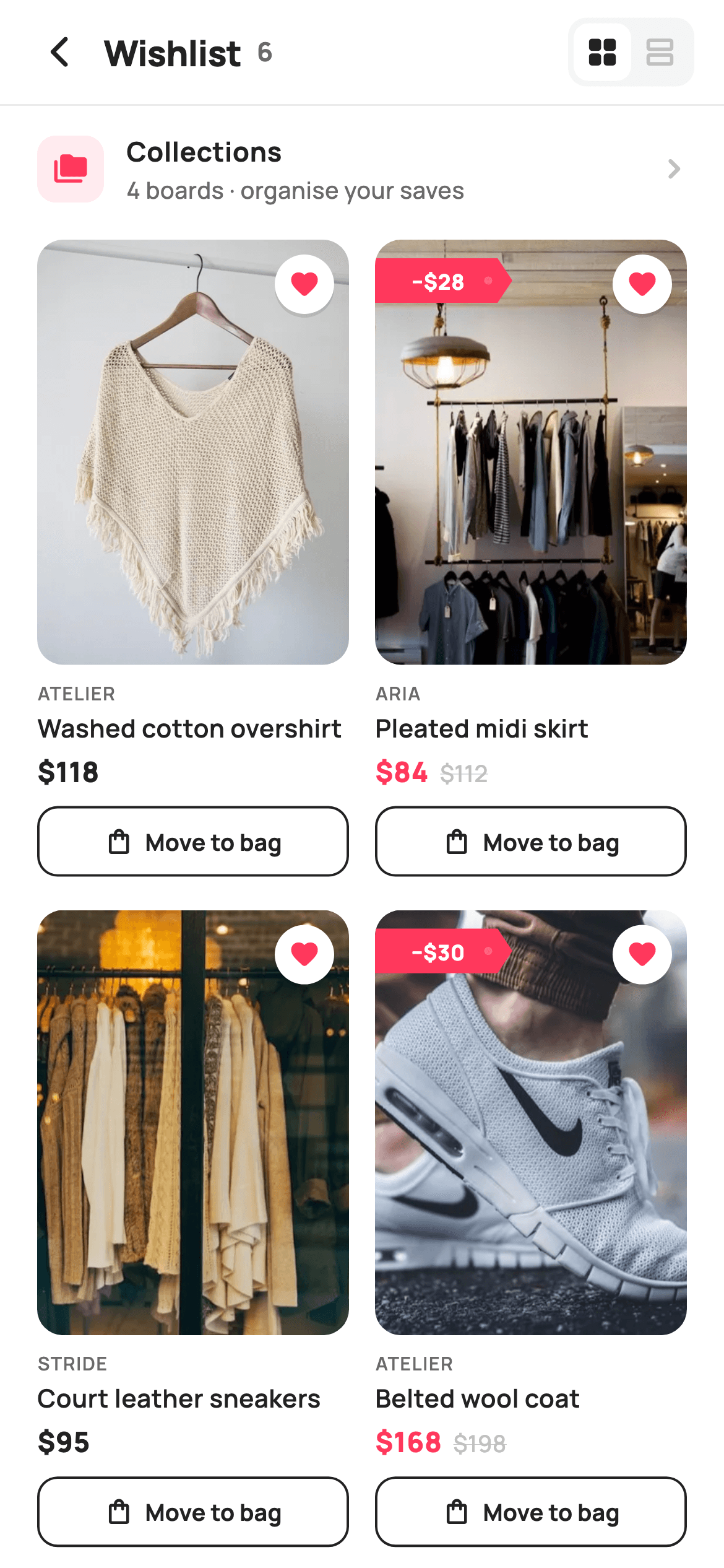
A wishlist is where shoppers park intent, and the screen earns its place by showing what changed since they saved. This tutorial builds StyleCart's Wishlist tab in Flutter: a single `_grid` bool flips six saved products between a two-column `GridView.builder` and a `ListView.separated`, a `_DropFlagPainter` draws a notched red ribbon reading the money saved on any item whose `was` price is set, and every card carries a floating heart plus an outlined Move to bag button. Pure Flutter, one file, callbacks only.
Watch the Flutter UI walkthrough
A short screen recording of Wishlist running, if you'd rather see it before you read the code. The written tutorial below covers everything in it.
Can't see the video? Watch it on YouTube.
What you'll build
- ✓A header segmented toggle where `_grid` swaps a `GridView.builder` for a `ListView.separated` under the same `Expanded`
- ✓A `_Fav` model whose nullable `was` field drives both the red price colour and the painted price-drop flag
- ✓A `_DropFlagPainter` that paths a notched tag shape and punches a translucent hole so it reads as a hanging price tag
- ✓A `_priceRow` that struck-through the original price in `_faint` only when a drop exists
- ✓A live saved count in the header that reads `_items.length` so it never drifts from the list
Step-by-step build
Create the file
Add a new file at lib/ecom_wishlist_main/ecom_wishlist_main_screen.dart in your Flutter project.
Register the bundled fonts
No external packages — this is pure Flutter. It does bundle its design font (Manrope), so drop the font file into fonts/ and declare it in pubspec.yaml:
flutter:
  fonts:
    - family: Manrope
      fonts:
- asset: fonts/Manrope-Regular.ttfBuild it, piece by piece
Here's how the screen goes together. Each block below is a real slice of the code with a plain-English explanation — paste them in order, or grab the whole file from the next section.
Callbacks, Airbnb-style tokens and the saved-items model
import 'package:flutter/material.dart';

/// StyleCart — Wishlist (the Wishlist tab).
///
/// The shopper's saved products as a two-column grid (or a comfortable list),
/// each with a filled wishlist heart to un-save, a painted price-drop flag for
/// items that fell in price, and a move-to-bag action. A header toggle flips
/// between grid and list density.
///
/// Self-contained per CONVENTIONS.md: pure Flutter, bundled Manrope, inline
/// Airbnb-style tokens, own light theme + SafeArea, bundled webp. The price-drop
/// flag is a CustomPainter (no emoji glyph). Exposes callbacks only.
class EcomWishlistMainScreen extends StatefulWidget {
  const EcomWishlistMainScreen({
    super.key,
    this.onBack,
    this.onProduct,
    this.onMoveToBag,
    this.onCollections,
  });

  final VoidCallback? onBack;
  final ValueChanged<String>? onProduct;
  final ValueChanged<String>? onMoveToBag;
  final VoidCallback? onCollections;

  @override
  State<EcomWishlistMainScreen> createState() => _EcomWishlistMainScreenState();
}

class _EcomWishlistMainScreenState extends State<EcomWishlistMainScreen> {
  static const String _font = 'Manrope';
  static const Color _canvas = Color(0xFFFFFFFF);
  static const Color _ink = Color(0xFF222222);
  static const Color _muted = Color(0xFF6A6A6A);
  static const Color _faint = Color(0xFFC1C1C1);
  static const Color _brand = Color(0xFFFF385C);
  static const Color _imageBg = Color(0xFFF5F5F5);
  static const Color _hairline = Color(0xFFEBEBEB);

  static const String _dir = 'lib/screens/ecommerce/ecom_wishlist_main/images';

  final List<_Fav> _items = <_Fav>[
    const _Fav('Washed cotton overshirt', 'Atelier', 118, null, 'Sand · M',
        'p01.webp'),
    const _Fav('Pleated midi skirt', 'Aria', 84, 112, 'Olive · S', 'p02.webp'),
    const _Fav('Court leather sneakers', 'Stride', 95, null, 'White · 42',
        'p03.webp'),
    const _Fav('Belted wool coat', 'Atelier', 168, 198, 'Camel · M',
        'p04.webp'),
    const _Fav('Silk slip dress', 'Aria', 138, null, 'Blush · S', 'p05.webp'),
    const _Fav('Boxy denim jacket', 'Stride', 109, 134, 'Indigo · L',
        'p06.webp'),
  ];

  bool _grid = true;
`EcomWishlistMainScreen` is a `StatefulWidget` because one piece of UI state lives here: `bool _grid = true`, the density toggle. It exposes four callbacks and nothing else — `onBack`, `onProduct` and `onMoveToBag` (both `ValueChanged<String>` carrying the product title), and `onCollections` — so persistence stays in the host app. The palette is deliberately Airbnb-flavoured: `_ink` `0xFF222222` for text, `_brand` `0xFFFF385C` coral for hearts and drops, `_faint` `0xFFC1C1C1` for struck prices and inactive icons, and `_imageBg` `0xFFF5F5F5` sitting behind every image so a slow-loading webp never flashes white. The six `_Fav` entries hold `price` and a nullable `was`; three of them (`112`, `198`, `134`) set `was`, and that single null check is what later decides whether a card shows the drop flag and red price. `_dir` points at the bundled webp folder.
Build tree and a header with a live count
  @override
  Widget build(BuildContext context) {
    return Theme(
      data: ThemeData.light(useMaterial3: true),
      child: Scaffold(
        backgroundColor: _canvas,
        body: SafeArea(
          child: Column(
            children: <Widget>[
              _header(),
              const Divider(height: 1, color: _hairline),
              _collectionsRow(),
              Expanded(
                child: _grid ? _gridView() : _listView(),
              ),
            ],
          ),
        ),
      ),
    );
  }

  Widget _header() {
    return Padding(
      padding: const EdgeInsets.fromLTRB(8, 4, 12, 4),
      child: Row(
        children: <Widget>[
          IconButton(
            onPressed: widget.onBack,
            icon: const Icon(Icons.arrow_back_ios_new_rounded,
                size: 20, color: _ink),
          ),
          Expanded(
            child: Row(
              children: <Widget>[
                const Text(
                  'Wishlist',
                  style: TextStyle(
                    fontFamily: _font,
                    fontSize: 19,
                    fontWeight: FontWeight.w800,
                    letterSpacing: -0.3,
                    color: _ink,
                  ),
                ),
                const SizedBox(width: 8),
                Text(
                  '${_items.length}',
                  style: const TextStyle(
                    fontFamily: _font,
                    fontSize: 14,
                    fontWeight: FontWeight.w700,
                    color: _muted,
                  ),
                ),
              ],
            ),
          ),
          _toggle(),
        ],
      ),
    );
  }
`build` wraps everything in `Theme(data: ThemeData.light(useMaterial3: true))` so the screen ignores whatever dark theme the host app runs, then a `Scaffold` on `_canvas` white and a `SafeArea` `Column`: header, a one-pixel `Divider` in `_hairline` `0xFFEBEBEB`, the Collections row, and an `Expanded` whose child is the ternary `_grid ? _gridView() : _listView()`. That ternary is the whole toggle mechanism — no `PageView`, no animation, just a rebuild swapping one scrolling widget for another. `_header` uses asymmetric padding `fromLTRB(8, 4, 12, 4)` because the `IconButton` on the left has its own 48px hit area. The title row prints `'Wishlist'` at 19px w800 with `-0.3` letter spacing, then `'${_items.length}'` in `_muted` 14px — a count derived from the list, so removing an item can never leave a stale number. `_toggle()` sits at the trailing end.
The segmented grid/list toggle
  Widget _toggle() {
    return Container(
      margin: const EdgeInsets.only(right: 4),
      padding: const EdgeInsets.all(3),
      decoration: BoxDecoration(
        color: _imageBg,
        borderRadius: BorderRadius.circular(10),
      ),
      child: Row(
        children: <Widget>[
          _toggleBtn(Icons.grid_view_rounded, _grid, () {
            setState(() => _grid = true);
          }),
          _toggleBtn(Icons.view_agenda_outlined, !_grid, () {
            setState(() => _grid = false);
          }),
        ],
      ),
    );
  }

  Widget _toggleBtn(IconData icon, bool active, VoidCallback onTap) {
    return GestureDetector(
      onTap: onTap,
      child: Container(
        padding: const EdgeInsets.all(6),
        decoration: BoxDecoration(
          color: active ? _canvas : Colors.transparent,
          borderRadius: BorderRadius.circular(8),
        ),
        child: Icon(icon, size: 19, color: active ? _ink : _faint),
      ),
    );
  }
The toggle is a hand-built segmented control rather than a `SegmentedButton`: an outer `Container` in `_imageBg` with radius 10 and 3px padding, holding two `_toggleBtn` calls. Each button is a `GestureDetector` around a 6px-padded `Container` whose `color` is `_canvas` white when `active` and transparent otherwise, with radius 8 — two pixels tighter than the outer 10 so the inner pill sits concentrically inside the 3px gutter. The icon flips colour with the same bool, `_ink` for active and `_faint` for idle, so the selected state is expressed twice (background plus icon) and reads even in a screenshot. The two callbacks simply `setState(() => _grid = true)` and `false`; passing `_grid` and `!_grid` as the `active` argument means both pills can never be lit at once. Icons are `grid_view_rounded` and `view_agenda_outlined`.
The tappable Collections row
  Widget _collectionsRow() {
    return GestureDetector(
      onTap: widget.onCollections,
      behavior: HitTestBehavior.opaque,
      child: Padding(
        padding: const EdgeInsets.fromLTRB(20, 14, 16, 14),
        child: Row(
          children: <Widget>[
            Container(
              width: 36,
              height: 36,
              decoration: BoxDecoration(
                color: _brand.withValues(alpha: 0.10),
                borderRadius: BorderRadius.circular(10),
              ),
              child: const Icon(Icons.folder_copy_rounded,
                  size: 19, color: _brand),
            ),
            const SizedBox(width: 12),
            const Expanded(
              child: Column(
                crossAxisAlignment: CrossAxisAlignment.start,
                children: <Widget>[
                  Text(
                    'Collections',
                    style: TextStyle(
                      fontFamily: _font,
                      fontSize: 14.5,
                      fontWeight: FontWeight.w700,
                      color: _ink,
                    ),
                  ),
                  SizedBox(height: 1),
                  Text(
                    '4 boards · organise your saves',
                    style: TextStyle(
                      fontFamily: _font,
                      fontSize: 12.5,
                      fontWeight: FontWeight.w500,
                      color: _muted,
                    ),
                  ),
                ],
              ),
            ),
            const Icon(Icons.chevron_right_rounded, size: 22, color: _faint),
          ],
        ),
      ),
    );
  }
Between the header and the product list sits a single-row shortcut to saved boards. The `GestureDetector` sets `behavior: HitTestBehavior.opaque` — without it, taps on the empty padding between the icon and the chevron would fall through, because a bare `Row` with transparent gaps doesn't register hits. The leading tile is a 36×36 `Container` tinted with `_brand.withValues(alpha: 0.10)` behind a solid `_brand` `folder_copy_rounded` icon, the same two-layer treatment the store uses for accents elsewhere. Text is a `const Expanded(Column(...))` with `'Collections'` at 14.5px w700 and the subtitle `'4 boards · organise your saves'` at 12.5px `_muted`; the `SizedBox(height: 1)` between them is intentionally tiny so the pair reads as one label. A `_faint` `chevron_right_rounded` at 22px signals navigation, and the whole thing fires `widget.onCollections`.
Two-column grid and the tall product card
  Widget _gridView() {
    return GridView.builder(
      padding: const EdgeInsets.fromLTRB(20, 4, 20, 24),
      gridDelegate: const SliverGridDelegateWithFixedCrossAxisCount(
        crossAxisCount: 2,
        crossAxisSpacing: 14,
        mainAxisSpacing: 18,
        childAspectRatio: 0.49,
      ),
      itemCount: _items.length,
      itemBuilder: (BuildContext context, int i) => _gridCard(_items[i]),
    );
  }

  Widget _gridCard(_Fav f) {
    return GestureDetector(
      onTap: () => widget.onProduct?.call(f.title),
      child: Column(
        crossAxisAlignment: CrossAxisAlignment.start,
        children: <Widget>[
          Expanded(
            child: ClipRRect(
              borderRadius: BorderRadius.circular(14),
              child: Stack(
                fit: StackFit.expand,
                children: <Widget>[
                  Container(color: _imageBg),
                  Image.asset('$_dir/${f.asset}', fit: BoxFit.cover),
                  Positioned(top: 8, right: 8, child: _heart()),
                  if (f.was != null)
                    Positioned(
                      top: 10,
                      left: 0,
                      child: _dropFlag(f.was! - f.price),
                    ),
                ],
              ),
            ),
          ),
          const SizedBox(height: 8),
          Text(
            f.brand.toUpperCase(),
            style: const TextStyle(
              fontFamily: _font,
              fontSize: 10,
              fontWeight: FontWeight.w600,
              letterSpacing: 0.6,
              color: _muted,
            ),
          ),
          const SizedBox(height: 2),
          Text(
            f.title,
            maxLines: 1,
            overflow: TextOverflow.ellipsis,
            style: const TextStyle(
              fontFamily: _font,
              fontSize: 13.5,
              fontWeight: FontWeight.w600,
              color: _ink,
            ),
          ),
          const SizedBox(height: 4),
          _priceRow(f),
          const SizedBox(height: 8),
          _moveBtn(f, full: true),
        ],
      ),
    );
  }
`_gridView` is a `GridView.builder` with `SliverGridDelegateWithFixedCrossAxisCount(crossAxisCount: 2, crossAxisSpacing: 14, mainAxisSpacing: 18, childAspectRatio: 0.49)`. That 0.49 ratio makes each cell roughly twice as tall as it is wide, which is what leaves room under the image for brand, title, price and a 38px button. `_gridCard` puts the image in an `Expanded` so it absorbs whatever height the ratio grants, then clips it with `ClipRRect` radius 14. Inside, a `Stack` with `StackFit.expand` layers `_imageBg`, the `Image.asset` at `BoxFit.cover`, a `_heart()` positioned `top: 8, right: 8`, and — only `if (f.was != null)` — a `_dropFlag(f.was! - f.price)` at `top: 10, left: 0`, flush against the left edge so the painted tag looks stuck onto the photo. Below: the brand uppercased at 10px with 0.6 letter spacing, a one-line ellipsised title, `_priceRow`, then `_moveBtn(f, full: true)` stretching the button to the column width.
The comfortable list and its row layout
  Widget _listView() {
    return ListView.separated(
      padding: const EdgeInsets.fromLTRB(20, 4, 20, 24),
      itemCount: _items.length,
      separatorBuilder: (_, _) =>
          const Divider(height: 28, color: _hairline),
      itemBuilder: (BuildContext context, int i) => _listRow(_items[i]),
    );
  }

  Widget _listRow(_Fav f) {
    return GestureDetector(
      onTap: () => widget.onProduct?.call(f.title),
      behavior: HitTestBehavior.opaque,
      child: Row(
        crossAxisAlignment: CrossAxisAlignment.start,
        children: <Widget>[
          ClipRRect(
            borderRadius: BorderRadius.circular(12),
            child: Stack(
              children: <Widget>[
                Container(
                  width: 92,
                  height: 116,
                  color: _imageBg,
                  child: Image.asset('$_dir/${f.asset}', fit: BoxFit.cover),
                ),
                if (f.was != null)
                  Positioned(top: 8, left: 0, child: _dropFlag(f.was! - f.price)),
              ],
            ),
          ),
          const SizedBox(width: 14),
          Expanded(
            child: Column(
              crossAxisAlignment: CrossAxisAlignment.start,
              children: <Widget>[
                const SizedBox(height: 2),
                Text(
                  f.brand.toUpperCase(),
                  style: const TextStyle(
                    fontFamily: _font,
                    fontSize: 10,
                    fontWeight: FontWeight.w600,
                    letterSpacing: 0.6,
                    color: _muted,
                  ),
                ),
                const SizedBox(height: 3),
                Text(
                  f.title,
                  maxLines: 1,
                  overflow: TextOverflow.ellipsis,
                  style: const TextStyle(
                    fontFamily: _font,
                    fontSize: 15,
                    fontWeight: FontWeight.w700,
                    color: _ink,
                  ),
                ),
                const SizedBox(height: 3),
                Text(
                  f.variant,
                  style: const TextStyle(
                    fontFamily: _font,
                    fontSize: 12.5,
                    fontWeight: FontWeight.w500,
                    color: _muted,
                  ),
                ),
                const SizedBox(height: 6),
                _priceRow(f),
                const SizedBox(height: 10),
                Row(
                  children: <Widget>[
                    Expanded(child: _moveBtn(f, full: true)),
                    const SizedBox(width: 10),
                    _heart(),
                  ],
                ),
              ],
            ),
          ),
        ],
      ),
    );
  }
`_listView` swaps the grid for a `ListView.separated` with the same `fromLTRB(20, 4, 20, 24)` padding, so toggling density doesn't shift the content edge. The separator is a `Divider(height: 28)` in `_hairline` — 28 logical pixels of breathing room with a hairline in the middle. `_listRow` is a top-aligned `Row`: a fixed 92×116 `Container` (a 4:5 portrait, matching the grid images) holding the webp, clipped at radius 12 and stacked with the same conditional `_dropFlag`. The text column now has room for a third line, so it adds `f.variant` (e.g. `'Olive · S'`) in `_muted` 12.5px between the 15px w700 title and the price row — information the grid card omits for space. The bottom `Row` places `_moveBtn` in an `Expanded` with the `_heart()` beside it, because there's no image overlay to host the heart at this density. Both densities call `widget.onProduct?.call(f.title)` on tap, and the row uses `HitTestBehavior.opaque` for the same reason as the Collections row.
Price row, Move to bag button and the floating heart
  Widget _priceRow(_Fav f) {
    return Row(
      crossAxisAlignment: CrossAxisAlignment.end,
      children: <Widget>[
        Text(
          '\$${f.price}',
          style: TextStyle(
            fontFamily: _font,
            fontSize: 15,
            fontWeight: FontWeight.w800,
            color: f.was != null ? _brand : _ink,
          ),
        ),
        if (f.was != null) ...<Widget>[
          const SizedBox(width: 6),
          Padding(
            padding: const EdgeInsets.only(bottom: 1),
            child: Text(
              '\$${f.was}',
              style: const TextStyle(
                fontFamily: _font,
                fontSize: 12.5,
                fontWeight: FontWeight.w500,
                decoration: TextDecoration.lineThrough,
                decorationColor: _faint,
                color: _faint,
              ),
            ),
          ),
        ],
      ],
    );
  }

  Widget _moveBtn(_Fav f, {bool full = false}) {
    return SizedBox(
      height: 38,
      width: full ? double.infinity : null,
      child: OutlinedButton(
        onPressed: () => widget.onMoveToBag?.call(f.title),
        style: OutlinedButton.styleFrom(
          foregroundColor: _ink,
          side: const BorderSide(color: _ink, width: 1.3),
          padding: const EdgeInsets.symmetric(horizontal: 12),
          shape:
              RoundedRectangleBorder(borderRadius: BorderRadius.circular(11)),
        ),
        child: const Row(
          mainAxisAlignment: MainAxisAlignment.center,
          children: <Widget>[
            Icon(Icons.shopping_bag_outlined, size: 16, color: _ink),
            SizedBox(width: 6),
            Text(
              'Move to bag',
              style: TextStyle(
                fontFamily: _font,
                fontSize: 12.5,
                fontWeight: FontWeight.w700,
              ),
            ),
          ],
        ),
      ),
    );
  }

  Widget _heart() {
    return Container(
      width: 32,
      height: 32,
      decoration: const BoxDecoration(
        color: _canvas,
        shape: BoxShape.circle,
        boxShadow: <BoxShadow>[
          BoxShadow(
            color: Color(0x1A000000),
            blurRadius: 6,
            offset: Offset(0, 2),
          ),
        ],
      ),
      child: const Icon(Icons.favorite_rounded, size: 17, color: _brand),
    );
  }
`_priceRow` aligns its children to `CrossAxisAlignment.end` so the smaller struck price sits on the baseline of the big one. The current price is 15px w800 and its colour is `f.was != null ? _brand : _ink` — coral only when there is a drop, which makes discounted items pop in a grid of black prices. The original price is added with a spread `...<Widget>[]` inside the `if`, rendered at 12.5px with `TextDecoration.lineThrough` and a matching `decorationColor: _faint` (set explicitly so the strike isn't drawn in the theme text colour). `_moveBtn` is a 38px `OutlinedButton` with a 1.3px `_ink` border, radius 11, and a `shopping_bag_outlined` icon plus `'Move to bag'` at 12.5px w700; `width: full ? double.infinity : null` lets the caller stretch it. `_heart` is a 32px white circle with a `0x1A000000` shadow (blur 6, offset 0,2) holding a filled `favorite_rounded` in `_brand` — filled because the item is already saved.
The price-drop flag and its CustomPainter
  Widget _dropFlag(int saved) {
    return SizedBox(
      width: 74,
      height: 24,
      child: CustomPaint(
        painter: _DropFlagPainter(),
        child: Center(
          child: Padding(
            padding: const EdgeInsets.only(right: 6),
            child: Text(
              '−\$$saved',
              style: const TextStyle(
                fontFamily: _font,
                fontSize: 11.5,
                fontWeight: FontWeight.w800,
                color: _canvas,
              ),
            ),
          ),
        ),
      ),
    );
  }
}

class _Fav {
  const _Fav(this.title, this.brand, this.price, this.was, this.variant,
      this.asset);
  final String title;
  final String brand;
  final int price;
  final int? was;
  final String variant;
  final String asset;
}

/// Paints a price-drop ribbon flag: a rounded-left tag with a notched right
/// tail, filled brand red, sitting flush against the image edge.
class _DropFlagPainter extends CustomPainter {
  @override
  void paint(Canvas canvas, Size size) {
    final double w = size.width;
    final double h = size.height;
    const double notch = 8;

    final Path tag = Path()
      ..moveTo(0, 0)
      ..lineTo(w - notch, 0)
      ..lineTo(w, h / 2)
      ..lineTo(w - notch, h)
      ..lineTo(0, h)
      ..close();

    canvas.drawPath(tag, Paint()..color = const Color(0xFFFF385C));

    // Punch-hole on the tail to read as a hanging price tag.
    canvas.drawCircle(
      Offset(w - notch - 5, h / 2),
      2.2,
      Paint()..color = const Color(0x33FFFFFF),
    );
  }

  @override
  bool shouldRepaint(_DropFlagPainter oldDelegate) => false;
}
`_dropFlag(int saved)` is a 74×24 `SizedBox` around a `CustomPaint` whose `child` is the label `'−\$$saved'` — a real minus sign — in 11.5px w800 white, padded 6px on the right so it doesn't run into the notch. `_DropFlagPainter.paint` builds a `Path` in five moves: from the top-left corner to `w - notch`, out to the tip at `(w, h / 2)`, back to `w - notch` at the bottom, along the bottom edge and close. With `notch = 8` that gives a rectangle whose right edge is a pointed arrow tip, filled with `0xFFFF385C`. Then a 2.2-radius circle at `(w - notch - 5, h / 2)` in `0x33FFFFFF` — 20% white — is drawn just inside the tip, reading as the punch hole of a hanging price tag. `shouldRepaint` returns `false` because the painter has no fields; the amount lives in the child `Text`, not the painter. `_Fav` above it is a plain six-field const value type.
Full code
The complete, ready-to-paste source. Free to use in your projects — one click copies it all.
import 'package:flutter/material.dart';

/// StyleCart — Wishlist (the Wishlist tab).
///
/// The shopper's saved products as a two-column grid (or a comfortable list),
/// each with a filled wishlist heart to un-save, a painted price-drop flag for
/// items that fell in price, and a move-to-bag action. A header toggle flips
/// between grid and list density.
///
/// Self-contained per CONVENTIONS.md: pure Flutter, bundled Manrope, inline
/// Airbnb-style tokens, own light theme + SafeArea, bundled webp. The price-drop
/// flag is a CustomPainter (no emoji glyph). Exposes callbacks only.
class EcomWishlistMainScreen extends StatefulWidget {
  const EcomWishlistMainScreen({
    super.key,
    this.onBack,
    this.onProduct,
    this.onMoveToBag,
    this.onCollections,
  });

  final VoidCallback? onBack;
  final ValueChanged<String>? onProduct;
  final ValueChanged<String>? onMoveToBag;
  final VoidCallback? onCollections;

  @override
  State<EcomWishlistMainScreen> createState() => _EcomWishlistMainScreenState();
}

class _EcomWishlistMainScreenState extends State<EcomWishlistMainScreen> {
  static const String _font = 'Manrope';
  static const Color _canvas = Color(0xFFFFFFFF);
  static const Color _ink = Color(0xFF222222);
  static const Color _muted = Color(0xFF6A6A6A);
  static const Color _faint = Color(0xFFC1C1C1);
  static const Color _brand = Color(0xFFFF385C);
  static const Color _imageBg = Color(0xFFF5F5F5);
  static const Color _hairline = Color(0xFFEBEBEB);

  static const String _dir = 'lib/screens/ecommerce/ecom_wishlist_main/images';

  final List<_Fav> _items = <_Fav>[
    const _Fav('Washed cotton overshirt', 'Atelier', 118, null, 'Sand · M',
        'p01.webp'),
    const _Fav('Pleated midi skirt', 'Aria', 84, 112, 'Olive · S', 'p02.webp'),
    const _Fav('Court leather sneakers', 'Stride', 95, null, 'White · 42',
        'p03.webp'),
    const _Fav('Belted wool coat', 'Atelier', 168, 198, 'Camel · M',
        'p04.webp'),
    const _Fav('Silk slip dress', 'Aria', 138, null, 'Blush · S', 'p05.webp'),
    const _Fav('Boxy denim jacket', 'Stride', 109, 134, 'Indigo · L',
        'p06.webp'),
  ];

  bool _grid = true;

  @override
  Widget build(BuildContext context) {
    return Theme(
      data: ThemeData.light(useMaterial3: true),
      child: Scaffold(
        backgroundColor: _canvas,
        body: SafeArea(
          child: Column(
            children: <Widget>[
              _header(),
              const Divider(height: 1, color: _hairline),
              _collectionsRow(),
              Expanded(
                child: _grid ? _gridView() : _listView(),
              ),
            ],
          ),
        ),
      ),
    );
  }

  Widget _header() {
    return Padding(
      padding: const EdgeInsets.fromLTRB(8, 4, 12, 4),
      child: Row(
        children: <Widget>[
          IconButton(
            onPressed: widget.onBack,
            icon: const Icon(Icons.arrow_back_ios_new_rounded,
                size: 20, color: _ink),
          ),
          Expanded(
            child: Row(
              children: <Widget>[
                const Text(
                  'Wishlist',
                  style: TextStyle(
                    fontFamily: _font,
                    fontSize: 19,
                    fontWeight: FontWeight.w800,
                    letterSpacing: -0.3,
                    color: _ink,
                  ),
                ),
                const SizedBox(width: 8),
                Text(
                  '${_items.length}',
                  style: const TextStyle(
                    fontFamily: _font,
                    fontSize: 14,
                    fontWeight: FontWeight.w700,
                    color: _muted,
                  ),
                ),
              ],
            ),
          ),
          _toggle(),
        ],
      ),
    );
  }

  Widget _toggle() {
    return Container(
      margin: const EdgeInsets.only(right: 4),
      padding: const EdgeInsets.all(3),
      decoration: BoxDecoration(
        color: _imageBg,
        borderRadius: BorderRadius.circular(10),
      ),
      child: Row(
        children: <Widget>[
          _toggleBtn(Icons.grid_view_rounded, _grid, () {
            setState(() => _grid = true);
          }),
          _toggleBtn(Icons.view_agenda_outlined, !_grid, () {
            setState(() => _grid = false);
          }),
        ],
      ),
    );
  }

  Widget _toggleBtn(IconData icon, bool active, VoidCallback onTap) {
    return GestureDetector(
      onTap: onTap,
      child: Container(
        padding: const EdgeInsets.all(6),
        decoration: BoxDecoration(
          color: active ? _canvas : Colors.transparent,
          borderRadius: BorderRadius.circular(8),
        ),
        child: Icon(icon, size: 19, color: active ? _ink : _faint),
      ),
    );
  }

  Widget _collectionsRow() {
    return GestureDetector(
      onTap: widget.onCollections,
      behavior: HitTestBehavior.opaque,
      child: Padding(
        padding: const EdgeInsets.fromLTRB(20, 14, 16, 14),
        child: Row(
          children: <Widget>[
            Container(
              width: 36,
              height: 36,
              decoration: BoxDecoration(
                color: _brand.withValues(alpha: 0.10),
                borderRadius: BorderRadius.circular(10),
              ),
              child: const Icon(Icons.folder_copy_rounded,
                  size: 19, color: _brand),
            ),
            const SizedBox(width: 12),
            const Expanded(
              child: Column(
                crossAxisAlignment: CrossAxisAlignment.start,
                children: <Widget>[
                  Text(
                    'Collections',
                    style: TextStyle(
                      fontFamily: _font,
                      fontSize: 14.5,
                      fontWeight: FontWeight.w700,
                      color: _ink,
                    ),
                  ),
                  SizedBox(height: 1),
                  Text(
                    '4 boards · organise your saves',
                    style: TextStyle(
                      fontFamily: _font,
                      fontSize: 12.5,
                      fontWeight: FontWeight.w500,
                      color: _muted,
                    ),
                  ),
                ],
              ),
            ),
            const Icon(Icons.chevron_right_rounded, size: 22, color: _faint),
          ],
        ),
      ),
    );
  }

  Widget _gridView() {
    return GridView.builder(
      padding: const EdgeInsets.fromLTRB(20, 4, 20, 24),
      gridDelegate: const SliverGridDelegateWithFixedCrossAxisCount(
        crossAxisCount: 2,
        crossAxisSpacing: 14,
        mainAxisSpacing: 18,
        childAspectRatio: 0.49,
      ),
      itemCount: _items.length,
      itemBuilder: (BuildContext context, int i) => _gridCard(_items[i]),
    );
  }

  Widget _gridCard(_Fav f) {
    return GestureDetector(
      onTap: () => widget.onProduct?.call(f.title),
      child: Column(
        crossAxisAlignment: CrossAxisAlignment.start,
        children: <Widget>[
          Expanded(
            child: ClipRRect(
              borderRadius: BorderRadius.circular(14),
              child: Stack(
                fit: StackFit.expand,
                children: <Widget>[
                  Container(color: _imageBg),
                  Image.asset('$_dir/${f.asset}', fit: BoxFit.cover),
                  Positioned(top: 8, right: 8, child: _heart()),
                  if (f.was != null)
                    Positioned(
                      top: 10,
                      left: 0,
                      child: _dropFlag(f.was! - f.price),
                    ),
                ],
              ),
            ),
          ),
          const SizedBox(height: 8),
          Text(
            f.brand.toUpperCase(),
            style: const TextStyle(
              fontFamily: _font,
              fontSize: 10,
              fontWeight: FontWeight.w600,
              letterSpacing: 0.6,
              color: _muted,
            ),
          ),
          const SizedBox(height: 2),
          Text(
            f.title,
            maxLines: 1,
            overflow: TextOverflow.ellipsis,
            style: const TextStyle(
              fontFamily: _font,
              fontSize: 13.5,
              fontWeight: FontWeight.w600,
              color: _ink,
            ),
          ),
          const SizedBox(height: 4),
          _priceRow(f),
          const SizedBox(height: 8),
          _moveBtn(f, full: true),
        ],
      ),
    );
  }

  Widget _listView() {
    return ListView.separated(
      padding: const EdgeInsets.fromLTRB(20, 4, 20, 24),
      itemCount: _items.length,
      separatorBuilder: (_, _) =>
          const Divider(height: 28, color: _hairline),
      itemBuilder: (BuildContext context, int i) => _listRow(_items[i]),
    );
  }

  Widget _listRow(_Fav f) {
    return GestureDetector(
      onTap: () => widget.onProduct?.call(f.title),
      behavior: HitTestBehavior.opaque,
      child: Row(
        crossAxisAlignment: CrossAxisAlignment.start,
        children: <Widget>[
          ClipRRect(
            borderRadius: BorderRadius.circular(12),
            child: Stack(
              children: <Widget>[
                Container(
                  width: 92,
                  height: 116,
                  color: _imageBg,
                  child: Image.asset('$_dir/${f.asset}', fit: BoxFit.cover),
                ),
                if (f.was != null)
                  Positioned(top: 8, left: 0, child: _dropFlag(f.was! - f.price)),
              ],
            ),
          ),
          const SizedBox(width: 14),
          Expanded(
            child: Column(
              crossAxisAlignment: CrossAxisAlignment.start,
              children: <Widget>[
                const SizedBox(height: 2),
                Text(
                  f.brand.toUpperCase(),
                  style: const TextStyle(
                    fontFamily: _font,
                    fontSize: 10,
                    fontWeight: FontWeight.w600,
                    letterSpacing: 0.6,
                    color: _muted,
                  ),
                ),
                const SizedBox(height: 3),
                Text(
                  f.title,
                  maxLines: 1,
                  overflow: TextOverflow.ellipsis,
                  style: const TextStyle(
                    fontFamily: _font,
                    fontSize: 15,
                    fontWeight: FontWeight.w700,
                    color: _ink,
                  ),
                ),
                const SizedBox(height: 3),
                Text(
                  f.variant,
                  style: const TextStyle(
                    fontFamily: _font,
                    fontSize: 12.5,
                    fontWeight: FontWeight.w500,
                    color: _muted,
                  ),
                ),
                const SizedBox(height: 6),
                _priceRow(f),
                const SizedBox(height: 10),
                Row(
                  children: <Widget>[
                    Expanded(child: _moveBtn(f, full: true)),
                    const SizedBox(width: 10),
                    _heart(),
                  ],
                ),
              ],
            ),
          ),
        ],
      ),
    );
  }

  Widget _priceRow(_Fav f) {
    return Row(
      crossAxisAlignment: CrossAxisAlignment.end,
      children: <Widget>[
        Text(
          '\$${f.price}',
          style: TextStyle(
            fontFamily: _font,
            fontSize: 15,
            fontWeight: FontWeight.w800,
            color: f.was != null ? _brand : _ink,
          ),
        ),
        if (f.was != null) ...<Widget>[
          const SizedBox(width: 6),
          Padding(
            padding: const EdgeInsets.only(bottom: 1),
            child: Text(
              '\$${f.was}',
              style: const TextStyle(
                fontFamily: _font,
                fontSize: 12.5,
                fontWeight: FontWeight.w500,
                decoration: TextDecoration.lineThrough,
                decorationColor: _faint,
                color: _faint,
              ),
            ),
          ),
        ],
      ],
    );
  }

  Widget _moveBtn(_Fav f, {bool full = false}) {
    return SizedBox(
      height: 38,
      width: full ? double.infinity : null,
      child: OutlinedButton(
        onPressed: () => widget.onMoveToBag?.call(f.title),
        style: OutlinedButton.styleFrom(
          foregroundColor: _ink,
          side: const BorderSide(color: _ink, width: 1.3),
          padding: const EdgeInsets.symmetric(horizontal: 12),
          shape:
              RoundedRectangleBorder(borderRadius: BorderRadius.circular(11)),
        ),
        child: const Row(
          mainAxisAlignment: MainAxisAlignment.center,
          children: <Widget>[
            Icon(Icons.shopping_bag_outlined, size: 16, color: _ink),
            SizedBox(width: 6),
            Text(
              'Move to bag',
              style: TextStyle(
                fontFamily: _font,
                fontSize: 12.5,
                fontWeight: FontWeight.w700,
              ),
            ),
          ],
        ),
      ),
    );
  }

  Widget _heart() {
    return Container(
      width: 32,
      height: 32,
      decoration: const BoxDecoration(
        color: _canvas,
        shape: BoxShape.circle,
        boxShadow: <BoxShadow>[
          BoxShadow(
            color: Color(0x1A000000),
            blurRadius: 6,
            offset: Offset(0, 2),
          ),
        ],
      ),
      child: const Icon(Icons.favorite_rounded, size: 17, color: _brand),
    );
  }

  Widget _dropFlag(int saved) {
    return SizedBox(
      width: 74,
      height: 24,
      child: CustomPaint(
        painter: _DropFlagPainter(),
        child: Center(
          child: Padding(
            padding: const EdgeInsets.only(right: 6),
            child: Text(
              '−\$$saved',
              style: const TextStyle(
                fontFamily: _font,
                fontSize: 11.5,
                fontWeight: FontWeight.w800,
                color: _canvas,
              ),
            ),
          ),
        ),
      ),
    );
  }
}

class _Fav {
  const _Fav(this.title, this.brand, this.price, this.was, this.variant,
      this.asset);
  final String title;
  final String brand;
  final int price;
  final int? was;
  final String variant;
  final String asset;
}

/// Paints a price-drop ribbon flag: a rounded-left tag with a notched right
/// tail, filled brand red, sitting flush against the image edge.
class _DropFlagPainter extends CustomPainter {
  @override
  void paint(Canvas canvas, Size size) {
    final double w = size.width;
    final double h = size.height;
    const double notch = 8;

    final Path tag = Path()
      ..moveTo(0, 0)
      ..lineTo(w - notch, 0)
      ..lineTo(w, h / 2)
      ..lineTo(w - notch, h)
      ..lineTo(0, h)
      ..close();

    canvas.drawPath(tag, Paint()..color = const Color(0xFFFF385C));

    // Punch-hole on the tail to read as a hanging price tag.
    canvas.drawCircle(
      Offset(w - notch - 5, h / 2),
      2.2,
      Paint()..color = const Color(0x33FFFFFF),
    );
  }

  @override
  bool shouldRepaint(_DropFlagPainter oldDelegate) => false;
}
Plus bundled 11 binary assets (fonts/images). The CLI and MCP install those for you automatically.
Two faster ways to add it
Copy-paste works, but you can skip it entirely.
1. FlutterKit CLI
One command drops this screen — and its fonts — straight into your project.
$ flutterkit add ecom-wishlist-main2. AI agent (MCP)
Connect FlutterKit's MCP server in Claude or Cursor and just ask your agent to install ecom-wishlist-main — it fetches and writes the files for you.
FAQ
Can I ship this wishlist screen in a commercial app?
Yes. FlutterKit screens are free for personal and commercial projects under an MIT-style licence — no key, no attribution, no sign-up. Copy the file from this page or run `flutterkit add ecom-wishlist-main` and drop it into any store app.
Does it need any pub packages or fonts?
No packages at all — it's pure `package:flutter/material.dart`, and the price-drop flag is a `CustomPainter` rather than an SVG. The only asset dependency is the Manrope font family (plus the six product webps under `_dir`), and the CLI bundles both and registers them in `pubspec.yaml` for you.
Which Flutter version does this require?
Flutter 3.22 or newer: the Collections tile uses `_brand.withValues(alpha: 0.10)` and the constructor uses `super.key`. On an older 3.x SDK, change that call to `withOpacity(0.10)` and rewrite the constructor as `{Key? key, ...}) : super(key: key)`.
How do I make the heart actually remove an item?
Right now `_heart()` is display-only — it has no tap handler because the widget exposes callbacks rather than mutating its own data. Wrap the `Container` in a `GestureDetector`, pass the `_Fav` in, and either call a new `onUnsave` callback or `setState(() => _items.remove(f))`. Because the header prints `_items.length`, the count updates on the same rebuild.
Where does the price-drop amount come from?
From the model, not the painter. Each `_Fav` has an `int? was`; when it's non-null the card computes `f.was! - f.price` and passes that integer to `_dropFlag`, which prints it as `−$N` over the painted ribbon. To drive it from a server, populate `was` with the price at the time the shopper saved the item and leave it null when nothing changed.


