How to Build a Wishlist Collection Detail Screen in Flutter (Full Code + Preview)
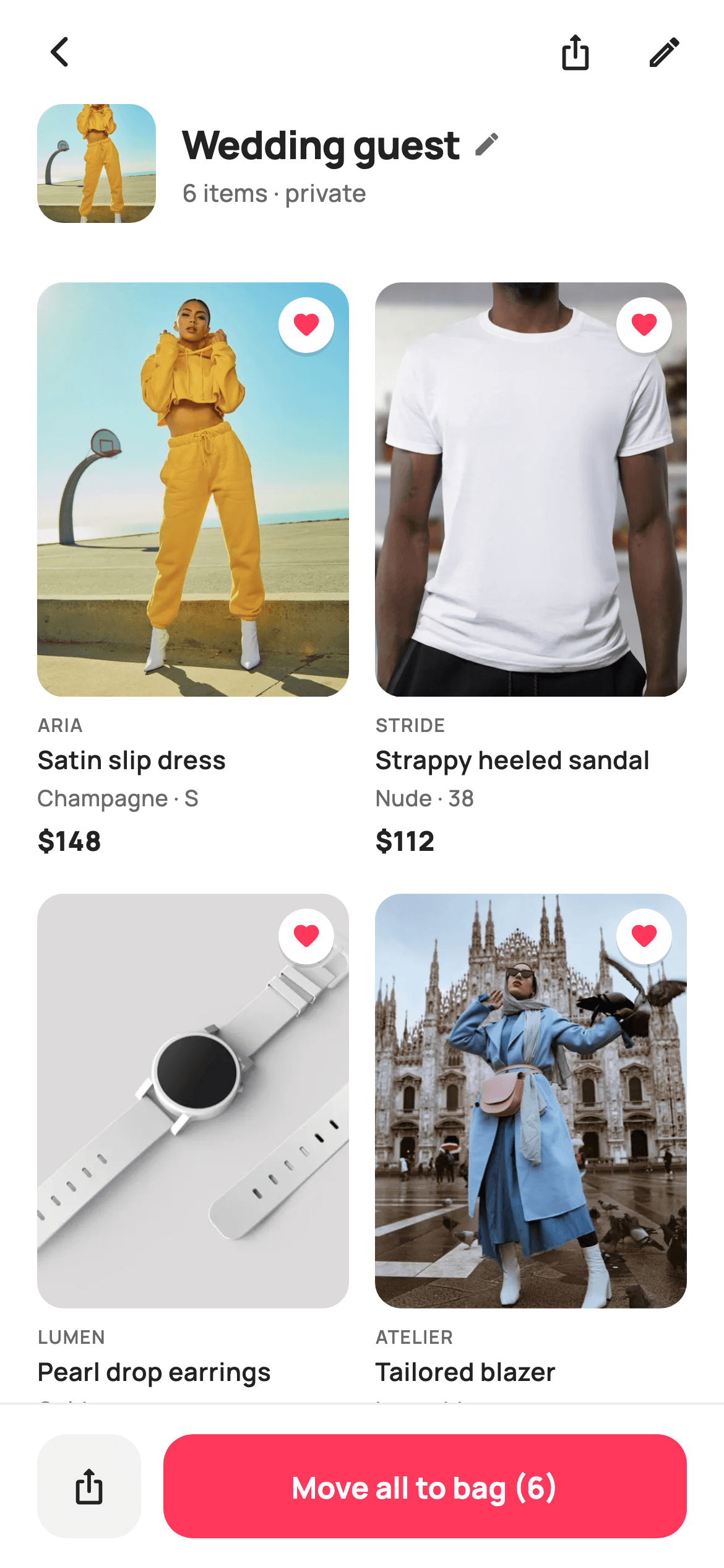
A wishlist board is easy to fill and hard to clean out, so the screen that opens one has to do two jobs at once: browse and prune. This tutorial builds StyleCart's collection detail screen in Flutter — a 64px cover thumbnail beside an inline-renameable board name, a two-column grid of saved products at a tall 0.54 aspect ratio, an app-bar pencil that flips every heart badge into a black remove button, and a pinned bar whose Move all to bag button counts down and disables at zero.
Watch the Flutter UI walkthrough
A short screen recording of Collection Detail running, if you'd rather see it before you read the code. The written tutorial below covers everything in it.
Can't see the video? Watch it on YouTube.
What you'll build
- ✓A cover strip pairing a 64px rounded thumbnail with an ellipsised board title and a rename pencil
- ✓A two-column GridView tuned to childAspectRatio 0.54 so a portrait fashion image plus four text lines fit without overflow
- ✓An edit mode that recolours every corner badge from white/coral heart to solid ink/close
- ✓Removal by index through a Set<int> so the source list is never mutated
- ✓A pinned action bar whose primary button reads the live count and falls back to a disabled 'No items'
Step-by-step build
Create the file
Add a new file at lib/ecom_wishlist_collection_detail/ecom_wishlist_collection_detail_screen.dart in your Flutter project.
Register the bundled fonts
No external packages — this is pure Flutter. It does bundle its design font (Manrope), so drop the font file into fonts/ and declare it in pubspec.yaml:
flutter:
  fonts:
    - family: Manrope
      fonts:
- asset: fonts/Manrope-Regular.ttfBuild it, piece by piece
Here's how the screen goes together. Each block below is a real slice of the code with a plain-English explanation — paste them in order, or grab the whole file from the next section.
A stateful board with five callbacks and no data layer
import 'package:flutter/material.dart';

/// StyleCart — Collection Detail.
///
/// One wishlist board opened up: a cover header with the board name, item count
/// and share / rename / more actions, then the saved products as a two-column
/// grid. An edit mode reveals per-item remove buttons; a pinned bar moves the
/// whole board to the bag.
///
/// Self-contained per CONVENTIONS.md: pure Flutter, bundled Manrope, inline
/// Airbnb-style tokens, own light theme + SafeArea, bundled webp. All chrome is
/// Material icons / painters (no emoji glyph). Exposes callbacks only.
class EcomWishlistCollectionDetailScreen extends StatefulWidget {
  const EcomWishlistCollectionDetailScreen({
    super.key,
    this.onBack,
    this.onProduct,
    this.onShare,
    this.onRename,
    this.onMoveAllToBag,
  });

  final VoidCallback? onBack;
  final ValueChanged<String>? onProduct;
  final VoidCallback? onShare;
  final VoidCallback? onRename;
  final VoidCallback? onMoveAllToBag;

  @override
  State<EcomWishlistCollectionDetailScreen> createState() =>
      _EcomWishlistCollectionDetailScreenState();
}
`EcomWishlistCollectionDetailScreen` is a `StatefulWidget` because two things genuinely change on-screen — which items survive and whether edit mode is on — while everything that leaves the screen is a callback: `onBack`, `onProduct`, `onShare`, `onRename`, `onMoveAllToBag`. Note that `onProduct` is a `ValueChanged<String>` rather than an id-typed callback; the card passes the product title through, which keeps the demo free of a model layer. `onRename` is exposed but this widget never edits the title itself — it hands the tap up so a host app can open its own rename sheet, which is why no `TextEditingController` appears anywhere in the file.
Tokens, the seed items, and a removal set instead of a mutable list
class _EcomWishlistCollectionDetailScreenState
    extends State<EcomWishlistCollectionDetailScreen> {
  static const String _font = 'Manrope';
  static const Color _canvas = Color(0xFFFFFFFF);
  static const Color _ink = Color(0xFF222222);
  static const Color _muted = Color(0xFF6A6A6A);
  static const Color _brand = Color(0xFFFF385C);
  static const Color _imageBg = Color(0xFFF5F5F5);
  static const Color _surface = Color(0xFFF2F2F2);
  static const Color _hairline = Color(0xFFEBEBEB);

  static const String _dir =
      'lib/screens/ecommerce/ecom_wishlist_collection_detail/images';

  final List<_Item> _items = <_Item>[
    const _Item('Satin slip dress', 'Aria', 148, 'Champagne · S', 'p15.webp'),
    const _Item('Strappy heeled sandal', 'Stride', 112, 'Nude · 38',
        'p16.webp'),
    const _Item('Pearl drop earrings', 'Lumen', 64, 'Gold', 'p17.webp'),
    const _Item('Tailored blazer', 'Atelier', 186, 'Ivory · M', 'p18.webp'),
    const _Item('Mini structured bag', 'Atelier', 134, 'Bone', 'p19.webp'),
    const _Item('Sheer pleated scarf', 'Aria', 42, 'Blush', 'p20.webp'),
  ];

  final Set<int> _removed = <int>{};
  bool _editing = false;

  List<int> get _visible =>
      List<int>.generate(_items.length, (int i) => i)
          .where((int i) => !_removed.contains(i))
          .toList();
Seven `static const Color` tokens carry the Airbnb-ish palette: `_ink` #222222 for text, `_muted` #6A6A6A for secondary lines, `_brand` #FF385C for the heart and the primary button, `_imageBg` #F5F5F5 as the placeholder behind every photo, `_surface` #F2F2F2 for the share tile and `_hairline` #EBEBEB doing double duty as the bar border and the disabled button fill. The six `_Item` records are `final`, never mutated. Deletion instead goes into `final Set<int> _removed`, and `_visible` derives the live index list by generating 0..5 and filtering out removed indices — so an item's index stays stable forever and 'undo' would be a single `_removed.remove(i)`.
Column, not CustomScrollView — why the header never scrolls
  @override
  Widget build(BuildContext context) {
    final List<int> vis = _visible;
    return Theme(
      data: ThemeData.light(useMaterial3: true),
      child: Scaffold(
        backgroundColor: _canvas,
        body: SafeArea(
          child: Column(
            children: <Widget>[
              _header(),
              _coverStrip(vis.length),
              Expanded(
                child: GridView.builder(
                  padding: const EdgeInsets.fromLTRB(20, 18, 20, 24),
                  gridDelegate:
                      const SliverGridDelegateWithFixedCrossAxisCount(
                    crossAxisCount: 2,
                    crossAxisSpacing: 14,
                    mainAxisSpacing: 18,
                    childAspectRatio: 0.54,
                  ),
                  itemCount: vis.length,
                  itemBuilder: (BuildContext context, int idx) =>
                      _card(vis[idx]),
                ),
              ),
              _bottomBar(vis.length),
            ],
          ),
        ),
      ),
    );
  }
`build` computes `vis` once and passes `vis.length` to both the cover strip and the bottom bar, so the count in '6 items · private' and the count in 'Move all to bag (6)' can never disagree. The body is a plain `Column` with only the `GridView.builder` inside an `Expanded`: the header and cover stay pinned while the grid scrolls under them, which suits a board you are pruning — the edit toggle must stay reachable. `childAspectRatio: 0.54` is the number doing the work: it makes each cell nearly twice as tall as it is wide, leaving room for a portrait image plus the four stacked text lines. Cross spacing is 14 against 18 vertical, so rows read as rows.
The header, and the pencil that becomes a tick
  Widget _header() {
    return Padding(
      padding: const EdgeInsets.fromLTRB(8, 4, 8, 4),
      child: Row(
        children: <Widget>[
          IconButton(
            onPressed: widget.onBack,
            icon: const Icon(Icons.arrow_back_ios_new_rounded,
                size: 20, color: _ink),
          ),
          const Spacer(),
          IconButton(
            onPressed: widget.onShare,
            icon: const Icon(Icons.ios_share_rounded, size: 21, color: _ink),
          ),
          IconButton(
            onPressed: () => setState(() => _editing = !_editing),
            icon: Icon(
              _editing ? Icons.check_rounded : Icons.edit_outlined,
              size: 21,
              color: _editing ? _brand : _ink,
            ),
          ),
        ],
      ),
    );
  }
A bare `Row` inside 8px padding stands in for an `AppBar` — back arrow, `Spacer()`, share, edit. The last `IconButton` is the mode switch: `setState(() => _editing = !_editing)` and the icon itself reports the state, swapping `Icons.edit_outlined` for `Icons.check_rounded` and `_ink` for `_brand`. Turning the control coral while active is what tells the shopper the screen is in a different mode without adding a banner or a title change. The back arrow is `arrow_back_ios_new_rounded` at 20px while the two action icons sit at 21px — a deliberate one-pixel lift, since the thin chevron reads heavier than its box suggests.
The cover strip: title, pencil and the live count line
  Widget _coverStrip(int count) {
    return Padding(
      padding: const EdgeInsets.fromLTRB(20, 0, 20, 14),
      child: Row(
        children: <Widget>[
          ClipRRect(
            borderRadius: BorderRadius.circular(14),
            child: Container(
              width: 64,
              height: 64,
              color: _imageBg,
              child: Image.asset('$_dir/p15.webp', fit: BoxFit.cover),
            ),
          ),
          const SizedBox(width: 14),
          Expanded(
            child: Column(
              crossAxisAlignment: CrossAxisAlignment.start,
              children: <Widget>[
                Row(
                  children: <Widget>[
                    const Flexible(
                      child: Text(
                        'Wedding guest',
                        maxLines: 1,
                        overflow: TextOverflow.ellipsis,
                        style: TextStyle(
                          fontFamily: _font,
                          fontSize: 21,
                          fontWeight: FontWeight.w800,
                          letterSpacing: -0.4,
                          color: _ink,
                        ),
                      ),
                    ),
                    const SizedBox(width: 6),
                    GestureDetector(
                      onTap: widget.onRename,
                      child: const Icon(Icons.edit_rounded,
                          size: 16, color: _muted),
                    ),
                  ],
                ),
                const SizedBox(height: 2),
                Text(
                  '$count items · private',
                  style: const TextStyle(
                    fontFamily: _font,
                    fontSize: 13,
                    fontWeight: FontWeight.w500,
                    color: _muted,
                  ),
                ),
              ],
            ),
          ),
        ],
      ),
    );
  }
The board's identity is a 64×64 `ClipRRect` at radius 14 wrapping a `Container(color: _imageBg)` — the grey shows while `p15.webp` decodes, so there is no white flash. The first product's asset doubles as the board cover, which is why no separate cover image exists. Beside it, the title Row wraps 'Wedding guest' in `Flexible` with `TextOverflow.ellipsis`, so a long board name truncates instead of shoving the pencil off-screen; a plain `Expanded` would work too, but `Flexible` lets a short name sit tight against its icon. The pencil is a `GestureDetector`, not an `IconButton`, to avoid a 48px tap target inflating the 21px headline row. Underneath, `'$count items · private'` recomputes on every removal.
The product image, its badge, and a removal tap that always fires
  Widget _card(int i) {
    final _Item it = _items[i];
    return GestureDetector(
      onTap: _editing ? null : () => widget.onProduct?.call(it.title),
      child: Column(
        crossAxisAlignment: CrossAxisAlignment.start,
        children: <Widget>[
          Expanded(
            child: ClipRRect(
              borderRadius: BorderRadius.circular(14),
              child: Stack(
                fit: StackFit.expand,
                children: <Widget>[
                  Container(color: _imageBg),
                  Image.asset('$_dir/${it.asset}', fit: BoxFit.cover),
                  Positioned(
                    top: 8,
                    right: 8,
                    child: GestureDetector(
                      onTap: () => setState(() => _removed.add(i)),
                      child: Container(
                        width: 30,
                        height: 30,
                        decoration: BoxDecoration(
                          color: _editing ? _ink : _canvas,
                          shape: BoxShape.circle,
                          boxShadow: const <BoxShadow>[
                            BoxShadow(
                              color: Color(0x1A000000),
                              blurRadius: 5,
                              offset: Offset(0, 2),
                            ),
                          ],
                        ),
                        child: Icon(
                          _editing
                              ? Icons.close_rounded
                              : Icons.favorite_rounded,
                          size: 16,
                          color: _editing ? _canvas : _brand,
                        ),
                      ),
                    ),
                  ),
                ],
              ),
            ),
          ),
The image occupies `Expanded` inside the card column, so the picture absorbs whatever height the 0.54 ratio leaves after the text. Inside a `Stack(fit: StackFit.expand)` the grey placeholder sits under `Image.asset`, and the badge is `Positioned(top: 8, right: 8)`. That 30px circle is the whole edit affordance: `_editing` swaps its fill from `_canvas` to `_ink` and its glyph from a coral `favorite_rounded` to a white `close_rounded`, with a soft `Color(0x1A000000)` shadow at blurRadius 5 keeping it legible over a pale photo. Worth knowing before you ship: the badge's `onTap` calls `_removed.add(i)` unconditionally, so it deletes in browse mode too — gate it on `_editing` if you want the heart to be inert.
Four text lines ranked by weight, not by size
          const SizedBox(height: 8),
          Text(
            it.brand.toUpperCase(),
            style: const TextStyle(
              fontFamily: _font,
              fontSize: 10,
              fontWeight: FontWeight.w600,
              letterSpacing: 0.6,
              color: _muted,
            ),
          ),
          const SizedBox(height: 2),
          Text(
            it.title,
            maxLines: 1,
            overflow: TextOverflow.ellipsis,
            style: const TextStyle(
              fontFamily: _font,
              fontSize: 13.5,
              fontWeight: FontWeight.w600,
              color: _ink,
            ),
          ),
          const SizedBox(height: 3),
          Text(
            it.variant,
            maxLines: 1,
            overflow: TextOverflow.ellipsis,
            style: const TextStyle(
              fontFamily: _font,
              fontSize: 12,
              fontWeight: FontWeight.w500,
              color: _muted,
            ),
          ),
          const SizedBox(height: 4),
          Text(
            '\$${it.price}',
            style: const TextStyle(
              fontFamily: _font,
              fontSize: 14.5,
              fontWeight: FontWeight.w800,
              color: _ink,
            ),
          ),
        ],
      ),
    );
  }
Below the image the card stacks brand, title, variant and price with 8/2/3/4px gaps — tightening as the group descends so the four lines read as one block rather than four rows. The brand is `it.brand.toUpperCase()` at only 10px but with `letterSpacing: 0.6` and `w600` in `_muted`, the classic fashion-label treatment: small and wide reads as a logotype, not as small print. Title and variant both carry `maxLines: 1` with ellipsis, which is what stops a long name from breaking the fixed cell height. The price is the visual anchor at 14.5px `w800` in `_ink` — heavier than the 13.5px `w600` title, so price wins the eye even though the title is technically the larger element.
The pinned bar and a button that disables itself
  Widget _bottomBar(int count) {
    return Container(
      decoration: const BoxDecoration(
        color: _canvas,
        border: Border(top: BorderSide(color: _hairline)),
      ),
      child: SafeArea(
        top: false,
        child: SizedBox(
          height: 88,
          child: Padding(
            padding: const EdgeInsets.fromLTRB(20, 14, 20, 14),
            child: Row(
              children: <Widget>[
                Container(
                  width: 56,
                  height: 56,
                  decoration: BoxDecoration(
                    color: _surface,
                    borderRadius: BorderRadius.circular(16),
                  ),
                  child: IconButton(
                    onPressed: widget.onShare,
                    icon: const Icon(Icons.ios_share_rounded,
                        size: 21, color: _ink),
                  ),
                ),
                const SizedBox(width: 12),
                Expanded(
                  child: SizedBox(
                    height: 56,
                    child: FilledButton(
                      onPressed: count == 0 ? null : widget.onMoveAllToBag,
                      style: FilledButton.styleFrom(
                        backgroundColor: _brand,
                        foregroundColor: _canvas,
                        disabledBackgroundColor: _hairline,
                        shape: RoundedRectangleBorder(
                          borderRadius: BorderRadius.circular(16),
                        ),
                      ),
                      child: Text(
                        count == 0 ? 'No items' : 'Move all to bag ($count)',
                        style: const TextStyle(
                          fontFamily: _font,
                          fontSize: 16,
                          fontWeight: FontWeight.w700,
                        ),
                      ),
                    ),
                  ),
                ),
              ],
            ),
          ),
        ),
      ),
    );
  }
The bar is a `Container` with a `_hairline` top border wrapping `SafeArea(top: false)` — inside the Container, so white extends under the home indicator while the controls stay above it. Its 88px `SizedBox` holds two unequal actions: a fixed 56px `_surface` tile for share, then the primary in `Expanded`. Ranking them this way means the coral button grows with the screen while the secondary never competes for width. `onPressed: count == 0 ? null : widget.onMoveAllToBag` is the disable switch — passing null is what makes Flutter paint `disabledBackgroundColor: _hairline` — and the label flips to 'No items' at the same instant, so an emptied board explains itself instead of showing a greyed-out button with a stale count.
Full code
The complete, ready-to-paste source. Free to use in your projects — one click copies it all.
import 'package:flutter/material.dart';

/// StyleCart — Collection Detail.
///
/// One wishlist board opened up: a cover header with the board name, item count
/// and share / rename / more actions, then the saved products as a two-column
/// grid. An edit mode reveals per-item remove buttons; a pinned bar moves the
/// whole board to the bag.
///
/// Self-contained per CONVENTIONS.md: pure Flutter, bundled Manrope, inline
/// Airbnb-style tokens, own light theme + SafeArea, bundled webp. All chrome is
/// Material icons / painters (no emoji glyph). Exposes callbacks only.
class EcomWishlistCollectionDetailScreen extends StatefulWidget {
  const EcomWishlistCollectionDetailScreen({
    super.key,
    this.onBack,
    this.onProduct,
    this.onShare,
    this.onRename,
    this.onMoveAllToBag,
  });

  final VoidCallback? onBack;
  final ValueChanged<String>? onProduct;
  final VoidCallback? onShare;
  final VoidCallback? onRename;
  final VoidCallback? onMoveAllToBag;

  @override
  State<EcomWishlistCollectionDetailScreen> createState() =>
      _EcomWishlistCollectionDetailScreenState();
}

class _EcomWishlistCollectionDetailScreenState
    extends State<EcomWishlistCollectionDetailScreen> {
  static const String _font = 'Manrope';
  static const Color _canvas = Color(0xFFFFFFFF);
  static const Color _ink = Color(0xFF222222);
  static const Color _muted = Color(0xFF6A6A6A);
  static const Color _brand = Color(0xFFFF385C);
  static const Color _imageBg = Color(0xFFF5F5F5);
  static const Color _surface = Color(0xFFF2F2F2);
  static const Color _hairline = Color(0xFFEBEBEB);

  static const String _dir =
      'lib/screens/ecommerce/ecom_wishlist_collection_detail/images';

  final List<_Item> _items = <_Item>[
    const _Item('Satin slip dress', 'Aria', 148, 'Champagne · S', 'p15.webp'),
    const _Item('Strappy heeled sandal', 'Stride', 112, 'Nude · 38',
        'p16.webp'),
    const _Item('Pearl drop earrings', 'Lumen', 64, 'Gold', 'p17.webp'),
    const _Item('Tailored blazer', 'Atelier', 186, 'Ivory · M', 'p18.webp'),
    const _Item('Mini structured bag', 'Atelier', 134, 'Bone', 'p19.webp'),
    const _Item('Sheer pleated scarf', 'Aria', 42, 'Blush', 'p20.webp'),
  ];

  final Set<int> _removed = <int>{};
  bool _editing = false;

  List<int> get _visible =>
      List<int>.generate(_items.length, (int i) => i)
          .where((int i) => !_removed.contains(i))
          .toList();

  @override
  Widget build(BuildContext context) {
    final List<int> vis = _visible;
    return Theme(
      data: ThemeData.light(useMaterial3: true),
      child: Scaffold(
        backgroundColor: _canvas,
        body: SafeArea(
          child: Column(
            children: <Widget>[
              _header(),
              _coverStrip(vis.length),
              Expanded(
                child: GridView.builder(
                  padding: const EdgeInsets.fromLTRB(20, 18, 20, 24),
                  gridDelegate:
                      const SliverGridDelegateWithFixedCrossAxisCount(
                    crossAxisCount: 2,
                    crossAxisSpacing: 14,
                    mainAxisSpacing: 18,
                    childAspectRatio: 0.54,
                  ),
                  itemCount: vis.length,
                  itemBuilder: (BuildContext context, int idx) =>
                      _card(vis[idx]),
                ),
              ),
              _bottomBar(vis.length),
            ],
          ),
        ),
      ),
    );
  }

  Widget _header() {
    return Padding(
      padding: const EdgeInsets.fromLTRB(8, 4, 8, 4),
      child: Row(
        children: <Widget>[
          IconButton(
            onPressed: widget.onBack,
            icon: const Icon(Icons.arrow_back_ios_new_rounded,
                size: 20, color: _ink),
          ),
          const Spacer(),
          IconButton(
            onPressed: widget.onShare,
            icon: const Icon(Icons.ios_share_rounded, size: 21, color: _ink),
          ),
          IconButton(
            onPressed: () => setState(() => _editing = !_editing),
            icon: Icon(
              _editing ? Icons.check_rounded : Icons.edit_outlined,
              size: 21,
              color: _editing ? _brand : _ink,
            ),
          ),
        ],
      ),
    );
  }

  Widget _coverStrip(int count) {
    return Padding(
      padding: const EdgeInsets.fromLTRB(20, 0, 20, 14),
      child: Row(
        children: <Widget>[
          ClipRRect(
            borderRadius: BorderRadius.circular(14),
            child: Container(
              width: 64,
              height: 64,
              color: _imageBg,
              child: Image.asset('$_dir/p15.webp', fit: BoxFit.cover),
            ),
          ),
          const SizedBox(width: 14),
          Expanded(
            child: Column(
              crossAxisAlignment: CrossAxisAlignment.start,
              children: <Widget>[
                Row(
                  children: <Widget>[
                    const Flexible(
                      child: Text(
                        'Wedding guest',
                        maxLines: 1,
                        overflow: TextOverflow.ellipsis,
                        style: TextStyle(
                          fontFamily: _font,
                          fontSize: 21,
                          fontWeight: FontWeight.w800,
                          letterSpacing: -0.4,
                          color: _ink,
                        ),
                      ),
                    ),
                    const SizedBox(width: 6),
                    GestureDetector(
                      onTap: widget.onRename,
                      child: const Icon(Icons.edit_rounded,
                          size: 16, color: _muted),
                    ),
                  ],
                ),
                const SizedBox(height: 2),
                Text(
                  '$count items · private',
                  style: const TextStyle(
                    fontFamily: _font,
                    fontSize: 13,
                    fontWeight: FontWeight.w500,
                    color: _muted,
                  ),
                ),
              ],
            ),
          ),
        ],
      ),
    );
  }

  Widget _card(int i) {
    final _Item it = _items[i];
    return GestureDetector(
      onTap: _editing ? null : () => widget.onProduct?.call(it.title),
      child: Column(
        crossAxisAlignment: CrossAxisAlignment.start,
        children: <Widget>[
          Expanded(
            child: ClipRRect(
              borderRadius: BorderRadius.circular(14),
              child: Stack(
                fit: StackFit.expand,
                children: <Widget>[
                  Container(color: _imageBg),
                  Image.asset('$_dir/${it.asset}', fit: BoxFit.cover),
                  Positioned(
                    top: 8,
                    right: 8,
                    child: GestureDetector(
                      onTap: () => setState(() => _removed.add(i)),
                      child: Container(
                        width: 30,
                        height: 30,
                        decoration: BoxDecoration(
                          color: _editing ? _ink : _canvas,
                          shape: BoxShape.circle,
                          boxShadow: const <BoxShadow>[
                            BoxShadow(
                              color: Color(0x1A000000),
                              blurRadius: 5,
                              offset: Offset(0, 2),
                            ),
                          ],
                        ),
                        child: Icon(
                          _editing
                              ? Icons.close_rounded
                              : Icons.favorite_rounded,
                          size: 16,
                          color: _editing ? _canvas : _brand,
                        ),
                      ),
                    ),
                  ),
                ],
              ),
            ),
          ),
          const SizedBox(height: 8),
          Text(
            it.brand.toUpperCase(),
            style: const TextStyle(
              fontFamily: _font,
              fontSize: 10,
              fontWeight: FontWeight.w600,
              letterSpacing: 0.6,
              color: _muted,
            ),
          ),
          const SizedBox(height: 2),
          Text(
            it.title,
            maxLines: 1,
            overflow: TextOverflow.ellipsis,
            style: const TextStyle(
              fontFamily: _font,
              fontSize: 13.5,
              fontWeight: FontWeight.w600,
              color: _ink,
            ),
          ),
          const SizedBox(height: 3),
          Text(
            it.variant,
            maxLines: 1,
            overflow: TextOverflow.ellipsis,
            style: const TextStyle(
              fontFamily: _font,
              fontSize: 12,
              fontWeight: FontWeight.w500,
              color: _muted,
            ),
          ),
          const SizedBox(height: 4),
          Text(
            '\$${it.price}',
            style: const TextStyle(
              fontFamily: _font,
              fontSize: 14.5,
              fontWeight: FontWeight.w800,
              color: _ink,
            ),
          ),
        ],
      ),
    );
  }

  Widget _bottomBar(int count) {
    return Container(
      decoration: const BoxDecoration(
        color: _canvas,
        border: Border(top: BorderSide(color: _hairline)),
      ),
      child: SafeArea(
        top: false,
        child: SizedBox(
          height: 88,
          child: Padding(
            padding: const EdgeInsets.fromLTRB(20, 14, 20, 14),
            child: Row(
              children: <Widget>[
                Container(
                  width: 56,
                  height: 56,
                  decoration: BoxDecoration(
                    color: _surface,
                    borderRadius: BorderRadius.circular(16),
                  ),
                  child: IconButton(
                    onPressed: widget.onShare,
                    icon: const Icon(Icons.ios_share_rounded,
                        size: 21, color: _ink),
                  ),
                ),
                const SizedBox(width: 12),
                Expanded(
                  child: SizedBox(
                    height: 56,
                    child: FilledButton(
                      onPressed: count == 0 ? null : widget.onMoveAllToBag,
                      style: FilledButton.styleFrom(
                        backgroundColor: _brand,
                        foregroundColor: _canvas,
                        disabledBackgroundColor: _hairline,
                        shape: RoundedRectangleBorder(
                          borderRadius: BorderRadius.circular(16),
                        ),
                      ),
                      child: Text(
                        count == 0 ? 'No items' : 'Move all to bag ($count)',
                        style: const TextStyle(
                          fontFamily: _font,
                          fontSize: 16,
                          fontWeight: FontWeight.w700,
                        ),
                      ),
                    ),
                  ),
                ),
              ],
            ),
          ),
        ),
      ),
    );
  }
}

class _Item {
  const _Item(this.title, this.brand, this.price, this.variant, this.asset);
  final String title;
  final String brand;
  final int price;
  final String variant;
  final String asset;
}
Plus bundled 11 binary assets (fonts/images). The CLI and MCP install those for you automatically.
Two faster ways to add it
Copy-paste works, but you can skip it entirely.
1. FlutterKit CLI
One command drops this screen — and its fonts — straight into your project.
$ flutterkit add ecom-wishlist-collection-detail2. AI agent (MCP)
Connect FlutterKit's MCP server in Claude or Cursor and just ask your agent to install ecom-wishlist-collection-detail — it fetches and writes the files for you.
FAQ
Can I use this wishlist collection screen in a commercial app?
Yes. FlutterKit is free — there is no paid tier behind this page, no licence key and no sign-up. Copy the Dart from this page, install it with the CLI, or pull it through MCP, and ship it in a store app. Attribution is not required.
How do I stop the heart badge from deleting items outside edit mode?
Change the badge's `onTap` from the unconditional `setState(() => _removed.add(i))` to `_editing ? () => setState(() => _removed.add(i)) : null` — or call your own favourite-toggle when `_editing` is false. As written, the tap removes in both modes, which is the one behaviour to fix before wiring it to a real saved-items backend.
Why does the grid use childAspectRatio 0.54, and what do I change it to?
0.54 makes each cell roughly twice as tall as wide, which is what fits a portrait product photo above four text lines. Drop a line — variant, say — and raise the value toward 0.62; add a size-picker row and lower it. Getting this wrong is the usual cause of a yellow overflow stripe under a product card.
Which packages and fonts does it need?
No packages at all — only `package:flutter/material.dart`. It uses the bundled Manrope family through `fontFamily: 'Manrope'`, declared in your `pubspec.yaml`; drop that line and it falls back to the platform font with the same weights. The six product images are local webp assets under the screen's own `images` folder, so swap them for `NetworkImage` when you connect real data.
Which Flutter version does this need?
Flutter 3.10 or newer is enough — the only modern syntax here is the `super.key` parameter, and `ThemeData.light(useMaterial3: true)` with `FilledButton`. On an older SDK, expand the constructor to the `{Key? key, ...}) : super(key: key)` form. There is no `Color.withValues` in this file, so no opacity call needs swapping.


