How to Build a Profile Setup Complete Screen with an Animated Success Ring in Flutter (Full Code + Preview)
The last step of onboarding should feel like a reward, not another form, and it has to prove that the work the user just did actually stuck. This tutorial builds Pulse's 'You're all set!' screen in Flutter: a 116px `CustomPaint` where `_SuccessRingPainter` sweeps a green arc and then draws a check mark stroke by stroke on a single 900ms `AnimationController`, a `_ProfilePreview` card with a gradient initials avatar computed by an `_initials` getter, three `_ReadyRow` summary lines, and a pinned 54px 'Start exploring' `FilledButton`.
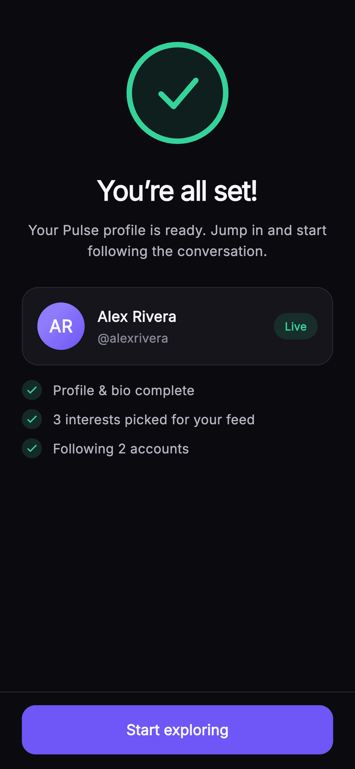
Watch the Flutter UI walkthrough
A short screen recording of Pulse · All Set running, if you'd rather see it before you read the code. The written tutorial below covers everything in it.
Can't see the video? Watch it on YouTube.
What you'll build
- ✓A `_SuccessRingPainter` that layers a hairline track, a glow fill whose alpha grows with progress, a sweeping arc starting at 12 o'clock, and a two-segment check mark that draws itself in
- ✓One 900ms `AnimationController` started with `..forward()` in `initState` and fed straight into `AnimatedBuilder` with no Tween
- ✓An `_initials` getter that turns 'Alex Rivera' into 'AR' with a regex split and handles empty or single-word names
- ✓A `_ProfilePreview` card with a diagonal #9B8CFF to #6E56F7 gradient avatar, ellipsised name, @handle, and a tinted green 'Live' pill
- ✓A pinned bottom bar with a hairline top border and a fixed-height indigo `FilledButton` wired to an injected `onStart` callback
Step-by-step build
Create the file
Add a new file at lib/social_setup_complete/social_setup_complete_screen.dart in your Flutter project.
Register the bundled fonts
No external packages — this is pure Flutter. It does bundle its design font (Inter), so drop the font file into fonts/ and declare it in pubspec.yaml:
flutter:
  fonts:
    - family: Inter
      fonts:
- asset: fonts/Inter-Regular.ttfBuild it, piece by piece
Here's how the screen goes together. Each block below is a real slice of the code with a plain-English explanation — paste them in order, or grab the whole file from the next section.
Props, a nine-colour palette, and why this is a StatefulWidget
import 'package:flutter/material.dart';

/// All Set — final step of Pulse profile setup. A painted animated success ring
/// with a check, a celebratory (confetti-free) headline, a compact profile
/// preview card, and a summary of what’s ready. A single "Start exploring" CTA
/// sits in a pinned bottom bar at fixed height. Self-contained per
/// CONVENTIONS.md: pure Flutter, bundled Inter font, own dark theme, SafeArea.
class SocialSetupCompleteScreen extends StatefulWidget {
  const SocialSetupCompleteScreen({
    super.key,
    this.onStart,
    this.name = 'Alex Rivera',
    this.handle = 'alexrivera',
  });

  final VoidCallback? onStart;
  final String name;
  final String handle;

  static const String _font = 'Inter';
  static const Color _bg = Color(0xFF0B0B0F);
  static const Color _surface = Color(0xFF15151B);
  static const Color _brand = Color(0xFF6E56F7);
  static const Color _accent = Color(0xFF9B8CFF);
  static const Color _success = Color(0xFF34D399);
  static const Color _hairline = Color(0xFF26262F);
  static const Color _textHi = Color(0xFFF4F4F7);
  static const Color _textLo = Color(0xFFB5B5C2);
  static const Color _muted = Color(0xFF8A8A99);

  @override
  State<SocialSetupCompleteScreen> createState() =>
      _SocialSetupCompleteScreenState();
}
`SocialSetupCompleteScreen` takes only three things: an optional `onStart` callback and `name` / `handle` strings with defaults of 'Alex Rivera' and 'alexrivera'. There is no user model passed in; the screen derives everything it shows (including the avatar initials) from those two strings, which is what makes it drop-in. Nine `static const Color`s define a near-mono dark palette: `_bg` #0B0B0F, `_surface` #15151B, a `_brand` indigo #6E56F7 with a lighter `_accent` #9B8CFF for the avatar gradient, and `_success` #34D399 reserved for the ring, checks and Live pill. Three text tones (`_textHi`, `_textLo`, `_muted`) give the hierarchy without changing weight. Unlike most success screens this one is a `StatefulWidget`, purely because the ring needs an `AnimationController`, which needs a `TickerProvider`.
A single 900ms controller and the initials getter
class _SocialSetupCompleteScreenState extends State<SocialSetupCompleteScreen>
    with SingleTickerProviderStateMixin {
  late final AnimationController _controller;

  @override
  void initState() {
    super.initState();
    _controller = AnimationController(
      vsync: this,
      duration: const Duration(milliseconds: 900),
    )..forward();
  }

  @override
  void dispose() {
    _controller.dispose();
    super.dispose();
  }

  String get _initials {
    final List<String> parts = widget.name
        .trim()
        .split(RegExp(r'\s+'))
        .where((String s) => s.isNotEmpty)
        .toList();
    if (parts.isEmpty) return '?';
    if (parts.length == 1) return parts.first[0].toUpperCase();
    return (parts.first[0] + parts.last[0]).toUpperCase();
  }
The state mixes in `SingleTickerProviderStateMixin` and creates one `AnimationController` with a 900ms duration, immediately calling `..forward()` in `initState` so the ring starts sweeping the moment the screen appears; it is disposed in `dispose`. There is no `Tween` or `CurvedAnimation` in between — the painter reads the raw `0.0..1.0` value and does its own easing arithmetic. The `_initials` getter is the small piece of logic that keeps the screen self-contained: it trims `widget.name`, splits on `RegExp(r'\s+')` so double spaces do not produce empty parts, filters blanks, and returns '?' for an empty name, the first letter for a single word, or first-plus-last initial uppercased for anything longer. Feeding 'Alex Rivera' yields 'AR' without any extra prop.
The scrolling body: ring, headline, preview card, ready rows
  @override
  Widget build(BuildContext context) {
    return Theme(
      data: ThemeData.dark(useMaterial3: true),
      child: Scaffold(
        backgroundColor: SocialSetupCompleteScreen._bg,
        body: SafeArea(
          child: Column(
            children: <Widget>[
              Expanded(
                child: SingleChildScrollView(
                  padding: const EdgeInsets.fromLTRB(24, 24, 24, 24),
                  child: Column(
                    children: <Widget>[
                      const SizedBox(height: 20),
                      SizedBox(
                        width: 116,
                        height: 116,
                        child: AnimatedBuilder(
                          animation: _controller,
                          builder: (BuildContext context, Widget? child) {
                            return CustomPaint(
                              painter: _SuccessRingPainter(
                                  progress: _controller.value),
                            );
                          },
                        ),
                      ),
                      const SizedBox(height: 28),
                      const Text(
                        'You’re all set!',
                        style: TextStyle(
                          fontFamily: SocialSetupCompleteScreen._font,
                          fontSize: 30,
                          fontWeight: FontWeight.w700,
                          letterSpacing: -0.9,
                          color: SocialSetupCompleteScreen._textHi,
                        ),
                      ),
                      const SizedBox(height: 10),
                      const Text(
                        'Your Pulse profile is ready. Jump in and start following the conversation.',
                        textAlign: TextAlign.center,
                        style: TextStyle(
                          fontFamily: SocialSetupCompleteScreen._font,
                          fontSize: 15,
                          height: 1.5,
                          color: SocialSetupCompleteScreen._textLo,
                        ),
                      ),
                      const SizedBox(height: 28),
                      _ProfilePreview(
                        initials: _initials,
                        name: widget.name,
                        handle: widget.handle,
                      ),
                      const SizedBox(height: 16),
                      const _ReadyRow(text: 'Profile & bio complete'),
                      const SizedBox(height: 10),
                      const _ReadyRow(text: '3 interests picked for your feed'),
                      const SizedBox(height: 10),
                      const _ReadyRow(text: 'Following 2 accounts'),
                    ],
                  ),
                ),
              ),
`build` wraps everything in `Theme(data: ThemeData.dark(useMaterial3: true))` so the screen stays dark regardless of the host app's theme, then a `Scaffold` on `_bg` with `SafeArea`. The outer `Column` splits into an `Expanded` `SingleChildScrollView` and a fixed bottom bar, which is what makes the body overflow-proof on short phones. Inside, a 116x116 `SizedBox` hosts an `AnimatedBuilder` listening to `_controller`; each tick it rebuilds a `CustomPaint` with a fresh `_SuccessRingPainter(progress: _controller.value)`. The headline is 30px `w700` with `letterSpacing: -0.9` in `_textHi`, followed by a 15px `_textLo` line at `height: 1.5`. Then the `_ProfilePreview` receives the computed `_initials` plus `widget.name` and `widget.handle`, and three `_ReadyRow`s with hard-coded summary copy ('3 interests picked for your feed', 'Following 2 accounts') are spaced by 10px `SizedBox`es.
The pinned bottom bar and the Start exploring button
              Container(
                decoration: const BoxDecoration(
                  color: SocialSetupCompleteScreen._bg,
                  border: Border(
                      top: BorderSide(
                          color: SocialSetupCompleteScreen._hairline)),
                ),
                padding: const EdgeInsets.fromLTRB(24, 14, 24, 16),
                child: SizedBox(
                  width: double.infinity,
                  height: 54,
                  child: FilledButton(
                    onPressed: widget.onStart,
                    style: FilledButton.styleFrom(
                      backgroundColor: SocialSetupCompleteScreen._brand,
                      foregroundColor: Colors.white,
                      shape: RoundedRectangleBorder(
                        borderRadius: BorderRadius.circular(15),
                      ),
                    ),
                    child: const Text(
                      'Start exploring',
                      style: TextStyle(
                        fontFamily: SocialSetupCompleteScreen._font,
                        fontSize: 16,
                        fontWeight: FontWeight.w600,
                      ),
                    ),
                  ),
                ),
              ),
            ],
          ),
        ),
      ),
    );
  }
}
The second child of the outer `Column` is a plain `Container` rather than a `bottomNavigationBar`, painted in `_bg` with a `Border(top: BorderSide(color: _hairline))` so a 1px #26262F line separates it from scrolling content. Padding is `fromLTRB(24, 14, 24, 16)` — slightly more below than above so the button does not sit hard against the home indicator. A `SizedBox` at `width: double.infinity, height: 54` locks the button size, and the `FilledButton` uses `styleFrom` with `_brand` background, white foreground and a 15px `RoundedRectangleBorder`. Its `onPressed` is `widget.onStart` directly; when the callback is null the button renders disabled, which is a useful signal during development that the screen has not been wired up. The label is 16px `w600` Inter.
_ProfilePreview: gradient initials avatar and the Live pill
class _ProfilePreview extends StatelessWidget {
  const _ProfilePreview({
    required this.initials,
    required this.name,
    required this.handle,
  });
  final String initials;
  final String name;
  final String handle;

  @override
  Widget build(BuildContext context) {
    return Container(
      padding: const EdgeInsets.all(16),
      decoration: BoxDecoration(
        color: SocialSetupCompleteScreen._surface,
        borderRadius: BorderRadius.circular(18),
        border: Border.all(color: SocialSetupCompleteScreen._hairline),
      ),
      child: Row(
        children: <Widget>[
          Container(
            width: 52,
            height: 52,
            decoration: const BoxDecoration(
              shape: BoxShape.circle,
              gradient: LinearGradient(
                begin: Alignment.topLeft,
                end: Alignment.bottomRight,
                colors: <Color>[
                  SocialSetupCompleteScreen._accent,
                  SocialSetupCompleteScreen._brand,
                ],
              ),
            ),
            child: Center(
              child: Text(
                initials,
                style: const TextStyle(
                  fontFamily: SocialSetupCompleteScreen._font,
                  fontSize: 19,
                  fontWeight: FontWeight.w700,
                  color: Colors.white,
                ),
              ),
            ),
          ),
          const SizedBox(width: 14),
          Expanded(
            child: Column(
              crossAxisAlignment: CrossAxisAlignment.start,
              children: <Widget>[
                Text(
                  name,
                  overflow: TextOverflow.ellipsis,
                  style: const TextStyle(
                    fontFamily: SocialSetupCompleteScreen._font,
                    fontSize: 16,
                    fontWeight: FontWeight.w700,
                    color: SocialSetupCompleteScreen._textHi,
                  ),
                ),
                const SizedBox(height: 2),
                Text(
                  '@$handle',
                  style: const TextStyle(
                    fontFamily: SocialSetupCompleteScreen._font,
                    fontSize: 13.5,
                    color: SocialSetupCompleteScreen._muted,
                  ),
                ),
              ],
            ),
          ),
          Container(
            padding: const EdgeInsets.symmetric(horizontal: 12, vertical: 6),
            decoration: BoxDecoration(
              color: SocialSetupCompleteScreen._success.withValues(alpha: 0.14),
              borderRadius: BorderRadius.circular(20),
            ),
            child: const Text(
              'Live',
              style: TextStyle(
                fontFamily: SocialSetupCompleteScreen._font,
                fontSize: 12,
                fontWeight: FontWeight.w700,
                color: SocialSetupCompleteScreen._success,
              ),
            ),
          ),
        ],
      ),
    );
  }
}
`_ProfilePreview` is a stateless card on `_surface` #15151B with an 18px radius and a `_hairline` border. The avatar is a 52px circle whose `BoxDecoration` uses a `LinearGradient` from `topLeft` to `bottomRight` running `_accent` #9B8CFF into `_brand` #6E56F7; the `initials` string sits centred at 19px `w700` white, so no image asset or network call is needed. The name column is `Expanded` with `crossAxisAlignment: start`; the name is 16px `w700` with `overflow: TextOverflow.ellipsis` so a long display name truncates instead of pushing the pill off-screen, and the handle is interpolated as `'@$handle'` at 13.5px in `_muted`. The trailing 'Live' pill is a `Container` with 12x6 padding, `_success.withValues(alpha: 0.14)` fill and a 20px radius, with the 12px `w700` label in full `_success` — the same tint-fill-plus-solid-text pattern the ready rows reuse.
_ReadyRow: tinted circular checks for the summary list
class _ReadyRow extends StatelessWidget {
  const _ReadyRow({required this.text});
  final String text;

  @override
  Widget build(BuildContext context) {
    return Row(
      children: <Widget>[
        Container(
          width: 22,
          height: 22,
          decoration: BoxDecoration(
            shape: BoxShape.circle,
            color: SocialSetupCompleteScreen._success.withValues(alpha: 0.16),
          ),
          child: const Icon(Icons.check,
              size: 14, color: SocialSetupCompleteScreen._success),
        ),
        const SizedBox(width: 12),
        Text(
          text,
          style: const TextStyle(
            fontFamily: SocialSetupCompleteScreen._font,
            fontSize: 14.5,
            fontWeight: FontWeight.w500,
            color: SocialSetupCompleteScreen._textLo,
          ),
        ),
      ],
    );
  }
}
`_ReadyRow` takes one `text` string and renders a `Row` of a 22px circular `Container` filled with `_success.withValues(alpha: 0.16)` holding a 14px `Icons.check` in solid `_success`, a 12px gap, then the label at 14.5px `w500` in `_textLo`. The check circle is intentionally smaller and paler than the big painted ring above so the three rows read as a receipt of completed steps rather than three more celebrations. Because the widget is `const`-constructible, the three rows in the body are built as `const _ReadyRow(...)` and never rebuild while the `AnimatedBuilder` is ticking — only the `CustomPaint` subtree repaints during the 900ms animation.
_SuccessRingPainter: track, glow, sweep, and a self-drawing check
/// Paints an accent success ring that sweeps in, with a check mark that scales
/// up as the ring completes.
class _SuccessRingPainter extends CustomPainter {
  const _SuccessRingPainter({required this.progress});
  final double progress;

  @override
  void paint(Canvas canvas, Size size) {
    final Offset center = size.center(Offset.zero);
    final double radius = size.width / 2 - 5;
    final Rect rect = Rect.fromCircle(center: center, radius: radius);
    // Track.
    canvas.drawCircle(
      center,
      radius,
      Paint()
        ..style = PaintingStyle.stroke
        ..strokeWidth = 6
        ..color = SocialSetupCompleteScreen._hairline,
    );
    // Glow fill.
    canvas.drawCircle(
      center,
      radius - 3,
      Paint()
        ..color = SocialSetupCompleteScreen._success
            .withValues(alpha: 0.10 * progress),
    );
    // Sweeping progress arc.
    canvas.drawArc(
      rect,
      -1.5708,
      6.2831853 * progress,
      false,
      Paint()
        ..style = PaintingStyle.stroke
        ..strokeWidth = 6
        ..strokeCap = StrokeCap.round
        ..color = SocialSetupCompleteScreen._success,
    );
    // Check mark (draws in over the back half of the animation).
    final double t = ((progress - 0.4) / 0.6).clamp(0.0, 1.0);
    if (t > 0) {
      final Paint check = Paint()
        ..style = PaintingStyle.stroke
        ..strokeWidth = 6
        ..strokeCap = StrokeCap.round
        ..strokeJoin = StrokeJoin.round
        ..color = SocialSetupCompleteScreen._success;
      final Offset p0 = Offset(center.dx - radius * 0.34, center.dy + radius * 0.02);
      final Offset p1 = Offset(center.dx - radius * 0.08, center.dy + radius * 0.28);
      final Offset p2 = Offset(center.dx + radius * 0.38, center.dy - radius * 0.26);
      final Path path = Path()..moveTo(p0.dx, p0.dy);
      if (t <= 0.5) {
        final double s = t / 0.5;
        path.lineTo(p0.dx + (p1.dx - p0.dx) * s, p0.dy + (p1.dy - p0.dy) * s);
      } else {
        path.lineTo(p1.dx, p1.dy);
        final double s = (t - 0.5) / 0.5;
        path.lineTo(p1.dx + (p2.dx - p1.dx) * s, p1.dy + (p2.dy - p1.dy) * s);
      }
      canvas.drawPath(path, check);
    }
  }

  @override
  bool shouldRepaint(covariant _SuccessRingPainter oldDelegate) =>
      oldDelegate.progress != progress;
}
The painter works from the box centre with `radius = size.width / 2 - 5`, leaving room for a 6px stroke. It draws four layers in order. First a full `_hairline` circle as the track. Second a filled circle at `radius - 3` in `_success` with `alpha: 0.10 * progress`, so the green glow fades in as the ring completes. Third `drawArc` from `-1.5708` radians (12 o'clock) sweeping `6.2831853 * progress` — a full turn at progress 1 — with `StrokeCap.round`. The check only starts once `progress` passes 0.4: `t = ((progress - 0.4) / 0.6).clamp(0, 1)` remaps the back 60% of the animation to 0..1. Three points are placed relative to the radius (`p0` left, `p1` bottom, `p2` upper right); for `t <= 0.5` the path lerps from `p0` toward `p1`, otherwise it commits the first stroke and lerps `p1` toward `p2`, so the tick is drawn as two strokes in sequence. `shouldRepaint` compares `progress` only.
Full code
The complete, ready-to-paste source. Free to use in your projects — one click copies it all.
import 'package:flutter/material.dart';

/// All Set — final step of Pulse profile setup. A painted animated success ring
/// with a check, a celebratory (confetti-free) headline, a compact profile
/// preview card, and a summary of what’s ready. A single "Start exploring" CTA
/// sits in a pinned bottom bar at fixed height. Self-contained per
/// CONVENTIONS.md: pure Flutter, bundled Inter font, own dark theme, SafeArea.
class SocialSetupCompleteScreen extends StatefulWidget {
  const SocialSetupCompleteScreen({
    super.key,
    this.onStart,
    this.name = 'Alex Rivera',
    this.handle = 'alexrivera',
  });

  final VoidCallback? onStart;
  final String name;
  final String handle;

  static const String _font = 'Inter';
  static const Color _bg = Color(0xFF0B0B0F);
  static const Color _surface = Color(0xFF15151B);
  static const Color _brand = Color(0xFF6E56F7);
  static const Color _accent = Color(0xFF9B8CFF);
  static const Color _success = Color(0xFF34D399);
  static const Color _hairline = Color(0xFF26262F);
  static const Color _textHi = Color(0xFFF4F4F7);
  static const Color _textLo = Color(0xFFB5B5C2);
  static const Color _muted = Color(0xFF8A8A99);

  @override
  State<SocialSetupCompleteScreen> createState() =>
      _SocialSetupCompleteScreenState();
}

class _SocialSetupCompleteScreenState extends State<SocialSetupCompleteScreen>
    with SingleTickerProviderStateMixin {
  late final AnimationController _controller;

  @override
  void initState() {
    super.initState();
    _controller = AnimationController(
      vsync: this,
      duration: const Duration(milliseconds: 900),
    )..forward();
  }

  @override
  void dispose() {
    _controller.dispose();
    super.dispose();
  }

  String get _initials {
    final List<String> parts = widget.name
        .trim()
        .split(RegExp(r'\s+'))
        .where((String s) => s.isNotEmpty)
        .toList();
    if (parts.isEmpty) return '?';
    if (parts.length == 1) return parts.first[0].toUpperCase();
    return (parts.first[0] + parts.last[0]).toUpperCase();
  }

  @override
  Widget build(BuildContext context) {
    return Theme(
      data: ThemeData.dark(useMaterial3: true),
      child: Scaffold(
        backgroundColor: SocialSetupCompleteScreen._bg,
        body: SafeArea(
          child: Column(
            children: <Widget>[
              Expanded(
                child: SingleChildScrollView(
                  padding: const EdgeInsets.fromLTRB(24, 24, 24, 24),
                  child: Column(
                    children: <Widget>[
                      const SizedBox(height: 20),
                      SizedBox(
                        width: 116,
                        height: 116,
                        child: AnimatedBuilder(
                          animation: _controller,
                          builder: (BuildContext context, Widget? child) {
                            return CustomPaint(
                              painter: _SuccessRingPainter(
                                  progress: _controller.value),
                            );
                          },
                        ),
                      ),
                      const SizedBox(height: 28),
                      const Text(
                        'You’re all set!',
                        style: TextStyle(
                          fontFamily: SocialSetupCompleteScreen._font,
                          fontSize: 30,
                          fontWeight: FontWeight.w700,
                          letterSpacing: -0.9,
                          color: SocialSetupCompleteScreen._textHi,
                        ),
                      ),
                      const SizedBox(height: 10),
                      const Text(
                        'Your Pulse profile is ready. Jump in and start following the conversation.',
                        textAlign: TextAlign.center,
                        style: TextStyle(
                          fontFamily: SocialSetupCompleteScreen._font,
                          fontSize: 15,
                          height: 1.5,
                          color: SocialSetupCompleteScreen._textLo,
                        ),
                      ),
                      const SizedBox(height: 28),
                      _ProfilePreview(
                        initials: _initials,
                        name: widget.name,
                        handle: widget.handle,
                      ),
                      const SizedBox(height: 16),
                      const _ReadyRow(text: 'Profile & bio complete'),
                      const SizedBox(height: 10),
                      const _ReadyRow(text: '3 interests picked for your feed'),
                      const SizedBox(height: 10),
                      const _ReadyRow(text: 'Following 2 accounts'),
                    ],
                  ),
                ),
              ),
              Container(
                decoration: const BoxDecoration(
                  color: SocialSetupCompleteScreen._bg,
                  border: Border(
                      top: BorderSide(
                          color: SocialSetupCompleteScreen._hairline)),
                ),
                padding: const EdgeInsets.fromLTRB(24, 14, 24, 16),
                child: SizedBox(
                  width: double.infinity,
                  height: 54,
                  child: FilledButton(
                    onPressed: widget.onStart,
                    style: FilledButton.styleFrom(
                      backgroundColor: SocialSetupCompleteScreen._brand,
                      foregroundColor: Colors.white,
                      shape: RoundedRectangleBorder(
                        borderRadius: BorderRadius.circular(15),
                      ),
                    ),
                    child: const Text(
                      'Start exploring',
                      style: TextStyle(
                        fontFamily: SocialSetupCompleteScreen._font,
                        fontSize: 16,
                        fontWeight: FontWeight.w600,
                      ),
                    ),
                  ),
                ),
              ),
            ],
          ),
        ),
      ),
    );
  }
}

class _ProfilePreview extends StatelessWidget {
  const _ProfilePreview({
    required this.initials,
    required this.name,
    required this.handle,
  });
  final String initials;
  final String name;
  final String handle;

  @override
  Widget build(BuildContext context) {
    return Container(
      padding: const EdgeInsets.all(16),
      decoration: BoxDecoration(
        color: SocialSetupCompleteScreen._surface,
        borderRadius: BorderRadius.circular(18),
        border: Border.all(color: SocialSetupCompleteScreen._hairline),
      ),
      child: Row(
        children: <Widget>[
          Container(
            width: 52,
            height: 52,
            decoration: const BoxDecoration(
              shape: BoxShape.circle,
              gradient: LinearGradient(
                begin: Alignment.topLeft,
                end: Alignment.bottomRight,
                colors: <Color>[
                  SocialSetupCompleteScreen._accent,
                  SocialSetupCompleteScreen._brand,
                ],
              ),
            ),
            child: Center(
              child: Text(
                initials,
                style: const TextStyle(
                  fontFamily: SocialSetupCompleteScreen._font,
                  fontSize: 19,
                  fontWeight: FontWeight.w700,
                  color: Colors.white,
                ),
              ),
            ),
          ),
          const SizedBox(width: 14),
          Expanded(
            child: Column(
              crossAxisAlignment: CrossAxisAlignment.start,
              children: <Widget>[
                Text(
                  name,
                  overflow: TextOverflow.ellipsis,
                  style: const TextStyle(
                    fontFamily: SocialSetupCompleteScreen._font,
                    fontSize: 16,
                    fontWeight: FontWeight.w700,
                    color: SocialSetupCompleteScreen._textHi,
                  ),
                ),
                const SizedBox(height: 2),
                Text(
                  '@$handle',
                  style: const TextStyle(
                    fontFamily: SocialSetupCompleteScreen._font,
                    fontSize: 13.5,
                    color: SocialSetupCompleteScreen._muted,
                  ),
                ),
              ],
            ),
          ),
          Container(
            padding: const EdgeInsets.symmetric(horizontal: 12, vertical: 6),
            decoration: BoxDecoration(
              color: SocialSetupCompleteScreen._success.withValues(alpha: 0.14),
              borderRadius: BorderRadius.circular(20),
            ),
            child: const Text(
              'Live',
              style: TextStyle(
                fontFamily: SocialSetupCompleteScreen._font,
                fontSize: 12,
                fontWeight: FontWeight.w700,
                color: SocialSetupCompleteScreen._success,
              ),
            ),
          ),
        ],
      ),
    );
  }
}

class _ReadyRow extends StatelessWidget {
  const _ReadyRow({required this.text});
  final String text;

  @override
  Widget build(BuildContext context) {
    return Row(
      children: <Widget>[
        Container(
          width: 22,
          height: 22,
          decoration: BoxDecoration(
            shape: BoxShape.circle,
            color: SocialSetupCompleteScreen._success.withValues(alpha: 0.16),
          ),
          child: const Icon(Icons.check,
              size: 14, color: SocialSetupCompleteScreen._success),
        ),
        const SizedBox(width: 12),
        Text(
          text,
          style: const TextStyle(
            fontFamily: SocialSetupCompleteScreen._font,
            fontSize: 14.5,
            fontWeight: FontWeight.w500,
            color: SocialSetupCompleteScreen._textLo,
          ),
        ),
      ],
    );
  }
}

/// Paints an accent success ring that sweeps in, with a check mark that scales
/// up as the ring completes.
class _SuccessRingPainter extends CustomPainter {
  const _SuccessRingPainter({required this.progress});
  final double progress;

  @override
  void paint(Canvas canvas, Size size) {
    final Offset center = size.center(Offset.zero);
    final double radius = size.width / 2 - 5;
    final Rect rect = Rect.fromCircle(center: center, radius: radius);
    // Track.
    canvas.drawCircle(
      center,
      radius,
      Paint()
        ..style = PaintingStyle.stroke
        ..strokeWidth = 6
        ..color = SocialSetupCompleteScreen._hairline,
    );
    // Glow fill.
    canvas.drawCircle(
      center,
      radius - 3,
      Paint()
        ..color = SocialSetupCompleteScreen._success
            .withValues(alpha: 0.10 * progress),
    );
    // Sweeping progress arc.
    canvas.drawArc(
      rect,
      -1.5708,
      6.2831853 * progress,
      false,
      Paint()
        ..style = PaintingStyle.stroke
        ..strokeWidth = 6
        ..strokeCap = StrokeCap.round
        ..color = SocialSetupCompleteScreen._success,
    );
    // Check mark (draws in over the back half of the animation).
    final double t = ((progress - 0.4) / 0.6).clamp(0.0, 1.0);
    if (t > 0) {
      final Paint check = Paint()
        ..style = PaintingStyle.stroke
        ..strokeWidth = 6
        ..strokeCap = StrokeCap.round
        ..strokeJoin = StrokeJoin.round
        ..color = SocialSetupCompleteScreen._success;
      final Offset p0 = Offset(center.dx - radius * 0.34, center.dy + radius * 0.02);
      final Offset p1 = Offset(center.dx - radius * 0.08, center.dy + radius * 0.28);
      final Offset p2 = Offset(center.dx + radius * 0.38, center.dy - radius * 0.26);
      final Path path = Path()..moveTo(p0.dx, p0.dy);
      if (t <= 0.5) {
        final double s = t / 0.5;
        path.lineTo(p0.dx + (p1.dx - p0.dx) * s, p0.dy + (p1.dy - p0.dy) * s);
      } else {
        path.lineTo(p1.dx, p1.dy);
        final double s = (t - 0.5) / 0.5;
        path.lineTo(p1.dx + (p2.dx - p1.dx) * s, p1.dy + (p2.dy - p1.dy) * s);
      }
      canvas.drawPath(path, check);
    }
  }

  @override
  bool shouldRepaint(covariant _SuccessRingPainter oldDelegate) =>
      oldDelegate.progress != progress;
}
Plus bundled 1 binary asset (fonts/images). The CLI and MCP install those for you automatically.
Two faster ways to add it
Copy-paste works, but you can skip it entirely.
1. FlutterKit CLI
One command drops this screen — and its fonts — straight into your project.
$ flutterkit add social-setup-complete2. AI agent (MCP)
Connect FlutterKit's MCP server in Claude or Cursor and just ask your agent to install social-setup-complete — it fetches and writes the files for you.
FAQ
Can I use this setup-complete screen in a commercial app?
Yes. FlutterKit screens are free for personal and commercial projects under an MIT-style licence. There is no licence key or account involved; run `flutterkit add social-setup-complete` or copy the file above into your project and ship it.
Which packages does this screen depend on?
None. It is pure Flutter: `package:flutter/material.dart` plus a `CustomPainter` and one `AnimationController`. The only asset is the Inter font, which `flutterkit add social-setup-complete` bundles and registers in pubspec.yaml for you. If you copy the code by hand, either add Inter yourself or remove the `fontFamily` lines to fall back to the platform font.
What Flutter version do I need?
Flutter 3.22 or newer. The file uses `super.key` in the constructor and `Color.withValues(alpha: ...)` in the glow fill, the Live pill and the ready-row checks. On an older 3.x SDK, replace each `withValues(alpha: x)` with `withOpacity(x)` and it compiles unchanged otherwise.
How do I change the timing so the check appears earlier or later?
Two numbers control it. The controller's `Duration(milliseconds: 900)` sets the total length. Inside `_SuccessRingPainter.paint`, `t = ((progress - 0.4) / 0.6)` means the check starts drawing at 40% of the ring sweep and finishes with it; lower the 0.4 (and raise the divisor so the two still sum to 1.0) to start the check sooner. To add easing, wrap the controller in a `CurvedAnimation` and pass its `.value` to the painter instead of `_controller.value`.
The summary rows are hard-coded — how do I drive them from real onboarding data?
The three `const _ReadyRow(text: ...)` calls in the body are plain strings. Add a `List<String> summary` prop to `SocialSetupCompleteScreen` alongside `name` and `handle`, then replace the three rows with `for (final s in widget.summary) ...[_ReadyRow(text: s), const SizedBox(height: 10)]`. The rows would no longer be `const`, but they are outside the `AnimatedBuilder` so the animation cost is unaffected.


