How to Build a Username Picker Screen in Flutter (Full Code + Preview)
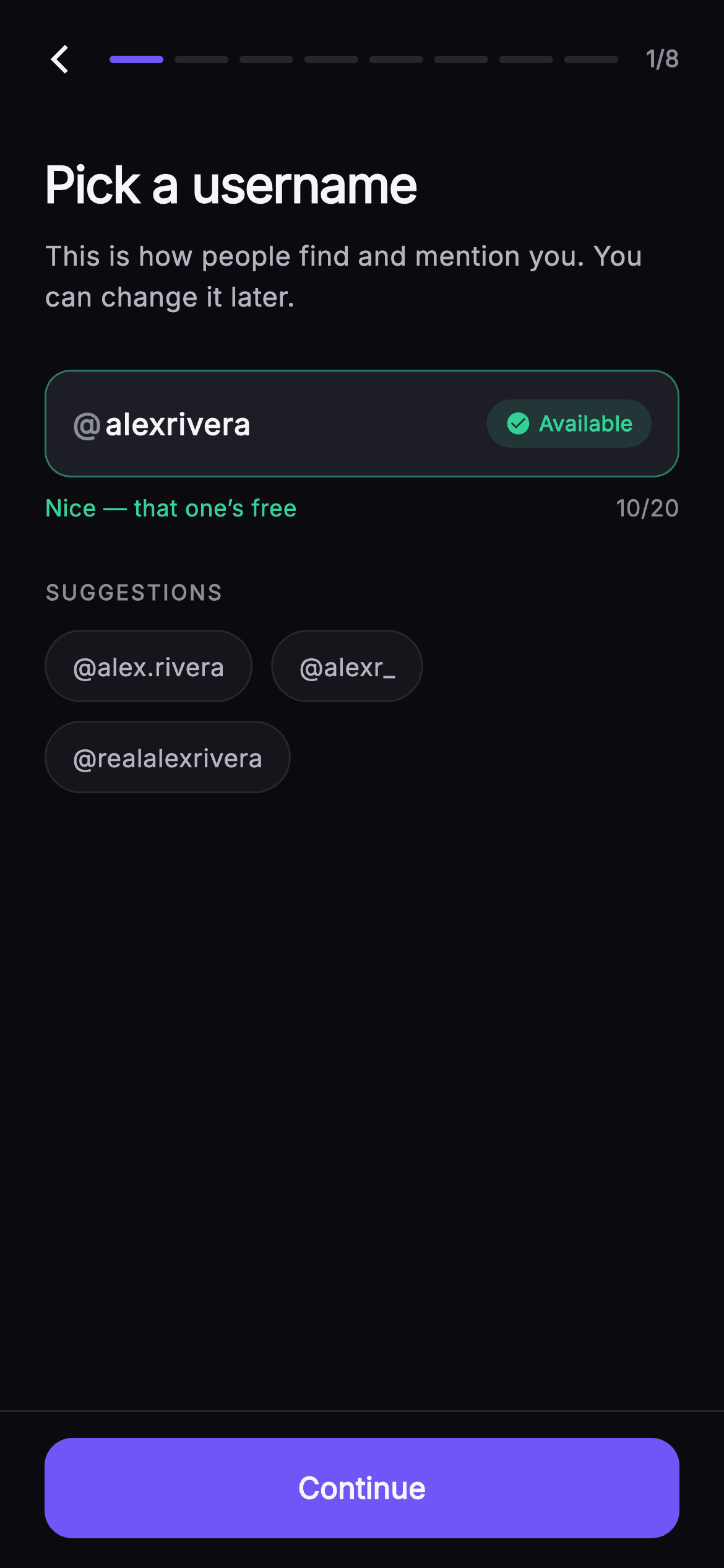
A public @handle is claimed once and lived with forever, so the picker has to say yes or no while the user is still typing rather than after they submit. This tutorial builds Pulse's step-1 username screen in Flutter: an @-prefixed TextField on the #0B0B0F dark canvas, a Set of taken handles standing in for an availability API, a green-check / red-cancel chip that hides itself below three characters, tappable suggestion pills, a live 20-character counter, and a Continue button gated on the same predicate the chip reads.
Watch the Flutter UI walkthrough
A short screen recording of Pulse · Pick Username running, if you'd rather see it before you read the code. The written tutorial below covers everything in it.
Can't see the video? Watch it on YouTube.
What you'll build
- ✓A constant Set of reserved handles acting as a synchronous stand-in for an availability API
- ✓An @-prefixed field whose '@' lives outside the TextField so it can never be typed or deleted
- ✓An availability pill that renders green check / red cancel and shrinks to nothing under three characters
- ✓Tappable suggestion pills that write straight into the TextEditingController and re-run validation
- ✓An eight-segment step bar and a Continue button that share one `_available` predicate with the field border
Step-by-step build
Create the file
Add a new file at lib/social_setup_username/social_setup_username_screen.dart in your Flutter project.
Register the bundled fonts
No external packages — this is pure Flutter. It does bundle its design font (Inter), so drop the font file into fonts/ and declare it in pubspec.yaml:
flutter:
  fonts:
    - family: Inter
      fonts:
- asset: fonts/Inter-Regular.ttfBuild it, piece by piece
Here's how the screen goes together. Each block below is a real slice of the code with a plain-English explanation — paste them in order, or grab the whole file from the next section.
The widget shell and a palette the private widgets can reach
import 'package:flutter/material.dart';

/// Pick Username — first step of Pulse profile setup. A live availability chip
/// (checking → available → taken) reacts to input, a suggestions row offers
/// alternatives, and a character counter caps the handle. A step-progress bar
/// tops the screen and the Continue CTA sits in a pinned bottom bar at fixed
/// height. Self-contained per CONVENTIONS.md: pure Flutter, bundled Inter font,
/// own dark theme, SafeArea.
class SocialSetupUsernameScreen extends StatefulWidget {
  const SocialSetupUsernameScreen({
    super.key,
    this.onBack,
    this.onContinue,
  });

  final VoidCallback? onBack;
  final VoidCallback? onContinue;

  static const String _font = 'Inter';
  static const Color _bg = Color(0xFF0B0B0F);
  static const Color _surface = Color(0xFF15151B);
  static const Color _surfaceAlt = Color(0xFF1D1D26);
  static const Color _brand = Color(0xFF6E56F7);
  static const Color _accent = Color(0xFF9B8CFF);
  static const Color _success = Color(0xFF34D399);
  static const Color _danger = Color(0xFFF4476B);
  static const Color _hairline = Color(0xFF26262F);
  static const Color _textHi = Color(0xFFF4F4F7);
  static const Color _textLo = Color(0xFFB5B5C2);
  static const Color _muted = Color(0xFF8A8A99);

  @override
  State<SocialSetupUsernameScreen> createState() =>
      _SocialSetupUsernameScreenState();
}
The doc comment promises a chip that goes 'checking → available → taken', but no checking state exists anywhere in this file — availability is computed synchronously on every keystroke, so trust the Dart over the comment. `SocialSetupUsernameScreen` is a `StatefulWidget` carrying only `onBack` and `onContinue`, both nullable, which keeps routing entirely outside the screen. The eleven palette entries — `_bg` #0B0B0F, `_surfaceAlt` #1D1D26 for the input, `_brand` indigo #6E56F7, `_success` #34D399, `_danger` #F4476B — are `static const` on the public class rather than on the state, and that placement is why `_AvailabilityChip`, `_SuggestionChip` and `_SetupFooter` further down can name colours directly without a theme lookup or a constructor parameter.
The fake availability API and the three derived getters
class _SocialSetupUsernameScreenState extends State<SocialSetupUsernameScreen> {
  static const int _maxLen = 20;
  final TextEditingController _controller =
      TextEditingController(text: 'alexrivera');
  static const Set<String> _taken = <String>{
    'alex',
    'alexr',
    'rivera',
    'admin',
    'pulse',
  };
  static const List<String> _suggestions = <String>[
    'alex.rivera',
    'alexr_',
    'realalexrivera',
  ];

  @override
  void initState() {
    super.initState();
    _controller.addListener(() => setState(() {}));
  }

  @override
  void dispose() {
    _controller.dispose();
    super.dispose();
  }

  String get _value => _controller.text.trim().toLowerCase();
  bool get _tooShort => _value.length < 3;
  bool get _taken_ => _taken.contains(_value);
  bool get _available => !_tooShort && !_taken_;
`_controller` is seeded with 'alexrivera' so the preview opens in the interesting state rather than empty. `_taken` is a `static const Set<String>` of five reserved handles — alex, alexr, rivera, admin, pulse — and `contains` on a Set is the whole availability check: constant-time, no async, no spinner. `initState` registers `_controller.addListener(() => setState(() {}))` instead of using `onChanged`, so a programmatic write from a suggestion chip rebuilds too, and `dispose` releases the controller. Then three getters do all the reasoning: `_value` trims and lowercases (so 'Alex ' still matches), `_tooShort` is under 3 characters, and `_available` is the single truth the whole screen reads.
Dark theme, the fixed header, and the scrolling body
  @override
  Widget build(BuildContext context) {
    return Theme(
      data: ThemeData.dark(useMaterial3: true),
      child: Scaffold(
        backgroundColor: SocialSetupUsernameScreen._bg,
        body: SafeArea(
          child: Column(
            children: <Widget>[
              _SetupHeader(
                step: 1,
                total: 8,
                onBack: widget.onBack,
              ),
              Expanded(
                child: ListView(
                  padding: const EdgeInsets.fromLTRB(24, 20, 24, 24),
                  children: <Widget>[
                    const Text(
                      'Pick a username',
                      style: TextStyle(
                        fontFamily: SocialSetupUsernameScreen._font,
                        fontSize: 27,
                        fontWeight: FontWeight.w700,
                        letterSpacing: -0.7,
                        color: SocialSetupUsernameScreen._textHi,
                      ),
                    ),
                    const SizedBox(height: 8),
                    const Text(
                      'This is how people find and mention you. You can change it later.',
                      style: TextStyle(
                        fontFamily: SocialSetupUsernameScreen._font,
                        fontSize: 14.5,
                        height: 1.5,
                        color: SocialSetupUsernameScreen._textLo,
                      ),
                    ),
                    const SizedBox(height: 28),
The tree is wrapped in `Theme(data: ThemeData.dark(useMaterial3: true))` so the screen keeps its own dark styling even when dropped into a light host app. Inside `SafeArea`, a `Column` places `_SetupHeader(step: 1, total: 8)` at the top and `_SetupFooter` at the bottom as fixed chrome, with the middle `Expanded(child: ListView(...))` taking whatever is left — that matters here because the keyboard is open almost immediately, and only the middle band needs to scroll. The title is 27px `w700` with `letterSpacing: -0.7`; the 14.5px subtitle at `height: 1.5` ends with 'You can change it later', which lowers the stakes of a decision people otherwise stall on.
The @-prefixed input and its validating border
                    Container(
                      decoration: BoxDecoration(
                        color: SocialSetupUsernameScreen._surfaceAlt,
                        borderRadius: BorderRadius.circular(14),
                        border: Border.all(
                          color: _available
                              ? SocialSetupUsernameScreen._success
                                  .withValues(alpha: 0.5)
                              : SocialSetupUsernameScreen._hairline,
                        ),
                      ),
                      padding: const EdgeInsets.symmetric(horizontal: 14),
                      child: Row(
                        children: <Widget>[
                          const Text(
                            '@',
                            style: TextStyle(
                              fontFamily: SocialSetupUsernameScreen._font,
                              fontSize: 16,
                              fontWeight: FontWeight.w600,
                              color: SocialSetupUsernameScreen._muted,
                            ),
                          ),
                          const SizedBox(width: 2),
                          Expanded(
                            child: TextField(
                              controller: _controller,
                              maxLength: _maxLen,
                              cursorColor: SocialSetupUsernameScreen._accent,
                              style: const TextStyle(
                                fontFamily: SocialSetupUsernameScreen._font,
                                fontSize: 16,
                                fontWeight: FontWeight.w600,
                                color: SocialSetupUsernameScreen._textHi,
                              ),
                              decoration: const InputDecoration(
                                isCollapsed: true,
                                counterText: '',
                                contentPadding:
                                    EdgeInsets.symmetric(vertical: 16),
                                border: InputBorder.none,
                                hintText: 'username',
                                hintStyle: TextStyle(
                                  fontFamily: SocialSetupUsernameScreen._font,
                                  fontSize: 16,
                                  color: SocialSetupUsernameScreen._muted,
                                ),
                              ),
                            ),
                          ),
                          const SizedBox(width: 8),
                          _AvailabilityChip(
                            available: _available,
                            tooShort: _tooShort,
                          ),
                        ],
                      ),
                    ),
The field is a `_surfaceAlt` Container at radius 14 whose `Border.all` colour flips to `_success.withValues(alpha: 0.5)` the moment `_available` is true and falls back to `_hairline` otherwise — half-strength green so it reads as quiet confirmation rather than an alert. The '@' is a separate 16px `w600` `_muted` `Text` sitting beside the field, never inside it, so it cannot be typed over or backspaced away and never pollutes `_controller.text`. The `InputDecoration` sets `isCollapsed: true`, `border: InputBorder.none` and `counterText: ''` to strip Material's own frame and counter, while `maxLength: _maxLen` keeps the truncating formatter — the only input restriction the screen actually applies.
Helper line, character counter, suggestions, and the gated footer
                    const SizedBox(height: 8),
                    Row(
                      mainAxisAlignment: MainAxisAlignment.spaceBetween,
                      children: <Widget>[
                        Text(
                          _tooShort
                              ? 'At least 3 characters'
                              : _taken_
                                  ? 'That username is taken'
                                  : 'Nice — that one’s free',
                          style: TextStyle(
                            fontFamily: SocialSetupUsernameScreen._font,
                            fontSize: 12.5,
                            fontWeight: FontWeight.w500,
                            color: _available
                                ? SocialSetupUsernameScreen._success
                                : _taken_
                                    ? SocialSetupUsernameScreen._danger
                                    : SocialSetupUsernameScreen._muted,
                          ),
                        ),
                        Text(
                          '${_controller.text.length}/$_maxLen',
                          style: const TextStyle(
                            fontFamily: SocialSetupUsernameScreen._font,
                            fontSize: 12.5,
                            fontWeight: FontWeight.w500,
                            color: SocialSetupUsernameScreen._muted,
                          ),
                        ),
                      ],
                    ),
                    const SizedBox(height: 28),
                    const Text(
                      'SUGGESTIONS',
                      style: TextStyle(
                        fontFamily: SocialSetupUsernameScreen._font,
                        fontSize: 11.5,
                        fontWeight: FontWeight.w700,
                        letterSpacing: 1.2,
                        color: SocialSetupUsernameScreen._muted,
                      ),
                    ),
                    const SizedBox(height: 12),
                    Wrap(
                      spacing: 10,
                      runSpacing: 10,
                      children: _suggestions
                          .map((String s) => _SuggestionChip(
                                label: s,
                                onTap: () => _controller.text = s,
                              ))
                          .toList(),
                    ),
                  ],
                ),
              ),
              _SetupFooter(
                enabled: _available,
                onContinue: widget.onContinue,
              ),
            ],
          ),
        ),
      ),
    );
  }
A `spaceBetween` Row pairs a three-branch message — 'At least 3 characters', 'That username is taken', 'Nice — that one's free' — with a colour ternary in the same order, so wording and colour can never disagree. The counter reads `_controller.text.length`, the raw string, while validation reads the trimmed `_value`; a trailing space therefore counts toward 20 but not toward the three-character floor. 'SUGGESTIONS' is an 11.5px `w700` eyebrow at `letterSpacing: 1.2`, and the `Wrap` with `spacing`/`runSpacing` of 10 lets long handles reflow onto a second line instead of overflowing. Each chip assigns `_controller.text = s`, which fires the listener, and `_SetupFooter` receives `enabled: _available` — the same predicate the border uses.
The availability chip that knows when to say nothing
class _AvailabilityChip extends StatelessWidget {
  const _AvailabilityChip({required this.available, required this.tooShort});
  final bool available;
  final bool tooShort;

  @override
  Widget build(BuildContext context) {
    if (tooShort) {
      return const SizedBox.shrink();
    }
    final Color color = available
        ? SocialSetupUsernameScreen._success
        : SocialSetupUsernameScreen._danger;
    return Container(
      padding: const EdgeInsets.symmetric(horizontal: 10, vertical: 5),
      decoration: BoxDecoration(
        color: color.withValues(alpha: 0.14),
        borderRadius: BorderRadius.circular(20),
      ),
      child: Row(
        mainAxisSize: MainAxisSize.min,
        children: <Widget>[
          Icon(available ? Icons.check_circle : Icons.cancel,
              size: 14, color: color),
          const SizedBox(width: 4),
          Text(
            available ? 'Available' : 'Taken',
            style: TextStyle(
              fontFamily: SocialSetupUsernameScreen._font,
              fontSize: 11.5,
              fontWeight: FontWeight.w600,
              color: color,
            ),
          ),
        ],
      ),
    );
  }
}
`_AvailabilityChip` takes two plain booleans, not an enum, which is the honest signature for a screen with no loading state. Its first act is to return `const SizedBox.shrink()` when `tooShort` — someone who has typed one letter has not failed yet, and flashing 'Taken' at them would be a lie about a handle that was never checked. Once past three characters a single local `Color` drives everything: the `Icons.check_circle` or `Icons.cancel` glyph at 14px, the 11.5px `w600` label, and the pill background at `color.withValues(alpha: 0.14)`. Deriving all three from one variable makes a green icon on a red pill impossible. `mainAxisSize: MainAxisSize.min` keeps it hugging its text.
Suggestion pills that write into the controller
class _SuggestionChip extends StatelessWidget {
  const _SuggestionChip({required this.label, this.onTap});
  final String label;
  final VoidCallback? onTap;

  @override
  Widget build(BuildContext context) {
    return Material(
      color: SocialSetupUsernameScreen._surface,
      borderRadius: BorderRadius.circular(20),
      child: InkWell(
        onTap: onTap,
        borderRadius: BorderRadius.circular(20),
        child: Container(
          padding: const EdgeInsets.symmetric(horizontal: 14, vertical: 9),
          decoration: BoxDecoration(
            borderRadius: BorderRadius.circular(20),
            border: Border.all(color: SocialSetupUsernameScreen._hairline),
          ),
          child: Text(
            '@$label',
            style: const TextStyle(
              fontFamily: SocialSetupUsernameScreen._font,
              fontSize: 13.5,
              fontWeight: FontWeight.w500,
              color: SocialSetupUsernameScreen._textLo,
            ),
          ),
        ),
      ),
    );
  }
}
Each pill is a `Material` → `InkWell` → `Container` sandwich, and each layer earns its place: `Material` supplies the `_surface` #15151B fill and clips the ripple to `BorderRadius.circular(20)`, the `InkWell` repeats that same radius so the splash follows the pill's curve instead of painting square into its corners, and the Container adds the `_hairline` outline plus 14×9 padding. The label renders `'@$label'` so the chip previews the finished handle, even though the tap callback writes only the bare string into the controller — the '@' beside the TextField supplies the prefix there. Text is 13.5px `w500` in `_textLo`, deliberately quieter than the value being typed.
The eight-segment step bar and the pinned Continue bar
/// Shared setup header: back button + a segmented step-progress bar.
class _SetupHeader extends StatelessWidget {
  const _SetupHeader({
    required this.step,
    required this.total,
    this.onBack,
  });
  final int step;
  final int total;
  final VoidCallback? onBack;

  @override
  Widget build(BuildContext context) {
    return Padding(
      padding: const EdgeInsets.fromLTRB(8, 8, 24, 4),
      child: Row(
        children: <Widget>[
          IconButton(
            onPressed: onBack,
            icon: const Icon(Icons.arrow_back_ios_new,
                size: 18, color: SocialSetupUsernameScreen._textHi),
          ),
          Expanded(
            child: Row(
              children: List<Widget>.generate(total, (int i) {
                return Expanded(
                  child: Container(
                    height: 4,
                    margin: const EdgeInsets.symmetric(horizontal: 3),
                    decoration: BoxDecoration(
                      borderRadius: BorderRadius.circular(2),
                      color: i < step
                          ? SocialSetupUsernameScreen._brand
                          : SocialSetupUsernameScreen._hairline,
                    ),
                  ),
                );
              }),
            ),
          ),
          const SizedBox(width: 12),
          Text(
            '$step/$total',
            style: const TextStyle(
              fontFamily: SocialSetupUsernameScreen._font,
              fontSize: 12.5,
              fontWeight: FontWeight.w600,
              color: SocialSetupUsernameScreen._muted,
            ),
          ),
        ],
      ),
    );
  }
}

/// Shared pinned footer: a full-width Continue CTA at fixed height.
class _SetupFooter extends StatelessWidget {
  const _SetupFooter({
    required this.enabled,
    this.onContinue,
  });
  final bool enabled;
  final VoidCallback? onContinue;

  @override
  Widget build(BuildContext context) {
    return Container(
      decoration: const BoxDecoration(
        color: SocialSetupUsernameScreen._bg,
        border: Border(
            top: BorderSide(color: SocialSetupUsernameScreen._hairline)),
      ),
      padding: const EdgeInsets.fromLTRB(24, 14, 24, 16),
      child: SizedBox(
        width: double.infinity,
        height: 54,
        child: FilledButton(
          onPressed: enabled ? onContinue : null,
          style: FilledButton.styleFrom(
            backgroundColor: SocialSetupUsernameScreen._brand,
            foregroundColor: Colors.white,
            disabledBackgroundColor: SocialSetupUsernameScreen._surfaceAlt,
            disabledForegroundColor: SocialSetupUsernameScreen._muted,
            shape: RoundedRectangleBorder(
              borderRadius: BorderRadius.circular(15),
            ),
          ),
          child: const Text(
            'Continue',
            style: TextStyle(
              fontFamily: SocialSetupUsernameScreen._font,
              fontSize: 16,
              fontWeight: FontWeight.w600,
            ),
          ),
        ),
      ),
    );
  }
}
`_SetupHeader` builds its progress bar with `List<Widget>.generate(total, ...)`, each segment an `Expanded` 4px-tall Container with 3px side margins, filled `_brand` when `i < step` — index-based, so step 1 lights exactly the first of eight — with a '1/8' readout at the end for people who want the number. Its `fromLTRB(8, 8, 24, 4)` padding is asymmetric because the `IconButton` already carries its own touch padding on the left. `_SetupFooter` pins a 54px `FilledButton` under a top hairline and passes `onPressed: enabled ? onContinue : null`; the null is what actually disables it, and `disabledBackgroundColor: _surfaceAlt` with `disabledForegroundColor: _muted` makes that state look designed rather than broken.
Full code
The complete, ready-to-paste source. Free to use in your projects — one click copies it all.
import 'package:flutter/material.dart';
/// Pick Username — first step of Pulse profile setup. A live availability chip
/// (checking → available → taken) reacts to input, a suggestions row offers
/// alternatives, and a character counter caps the handle. A step-progress bar
/// tops the screen and the Continue CTA sits in a pinned bottom bar at fixed
/// height. Self-contained per CONVENTIONS.md: pure Flutter, bundled Inter font,
/// own dark theme, SafeArea.
class SocialSetupUsernameScreen extends StatefulWidget {
const SocialSetupUsernameScreen({
super.key,
this.onBack,
this.onContinue,
});
final VoidCallback? onBack;
final VoidCallback? onContinue;
static const String _font = 'Inter';
static const Color _bg = Color(0xFF0B0B0F);
static const Color _surface = Color(0xFF15151B);
static const Color _surfaceAlt = Color(0xFF1D1D26);
static const Color _brand = Color(0xFF6E56F7);
static const Color _accent = Color(0xFF9B8CFF);
static const Color _success = Color(0xFF34D399);
static const Color _danger = Color(0xFFF4476B);
static const Color _hairline = Color(0xFF26262F);
static const Color _textHi = Color(0xFFF4F4F7);
static const Color _textLo = Color(0xFFB5B5C2);
static const Color _muted = Color(0xFF8A8A99);
@override
State<SocialSetupUsernameScreen> createState() =>
_SocialSetupUsernameScreenState();
}
class _SocialSetupUsernameScreenState extends State<SocialSetupUsernameScreen> {
static const int _maxLen = 20;
final TextEditingController _controller =
TextEditingController(text: 'alexrivera');
static const Set<String> _taken = <String>{
'alex',
'alexr',
'rivera',
'admin',
'pulse',
};
static const List<String> _suggestions = <String>[
'alex.rivera',
'alexr_',
'realalexrivera',
];
@override
void initState() {
super.initState();
_controller.addListener(() => setState(() {}));
}
@override
void dispose() {
_controller.dispose();
super.dispose();
}
String get _value => _controller.text.trim().toLowerCase();
bool get _tooShort => _value.length < 3;
bool get _taken_ => _taken.contains(_value);
bool get _available => !_tooShort && !_taken_;
@override
Widget build(BuildContext context) {
return Theme(
data: ThemeData.dark(useMaterial3: true),
child: Scaffold(
backgroundColor: SocialSetupUsernameScreen._bg,
body: SafeArea(
child: Column(
children: <Widget>[
_SetupHeader(
step: 1,
total: 8,
onBack: widget.onBack,
),
Expanded(
child: ListView(
padding: const EdgeInsets.fromLTRB(24, 20, 24, 24),
children: <Widget>[
const Text(
'Pick a username',
style: TextStyle(
fontFamily: SocialSetupUsernameScreen._font,
fontSize: 27,
fontWeight: FontWeight.w700,
letterSpacing: -0.7,
color: SocialSetupUsernameScreen._textHi,
),
),
const SizedBox(height: 8),
const Text(
'This is how people find and mention you. You can change it later.',
style: TextStyle(
fontFamily: SocialSetupUsernameScreen._font,
fontSize: 14.5,
height: 1.5,
color: SocialSetupUsernameScreen._textLo,
),
),
const SizedBox(height: 28),
Container(
decoration: BoxDecoration(
color: SocialSetupUsernameScreen._surfaceAlt,
borderRadius: BorderRadius.circular(14),
border: Border.all(
color: _available
? SocialSetupUsernameScreen._success
.withValues(alpha: 0.5)
: SocialSetupUsernameScreen._hairline,
),
),
padding: const EdgeInsets.symmetric(horizontal: 14),
child: Row(
children: <Widget>[
const Text(
'@',
style: TextStyle(
fontFamily: SocialSetupUsernameScreen._font,
fontSize: 16,
fontWeight: FontWeight.w600,
color: SocialSetupUsernameScreen._muted,
),
),
const SizedBox(width: 2),
Expanded(
child: TextField(
controller: _controller,
maxLength: _maxLen,
cursorColor: SocialSetupUsernameScreen._accent,
style: const TextStyle(
fontFamily: SocialSetupUsernameScreen._font,
fontSize: 16,
fontWeight: FontWeight.w600,
color: SocialSetupUsernameScreen._textHi,
),
decoration: const InputDecoration(
isCollapsed: true,
counterText: '',
contentPadding:
EdgeInsets.symmetric(vertical: 16),
border: InputBorder.none,
hintText: 'username',
hintStyle: TextStyle(
fontFamily: SocialSetupUsernameScreen._font,
fontSize: 16,
color: SocialSetupUsernameScreen._muted,
),
),
),
),
const SizedBox(width: 8),
_AvailabilityChip(
available: _available,
tooShort: _tooShort,
),
],
),
),
const SizedBox(height: 8),
Row(
mainAxisAlignment: MainAxisAlignment.spaceBetween,
children: <Widget>[
Text(
_tooShort
? 'At least 3 characters'
: _taken_
? 'That username is taken'
: 'Nice — that one’s free',
style: TextStyle(
fontFamily: SocialSetupUsernameScreen._font,
fontSize: 12.5,
fontWeight: FontWeight.w500,
color: _available
? SocialSetupUsernameScreen._success
: _taken_
? SocialSetupUsernameScreen._danger
: SocialSetupUsernameScreen._muted,
),
),
Text(
'${_controller.text.length}/$_maxLen',
style: const TextStyle(
fontFamily: SocialSetupUsernameScreen._font,
fontSize: 12.5,
fontWeight: FontWeight.w500,
color: SocialSetupUsernameScreen._muted,
),
),
],
),
const SizedBox(height: 28),
const Text(
'SUGGESTIONS',
style: TextStyle(
fontFamily: SocialSetupUsernameScreen._font,
fontSize: 11.5,
fontWeight: FontWeight.w700,
letterSpacing: 1.2,
color: SocialSetupUsernameScreen._muted,
),
),
const SizedBox(height: 12),
Wrap(
spacing: 10,
runSpacing: 10,
children: _suggestions
.map((String s) => _SuggestionChip(
label: s,
onTap: () => _controller.text = s,
))
.toList(),
),
],
),
),
_SetupFooter(
enabled: _available,
onContinue: widget.onContinue,
),
],
),
),
),
);
}
}
class _AvailabilityChip extends StatelessWidget {
const _AvailabilityChip({required this.available, required this.tooShort});
final bool available;
final bool tooShort;
@override
Widget build(BuildContext context) {
if (tooShort) {
return const SizedBox.shrink();
}
final Color color = available
? SocialSetupUsernameScreen._success
: SocialSetupUsernameScreen._danger;
return Container(
padding: const EdgeInsets.symmetric(horizontal: 10, vertical: 5),
decoration: BoxDecoration(
color: color.withValues(alpha: 0.14),
borderRadius: BorderRadius.circular(20),
),
child: Row(
mainAxisSize: MainAxisSize.min,
children: <Widget>[
Icon(available ? Icons.check_circle : Icons.cancel,
size: 14, color: color),
const SizedBox(width: 4),
Text(
available ? 'Available' : 'Taken',
style: TextStyle(
fontFamily: SocialSetupUsernameScreen._font,
fontSize: 11.5,
fontWeight: FontWeight.w600,
color: color,
),
),
],
),
);
}
}
class _SuggestionChip extends StatelessWidget {
const _SuggestionChip({required this.label, this.onTap});
final String label;
final VoidCallback? onTap;
@override
Widget build(BuildContext context) {
return Material(
color: SocialSetupUsernameScreen._surface,
borderRadius: BorderRadius.circular(20),
child: InkWell(
onTap: onTap,
borderRadius: BorderRadius.circular(20),
child: Container(
padding: const EdgeInsets.symmetric(horizontal: 14, vertical: 9),
decoration: BoxDecoration(
borderRadius: BorderRadius.circular(20),
border: Border.all(color: SocialSetupUsernameScreen._hairline),
),
child: Text(
'@$label',
style: const TextStyle(
fontFamily: SocialSetupUsernameScreen._font,
fontSize: 13.5,
fontWeight: FontWeight.w500,
color: SocialSetupUsernameScreen._textLo,
),
),
),
),
);
}
}
/// Shared setup header: back button + a segmented step-progress bar.
class _SetupHeader extends StatelessWidget {
const _SetupHeader({
required this.step,
required this.total,
this.onBack,
});
final int step;
final int total;
final VoidCallback? onBack;
@override
Widget build(BuildContext context) {
return Padding(
padding: const EdgeInsets.fromLTRB(8, 8, 24, 4),
child: Row(
children: <Widget>[
IconButton(
onPressed: onBack,
icon: const Icon(Icons.arrow_back_ios_new,
size: 18, color: SocialSetupUsernameScreen._textHi),
),
Expanded(
child: Row(
children: List<Widget>.generate(total, (int i) {
return Expanded(
child: Container(
height: 4,
margin: const EdgeInsets.symmetric(horizontal: 3),
decoration: BoxDecoration(
borderRadius: BorderRadius.circular(2),
color: i < step
? SocialSetupUsernameScreen._brand
: SocialSetupUsernameScreen._hairline,
),
),
);
}),
),
),
const SizedBox(width: 12),
Text(
'$step/$total',
style: const TextStyle(
fontFamily: SocialSetupUsernameScreen._font,
fontSize: 12.5,
fontWeight: FontWeight.w600,
color: SocialSetupUsernameScreen._muted,
),
),
],
),
);
}
}
/// Shared pinned footer: a full-width Continue CTA at fixed height.
class _SetupFooter extends StatelessWidget {
const _SetupFooter({
required this.enabled,
this.onContinue,
});
final bool enabled;
final VoidCallback? onContinue;
@override
Widget build(BuildContext context) {
return Container(
decoration: const BoxDecoration(
color: SocialSetupUsernameScreen._bg,
border: Border(
top: BorderSide(color: SocialSetupUsernameScreen._hairline)),
),
padding: const EdgeInsets.fromLTRB(24, 14, 24, 16),
child: SizedBox(
width: double.infinity,
height: 54,
child: FilledButton(
onPressed: enabled ? onContinue : null,
style: FilledButton.styleFrom(
backgroundColor: SocialSetupUsernameScreen._brand,
foregroundColor: Colors.white,
disabledBackgroundColor: SocialSetupUsernameScreen._surfaceAlt,
disabledForegroundColor: SocialSetupUsernameScreen._muted,
shape: RoundedRectangleBorder(
borderRadius: BorderRadius.circular(15),
),
),
child: const Text(
'Continue',
style: TextStyle(
fontFamily: SocialSetupUsernameScreen._font,
fontSize: 16,
fontWeight: FontWeight.w600,
),
),
),
),
);
}
}
Plus bundled 1 binary asset (fonts/images). The CLI and MCP install those for you automatically.
Two faster ways to add it
Copy-paste works, but you can skip it entirely.
1. FlutterKit CLI
One command drops this screen — and its fonts — straight into your project.
$ flutterkit add social-setup-username2. AI agent (MCP)
Connect FlutterKit's MCP server in Claude or Cursor and just ask your agent to install social-setup-username — it fetches and writes the files for you.
FAQ
Can I use this username picker in a commercial app?
Yes. FlutterKit is free — there is no paid tier, no licence key and no sign-up. Copy the Dart from this page, install it with the CLI, or pull it through MCP, and ship it in a product you charge for. Attribution is not required.
What packages or fonts does this screen need?
None beyond `package:flutter/material.dart`. The check and cancel glyphs are Material icons, so there is no icon package and no SVG asset. Typography is Inter, referenced as `fontFamily: 'Inter'` on every `TextStyle` — bundle the font files and declare the family in `pubspec.yaml`, or delete the `_font` references to fall back to the platform default.
How do I replace the taken Set with a real availability check?
Swap the `_taken` Set for a `Future<bool>` call to your users endpoint, debounce it roughly 400ms off the controller listener so you are not firing a request per keystroke, and cancel the in-flight one when a newer keystroke arrives. Because `_AvailabilityChip` takes two booleans and has no pending state, add a third — an enum or a nullable bool — and render a small `CircularProgressIndicator` in its place while the request is out.
Why can I still type spaces and capitals into the field?
Because the only formatter present is the truncating one that `maxLength: 20` installs — there is no `TextInputFormatter` restricting characters. `_value` compensates by lowercasing and trimming before comparison, but the raw text is what gets submitted. To enforce the shape at the keyboard, add `inputFormatters: [FilteringTextInputFormatter.allow(RegExp(r'[a-zA-Z0-9._]'))]` and lowercase the text in the listener.
Which Flutter version is required?
Flutter 3.22 or newer, because the field border and the chip background both call `Color.withValues(alpha: ...)` and the constructor uses `super.key`. On an older SDK replace those with `withOpacity(0.5)` and `withOpacity(0.14)`, and expand the constructor to `{Key? key, ...}) : super(key: key)`.


