How to Build a Profile Photo Setup Screen in Flutter (Full Code + Preview)
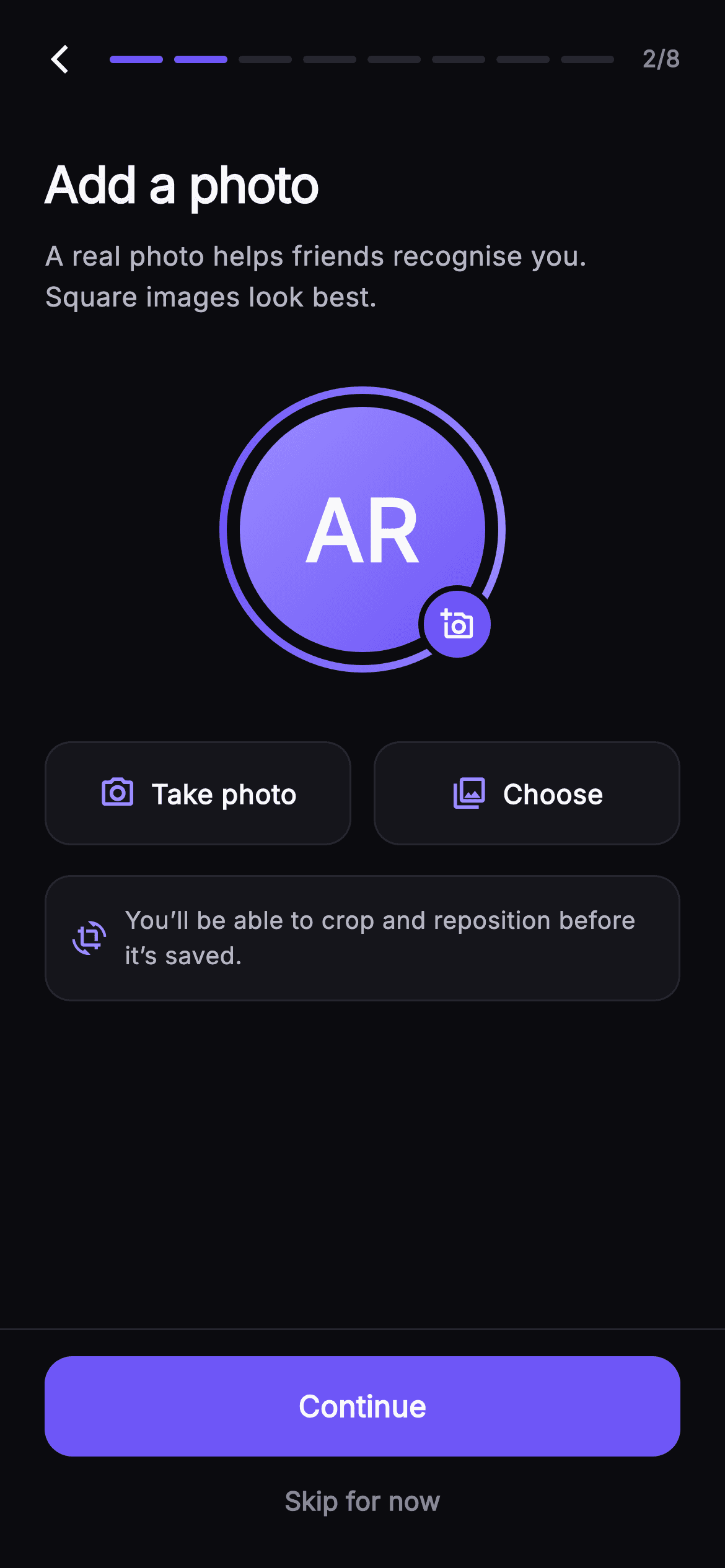
Most new users skip the profile-photo step, and a blank grey circle is usually why. Step 2 of Pulse's onboarding makes the avatar the loudest thing on the page: a sweep-gradient story ring wrapped around a 132px circle that already shows the person's initials, a camera badge pinned to its corner, and Take photo / Choose tiles beneath. This tutorial walks the whole Dart file — the initials parser, the ring painter's geometry, the `_hasPhoto` flip that swaps gradient and glyph, the eight-segment progress header, and a Continue button ranked above a quiet skip link.
Watch the Flutter UI walkthrough
A short screen recording of Pulse · Add Photo running, if you'd rather see it before you read the code. The written tutorial below covers everything in it.
Can't see the video? Watch it on YouTube.
What you'll build
- ✓A 156px avatar stack: a painted sweep-gradient story ring, a 132px gradient circle and a 42px camera badge cut into the background
- ✓An initials fallback that parses the injected `name` into 'AR' so the circle is never empty before a photo exists
- ✓A `_hasPhoto` boolean that repaints the circle, swaps `add_a_photo_outlined` for `edit`, and is toggled from three different taps
- ✓Two 56px `Take photo` / `Choose` tiles built as Material + InkWell so the ripple follows the same 14px radius as the border
- ✓An eight-segment progress header at 2/8 and a footer that ranks Continue above `Skip for now`
Step-by-step build
Create the file
Add a new file at lib/social_setup_avatar/social_setup_avatar_screen.dart in your Flutter project.
Register the bundled fonts
No external packages — this is pure Flutter. It does bundle its design font (Inter), so drop the font file into fonts/ and declare it in pubspec.yaml:
flutter:
  fonts:
    - family: Inter
      fonts:
- asset: fonts/Inter-Regular.ttfBuild it, piece by piece
Here's how the screen goes together. Each block below is a real slice of the code with a plain-English explanation — paste them in order, or grab the whole file from the next section.
Callbacks, a name, and the Pulse palette
import 'package:flutter/material.dart';

/// Add Photo — second step of Pulse profile setup. A large circular avatar sits
/// inside a painted gradient story ring with a camera badge; the user can take a
/// photo or choose from library (painted-icon tiles), and a crop-preview hint
/// explains the next step. A "Skip for now" link lets people move on. Step
/// progress tops the screen; Continue is pinned at fixed height. Self-contained
/// per CONVENTIONS.md: pure Flutter, bundled Inter font, own dark theme,
/// SafeArea.
class SocialSetupAvatarScreen extends StatefulWidget {
  const SocialSetupAvatarScreen({
    super.key,
    this.onBack,
    this.onContinue,
    this.onSkip,
    this.name = 'Alex Rivera',
  });

  final VoidCallback? onBack;
  final VoidCallback? onContinue;
  final VoidCallback? onSkip;
  final String name;

  static const String _font = 'Inter';
  static const Color _bg = Color(0xFF0B0B0F);
  static const Color _surface = Color(0xFF15151B);
  static const Color _brand = Color(0xFF6E56F7);
  static const Color _accent = Color(0xFF9B8CFF);
  static const Color _hairline = Color(0xFF26262F);
  static const Color _textHi = Color(0xFFF4F4F7);
  static const Color _textLo = Color(0xFFB5B5C2);
  static const Color _muted = Color(0xFF8A8A99);

  @override
  State<SocialSetupAvatarScreen> createState() =>
      _SocialSetupAvatarScreenState();
}
Only `material.dart` is imported — there is no `image_picker`, no `permission_handler`, no upload client, so this screen simulates choosing a photo rather than opening the camera roll. The widget takes `onBack`, `onContinue` and `onSkip` so the host app owns navigation, plus `name` defaulting to 'Alex Rivera' because the avatar needs something to render before any file exists. The palette is worth reading as pairs: `_brand` #6E56F7 drives the filled badge, filled progress segments and Continue button, while `_accent` #9B8CFF is the lighter partner used only for icons and the top of gradients. `_textLo` and `_muted` split secondary text from the deliberately quieter skip link.
Turning a name into initials
class _SocialSetupAvatarScreenState extends State<SocialSetupAvatarScreen> {
  bool _hasPhoto = false;

  String get _initials {
    final List<String> parts = widget.name
        .trim()
        .split(RegExp(r'\s+'))
        .where((String s) => s.isNotEmpty)
        .toList();
    if (parts.isEmpty) return '?';
    if (parts.length == 1) return parts.first[0].toUpperCase();
    return (parts.first[0] + parts.last[0]).toUpperCase();
  }
`_initials` splits `widget.name` on `RegExp(r'\s+')` rather than a single space, so double spaces or a tab between first and last name still produce two parts, and the `where` filter drops the empty strings a leading space would create. Three cases are handled in order: nothing usable returns `'?'`, a mononym returns its first letter, and anything else takes the first character of the first and last parts — so 'Alex Rivera' becomes 'AR' and a middle name is ignored rather than crowding the circle. It is a getter, not a stored field, so editing the name upstream recomputes it on the next build for free.
Dark theme, header, and the copy above the avatar
  @override
  Widget build(BuildContext context) {
    return Theme(
      data: ThemeData.dark(useMaterial3: true),
      child: Scaffold(
        backgroundColor: SocialSetupAvatarScreen._bg,
        body: SafeArea(
          child: Column(
            children: <Widget>[
              _SetupHeader(step: 2, total: 8, onBack: widget.onBack),
              Expanded(
                child: ListView(
                  padding: const EdgeInsets.fromLTRB(24, 20, 24, 24),
                  children: <Widget>[
                    const Text(
                      'Add a photo',
                      style: TextStyle(
                        fontFamily: SocialSetupAvatarScreen._font,
                        fontSize: 27,
                        fontWeight: FontWeight.w700,
                        letterSpacing: -0.7,
                        color: SocialSetupAvatarScreen._textHi,
                      ),
                    ),
                    const SizedBox(height: 8),
                    const Text(
                      'A real photo helps friends recognise you. Square images look best.',
                      style: TextStyle(
                        fontFamily: SocialSetupAvatarScreen._font,
                        fontSize: 14.5,
                        height: 1.5,
                        color: SocialSetupAvatarScreen._textLo,
                      ),
                    ),
                    const SizedBox(height: 36),
                    Center(
                      child: _AvatarPicker(
                        initials: _initials,
                        hasPhoto: _hasPhoto,
                        onTap: () => setState(() => _hasPhoto = !_hasPhoto),
                      ),
                    ),
                    const SizedBox(height: 36),
The screen wraps itself in `Theme(data: ThemeData.dark(useMaterial3: true))` so it renders identically inside a light host app — nothing here inherits the parent's colours. Inside `SafeArea`, a Column pins `_SetupHeader(step: 2, total: 8)` at the top and gives the rest to a `ListView`, which matters on a short phone: a 156px avatar plus two blocks of copy will overflow a fixed Column, and scrolling is a better failure mode than a yellow stripe. 'Add a photo' is set at 27px `w700` with `letterSpacing: -0.7` to tighten the display size, and the subline explains the two things that reduce bad uploads — recognisability and square crops.
Source tiles and the crop reassurance
                    Row(
                      children: <Widget>[
                        Expanded(
                          child: _ActionTile(
                            icon: Icons.photo_camera_outlined,
                            label: 'Take photo',
                            onTap: () => setState(() => _hasPhoto = true),
                          ),
                        ),
                        const SizedBox(width: 12),
                        Expanded(
                          child: _ActionTile(
                            icon: Icons.photo_library_outlined,
                            label: 'Choose',
                            onTap: () => setState(() => _hasPhoto = true),
                          ),
                        ),
                      ],
                    ),
                    const SizedBox(height: 16),
                    Container(
                      padding: const EdgeInsets.all(14),
                      decoration: BoxDecoration(
                        color: SocialSetupAvatarScreen._surface,
                        borderRadius: BorderRadius.circular(14),
                        border:
                            Border.all(color: SocialSetupAvatarScreen._hairline),
                      ),
                      child: const Row(
                        children: <Widget>[
                          Icon(Icons.crop_rotate,
                              size: 18, color: SocialSetupAvatarScreen._accent),
                          SizedBox(width: 10),
                          Expanded(
                            child: Text(
                              'You’ll be able to crop and reposition before it’s saved.',
                              style: TextStyle(
                                fontFamily: SocialSetupAvatarScreen._font,
                                fontSize: 13,
                                height: 1.45,
                                color: SocialSetupAvatarScreen._textLo,
                              ),
                            ),
                          ),
                        ],
                      ),
                    ),
                  ],
                ),
              ),
              _SetupFooter(
                onContinue: widget.onContinue,
                onSkip: widget.onSkip,
              ),
            ],
          ),
        ),
      ),
    );
  }
}
Rather than a bottom-sheet source picker, the two sources sit inline as a Row of `Expanded` `_ActionTile`s split by a 12px gap, so both options are visible without a second tap. Both set `_hasPhoto = true` outright — they commit — whereas tapping the avatar itself calls `!_hasPhoto`, which lets you toggle back to the initials state while demoing. Under them, a `_surface` card with a hairline border and an accent `crop_rotate` icon promises 'You'll be able to crop and reposition before it's saved.' That sentence is doing conversion work: the common reason people abandon this step is fear of committing a badly framed photo. The footer then mounts outside the ListView so Continue never scrolls away.
The avatar stack: ring, circle, badge
class _AvatarPicker extends StatelessWidget {
  const _AvatarPicker({
    required this.initials,
    required this.hasPhoto,
    this.onTap,
  });
  final String initials;
  final bool hasPhoto;
  final VoidCallback? onTap;

  @override
  Widget build(BuildContext context) {
    return GestureDetector(
      onTap: onTap,
      child: SizedBox(
        width: 156,
        height: 156,
        child: Stack(
          children: <Widget>[
            // Painted gradient story ring.
            const Positioned.fill(child: CustomPaint(painter: _RingPainter())),
            Center(
              child: Container(
                width: 132,
                height: 132,
                decoration: BoxDecoration(
                  shape: BoxShape.circle,
                  gradient: hasPhoto
                      ? const LinearGradient(
                          begin: Alignment.topLeft,
                          end: Alignment.bottomRight,
                          colors: <Color>[
                            Color(0xFF3A3550),
                            Color(0xFF24222E),
                          ],
                        )
                      : const LinearGradient(
                          begin: Alignment.topLeft,
                          end: Alignment.bottomRight,
                          colors: <Color>[
                            SocialSetupAvatarScreen._accent,
                            SocialSetupAvatarScreen._brand,
                          ],
                        ),
                ),
                child: Center(
                  child: hasPhoto
                      ? const Icon(Icons.person,
                          size: 72, color: SocialSetupAvatarScreen._textLo)
                      : Text(
                          initials,
                          style: const TextStyle(
                            fontFamily: SocialSetupAvatarScreen._font,
                            fontSize: 46,
                            fontWeight: FontWeight.w700,
                            color: Colors.white,
                          ),
                        ),
                ),
              ),
            ),
            Positioned(
              right: 6,
              bottom: 6,
              child: Container(
                width: 42,
                height: 42,
                decoration: BoxDecoration(
                  shape: BoxShape.circle,
                  color: SocialSetupAvatarScreen._brand,
                  border: Border.all(
                      color: SocialSetupAvatarScreen._bg, width: 3),
                ),
                child: Icon(
                  hasPhoto ? Icons.edit : Icons.add_a_photo_outlined,
                  size: 18,
                  color: Colors.white,
                ),
              ),
            ),
          ],
        ),
      ),
    );
  }
}
`_AvatarPicker` is a 156x156 `Stack` with three layers. `Positioned.fill` hands the whole box to the ring painter; a centred 132px `Container` leaves a 12px band for that ring to live in; and the badge is pinned at `right: 6, bottom: 6`. The circle's gradient carries the state — accent-to-brand indigo with white initials when there is no photo, and a muted #3A3550 to #24222E fill with a grey `Icons.person` once `hasPhoto` flips, so a real photo would slot in without changing the geometry. The badge's trick is `Border.all(color: _bg, width: 3)`: painting the page background as a border cuts a clean gap between badge and ring instead of overlapping it.
Painting the story ring
class _RingPainter extends CustomPainter {
  const _RingPainter();

  @override
  void paint(Canvas canvas, Size size) {
    final Offset center = size.center(Offset.zero);
    final double radius = size.width / 2 - 3;
    final Rect rect = Rect.fromCircle(center: center, radius: radius);
    canvas.drawArc(
      rect,
      0,
      6.2831853,
      false,
      Paint()
        ..style = PaintingStyle.stroke
        ..strokeWidth = 4
        ..strokeCap = StrokeCap.round
        ..shader = const SweepGradient(
          colors: <Color>[
            SocialSetupAvatarScreen._accent,
            SocialSetupAvatarScreen._brand,
            SocialSetupAvatarScreen._accent,
          ],
        ).createShader(rect),
    );
  }

  @override
  bool shouldRepaint(covariant _RingPainter oldDelegate) => false;
}
`_RingPainter` draws one arc of `6.2831853` radians — a full turn — so it is a closed circle whose stroke can carry a shader. The radius is `size.width / 2 - 3`, exactly half the 4px `strokeWidth` inset from the edge, which keeps the stroke fully inside the 156px box instead of clipping. `SweepGradient` is given three stops, accent → brand → accent, so the sweep meets itself at 0 radians with the same colour and shows no seam; a two-colour sweep would leave a visible hard edge. Sharing the same `rect` for the arc and `createShader` locks the gradient to the circle, and `shouldRepaint` returns false since the ring never varies with state.
The source tile
class _ActionTile extends StatelessWidget {
  const _ActionTile({
    required this.icon,
    required this.label,
    this.onTap,
  });
  final IconData icon;
  final String label;
  final VoidCallback? onTap;

  @override
  Widget build(BuildContext context) {
    return Material(
      color: SocialSetupAvatarScreen._surface,
      borderRadius: BorderRadius.circular(14),
      child: InkWell(
        onTap: onTap,
        borderRadius: BorderRadius.circular(14),
        child: Container(
          height: 56,
          decoration: BoxDecoration(
            borderRadius: BorderRadius.circular(14),
            border: Border.all(color: SocialSetupAvatarScreen._hairline),
          ),
          child: Row(
            mainAxisAlignment: MainAxisAlignment.center,
            children: <Widget>[
              Icon(icon, size: 20, color: SocialSetupAvatarScreen._accent),
              const SizedBox(width: 8),
              Text(
                label,
                style: const TextStyle(
                  fontFamily: SocialSetupAvatarScreen._font,
                  fontSize: 14.5,
                  fontWeight: FontWeight.w600,
                  color: SocialSetupAvatarScreen._textHi,
                ),
              ),
            ],
          ),
        ),
      ),
    );
  }
}
`_ActionTile` is layered `Material` → `InkWell` → `Container`, and the 14px radius is repeated on all three: on the Material so the surface fill is rounded, on the InkWell so the ripple is clipped to the same shape, and on the Container so the hairline border traces it. Drop the InkWell radius and the splash spills into square corners. The tile is a fixed 56px high with a centred Row — a 20px accent icon, an 8px gap, then a 14.5px `w600` label in `_textHi` — so 'Take photo' and 'Choose' stay optically balanced despite very different label widths, since the Row centres the pair as a unit.
Progress header and the ranked footer
class _SetupHeader extends StatelessWidget {
  const _SetupHeader({required this.step, required this.total, this.onBack});
  final int step;
  final int total;
  final VoidCallback? onBack;

  @override
  Widget build(BuildContext context) {
    return Padding(
      padding: const EdgeInsets.fromLTRB(8, 8, 24, 4),
      child: Row(
        children: <Widget>[
          IconButton(
            onPressed: onBack,
            icon: const Icon(Icons.arrow_back_ios_new,
                size: 18, color: SocialSetupAvatarScreen._textHi),
          ),
          Expanded(
            child: Row(
              children: List<Widget>.generate(total, (int i) {
                return Expanded(
                  child: Container(
                    height: 4,
                    margin: const EdgeInsets.symmetric(horizontal: 3),
                    decoration: BoxDecoration(
                      borderRadius: BorderRadius.circular(2),
                      color: i < step
                          ? SocialSetupAvatarScreen._brand
                          : SocialSetupAvatarScreen._hairline,
                    ),
                  ),
                );
              }),
            ),
          ),
          const SizedBox(width: 12),
          Text(
            '$step/$total',
            style: const TextStyle(
              fontFamily: SocialSetupAvatarScreen._font,
              fontSize: 12.5,
              fontWeight: FontWeight.w600,
              color: SocialSetupAvatarScreen._muted,
            ),
          ),
        ],
      ),
    );
  }
}

class _SetupFooter extends StatelessWidget {
  const _SetupFooter({this.onContinue, this.onSkip});
  final VoidCallback? onContinue;
  final VoidCallback? onSkip;

  @override
  Widget build(BuildContext context) {
    return Container(
      decoration: const BoxDecoration(
        color: SocialSetupAvatarScreen._bg,
        border:
            Border(top: BorderSide(color: SocialSetupAvatarScreen._hairline)),
      ),
      padding: const EdgeInsets.fromLTRB(24, 14, 24, 12),
      child: Column(
        mainAxisSize: MainAxisSize.min,
        children: <Widget>[
          SizedBox(
            width: double.infinity,
            height: 54,
            child: FilledButton(
              onPressed: onContinue,
              style: FilledButton.styleFrom(
                backgroundColor: SocialSetupAvatarScreen._brand,
                foregroundColor: Colors.white,
                shape: RoundedRectangleBorder(
                  borderRadius: BorderRadius.circular(15),
                ),
              ),
              child: const Text(
                'Continue',
                style: TextStyle(
                  fontFamily: SocialSetupAvatarScreen._font,
                  fontSize: 16,
                  fontWeight: FontWeight.w600,
                ),
              ),
            ),
          ),
          TextButton(
            onPressed: onSkip,
            style: TextButton.styleFrom(
              foregroundColor: SocialSetupAvatarScreen._muted,
            ),
            child: const Text(
              'Skip for now',
              style: TextStyle(
                fontFamily: SocialSetupAvatarScreen._font,
                fontSize: 14,
                fontWeight: FontWeight.w600,
              ),
            ),
          ),
        ],
      ),
    );
  }
}
`_SetupHeader` builds its bar with `List<Widget>.generate(total, ...)` where each segment is an `Expanded` 4px bar, filled `_brand` when `i < step` and `_hairline` otherwise — so passing `step: 2, total: 8` is the only edit needed to reuse this on any other step, with the '2/8' text reading from the same two values. The footer is a Container with a top hairline holding a full-width 54px `FilledButton` and, below it, a `TextButton` in `_muted`. That ranking is the whole point of an optional step: skipping stays available for anyone without a photo to hand, but it reads as the quiet secondary path rather than an equal choice.
Full code
The complete, ready-to-paste source. Free to use in your projects — one click copies it all.
import 'package:flutter/material.dart';
/// Add Photo — second step of Pulse profile setup. A large circular avatar sits
/// inside a painted gradient story ring with a camera badge; the user can take a
/// photo or choose from library (painted-icon tiles), and a crop-preview hint
/// explains the next step. A "Skip for now" link lets people move on. Step
/// progress tops the screen; Continue is pinned at fixed height. Self-contained
/// per CONVENTIONS.md: pure Flutter, bundled Inter font, own dark theme,
/// SafeArea.
class SocialSetupAvatarScreen extends StatefulWidget {
const SocialSetupAvatarScreen({
super.key,
this.onBack,
this.onContinue,
this.onSkip,
this.name = 'Alex Rivera',
});
final VoidCallback? onBack;
final VoidCallback? onContinue;
final VoidCallback? onSkip;
final String name;
static const String _font = 'Inter';
static const Color _bg = Color(0xFF0B0B0F);
static const Color _surface = Color(0xFF15151B);
static const Color _brand = Color(0xFF6E56F7);
static const Color _accent = Color(0xFF9B8CFF);
static const Color _hairline = Color(0xFF26262F);
static const Color _textHi = Color(0xFFF4F4F7);
static const Color _textLo = Color(0xFFB5B5C2);
static const Color _muted = Color(0xFF8A8A99);
@override
State<SocialSetupAvatarScreen> createState() =>
_SocialSetupAvatarScreenState();
}
class _SocialSetupAvatarScreenState extends State<SocialSetupAvatarScreen> {
bool _hasPhoto = false;
String get _initials {
final List<String> parts = widget.name
.trim()
.split(RegExp(r'\s+'))
.where((String s) => s.isNotEmpty)
.toList();
if (parts.isEmpty) return '?';
if (parts.length == 1) return parts.first[0].toUpperCase();
return (parts.first[0] + parts.last[0]).toUpperCase();
}
@override
Widget build(BuildContext context) {
return Theme(
data: ThemeData.dark(useMaterial3: true),
child: Scaffold(
backgroundColor: SocialSetupAvatarScreen._bg,
body: SafeArea(
child: Column(
children: <Widget>[
_SetupHeader(step: 2, total: 8, onBack: widget.onBack),
Expanded(
child: ListView(
padding: const EdgeInsets.fromLTRB(24, 20, 24, 24),
children: <Widget>[
const Text(
'Add a photo',
style: TextStyle(
fontFamily: SocialSetupAvatarScreen._font,
fontSize: 27,
fontWeight: FontWeight.w700,
letterSpacing: -0.7,
color: SocialSetupAvatarScreen._textHi,
),
),
const SizedBox(height: 8),
const Text(
'A real photo helps friends recognise you. Square images look best.',
style: TextStyle(
fontFamily: SocialSetupAvatarScreen._font,
fontSize: 14.5,
height: 1.5,
color: SocialSetupAvatarScreen._textLo,
),
),
const SizedBox(height: 36),
Center(
child: _AvatarPicker(
initials: _initials,
hasPhoto: _hasPhoto,
onTap: () => setState(() => _hasPhoto = !_hasPhoto),
),
),
const SizedBox(height: 36),
Row(
children: <Widget>[
Expanded(
child: _ActionTile(
icon: Icons.photo_camera_outlined,
label: 'Take photo',
onTap: () => setState(() => _hasPhoto = true),
),
),
const SizedBox(width: 12),
Expanded(
child: _ActionTile(
icon: Icons.photo_library_outlined,
label: 'Choose',
onTap: () => setState(() => _hasPhoto = true),
),
),
],
),
const SizedBox(height: 16),
Container(
padding: const EdgeInsets.all(14),
decoration: BoxDecoration(
color: SocialSetupAvatarScreen._surface,
borderRadius: BorderRadius.circular(14),
border:
Border.all(color: SocialSetupAvatarScreen._hairline),
),
child: const Row(
children: <Widget>[
Icon(Icons.crop_rotate,
size: 18, color: SocialSetupAvatarScreen._accent),
SizedBox(width: 10),
Expanded(
child: Text(
'You’ll be able to crop and reposition before it’s saved.',
style: TextStyle(
fontFamily: SocialSetupAvatarScreen._font,
fontSize: 13,
height: 1.45,
color: SocialSetupAvatarScreen._textLo,
),
),
),
],
),
),
],
),
),
_SetupFooter(
onContinue: widget.onContinue,
onSkip: widget.onSkip,
),
],
),
),
),
);
}
}
class _AvatarPicker extends StatelessWidget {
const _AvatarPicker({
required this.initials,
required this.hasPhoto,
this.onTap,
});
final String initials;
final bool hasPhoto;
final VoidCallback? onTap;
@override
Widget build(BuildContext context) {
return GestureDetector(
onTap: onTap,
child: SizedBox(
width: 156,
height: 156,
child: Stack(
children: <Widget>[
// Painted gradient story ring.
const Positioned.fill(child: CustomPaint(painter: _RingPainter())),
Center(
child: Container(
width: 132,
height: 132,
decoration: BoxDecoration(
shape: BoxShape.circle,
gradient: hasPhoto
? const LinearGradient(
begin: Alignment.topLeft,
end: Alignment.bottomRight,
colors: <Color>[
Color(0xFF3A3550),
Color(0xFF24222E),
],
)
: const LinearGradient(
begin: Alignment.topLeft,
end: Alignment.bottomRight,
colors: <Color>[
SocialSetupAvatarScreen._accent,
SocialSetupAvatarScreen._brand,
],
),
),
child: Center(
child: hasPhoto
? const Icon(Icons.person,
size: 72, color: SocialSetupAvatarScreen._textLo)
: Text(
initials,
style: const TextStyle(
fontFamily: SocialSetupAvatarScreen._font,
fontSize: 46,
fontWeight: FontWeight.w700,
color: Colors.white,
),
),
),
),
),
Positioned(
right: 6,
bottom: 6,
child: Container(
width: 42,
height: 42,
decoration: BoxDecoration(
shape: BoxShape.circle,
color: SocialSetupAvatarScreen._brand,
border: Border.all(
color: SocialSetupAvatarScreen._bg, width: 3),
),
child: Icon(
hasPhoto ? Icons.edit : Icons.add_a_photo_outlined,
size: 18,
color: Colors.white,
),
),
),
],
),
),
);
}
}
class _RingPainter extends CustomPainter {
const _RingPainter();
@override
void paint(Canvas canvas, Size size) {
final Offset center = size.center(Offset.zero);
final double radius = size.width / 2 - 3;
final Rect rect = Rect.fromCircle(center: center, radius: radius);
canvas.drawArc(
rect,
0,
6.2831853,
false,
Paint()
..style = PaintingStyle.stroke
..strokeWidth = 4
..strokeCap = StrokeCap.round
..shader = const SweepGradient(
colors: <Color>[
SocialSetupAvatarScreen._accent,
SocialSetupAvatarScreen._brand,
SocialSetupAvatarScreen._accent,
],
).createShader(rect),
);
}
@override
bool shouldRepaint(covariant _RingPainter oldDelegate) => false;
}
class _ActionTile extends StatelessWidget {
const _ActionTile({
required this.icon,
required this.label,
this.onTap,
});
final IconData icon;
final String label;
final VoidCallback? onTap;
@override
Widget build(BuildContext context) {
return Material(
color: SocialSetupAvatarScreen._surface,
borderRadius: BorderRadius.circular(14),
child: InkWell(
onTap: onTap,
borderRadius: BorderRadius.circular(14),
child: Container(
height: 56,
decoration: BoxDecoration(
borderRadius: BorderRadius.circular(14),
border: Border.all(color: SocialSetupAvatarScreen._hairline),
),
child: Row(
mainAxisAlignment: MainAxisAlignment.center,
children: <Widget>[
Icon(icon, size: 20, color: SocialSetupAvatarScreen._accent),
const SizedBox(width: 8),
Text(
label,
style: const TextStyle(
fontFamily: SocialSetupAvatarScreen._font,
fontSize: 14.5,
fontWeight: FontWeight.w600,
color: SocialSetupAvatarScreen._textHi,
),
),
],
),
),
),
);
}
}
class _SetupHeader extends StatelessWidget {
const _SetupHeader({required this.step, required this.total, this.onBack});
final int step;
final int total;
final VoidCallback? onBack;
@override
Widget build(BuildContext context) {
return Padding(
padding: const EdgeInsets.fromLTRB(8, 8, 24, 4),
child: Row(
children: <Widget>[
IconButton(
onPressed: onBack,
icon: const Icon(Icons.arrow_back_ios_new,
size: 18, color: SocialSetupAvatarScreen._textHi),
),
Expanded(
child: Row(
children: List<Widget>.generate(total, (int i) {
return Expanded(
child: Container(
height: 4,
margin: const EdgeInsets.symmetric(horizontal: 3),
decoration: BoxDecoration(
borderRadius: BorderRadius.circular(2),
color: i < step
? SocialSetupAvatarScreen._brand
: SocialSetupAvatarScreen._hairline,
),
),
);
}),
),
),
const SizedBox(width: 12),
Text(
'$step/$total',
style: const TextStyle(
fontFamily: SocialSetupAvatarScreen._font,
fontSize: 12.5,
fontWeight: FontWeight.w600,
color: SocialSetupAvatarScreen._muted,
),
),
],
),
);
}
}
class _SetupFooter extends StatelessWidget {
const _SetupFooter({this.onContinue, this.onSkip});
final VoidCallback? onContinue;
final VoidCallback? onSkip;
@override
Widget build(BuildContext context) {
return Container(
decoration: const BoxDecoration(
color: SocialSetupAvatarScreen._bg,
border:
Border(top: BorderSide(color: SocialSetupAvatarScreen._hairline)),
),
padding: const EdgeInsets.fromLTRB(24, 14, 24, 12),
child: Column(
mainAxisSize: MainAxisSize.min,
children: <Widget>[
SizedBox(
width: double.infinity,
height: 54,
child: FilledButton(
onPressed: onContinue,
style: FilledButton.styleFrom(
backgroundColor: SocialSetupAvatarScreen._brand,
foregroundColor: Colors.white,
shape: RoundedRectangleBorder(
borderRadius: BorderRadius.circular(15),
),
),
child: const Text(
'Continue',
style: TextStyle(
fontFamily: SocialSetupAvatarScreen._font,
fontSize: 16,
fontWeight: FontWeight.w600,
),
),
),
),
TextButton(
onPressed: onSkip,
style: TextButton.styleFrom(
foregroundColor: SocialSetupAvatarScreen._muted,
),
child: const Text(
'Skip for now',
style: TextStyle(
fontFamily: SocialSetupAvatarScreen._font,
fontSize: 14,
fontWeight: FontWeight.w600,
),
),
),
],
),
);
}
}
Plus bundled 1 binary asset (fonts/images). The CLI and MCP install those for you automatically.
Two faster ways to add it
Copy-paste works, but you can skip it entirely.
1. FlutterKit CLI
One command drops this screen — and its fonts — straight into your project.
$ flutterkit add social-setup-avatar2. AI agent (MCP)
Connect FlutterKit's MCP server in Claude or Cursor and just ask your agent to install social-setup-avatar — it fetches and writes the files for you.
FAQ
Is this profile photo screen free to use in a commercial app?
Yes. FlutterKit is free — there is no paid tier, no licence key, no sign-up and no attribution requirement. Copy the Dart from this page, install it with the CLI, or pull it through MCP, and ship it in a production onboarding flow.
Does it actually open the camera or photo library?
No — the file imports only `material.dart`. Tapping the avatar or either tile just flips a local `_hasPhoto` boolean, which repaints the circle and swaps the badge glyph. It is the finished UI for the step, with the picker left to you so it is not tied to any one plugin.
How do I wire a real image picker and upload behind it?
Give the state an `File?`/`XFile?` field, make `_ActionTile.onTap` async and call your picker with `ImageSource.camera` and `ImageSource.gallery` respectively, then `setState` the file. In `_AvatarPicker`, replace the `hasPhoto` branch's `Icons.person` with a `ClipOval(child: Image.file(..., fit: BoxFit.cover))`, and start the upload from `onContinue` so a slow network never blocks the step.
What packages or fonts does it need?
No packages at all — the ring is a `CustomPainter` and every icon comes from Material Icons, so there is no `flutter_svg` or asset image. The only dependency is the Inter font family: add Inter to `pubspec.yaml` under `fonts:`, or delete the `fontFamily: _font` lines to fall back to the platform default.
Which Flutter version does this need?
Flutter 3.0 or newer. It uses super parameters (`super.key`) and `ThemeData.dark(useMaterial3: true)`, but no `Color.withValues`, so nothing needs the 3.22 SDK. On anything older than Dart 2.17, expand the constructors back to the `{Key? key, ...}) : super(key: key)` form.


