How to Build a Suggested Follows Onboarding Screen in Flutter (Full Code + Preview)
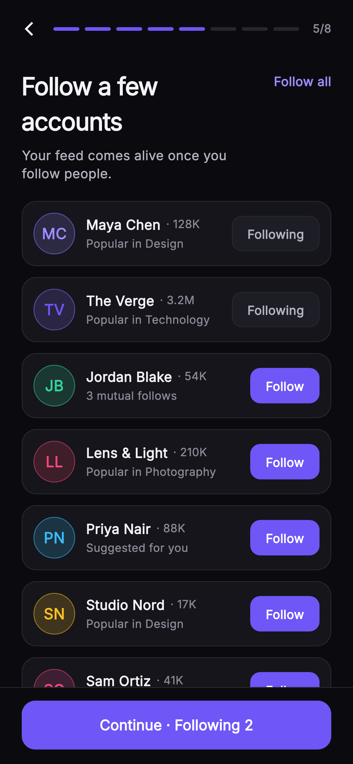
A brand-new social account has an empty feed, and an empty feed is where most sign-ups quietly die. This tutorial builds Pulse's fifth onboarding step in Flutter: a list of seven recommended accounts, each with a `_Monogram` avatar that derives initials from the name, a follower count, a reason line like '3 mutual follows', and a `_FollowButton` that flips between solid indigo and a muted outline. A single `Set<String>` of handles drives every row, the 'Follow all' / 'Clear' shortcut, and a pinned footer that reads 'Skip for now' or 'Continue · Following N'. Pure Flutter, no packages.
Watch the Flutter UI walkthrough
A short screen recording of Pulse · Suggested Follows running, if you'd rather see it before you read the code. The written tutorial below covers everything in it.
Can't see the video? Watch it on YouTube.
What you'll build
- ✓A `Set<String>`-backed `_following` state where per-row taps, 'Follow all' and the footer count can never disagree
- ✓A `_Monogram` circle that computes initials with a `RegExp(r'\s+')` split and tints itself with each account's accent colour at 18% fill and 50% border
- ✓A `_FollowButton` pill that swaps `Material` colour, border and text colour between 'Follow' and 'Following' in one ternary set
- ✓A `_SetupHeader` whose eight-segment progress bar is generated with `List<Widget>.generate` and filled up to `step`
- ✓A `_SetupFooter` `FilledButton` whose label changes from 'Skip for now' at zero to 'Continue · Following N' as the count grows
Step-by-step build
Create the file
Add a new file at lib/social_setup_follow/social_setup_follow_screen.dart in your Flutter project.
Register the bundled fonts
No external packages — this is pure Flutter. It does bundle its design font (Inter), so drop the font file into fonts/ and declare it in pubspec.yaml:
flutter:
  fonts:
    - family: Inter
      fonts:
- asset: fonts/Inter-Regular.ttfBuild it, piece by piece
Here's how the screen goes together. Each block below is a real slice of the code with a plain-English explanation — paste them in order, or grab the whole file from the next section.
The screen shell, its palette and the account model
import 'package:flutter/material.dart';

/// Suggested Follows — fifth step of Pulse profile setup. A list of recommended
/// accounts (painted monogram avatar, name, handle, follower count, and the
/// reason they’re suggested) each carry a Follow / Following toggle, and a
/// "Follow all" shortcut sits up top. The pinned CTA reflects how many the user
/// has followed. Self-contained per CONVENTIONS.md: pure Flutter, bundled Inter
/// font, own dark theme, SafeArea.
class SocialSetupFollowScreen extends StatefulWidget {
  const SocialSetupFollowScreen({
    super.key,
    this.onBack,
    this.onContinue,
  });

  final VoidCallback? onBack;
  final VoidCallback? onContinue;

  static const String _font = 'Inter';
  static const Color _bg = Color(0xFF0B0B0F);
  static const Color _surface = Color(0xFF15151B);
  static const Color _surfaceAlt = Color(0xFF1D1D26);
  static const Color _brand = Color(0xFF6E56F7);
  static const Color _accent = Color(0xFF9B8CFF);
  static const Color _hairline = Color(0xFF26262F);
  static const Color _textHi = Color(0xFFF4F4F7);
  static const Color _textLo = Color(0xFFB5B5C2);
  static const Color _muted = Color(0xFF8A8A99);

  @override
  State<SocialSetupFollowScreen> createState() =>
      _SocialSetupFollowScreenState();
}

class _Account {
  const _Account(this.name, this.handle, this.followers, this.reason, this.color);
  final String name;
  final String handle;
  final String followers;
  final String reason;
  final Color color;
}
`SocialSetupFollowScreen` is a `StatefulWidget` because, unlike a static onboarding page, it has to remember which accounts the user has tapped. It takes only two callbacks, `onBack` and `onContinue`, so the flow controller outside decides where step 5 of 8 goes next. Nine colour constants define a near-monochrome dark palette: `_bg` #0B0B0F, two surfaces (#15151B and #1D1D26), a #26262F `_hairline`, and three text tiers from #F4F4F7 down to #8A8A99. The only saturated colours are `_brand` #6E56F7 and the lighter `_accent` #9B8CFF, which is why the Follow pills and progress bar read as the focal points. `_Account` is a tiny immutable model with `name`, `handle`, `followers`, `reason` and a per-account `Color`; storing the colour on the model, rather than deriving it, is what lets each monogram carry its own tint.
Seven seeded accounts and a Set of followed handles
class _SocialSetupFollowScreenState extends State<SocialSetupFollowScreen> {
  static const List<_Account> _accounts = <_Account>[
    _Account('Maya Chen', 'mayadraws', '128K', 'Popular in Design',
        Color(0xFF9B8CFF)),
    _Account('The Verge', 'verge', '3.2M', 'Popular in Technology',
        Color(0xFF6E56F7)),
    _Account('Jordan Blake', 'jblake', '54K', '3 mutual follows',
        Color(0xFF34D399)),
    _Account('Lens & Light', 'lenslight', '210K', 'Popular in Photography',
        Color(0xFFF4476B)),
    _Account('Priya Nair', 'priyacodes', '88K', 'Suggested for you',
        Color(0xFF38BDF8)),
    _Account('Studio Nord', 'studionord', '17K', 'Popular in Design',
        Color(0xFFFBBF24)),
    _Account('Sam Ortiz', 'samshoots', '41K', '5 mutual follows',
        Color(0xFFEC4899)),
  ];

  late final Set<String> _following = <String>{'mayadraws', 'verge'};
The suggestions are a `static const List<_Account>` of seven entries with varied follower strings ('128K', '3.2M', '17K') and reasons that mix topic popularity ('Popular in Design') with social proof ('3 mutual follows', '5 mutual follows'). Each carries a distinct accent — mint #34D399, rose #F4476B, sky #38BDF8, amber #FBBF24, pink #EC4899 — so the column of avatars does not look like a single-colour list. The crucial line is `late final Set<String> _following = <String>{'mayadraws', 'verge'}`: state is a Set of handles, not a list of booleans indexed by position. Two accounts start pre-followed so the footer already reads 'Continue · Following 2' on first paint. Because a Set has no duplicates and `contains` is O(1), every row, the header shortcut and the footer can all ask the same object the same question without any bookkeeping.
Forcing a dark theme, the title row and the Follow all / Clear toggle
  @override
  Widget build(BuildContext context) {
    return Theme(
      data: ThemeData.dark(useMaterial3: true),
      child: Scaffold(
        backgroundColor: SocialSetupFollowScreen._bg,
        body: SafeArea(
          child: Column(
            children: <Widget>[
              _SetupHeader(step: 5, total: 8, onBack: widget.onBack),
              Padding(
                padding: const EdgeInsets.fromLTRB(24, 16, 24, 4),
                child: Row(
                  crossAxisAlignment: CrossAxisAlignment.start,
                  children: <Widget>[
                    const Expanded(
                      child: Column(
                        crossAxisAlignment: CrossAxisAlignment.start,
                        children: <Widget>[
                          Text(
                            'Follow a few accounts',
                            style: TextStyle(
                              fontFamily: SocialSetupFollowScreen._font,
                              fontSize: 27,
                              fontWeight: FontWeight.w700,
                              letterSpacing: -0.7,
                              color: SocialSetupFollowScreen._textHi,
                            ),
                          ),
                          SizedBox(height: 8),
                          Text(
                            'Your feed comes alive once you follow people.',
                            style: TextStyle(
                              fontFamily: SocialSetupFollowScreen._font,
                              fontSize: 14.5,
                              height: 1.4,
                              color: SocialSetupFollowScreen._textLo,
                            ),
                          ),
                        ],
                      ),
                    ),
                    const SizedBox(width: 12),
                    GestureDetector(
                      onTap: () => setState(() {
                        if (_following.length == _accounts.length) {
                          _following.clear();
                        } else {
                          _following.addAll(
                              _accounts.map((_Account a) => a.handle));
                        }
                      }),
                      child: Padding(
                        padding: const EdgeInsets.only(top: 4),
                        child: Text(
                          _following.length == _accounts.length
                              ? 'Clear'
                              : 'Follow all',
                          style: const TextStyle(
                            fontFamily: SocialSetupFollowScreen._font,
                            fontSize: 14,
                            fontWeight: FontWeight.w600,
                            color: SocialSetupFollowScreen._accent,
                          ),
                        ),
                      ),
                    ),
                  ],
                ),
              ),
`build` wraps everything in `Theme(data: ThemeData.dark(useMaterial3: true))` so the screen ignores whatever light theme the host app uses, then lays out header, title, list and footer in a `Column` inside `SafeArea`. The title 'Follow a few accounts' is 27px, weight 700, with `letterSpacing: -0.7` to tighten the large glyphs, above a 14.5px `_textLo` subtitle. To its right, a `GestureDetector` around plain text acts as the bulk shortcut. Its `onTap` checks `_following.length == _accounts.length`: if everyone is followed it calls `_following.clear()`, otherwise `addAll(_accounts.map((a) => a.handle))`. The same comparison picks the label, so the text reads 'Follow all' until the last account is followed and then flips to 'Clear'. There is no separate `_allFollowed` boolean to keep in sync; the Set's length is the truth.
The account list and per-row toggling
              Expanded(
                child: ListView.separated(
                  padding: const EdgeInsets.fromLTRB(24, 16, 24, 24),
                  itemCount: _accounts.length,
                  separatorBuilder: (BuildContext context, int i) =>
                      const SizedBox(height: 12),
                  itemBuilder: (BuildContext context, int i) {
                    final _Account a = _accounts[i];
                    final bool following = _following.contains(a.handle);
                    return _AccountRow(
                      account: a,
                      following: following,
                      onToggle: () => setState(() {
                        if (following) {
                          _following.remove(a.handle);
                        } else {
                          _following.add(a.handle);
                        }
                      }),
                    );
                  },
                ),
              ),
              _SetupFooter(
                count: _following.length,
                onContinue: widget.onContinue,
              ),
            ],
          ),
        ),
      ),
    );
  }
}
The list is a `ListView.separated` inside `Expanded`, so it takes whatever height remains between title and footer and scrolls independently. `separatorBuilder` returns a 12px `SizedBox`, which is cleaner than giving each card a bottom margin because the last card gets no trailing gap. In `itemBuilder`, `final bool following = _following.contains(a.handle)` is computed once per row and passed down along with the `_Account`. The `onToggle` closure captures that boolean: if the row was already followed it calls `_following.remove(a.handle)`, otherwise `add`. Both branches run inside `setState`, so the rebuild also refreshes the header shortcut label and the footer count. Finally `_SetupFooter` receives `count: _following.length`, meaning the CTA never stores its own number, it just reads the Set on every build.
The account card: monogram, name, follower count and reason
class _AccountRow extends StatelessWidget {
  const _AccountRow({
    required this.account,
    required this.following,
    this.onToggle,
  });
  final _Account account;
  final bool following;
  final VoidCallback? onToggle;

  @override
  Widget build(BuildContext context) {
    return Container(
      padding: const EdgeInsets.all(12),
      decoration: BoxDecoration(
        color: SocialSetupFollowScreen._surface,
        borderRadius: BorderRadius.circular(16),
        border: Border.all(color: SocialSetupFollowScreen._hairline),
      ),
      child: Row(
        children: <Widget>[
          _Monogram(name: account.name, color: account.color, size: 46),
          const SizedBox(width: 12),
          Expanded(
            child: Column(
              crossAxisAlignment: CrossAxisAlignment.start,
              children: <Widget>[
                Row(
                  children: <Widget>[
                    Flexible(
                      child: Text(
                        account.name,
                        overflow: TextOverflow.ellipsis,
                        style: const TextStyle(
                          fontFamily: SocialSetupFollowScreen._font,
                          fontSize: 15,
                          fontWeight: FontWeight.w600,
                          color: SocialSetupFollowScreen._textHi,
                        ),
                      ),
                    ),
                    const SizedBox(width: 6),
                    Text(
                      '· ${account.followers}',
                      style: const TextStyle(
                        fontFamily: SocialSetupFollowScreen._font,
                        fontSize: 12.5,
                        fontWeight: FontWeight.w500,
                        color: SocialSetupFollowScreen._muted,
                      ),
                    ),
                  ],
                ),
                const SizedBox(height: 2),
                Text(
                  account.reason,
                  style: const TextStyle(
                    fontFamily: SocialSetupFollowScreen._font,
                    fontSize: 12.5,
                    color: SocialSetupFollowScreen._muted,
                  ),
                ),
              ],
            ),
          ),
          const SizedBox(width: 10),
          _FollowButton(following: following, onTap: onToggle),
        ],
      ),
    );
  }
}
`_AccountRow` is a stateless card with 12px padding, `_surface` fill, 16px radius and a `_hairline` border, so it separates from the #0B0B0F background by a single tint step rather than a shadow. A `Row` places a 46px `_Monogram` on the left, then an `Expanded` text column, then the follow pill. The name row is worth studying: the name is wrapped in `Flexible` with `overflow: TextOverflow.ellipsis`, while the `'· ${account.followers}'` text sits outside it unconstrained. That means a long name like 'Lens & Light' truncates but the follower count is never pushed off the card. Name is 15px weight 600 in `_textHi`; both the follower count and the reason line drop to 12.5px `_muted`, with only a 2px gap between the name row and the reason, so the card reads as one headline and one quiet caption.
One button, two states: the Follow / Following pill
class _FollowButton extends StatelessWidget {
  const _FollowButton({required this.following, this.onTap});
  final bool following;
  final VoidCallback? onTap;

  @override
  Widget build(BuildContext context) {
    return Material(
      color: following
          ? SocialSetupFollowScreen._surfaceAlt
          : SocialSetupFollowScreen._brand,
      borderRadius: BorderRadius.circular(11),
      child: InkWell(
        onTap: onTap,
        borderRadius: BorderRadius.circular(11),
        child: Container(
          padding: const EdgeInsets.symmetric(horizontal: 16, vertical: 9),
          decoration: BoxDecoration(
            borderRadius: BorderRadius.circular(11),
            border: Border.all(
              color: following
                  ? SocialSetupFollowScreen._hairline
                  : SocialSetupFollowScreen._brand,
            ),
          ),
          child: Text(
            following ? 'Following' : 'Follow',
            style: TextStyle(
              fontFamily: SocialSetupFollowScreen._font,
              fontSize: 13.5,
              fontWeight: FontWeight.w600,
              color: following ? SocialSetupFollowScreen._textLo : Colors.white,
            ),
          ),
        ),
      ),
    );
  }
}
`_FollowButton` uses `Material` plus `InkWell` rather than a `TextButton` so it gets a ripple clipped to an 11px radius while keeping full control of colour. Every visual property is a ternary on `following`: the `Material` colour is `_brand` indigo when not followed and `_surfaceAlt` #1D1D26 when followed; the `Border.all` colour matches `_brand` in the first case and drops to `_hairline` in the second; the label swaps 'Follow' for 'Following'; and the text goes from `Colors.white` to `_textLo`. The result is that the un-followed state is the loud, filled action and the followed state visually recedes into the card, inviting the eye to the next un-followed row. Padding is 16px by 9px with 13.5px weight-600 text, small enough that seven pills stacked in a column do not compete with the footer CTA.
Monogram avatars from initials, no image assets
class _Monogram extends StatelessWidget {
  const _Monogram({required this.name, required this.color, required this.size});
  final String name;
  final Color color;
  final double size;

  String get _initials {
    final List<String> parts = name
        .trim()
        .split(RegExp(r'\s+'))
        .where((String s) => s.isNotEmpty)
        .toList();
    if (parts.isEmpty) return '?';
    if (parts.length == 1) return parts.first[0].toUpperCase();
    return (parts.first[0] + parts.last[0]).toUpperCase();
  }

  @override
  Widget build(BuildContext context) {
    return Container(
      width: size,
      height: size,
      decoration: BoxDecoration(
        shape: BoxShape.circle,
        color: color.withValues(alpha: 0.18),
        border: Border.all(color: color.withValues(alpha: 0.5)),
      ),
      child: Center(
        child: Text(
          _initials,
          style: TextStyle(
            fontFamily: SocialSetupFollowScreen._font,
            fontSize: size * 0.36,
            fontWeight: FontWeight.w700,
            color: color,
          ),
        ),
      ),
    );
  }
}
`_Monogram` replaces network avatars with a computed one, which is why the screen has zero image dependencies. The `_initials` getter trims the name, splits on `RegExp(r'\s+')`, filters empty parts, and returns '?' for an empty string, the single upper-cased first letter for a one-word name, or first-plus-last initials otherwise — so 'The Verge' becomes 'TV' and 'Lens & Light' becomes 'LL'. The circle is a `BoxShape.circle` container whose fill is the account colour at `withValues(alpha: 0.18)` and whose 1px border is the same colour at 0.5 alpha, with the letters drawn in the fully opaque colour. Font size is `size * 0.36`, so the same widget scales correctly if you pass 32 or 64 instead of 46. Three alpha levels of one hue give each avatar depth without a gradient or shadow.
Progress header and the count-aware footer CTA
class _SetupHeader extends StatelessWidget {
  const _SetupHeader({required this.step, required this.total, this.onBack});
  final int step;
  final int total;
  final VoidCallback? onBack;

  @override
  Widget build(BuildContext context) {
    return Padding(
      padding: const EdgeInsets.fromLTRB(8, 8, 24, 4),
      child: Row(
        children: <Widget>[
          IconButton(
            onPressed: onBack,
            icon: const Icon(Icons.arrow_back_ios_new,
                size: 18, color: SocialSetupFollowScreen._textHi),
          ),
          Expanded(
            child: Row(
              children: List<Widget>.generate(total, (int i) {
                return Expanded(
                  child: Container(
                    height: 4,
                    margin: const EdgeInsets.symmetric(horizontal: 3),
                    decoration: BoxDecoration(
                      borderRadius: BorderRadius.circular(2),
                      color: i < step
                          ? SocialSetupFollowScreen._brand
                          : SocialSetupFollowScreen._hairline,
                    ),
                  ),
                );
              }),
            ),
          ),
          const SizedBox(width: 12),
          Text(
            '$step/$total',
            style: const TextStyle(
              fontFamily: SocialSetupFollowScreen._font,
              fontSize: 12.5,
              fontWeight: FontWeight.w600,
              color: SocialSetupFollowScreen._muted,
            ),
          ),
        ],
      ),
    );
  }
}

class _SetupFooter extends StatelessWidget {
  const _SetupFooter({required this.count, this.onContinue});
  final int count;
  final VoidCallback? onContinue;

  @override
  Widget build(BuildContext context) {
    return Container(
      decoration: const BoxDecoration(
        color: SocialSetupFollowScreen._bg,
        border:
            Border(top: BorderSide(color: SocialSetupFollowScreen._hairline)),
      ),
      padding: const EdgeInsets.fromLTRB(24, 14, 24, 16),
      child: SizedBox(
        width: double.infinity,
        height: 54,
        child: FilledButton(
          onPressed: onContinue,
          style: FilledButton.styleFrom(
            backgroundColor: SocialSetupFollowScreen._brand,
            foregroundColor: Colors.white,
            shape: RoundedRectangleBorder(
              borderRadius: BorderRadius.circular(15),
            ),
          ),
          child: Text(
            count == 0 ? 'Skip for now' : 'Continue · Following $count',
            style: const TextStyle(
              fontFamily: SocialSetupFollowScreen._font,
              fontSize: 16,
              fontWeight: FontWeight.w600,
            ),
          ),
        ),
      ),
    );
  }
}
`_SetupHeader` puts a back `IconButton` (an 18px `arrow_back_ios_new`) beside a progress bar built from `List<Widget>.generate(total, ...)`: each segment is an `Expanded` 4px-tall container with 3px horizontal margins, coloured `_brand` when `i < step` and `_hairline` otherwise, so passing `step: 5, total: 8` lights exactly five of eight bars. A '5/8' label in 12.5px `_muted` confirms it numerically. `_SetupFooter` pins a 54px full-width `FilledButton` under a top hairline, with `_brand` background and a 15px rounded shape. Its label is the screen's honesty check: `count == 0 ? 'Skip for now' : 'Continue · Following $count'`. A user who followed nobody is offered a skip rather than a misleading 'Continue', and one who followed people sees the number they chose, so the CTA doubles as a live summary of the Set above it.
Full code
The complete, ready-to-paste source. Free to use in your projects — one click copies it all.
import 'package:flutter/material.dart';

/// Suggested Follows — fifth step of Pulse profile setup. A list of recommended
/// accounts (painted monogram avatar, name, handle, follower count, and the
/// reason they’re suggested) each carry a Follow / Following toggle, and a
/// "Follow all" shortcut sits up top. The pinned CTA reflects how many the user
/// has followed. Self-contained per CONVENTIONS.md: pure Flutter, bundled Inter
/// font, own dark theme, SafeArea.
class SocialSetupFollowScreen extends StatefulWidget {
  const SocialSetupFollowScreen({
    super.key,
    this.onBack,
    this.onContinue,
  });

  final VoidCallback? onBack;
  final VoidCallback? onContinue;

  static const String _font = 'Inter';
  static const Color _bg = Color(0xFF0B0B0F);
  static const Color _surface = Color(0xFF15151B);
  static const Color _surfaceAlt = Color(0xFF1D1D26);
  static const Color _brand = Color(0xFF6E56F7);
  static const Color _accent = Color(0xFF9B8CFF);
  static const Color _hairline = Color(0xFF26262F);
  static const Color _textHi = Color(0xFFF4F4F7);
  static const Color _textLo = Color(0xFFB5B5C2);
  static const Color _muted = Color(0xFF8A8A99);

  @override
  State<SocialSetupFollowScreen> createState() =>
      _SocialSetupFollowScreenState();
}

class _Account {
  const _Account(this.name, this.handle, this.followers, this.reason, this.color);
  final String name;
  final String handle;
  final String followers;
  final String reason;
  final Color color;
}

class _SocialSetupFollowScreenState extends State<SocialSetupFollowScreen> {
  static const List<_Account> _accounts = <_Account>[
    _Account('Maya Chen', 'mayadraws', '128K', 'Popular in Design',
        Color(0xFF9B8CFF)),
    _Account('The Verge', 'verge', '3.2M', 'Popular in Technology',
        Color(0xFF6E56F7)),
    _Account('Jordan Blake', 'jblake', '54K', '3 mutual follows',
        Color(0xFF34D399)),
    _Account('Lens & Light', 'lenslight', '210K', 'Popular in Photography',
        Color(0xFFF4476B)),
    _Account('Priya Nair', 'priyacodes', '88K', 'Suggested for you',
        Color(0xFF38BDF8)),
    _Account('Studio Nord', 'studionord', '17K', 'Popular in Design',
        Color(0xFFFBBF24)),
    _Account('Sam Ortiz', 'samshoots', '41K', '5 mutual follows',
        Color(0xFFEC4899)),
  ];

  late final Set<String> _following = <String>{'mayadraws', 'verge'};

  @override
  Widget build(BuildContext context) {
    return Theme(
      data: ThemeData.dark(useMaterial3: true),
      child: Scaffold(
        backgroundColor: SocialSetupFollowScreen._bg,
        body: SafeArea(
          child: Column(
            children: <Widget>[
              _SetupHeader(step: 5, total: 8, onBack: widget.onBack),
              Padding(
                padding: const EdgeInsets.fromLTRB(24, 16, 24, 4),
                child: Row(
                  crossAxisAlignment: CrossAxisAlignment.start,
                  children: <Widget>[
                    const Expanded(
                      child: Column(
                        crossAxisAlignment: CrossAxisAlignment.start,
                        children: <Widget>[
                          Text(
                            'Follow a few accounts',
                            style: TextStyle(
                              fontFamily: SocialSetupFollowScreen._font,
                              fontSize: 27,
                              fontWeight: FontWeight.w700,
                              letterSpacing: -0.7,
                              color: SocialSetupFollowScreen._textHi,
                            ),
                          ),
                          SizedBox(height: 8),
                          Text(
                            'Your feed comes alive once you follow people.',
                            style: TextStyle(
                              fontFamily: SocialSetupFollowScreen._font,
                              fontSize: 14.5,
                              height: 1.4,
                              color: SocialSetupFollowScreen._textLo,
                            ),
                          ),
                        ],
                      ),
                    ),
                    const SizedBox(width: 12),
                    GestureDetector(
                      onTap: () => setState(() {
                        if (_following.length == _accounts.length) {
                          _following.clear();
                        } else {
                          _following.addAll(
                              _accounts.map((_Account a) => a.handle));
                        }
                      }),
                      child: Padding(
                        padding: const EdgeInsets.only(top: 4),
                        child: Text(
                          _following.length == _accounts.length
                              ? 'Clear'
                              : 'Follow all',
                          style: const TextStyle(
                            fontFamily: SocialSetupFollowScreen._font,
                            fontSize: 14,
                            fontWeight: FontWeight.w600,
                            color: SocialSetupFollowScreen._accent,
                          ),
                        ),
                      ),
                    ),
                  ],
                ),
              ),
              Expanded(
                child: ListView.separated(
                  padding: const EdgeInsets.fromLTRB(24, 16, 24, 24),
                  itemCount: _accounts.length,
                  separatorBuilder: (BuildContext context, int i) =>
                      const SizedBox(height: 12),
                  itemBuilder: (BuildContext context, int i) {
                    final _Account a = _accounts[i];
                    final bool following = _following.contains(a.handle);
                    return _AccountRow(
                      account: a,
                      following: following,
                      onToggle: () => setState(() {
                        if (following) {
                          _following.remove(a.handle);
                        } else {
                          _following.add(a.handle);
                        }
                      }),
                    );
                  },
                ),
              ),
              _SetupFooter(
                count: _following.length,
                onContinue: widget.onContinue,
              ),
            ],
          ),
        ),
      ),
    );
  }
}

class _AccountRow extends StatelessWidget {
  const _AccountRow({
    required this.account,
    required this.following,
    this.onToggle,
  });
  final _Account account;
  final bool following;
  final VoidCallback? onToggle;

  @override
  Widget build(BuildContext context) {
    return Container(
      padding: const EdgeInsets.all(12),
      decoration: BoxDecoration(
        color: SocialSetupFollowScreen._surface,
        borderRadius: BorderRadius.circular(16),
        border: Border.all(color: SocialSetupFollowScreen._hairline),
      ),
      child: Row(
        children: <Widget>[
          _Monogram(name: account.name, color: account.color, size: 46),
          const SizedBox(width: 12),
          Expanded(
            child: Column(
              crossAxisAlignment: CrossAxisAlignment.start,
              children: <Widget>[
                Row(
                  children: <Widget>[
                    Flexible(
                      child: Text(
                        account.name,
                        overflow: TextOverflow.ellipsis,
                        style: const TextStyle(
                          fontFamily: SocialSetupFollowScreen._font,
                          fontSize: 15,
                          fontWeight: FontWeight.w600,
                          color: SocialSetupFollowScreen._textHi,
                        ),
                      ),
                    ),
                    const SizedBox(width: 6),
                    Text(
                      '· ${account.followers}',
                      style: const TextStyle(
                        fontFamily: SocialSetupFollowScreen._font,
                        fontSize: 12.5,
                        fontWeight: FontWeight.w500,
                        color: SocialSetupFollowScreen._muted,
                      ),
                    ),
                  ],
                ),
                const SizedBox(height: 2),
                Text(
                  account.reason,
                  style: const TextStyle(
                    fontFamily: SocialSetupFollowScreen._font,
                    fontSize: 12.5,
                    color: SocialSetupFollowScreen._muted,
                  ),
                ),
              ],
            ),
          ),
          const SizedBox(width: 10),
          _FollowButton(following: following, onTap: onToggle),
        ],
      ),
    );
  }
}

class _FollowButton extends StatelessWidget {
  const _FollowButton({required this.following, this.onTap});
  final bool following;
  final VoidCallback? onTap;

  @override
  Widget build(BuildContext context) {
    return Material(
      color: following
          ? SocialSetupFollowScreen._surfaceAlt
          : SocialSetupFollowScreen._brand,
      borderRadius: BorderRadius.circular(11),
      child: InkWell(
        onTap: onTap,
        borderRadius: BorderRadius.circular(11),
        child: Container(
          padding: const EdgeInsets.symmetric(horizontal: 16, vertical: 9),
          decoration: BoxDecoration(
            borderRadius: BorderRadius.circular(11),
            border: Border.all(
              color: following
                  ? SocialSetupFollowScreen._hairline
                  : SocialSetupFollowScreen._brand,
            ),
          ),
          child: Text(
            following ? 'Following' : 'Follow',
            style: TextStyle(
              fontFamily: SocialSetupFollowScreen._font,
              fontSize: 13.5,
              fontWeight: FontWeight.w600,
              color: following ? SocialSetupFollowScreen._textLo : Colors.white,
            ),
          ),
        ),
      ),
    );
  }
}

class _Monogram extends StatelessWidget {
  const _Monogram({required this.name, required this.color, required this.size});
  final String name;
  final Color color;
  final double size;

  String get _initials {
    final List<String> parts = name
        .trim()
        .split(RegExp(r'\s+'))
        .where((String s) => s.isNotEmpty)
        .toList();
    if (parts.isEmpty) return '?';
    if (parts.length == 1) return parts.first[0].toUpperCase();
    return (parts.first[0] + parts.last[0]).toUpperCase();
  }

  @override
  Widget build(BuildContext context) {
    return Container(
      width: size,
      height: size,
      decoration: BoxDecoration(
        shape: BoxShape.circle,
        color: color.withValues(alpha: 0.18),
        border: Border.all(color: color.withValues(alpha: 0.5)),
      ),
      child: Center(
        child: Text(
          _initials,
          style: TextStyle(
            fontFamily: SocialSetupFollowScreen._font,
            fontSize: size * 0.36,
            fontWeight: FontWeight.w700,
            color: color,
          ),
        ),
      ),
    );
  }
}

class _SetupHeader extends StatelessWidget {
  const _SetupHeader({required this.step, required this.total, this.onBack});
  final int step;
  final int total;
  final VoidCallback? onBack;

  @override
  Widget build(BuildContext context) {
    return Padding(
      padding: const EdgeInsets.fromLTRB(8, 8, 24, 4),
      child: Row(
        children: <Widget>[
          IconButton(
            onPressed: onBack,
            icon: const Icon(Icons.arrow_back_ios_new,
                size: 18, color: SocialSetupFollowScreen._textHi),
          ),
          Expanded(
            child: Row(
              children: List<Widget>.generate(total, (int i) {
                return Expanded(
                  child: Container(
                    height: 4,
                    margin: const EdgeInsets.symmetric(horizontal: 3),
                    decoration: BoxDecoration(
                      borderRadius: BorderRadius.circular(2),
                      color: i < step
                          ? SocialSetupFollowScreen._brand
                          : SocialSetupFollowScreen._hairline,
                    ),
                  ),
                );
              }),
            ),
          ),
          const SizedBox(width: 12),
          Text(
            '$step/$total',
            style: const TextStyle(
              fontFamily: SocialSetupFollowScreen._font,
              fontSize: 12.5,
              fontWeight: FontWeight.w600,
              color: SocialSetupFollowScreen._muted,
            ),
          ),
        ],
      ),
    );
  }
}

class _SetupFooter extends StatelessWidget {
  const _SetupFooter({required this.count, this.onContinue});
  final int count;
  final VoidCallback? onContinue;

  @override
  Widget build(BuildContext context) {
    return Container(
      decoration: const BoxDecoration(
        color: SocialSetupFollowScreen._bg,
        border:
            Border(top: BorderSide(color: SocialSetupFollowScreen._hairline)),
      ),
      padding: const EdgeInsets.fromLTRB(24, 14, 24, 16),
      child: SizedBox(
        width: double.infinity,
        height: 54,
        child: FilledButton(
          onPressed: onContinue,
          style: FilledButton.styleFrom(
            backgroundColor: SocialSetupFollowScreen._brand,
            foregroundColor: Colors.white,
            shape: RoundedRectangleBorder(
              borderRadius: BorderRadius.circular(15),
            ),
          ),
          child: Text(
            count == 0 ? 'Skip for now' : 'Continue · Following $count',
            style: const TextStyle(
              fontFamily: SocialSetupFollowScreen._font,
              fontSize: 16,
              fontWeight: FontWeight.w600,
            ),
          ),
        ),
      ),
    );
  }
}
Plus bundled 1 binary asset (fonts/images). The CLI and MCP install those for you automatically.
Two faster ways to add it
Copy-paste works, but you can skip it entirely.
1. FlutterKit CLI
One command drops this screen — and its fonts — straight into your project.
$ flutterkit add social-setup-follow2. AI agent (MCP)
Connect FlutterKit's MCP server in Claude or Cursor and just ask your agent to install social-setup-follow — it fetches and writes the files for you.
FAQ
Can I use this suggested follows screen in a commercial app?
Yes. FlutterKit screens are free for personal and commercial projects under an MIT-style licence. There is no licence key to enter; run `flutterkit add social-setup-follow`, drop `SocialSetupFollowScreen` into your onboarding flow, and ship it.
How do I load the suggested accounts from my API instead of the hard-coded list?
Replace the `static const List<_Account> _accounts` with a field populated from your response, mapping each record to `_Account(name, handle, followers, reason, color)`. Keep `_following` as a `Set<String>` of handles so the per-row toggle, the 'Follow all' / 'Clear' shortcut and the footer count keep working unchanged. When the user taps Continue, `_following` is exactly the set of handles to send to your follow endpoint.
Why does the header button say 'Clear' sometimes?
The label is a ternary on `_following.length == _accounts.length`. While at least one account is unfollowed it reads 'Follow all' and tapping calls `addAll` with every handle; once every account is followed the same comparison is true, the text becomes 'Clear', and tapping calls `_following.clear()`. Because the check reads the Set directly, tapping individual rows also updates the header label automatically.
Do I need any packages, fonts or image assets?
No pub packages: the file imports only `package:flutter/material.dart`. Avatars are `_Monogram` circles computed from initials, so there are no image URLs or asset files. The Inter font is used throughout, and `flutterkit add social-setup-follow` bundles it and registers it in your pubspec for you.
Which Flutter version does this need?
Flutter 3.22 or newer, because the monogram uses `color.withValues(alpha: 0.18)` and the constructors use `super.key`. On an older 3.x SDK, change each `withValues(alpha: x)` to `withOpacity(x)` and the rest of the file compiles as is.


