How to Build a Stories Rail Screen in Flutter (Full Code + Preview)
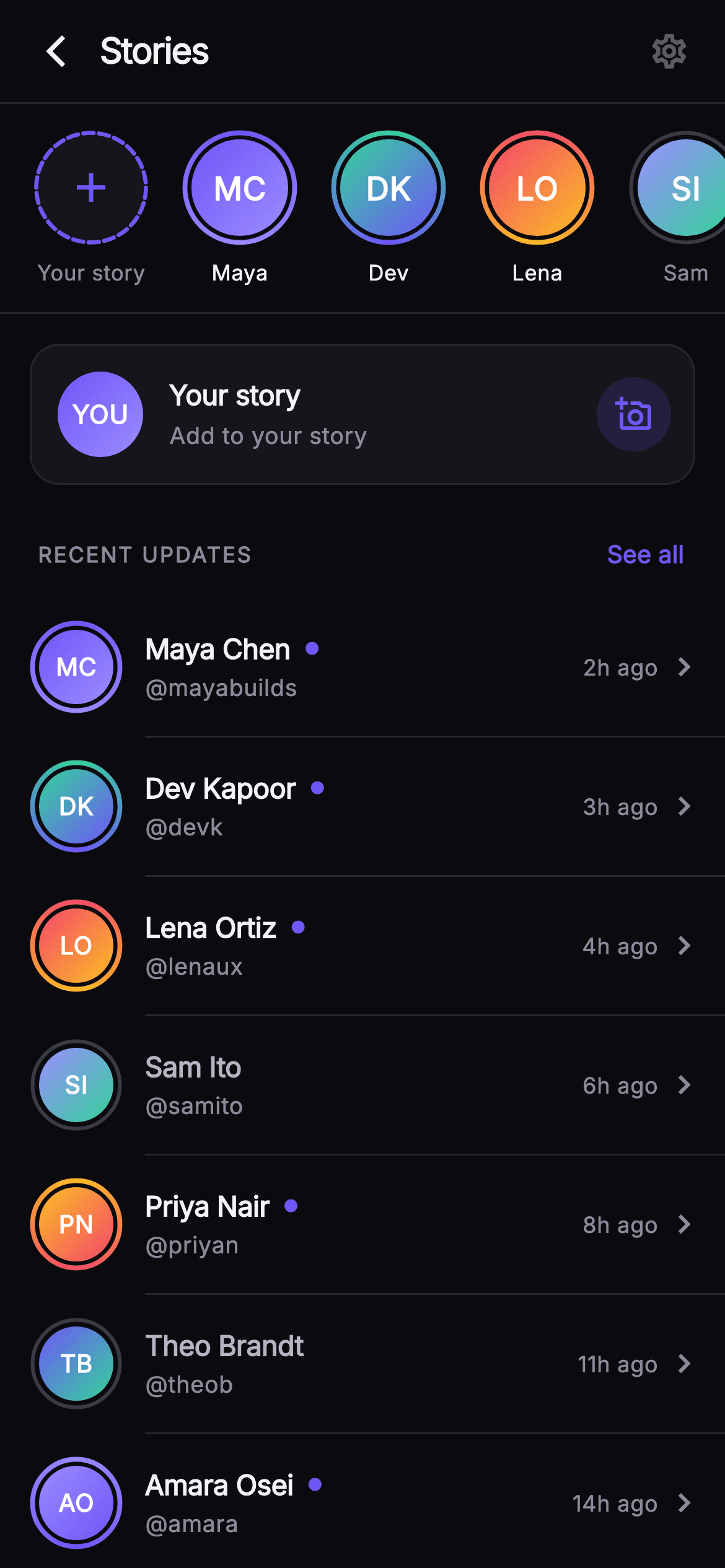
A stories strip squeezed into the top of a feed hides most of what your friends posted today. This tutorial builds Pulse's dedicated Stories screen in Flutter: a 112px horizontal rail led by an 'Add story' tile whose dashed indigo ring is drawn by `_DashedRingPainter`, followed by avatars wrapped in a `SweepGradient` unseen ring or a grey seen ring from `_RingAvatarPainter`. Below a hairline divider, a RECENT UPDATES list repeats the same people as full rows with handles, timestamps and a 7px unseen dot. Everything is pure Flutter, no images, and every tap is a nullable callback.
Watch the Flutter UI walkthrough
A short screen recording of Pulse · Stories Rail running, if you'd rather see it before you read the code. The written tutorial below covers everything in it.
Can't see the video? Watch it on YouTube.
What you'll build
- ✓A horizontal `ListView.separated` rail with a leading add tile that reports `-1` through the same `onStory` callback as real stories
- ✓`_RingAvatarPainter`, which strokes a `SweepGradient` ring rotated by `-math.pi / 2` for unseen stories and a `#3A3A46` grey ring for seen ones
- ✓`_DashedRingPainter`, a 22-segment dashed ring built from `drawArc` calls with a 34% gap fraction
- ✓A `_RingAvatar` widget that reuses one `_Story` model at two sizes (62px in the rail, 50px in the list) and computes initials from the name
- ✓An `_UpdateRow` list whose name colour, unseen dot and indented dividers all derive from the `unseen` flag
Step-by-step build
Create the file
Add a new file at lib/social_feed_stories_rail/social_feed_stories_rail_screen.dart in your Flutter project.
Register the bundled fonts
No external packages — this is pure Flutter. It does bundle its design font (Inter), so drop the font file into fonts/ and declare it in pubspec.yaml:
flutter:
  fonts:
    - family: Inter
      fonts:
- asset: fonts/Inter-Regular.ttfBuild it, piece by piece
Here's how the screen goes together. Each block below is a real slice of the code with a plain-English explanation — paste them in order, or grab the whole file from the next section.
Callbacks, palette and the story data
import 'dart:math' as math;

import 'package:flutter/material.dart';

/// Stories Rail Detail — a dedicated Pulse screen that expands the stories
/// experience into a full horizontal tray plus a scrolling list of recent
/// story updates. The tray leads with an "Add story" tile, then painted
/// gradient unseen-rings and muted seen-rings around gradient monogram
/// avatars. Below, a "RECENT UPDATES" section lists per-person updates with
/// handles, timestamps and unseen indicators, led by a bordered "Add to your
/// story" card. Every action is a nullable callback so the gallery registry
/// wires navigation. Self-contained per CONVENTIONS.md: pure Flutter, bundled
/// Inter font, own dark theme, SafeArea, fully overflow-proof.
///
/// slug: social-feed-stories-rail
class SocialFeedStoriesRailScreen extends StatelessWidget {
  const SocialFeedStoriesRailScreen({
    super.key,
    this.onBack,
    this.onSettings,
    this.onStory,
    this.onAddStory,
    this.onSeeAll,
  });

  final VoidCallback? onBack;
  final VoidCallback? onSettings;

  /// A story ring/update tap (index into the story list).
  final ValueChanged<int>? onStory;
  final VoidCallback? onAddStory;
  final VoidCallback? onSeeAll;

  static const String _font = 'Inter';
  static const Color _bg = Color(0xFF0B0B0F);
  static const Color _surface = Color(0xFF15151B);
  static const Color _brand = Color(0xFF6E56F7);
  static const Color _hairline = Color(0xFF26262F);
  static const Color _textHi = Color(0xFFF4F4F7);
  static const Color _textLo = Color(0xFFB5B5C2);
  static const Color _muted = Color(0xFF8A8A99);

  static const List<_Story> _stories = <_Story>[
    _Story('Maya Chen', 'mayabuilds', '2h ago', 0xFF6E56F7, 0xFF9B8CFF,
        unseen: true),
    _Story('Dev Kapoor', 'devk', '3h ago', 0xFF34D399, 0xFF6E56F7,
        unseen: true),
    _Story('Lena Ortiz', 'lenaux', '4h ago', 0xFFF4476B, 0xFFFBBF24,
        unseen: true),
    _Story('Sam Ito', 'samito', '6h ago', 0xFF9B8CFF, 0xFF34D399,
        unseen: false),
    _Story('Priya Nair', 'priyan', '8h ago', 0xFFFBBF24, 0xFFF4476B,
        unseen: true),
    _Story('Theo Brandt', 'theob', '11h ago', 0xFF6E56F7, 0xFF34D399,
        unseen: false),
    _Story('Amara Osei', 'amara', '14h ago', 0xFF9B8CFF, 0xFF6E56F7,
        unseen: true),
    _Story('Kai Fisher', 'kaifisher', '19h ago', 0xFFF4476B, 0xFF9B8CFF,
        unseen: false),
  ];
`SocialFeedStoriesRailScreen` is a `StatelessWidget` because nothing on this screen mutates locally — seen/unseen state comes from the data, and every interaction leaves through a nullable callback: `onBack`, `onSettings`, `onAddStory`, `onSeeAll`, and `onStory`, which is a `ValueChanged<int>` carrying the index into the story list rather than a plain `VoidCallback`. The palette is the Pulse near-mono dark set: `_bg` `#0B0B0F`, `_surface` `#15151B`, `_hairline` `#26262F`, with a single indigo `_brand` `#6E56F7` and three text tiers (`_textHi`, `_textLo`, `_muted`). The eight `_Story` records hold two colour ints, `colorA` and `colorB`, instead of image URLs — those two colours drive both the avatar gradient and the ring sweep, so each person gets a consistent identity with zero network assets. Note the mix of `unseen: true` and `false` so both ring styles render in the preview.
Forcing a dark theme and composing the column
  @override
  Widget build(BuildContext context) {
    return Theme(
      data: ThemeData.dark(useMaterial3: true),
      child: Scaffold(
        backgroundColor: _bg,
        body: SafeArea(
          bottom: false,
          child: Column(
            children: <Widget>[
              _TopBar(onBack: onBack, onSettings: onSettings),
              _StoriesRail(stories: _stories, onTap: onStory),
              const Divider(height: 1, color: _hairline),
              Expanded(
                child: ListView(
                  padding: const EdgeInsets.only(bottom: 28),
                  children: <Widget>[
                    _AddYourStoryCard(onTap: onAddStory),
                    _SectionHeader(onSeeAll: onSeeAll),
                    for (int i = 0; i < _stories.length - 1; i++) ...<Widget>[
                      _UpdateRow(
                        story: _stories[i],
                        onTap: () => onStory?.call(i),
                      ),
                      if (i < _stories.length - 2)
                        const Divider(
                          height: 1,
                          thickness: 1,
                          indent: 78,
                          color: _hairline,
                        ),
                    ],
                  ],
                ),
              ),
            ],
          ),
        ),
      ),
    );
  }
}
`build` wraps the `Scaffold` in `Theme(data: ThemeData.dark(useMaterial3: true))` so the `IconButton` ripples, `TextButton` and `Divider` pick up dark defaults even if the host app is light. `SafeArea(bottom: false)` protects the top bar from the notch but lets the list run under the home indicator, with `EdgeInsets.only(bottom: 28)` on the `ListView` providing the breathing room instead. The layout is a `Column`: `_TopBar`, the fixed-height `_StoriesRail`, a 1px hairline `Divider`, then an `Expanded` `ListView`. The list loop runs `i < _stories.length - 1`, so seven of the eight people appear as rows, and the inner `if (i < _stories.length - 2)` stops a divider being drawn after the final row. Each `_UpdateRow` gets `() => onStory?.call(i)`, so tapping a row and tapping the same avatar in the rail fire the identical callback with the identical index. Dividers use `indent: 78` — 16px padding plus the 50px avatar plus the 12px gap — so the line starts under the text, not the avatar.
Top bar, story model and the horizontal rail
// ── top bar ──────────────────────────────────────────────────────────────────
class _TopBar extends StatelessWidget {
  const _TopBar({this.onBack, this.onSettings});
  final VoidCallback? onBack;
  final VoidCallback? onSettings;

  @override
  Widget build(BuildContext context) {
    return Container(
      height: 56,
      padding: const EdgeInsets.symmetric(horizontal: 6),
      decoration: const BoxDecoration(
        color: SocialFeedStoriesRailScreen._bg,
        border: Border(
          bottom: BorderSide(color: SocialFeedStoriesRailScreen._hairline),
        ),
      ),
      child: Row(
        children: <Widget>[
          IconButton(
            onPressed: onBack,
            icon: const Icon(Icons.arrow_back_ios_new, size: 20),
            color: SocialFeedStoriesRailScreen._textHi,
            splashRadius: 22,
          ),
          const Expanded(
            child: Text(
              'Stories',
              style: TextStyle(
                fontFamily: SocialFeedStoriesRailScreen._font,
                fontSize: 19,
                fontWeight: FontWeight.w800,
                letterSpacing: -0.6,
                color: SocialFeedStoriesRailScreen._textHi,
              ),
            ),
          ),
          IconButton(
            onPressed: onSettings,
            icon: const Icon(Icons.settings_outlined, size: 22),
            color: SocialFeedStoriesRailScreen._textHi,
            splashRadius: 22,
          ),
        ],
      ),
    );
  }
}

// ── stories rail ─────────────────────────────────────────────────────────────
class _Story {
  const _Story(
    this.name,
    this.handle,
    this.time,
    this.colorA,
    this.colorB, {
    required this.unseen,
  });
  final String name;
  final String handle;
  final String time;
  final int colorA;
  final int colorB;
  final bool unseen;
}

class _StoriesRail extends StatelessWidget {
  const _StoriesRail({required this.stories, this.onTap});
  final List<_Story> stories;
  final ValueChanged<int>? onTap;

  @override
  Widget build(BuildContext context) {
    return SizedBox(
      height: 112,
      child: ListView.separated(
        scrollDirection: Axis.horizontal,
        padding: const EdgeInsets.fromLTRB(16, 14, 16, 12),
        itemCount: stories.length + 1,
        separatorBuilder: (BuildContext context, int _) =>
            const SizedBox(width: 14),
        itemBuilder: (BuildContext context, int i) {
          if (i == 0) {
            return _AddStoryTile(onTap: onTap);
          }
          final _Story s = stories[i - 1];
          return _StoryItem(story: s, onTap: () => onTap?.call(i - 1));
        },
      ),
    );
  }
}
`_TopBar` is a fixed 56px `Container` with only 6px horizontal padding, because the `IconButton`s carry their own 48px tap targets; its bottom edge is a `Border(bottom: BorderSide(color: _hairline))` rather than a separate `Divider`. The 'Stories' title sits at 19px `w800` with `letterSpacing: -0.6` inside `Expanded`, claiming all space between the 20px back chevron and the 22px settings gear (sized differently to balance the denser chevron glyph). `_Story` is a plain const class with a named `required this.unseen`, forcing the seen state to be spelled out at every call site. `_StoriesRail` is a `SizedBox(height: 112)` around a horizontal `ListView.separated`; the fixed height lets it sit inside the parent `Column` without an unbounded-height error. `itemCount` is `stories.length + 1` and index 0 is special-cased to `_AddStoryTile`, so the add tile scrolls with the rail rather than being pinned. The `i - 1` offset appears twice, once to read `stories[i - 1]` and once in `onTap?.call(i - 1)`, so the index the callback reports matches the data list rather than rail positions. Separators are constant 14px `SizedBox`es.
The add tile and a story tile
class _AddStoryTile extends StatelessWidget {
  const _AddStoryTile({this.onTap});
  final ValueChanged<int>? onTap;

  @override
  Widget build(BuildContext context) {
    return GestureDetector(
      onTap: () => onTap?.call(-1),
      behavior: HitTestBehavior.opaque,
      child: SizedBox(
        width: 66,
        child: Column(
          children: <Widget>[
            SizedBox(
              width: 62,
              height: 62,
              child: CustomPaint(
                painter: _DashedRingPainter(),
                child: const Center(
                  child: Icon(
                    Icons.add,
                    color: SocialFeedStoriesRailScreen._brand,
                    size: 26,
                  ),
                ),
              ),
            ),
            const SizedBox(height: 7),
            const Text(
              'Your story',
              maxLines: 1,
              overflow: TextOverflow.ellipsis,
              style: TextStyle(
                fontFamily: SocialFeedStoriesRailScreen._font,
                fontSize: 11.5,
                color: SocialFeedStoriesRailScreen._muted,
              ),
            ),
          ],
        ),
      ),
    );
  }
}

class _StoryItem extends StatelessWidget {
  const _StoryItem({required this.story, this.onTap});
  final _Story story;
  final VoidCallback? onTap;

  @override
  Widget build(BuildContext context) {
    return GestureDetector(
      onTap: onTap,
      behavior: HitTestBehavior.opaque,
      child: SizedBox(
        width: 66,
        child: Column(
          children: <Widget>[
            _RingAvatar(story: story, size: 62),
            const SizedBox(height: 7),
            Text(
              story.name.split(' ').first,
              maxLines: 1,
              overflow: TextOverflow.ellipsis,
              style: TextStyle(
                fontFamily: SocialFeedStoriesRailScreen._font,
                fontSize: 11.5,
                color: story.unseen
                    ? SocialFeedStoriesRailScreen._textHi
                    : SocialFeedStoriesRailScreen._muted,
              ),
            ),
          ],
        ),
      ),
    );
  }
}
Both tiles are 66px wide `Column`s inside a `GestureDetector` with `HitTestBehavior.opaque`, so the gap between the ring and the caption is tappable rather than falling through to the list. `_AddStoryTile` takes the same `ValueChanged<int>?` as real stories and reports `-1`, so a host app can route 'new story' through the single `onStory` handler without a second parameter — the registry's `onAddStory` is reserved for the larger card below. Its 62px `CustomPaint` uses `_DashedRingPainter` with a centred 26px indigo `Icons.add`. `_StoryItem` swaps in `_RingAvatar(size: 62)` and shows only `story.name.split(' ').first`, because a 66px tile has room for one name, with `maxLines: 1` and ellipsis as a guard for long first names. The caption colour flips with `story.unseen`: `_textHi` for unseen, `_muted` for seen, which is the same visual convention Instagram uses so users read it without thinking.
One ring avatar, two sizes
/// A gradient sweep (unseen) / grey (seen) ring around a gradient monogram.
class _RingAvatar extends StatelessWidget {
  const _RingAvatar({required this.story, required this.size});
  final _Story story;
  final double size;

  String get _initials {
    final List<String> p = story.name.trim().split(RegExp(r'\s+'));
    if (p.length == 1) return p.first.characters.first.toUpperCase();
    return (p.first[0] + p.last[0]).toUpperCase();
  }

  @override
  Widget build(BuildContext context) {
    final double inner = size - 10;
    return SizedBox(
      width: size,
      height: size,
      child: CustomPaint(
        painter: _RingAvatarPainter(
          colorA: Color(story.colorA),
          colorB: Color(story.colorB),
          unseen: story.unseen,
        ),
        child: Center(
          child: Container(
            width: inner,
            height: inner,
            decoration: BoxDecoration(
              shape: BoxShape.circle,
              gradient: LinearGradient(
                begin: Alignment.topLeft,
                end: Alignment.bottomRight,
                colors: <Color>[Color(story.colorA), Color(story.colorB)],
              ),
            ),
            child: Center(
              child: Text(
                _initials,
                style: TextStyle(
                  fontFamily: SocialFeedStoriesRailScreen._font,
                  fontSize: inner * 0.33,
                  fontWeight: FontWeight.w700,
                  color: Colors.white,
                ),
              ),
            ),
          ),
        ),
      ),
    );
  }
}
`_RingAvatar` is the piece that makes the rail and the update list feel like the same people. It takes a `size` and derives `inner = size - 10`, leaving a 5px gutter on each side for the painted ring and a gap between ring and disc. The `_initials` getter splits the name on `RegExp(r'\s+')`, so double spaces don't produce an empty part, and uses `characters.first` for the single-name case so a name starting with a multi-code-unit glyph doesn't get split mid-grapheme; two-part names take the first letter of the first and last parts. The `CustomPaint` layers `_RingAvatarPainter` behind a `Center`ed circular `Container` carrying a top-left to bottom-right `LinearGradient` from `colorA` to `colorB`. The initials are `inner * 0.33` in size, so text scales with the avatar rather than being hard-coded — at 62px the inner disc is 52px and the letters about 17px; at 50px they drop to roughly 13px automatically.
The 'Add to your story' card
// ── add-to-your-story card ───────────────────────────────────────────────────
class _AddYourStoryCard extends StatelessWidget {
  const _AddYourStoryCard({this.onTap});
  final VoidCallback? onTap;

  @override
  Widget build(BuildContext context) {
    return Padding(
      padding: const EdgeInsets.fromLTRB(16, 16, 16, 8),
      child: GestureDetector(
        onTap: onTap,
        behavior: HitTestBehavior.opaque,
        child: Container(
          padding: const EdgeInsets.fromLTRB(14, 14, 12, 14),
          decoration: BoxDecoration(
            color: SocialFeedStoriesRailScreen._surface,
            borderRadius: BorderRadius.circular(16),
            border: Border.all(color: SocialFeedStoriesRailScreen._hairline),
          ),
          child: Row(
            children: <Widget>[
              const _Monogram(
                initials: 'YOU',
                colorA: Color(0xFF6E56F7),
                colorB: Color(0xFF9B8CFF),
                size: 46,
              ),
              const SizedBox(width: 14),
              const Expanded(
                child: Column(
                  crossAxisAlignment: CrossAxisAlignment.start,
                  children: <Widget>[
                    Text(
                      'Your story',
                      maxLines: 1,
                      overflow: TextOverflow.ellipsis,
                      style: TextStyle(
                        fontFamily: SocialFeedStoriesRailScreen._font,
                        fontSize: 15,
                        fontWeight: FontWeight.w700,
                        letterSpacing: -0.2,
                        color: SocialFeedStoriesRailScreen._textHi,
                      ),
                    ),
                    SizedBox(height: 3),
                    Text(
                      'Add to your story',
                      maxLines: 1,
                      overflow: TextOverflow.ellipsis,
                      style: TextStyle(
                        fontFamily: SocialFeedStoriesRailScreen._font,
                        fontSize: 12.5,
                        color: SocialFeedStoriesRailScreen._muted,
                      ),
                    ),
                  ],
                ),
              ),
              Container(
                width: 40,
                height: 40,
                decoration: BoxDecoration(
                  color: SocialFeedStoriesRailScreen._brand
                      .withValues(alpha: 0.16),
                  shape: BoxShape.circle,
                ),
                child: const Icon(
                  Icons.add_a_photo_outlined,
                  color: SocialFeedStoriesRailScreen._brand,
                  size: 20,
                ),
              ),
            ],
          ),
        ),
      ),
    );
  }
}
`_AddYourStoryCard` is the first item in the scrolling list and the only bordered card on the screen, which visually promotes it above the flat rows beneath. It uses `_surface` `#15151B` with a 16px radius and a `_hairline` border, and padding of `fromLTRB(14, 14, 12, 14)` — the right side is 2px tighter because the 40px icon circle already carries visual weight. The leading avatar is a `_Monogram` with hard-coded 'YOU' initials in the brand gradient `#6E56F7` to `#9B8CFF`, which distinguishes the user from the friends' avatars without needing a profile photo. Two text lines, 'Your story' at 15px `w700` and 'Add to your story' at 12.5px muted, sit in an `Expanded` `Column` so long translations ellipsise instead of overflowing. The trailing `Icons.add_a_photo_outlined` sits in a circle tinted `_brand.withValues(alpha: 0.16)`, the two-layer accent pattern — soft tinted disc, saturated glyph — used across the Pulse kit.
Section header and the update rows
// ── section header ───────────────────────────────────────────────────────────
class _SectionHeader extends StatelessWidget {
  const _SectionHeader({this.onSeeAll});
  final VoidCallback? onSeeAll;

  @override
  Widget build(BuildContext context) {
    return Padding(
      padding: const EdgeInsets.fromLTRB(20, 14, 12, 8),
      child: Row(
        children: <Widget>[
          const Expanded(
            child: Text(
              'RECENT UPDATES',
              maxLines: 1,
              overflow: TextOverflow.ellipsis,
              style: TextStyle(
                fontFamily: SocialFeedStoriesRailScreen._font,
                fontSize: 11.5,
                fontWeight: FontWeight.w700,
                letterSpacing: 1.0,
                color: SocialFeedStoriesRailScreen._muted,
              ),
            ),
          ),
          TextButton(
            onPressed: onSeeAll,
            style: TextButton.styleFrom(
              minimumSize: Size.zero,
              padding: const EdgeInsets.symmetric(horizontal: 10, vertical: 6),
              tapTargetSize: MaterialTapTargetSize.shrinkWrap,
            ),
            child: const Text(
              'See all',
              style: TextStyle(
                fontFamily: SocialFeedStoriesRailScreen._font,
                fontSize: 13,
                fontWeight: FontWeight.w600,
                color: SocialFeedStoriesRailScreen._brand,
              ),
            ),
          ),
        ],
      ),
    );
  }
}

// ── update row ───────────────────────────────────────────────────────────────
class _UpdateRow extends StatelessWidget {
  const _UpdateRow({required this.story, this.onTap});
  final _Story story;
  final VoidCallback? onTap;

  @override
  Widget build(BuildContext context) {
    return GestureDetector(
      onTap: onTap,
      behavior: HitTestBehavior.opaque,
      child: Padding(
        padding: const EdgeInsets.fromLTRB(16, 12, 12, 12),
        child: Row(
          children: <Widget>[
            _RingAvatar(story: story, size: 50),
            const SizedBox(width: 12),
            Expanded(
              child: Column(
                crossAxisAlignment: CrossAxisAlignment.start,
                children: <Widget>[
                  Row(
                    children: <Widget>[
                      Flexible(
                        child: Text(
                          story.name,
                          maxLines: 1,
                          overflow: TextOverflow.ellipsis,
                          style: TextStyle(
                            fontFamily: SocialFeedStoriesRailScreen._font,
                            fontSize: 15,
                            fontWeight: FontWeight.w600,
                            letterSpacing: -0.2,
                            color: story.unseen
                                ? SocialFeedStoriesRailScreen._textHi
                                : SocialFeedStoriesRailScreen._textLo,
                          ),
                        ),
                      ),
                      if (story.unseen) ...<Widget>[
                        const SizedBox(width: 8),
                        Container(
                          width: 7,
                          height: 7,
                          decoration: const BoxDecoration(
                            color: SocialFeedStoriesRailScreen._brand,
                            shape: BoxShape.circle,
                          ),
                        ),
                      ],
                    ],
                  ),
                  const SizedBox(height: 2),
                  Text(
                    '@${story.handle}',
                    maxLines: 1,
                    overflow: TextOverflow.ellipsis,
                    style: const TextStyle(
                      fontFamily: SocialFeedStoriesRailScreen._font,
                      fontSize: 12.5,
                      color: SocialFeedStoriesRailScreen._muted,
                    ),
                  ),
                ],
              ),
            ),
            const SizedBox(width: 10),
            Text(
              story.time,
              style: const TextStyle(
                fontFamily: SocialFeedStoriesRailScreen._font,
                fontSize: 12,
                color: SocialFeedStoriesRailScreen._muted,
              ),
            ),
            const SizedBox(width: 4),
            const Icon(
              Icons.chevron_right,
              size: 20,
              color: SocialFeedStoriesRailScreen._muted,
            ),
          ],
        ),
      ),
    );
  }
}
`_SectionHeader` sets 'RECENT UPDATES' at 11.5px `w700` with `letterSpacing: 1.0`, the uppercase-tracked eyebrow style, next to a 'See all' `TextButton`. The button overrides `minimumSize: Size.zero`, `tapTargetSize: MaterialTapTargetSize.shrinkWrap` and a 10×6 padding, because Material's default 48px minimum would push the header row to almost twice its intended height. `_UpdateRow` reuses `_RingAvatar` at 50px next to a name/handle column and a trailing timestamp plus chevron. The name is wrapped in `Flexible` inside a `Row`, so it shrinks to make room for the 7px indigo unseen dot that follows it, rather than pushing the dot off screen for a long name; the dot and its 8px spacer only render inside `if (story.unseen)`. The name colour steps down from `_textHi` to `_textLo` for seen stories, a lighter demotion than the rail's `_muted`, because a list row still needs to be readable at a glance.
The monogram and the two painters
// ── monogram avatar ──────────────────────────────────────────────────────────
class _Monogram extends StatelessWidget {
  const _Monogram({
    required this.initials,
    required this.colorA,
    required this.colorB,
    this.size = 42,
  });
  final String initials;
  final Color colorA;
  final Color colorB;
  final double size;

  @override
  Widget build(BuildContext context) {
    return Container(
      width: size,
      height: size,
      decoration: BoxDecoration(
        shape: BoxShape.circle,
        gradient: LinearGradient(
          begin: Alignment.topLeft,
          end: Alignment.bottomRight,
          colors: <Color>[colorA, colorB],
        ),
      ),
      child: Center(
        child: Text(
          initials,
          style: TextStyle(
            fontFamily: SocialFeedStoriesRailScreen._font,
            fontSize: size * 0.3,
            fontWeight: FontWeight.w700,
            color: Colors.white,
          ),
        ),
      ),
    );
  }
}

// ── painters ─────────────────────────────────────────────────────────────────
class _RingAvatarPainter extends CustomPainter {
  _RingAvatarPainter({
    required this.colorA,
    required this.colorB,
    required this.unseen,
  });
  final Color colorA;
  final Color colorB;
  final bool unseen;

  @override
  void paint(Canvas canvas, Size size) {
    final Offset center = size.center(Offset.zero);
    final double radius = size.width / 2 - 1.5;
    if (unseen) {
      canvas.drawCircle(
        center,
        radius,
        Paint()
          ..style = PaintingStyle.stroke
          ..strokeWidth = 2.6
          ..shader = SweepGradient(
            colors: <Color>[colorA, colorB, colorA],
            transform: const GradientRotation(-math.pi / 2),
          ).createShader(Rect.fromCircle(center: center, radius: radius)),
      );
    } else {
      canvas.drawCircle(
        center,
        radius,
        Paint()
          ..style = PaintingStyle.stroke
          ..strokeWidth = 2.0
          ..color = const Color(0xFF3A3A46),
      );
    }
  }

  @override
  bool shouldRepaint(covariant _RingAvatarPainter old) =>
      old.unseen != unseen || old.colorA != colorA || old.colorB != colorB;
}

/// A dashed-look brand ring used for the "Add story" tile.
class _DashedRingPainter extends CustomPainter {
  @override
  void paint(Canvas canvas, Size size) {
    final Offset center = size.center(Offset.zero);
    final double radius = size.width / 2 - 1.5;

    // Filled surface disc.
    canvas.drawCircle(
      center,
      radius,
      Paint()..color = const Color(0xFF15151B),
    );

    // Dashed brand ring.
    final Paint dash = Paint()
      ..style = PaintingStyle.stroke
      ..strokeWidth = 2.2
      ..strokeCap = StrokeCap.round
      ..color = const Color(0xFF6E56F7);
    const int segments = 22;
    const double gap = 0.34; // fraction of each segment left empty
    final double step = (2 * math.pi) / segments;
    for (int i = 0; i < segments; i++) {
      final double start = i * step;
      canvas.drawArc(
        Rect.fromCircle(center: center, radius: radius),
        start,
        step * (1 - gap),
        false,
        dash,
      );
    }
  }

  @override
  bool shouldRepaint(covariant CustomPainter oldDelegate) => false;
}
`_Monogram` is the standalone version of the avatar disc — a gradient circle with initials at `size * 0.3` — used only by the 'YOU' card. `_RingAvatarPainter` computes `radius = size.width / 2 - 1.5` so the 2.6px stroke doesn't clip at the edges. For unseen it builds a `SweepGradient` with `[colorA, colorB, colorA]` so the ring's start and end colours match and there is no visible seam, and rotates it by `GradientRotation(-math.pi / 2)` so the sweep begins at twelve o'clock instead of three. Seen rings are a thinner 2.0px `#3A3A46` stroke. `shouldRepaint` compares `unseen` and both colours, so scrolling doesn't repaint unchanged rings. `_DashedRingPainter` first fills a `#15151B` disc, then loops 22 times drawing arcs of `step * (1 - gap)` where `gap = 0.34`, leaving a third of each segment empty; `StrokeCap.round` softens the dash ends. It never repaints because it has no inputs.
Full code
The complete, ready-to-paste source. Free to use in your projects — one click copies it all.
import 'dart:math' as math;
import 'package:flutter/material.dart';
/// Stories Rail Detail — a dedicated Pulse screen that expands the stories
/// experience into a full horizontal tray plus a scrolling list of recent
/// story updates. The tray leads with an "Add story" tile, then painted
/// gradient unseen-rings and muted seen-rings around gradient monogram
/// avatars. Below, a "RECENT UPDATES" section lists per-person updates with
/// handles, timestamps and unseen indicators, led by a bordered "Add to your
/// story" card. Every action is a nullable callback so the gallery registry
/// wires navigation. Self-contained per CONVENTIONS.md: pure Flutter, bundled
/// Inter font, own dark theme, SafeArea, fully overflow-proof.
///
/// slug: social-feed-stories-rail
class SocialFeedStoriesRailScreen extends StatelessWidget {
const SocialFeedStoriesRailScreen({
super.key,
this.onBack,
this.onSettings,
this.onStory,
this.onAddStory,
this.onSeeAll,
});
final VoidCallback? onBack;
final VoidCallback? onSettings;
/// A story ring/update tap (index into the story list).
final ValueChanged<int>? onStory;
final VoidCallback? onAddStory;
final VoidCallback? onSeeAll;
static const String _font = 'Inter';
static const Color _bg = Color(0xFF0B0B0F);
static const Color _surface = Color(0xFF15151B);
static const Color _brand = Color(0xFF6E56F7);
static const Color _hairline = Color(0xFF26262F);
static const Color _textHi = Color(0xFFF4F4F7);
static const Color _textLo = Color(0xFFB5B5C2);
static const Color _muted = Color(0xFF8A8A99);
static const List<_Story> _stories = <_Story>[
_Story('Maya Chen', 'mayabuilds', '2h ago', 0xFF6E56F7, 0xFF9B8CFF,
unseen: true),
_Story('Dev Kapoor', 'devk', '3h ago', 0xFF34D399, 0xFF6E56F7,
unseen: true),
_Story('Lena Ortiz', 'lenaux', '4h ago', 0xFFF4476B, 0xFFFBBF24,
unseen: true),
_Story('Sam Ito', 'samito', '6h ago', 0xFF9B8CFF, 0xFF34D399,
unseen: false),
_Story('Priya Nair', 'priyan', '8h ago', 0xFFFBBF24, 0xFFF4476B,
unseen: true),
_Story('Theo Brandt', 'theob', '11h ago', 0xFF6E56F7, 0xFF34D399,
unseen: false),
_Story('Amara Osei', 'amara', '14h ago', 0xFF9B8CFF, 0xFF6E56F7,
unseen: true),
_Story('Kai Fisher', 'kaifisher', '19h ago', 0xFFF4476B, 0xFF9B8CFF,
unseen: false),
];
@override
Widget build(BuildContext context) {
return Theme(
data: ThemeData.dark(useMaterial3: true),
child: Scaffold(
backgroundColor: _bg,
body: SafeArea(
bottom: false,
child: Column(
children: <Widget>[
_TopBar(onBack: onBack, onSettings: onSettings),
_StoriesRail(stories: _stories, onTap: onStory),
const Divider(height: 1, color: _hairline),
Expanded(
child: ListView(
padding: const EdgeInsets.only(bottom: 28),
children: <Widget>[
_AddYourStoryCard(onTap: onAddStory),
_SectionHeader(onSeeAll: onSeeAll),
for (int i = 0; i < _stories.length - 1; i++) ...<Widget>[
_UpdateRow(
story: _stories[i],
onTap: () => onStory?.call(i),
),
if (i < _stories.length - 2)
const Divider(
height: 1,
thickness: 1,
indent: 78,
color: _hairline,
),
],
],
),
),
],
),
),
),
);
}
}
// ── top bar ──────────────────────────────────────────────────────────────────
class _TopBar extends StatelessWidget {
const _TopBar({this.onBack, this.onSettings});
final VoidCallback? onBack;
final VoidCallback? onSettings;
@override
Widget build(BuildContext context) {
return Container(
height: 56,
padding: const EdgeInsets.symmetric(horizontal: 6),
decoration: const BoxDecoration(
color: SocialFeedStoriesRailScreen._bg,
border: Border(
bottom: BorderSide(color: SocialFeedStoriesRailScreen._hairline),
),
),
child: Row(
children: <Widget>[
IconButton(
onPressed: onBack,
icon: const Icon(Icons.arrow_back_ios_new, size: 20),
color: SocialFeedStoriesRailScreen._textHi,
splashRadius: 22,
),
const Expanded(
child: Text(
'Stories',
style: TextStyle(
fontFamily: SocialFeedStoriesRailScreen._font,
fontSize: 19,
fontWeight: FontWeight.w800,
letterSpacing: -0.6,
color: SocialFeedStoriesRailScreen._textHi,
),
),
),
IconButton(
onPressed: onSettings,
icon: const Icon(Icons.settings_outlined, size: 22),
color: SocialFeedStoriesRailScreen._textHi,
splashRadius: 22,
),
],
),
);
}
}
// ── stories rail ─────────────────────────────────────────────────────────────
class _Story {
const _Story(
this.name,
this.handle,
this.time,
this.colorA,
this.colorB, {
required this.unseen,
});
final String name;
final String handle;
final String time;
final int colorA;
final int colorB;
final bool unseen;
}
class _StoriesRail extends StatelessWidget {
const _StoriesRail({required this.stories, this.onTap});
final List<_Story> stories;
final ValueChanged<int>? onTap;
@override
Widget build(BuildContext context) {
return SizedBox(
height: 112,
child: ListView.separated(
scrollDirection: Axis.horizontal,
padding: const EdgeInsets.fromLTRB(16, 14, 16, 12),
itemCount: stories.length + 1,
separatorBuilder: (BuildContext context, int _) =>
const SizedBox(width: 14),
itemBuilder: (BuildContext context, int i) {
if (i == 0) {
return _AddStoryTile(onTap: onTap);
}
final _Story s = stories[i - 1];
return _StoryItem(story: s, onTap: () => onTap?.call(i - 1));
},
),
);
}
}
class _AddStoryTile extends StatelessWidget {
const _AddStoryTile({this.onTap});
final ValueChanged<int>? onTap;
@override
Widget build(BuildContext context) {
return GestureDetector(
onTap: () => onTap?.call(-1),
behavior: HitTestBehavior.opaque,
child: SizedBox(
width: 66,
child: Column(
children: <Widget>[
SizedBox(
width: 62,
height: 62,
child: CustomPaint(
painter: _DashedRingPainter(),
child: const Center(
child: Icon(
Icons.add,
color: SocialFeedStoriesRailScreen._brand,
size: 26,
),
),
),
),
const SizedBox(height: 7),
const Text(
'Your story',
maxLines: 1,
overflow: TextOverflow.ellipsis,
style: TextStyle(
fontFamily: SocialFeedStoriesRailScreen._font,
fontSize: 11.5,
color: SocialFeedStoriesRailScreen._muted,
),
),
],
),
),
);
}
}
class _StoryItem extends StatelessWidget {
const _StoryItem({required this.story, this.onTap});
final _Story story;
final VoidCallback? onTap;
@override
Widget build(BuildContext context) {
return GestureDetector(
onTap: onTap,
behavior: HitTestBehavior.opaque,
child: SizedBox(
width: 66,
child: Column(
children: <Widget>[
_RingAvatar(story: story, size: 62),
const SizedBox(height: 7),
Text(
story.name.split(' ').first,
maxLines: 1,
overflow: TextOverflow.ellipsis,
style: TextStyle(
fontFamily: SocialFeedStoriesRailScreen._font,
fontSize: 11.5,
color: story.unseen
? SocialFeedStoriesRailScreen._textHi
: SocialFeedStoriesRailScreen._muted,
),
),
],
),
),
);
}
}
/// A gradient sweep (unseen) / grey (seen) ring around a gradient monogram.
class _RingAvatar extends StatelessWidget {
const _RingAvatar({required this.story, required this.size});
final _Story story;
final double size;
String get _initials {
final List<String> p = story.name.trim().split(RegExp(r'\s+'));
if (p.length == 1) return p.first.characters.first.toUpperCase();
return (p.first[0] + p.last[0]).toUpperCase();
}
@override
Widget build(BuildContext context) {
final double inner = size - 10;
return SizedBox(
width: size,
height: size,
child: CustomPaint(
painter: _RingAvatarPainter(
colorA: Color(story.colorA),
colorB: Color(story.colorB),
unseen: story.unseen,
),
child: Center(
child: Container(
width: inner,
height: inner,
decoration: BoxDecoration(
shape: BoxShape.circle,
gradient: LinearGradient(
begin: Alignment.topLeft,
end: Alignment.bottomRight,
colors: <Color>[Color(story.colorA), Color(story.colorB)],
),
),
child: Center(
child: Text(
_initials,
style: TextStyle(
fontFamily: SocialFeedStoriesRailScreen._font,
fontSize: inner * 0.33,
fontWeight: FontWeight.w700,
color: Colors.white,
),
),
),
),
),
),
);
}
}
// ── add-to-your-story card ───────────────────────────────────────────────────
class _AddYourStoryCard extends StatelessWidget {
const _AddYourStoryCard({this.onTap});
final VoidCallback? onTap;
@override
Widget build(BuildContext context) {
return Padding(
padding: const EdgeInsets.fromLTRB(16, 16, 16, 8),
child: GestureDetector(
onTap: onTap,
behavior: HitTestBehavior.opaque,
child: Container(
padding: const EdgeInsets.fromLTRB(14, 14, 12, 14),
decoration: BoxDecoration(
color: SocialFeedStoriesRailScreen._surface,
borderRadius: BorderRadius.circular(16),
border: Border.all(color: SocialFeedStoriesRailScreen._hairline),
),
child: Row(
children: <Widget>[
const _Monogram(
initials: 'YOU',
colorA: Color(0xFF6E56F7),
colorB: Color(0xFF9B8CFF),
size: 46,
),
const SizedBox(width: 14),
const Expanded(
child: Column(
crossAxisAlignment: CrossAxisAlignment.start,
children: <Widget>[
Text(
'Your story',
maxLines: 1,
overflow: TextOverflow.ellipsis,
style: TextStyle(
fontFamily: SocialFeedStoriesRailScreen._font,
fontSize: 15,
fontWeight: FontWeight.w700,
letterSpacing: -0.2,
color: SocialFeedStoriesRailScreen._textHi,
),
),
SizedBox(height: 3),
Text(
'Add to your story',
maxLines: 1,
overflow: TextOverflow.ellipsis,
style: TextStyle(
fontFamily: SocialFeedStoriesRailScreen._font,
fontSize: 12.5,
color: SocialFeedStoriesRailScreen._muted,
),
),
],
),
),
Container(
width: 40,
height: 40,
decoration: BoxDecoration(
color: SocialFeedStoriesRailScreen._brand
.withValues(alpha: 0.16),
shape: BoxShape.circle,
),
child: const Icon(
Icons.add_a_photo_outlined,
color: SocialFeedStoriesRailScreen._brand,
size: 20,
),
),
],
),
),
),
);
}
}
// ── section header ───────────────────────────────────────────────────────────
class _SectionHeader extends StatelessWidget {
const _SectionHeader({this.onSeeAll});
final VoidCallback? onSeeAll;
@override
Widget build(BuildContext context) {
return Padding(
padding: const EdgeInsets.fromLTRB(20, 14, 12, 8),
child: Row(
children: <Widget>[
const Expanded(
child: Text(
'RECENT UPDATES',
maxLines: 1,
overflow: TextOverflow.ellipsis,
style: TextStyle(
fontFamily: SocialFeedStoriesRailScreen._font,
fontSize: 11.5,
fontWeight: FontWeight.w700,
letterSpacing: 1.0,
color: SocialFeedStoriesRailScreen._muted,
),
),
),
TextButton(
onPressed: onSeeAll,
style: TextButton.styleFrom(
minimumSize: Size.zero,
padding: const EdgeInsets.symmetric(horizontal: 10, vertical: 6),
tapTargetSize: MaterialTapTargetSize.shrinkWrap,
),
child: const Text(
'See all',
style: TextStyle(
fontFamily: SocialFeedStoriesRailScreen._font,
fontSize: 13,
fontWeight: FontWeight.w600,
color: SocialFeedStoriesRailScreen._brand,
),
),
),
],
),
);
}
}
// ── update row ───────────────────────────────────────────────────────────────
class _UpdateRow extends StatelessWidget {
const _UpdateRow({required this.story, this.onTap});
final _Story story;
final VoidCallback? onTap;
@override
Widget build(BuildContext context) {
return GestureDetector(
onTap: onTap,
behavior: HitTestBehavior.opaque,
child: Padding(
padding: const EdgeInsets.fromLTRB(16, 12, 12, 12),
child: Row(
children: <Widget>[
_RingAvatar(story: story, size: 50),
const SizedBox(width: 12),
Expanded(
child: Column(
crossAxisAlignment: CrossAxisAlignment.start,
children: <Widget>[
Row(
children: <Widget>[
Flexible(
child: Text(
story.name,
maxLines: 1,
overflow: TextOverflow.ellipsis,
style: TextStyle(
fontFamily: SocialFeedStoriesRailScreen._font,
fontSize: 15,
fontWeight: FontWeight.w600,
letterSpacing: -0.2,
color: story.unseen
? SocialFeedStoriesRailScreen._textHi
: SocialFeedStoriesRailScreen._textLo,
),
),
),
if (story.unseen) ...<Widget>[
const SizedBox(width: 8),
Container(
width: 7,
height: 7,
decoration: const BoxDecoration(
color: SocialFeedStoriesRailScreen._brand,
shape: BoxShape.circle,
),
),
],
],
),
const SizedBox(height: 2),
Text(
'@${story.handle}',
maxLines: 1,
overflow: TextOverflow.ellipsis,
style: const TextStyle(
fontFamily: SocialFeedStoriesRailScreen._font,
fontSize: 12.5,
color: SocialFeedStoriesRailScreen._muted,
),
),
],
),
),
const SizedBox(width: 10),
Text(
story.time,
style: const TextStyle(
fontFamily: SocialFeedStoriesRailScreen._font,
fontSize: 12,
color: SocialFeedStoriesRailScreen._muted,
),
),
const SizedBox(width: 4),
const Icon(
Icons.chevron_right,
size: 20,
color: SocialFeedStoriesRailScreen._muted,
),
],
),
),
);
}
}
// ── monogram avatar ──────────────────────────────────────────────────────────
class _Monogram extends StatelessWidget {
const _Monogram({
required this.initials,
required this.colorA,
required this.colorB,
this.size = 42,
});
final String initials;
final Color colorA;
final Color colorB;
final double size;
@override
Widget build(BuildContext context) {
return Container(
width: size,
height: size,
decoration: BoxDecoration(
shape: BoxShape.circle,
gradient: LinearGradient(
begin: Alignment.topLeft,
end: Alignment.bottomRight,
colors: <Color>[colorA, colorB],
),
),
child: Center(
child: Text(
initials,
style: TextStyle(
fontFamily: SocialFeedStoriesRailScreen._font,
fontSize: size * 0.3,
fontWeight: FontWeight.w700,
color: Colors.white,
),
),
),
);
}
}
// ── painters ─────────────────────────────────────────────────────────────────
class _RingAvatarPainter extends CustomPainter {
_RingAvatarPainter({
required this.colorA,
required this.colorB,
required this.unseen,
});
final Color colorA;
final Color colorB;
final bool unseen;
@override
void paint(Canvas canvas, Size size) {
final Offset center = size.center(Offset.zero);
final double radius = size.width / 2 - 1.5;
if (unseen) {
canvas.drawCircle(
center,
radius,
Paint()
..style = PaintingStyle.stroke
..strokeWidth = 2.6
..shader = SweepGradient(
colors: <Color>[colorA, colorB, colorA],
transform: const GradientRotation(-math.pi / 2),
).createShader(Rect.fromCircle(center: center, radius: radius)),
);
} else {
canvas.drawCircle(
center,
radius,
Paint()
..style = PaintingStyle.stroke
..strokeWidth = 2.0
..color = const Color(0xFF3A3A46),
);
}
}
@override
bool shouldRepaint(covariant _RingAvatarPainter old) =>
old.unseen != unseen || old.colorA != colorA || old.colorB != colorB;
}
/// A dashed-look brand ring used for the "Add story" tile.
class _DashedRingPainter extends CustomPainter {
@override
void paint(Canvas canvas, Size size) {
final Offset center = size.center(Offset.zero);
final double radius = size.width / 2 - 1.5;
// Filled surface disc.
canvas.drawCircle(
center,
radius,
Paint()..color = const Color(0xFF15151B),
);
// Dashed brand ring.
final Paint dash = Paint()
..style = PaintingStyle.stroke
..strokeWidth = 2.2
..strokeCap = StrokeCap.round
..color = const Color(0xFF6E56F7);
const int segments = 22;
const double gap = 0.34; // fraction of each segment left empty
final double step = (2 * math.pi) / segments;
for (int i = 0; i < segments; i++) {
final double start = i * step;
canvas.drawArc(
Rect.fromCircle(center: center, radius: radius),
start,
step * (1 - gap),
false,
dash,
);
}
}
@override
bool shouldRepaint(covariant CustomPainter oldDelegate) => false;
}
Plus bundled 1 binary asset (fonts/images). The CLI and MCP install those for you automatically.
Two faster ways to add it
Copy-paste works, but you can skip it entirely.
1. FlutterKit CLI
One command drops this screen — and its fonts — straight into your project.
$ flutterkit add social-feed-stories-rail2. AI agent (MCP)
Connect FlutterKit's MCP server in Claude or Cursor and just ask your agent to install social-feed-stories-rail — it fetches and writes the files for you.
FAQ
Can I use this stories screen in a commercial app?
Yes. FlutterKit screens are free for personal and commercial projects under MIT-style terms. There is no licence key or attribution requirement — run `flutterkit add social-feed-stories-rail`, or copy the Dart above into your project, and ship it.
Does the screen need any pub packages or fonts?
No packages — it imports only `dart:math` and `package:flutter/material.dart`. The only asset is the Inter font, which `flutterkit add social-feed-stories-rail` bundles and registers in your pubspec. If you paste the code manually, either add Inter yourself or delete the `fontFamily` lines to fall back to the system font.
Which Flutter version does this need?
Flutter 3.22 or newer, because of `super.key` in the constructor and `_brand.withValues(alpha: 0.16)` on the add-a-photo circle. On an older 3.x SDK, change `withValues(alpha: 0.16)` to `withOpacity(0.16)` and replace `super.key` with `Key? key` plus `super(key: key)`.
How do I load real stories from a server instead of the static list?
The screen reads everything from `_stories`, a `static const List<_Story>`. Convert it to a constructor parameter (`final List<_Story> stories`) and pass it from your state layer, mapping each API record to `_Story(name, handle, time, colorA, colorB, unseen: ...)`. Both `_StoriesRail` and the update loop already take the list as input, so no other code changes. For profile photos, swap the gradient `Container` inside `_RingAvatar` for a `ClipOval` with your image while keeping the painter behind it.
Why does tapping the 'Add story' tile call `onStory(-1)` instead of `onAddStory`?
The rail is built from one `ValueChanged<int>` so every tile is handled uniformly, and `-1` is the sentinel for 'not a story index'. The bigger 'Add to your story' card below uses the dedicated `onAddStory`. If you prefer one handler, pass the same function to both and treat a negative index as the create action.


