How to Build a Social Post Card States Screen in Flutter (Full Code + Preview)
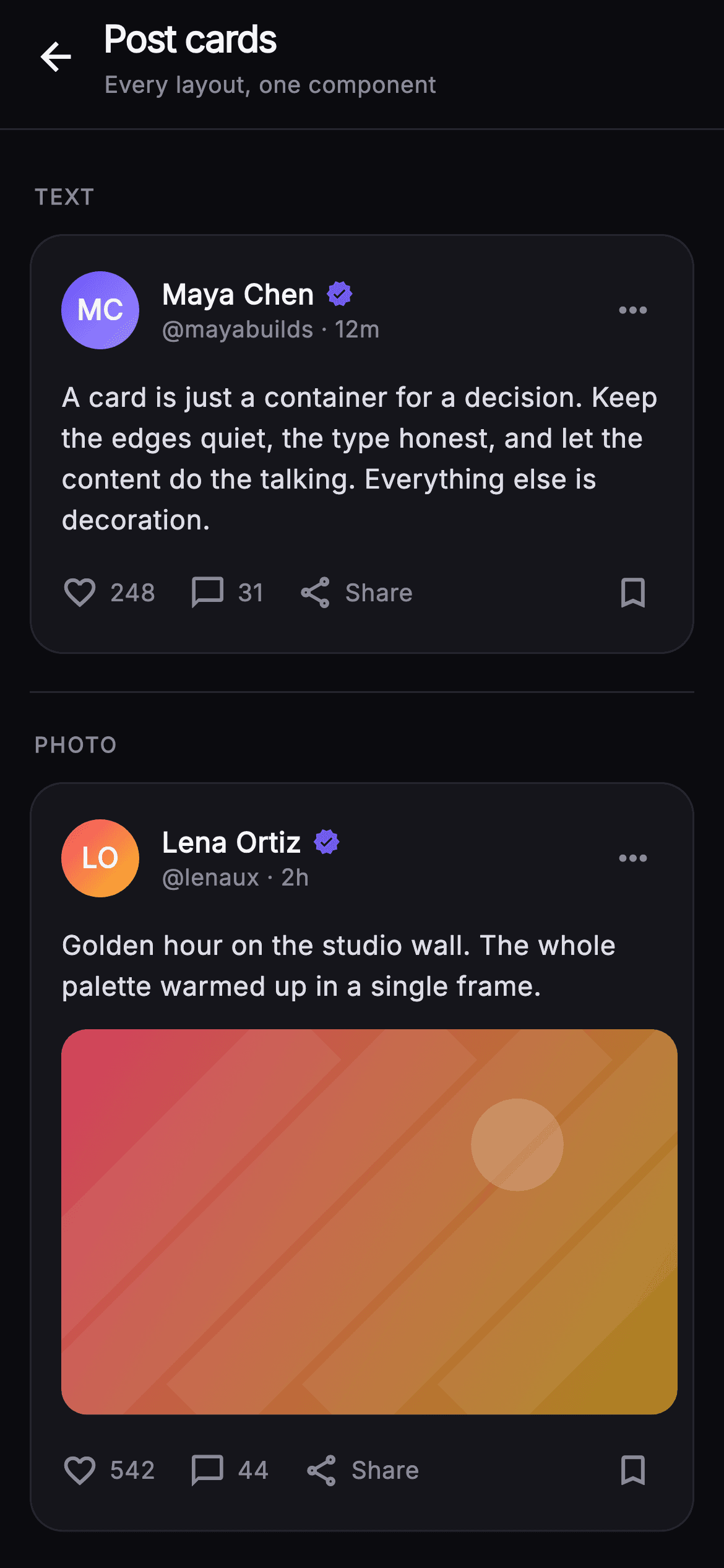
A timeline has to render whatever people post — a paragraph, one photo, a gallery, a shared link, a poll — and if each of those grows its own card widget the spacing drifts within a week. This tutorial builds Pulse's post-card sheet in Flutter: a labelled catalogue that stacks all five variants in one scroll so you can compare them side by side. Every card reuses the same `_CardShell`, `_AuthorRow` and `_ActionBar`; only the middle changes. Media is painted in code, so nothing here waits on a network image.
Watch the Flutter UI walkthrough
A short screen recording of Pulse · Post Card States running, if you'd rather see it before you read the code. The written tutorial below covers everything in it.
Can't see the video? Watch it on YouTube.
What you'll build
- ✓A labelled component sheet — TEXT, PHOTO, MULTI-IMAGE, LINK, POLL — with hairline dividers between sections
- ✓One `_CardShell` plus `_AuthorRow` spine that all five post variants share, so padding never drifts between them
- ✓A `_MediaPainter` that fakes every photo, gallery pane and link thumbnail with a gradient, light streaks and a sun disc
- ✓Poll bars whose fill width comes from `LayoutBuilder` constraints, with an indigo selected state and percent labels
- ✓A `_Monogram` avatar that derives its initials from the author's name and a `_fmt` helper that prints 1120 as 1.1k
Step-by-step build
Create the file
Add a new file at lib/social_feed_post_card/social_feed_post_card_screen.dart in your Flutter project.
Register the bundled fonts
No external packages — this is pure Flutter. It does bundle its design font (Inter), so drop the font file into fonts/ and declare it in pubspec.yaml:
flutter:
  fonts:
    - family: Inter
      fonts:
- asset: fonts/Inter-Regular.ttfBuild it, piece by piece
Here's how the screen goes together. Each block below is a real slice of the code with a plain-English explanation — paste them in order, or grab the whole file from the next section.
The sheet: one palette, five labelled sections
import 'package:flutter/material.dart';

/// Post cards — a component sheet that showcases every post-card layout the
/// Pulse kit supports: text, single photo, multi-image, rich link preview, and
/// inline poll. A calm back header sits above a scrolling list of labeled
/// sections so a buyer can see each variant in one place. Self-contained per
/// CONVENTIONS.md: pure Flutter, bundled Inter font, own dark theme, SafeArea,
/// fully overflow-proof.
class SocialFeedPostCardScreen extends StatelessWidget {
  const SocialFeedPostCardScreen({super.key, this.onBack});

  final VoidCallback? onBack;

  static const String _font = 'Inter';
  static const Color _bg = Color(0xFF0B0B0F);
  static const Color _surface = Color(0xFF15151B);
  static const Color _brand = Color(0xFF6E56F7);
  static const Color _hairline = Color(0xFF26262F);
  static const Color _textHi = Color(0xFFF4F4F7);
  static const Color _textLo = Color(0xFFB5B5C2);
  static const Color _muted = Color(0xFF8A8A99);

  @override
  Widget build(BuildContext context) {
    return Theme(
      data: ThemeData.dark(useMaterial3: true),
      child: Scaffold(
        backgroundColor: _bg,
        body: SafeArea(
          bottom: false,
          child: Column(
            children: <Widget>[
              _Header(onBack: onBack),
              Expanded(
                child: ListView(
                  padding: const EdgeInsets.fromLTRB(16, 8, 16, 32),
                  children: const <Widget>[
                    _Section(label: 'TEXT', child: _TextPostCard()),
                    _SectionDivider(),
                    _Section(label: 'PHOTO', child: _PhotoPostCard()),
                    _SectionDivider(),
                    _Section(label: 'MULTI-IMAGE', child: _MultiPostCard()),
                    _SectionDivider(),
                    _Section(label: 'LINK', child: _LinkPostCard()),
                    _SectionDivider(),
                    _Section(label: 'POLL', child: _PollPostCard()),
                  ],
                ),
              ),
            ],
          ),
        ),
      ),
    );
  }
}
The whole file is one `StatelessWidget` with a single `onBack` callback — a catalogue has no state to hold. Seven `static const Color` fields fix the Pulse palette in one place: `_bg` #0B0B0F behind everything, `_surface` #15151B for the cards, `_hairline` #26262F for borders, `_brand` indigo #6E56F7, and three text tiers `_textHi`/`_textLo`/`_muted`. Because they are static on the screen class, every private widget below references them as `SocialFeedPostCardScreen._surface` instead of passing a theme down. The body is a `ListView` of alternating `_Section` and `_SectionDivider` children — the variant list is data you can reorder in one place.
Header, section labels and the divider
class _Header extends StatelessWidget {
  const _Header({this.onBack});
  final VoidCallback? onBack;

  @override
  Widget build(BuildContext context) {
    return Container(
      padding: const EdgeInsets.fromLTRB(6, 6, 16, 14),
      decoration: const BoxDecoration(
        color: SocialFeedPostCardScreen._bg,
        border: Border(
          bottom: BorderSide(color: SocialFeedPostCardScreen._hairline),
        ),
      ),
      child: Row(
        crossAxisAlignment: CrossAxisAlignment.center,
        children: <Widget>[
          IconButton(
            onPressed: onBack,
            icon: const Icon(Icons.arrow_back,
                size: 24, color: SocialFeedPostCardScreen._textHi),
            splashRadius: 22,
          ),
          const SizedBox(width: 2),
          Expanded(
            child: Column(
              crossAxisAlignment: CrossAxisAlignment.start,
              children: const <Widget>[
                Text(
                  'Post cards',
                  maxLines: 1,
                  overflow: TextOverflow.ellipsis,
                  style: TextStyle(
                    fontFamily: SocialFeedPostCardScreen._font,
                    fontSize: 20,
                    fontWeight: FontWeight.w800,
                    letterSpacing: -0.7,
                    color: SocialFeedPostCardScreen._textHi,
                  ),
                ),
                SizedBox(height: 2),
                Text(
                  'Every layout, one component',
                  maxLines: 1,
                  overflow: TextOverflow.ellipsis,
                  style: TextStyle(
                    fontFamily: SocialFeedPostCardScreen._font,
                    fontSize: 12.5,
                    color: SocialFeedPostCardScreen._muted,
                  ),
                ),
              ],
            ),
          ),
        ],
      ),
    );
  }
}

class _Section extends StatelessWidget {
  const _Section({required this.label, required this.child});
  final String label;
  final Widget child;

  @override
  Widget build(BuildContext context) {
    return Column(
      crossAxisAlignment: CrossAxisAlignment.start,
      children: <Widget>[
        Padding(
          padding: const EdgeInsets.fromLTRB(2, 20, 0, 12),
          child: Text(
            label,
            style: const TextStyle(
              fontFamily: SocialFeedPostCardScreen._font,
              fontSize: 11.5,
              fontWeight: FontWeight.w700,
              letterSpacing: 1.0,
              color: SocialFeedPostCardScreen._muted,
            ),
          ),
        ),
        child,
      ],
    );
  }
}

class _SectionDivider extends StatelessWidget {
  const _SectionDivider();

  @override
  Widget build(BuildContext context) {
    return const Padding(
      padding: EdgeInsets.only(top: 20),
      child: Divider(height: 1, color: SocialFeedPostCardScreen._hairline),
    );
  }
}
`_Header` is a Container with a bottom `BorderSide` hairline rather than an `AppBar`, so it keeps the exact `_bg` colour and the tight `fromLTRB(6, 6, 16, 14)` padding. Its `arrow_back` `IconButton` is the only wired control on the screen; the title 'Post cards' sits at 20px `w800` with `letterSpacing: -0.7` above a 12.5px muted subtitle, both `maxLines: 1` with ellipsis so a long localisation cannot push the row. `_Section` prints its label at 11.5px `w700` with `letterSpacing: 1.0` — wide tracking is what makes an all-caps label read as a category marker rather than shouted copy — and `_SectionDivider` adds a 1px `Divider` with 20px of top padding.
The shared spine every variant reuses
// ── shared card scaffold ─────────────────────────────────────────────────────
class _CardShell extends StatelessWidget {
  const _CardShell({required this.children});
  final List<Widget> children;

  @override
  Widget build(BuildContext context) {
    return Container(
      padding: const EdgeInsets.fromLTRB(16, 16, 8, 8),
      decoration: BoxDecoration(
        color: SocialFeedPostCardScreen._surface,
        borderRadius: BorderRadius.circular(18),
        border: Border.all(color: SocialFeedPostCardScreen._hairline),
      ),
      child: Column(
        crossAxisAlignment: CrossAxisAlignment.start,
        children: children,
      ),
    );
  }
}

class _AuthorRow extends StatelessWidget {
  const _AuthorRow({
    required this.name,
    required this.handle,
    required this.time,
    required this.colorA,
    required this.colorB,
  });
  final String name;
  final String handle;
  final String time;
  final int colorA;
  final int colorB;

  String get _initials {
    final List<String> p = name.trim().split(RegExp(r'\s+'));
    if (p.length == 1) return p.first.characters.first.toUpperCase();
    return (p.first[0] + p.last[0]).toUpperCase();
  }

  @override
  Widget build(BuildContext context) {
    return Row(
      children: <Widget>[
        _Monogram(
          initials: _initials,
          colorA: Color(colorA),
          colorB: Color(colorB),
          size: 42,
        ),
        const SizedBox(width: 12),
        Expanded(
          child: Column(
            crossAxisAlignment: CrossAxisAlignment.start,
            children: <Widget>[
              Row(
                children: <Widget>[
                  Flexible(
                    child: Text(
                      name,
                      overflow: TextOverflow.ellipsis,
                      style: const TextStyle(
                        fontFamily: SocialFeedPostCardScreen._font,
                        fontSize: 15,
                        fontWeight: FontWeight.w700,
                        color: SocialFeedPostCardScreen._textHi,
                      ),
                    ),
                  ),
                  const SizedBox(width: 6),
                  const Icon(Icons.verified,
                      size: 15, color: SocialFeedPostCardScreen._brand),
                ],
              ),
              Text(
                '@$handle · $time',
                maxLines: 1,
                overflow: TextOverflow.ellipsis,
                style: const TextStyle(
                  fontFamily: SocialFeedPostCardScreen._font,
                  fontSize: 12.5,
                  color: SocialFeedPostCardScreen._muted,
                ),
              ),
            ],
          ),
        ),
        IconButton(
          onPressed: () {},
          icon: const Icon(Icons.more_horiz,
              color: SocialFeedPostCardScreen._muted, size: 22),
          splashRadius: 20,
        ),
      ],
    );
  }
}

class _BodyText extends StatelessWidget {
  const _BodyText(this.text);
  final String text;

  @override
  Widget build(BuildContext context) {
    return Text(
      text,
      style: const TextStyle(
        fontFamily: SocialFeedPostCardScreen._font,
        fontSize: 14.5,
        height: 1.5,
        color: Color(0xFFDDDDE6),
      ),
    );
  }
}
This is the part that makes the catalogue a component rather than five drawings. `_CardShell` is an 18px-radius `_surface` container with a hairline border and asymmetric padding `fromLTRB(16, 16, 8, 8)` — the right and bottom sides are cut back because the `more_horiz` and bookmark `IconButton`s carry their own 48px touch padding, and matching 16 there would look like a gap. `_AuthorRow` takes name, handle, time and two gradient colours, computes `_initials` (first letter of first and last word, or the first grapheme for a single name), and puts the name in a `Flexible` beside a 15px indigo `Icons.verified`. `_BodyText` fixes caption type at 14.5px with `height: 1.5`.
Text, then photo: the first escalation
// ── 1. text ──────────────────────────────────────────────────────────────────
class _TextPostCard extends StatelessWidget {
  const _TextPostCard();

  @override
  Widget build(BuildContext context) {
    return const _CardShell(
      children: <Widget>[
        _AuthorRow(
          name: 'Maya Chen',
          handle: 'mayabuilds',
          time: '12m',
          colorA: 0xFF6E56F7,
          colorB: 0xFF9B8CFF,
        ),
        SizedBox(height: 12),
        _BodyText(
          'A card is just a container for a decision. Keep the edges quiet, '
          'the type honest, and let the content do the talking. Everything '
          'else is decoration.',
        ),
        SizedBox(height: 4),
        _ActionBar(likes: 248, comments: 31),
      ],
    );
  }
}

// ── 2. photo ─────────────────────────────────────────────────────────────────
class _PhotoPostCard extends StatelessWidget {
  const _PhotoPostCard();

  @override
  Widget build(BuildContext context) {
    return _CardShell(
      children: <Widget>[
        const _AuthorRow(
          name: 'Lena Ortiz',
          handle: 'lenaux',
          time: '2h',
          colorA: 0xFFF4476B,
          colorB: 0xFFFBBF24,
        ),
        const SizedBox(height: 12),
        const _BodyText(
          'Golden hour on the studio wall. The whole palette warmed up in a '
          'single frame.',
        ),
        const SizedBox(height: 12),
        ClipRRect(
          borderRadius: BorderRadius.circular(14),
          child: AspectRatio(
            aspectRatio: 16 / 10,
            child: CustomPaint(
              painter: _MediaPainter(
                const Color(0xFFF4476B),
                const Color(0xFFFBBF24),
              ),
              child: const SizedBox.expand(),
            ),
          ),
        ),
        const SizedBox(height: 6),
        const _ActionBar(likes: 542, comments: 44),
      ],
    );
  }
}

// ── 3. multi-image ───────────────────────────────────────────────────────────
class _MultiPostCard extends StatelessWidget {
  const _MultiPostCard();

  @override
  Widget build(BuildContext context) {
    return _CardShell(
      children: <Widget>[
        const _AuthorRow(
          name: 'Dev Kapoor',
          handle: 'devk',
          time: '48m',
          colorA: 0xFF34D399,
          colorB: 0xFF6E56F7,
        ),
        const SizedBox(height: 12),
        const _BodyText(
          'Five studies, one direction. Swipe through the set — the second '
          'row is where it clicked.',
        ),
        const SizedBox(height: 12),
        ClipRRect(
          borderRadius: BorderRadius.circular(14),
          child: SizedBox(
            height: 150,
            child: Row(
              children: <Widget>[
                Expanded(
                  child: CustomPaint(
                    painter: _MediaPainter(
                      const Color(0xFF34D399),
                      const Color(0xFF6E56F7),
                    ),
                    child: const SizedBox.expand(),
                  ),
                ),
                const SizedBox(width: 3),
                Expanded(
                  child: Stack(
                    children: <Widget>[
                      CustomPaint(
                        painter: _MediaPainter(
                          const Color(0xFF6E56F7),
                          const Color(0xFF34D399),
                        ),
                        child: const SizedBox.expand(),
                      ),
                      Positioned(
                        right: 8,
                        bottom: 8,
                        child: Container(
                          padding: const EdgeInsets.symmetric(
                              horizontal: 10, vertical: 5),
                          decoration: BoxDecoration(
                            color: Colors.black.withValues(alpha: 0.55),
                            borderRadius: BorderRadius.circular(999),
                          ),
                          child: const Text(
                            '+3',
                            style: TextStyle(
                              fontFamily: SocialFeedPostCardScreen._font,
                              fontSize: 13,
                              fontWeight: FontWeight.w700,
                              color: Colors.white,
                            ),
                          ),
                        ),
                      ),
                    ],
                  ),
                ),
              ],
            ),
          ),
        ),
        const SizedBox(height: 6),
        const _ActionBar(likes: 1120, comments: 96),
      ],
    );
  }
}
Three variants, one shell. `_TextPostCard` is fully `const` — author row, caption, `_ActionBar(likes: 248, comments: 31)` — and proves the shell reads fine with no media at all. `_PhotoPostCard` inserts a `ClipRRect(14)` wrapping an `AspectRatio(16 / 10)` so the image reserves its height before anything paints, which is what stops the card jumping. `_MultiPostCard` swaps that for a fixed `SizedBox(height: 150)` holding two `Expanded` panes split by a 3px gap, and stacks a `+3` pill at 55% black over the right pane. Note the gap between caption and media is 12px, but only 6px sits below media before the actions — the picture already supplies visual weight.
The link preview card
// ── 4. link ──────────────────────────────────────────────────────────────────
class _LinkPostCard extends StatelessWidget {
  const _LinkPostCard();

  @override
  Widget build(BuildContext context) {
    return _CardShell(
      children: <Widget>[
        const _AuthorRow(
          name: 'Sam Ito',
          handle: 'samwrites',
          time: '5h',
          colorA: 0xFF9B8CFF,
          colorB: 0xFF34D399,
        ),
        const SizedBox(height: 12),
        const _BodyText(
          'Best thing I read this week on interface restraint. Saving this '
          'one for the team.',
        ),
        const SizedBox(height: 12),
        Container(
          decoration: BoxDecoration(
            borderRadius: BorderRadius.circular(14),
            border: Border.all(color: SocialFeedPostCardScreen._hairline),
          ),
          child: Row(
            children: <Widget>[
              ClipRRect(
                borderRadius: const BorderRadius.only(
                  topLeft: Radius.circular(13),
                  bottomLeft: Radius.circular(13),
                ),
                child: SizedBox(
                  width: 72,
                  height: 72,
                  child: CustomPaint(
                    painter: _MediaPainter(
                      const Color(0xFF6E56F7),
                      const Color(0xFF9B8CFF),
                    ),
                    child: const SizedBox.expand(),
                  ),
                ),
              ),
              Expanded(
                child: Padding(
                  padding: const EdgeInsets.fromLTRB(12, 10, 6, 10),
                  child: Column(
                    crossAxisAlignment: CrossAxisAlignment.start,
                    mainAxisSize: MainAxisSize.min,
                    children: const <Widget>[
                      Text(
                        'craftletter.design',
                        maxLines: 1,
                        overflow: TextOverflow.ellipsis,
                        style: TextStyle(
                          fontFamily: SocialFeedPostCardScreen._font,
                          fontSize: 11.5,
                          color: SocialFeedPostCardScreen._muted,
                        ),
                      ),
                      SizedBox(height: 3),
                      Text(
                        'The quiet power of a well-behaved component',
                        maxLines: 2,
                        overflow: TextOverflow.ellipsis,
                        style: TextStyle(
                          fontFamily: SocialFeedPostCardScreen._font,
                          fontSize: 13.5,
                          height: 1.3,
                          fontWeight: FontWeight.w600,
                          color: SocialFeedPostCardScreen._textHi,
                        ),
                      ),
                    ],
                  ),
                ),
              ),
              const Padding(
                padding: EdgeInsets.only(right: 10, left: 2),
                child: Icon(Icons.chevron_right,
                    size: 22, color: SocialFeedPostCardScreen._muted),
              ),
            ],
          ),
        ),
        const SizedBox(height: 6),
        const _ActionBar(likes: 87, comments: 12),
      ],
    );
  }
}
The preview is an outlined Container with a 14px radius wrapping a Row, and the thumbnail's `ClipRRect` rounds only `topLeft`/`bottomLeft` at 13 — one pixel inside the parent's 14 — so the painted square sits flush against the border without a bright sliver showing at the corner. The thumbnail is a fixed 72×72 `CustomPaint`; the middle column is `Expanded` with `mainAxisSize: MainAxisSize.min`, showing the domain 'craftletter.design' at 11.5px muted above a `maxLines: 2` title at 13.5px `w600`. A trailing `chevron_right` signals the whole row is tappable. Constraining the title to two lines is what keeps every link card the same height regardless of headline length.
The poll card and its proportional bars
// ── 5. poll ──────────────────────────────────────────────────────────────────
class _PollPostCard extends StatelessWidget {
  const _PollPostCard();

  @override
  Widget build(BuildContext context) {
    return _CardShell(
      children: <Widget>[
        const _AuthorRow(
          name: 'Priya Nair',
          handle: 'priyaships',
          time: '1d',
          colorA: 0xFFFBBF24,
          colorB: 0xFFF4476B,
        ),
        const SizedBox(height: 12),
        const _BodyText(
          'Settling a studio debate: where does the primary action belong on '
          'a card?',
        ),
        const SizedBox(height: 14),
        const _PollOption(label: 'Bottom-left, always', percent: 0.52,
            selected: true),
        const SizedBox(height: 8),
        const _PollOption(label: 'Bottom-right, always', percent: 0.31,
            selected: false),
        const SizedBox(height: 8),
        const _PollOption(label: 'It depends on the flow', percent: 0.17,
            selected: false),
        const SizedBox(height: 12),
        Padding(
          padding: const EdgeInsets.only(left: 2),
          child: Row(
            children: const <Widget>[
              Text(
                '1,204 votes',
                style: TextStyle(
                  fontFamily: SocialFeedPostCardScreen._font,
                  fontSize: 12.5,
                  color: SocialFeedPostCardScreen._muted,
                ),
              ),
              SizedBox(width: 8),
              Text(
                '·',
                style: TextStyle(
                  fontFamily: SocialFeedPostCardScreen._font,
                  fontSize: 12.5,
                  color: SocialFeedPostCardScreen._muted,
                ),
              ),
              SizedBox(width: 8),
              Text(
                '1d left',
                style: TextStyle(
                  fontFamily: SocialFeedPostCardScreen._font,
                  fontSize: 12.5,
                  color: SocialFeedPostCardScreen._muted,
                ),
              ),
            ],
          ),
        ),
        const SizedBox(height: 8),
        const _ActionBar(likes: 316, comments: 58),
      ],
    );
  }
}

class _PollOption extends StatelessWidget {
  const _PollOption({
    required this.label,
    required this.percent,
    required this.selected,
  });
  final String label;
  final double percent;
  final bool selected;

  @override
  Widget build(BuildContext context) {
    final int pct = (percent * 100).round();
    return SizedBox(
      height: 40,
      child: LayoutBuilder(
        builder: (BuildContext context, BoxConstraints c) {
          return Stack(
            children: <Widget>[
              Container(
                decoration: BoxDecoration(
                  color: SocialFeedPostCardScreen._bg,
                  borderRadius: BorderRadius.circular(10),
                  border: Border.all(
                    color: selected
                        ? SocialFeedPostCardScreen._brand
                            .withValues(alpha: 0.55)
                        : SocialFeedPostCardScreen._hairline,
                  ),
                ),
              ),
              ClipRRect(
                borderRadius: BorderRadius.circular(10),
                child: Align(
                  alignment: Alignment.centerLeft,
                  child: Container(
                    width: c.maxWidth * percent,
                    height: 40,
                    color: SocialFeedPostCardScreen._brand.withValues(
                      alpha: selected ? 0.28 : 0.14,
                    ),
                  ),
                ),
              ),
              Padding(
                padding: const EdgeInsets.symmetric(horizontal: 12),
                child: Row(
                  children: <Widget>[
                    if (selected)
                      const Padding(
                        padding: EdgeInsets.only(right: 6),
                        child: Icon(Icons.check_circle,
                            size: 16,
                            color: SocialFeedPostCardScreen._brand),
                      ),
                    Expanded(
                      child: Text(
                        label,
                        maxLines: 1,
                        overflow: TextOverflow.ellipsis,
                        style: TextStyle(
                          fontFamily: SocialFeedPostCardScreen._font,
                          fontSize: 13.5,
                          fontWeight:
                              selected ? FontWeight.w700 : FontWeight.w500,
                          color: selected
                              ? SocialFeedPostCardScreen._textHi
                              : SocialFeedPostCardScreen._textLo,
                        ),
                      ),
                    ),
                    const SizedBox(width: 8),
                    Text(
                      '$pct%',
                      style: TextStyle(
                        fontFamily: SocialFeedPostCardScreen._font,
                        fontSize: 13.5,
                        fontWeight: FontWeight.w700,
                        color: selected
                            ? SocialFeedPostCardScreen._textHi
                            : SocialFeedPostCardScreen._muted,
                      ),
                    ),
                  ],
                ),
              ),
            ],
          );
        },
      ),
    );
  }
}
`_PollPostCard` stacks three `_PollOption`s at 0.52 / 0.31 / 0.17 with the first marked `selected`, then a meta Row reading '1,204 votes · 1d left'. Each option is a 40px `SizedBox` around a `LayoutBuilder`, because the fill needs a real pixel width: `c.maxWidth * percent` inside a `ClipRRect` and a left-aligned `Align`. Selection changes four things at once — border to `_brand` at 55% alpha, fill from 14% to 28%, a 16px `check_circle` prefix, and the label from `w500`/`_textLo` to `w700`/`_textHi`. The percentage is derived once as `(percent * 100).round()`, so the label can never disagree with the bar it sits on.
The action bar and the count formatter
// ── action bar ───────────────────────────────────────────────────────────────
class _ActionBar extends StatelessWidget {
  const _ActionBar({required this.likes, required this.comments});
  final int likes;
  final int comments;

  String _fmt(int n) =>
      n >= 1000 ? '${(n / 1000).toStringAsFixed(1)}k' : '$n';

  @override
  Widget build(BuildContext context) {
    return Row(
      children: <Widget>[
        _Action(icon: Icons.favorite_border, label: _fmt(likes)),
        const SizedBox(width: 18),
        _Action(icon: Icons.chat_bubble_outline, label: _fmt(comments)),
        const SizedBox(width: 18),
        const _Action(icon: Icons.share_outlined, label: 'Share'),
        const Spacer(),
        IconButton(
          onPressed: () {},
          icon: const Icon(Icons.bookmark_border,
              size: 21, color: SocialFeedPostCardScreen._muted),
          splashRadius: 20,
        ),
      ],
    );
  }
}

class _Action extends StatelessWidget {
  const _Action({required this.icon, required this.label});
  final IconData icon;
  final String label;

  @override
  Widget build(BuildContext context) {
    return Row(
      children: <Widget>[
        Icon(icon, size: 20, color: SocialFeedPostCardScreen._muted),
        const SizedBox(width: 6),
        Text(
          label,
          style: const TextStyle(
            fontFamily: SocialFeedPostCardScreen._font,
            fontSize: 13,
            fontWeight: FontWeight.w500,
            color: SocialFeedPostCardScreen._muted,
          ),
        ),
      ],
    );
  }
}
`_ActionBar` lays out three `_Action` rows — `favorite_border`, `chat_bubble_outline`, `share_outlined` — separated by 18px, then a `Spacer()` pushes a `bookmark_border` `IconButton` to the far right. That split is deliberate: engagement actions cluster on the left where a thumb reaches them, saving is a different intent and gets its own edge. `_fmt` shortens anything from 1000 up via `toStringAsFixed(1)`, so the multi-image card's 1120 likes render as '1.1k' and the column widths stay stable as counts grow. Worth knowing before you wire this up: `_Action` is a plain Row with no gesture detector, and the bookmark's `onPressed` is an empty closure — these are display states, not toggles.
The monogram avatar and the media painter
// ── monogram avatar ──────────────────────────────────────────────────────────
class _Monogram extends StatelessWidget {
  const _Monogram({
    required this.initials,
    required this.colorA,
    required this.colorB,
    this.size = 42,
  });
  final String initials;
  final Color colorA;
  final Color colorB;
  final double size;

  @override
  Widget build(BuildContext context) {
    return Container(
      width: size,
      height: size,
      decoration: BoxDecoration(
        shape: BoxShape.circle,
        gradient: LinearGradient(
          begin: Alignment.topLeft,
          end: Alignment.bottomRight,
          colors: <Color>[colorA, colorB],
        ),
      ),
      child: Center(
        child: Text(
          initials,
          style: TextStyle(
            fontFamily: SocialFeedPostCardScreen._font,
            fontSize: size * 0.36,
            fontWeight: FontWeight.w700,
            color: Colors.white,
          ),
        ),
      ),
    );
  }
}

// ── media painter ────────────────────────────────────────────────────────────
class _MediaPainter extends CustomPainter {
  _MediaPainter(this.colorA, this.colorB);
  final Color colorA;
  final Color colorB;

  @override
  void paint(Canvas canvas, Size size) {
    final Rect rect = Offset.zero & size;
    canvas.drawRect(
      rect,
      Paint()
        ..shader = LinearGradient(
          begin: Alignment.topLeft,
          end: Alignment.bottomRight,
          colors: <Color>[
            colorA.withValues(alpha: 0.85),
            colorB.withValues(alpha: 0.65),
          ],
        ).createShader(rect),
    );
    // Soft light streaks for texture.
    final Paint streak = Paint()
      ..color = Colors.white.withValues(alpha: 0.06)
      ..style = PaintingStyle.stroke
      ..strokeWidth = size.width * 0.14;
    for (int i = -1; i < 4; i++) {
      final double x = size.width * (0.22 * i);
      canvas.drawLine(
        Offset(x, size.height),
        Offset(x + size.height, 0),
        streak,
      );
    }
    // Painted "sun" disc.
    canvas.drawCircle(
      Offset(size.width * 0.74, size.height * 0.30),
      size.height * 0.12,
      Paint()..color = Colors.white.withValues(alpha: 0.18),
    );
  }

  @override
  bool shouldRepaint(covariant _MediaPainter old) =>
      old.colorA != colorA || old.colorB != colorB;
}
`_Monogram` is a circular Container with a topLeft-to-bottomRight `LinearGradient` between the two colours each card passes in, and its text scales as `size * 0.36` so the same widget works at 42px here or any other size. `_MediaPainter` replaces every image in the file: a diagonal gradient from `colorA` at 85% alpha to `colorB` at 65%, then five white strokes at 6% alpha drawn from `(x, height)` to `(x + height, 0)` — using the height as the run gives a true 45° streak at any aspect ratio — and a soft white disc at 74%/30% for a sun. `shouldRepaint` compares both colours, so repainting only happens when the palette actually changes.
Full code
The complete, ready-to-paste source. Free to use in your projects — one click copies it all.
import 'package:flutter/material.dart';
/// Post cards — a component sheet that showcases every post-card layout the
/// Pulse kit supports: text, single photo, multi-image, rich link preview, and
/// inline poll. A calm back header sits above a scrolling list of labeled
/// sections so a buyer can see each variant in one place. Self-contained per
/// CONVENTIONS.md: pure Flutter, bundled Inter font, own dark theme, SafeArea,
/// fully overflow-proof.
class SocialFeedPostCardScreen extends StatelessWidget {
const SocialFeedPostCardScreen({super.key, this.onBack});
final VoidCallback? onBack;
static const String _font = 'Inter';
static const Color _bg = Color(0xFF0B0B0F);
static const Color _surface = Color(0xFF15151B);
static const Color _brand = Color(0xFF6E56F7);
static const Color _hairline = Color(0xFF26262F);
static const Color _textHi = Color(0xFFF4F4F7);
static const Color _textLo = Color(0xFFB5B5C2);
static const Color _muted = Color(0xFF8A8A99);
@override
Widget build(BuildContext context) {
return Theme(
data: ThemeData.dark(useMaterial3: true),
child: Scaffold(
backgroundColor: _bg,
body: SafeArea(
bottom: false,
child: Column(
children: <Widget>[
_Header(onBack: onBack),
Expanded(
child: ListView(
padding: const EdgeInsets.fromLTRB(16, 8, 16, 32),
children: const <Widget>[
_Section(label: 'TEXT', child: _TextPostCard()),
_SectionDivider(),
_Section(label: 'PHOTO', child: _PhotoPostCard()),
_SectionDivider(),
_Section(label: 'MULTI-IMAGE', child: _MultiPostCard()),
_SectionDivider(),
_Section(label: 'LINK', child: _LinkPostCard()),
_SectionDivider(),
_Section(label: 'POLL', child: _PollPostCard()),
],
),
),
],
),
),
),
);
}
}
class _Header extends StatelessWidget {
const _Header({this.onBack});
final VoidCallback? onBack;
@override
Widget build(BuildContext context) {
return Container(
padding: const EdgeInsets.fromLTRB(6, 6, 16, 14),
decoration: const BoxDecoration(
color: SocialFeedPostCardScreen._bg,
border: Border(
bottom: BorderSide(color: SocialFeedPostCardScreen._hairline),
),
),
child: Row(
crossAxisAlignment: CrossAxisAlignment.center,
children: <Widget>[
IconButton(
onPressed: onBack,
icon: const Icon(Icons.arrow_back,
size: 24, color: SocialFeedPostCardScreen._textHi),
splashRadius: 22,
),
const SizedBox(width: 2),
Expanded(
child: Column(
crossAxisAlignment: CrossAxisAlignment.start,
children: const <Widget>[
Text(
'Post cards',
maxLines: 1,
overflow: TextOverflow.ellipsis,
style: TextStyle(
fontFamily: SocialFeedPostCardScreen._font,
fontSize: 20,
fontWeight: FontWeight.w800,
letterSpacing: -0.7,
color: SocialFeedPostCardScreen._textHi,
),
),
SizedBox(height: 2),
Text(
'Every layout, one component',
maxLines: 1,
overflow: TextOverflow.ellipsis,
style: TextStyle(
fontFamily: SocialFeedPostCardScreen._font,
fontSize: 12.5,
color: SocialFeedPostCardScreen._muted,
),
),
],
),
),
],
),
);
}
}
class _Section extends StatelessWidget {
const _Section({required this.label, required this.child});
final String label;
final Widget child;
@override
Widget build(BuildContext context) {
return Column(
crossAxisAlignment: CrossAxisAlignment.start,
children: <Widget>[
Padding(
padding: const EdgeInsets.fromLTRB(2, 20, 0, 12),
child: Text(
label,
style: const TextStyle(
fontFamily: SocialFeedPostCardScreen._font,
fontSize: 11.5,
fontWeight: FontWeight.w700,
letterSpacing: 1.0,
color: SocialFeedPostCardScreen._muted,
),
),
),
child,
],
);
}
}
class _SectionDivider extends StatelessWidget {
const _SectionDivider();
@override
Widget build(BuildContext context) {
return const Padding(
padding: EdgeInsets.only(top: 20),
child: Divider(height: 1, color: SocialFeedPostCardScreen._hairline),
);
}
}
// ── shared card scaffold ─────────────────────────────────────────────────────
class _CardShell extends StatelessWidget {
const _CardShell({required this.children});
final List<Widget> children;
@override
Widget build(BuildContext context) {
return Container(
padding: const EdgeInsets.fromLTRB(16, 16, 8, 8),
decoration: BoxDecoration(
color: SocialFeedPostCardScreen._surface,
borderRadius: BorderRadius.circular(18),
border: Border.all(color: SocialFeedPostCardScreen._hairline),
),
child: Column(
crossAxisAlignment: CrossAxisAlignment.start,
children: children,
),
);
}
}
class _AuthorRow extends StatelessWidget {
const _AuthorRow({
required this.name,
required this.handle,
required this.time,
required this.colorA,
required this.colorB,
});
final String name;
final String handle;
final String time;
final int colorA;
final int colorB;
String get _initials {
final List<String> p = name.trim().split(RegExp(r'\s+'));
if (p.length == 1) return p.first.characters.first.toUpperCase();
return (p.first[0] + p.last[0]).toUpperCase();
}
@override
Widget build(BuildContext context) {
return Row(
children: <Widget>[
_Monogram(
initials: _initials,
colorA: Color(colorA),
colorB: Color(colorB),
size: 42,
),
const SizedBox(width: 12),
Expanded(
child: Column(
crossAxisAlignment: CrossAxisAlignment.start,
children: <Widget>[
Row(
children: <Widget>[
Flexible(
child: Text(
name,
overflow: TextOverflow.ellipsis,
style: const TextStyle(
fontFamily: SocialFeedPostCardScreen._font,
fontSize: 15,
fontWeight: FontWeight.w700,
color: SocialFeedPostCardScreen._textHi,
),
),
),
const SizedBox(width: 6),
const Icon(Icons.verified,
size: 15, color: SocialFeedPostCardScreen._brand),
],
),
Text(
'@$handle · $time',
maxLines: 1,
overflow: TextOverflow.ellipsis,
style: const TextStyle(
fontFamily: SocialFeedPostCardScreen._font,
fontSize: 12.5,
color: SocialFeedPostCardScreen._muted,
),
),
],
),
),
IconButton(
onPressed: () {},
icon: const Icon(Icons.more_horiz,
color: SocialFeedPostCardScreen._muted, size: 22),
splashRadius: 20,
),
],
);
}
}
class _BodyText extends StatelessWidget {
const _BodyText(this.text);
final String text;
@override
Widget build(BuildContext context) {
return Text(
text,
style: const TextStyle(
fontFamily: SocialFeedPostCardScreen._font,
fontSize: 14.5,
height: 1.5,
color: Color(0xFFDDDDE6),
),
);
}
}
// ── 1. text ──────────────────────────────────────────────────────────────────
class _TextPostCard extends StatelessWidget {
const _TextPostCard();
@override
Widget build(BuildContext context) {
return const _CardShell(
children: <Widget>[
_AuthorRow(
name: 'Maya Chen',
handle: 'mayabuilds',
time: '12m',
colorA: 0xFF6E56F7,
colorB: 0xFF9B8CFF,
),
SizedBox(height: 12),
_BodyText(
'A card is just a container for a decision. Keep the edges quiet, '
'the type honest, and let the content do the talking. Everything '
'else is decoration.',
),
SizedBox(height: 4),
_ActionBar(likes: 248, comments: 31),
],
);
}
}
// ── 2. photo ─────────────────────────────────────────────────────────────────
class _PhotoPostCard extends StatelessWidget {
const _PhotoPostCard();
@override
Widget build(BuildContext context) {
return _CardShell(
children: <Widget>[
const _AuthorRow(
name: 'Lena Ortiz',
handle: 'lenaux',
time: '2h',
colorA: 0xFFF4476B,
colorB: 0xFFFBBF24,
),
const SizedBox(height: 12),
const _BodyText(
'Golden hour on the studio wall. The whole palette warmed up in a '
'single frame.',
),
const SizedBox(height: 12),
ClipRRect(
borderRadius: BorderRadius.circular(14),
child: AspectRatio(
aspectRatio: 16 / 10,
child: CustomPaint(
painter: _MediaPainter(
const Color(0xFFF4476B),
const Color(0xFFFBBF24),
),
child: const SizedBox.expand(),
),
),
),
const SizedBox(height: 6),
const _ActionBar(likes: 542, comments: 44),
],
);
}
}
// ── 3. multi-image ───────────────────────────────────────────────────────────
class _MultiPostCard extends StatelessWidget {
const _MultiPostCard();
@override
Widget build(BuildContext context) {
return _CardShell(
children: <Widget>[
const _AuthorRow(
name: 'Dev Kapoor',
handle: 'devk',
time: '48m',
colorA: 0xFF34D399,
colorB: 0xFF6E56F7,
),
const SizedBox(height: 12),
const _BodyText(
'Five studies, one direction. Swipe through the set — the second '
'row is where it clicked.',
),
const SizedBox(height: 12),
ClipRRect(
borderRadius: BorderRadius.circular(14),
child: SizedBox(
height: 150,
child: Row(
children: <Widget>[
Expanded(
child: CustomPaint(
painter: _MediaPainter(
const Color(0xFF34D399),
const Color(0xFF6E56F7),
),
child: const SizedBox.expand(),
),
),
const SizedBox(width: 3),
Expanded(
child: Stack(
children: <Widget>[
CustomPaint(
painter: _MediaPainter(
const Color(0xFF6E56F7),
const Color(0xFF34D399),
),
child: const SizedBox.expand(),
),
Positioned(
right: 8,
bottom: 8,
child: Container(
padding: const EdgeInsets.symmetric(
horizontal: 10, vertical: 5),
decoration: BoxDecoration(
color: Colors.black.withValues(alpha: 0.55),
borderRadius: BorderRadius.circular(999),
),
child: const Text(
'+3',
style: TextStyle(
fontFamily: SocialFeedPostCardScreen._font,
fontSize: 13,
fontWeight: FontWeight.w700,
color: Colors.white,
),
),
),
),
],
),
),
],
),
),
),
const SizedBox(height: 6),
const _ActionBar(likes: 1120, comments: 96),
],
);
}
}
// ── 4. link ──────────────────────────────────────────────────────────────────
class _LinkPostCard extends StatelessWidget {
const _LinkPostCard();
@override
Widget build(BuildContext context) {
return _CardShell(
children: <Widget>[
const _AuthorRow(
name: 'Sam Ito',
handle: 'samwrites',
time: '5h',
colorA: 0xFF9B8CFF,
colorB: 0xFF34D399,
),
const SizedBox(height: 12),
const _BodyText(
'Best thing I read this week on interface restraint. Saving this '
'one for the team.',
),
const SizedBox(height: 12),
Container(
decoration: BoxDecoration(
borderRadius: BorderRadius.circular(14),
border: Border.all(color: SocialFeedPostCardScreen._hairline),
),
child: Row(
children: <Widget>[
ClipRRect(
borderRadius: const BorderRadius.only(
topLeft: Radius.circular(13),
bottomLeft: Radius.circular(13),
),
child: SizedBox(
width: 72,
height: 72,
child: CustomPaint(
painter: _MediaPainter(
const Color(0xFF6E56F7),
const Color(0xFF9B8CFF),
),
child: const SizedBox.expand(),
),
),
),
Expanded(
child: Padding(
padding: const EdgeInsets.fromLTRB(12, 10, 6, 10),
child: Column(
crossAxisAlignment: CrossAxisAlignment.start,
mainAxisSize: MainAxisSize.min,
children: const <Widget>[
Text(
'craftletter.design',
maxLines: 1,
overflow: TextOverflow.ellipsis,
style: TextStyle(
fontFamily: SocialFeedPostCardScreen._font,
fontSize: 11.5,
color: SocialFeedPostCardScreen._muted,
),
),
SizedBox(height: 3),
Text(
'The quiet power of a well-behaved component',
maxLines: 2,
overflow: TextOverflow.ellipsis,
style: TextStyle(
fontFamily: SocialFeedPostCardScreen._font,
fontSize: 13.5,
height: 1.3,
fontWeight: FontWeight.w600,
color: SocialFeedPostCardScreen._textHi,
),
),
],
),
),
),
const Padding(
padding: EdgeInsets.only(right: 10, left: 2),
child: Icon(Icons.chevron_right,
size: 22, color: SocialFeedPostCardScreen._muted),
),
],
),
),
const SizedBox(height: 6),
const _ActionBar(likes: 87, comments: 12),
],
);
}
}
// ── 5. poll ──────────────────────────────────────────────────────────────────
class _PollPostCard extends StatelessWidget {
const _PollPostCard();
@override
Widget build(BuildContext context) {
return _CardShell(
children: <Widget>[
const _AuthorRow(
name: 'Priya Nair',
handle: 'priyaships',
time: '1d',
colorA: 0xFFFBBF24,
colorB: 0xFFF4476B,
),
const SizedBox(height: 12),
const _BodyText(
'Settling a studio debate: where does the primary action belong on '
'a card?',
),
const SizedBox(height: 14),
const _PollOption(label: 'Bottom-left, always', percent: 0.52,
selected: true),
const SizedBox(height: 8),
const _PollOption(label: 'Bottom-right, always', percent: 0.31,
selected: false),
const SizedBox(height: 8),
const _PollOption(label: 'It depends on the flow', percent: 0.17,
selected: false),
const SizedBox(height: 12),
Padding(
padding: const EdgeInsets.only(left: 2),
child: Row(
children: const <Widget>[
Text(
'1,204 votes',
style: TextStyle(
fontFamily: SocialFeedPostCardScreen._font,
fontSize: 12.5,
color: SocialFeedPostCardScreen._muted,
),
),
SizedBox(width: 8),
Text(
'·',
style: TextStyle(
fontFamily: SocialFeedPostCardScreen._font,
fontSize: 12.5,
color: SocialFeedPostCardScreen._muted,
),
),
SizedBox(width: 8),
Text(
'1d left',
style: TextStyle(
fontFamily: SocialFeedPostCardScreen._font,
fontSize: 12.5,
color: SocialFeedPostCardScreen._muted,
),
),
],
),
),
const SizedBox(height: 8),
const _ActionBar(likes: 316, comments: 58),
],
);
}
}
class _PollOption extends StatelessWidget {
const _PollOption({
required this.label,
required this.percent,
required this.selected,
});
final String label;
final double percent;
final bool selected;
@override
Widget build(BuildContext context) {
final int pct = (percent * 100).round();
return SizedBox(
height: 40,
child: LayoutBuilder(
builder: (BuildContext context, BoxConstraints c) {
return Stack(
children: <Widget>[
Container(
decoration: BoxDecoration(
color: SocialFeedPostCardScreen._bg,
borderRadius: BorderRadius.circular(10),
border: Border.all(
color: selected
? SocialFeedPostCardScreen._brand
.withValues(alpha: 0.55)
: SocialFeedPostCardScreen._hairline,
),
),
),
ClipRRect(
borderRadius: BorderRadius.circular(10),
child: Align(
alignment: Alignment.centerLeft,
child: Container(
width: c.maxWidth * percent,
height: 40,
color: SocialFeedPostCardScreen._brand.withValues(
alpha: selected ? 0.28 : 0.14,
),
),
),
),
Padding(
padding: const EdgeInsets.symmetric(horizontal: 12),
child: Row(
children: <Widget>[
if (selected)
const Padding(
padding: EdgeInsets.only(right: 6),
child: Icon(Icons.check_circle,
size: 16,
color: SocialFeedPostCardScreen._brand),
),
Expanded(
child: Text(
label,
maxLines: 1,
overflow: TextOverflow.ellipsis,
style: TextStyle(
fontFamily: SocialFeedPostCardScreen._font,
fontSize: 13.5,
fontWeight:
selected ? FontWeight.w700 : FontWeight.w500,
color: selected
? SocialFeedPostCardScreen._textHi
: SocialFeedPostCardScreen._textLo,
),
),
),
const SizedBox(width: 8),
Text(
'$pct%',
style: TextStyle(
fontFamily: SocialFeedPostCardScreen._font,
fontSize: 13.5,
fontWeight: FontWeight.w700,
color: selected
? SocialFeedPostCardScreen._textHi
: SocialFeedPostCardScreen._muted,
),
),
],
),
),
],
);
},
),
);
}
}
// ── action bar ───────────────────────────────────────────────────────────────
class _ActionBar extends StatelessWidget {
const _ActionBar({required this.likes, required this.comments});
final int likes;
final int comments;
String _fmt(int n) =>
n >= 1000 ? '${(n / 1000).toStringAsFixed(1)}k' : '$n';
@override
Widget build(BuildContext context) {
return Row(
children: <Widget>[
_Action(icon: Icons.favorite_border, label: _fmt(likes)),
const SizedBox(width: 18),
_Action(icon: Icons.chat_bubble_outline, label: _fmt(comments)),
const SizedBox(width: 18),
const _Action(icon: Icons.share_outlined, label: 'Share'),
const Spacer(),
IconButton(
onPressed: () {},
icon: const Icon(Icons.bookmark_border,
size: 21, color: SocialFeedPostCardScreen._muted),
splashRadius: 20,
),
],
);
}
}
class _Action extends StatelessWidget {
const _Action({required this.icon, required this.label});
final IconData icon;
final String label;
@override
Widget build(BuildContext context) {
return Row(
children: <Widget>[
Icon(icon, size: 20, color: SocialFeedPostCardScreen._muted),
const SizedBox(width: 6),
Text(
label,
style: const TextStyle(
fontFamily: SocialFeedPostCardScreen._font,
fontSize: 13,
fontWeight: FontWeight.w500,
color: SocialFeedPostCardScreen._muted,
),
),
],
);
}
}
// ── monogram avatar ──────────────────────────────────────────────────────────
class _Monogram extends StatelessWidget {
const _Monogram({
required this.initials,
required this.colorA,
required this.colorB,
this.size = 42,
});
final String initials;
final Color colorA;
final Color colorB;
final double size;
@override
Widget build(BuildContext context) {
return Container(
width: size,
height: size,
decoration: BoxDecoration(
shape: BoxShape.circle,
gradient: LinearGradient(
begin: Alignment.topLeft,
end: Alignment.bottomRight,
colors: <Color>[colorA, colorB],
),
),
child: Center(
child: Text(
initials,
style: TextStyle(
fontFamily: SocialFeedPostCardScreen._font,
fontSize: size * 0.36,
fontWeight: FontWeight.w700,
color: Colors.white,
),
),
),
);
}
}
// ── media painter ────────────────────────────────────────────────────────────
class _MediaPainter extends CustomPainter {
_MediaPainter(this.colorA, this.colorB);
final Color colorA;
final Color colorB;
@override
void paint(Canvas canvas, Size size) {
final Rect rect = Offset.zero & size;
canvas.drawRect(
rect,
Paint()
..shader = LinearGradient(
begin: Alignment.topLeft,
end: Alignment.bottomRight,
colors: <Color>[
colorA.withValues(alpha: 0.85),
colorB.withValues(alpha: 0.65),
],
).createShader(rect),
);
// Soft light streaks for texture.
final Paint streak = Paint()
..color = Colors.white.withValues(alpha: 0.06)
..style = PaintingStyle.stroke
..strokeWidth = size.width * 0.14;
for (int i = -1; i < 4; i++) {
final double x = size.width * (0.22 * i);
canvas.drawLine(
Offset(x, size.height),
Offset(x + size.height, 0),
streak,
);
}
// Painted "sun" disc.
canvas.drawCircle(
Offset(size.width * 0.74, size.height * 0.30),
size.height * 0.12,
Paint()..color = Colors.white.withValues(alpha: 0.18),
);
}
@override
bool shouldRepaint(covariant _MediaPainter old) =>
old.colorA != colorA || old.colorB != colorB;
}
Plus bundled 1 binary asset (fonts/images). The CLI and MCP install those for you automatically.
Two faster ways to add it
Copy-paste works, but you can skip it entirely.
1. FlutterKit CLI
One command drops this screen — and its fonts — straight into your project.
$ flutterkit add social-feed-post-card2. AI agent (MCP)
Connect FlutterKit's MCP server in Claude or Cursor and just ask your agent to install social-feed-post-card — it fetches and writes the files for you.
FAQ
Can I use these post cards in a commercial app?
Yes. FlutterKit is free with no paid tier behind it — copy the Dart from this page, install it with the CLI, or pull it through MCP, and ship it in a product you charge for. No sign-up, no licence key, no attribution line required.
Do I need any packages or an image loader for this screen?
No. The only import is `package:flutter/material.dart`. Every photo, gallery pane and link thumbnail is a `CustomPaint` running `_MediaPainter`, so there is no `cached_network_image`, no `flutter_svg` and no asset folder. The one asset is the bundled Inter font, referenced as `fontFamily: 'Inter'` — drop that line to fall back to the platform font.
How do I lift one variant out into a reusable feed widget?
Take `_CardShell`, `_AuthorRow`, `_BodyText`, `_ActionBar`, `_Monogram` and `_MediaPainter` — that set is the whole component. Then rewrite the variant you want with parameters instead of literals: `_PhotoPostCard` becomes a widget taking name, handle, time, caption, counts and an image child. Keep `_CardShell` unchanged so a card added later inherits the same 18px radius and padding.
The likes and bookmark do not respond to taps — is that expected?
Yes, on this screen. It is a states catalogue, so `_Action` renders an icon and label with no gesture detector, and the bookmark `IconButton` has an empty `onPressed`. To make them live, promote the card to a `StatefulWidget`, hold `liked` and `saved` booleans, and swap `favorite_border` for `favorite` and `bookmark_border` for `bookmark` in `_brand` when set.
Which Flutter version does this screen need?
Flutter 3.22 or newer. The `+3` pill, the poll fills and `_MediaPainter` all call `Color.withValues(alpha: ...)`, and the constructors use the `super.key` shorthand. On an older SDK replace each call with `withOpacity(...)` and expand the constructor to `({Key? key, this.onBack}) : super(key: key)`.


