How to Build a Following Feed Screen in Flutter (Full Code + Preview)
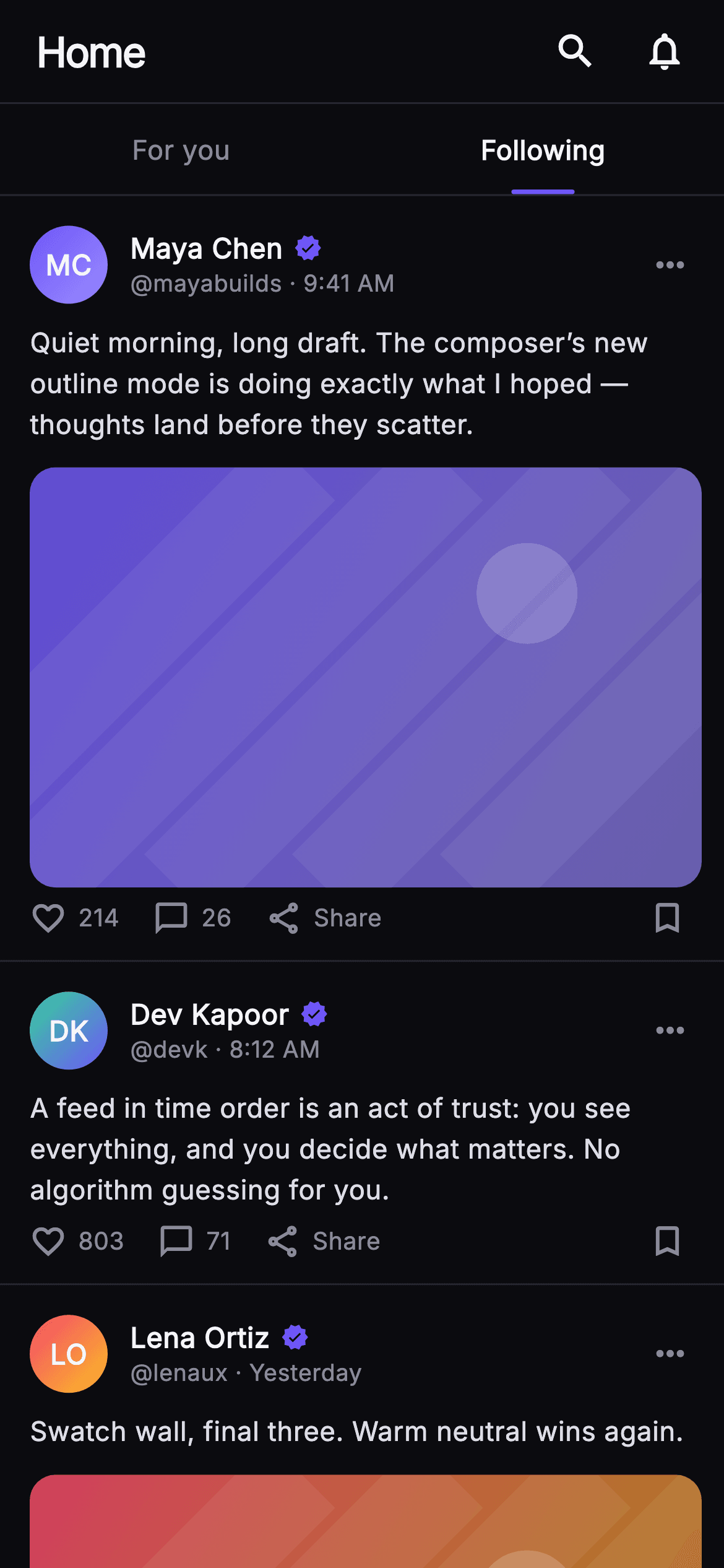
A chronological Following feed makes a promise the algorithmic tab does not: you see every post from the people you follow, in the order they were written, and nothing else. That promise only holds if the screen can also say when it has run out. This tutorial builds Pulse's Following tab in Flutter — a two-column segmented control with the Following side underlined, time-ordered post cards whose media is painted rather than downloaded, a green 'You're all caught up' rule, and a suggested-account nudge below it.
Watch the Flutter UI walkthrough
A short screen recording of Pulse · Following Feed running, if you'd rather see it before you read the code. The written tutorial below covers everything in it.
Can't see the video? Watch it on YouTube.
What you'll build
- ✓A two-column For-you / Following segmented control where the active side is marked by a 34px indigo underline
- ✓Time-ordered post cards driven by a const `_Post` list carrying handle, timestamp, counts and a `hasMedia` flag
- ✓A 'You're all caught up' divider that closes the chronological feed with a green check between two hairline rules
- ✓A suggested-account card that follows the caught-up marker instead of endlessly padding the feed
- ✓Gradient monogram avatars and 16:10 media panels drawn by `CustomPainter`, so the screen runs with zero network images
Step-by-step build
Create the file
Add a new file at lib/social_feed_following/social_feed_following_screen.dart in your Flutter project.
Register the bundled fonts
No external packages — this is pure Flutter. It does bundle its design font (Inter), so drop the font file into fonts/ and declare it in pubspec.yaml:
flutter:
  fonts:
    - family: Inter
      fonts:
- asset: fonts/Inter-Regular.ttfBuild it, piece by piece
Here's how the screen goes together. Each block below is a real slice of the code with a plain-English explanation — paste them in order, or grab the whole file from the next section.
Callbacks, the Pulse palette, and posts as const data
import 'package:flutter/material.dart';

/// Following Feed — the chronological tab of the Pulse home. A top bar, a
/// segmented For-you / Following control (Following active), a strictly
/// time-ordered column of post cards, and a "you're all caught up" inline
/// divider with a suggested-account nudge. Self-contained per CONVENTIONS.md:
/// pure Flutter, bundled Inter font, own dark theme, SafeArea, overflow-proof.
class SocialFeedFollowingScreen extends StatelessWidget {
  const SocialFeedFollowingScreen({
    super.key,
    this.onSwitchTab,
    this.onSearch,
    this.onNotifications,
    this.onPost,
    this.onFollow,
  });

  final VoidCallback? onSwitchTab;
  final VoidCallback? onSearch;
  final VoidCallback? onNotifications;
  final ValueChanged<String>? onPost;
  final ValueChanged<String>? onFollow;

  static const String _font = 'Inter';
  static const Color _bg = Color(0xFF0B0B0F);
  static const Color _surface = Color(0xFF15151B);
  static const Color _brand = Color(0xFF6E56F7);
  static const Color _success = Color(0xFF34D399);
  static const Color _hairline = Color(0xFF26262F);
  static const Color _textHi = Color(0xFFF4F4F7);
  static const Color _muted = Color(0xFF8A8A99);

  static const List<_Post> _posts = <_Post>[
    _Post(
      id: 'f1',
      name: 'Maya Chen',
      handle: 'mayabuilds',
      time: '9:41 AM',
      colorA: 0xFF6E56F7,
      colorB: 0xFF9B8CFF,
      body:
          'Quiet morning, long draft. The composer’s new outline mode is doing '
          'exactly what I hoped — thoughts land before they scatter.',
      likes: 214,
      comments: 26,
      hasMedia: true,
    ),
    _Post(
      id: 'f2',
      name: 'Dev Kapoor',
      handle: 'devk',
      time: '8:12 AM',
      colorA: 0xFF34D399,
      colorB: 0xFF6E56F7,
      body:
          'A feed in time order is an act of trust: you see everything, and you '
          'decide what matters. No algorithm guessing for you.',
      likes: 803,
      comments: 71,
      hasMedia: false,
    ),
    _Post(
      id: 'f3',
      name: 'Lena Ortiz',
      handle: 'lenaux',
      time: 'Yesterday',
      colorA: 0xFFF4476B,
      colorB: 0xFFFBBF24,
      body: 'Swatch wall, final three. Warm neutral wins again.',
      likes: 456,
      comments: 38,
      hasMedia: true,
    ),
  ];
`SocialFeedFollowingScreen` is a `StatelessWidget` whose five callbacks — `onSwitchTab`, `onSearch`, `onNotifications`, `onPost` and `onFollow` — are the screen's only contract with a backend; `onPost` and `onFollow` are `ValueChanged<String>` so they hand back the post id and the handle rather than an index. The palette is Pulse's near-mono dark: `_bg` #0B0B0F under `_surface` #15151B, `_hairline` #26262F for every divider, brand indigo #6E56F7 and `_success` #34D399. The three `_Post` entries are a `static const` list, and their `time` fields read '9:41 AM', '8:12 AM', 'Yesterday' — descending, because a Following feed is sorted by time, not score.
Composing the column and the end of the feed
  @override
  Widget build(BuildContext context) {
    return Theme(
      data: ThemeData.dark(useMaterial3: true),
      child: Scaffold(
        backgroundColor: _bg,
        body: SafeArea(
          child: Column(
            children: <Widget>[
              _TopBar(onSearch: onSearch, onNotifications: onNotifications),
              _SegTabs(onForYou: onSwitchTab),
              Expanded(
                child: ListView(
                  padding: EdgeInsets.zero,
                  children: <Widget>[
                    for (int i = 0; i < _posts.length; i++)
                      _PostCard(
                        post: _posts[i],
                        onTap: () => onPost?.call(_posts[i].id),
                      ),
                    const SizedBox(height: 26),
                    const _CaughtUpDivider(),
                    const SizedBox(height: 22),
                    _SuggestCard(onFollow: onFollow),
                    const SizedBox(height: 28),
                  ],
                ),
              ),
            ],
          ),
        ),
      ),
    );
  }
}
`build` wraps a `Scaffold` in `Theme(data: ThemeData.dark(useMaterial3: true))` so the screen keeps its own dark surface no matter what the host app's theme is. Inside `SafeArea`, a `Column` pins `_TopBar` and `_SegTabs` while only the `ListView` in the `Expanded` scrolls — the tab control must stay reachable when you are ten posts down. The list body is a plain `children` array rather than a builder because the tail is not homogeneous: after a `for` loop over `_posts` come a 26px gap, `_CaughtUpDivider`, a 22px gap and `_SuggestCard`. `padding: EdgeInsets.zero` lets each card's own bottom hairline run edge to edge.
A 56px header that names the surface
class _TopBar extends StatelessWidget {
  const _TopBar({this.onSearch, this.onNotifications});
  final VoidCallback? onSearch;
  final VoidCallback? onNotifications;

  @override
  Widget build(BuildContext context) {
    return Container(
      height: 56,
      padding: const EdgeInsets.fromLTRB(20, 0, 8, 0),
      decoration: const BoxDecoration(
        border: Border(
          bottom: BorderSide(color: SocialFeedFollowingScreen._hairline),
        ),
      ),
      child: Row(
        children: <Widget>[
          const Text(
            'Home',
            style: TextStyle(
              fontFamily: SocialFeedFollowingScreen._font,
              fontSize: 22,
              fontWeight: FontWeight.w800,
              letterSpacing: -0.8,
              color: SocialFeedFollowingScreen._textHi,
            ),
          ),
          const Spacer(),
          IconButton(
            onPressed: onSearch,
            icon: const Icon(Icons.search,
                size: 24, color: SocialFeedFollowingScreen._textHi),
            splashRadius: 22,
          ),
          IconButton(
            onPressed: onNotifications,
            icon: const Icon(Icons.notifications_none,
                size: 24, color: SocialFeedFollowingScreen._textHi),
            splashRadius: 22,
          ),
        ],
      ),
    );
  }
}
`_TopBar` is a fixed 56px `Container` with `EdgeInsets.fromLTRB(20, 0, 8, 0)` — 20px of breathing room on the wordmark side, only 8px on the right because `IconButton` already carries its own 8px of internal padding, so a symmetric value would push the icons visibly inboard. The title is 'Home', not 'Following': the segmented control below is what names the tab, and repeating it here would spend the largest type on the screen saying the same word twice. It sits at 22px `w800` with `letterSpacing: -0.8` for a tight logotype feel, a `Spacer()` shoves search and `notifications_none` right, and a bottom `BorderSide` in `_hairline` seams the bar to the tabs.
The tab switch, and how the active side is marked
class _SegTabs extends StatelessWidget {
  const _SegTabs({this.onForYou});
  final VoidCallback? onForYou;

  @override
  Widget build(BuildContext context) {
    return Container(
      decoration: const BoxDecoration(
        border: Border(
          bottom: BorderSide(color: SocialFeedFollowingScreen._hairline),
        ),
      ),
      child: Row(
        children: <Widget>[
          Expanded(
            child: _Tab(label: 'For you', active: false, onTap: onForYou),
          ),
          Expanded(
            child: _Tab(label: 'Following', active: true, onTap: () {}),
          ),
        ],
      ),
    );
  }
}

class _Tab extends StatelessWidget {
  const _Tab({required this.label, required this.active, this.onTap});
  final String label;
  final bool active;
  final VoidCallback? onTap;

  @override
  Widget build(BuildContext context) {
    return InkWell(
      onTap: onTap,
      child: Column(
        mainAxisSize: MainAxisSize.min,
        children: <Widget>[
          const SizedBox(height: 14),
          Text(
            label,
            style: TextStyle(
              fontFamily: SocialFeedFollowingScreen._font,
              fontSize: 14.5,
              fontWeight: active ? FontWeight.w700 : FontWeight.w500,
              color: active
                  ? SocialFeedFollowingScreen._textHi
                  : SocialFeedFollowingScreen._muted,
            ),
          ),
          const SizedBox(height: 11),
          Container(
            height: 2.5,
            width: 34,
            decoration: BoxDecoration(
              borderRadius: BorderRadius.circular(2),
              color: active
                  ? SocialFeedFollowingScreen._brand
                  : Colors.transparent,
            ),
          ),
        ],
      ),
    );
  }
}
`_SegTabs` is a `Row` of two `Expanded` `_Tab`s, so each takes exactly half the width and the pair reads as one control rather than two links. Selection is not state: `active` is passed literally — `false` for 'For you', `true` for 'Following' — because this screen *is* the Following route, and switching is navigation fired through `onSwitchTab`. The active tab's own `onTap` is an empty closure, which keeps the ink splash without re-navigating to itself. `_Tab` marks selection twice over: weight moves w500 → w700 and colour `_muted` → `_textHi`, then a 34px × 2.5px indigo bar sits below. The inactive tab still renders that bar in `Colors.transparent`, so both labels keep identical heights and nothing shifts on switch.
The post model and one feed card
// ── post card ───────────────────────────────────────────────────────────────
class _Post {
  const _Post({
    required this.id,
    required this.name,
    required this.handle,
    required this.time,
    required this.colorA,
    required this.colorB,
    required this.body,
    required this.likes,
    required this.comments,
    required this.hasMedia,
  });
  final String id;
  final String name;
  final String handle;
  final String time;
  final int colorA;
  final int colorB;
  final String body;
  final int likes;
  final int comments;
  final bool hasMedia;
}

class _PostCard extends StatelessWidget {
  const _PostCard({required this.post, this.onTap});
  final _Post post;
  final VoidCallback? onTap;

  String get _initials {
    final List<String> p = post.name.trim().split(RegExp(r'\s+'));
    if (p.length == 1) return p.first.characters.first.toUpperCase();
    return (p.first[0] + p.last[0]).toUpperCase();
  }

  @override
  Widget build(BuildContext context) {
    return GestureDetector(
      onTap: onTap,
      behavior: HitTestBehavior.opaque,
      child: Container(
        padding: const EdgeInsets.fromLTRB(16, 16, 12, 12),
        decoration: const BoxDecoration(
          border: Border(
            bottom: BorderSide(color: SocialFeedFollowingScreen._hairline),
          ),
        ),
        child: Column(
          crossAxisAlignment: CrossAxisAlignment.start,
          children: <Widget>[
            Row(
              children: <Widget>[
                _Monogram(
                  initials: _initials,
                  colorA: Color(post.colorA),
                  colorB: Color(post.colorB),
                ),
                const SizedBox(width: 12),
                Expanded(
                  child: Column(
                    crossAxisAlignment: CrossAxisAlignment.start,
                    children: <Widget>[
                      Row(
                        children: <Widget>[
                          Flexible(
                            child: Text(
                              post.name,
                              overflow: TextOverflow.ellipsis,
                              style: const TextStyle(
                                fontFamily: SocialFeedFollowingScreen._font,
                                fontSize: 15,
                                fontWeight: FontWeight.w700,
                                color: SocialFeedFollowingScreen._textHi,
                              ),
                            ),
                          ),
                          const SizedBox(width: 6),
                          const Icon(Icons.verified,
                              size: 15, color: SocialFeedFollowingScreen._brand),
                        ],
                      ),
                      Text(
                        '@${post.handle} · ${post.time}',
                        style: const TextStyle(
                          fontFamily: SocialFeedFollowingScreen._font,
                          fontSize: 12.5,
                          color: SocialFeedFollowingScreen._muted,
                        ),
                      ),
                    ],
                  ),
                ),
                const Icon(Icons.more_horiz,
                    color: SocialFeedFollowingScreen._muted, size: 22),
                const SizedBox(width: 6),
              ],
            ),
            const SizedBox(height: 10),
            Text(
              post.body,
              style: const TextStyle(
                fontFamily: SocialFeedFollowingScreen._font,
                fontSize: 14.5,
                height: 1.5,
                color: Color(0xFFDDDDE6),
              ),
            ),
            if (post.hasMedia) ...<Widget>[
              const SizedBox(height: 12),
              ClipRRect(
                borderRadius: BorderRadius.circular(14),
                child: AspectRatio(
                  aspectRatio: 16 / 10,
                  child: CustomPaint(
                    painter:
                        _MediaPainter(Color(post.colorA), Color(post.colorB)),
                    child: const SizedBox.expand(),
                  ),
                ),
              ),
            ],
            const SizedBox(height: 6),
            _ActionBar(likes: post.likes, comments: post.comments),
          ],
        ),
      ),
    );
  }
}
`_Post` is a plain const class — `id`, `name`, `handle`, `time`, two `int` gradient seeds, `body`, `likes`, `comments` and `hasMedia`. Storing colours as ints keeps the list `const`; `_PostCard` inflates them with `Color(post.colorA)` at build. `_initials` splits the name on `RegExp(r'\s+')` and takes first-and-last capitals, falling back to `characters.first` for a one-word name so an emoji or accented grapheme is not sliced mid-cluster. The card is a `GestureDetector` with `HitTestBehavior.opaque`, making the whole row tappable including its padding. The name sits in `Flexible` with `TextOverflow.ellipsis` so a long name truncates before it can shove the verified tick off-screen, and media is a spread `if (post.hasMedia) ...` — absent posts add no empty box.
Action counts and the caught-up marker
class _ActionBar extends StatelessWidget {
  const _ActionBar({required this.likes, required this.comments});
  final int likes;
  final int comments;

  String _fmt(int n) => n >= 1000 ? '${(n / 1000).toStringAsFixed(1)}k' : '$n';

  @override
  Widget build(BuildContext context) {
    return Row(
      children: <Widget>[
        _Action(icon: Icons.favorite_border, label: _fmt(likes)),
        const SizedBox(width: 18),
        _Action(icon: Icons.chat_bubble_outline, label: _fmt(comments)),
        const SizedBox(width: 18),
        const _Action(icon: Icons.share_outlined, label: 'Share'),
        const Spacer(),
        const Icon(Icons.bookmark_border,
            size: 21, color: SocialFeedFollowingScreen._muted),
        const SizedBox(width: 8),
      ],
    );
  }
}

class _Action extends StatelessWidget {
  const _Action({required this.icon, required this.label});
  final IconData icon;
  final String label;

  @override
  Widget build(BuildContext context) {
    return Row(
      children: <Widget>[
        Icon(icon, size: 20, color: SocialFeedFollowingScreen._muted),
        const SizedBox(width: 6),
        Text(
          label,
          style: const TextStyle(
            fontFamily: SocialFeedFollowingScreen._font,
            fontSize: 13,
            fontWeight: FontWeight.w500,
            color: SocialFeedFollowingScreen._muted,
          ),
        ),
      ],
    );
  }
}

// ── caught-up divider ───────────────────────────────────────────────────────
class _CaughtUpDivider extends StatelessWidget {
  const _CaughtUpDivider();

  @override
  Widget build(BuildContext context) {
    return Padding(
      padding: const EdgeInsets.symmetric(horizontal: 20),
      child: Column(
        children: <Widget>[
          Row(
            children: <Widget>[
              const Expanded(
                child: Divider(color: SocialFeedFollowingScreen._hairline),
              ),
              const SizedBox(width: 12),
              const Icon(Icons.check_circle,
                  size: 20, color: SocialFeedFollowingScreen._success),
              const SizedBox(width: 8),
              const Text(
                'You’re all caught up',
                style: TextStyle(
                  fontFamily: SocialFeedFollowingScreen._font,
                  fontSize: 14,
                  fontWeight: FontWeight.w700,
                  color: SocialFeedFollowingScreen._textHi,
                ),
              ),
              const SizedBox(width: 12),
              const Expanded(
                child: Divider(color: SocialFeedFollowingScreen._hairline),
              ),
            ],
          ),
          const SizedBox(height: 8),
          const Text(
            'You’ve seen everything from people you follow.',
            textAlign: TextAlign.center,
            style: TextStyle(
              fontFamily: SocialFeedFollowingScreen._font,
              fontSize: 13,
              color: SocialFeedFollowingScreen._muted,
            ),
          ),
        ],
      ),
    );
  }
}
`_ActionBar._fmt` collapses anything at or above 1000 into one decimal with a 'k' suffix, so 803 stays 803 while a five-figure count never widens the row; below that, the exact number beats the rounding. Like, comment and Share sit left with 18px gaps, a `Spacer()` throws the bookmark to the far edge — saving is a personal act, sharing a social one, and the gap keeps them from being mistaken for each other. `_CaughtUpDivider` is the payoff of a chronological feed: two `Expanded` `Divider`s squeezing a `check_circle` in `_success` green and a w700 label, with 'You've seen everything from people you follow.' underneath. It is inline content, not an empty state — the feed above it still exists.
The suggested-account nudge
class _SuggestCard extends StatelessWidget {
  const _SuggestCard({this.onFollow});
  final ValueChanged<String>? onFollow;

  @override
  Widget build(BuildContext context) {
    return Container(
      margin: const EdgeInsets.symmetric(horizontal: 16),
      padding: const EdgeInsets.all(14),
      decoration: BoxDecoration(
        color: SocialFeedFollowingScreen._surface,
        borderRadius: BorderRadius.circular(16),
        border: Border.all(color: SocialFeedFollowingScreen._hairline),
      ),
      child: Row(
        children: <Widget>[
          const _Monogram(
            initials: 'RS',
            colorA: Color(0xFF9B8CFF),
            colorB: Color(0xFF34D399),
          ),
          const SizedBox(width: 12),
          Expanded(
            child: Column(
              crossAxisAlignment: CrossAxisAlignment.start,
              children: <Widget>[
                const Text(
                  'Riley Shaw',
                  overflow: TextOverflow.ellipsis,
                  style: TextStyle(
                    fontFamily: SocialFeedFollowingScreen._font,
                    fontSize: 14.5,
                    fontWeight: FontWeight.w700,
                    color: SocialFeedFollowingScreen._textHi,
                  ),
                ),
                const SizedBox(height: 2),
                const Text(
                  'Suggested · followed by Maya',
                  overflow: TextOverflow.ellipsis,
                  style: TextStyle(
                    fontFamily: SocialFeedFollowingScreen._font,
                    fontSize: 12.5,
                    color: SocialFeedFollowingScreen._muted,
                  ),
                ),
              ],
            ),
          ),
          const SizedBox(width: 10),
          SizedBox(
            height: 34,
            child: FilledButton(
              onPressed: () => onFollow?.call('rileyshaw'),
              style: FilledButton.styleFrom(
                backgroundColor: SocialFeedFollowingScreen._brand,
                foregroundColor: Colors.white,
                padding: const EdgeInsets.symmetric(horizontal: 18),
                shape: RoundedRectangleBorder(
                  borderRadius: BorderRadius.circular(10),
                ),
              ),
              child: const Text(
                'Follow',
                style: TextStyle(
                  fontFamily: SocialFeedFollowingScreen._font,
                  fontSize: 13,
                  fontWeight: FontWeight.w700,
                ),
              ),
            ),
          ),
        ],
      ),
    );
  }
}
`_SuggestCard` is the only raised element on the screen: `_surface` #15151B, `BorderRadius.circular(16)`, a `_hairline` border and 16px side margins, so it reads as a card floating between the full-bleed post rows rather than another post. Placing it *after* the caught-up divider is the deliberate part — the feed admits it is finished first, then offers a way to extend it, instead of interleaving recommendations among posts you actually subscribed to. The subtitle 'Suggested · followed by Maya' borrows social proof from someone already in the list above. The 34px `FilledButton` is the screen's single filled surface in brand indigo, and its `onPressed` sends the handle string `'rileyshaw'` through `onFollow`, not a widget reference.
Painted avatars and painted media
// ── monogram + media painter ────────────────────────────────────────────────
class _Monogram extends StatelessWidget {
  const _Monogram({
    required this.initials,
    required this.colorA,
    required this.colorB,
  });
  final String initials;
  final Color colorA;
  final Color colorB;

  @override
  Widget build(BuildContext context) {
    return Container(
      width: 42,
      height: 42,
      decoration: BoxDecoration(
        shape: BoxShape.circle,
        gradient: LinearGradient(
          begin: Alignment.topLeft,
          end: Alignment.bottomRight,
          colors: <Color>[colorA, colorB],
        ),
      ),
      child: Center(
        child: Text(
          initials,
          style: const TextStyle(
            fontFamily: SocialFeedFollowingScreen._font,
            fontSize: 15,
            fontWeight: FontWeight.w700,
            color: Colors.white,
          ),
        ),
      ),
    );
  }
}

class _MediaPainter extends CustomPainter {
  _MediaPainter(this.colorA, this.colorB);
  final Color colorA;
  final Color colorB;

  @override
  void paint(Canvas canvas, Size size) {
    final Rect rect = Offset.zero & size;
    canvas.drawRect(
      rect,
      Paint()
        ..shader = LinearGradient(
          begin: Alignment.topLeft,
          end: Alignment.bottomRight,
          colors: <Color>[
            colorA.withValues(alpha: 0.85),
            colorB.withValues(alpha: 0.65),
          ],
        ).createShader(rect),
    );
    final Paint streak = Paint()
      ..color = Colors.white.withValues(alpha: 0.06)
      ..style = PaintingStyle.stroke
      ..strokeWidth = size.width * 0.14;
    for (int i = -1; i < 4; i++) {
      final double x = size.width * (0.22 * i);
      canvas.drawLine(Offset(x, size.height), Offset(x + size.height, 0), streak);
    }
    canvas.drawCircle(
      Offset(size.width * 0.74, size.height * 0.30),
      size.height * 0.12,
      Paint()..color = Colors.white.withValues(alpha: 0.18),
    );
  }

  @override
  bool shouldRepaint(covariant _MediaPainter old) =>
      old.colorA != colorA || old.colorB != colorB;
}
`_Monogram` is a 42px circle with a top-left to bottom-right `LinearGradient` between the post's two seed colours and centred white initials — identity with no avatar URL to cache. `_MediaPainter` fills its rect with the same two colours at `withValues(alpha: 0.85)` and `0.65`, then strokes five diagonal streaks in white at 6% alpha, each `strokeWidth` set to `size.width * 0.14` so the texture scales with the card instead of thinning on a tablet. The loop starts at `i = -1` so the first streak enters from off-canvas and the pattern has no visible start. An 18%-white circle at (0.74, 0.30) reads as a light source. `shouldRepaint` compares both colours, so the canvas is redrawn only when the post changes.
Full code
The complete, ready-to-paste source. Free to use in your projects — one click copies it all.
import 'package:flutter/material.dart';
/// Following Feed — the chronological tab of the Pulse home. A top bar, a
/// segmented For-you / Following control (Following active), a strictly
/// time-ordered column of post cards, and a "you're all caught up" inline
/// divider with a suggested-account nudge. Self-contained per CONVENTIONS.md:
/// pure Flutter, bundled Inter font, own dark theme, SafeArea, overflow-proof.
class SocialFeedFollowingScreen extends StatelessWidget {
const SocialFeedFollowingScreen({
super.key,
this.onSwitchTab,
this.onSearch,
this.onNotifications,
this.onPost,
this.onFollow,
});
final VoidCallback? onSwitchTab;
final VoidCallback? onSearch;
final VoidCallback? onNotifications;
final ValueChanged<String>? onPost;
final ValueChanged<String>? onFollow;
static const String _font = 'Inter';
static const Color _bg = Color(0xFF0B0B0F);
static const Color _surface = Color(0xFF15151B);
static const Color _brand = Color(0xFF6E56F7);
static const Color _success = Color(0xFF34D399);
static const Color _hairline = Color(0xFF26262F);
static const Color _textHi = Color(0xFFF4F4F7);
static const Color _muted = Color(0xFF8A8A99);
static const List<_Post> _posts = <_Post>[
_Post(
id: 'f1',
name: 'Maya Chen',
handle: 'mayabuilds',
time: '9:41 AM',
colorA: 0xFF6E56F7,
colorB: 0xFF9B8CFF,
body:
'Quiet morning, long draft. The composer’s new outline mode is doing '
'exactly what I hoped — thoughts land before they scatter.',
likes: 214,
comments: 26,
hasMedia: true,
),
_Post(
id: 'f2',
name: 'Dev Kapoor',
handle: 'devk',
time: '8:12 AM',
colorA: 0xFF34D399,
colorB: 0xFF6E56F7,
body:
'A feed in time order is an act of trust: you see everything, and you '
'decide what matters. No algorithm guessing for you.',
likes: 803,
comments: 71,
hasMedia: false,
),
_Post(
id: 'f3',
name: 'Lena Ortiz',
handle: 'lenaux',
time: 'Yesterday',
colorA: 0xFFF4476B,
colorB: 0xFFFBBF24,
body: 'Swatch wall, final three. Warm neutral wins again.',
likes: 456,
comments: 38,
hasMedia: true,
),
];
@override
Widget build(BuildContext context) {
return Theme(
data: ThemeData.dark(useMaterial3: true),
child: Scaffold(
backgroundColor: _bg,
body: SafeArea(
child: Column(
children: <Widget>[
_TopBar(onSearch: onSearch, onNotifications: onNotifications),
_SegTabs(onForYou: onSwitchTab),
Expanded(
child: ListView(
padding: EdgeInsets.zero,
children: <Widget>[
for (int i = 0; i < _posts.length; i++)
_PostCard(
post: _posts[i],
onTap: () => onPost?.call(_posts[i].id),
),
const SizedBox(height: 26),
const _CaughtUpDivider(),
const SizedBox(height: 22),
_SuggestCard(onFollow: onFollow),
const SizedBox(height: 28),
],
),
),
],
),
),
),
);
}
}
class _TopBar extends StatelessWidget {
const _TopBar({this.onSearch, this.onNotifications});
final VoidCallback? onSearch;
final VoidCallback? onNotifications;
@override
Widget build(BuildContext context) {
return Container(
height: 56,
padding: const EdgeInsets.fromLTRB(20, 0, 8, 0),
decoration: const BoxDecoration(
border: Border(
bottom: BorderSide(color: SocialFeedFollowingScreen._hairline),
),
),
child: Row(
children: <Widget>[
const Text(
'Home',
style: TextStyle(
fontFamily: SocialFeedFollowingScreen._font,
fontSize: 22,
fontWeight: FontWeight.w800,
letterSpacing: -0.8,
color: SocialFeedFollowingScreen._textHi,
),
),
const Spacer(),
IconButton(
onPressed: onSearch,
icon: const Icon(Icons.search,
size: 24, color: SocialFeedFollowingScreen._textHi),
splashRadius: 22,
),
IconButton(
onPressed: onNotifications,
icon: const Icon(Icons.notifications_none,
size: 24, color: SocialFeedFollowingScreen._textHi),
splashRadius: 22,
),
],
),
);
}
}
class _SegTabs extends StatelessWidget {
const _SegTabs({this.onForYou});
final VoidCallback? onForYou;
@override
Widget build(BuildContext context) {
return Container(
decoration: const BoxDecoration(
border: Border(
bottom: BorderSide(color: SocialFeedFollowingScreen._hairline),
),
),
child: Row(
children: <Widget>[
Expanded(
child: _Tab(label: 'For you', active: false, onTap: onForYou),
),
Expanded(
child: _Tab(label: 'Following', active: true, onTap: () {}),
),
],
),
);
}
}
class _Tab extends StatelessWidget {
const _Tab({required this.label, required this.active, this.onTap});
final String label;
final bool active;
final VoidCallback? onTap;
@override
Widget build(BuildContext context) {
return InkWell(
onTap: onTap,
child: Column(
mainAxisSize: MainAxisSize.min,
children: <Widget>[
const SizedBox(height: 14),
Text(
label,
style: TextStyle(
fontFamily: SocialFeedFollowingScreen._font,
fontSize: 14.5,
fontWeight: active ? FontWeight.w700 : FontWeight.w500,
color: active
? SocialFeedFollowingScreen._textHi
: SocialFeedFollowingScreen._muted,
),
),
const SizedBox(height: 11),
Container(
height: 2.5,
width: 34,
decoration: BoxDecoration(
borderRadius: BorderRadius.circular(2),
color: active
? SocialFeedFollowingScreen._brand
: Colors.transparent,
),
),
],
),
);
}
}
// ── post card ───────────────────────────────────────────────────────────────
class _Post {
const _Post({
required this.id,
required this.name,
required this.handle,
required this.time,
required this.colorA,
required this.colorB,
required this.body,
required this.likes,
required this.comments,
required this.hasMedia,
});
final String id;
final String name;
final String handle;
final String time;
final int colorA;
final int colorB;
final String body;
final int likes;
final int comments;
final bool hasMedia;
}
class _PostCard extends StatelessWidget {
const _PostCard({required this.post, this.onTap});
final _Post post;
final VoidCallback? onTap;
String get _initials {
final List<String> p = post.name.trim().split(RegExp(r'\s+'));
if (p.length == 1) return p.first.characters.first.toUpperCase();
return (p.first[0] + p.last[0]).toUpperCase();
}
@override
Widget build(BuildContext context) {
return GestureDetector(
onTap: onTap,
behavior: HitTestBehavior.opaque,
child: Container(
padding: const EdgeInsets.fromLTRB(16, 16, 12, 12),
decoration: const BoxDecoration(
border: Border(
bottom: BorderSide(color: SocialFeedFollowingScreen._hairline),
),
),
child: Column(
crossAxisAlignment: CrossAxisAlignment.start,
children: <Widget>[
Row(
children: <Widget>[
_Monogram(
initials: _initials,
colorA: Color(post.colorA),
colorB: Color(post.colorB),
),
const SizedBox(width: 12),
Expanded(
child: Column(
crossAxisAlignment: CrossAxisAlignment.start,
children: <Widget>[
Row(
children: <Widget>[
Flexible(
child: Text(
post.name,
overflow: TextOverflow.ellipsis,
style: const TextStyle(
fontFamily: SocialFeedFollowingScreen._font,
fontSize: 15,
fontWeight: FontWeight.w700,
color: SocialFeedFollowingScreen._textHi,
),
),
),
const SizedBox(width: 6),
const Icon(Icons.verified,
size: 15, color: SocialFeedFollowingScreen._brand),
],
),
Text(
'@${post.handle} · ${post.time}',
style: const TextStyle(
fontFamily: SocialFeedFollowingScreen._font,
fontSize: 12.5,
color: SocialFeedFollowingScreen._muted,
),
),
],
),
),
const Icon(Icons.more_horiz,
color: SocialFeedFollowingScreen._muted, size: 22),
const SizedBox(width: 6),
],
),
const SizedBox(height: 10),
Text(
post.body,
style: const TextStyle(
fontFamily: SocialFeedFollowingScreen._font,
fontSize: 14.5,
height: 1.5,
color: Color(0xFFDDDDE6),
),
),
if (post.hasMedia) ...<Widget>[
const SizedBox(height: 12),
ClipRRect(
borderRadius: BorderRadius.circular(14),
child: AspectRatio(
aspectRatio: 16 / 10,
child: CustomPaint(
painter:
_MediaPainter(Color(post.colorA), Color(post.colorB)),
child: const SizedBox.expand(),
),
),
),
],
const SizedBox(height: 6),
_ActionBar(likes: post.likes, comments: post.comments),
],
),
),
);
}
}
class _ActionBar extends StatelessWidget {
const _ActionBar({required this.likes, required this.comments});
final int likes;
final int comments;
String _fmt(int n) => n >= 1000 ? '${(n / 1000).toStringAsFixed(1)}k' : '$n';
@override
Widget build(BuildContext context) {
return Row(
children: <Widget>[
_Action(icon: Icons.favorite_border, label: _fmt(likes)),
const SizedBox(width: 18),
_Action(icon: Icons.chat_bubble_outline, label: _fmt(comments)),
const SizedBox(width: 18),
const _Action(icon: Icons.share_outlined, label: 'Share'),
const Spacer(),
const Icon(Icons.bookmark_border,
size: 21, color: SocialFeedFollowingScreen._muted),
const SizedBox(width: 8),
],
);
}
}
class _Action extends StatelessWidget {
const _Action({required this.icon, required this.label});
final IconData icon;
final String label;
@override
Widget build(BuildContext context) {
return Row(
children: <Widget>[
Icon(icon, size: 20, color: SocialFeedFollowingScreen._muted),
const SizedBox(width: 6),
Text(
label,
style: const TextStyle(
fontFamily: SocialFeedFollowingScreen._font,
fontSize: 13,
fontWeight: FontWeight.w500,
color: SocialFeedFollowingScreen._muted,
),
),
],
);
}
}
// ── caught-up divider ───────────────────────────────────────────────────────
class _CaughtUpDivider extends StatelessWidget {
const _CaughtUpDivider();
@override
Widget build(BuildContext context) {
return Padding(
padding: const EdgeInsets.symmetric(horizontal: 20),
child: Column(
children: <Widget>[
Row(
children: <Widget>[
const Expanded(
child: Divider(color: SocialFeedFollowingScreen._hairline),
),
const SizedBox(width: 12),
const Icon(Icons.check_circle,
size: 20, color: SocialFeedFollowingScreen._success),
const SizedBox(width: 8),
const Text(
'You’re all caught up',
style: TextStyle(
fontFamily: SocialFeedFollowingScreen._font,
fontSize: 14,
fontWeight: FontWeight.w700,
color: SocialFeedFollowingScreen._textHi,
),
),
const SizedBox(width: 12),
const Expanded(
child: Divider(color: SocialFeedFollowingScreen._hairline),
),
],
),
const SizedBox(height: 8),
const Text(
'You’ve seen everything from people you follow.',
textAlign: TextAlign.center,
style: TextStyle(
fontFamily: SocialFeedFollowingScreen._font,
fontSize: 13,
color: SocialFeedFollowingScreen._muted,
),
),
],
),
);
}
}
class _SuggestCard extends StatelessWidget {
const _SuggestCard({this.onFollow});
final ValueChanged<String>? onFollow;
@override
Widget build(BuildContext context) {
return Container(
margin: const EdgeInsets.symmetric(horizontal: 16),
padding: const EdgeInsets.all(14),
decoration: BoxDecoration(
color: SocialFeedFollowingScreen._surface,
borderRadius: BorderRadius.circular(16),
border: Border.all(color: SocialFeedFollowingScreen._hairline),
),
child: Row(
children: <Widget>[
const _Monogram(
initials: 'RS',
colorA: Color(0xFF9B8CFF),
colorB: Color(0xFF34D399),
),
const SizedBox(width: 12),
Expanded(
child: Column(
crossAxisAlignment: CrossAxisAlignment.start,
children: <Widget>[
const Text(
'Riley Shaw',
overflow: TextOverflow.ellipsis,
style: TextStyle(
fontFamily: SocialFeedFollowingScreen._font,
fontSize: 14.5,
fontWeight: FontWeight.w700,
color: SocialFeedFollowingScreen._textHi,
),
),
const SizedBox(height: 2),
const Text(
'Suggested · followed by Maya',
overflow: TextOverflow.ellipsis,
style: TextStyle(
fontFamily: SocialFeedFollowingScreen._font,
fontSize: 12.5,
color: SocialFeedFollowingScreen._muted,
),
),
],
),
),
const SizedBox(width: 10),
SizedBox(
height: 34,
child: FilledButton(
onPressed: () => onFollow?.call('rileyshaw'),
style: FilledButton.styleFrom(
backgroundColor: SocialFeedFollowingScreen._brand,
foregroundColor: Colors.white,
padding: const EdgeInsets.symmetric(horizontal: 18),
shape: RoundedRectangleBorder(
borderRadius: BorderRadius.circular(10),
),
),
child: const Text(
'Follow',
style: TextStyle(
fontFamily: SocialFeedFollowingScreen._font,
fontSize: 13,
fontWeight: FontWeight.w700,
),
),
),
),
],
),
);
}
}
// ── monogram + media painter ────────────────────────────────────────────────
class _Monogram extends StatelessWidget {
const _Monogram({
required this.initials,
required this.colorA,
required this.colorB,
});
final String initials;
final Color colorA;
final Color colorB;
@override
Widget build(BuildContext context) {
return Container(
width: 42,
height: 42,
decoration: BoxDecoration(
shape: BoxShape.circle,
gradient: LinearGradient(
begin: Alignment.topLeft,
end: Alignment.bottomRight,
colors: <Color>[colorA, colorB],
),
),
child: Center(
child: Text(
initials,
style: const TextStyle(
fontFamily: SocialFeedFollowingScreen._font,
fontSize: 15,
fontWeight: FontWeight.w700,
color: Colors.white,
),
),
),
);
}
}
class _MediaPainter extends CustomPainter {
_MediaPainter(this.colorA, this.colorB);
final Color colorA;
final Color colorB;
@override
void paint(Canvas canvas, Size size) {
final Rect rect = Offset.zero & size;
canvas.drawRect(
rect,
Paint()
..shader = LinearGradient(
begin: Alignment.topLeft,
end: Alignment.bottomRight,
colors: <Color>[
colorA.withValues(alpha: 0.85),
colorB.withValues(alpha: 0.65),
],
).createShader(rect),
);
final Paint streak = Paint()
..color = Colors.white.withValues(alpha: 0.06)
..style = PaintingStyle.stroke
..strokeWidth = size.width * 0.14;
for (int i = -1; i < 4; i++) {
final double x = size.width * (0.22 * i);
canvas.drawLine(Offset(x, size.height), Offset(x + size.height, 0), streak);
}
canvas.drawCircle(
Offset(size.width * 0.74, size.height * 0.30),
size.height * 0.12,
Paint()..color = Colors.white.withValues(alpha: 0.18),
);
}
@override
bool shouldRepaint(covariant _MediaPainter old) =>
old.colorA != colorA || old.colorB != colorB;
}
Plus bundled 1 binary asset (fonts/images). The CLI and MCP install those for you automatically.
Two faster ways to add it
Copy-paste works, but you can skip it entirely.
1. FlutterKit CLI
One command drops this screen — and its fonts — straight into your project.
$ flutterkit add social-feed-following2. AI agent (MCP)
Connect FlutterKit's MCP server in Claude or Cursor and just ask your agent to install social-feed-following — it fetches and writes the files for you.
FAQ
Is this Following feed screen free to use in a commercial app?
Yes. FlutterKit is free — there is no paid tier, no licence key and no sign-up. Copy the Dart from this page, install it with the CLI, or pull it through MCP, and ship it in a product you charge for. Attribution is not required.
How do I make the For-you / Following tabs actually switch feeds?
Keep them as routes. `_SegTabs` hardcodes `active: true` on Following and fires `onSwitchTab` from the For-you side, so the host decides what happens — push the For-you screen, or swap the body of a parent widget. If you would rather hold both in one widget, lift a `String _tab` into a `StatefulWidget` and pass `active: _tab == 'following'` to each `_Tab`.
How do I swap the painted media for real photos?
Replace the `CustomPaint` inside the `ClipRRect` with your image widget and leave the `AspectRatio(aspectRatio: 16 / 10)` in place, so cards keep the same rhythm whatever the source image's dimensions are. Keeping `_MediaPainter` as the `loadingBuilder` or `errorBuilder` gives you a coloured placeholder that already matches each post's gradient.
Does it need any packages or a font file?
No packages — it is pure `flutter/material`, and every avatar and media panel is drawn with `CustomPainter` rather than fetched. The one asset is Inter, referenced as `fontFamily: 'Inter'`; bundle it under `flutter: fonts:` in `pubspec.yaml`, or delete the `fontFamily` lines to fall back to the platform default.
Which Flutter version does this need?
Flutter 3.22 or newer, because `_MediaPainter` uses `Color.withValues(alpha: 0.85)` and the constructor uses the `super.key` parameter form. On an older SDK swap each call for `withOpacity(...)` and expand the constructor to `{Key? key, ...}) : super(key: key)`.


