How to Build a Social Home Feed Screen in Flutter (Full Code + Preview)
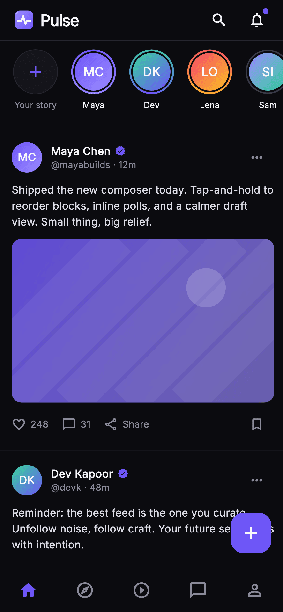
A social app's home tab has to carry the entire product in one scroll — who is posting stories right now, what the feed looks like, and where every other tab lives. This tutorial builds Pulse's home feed in Flutter as one self-contained dark screen: a 56px brand bar with an unread dot, a 120px stories rail whose unseen rings are painted with a SweepGradient, three post cards covering text, single-image and two-up media, an end-of-feed state, and a five-tab nav with a floating composer. No network images, no packages.
Watch the Flutter UI walkthrough
A short screen recording of Pulse · Home Feed running, if you'd rather see it before you read the code. The written tutorial below covers everything in it.
Can't see the video? Watch it on YouTube.
What you'll build
- ✓A horizontal stories rail built from ListView.separated with a 'Your story' tile injected at index 0
- ✓Story avatars whose unseen ring is a SweepGradient stroke and whose seen ring is a flat grey one
- ✓Post cards that switch between no media, a 16:10 painted gradient and a two-up split, driven by one enum
- ✓Like and comment counts abbreviated to '1.1k' by a three-line formatter, with share and bookmark alongside
- ✓A five-tab bottom nav plus a squircle FloatingActionButton, both routing through injected callbacks
Step-by-step build
Create the file
Add a new file at lib/social_feed_home/social_feed_home_screen.dart in your Flutter project.
Register the bundled fonts
No external packages — this is pure Flutter. It does bundle its design font (Inter), so drop the font file into fonts/ and declare it in pubspec.yaml:
flutter:
  fonts:
    - family: Inter
      fonts:
- asset: fonts/Inter-Regular.ttfBuild it, piece by piece
Here's how the screen goes together. Each block below is a real slice of the code with a plain-English explanation — paste them in order, or grab the whole file from the next section.
The screen contract, palette and story fixtures
import 'dart:math' as math;

import 'package:flutter/material.dart';

/// Home Feed — the Pulse app shell and Home tab. A sticky brand top bar, a
/// horizontal stories rail with painted gradient unseen-rings, an infinite
/// column of post cards (text / photo / multi), and the 5-tab bottom nav with a
/// floating compose button. This is the post-onboarding app root; every action
/// is exposed as a callback so the gallery registry wires navigation and the
/// tab switch. Self-contained per CONVENTIONS.md: pure Flutter, bundled Inter
/// font, own dark theme, SafeArea, fully overflow-proof.
class SocialFeedHomeScreen extends StatelessWidget {
  const SocialFeedHomeScreen({
    super.key,
    this.onTab,
    this.onCompose,
    this.onSearch,
    this.onNotifications,
    this.onStory,
    this.onPost,
    this.onProfile,
  });

  /// Bottom-nav tab tap: 0 Home · 1 Explore · 2 Reels · 3 Chats · 4 Profile.
  final ValueChanged<int>? onTab;
  final VoidCallback? onCompose;
  final VoidCallback? onSearch;
  final VoidCallback? onNotifications;

  /// A story ring tap (index into the rail).
  final ValueChanged<int>? onStory;

  /// A post tap (post id).
  final ValueChanged<String>? onPost;
  final VoidCallback? onProfile;

  static const String _font = 'Inter';
  static const Color _bg = Color(0xFF0B0B0F);
  static const Color _brand = Color(0xFF6E56F7);
  static const Color _hairline = Color(0xFF26262F);
  static const Color _textHi = Color(0xFFF4F4F7);
  static const Color _muted = Color(0xFF8A8A99);

  static const List<_Story> _stories = <_Story>[
    _Story('Maya Chen', 0xFF6E56F7, 0xFF9B8CFF, unseen: true),
    _Story('Dev Kapoor', 0xFF34D399, 0xFF6E56F7, unseen: true),
    _Story('Lena Ortiz', 0xFFF4476B, 0xFFFBBF24, unseen: true),
    _Story('Sam Ito', 0xFF9B8CFF, 0xFF34D399, unseen: false),
    _Story('Priya N', 0xFFFBBF24, 0xFFF4476B, unseen: true),
    _Story('Theo B', 0xFF6E56F7, 0xFF34D399, unseen: false),
  ];
`SocialFeedHomeScreen` is a `StatelessWidget` that owns no state at all — every interaction leaves through one of seven callbacks (`onTab`, `onCompose`, `onSearch`, `onNotifications`, `onStory`, `onPost`, `onProfile`), so the host app decides what navigation means. The palette is five constants: `_bg` at `#0B0B0F` is near-black rather than pure black so the `#26262F` hairlines still read; `_brand` indigo `#6E56F7` is spent only on the active tab, the verified tick, the unread dot and the FAB. `_stories` stores its two ring colours as raw `int` values instead of `Color` objects, which is what lets the whole list stay `const`.
Three posts, and the shell that stacks everything
  static const List<_Post> _posts = <_Post>[
    _Post(
      id: 'p1',
      name: 'Maya Chen',
      handle: 'mayabuilds',
      time: '12m',
      colorA: 0xFF6E56F7,
      colorB: 0xFF9B8CFF,
      body:
          'Shipped the new composer today. Tap-and-hold to reorder blocks, '
          'inline polls, and a calmer draft view. Small thing, big relief.',
      likes: 248,
      comments: 31,
      media: _MediaKind.gradient,
    ),
    _Post(
      id: 'p2',
      name: 'Dev Kapoor',
      handle: 'devk',
      time: '48m',
      colorA: 0xFF34D399,
      colorB: 0xFF6E56F7,
      body:
          'Reminder: the best feed is the one you curate. Unfollow noise, '
          'follow craft. Your future self scrolls with intention.',
      likes: 1120,
      comments: 96,
      media: _MediaKind.none,
    ),
    _Post(
      id: 'p3',
      name: 'Lena Ortiz',
      handle: 'lenaux',
      time: '2h',
      colorA: 0xFFF4476B,
      colorB: 0xFFFBBF24,
      body: 'Golden hour on the studio wall. Three swatches made the cut.',
      likes: 542,
      comments: 44,
      media: _MediaKind.multi,
    ),
  ];

  @override
  Widget build(BuildContext context) {
    return Theme(
      data: ThemeData.dark(useMaterial3: true),
      child: Scaffold(
        backgroundColor: _bg,
        body: SafeArea(
          bottom: false,
          child: Column(
            children: <Widget>[
              const _TopBar(),
              Expanded(
                child: ListView(
                  padding: EdgeInsets.zero,
                  children: <Widget>[
                    _StoriesRail(
                      stories: _stories,
                      onTap: onStory,
                    ),
                    const Divider(height: 1, color: _hairline),
                    for (int i = 0; i < _posts.length; i++)
                      _PostCard(
                        post: _posts[i],
                        onTap: () => onPost?.call(_posts[i].id),
                      ),
                    const SizedBox(height: 24),
                    const _CaughtUp(),
                    const SizedBox(height: 24),
                  ],
                ),
              ),
            ],
          ),
        ),
        floatingActionButton: Padding(
          padding: const EdgeInsets.only(bottom: 4),
          child: FloatingActionButton(
            onPressed: onCompose,
            backgroundColor: _brand,
            elevation: 0,
            shape: RoundedRectangleBorder(
              borderRadius: BorderRadius.circular(18),
            ),
            child: const Icon(Icons.add, color: Colors.white, size: 28),
          ),
        ),
        bottomNavigationBar: _PulseNavBar(
          current: 0,
          onTab: onTab,
          onProfile: onProfile,
        ),
      ),
    );
  }
}
The `_posts` fixtures are chosen to exercise all three `_MediaKind` branches — a gradient photo, a plain text post, a multi-image post — so the layout is proven against every shape it can receive. `build` wraps a `Theme(data: ThemeData.dark(useMaterial3: true))` around the `Scaffold` so the screen keeps its own dark styling regardless of the host app's theme. `SafeArea(bottom: false)` guards the notch but leaves the bottom inset alone, because `_PulseNavBar` handles that itself. The `_TopBar` sits outside the `Expanded` `ListView`, which is what makes it sticky, and each `_PostCard` closes over `_posts[i].id` so `onPost` reports which post was tapped.
The brand bar and its unread dot
class _TopBar extends StatelessWidget {
  const _TopBar();

  @override
  Widget build(BuildContext context) {
    return Container(
      height: 56,
      padding: const EdgeInsets.fromLTRB(20, 0, 12, 0),
      decoration: const BoxDecoration(
        color: SocialFeedHomeScreen._bg,
        border: Border(
          bottom: BorderSide(color: SocialFeedHomeScreen._hairline),
        ),
      ),
      child: Row(
        children: <Widget>[
          SizedBox(
            width: 26,
            height: 26,
            child: CustomPaint(painter: _PulseMarkPainter()),
          ),
          const SizedBox(width: 10),
          const Text(
            'Pulse',
            style: TextStyle(
              fontFamily: SocialFeedHomeScreen._font,
              fontSize: 22,
              fontWeight: FontWeight.w800,
              letterSpacing: -0.8,
              color: SocialFeedHomeScreen._textHi,
            ),
          ),
          const Spacer(),
          _CircleIcon(icon: Icons.search, onTap: () {}),
          const SizedBox(width: 4),
          Stack(
            clipBehavior: Clip.none,
            children: <Widget>[
              _CircleIcon(icon: Icons.notifications_none, onTap: () {}),
              Positioned(
                right: 8,
                top: 8,
                child: Container(
                  width: 8,
                  height: 8,
                  decoration: const BoxDecoration(
                    color: SocialFeedHomeScreen._brand,
                    shape: BoxShape.circle,
                  ),
                ),
              ),
            ],
          ),
        ],
      ),
    );
  }
}

class _CircleIcon extends StatelessWidget {
  const _CircleIcon({required this.icon, required this.onTap});
  final IconData icon;
  final VoidCallback onTap;

  @override
  Widget build(BuildContext context) {
    return IconButton(
      onPressed: onTap,
      icon: Icon(icon, size: 24, color: SocialFeedHomeScreen._textHi),
      splashRadius: 22,
    );
  }
}
A fixed 56px `Container` with a bottom `BorderSide` hairline holds a 26px `CustomPaint` logo, the 'Pulse' wordmark at 22px `w800` with `letterSpacing: -0.8` for that tightly-set product feel, then a `Spacer` pushing the two circle icons right. The notification badge is a `Stack` with `clipBehavior: Clip.none` and an 8px brand circle `Positioned(right: 8, top: 8)` — the `IconButton`'s own splash padding means the dot has to be inset from the corner to land on the bell glyph rather than beside it. Note the two `_CircleIcon`s are wired to empty `() {}` closures here, so pass `onSearch` and `onNotifications` through if you want them live.
The stories rail, from add-tile to painted ring
// ── stories rail ────────────────────────────────────────────────────────────
class _Story {
  const _Story(this.name, this.colorA, this.colorB, {required this.unseen});
  final String name;
  final int colorA;
  final int colorB;
  final bool unseen;
}

class _StoriesRail extends StatelessWidget {
  const _StoriesRail({required this.stories, this.onTap});
  final List<_Story> stories;
  final ValueChanged<int>? onTap;

  @override
  Widget build(BuildContext context) {
    return SizedBox(
      height: 120,
      child: ListView.separated(
        scrollDirection: Axis.horizontal,
        padding: const EdgeInsets.fromLTRB(16, 12, 16, 12),
        itemCount: stories.length + 1,
        separatorBuilder: (BuildContext context, int _) =>
            const SizedBox(width: 14),
        itemBuilder: (BuildContext context, int i) {
          if (i == 0) {
            return const _AddStoryTile();
          }
          final _Story s = stories[i - 1];
          return _StoryItem(story: s, onTap: () => onTap?.call(i - 1));
        },
      ),
    );
  }
}

class _AddStoryTile extends StatelessWidget {
  const _AddStoryTile();

  @override
  Widget build(BuildContext context) {
    return SizedBox(
      width: 66,
      child: Column(
        children: <Widget>[
          Container(
            width: 62,
            height: 62,
            decoration: BoxDecoration(
              color: const Color(0xFF15151B),
              shape: BoxShape.circle,
              border: Border.all(color: SocialFeedHomeScreen._hairline),
            ),
            child: const Icon(Icons.add,
                color: SocialFeedHomeScreen._brand, size: 26),
          ),
          const SizedBox(height: 7),
          const Text(
            'Your story',
            maxLines: 1,
            overflow: TextOverflow.ellipsis,
            style: TextStyle(
              fontFamily: SocialFeedHomeScreen._font,
              fontSize: 11.5,
              color: SocialFeedHomeScreen._muted,
            ),
          ),
        ],
      ),
    );
  }
}

class _StoryItem extends StatelessWidget {
  const _StoryItem({required this.story, this.onTap});
  final _Story story;
  final VoidCallback? onTap;

  String get _initials {
    final List<String> p = story.name.trim().split(RegExp(r'\s+'));
    if (p.length == 1) return p.first.characters.first.toUpperCase();
    return (p.first[0] + p.last[0]).toUpperCase();
  }

  @override
  Widget build(BuildContext context) {
    return GestureDetector(
      onTap: onTap,
      behavior: HitTestBehavior.opaque,
      child: SizedBox(
        width: 66,
        child: Column(
          children: <Widget>[
            SizedBox(
              width: 62,
              height: 62,
              child: CustomPaint(
                painter: _RingAvatarPainter(
                  colorA: Color(story.colorA),
                  colorB: Color(story.colorB),
                  unseen: story.unseen,
                ),
                child: Center(
                  child: Container(
                    width: 52,
                    height: 52,
                    decoration: BoxDecoration(
                      shape: BoxShape.circle,
                      gradient: LinearGradient(
                        begin: Alignment.topLeft,
                        end: Alignment.bottomRight,
                        colors: <Color>[
                          Color(story.colorA),
                          Color(story.colorB),
                        ],
                      ),
                    ),
                    child: Center(
                      child: Text(
                        _initials,
                        style: const TextStyle(
                          fontFamily: SocialFeedHomeScreen._font,
                          fontSize: 17,
                          fontWeight: FontWeight.w700,
                          color: Colors.white,
                        ),
                      ),
                    ),
                  ),
                ),
              ),
            ),
            const SizedBox(height: 7),
            Text(
              story.name.split(' ').first,
              maxLines: 1,
              overflow: TextOverflow.ellipsis,
              style: const TextStyle(
                fontFamily: SocialFeedHomeScreen._font,
                fontSize: 11.5,
                color: SocialFeedHomeScreen._textHi,
              ),
            ),
          ],
        ),
      ),
    );
  }
}
The rail is a 120px `SizedBox` around a horizontal `ListView.separated` with `itemCount: stories.length + 1`. Index 0 is special-cased to `_AddStoryTile`, and every later item reads `stories[i - 1]` and reports `onTap?.call(i - 1)` — that single offset is what lets the compose affordance live inside the same scrollable as the real stories instead of being pinned outside it. `separatorBuilder` supplies the 14px gaps so no tile carries trailing padding. `_StoryItem` puts a 62px `CustomPaint` ring around a 52px gradient circle; the 5px difference is the visible gap between ring and avatar. `_initials` splits on `RegExp(r'\s+')` and falls back to `characters.first` for a single-word name, so an emoji or accented first letter is never sliced mid-grapheme. The label prints only `story.name.split(' ').first`, ellipsised, so a long surname cannot widen a 66px tile.
The post model and the card that renders it
// ── post card ───────────────────────────────────────────────────────────────
enum _MediaKind { none, gradient, multi }

class _Post {
  const _Post({
    required this.id,
    required this.name,
    required this.handle,
    required this.time,
    required this.colorA,
    required this.colorB,
    required this.body,
    required this.likes,
    required this.comments,
    required this.media,
  });
  final String id;
  final String name;
  final String handle;
  final String time;
  final int colorA;
  final int colorB;
  final String body;
  final int likes;
  final int comments;
  final _MediaKind media;
}

class _PostCard extends StatelessWidget {
  const _PostCard({required this.post, this.onTap});
  final _Post post;
  final VoidCallback? onTap;

  String get _initials {
    final List<String> p = post.name.trim().split(RegExp(r'\s+'));
    if (p.length == 1) return p.first.characters.first.toUpperCase();
    return (p.first[0] + p.last[0]).toUpperCase();
  }

  @override
  Widget build(BuildContext context) {
    return GestureDetector(
      onTap: onTap,
      behavior: HitTestBehavior.opaque,
      child: Container(
        padding: const EdgeInsets.fromLTRB(16, 16, 12, 12),
        decoration: const BoxDecoration(
          border: Border(
            bottom: BorderSide(color: SocialFeedHomeScreen._hairline),
          ),
        ),
        child: Column(
          crossAxisAlignment: CrossAxisAlignment.start,
          children: <Widget>[
            Row(
              children: <Widget>[
                _Monogram(
                  initials: _initials,
                  colorA: Color(post.colorA),
                  colorB: Color(post.colorB),
                  size: 42,
                ),
                const SizedBox(width: 12),
                Expanded(
                  child: Column(
                    crossAxisAlignment: CrossAxisAlignment.start,
                    children: <Widget>[
                      Row(
                        children: <Widget>[
                          Flexible(
                            child: Text(
                              post.name,
                              overflow: TextOverflow.ellipsis,
                              style: const TextStyle(
                                fontFamily: SocialFeedHomeScreen._font,
                                fontSize: 15,
                                fontWeight: FontWeight.w700,
                                color: SocialFeedHomeScreen._textHi,
                              ),
                            ),
                          ),
                          const SizedBox(width: 6),
                          const Icon(Icons.verified,
                              size: 15, color: SocialFeedHomeScreen._brand),
                        ],
                      ),
                      Text(
                        '@${post.handle} · ${post.time}',
                        style: const TextStyle(
                          fontFamily: SocialFeedHomeScreen._font,
                          fontSize: 12.5,
                          color: SocialFeedHomeScreen._muted,
                        ),
                      ),
                    ],
                  ),
                ),
                IconButton(
                  onPressed: () {},
                  icon: const Icon(Icons.more_horiz,
                      color: SocialFeedHomeScreen._muted, size: 22),
                  splashRadius: 20,
                ),
              ],
            ),
            const SizedBox(height: 10),
            Text(
              post.body,
              style: const TextStyle(
                fontFamily: SocialFeedHomeScreen._font,
                fontSize: 14.5,
                height: 1.5,
                color: Color(0xFFDDDDE6),
              ),
            ),
            if (post.media != _MediaKind.none) ...<Widget>[
              const SizedBox(height: 12),
              _PostMedia(post: post),
            ],
            const SizedBox(height: 6),
            _ActionBar(likes: post.likes, comments: post.comments),
          ],
        ),
      ),
    );
  }
}
`_MediaKind` is a three-value enum — `none`, `gradient`, `multi` — and it is the only switch the card needs to decide whether media appears at all. `_PostCard` separates itself from its neighbour with a bottom hairline instead of elevation or margin, so the feed reads as one continuous column rather than a stack of floating cards. In the name row the text is `Flexible` while `Icons.verified` is not, so a long display name ellipsises and the tick stays visible instead of being pushed off-screen. Body copy is 14.5px at `height: 1.5` in `#DDDDE6`, a step below `_textHi`, which keeps the author's name the brightest thing in the card. The media block is spread with `if (post.media != _MediaKind.none) ...<Widget>[...]`, so a text-only post never leaves a 12px orphan gap.
Two media layouts and the action bar
class _PostMedia extends StatelessWidget {
  const _PostMedia({required this.post});
  final _Post post;

  @override
  Widget build(BuildContext context) {
    if (post.media == _MediaKind.multi) {
      return ClipRRect(
        borderRadius: BorderRadius.circular(14),
        child: SizedBox(
          height: 150,
          child: Row(
            children: <Widget>[
              Expanded(
                child: CustomPaint(
                  painter: _MediaPainter(Color(post.colorA), Color(post.colorB)),
                  child: const SizedBox.expand(),
                ),
              ),
              const SizedBox(width: 3),
              Expanded(
                child: CustomPaint(
                  painter: _MediaPainter(Color(post.colorB), Color(post.colorA)),
                  child: const SizedBox.expand(),
                ),
              ),
            ],
          ),
        ),
      );
    }
    return ClipRRect(
      borderRadius: BorderRadius.circular(14),
      child: AspectRatio(
        aspectRatio: 16 / 10,
        child: CustomPaint(
          painter: _MediaPainter(Color(post.colorA), Color(post.colorB)),
          child: const SizedBox.expand(),
        ),
      ),
    );
  }
}

class _ActionBar extends StatelessWidget {
  const _ActionBar({required this.likes, required this.comments});
  final int likes;
  final int comments;

  String _fmt(int n) =>
      n >= 1000 ? '${(n / 1000).toStringAsFixed(1)}k' : '$n';

  @override
  Widget build(BuildContext context) {
    return Row(
      children: <Widget>[
        _Action(icon: Icons.favorite_border, label: _fmt(likes)),
        const SizedBox(width: 18),
        _Action(icon: Icons.chat_bubble_outline, label: _fmt(comments)),
        const SizedBox(width: 18),
        const _Action(icon: Icons.share_outlined, label: 'Share'),
        const Spacer(),
        IconButton(
          onPressed: () {},
          icon: const Icon(Icons.bookmark_border,
              size: 21, color: SocialFeedHomeScreen._muted),
          splashRadius: 20,
        ),
      ],
    );
  }
}

class _Action extends StatelessWidget {
  const _Action({required this.icon, required this.label});
  final IconData icon;
  final String label;

  @override
  Widget build(BuildContext context) {
    return Row(
      children: <Widget>[
        Icon(icon, size: 20, color: SocialFeedHomeScreen._muted),
        const SizedBox(width: 6),
        Text(
          label,
          style: const TextStyle(
            fontFamily: SocialFeedHomeScreen._font,
            fontSize: 13,
            fontWeight: FontWeight.w500,
            color: SocialFeedHomeScreen._muted,
          ),
        ),
      ],
    );
  }
}
`_PostMedia` returns one of two shapes. `multi` is a fixed 150px `Row` of two `Expanded` painters split by a 3px gutter, with `colorA` and `colorB` swapped on the second so the pair looks like two related photos rather than one duplicated tile. Anything else gets an `AspectRatio(16 / 10)`, which keeps the image height proportional to the phone's width instead of hard-coding it. Both are wrapped in `ClipRRect(borderRadius: 14)` because a `CustomPaint` will happily paint into the corners otherwise. `_ActionBar._fmt` collapses anything from 1000 up to `'1.1k'` via `toStringAsFixed(1)`, and the `Spacer` before the bookmark is what parks it on the far right while like, comment and share stay grouped at 18px intervals.
End-of-feed, the reusable monogram and the nav bar
class _CaughtUp extends StatelessWidget {
  const _CaughtUp();

  @override
  Widget build(BuildContext context) {
    return Column(
      children: <Widget>[
        SizedBox(
          width: 46,
          height: 46,
          child: CustomPaint(painter: _CheckBadgePainter()),
        ),
        const SizedBox(height: 12),
        const Text(
          'You’re all caught up',
          style: TextStyle(
            fontFamily: SocialFeedHomeScreen._font,
            fontSize: 15,
            fontWeight: FontWeight.w700,
            color: SocialFeedHomeScreen._textHi,
          ),
        ),
        const SizedBox(height: 4),
        const Text(
          'You’ve seen all new posts from the last 3 days.',
          style: TextStyle(
            fontFamily: SocialFeedHomeScreen._font,
            fontSize: 13,
            color: SocialFeedHomeScreen._muted,
          ),
        ),
      ],
    );
  }
}

// ── monogram avatar ─────────────────────────────────────────────────────────
class _Monogram extends StatelessWidget {
  const _Monogram({
    required this.initials,
    required this.colorA,
    required this.colorB,
    this.size = 42,
  });
  final String initials;
  final Color colorA;
  final Color colorB;
  final double size;

  @override
  Widget build(BuildContext context) {
    return Container(
      width: size,
      height: size,
      decoration: BoxDecoration(
        shape: BoxShape.circle,
        gradient: LinearGradient(
          begin: Alignment.topLeft,
          end: Alignment.bottomRight,
          colors: <Color>[colorA, colorB],
        ),
      ),
      child: Center(
        child: Text(
          initials,
          style: TextStyle(
            fontFamily: SocialFeedHomeScreen._font,
            fontSize: size * 0.36,
            fontWeight: FontWeight.w700,
            color: Colors.white,
          ),
        ),
      ),
    );
  }
}

// ── bottom nav ──────────────────────────────────────────────────────────────
class _PulseNavBar extends StatelessWidget {
  const _PulseNavBar({required this.current, this.onTab, this.onProfile});
  final int current;
  final ValueChanged<int>? onTab;
  final VoidCallback? onProfile;

  static const List<IconData> _icons = <IconData>[
    Icons.home_rounded,
    Icons.explore_outlined,
    Icons.play_circle_outline,
    Icons.chat_bubble_outline,
    Icons.person_outline,
  ];

  @override
  Widget build(BuildContext context) {
    return Container(
      decoration: const BoxDecoration(
        color: SocialFeedHomeScreen._bg,
        border: Border(
          top: BorderSide(color: SocialFeedHomeScreen._hairline),
        ),
      ),
      child: SafeArea(
        top: false,
        child: SizedBox(
          height: 60,
          child: Row(
            children: List<Widget>.generate(5, (int i) {
              final bool active = i == current;
              return Expanded(
                child: InkWell(
                  onTap: () {
                    if (i == 4) {
                      onProfile?.call();
                    }
                    onTab?.call(i);
                  },
                  child: Icon(
                    _icons[i],
                    size: 26,
                    color: active
                        ? SocialFeedHomeScreen._brand
                        : SocialFeedHomeScreen._muted,
                  ),
                ),
              );
            }),
          ),
        ),
      ),
    );
  }
}
`_CaughtUp` closes the feed with a 46px painted tick and two lines of copy — an explicit stopping point is what stops an endless scroll from feeling broken when it runs out. `_Monogram` sizes its text at `size * 0.36`, so the same widget serves the 42px card avatar and any other size without a second style. `_PulseNavBar` generates its five tabs with `List<Widget>.generate(5, ...)` wrapped in `Expanded`, giving every tab an exact fifth of the width regardless of glyph shape; `active` is a plain `i == current` comparison, and tab 4 fires `onProfile` *and* `onTab(4)` so a host can either route generically or handle profile specially. `SafeArea(top: false)` sits inside the `Container`, letting the bar's background paint under the home indicator while the icons stay above it.
Four painters: logo, ring, media and tick
class _PulseMarkPainter extends CustomPainter {
  @override
  void paint(Canvas canvas, Size size) {
    final RRect box = RRect.fromRectAndRadius(
      Offset.zero & size,
      Radius.circular(size.width * 0.28),
    );
    canvas.drawRRect(
      box,
      Paint()
        ..shader = const LinearGradient(
          begin: Alignment.topLeft,
          end: Alignment.bottomRight,
          colors: <Color>[Color(0xFF9B8CFF), Color(0xFF6E56F7)],
        ).createShader(Offset.zero & size),
    );
    final Paint wave = Paint()
      ..style = PaintingStyle.stroke
      ..strokeWidth = size.width * 0.09
      ..strokeCap = StrokeCap.round
      ..strokeJoin = StrokeJoin.round
      ..color = Colors.white;
    final double h = size.height;
    final double w = size.width;
    final Path p = Path()
      ..moveTo(w * 0.16, h * 0.55)
      ..lineTo(w * 0.36, h * 0.55)
      ..lineTo(w * 0.46, h * 0.30)
      ..lineTo(w * 0.58, h * 0.72)
      ..lineTo(w * 0.66, h * 0.55)
      ..lineTo(w * 0.84, h * 0.55);
    canvas.drawPath(p, wave);
  }

  @override
  bool shouldRepaint(covariant CustomPainter oldDelegate) => false;
}

class _RingAvatarPainter extends CustomPainter {
  _RingAvatarPainter({
    required this.colorA,
    required this.colorB,
    required this.unseen,
  });
  final Color colorA;
  final Color colorB;
  final bool unseen;

  @override
  void paint(Canvas canvas, Size size) {
    final Offset center = size.center(Offset.zero);
    final double radius = size.width / 2 - 1.5;
    if (unseen) {
      canvas.drawCircle(
        center,
        radius,
        Paint()
          ..style = PaintingStyle.stroke
          ..strokeWidth = 2.6
          ..shader = SweepGradient(
            colors: <Color>[colorA, colorB, colorA],
            transform: const GradientRotation(-math.pi / 2),
          ).createShader(Rect.fromCircle(center: center, radius: radius)),
      );
    } else {
      canvas.drawCircle(
        center,
        radius,
        Paint()
          ..style = PaintingStyle.stroke
          ..strokeWidth = 2.0
          ..color = const Color(0xFF3A3A46),
      );
    }
  }

  @override
  bool shouldRepaint(covariant _RingAvatarPainter old) =>
      old.unseen != unseen || old.colorA != colorA || old.colorB != colorB;
}

class _MediaPainter extends CustomPainter {
  _MediaPainter(this.colorA, this.colorB);
  final Color colorA;
  final Color colorB;

  @override
  void paint(Canvas canvas, Size size) {
    final Rect rect = Offset.zero & size;
    canvas.drawRect(
      rect,
      Paint()
        ..shader = LinearGradient(
          begin: Alignment.topLeft,
          end: Alignment.bottomRight,
          colors: <Color>[
            colorA.withValues(alpha: 0.85),
            colorB.withValues(alpha: 0.65),
          ],
        ).createShader(rect),
    );
    // Soft light streaks for texture.
    final Paint streak = Paint()
      ..color = Colors.white.withValues(alpha: 0.06)
      ..style = PaintingStyle.stroke
      ..strokeWidth = size.width * 0.14;
    for (int i = -1; i < 4; i++) {
      final double x = size.width * (0.22 * i);
      canvas.drawLine(
        Offset(x, size.height),
        Offset(x + size.height, 0),
        streak,
      );
    }
    // Painted "sun" disc.
    canvas.drawCircle(
      Offset(size.width * 0.74, size.height * 0.30),
      size.height * 0.12,
      Paint()..color = Colors.white.withValues(alpha: 0.18),
    );
  }

  @override
  bool shouldRepaint(covariant _MediaPainter old) =>
      old.colorA != colorA || old.colorB != colorB;
}

class _CheckBadgePainter extends CustomPainter {
  @override
  void paint(Canvas canvas, Size size) {
    final Offset c = size.center(Offset.zero);
    final double r = size.width / 2;
    canvas.drawCircle(
      c,
      r,
      Paint()..color = const Color(0xFF34D399).withValues(alpha: 0.14),
    );
    final Paint check = Paint()
      ..style = PaintingStyle.stroke
      ..strokeWidth = 3
      ..strokeCap = StrokeCap.round
      ..strokeJoin = StrokeJoin.round
      ..color = const Color(0xFF34D399);
    final Path p = Path()
      ..moveTo(c.dx - r * 0.34, c.dy + r * 0.02)
      ..lineTo(c.dx - r * 0.06, c.dy + r * 0.30)
      ..lineTo(c.dx + r * 0.40, c.dy - r * 0.26);
    canvas.drawPath(p, check);
  }

  @override
  bool shouldRepaint(covariant CustomPainter oldDelegate) => false;
}
`_PulseMarkPainter` draws a gradient `RRect` with a `size.width * 0.28` radius, then strokes a six-point heartbeat `Path` in white — every coordinate is a fraction of `w` and `h`, so the mark is crisp at any box size. `_RingAvatarPainter` is the interesting one: unseen stories get a 2.6px stroke shaded by a `SweepGradient` whose colours run `[colorA, colorB, colorA]` — repeating the first colour is what hides the seam where the sweep wraps — rotated by `GradientRotation(-math.pi / 2)` so it starts at the top. Seen stories get a thinner 2.0px flat `#3A3A46` stroke instead. `_MediaPainter` fakes a photo with a gradient at 0.85/0.65 alpha, five diagonal white streaks at 6% opacity drawn as thick lines, and one 18%-white 'sun' disc. `_CheckBadgePainter` fills a green disc at 14% alpha and strokes a three-point tick with round caps.
Full code
The complete, ready-to-paste source. Free to use in your projects — one click copies it all.
import 'dart:math' as math;
import 'package:flutter/material.dart';
/// Home Feed — the Pulse app shell and Home tab. A sticky brand top bar, a
/// horizontal stories rail with painted gradient unseen-rings, an infinite
/// column of post cards (text / photo / multi), and the 5-tab bottom nav with a
/// floating compose button. This is the post-onboarding app root; every action
/// is exposed as a callback so the gallery registry wires navigation and the
/// tab switch. Self-contained per CONVENTIONS.md: pure Flutter, bundled Inter
/// font, own dark theme, SafeArea, fully overflow-proof.
class SocialFeedHomeScreen extends StatelessWidget {
const SocialFeedHomeScreen({
super.key,
this.onTab,
this.onCompose,
this.onSearch,
this.onNotifications,
this.onStory,
this.onPost,
this.onProfile,
});
/// Bottom-nav tab tap: 0 Home · 1 Explore · 2 Reels · 3 Chats · 4 Profile.
final ValueChanged<int>? onTab;
final VoidCallback? onCompose;
final VoidCallback? onSearch;
final VoidCallback? onNotifications;
/// A story ring tap (index into the rail).
final ValueChanged<int>? onStory;
/// A post tap (post id).
final ValueChanged<String>? onPost;
final VoidCallback? onProfile;
static const String _font = 'Inter';
static const Color _bg = Color(0xFF0B0B0F);
static const Color _brand = Color(0xFF6E56F7);
static const Color _hairline = Color(0xFF26262F);
static const Color _textHi = Color(0xFFF4F4F7);
static const Color _muted = Color(0xFF8A8A99);
static const List<_Story> _stories = <_Story>[
_Story('Maya Chen', 0xFF6E56F7, 0xFF9B8CFF, unseen: true),
_Story('Dev Kapoor', 0xFF34D399, 0xFF6E56F7, unseen: true),
_Story('Lena Ortiz', 0xFFF4476B, 0xFFFBBF24, unseen: true),
_Story('Sam Ito', 0xFF9B8CFF, 0xFF34D399, unseen: false),
_Story('Priya N', 0xFFFBBF24, 0xFFF4476B, unseen: true),
_Story('Theo B', 0xFF6E56F7, 0xFF34D399, unseen: false),
];
static const List<_Post> _posts = <_Post>[
_Post(
id: 'p1',
name: 'Maya Chen',
handle: 'mayabuilds',
time: '12m',
colorA: 0xFF6E56F7,
colorB: 0xFF9B8CFF,
body:
'Shipped the new composer today. Tap-and-hold to reorder blocks, '
'inline polls, and a calmer draft view. Small thing, big relief.',
likes: 248,
comments: 31,
media: _MediaKind.gradient,
),
_Post(
id: 'p2',
name: 'Dev Kapoor',
handle: 'devk',
time: '48m',
colorA: 0xFF34D399,
colorB: 0xFF6E56F7,
body:
'Reminder: the best feed is the one you curate. Unfollow noise, '
'follow craft. Your future self scrolls with intention.',
likes: 1120,
comments: 96,
media: _MediaKind.none,
),
_Post(
id: 'p3',
name: 'Lena Ortiz',
handle: 'lenaux',
time: '2h',
colorA: 0xFFF4476B,
colorB: 0xFFFBBF24,
body: 'Golden hour on the studio wall. Three swatches made the cut.',
likes: 542,
comments: 44,
media: _MediaKind.multi,
),
];
@override
Widget build(BuildContext context) {
return Theme(
data: ThemeData.dark(useMaterial3: true),
child: Scaffold(
backgroundColor: _bg,
body: SafeArea(
bottom: false,
child: Column(
children: <Widget>[
const _TopBar(),
Expanded(
child: ListView(
padding: EdgeInsets.zero,
children: <Widget>[
_StoriesRail(
stories: _stories,
onTap: onStory,
),
const Divider(height: 1, color: _hairline),
for (int i = 0; i < _posts.length; i++)
_PostCard(
post: _posts[i],
onTap: () => onPost?.call(_posts[i].id),
),
const SizedBox(height: 24),
const _CaughtUp(),
const SizedBox(height: 24),
],
),
),
],
),
),
floatingActionButton: Padding(
padding: const EdgeInsets.only(bottom: 4),
child: FloatingActionButton(
onPressed: onCompose,
backgroundColor: _brand,
elevation: 0,
shape: RoundedRectangleBorder(
borderRadius: BorderRadius.circular(18),
),
child: const Icon(Icons.add, color: Colors.white, size: 28),
),
),
bottomNavigationBar: _PulseNavBar(
current: 0,
onTab: onTab,
onProfile: onProfile,
),
),
);
}
}
class _TopBar extends StatelessWidget {
const _TopBar();
@override
Widget build(BuildContext context) {
return Container(
height: 56,
padding: const EdgeInsets.fromLTRB(20, 0, 12, 0),
decoration: const BoxDecoration(
color: SocialFeedHomeScreen._bg,
border: Border(
bottom: BorderSide(color: SocialFeedHomeScreen._hairline),
),
),
child: Row(
children: <Widget>[
SizedBox(
width: 26,
height: 26,
child: CustomPaint(painter: _PulseMarkPainter()),
),
const SizedBox(width: 10),
const Text(
'Pulse',
style: TextStyle(
fontFamily: SocialFeedHomeScreen._font,
fontSize: 22,
fontWeight: FontWeight.w800,
letterSpacing: -0.8,
color: SocialFeedHomeScreen._textHi,
),
),
const Spacer(),
_CircleIcon(icon: Icons.search, onTap: () {}),
const SizedBox(width: 4),
Stack(
clipBehavior: Clip.none,
children: <Widget>[
_CircleIcon(icon: Icons.notifications_none, onTap: () {}),
Positioned(
right: 8,
top: 8,
child: Container(
width: 8,
height: 8,
decoration: const BoxDecoration(
color: SocialFeedHomeScreen._brand,
shape: BoxShape.circle,
),
),
),
],
),
],
),
);
}
}
class _CircleIcon extends StatelessWidget {
const _CircleIcon({required this.icon, required this.onTap});
final IconData icon;
final VoidCallback onTap;
@override
Widget build(BuildContext context) {
return IconButton(
onPressed: onTap,
icon: Icon(icon, size: 24, color: SocialFeedHomeScreen._textHi),
splashRadius: 22,
);
}
}
// ── stories rail ────────────────────────────────────────────────────────────
class _Story {
const _Story(this.name, this.colorA, this.colorB, {required this.unseen});
final String name;
final int colorA;
final int colorB;
final bool unseen;
}
class _StoriesRail extends StatelessWidget {
const _StoriesRail({required this.stories, this.onTap});
final List<_Story> stories;
final ValueChanged<int>? onTap;
@override
Widget build(BuildContext context) {
return SizedBox(
height: 120,
child: ListView.separated(
scrollDirection: Axis.horizontal,
padding: const EdgeInsets.fromLTRB(16, 12, 16, 12),
itemCount: stories.length + 1,
separatorBuilder: (BuildContext context, int _) =>
const SizedBox(width: 14),
itemBuilder: (BuildContext context, int i) {
if (i == 0) {
return const _AddStoryTile();
}
final _Story s = stories[i - 1];
return _StoryItem(story: s, onTap: () => onTap?.call(i - 1));
},
),
);
}
}
class _AddStoryTile extends StatelessWidget {
const _AddStoryTile();
@override
Widget build(BuildContext context) {
return SizedBox(
width: 66,
child: Column(
children: <Widget>[
Container(
width: 62,
height: 62,
decoration: BoxDecoration(
color: const Color(0xFF15151B),
shape: BoxShape.circle,
border: Border.all(color: SocialFeedHomeScreen._hairline),
),
child: const Icon(Icons.add,
color: SocialFeedHomeScreen._brand, size: 26),
),
const SizedBox(height: 7),
const Text(
'Your story',
maxLines: 1,
overflow: TextOverflow.ellipsis,
style: TextStyle(
fontFamily: SocialFeedHomeScreen._font,
fontSize: 11.5,
color: SocialFeedHomeScreen._muted,
),
),
],
),
);
}
}
class _StoryItem extends StatelessWidget {
const _StoryItem({required this.story, this.onTap});
final _Story story;
final VoidCallback? onTap;
String get _initials {
final List<String> p = story.name.trim().split(RegExp(r'\s+'));
if (p.length == 1) return p.first.characters.first.toUpperCase();
return (p.first[0] + p.last[0]).toUpperCase();
}
@override
Widget build(BuildContext context) {
return GestureDetector(
onTap: onTap,
behavior: HitTestBehavior.opaque,
child: SizedBox(
width: 66,
child: Column(
children: <Widget>[
SizedBox(
width: 62,
height: 62,
child: CustomPaint(
painter: _RingAvatarPainter(
colorA: Color(story.colorA),
colorB: Color(story.colorB),
unseen: story.unseen,
),
child: Center(
child: Container(
width: 52,
height: 52,
decoration: BoxDecoration(
shape: BoxShape.circle,
gradient: LinearGradient(
begin: Alignment.topLeft,
end: Alignment.bottomRight,
colors: <Color>[
Color(story.colorA),
Color(story.colorB),
],
),
),
child: Center(
child: Text(
_initials,
style: const TextStyle(
fontFamily: SocialFeedHomeScreen._font,
fontSize: 17,
fontWeight: FontWeight.w700,
color: Colors.white,
),
),
),
),
),
),
),
const SizedBox(height: 7),
Text(
story.name.split(' ').first,
maxLines: 1,
overflow: TextOverflow.ellipsis,
style: const TextStyle(
fontFamily: SocialFeedHomeScreen._font,
fontSize: 11.5,
color: SocialFeedHomeScreen._textHi,
),
),
],
),
),
);
}
}
// ── post card ───────────────────────────────────────────────────────────────
enum _MediaKind { none, gradient, multi }
class _Post {
const _Post({
required this.id,
required this.name,
required this.handle,
required this.time,
required this.colorA,
required this.colorB,
required this.body,
required this.likes,
required this.comments,
required this.media,
});
final String id;
final String name;
final String handle;
final String time;
final int colorA;
final int colorB;
final String body;
final int likes;
final int comments;
final _MediaKind media;
}
class _PostCard extends StatelessWidget {
const _PostCard({required this.post, this.onTap});
final _Post post;
final VoidCallback? onTap;
String get _initials {
final List<String> p = post.name.trim().split(RegExp(r'\s+'));
if (p.length == 1) return p.first.characters.first.toUpperCase();
return (p.first[0] + p.last[0]).toUpperCase();
}
@override
Widget build(BuildContext context) {
return GestureDetector(
onTap: onTap,
behavior: HitTestBehavior.opaque,
child: Container(
padding: const EdgeInsets.fromLTRB(16, 16, 12, 12),
decoration: const BoxDecoration(
border: Border(
bottom: BorderSide(color: SocialFeedHomeScreen._hairline),
),
),
child: Column(
crossAxisAlignment: CrossAxisAlignment.start,
children: <Widget>[
Row(
children: <Widget>[
_Monogram(
initials: _initials,
colorA: Color(post.colorA),
colorB: Color(post.colorB),
size: 42,
),
const SizedBox(width: 12),
Expanded(
child: Column(
crossAxisAlignment: CrossAxisAlignment.start,
children: <Widget>[
Row(
children: <Widget>[
Flexible(
child: Text(
post.name,
overflow: TextOverflow.ellipsis,
style: const TextStyle(
fontFamily: SocialFeedHomeScreen._font,
fontSize: 15,
fontWeight: FontWeight.w700,
color: SocialFeedHomeScreen._textHi,
),
),
),
const SizedBox(width: 6),
const Icon(Icons.verified,
size: 15, color: SocialFeedHomeScreen._brand),
],
),
Text(
'@${post.handle} · ${post.time}',
style: const TextStyle(
fontFamily: SocialFeedHomeScreen._font,
fontSize: 12.5,
color: SocialFeedHomeScreen._muted,
),
),
],
),
),
IconButton(
onPressed: () {},
icon: const Icon(Icons.more_horiz,
color: SocialFeedHomeScreen._muted, size: 22),
splashRadius: 20,
),
],
),
const SizedBox(height: 10),
Text(
post.body,
style: const TextStyle(
fontFamily: SocialFeedHomeScreen._font,
fontSize: 14.5,
height: 1.5,
color: Color(0xFFDDDDE6),
),
),
if (post.media != _MediaKind.none) ...<Widget>[
const SizedBox(height: 12),
_PostMedia(post: post),
],
const SizedBox(height: 6),
_ActionBar(likes: post.likes, comments: post.comments),
],
),
),
);
}
}
class _PostMedia extends StatelessWidget {
const _PostMedia({required this.post});
final _Post post;
@override
Widget build(BuildContext context) {
if (post.media == _MediaKind.multi) {
return ClipRRect(
borderRadius: BorderRadius.circular(14),
child: SizedBox(
height: 150,
child: Row(
children: <Widget>[
Expanded(
child: CustomPaint(
painter: _MediaPainter(Color(post.colorA), Color(post.colorB)),
child: const SizedBox.expand(),
),
),
const SizedBox(width: 3),
Expanded(
child: CustomPaint(
painter: _MediaPainter(Color(post.colorB), Color(post.colorA)),
child: const SizedBox.expand(),
),
),
],
),
),
);
}
return ClipRRect(
borderRadius: BorderRadius.circular(14),
child: AspectRatio(
aspectRatio: 16 / 10,
child: CustomPaint(
painter: _MediaPainter(Color(post.colorA), Color(post.colorB)),
child: const SizedBox.expand(),
),
),
);
}
}
class _ActionBar extends StatelessWidget {
const _ActionBar({required this.likes, required this.comments});
final int likes;
final int comments;
String _fmt(int n) =>
n >= 1000 ? '${(n / 1000).toStringAsFixed(1)}k' : '$n';
@override
Widget build(BuildContext context) {
return Row(
children: <Widget>[
_Action(icon: Icons.favorite_border, label: _fmt(likes)),
const SizedBox(width: 18),
_Action(icon: Icons.chat_bubble_outline, label: _fmt(comments)),
const SizedBox(width: 18),
const _Action(icon: Icons.share_outlined, label: 'Share'),
const Spacer(),
IconButton(
onPressed: () {},
icon: const Icon(Icons.bookmark_border,
size: 21, color: SocialFeedHomeScreen._muted),
splashRadius: 20,
),
],
);
}
}
class _Action extends StatelessWidget {
const _Action({required this.icon, required this.label});
final IconData icon;
final String label;
@override
Widget build(BuildContext context) {
return Row(
children: <Widget>[
Icon(icon, size: 20, color: SocialFeedHomeScreen._muted),
const SizedBox(width: 6),
Text(
label,
style: const TextStyle(
fontFamily: SocialFeedHomeScreen._font,
fontSize: 13,
fontWeight: FontWeight.w500,
color: SocialFeedHomeScreen._muted,
),
),
],
);
}
}
class _CaughtUp extends StatelessWidget {
const _CaughtUp();
@override
Widget build(BuildContext context) {
return Column(
children: <Widget>[
SizedBox(
width: 46,
height: 46,
child: CustomPaint(painter: _CheckBadgePainter()),
),
const SizedBox(height: 12),
const Text(
'You’re all caught up',
style: TextStyle(
fontFamily: SocialFeedHomeScreen._font,
fontSize: 15,
fontWeight: FontWeight.w700,
color: SocialFeedHomeScreen._textHi,
),
),
const SizedBox(height: 4),
const Text(
'You’ve seen all new posts from the last 3 days.',
style: TextStyle(
fontFamily: SocialFeedHomeScreen._font,
fontSize: 13,
color: SocialFeedHomeScreen._muted,
),
),
],
);
}
}
// ── monogram avatar ─────────────────────────────────────────────────────────
class _Monogram extends StatelessWidget {
const _Monogram({
required this.initials,
required this.colorA,
required this.colorB,
this.size = 42,
});
final String initials;
final Color colorA;
final Color colorB;
final double size;
@override
Widget build(BuildContext context) {
return Container(
width: size,
height: size,
decoration: BoxDecoration(
shape: BoxShape.circle,
gradient: LinearGradient(
begin: Alignment.topLeft,
end: Alignment.bottomRight,
colors: <Color>[colorA, colorB],
),
),
child: Center(
child: Text(
initials,
style: TextStyle(
fontFamily: SocialFeedHomeScreen._font,
fontSize: size * 0.36,
fontWeight: FontWeight.w700,
color: Colors.white,
),
),
),
);
}
}
// ── bottom nav ──────────────────────────────────────────────────────────────
class _PulseNavBar extends StatelessWidget {
const _PulseNavBar({required this.current, this.onTab, this.onProfile});
final int current;
final ValueChanged<int>? onTab;
final VoidCallback? onProfile;
static const List<IconData> _icons = <IconData>[
Icons.home_rounded,
Icons.explore_outlined,
Icons.play_circle_outline,
Icons.chat_bubble_outline,
Icons.person_outline,
];
@override
Widget build(BuildContext context) {
return Container(
decoration: const BoxDecoration(
color: SocialFeedHomeScreen._bg,
border: Border(
top: BorderSide(color: SocialFeedHomeScreen._hairline),
),
),
child: SafeArea(
top: false,
child: SizedBox(
height: 60,
child: Row(
children: List<Widget>.generate(5, (int i) {
final bool active = i == current;
return Expanded(
child: InkWell(
onTap: () {
if (i == 4) {
onProfile?.call();
}
onTab?.call(i);
},
child: Icon(
_icons[i],
size: 26,
color: active
? SocialFeedHomeScreen._brand
: SocialFeedHomeScreen._muted,
),
),
);
}),
),
),
),
);
}
}
// ── painters ────────────────────────────────────────────────────────────────
class _PulseMarkPainter extends CustomPainter {
@override
void paint(Canvas canvas, Size size) {
final RRect box = RRect.fromRectAndRadius(
Offset.zero & size,
Radius.circular(size.width * 0.28),
);
canvas.drawRRect(
box,
Paint()
..shader = const LinearGradient(
begin: Alignment.topLeft,
end: Alignment.bottomRight,
colors: <Color>[Color(0xFF9B8CFF), Color(0xFF6E56F7)],
).createShader(Offset.zero & size),
);
final Paint wave = Paint()
..style = PaintingStyle.stroke
..strokeWidth = size.width * 0.09
..strokeCap = StrokeCap.round
..strokeJoin = StrokeJoin.round
..color = Colors.white;
final double h = size.height;
final double w = size.width;
final Path p = Path()
..moveTo(w * 0.16, h * 0.55)
..lineTo(w * 0.36, h * 0.55)
..lineTo(w * 0.46, h * 0.30)
..lineTo(w * 0.58, h * 0.72)
..lineTo(w * 0.66, h * 0.55)
..lineTo(w * 0.84, h * 0.55);
canvas.drawPath(p, wave);
}
@override
bool shouldRepaint(covariant CustomPainter oldDelegate) => false;
}
class _RingAvatarPainter extends CustomPainter {
_RingAvatarPainter({
required this.colorA,
required this.colorB,
required this.unseen,
});
final Color colorA;
final Color colorB;
final bool unseen;
@override
void paint(Canvas canvas, Size size) {
final Offset center = size.center(Offset.zero);
final double radius = size.width / 2 - 1.5;
if (unseen) {
canvas.drawCircle(
center,
radius,
Paint()
..style = PaintingStyle.stroke
..strokeWidth = 2.6
..shader = SweepGradient(
colors: <Color>[colorA, colorB, colorA],
transform: const GradientRotation(-math.pi / 2),
).createShader(Rect.fromCircle(center: center, radius: radius)),
);
} else {
canvas.drawCircle(
center,
radius,
Paint()
..style = PaintingStyle.stroke
..strokeWidth = 2.0
..color = const Color(0xFF3A3A46),
);
}
}
@override
bool shouldRepaint(covariant _RingAvatarPainter old) =>
old.unseen != unseen || old.colorA != colorA || old.colorB != colorB;
}
class _MediaPainter extends CustomPainter {
_MediaPainter(this.colorA, this.colorB);
final Color colorA;
final Color colorB;
@override
void paint(Canvas canvas, Size size) {
final Rect rect = Offset.zero & size;
canvas.drawRect(
rect,
Paint()
..shader = LinearGradient(
begin: Alignment.topLeft,
end: Alignment.bottomRight,
colors: <Color>[
colorA.withValues(alpha: 0.85),
colorB.withValues(alpha: 0.65),
],
).createShader(rect),
);
// Soft light streaks for texture.
final Paint streak = Paint()
..color = Colors.white.withValues(alpha: 0.06)
..style = PaintingStyle.stroke
..strokeWidth = size.width * 0.14;
for (int i = -1; i < 4; i++) {
final double x = size.width * (0.22 * i);
canvas.drawLine(
Offset(x, size.height),
Offset(x + size.height, 0),
streak,
);
}
// Painted "sun" disc.
canvas.drawCircle(
Offset(size.width * 0.74, size.height * 0.30),
size.height * 0.12,
Paint()..color = Colors.white.withValues(alpha: 0.18),
);
}
@override
bool shouldRepaint(covariant _MediaPainter old) =>
old.colorA != colorA || old.colorB != colorB;
}
class _CheckBadgePainter extends CustomPainter {
@override
void paint(Canvas canvas, Size size) {
final Offset c = size.center(Offset.zero);
final double r = size.width / 2;
canvas.drawCircle(
c,
r,
Paint()..color = const Color(0xFF34D399).withValues(alpha: 0.14),
);
final Paint check = Paint()
..style = PaintingStyle.stroke
..strokeWidth = 3
..strokeCap = StrokeCap.round
..strokeJoin = StrokeJoin.round
..color = const Color(0xFF34D399);
final Path p = Path()
..moveTo(c.dx - r * 0.34, c.dy + r * 0.02)
..lineTo(c.dx - r * 0.06, c.dy + r * 0.30)
..lineTo(c.dx + r * 0.40, c.dy - r * 0.26);
canvas.drawPath(p, check);
}
@override
bool shouldRepaint(covariant CustomPainter oldDelegate) => false;
}
Plus bundled 1 binary asset (fonts/images). The CLI and MCP install those for you automatically.
Two faster ways to add it
Copy-paste works, but you can skip it entirely.
1. FlutterKit CLI
One command drops this screen — and its fonts — straight into your project.
$ flutterkit add social-feed-home2. AI agent (MCP)
Connect FlutterKit's MCP server in Claude or Cursor and just ask your agent to install social-feed-home — it fetches and writes the files for you.
FAQ
Can I use this home feed screen in a commercial app?
Yes. FlutterKit is free — there is no paid tier, no licence key and no sign-up. Copy the Dart from this page, install it with the CLI, or pull it through MCP, and ship it in a production app. Attribution is not required.
What packages or fonts does it need?
No packages at all — the imports are `dart:math` (for the `GradientRotation(-math.pi / 2)` in the story ring) and `package:flutter/material.dart`. Typography is Inter, declared as `fontFamily: 'Inter'`; bundle it in `pubspec.yaml` or delete the `fontFamily` lines to fall back to the platform default.
How do I replace the painted post media with real network images?
Swap the `CustomPaint` calls inside `_PostMedia` for `Image.network(post.imageUrl, fit: BoxFit.cover)` and add a URL field to `_Post`. Keep the `ClipRRect(borderRadius: 14)`, the `AspectRatio(16 / 10)` and the two-up `Row`, and pass a `loadingBuilder` that returns a `_MediaPainter` so the gradient becomes your placeholder while the photo downloads.
How do I paginate the feed instead of showing three fixed posts?
Make the screen stateful, hold a growing `List<_Post>`, and turn the `ListView` in `build` into `ListView.builder`. Keep the rail and the caught-up block by reserving index 0 and the last index for them and offsetting the post lookup, then attach a `ScrollController` listener that fetches the next page when `position.pixels` nears `maxScrollExtent`.
Which Flutter version does this need?
Flutter 3.22 or newer, because `_MediaPainter` and `_CheckBadgePainter` use `Color.withValues(alpha: ...)` and the constructor uses `super.key`. On an older SDK replace each call with `withOpacity(...)` and expand the constructor to the `{Key? key, ...}) : super(key: key)` form.


