How to Build a Social Poll Post Card in Flutter (Full Code + Preview)
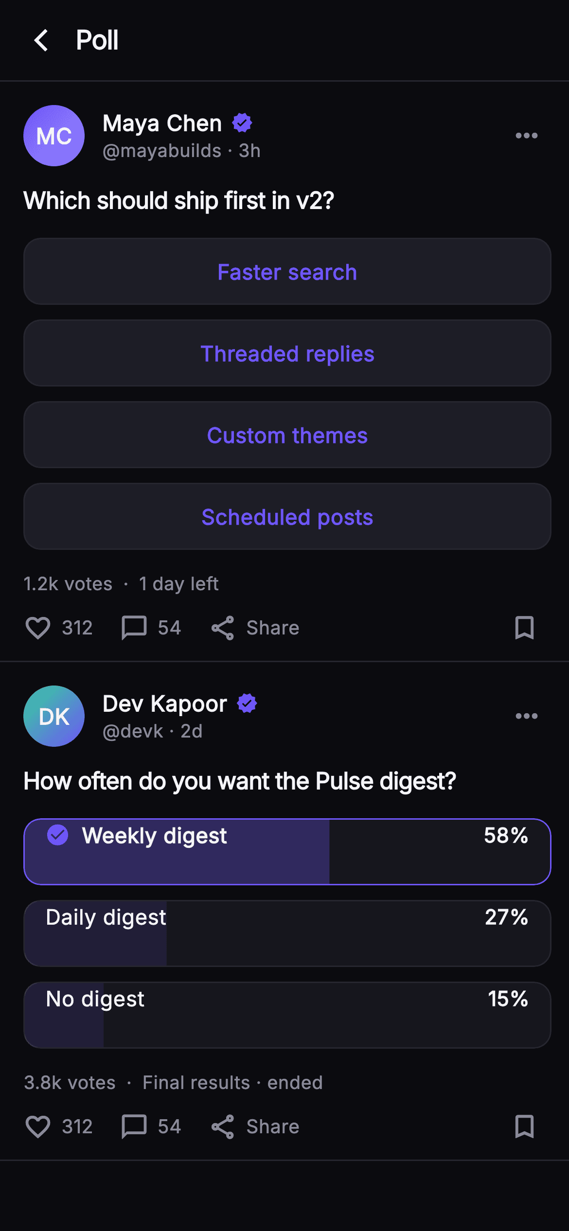
A poll in a feed has to do two things at once: look inviting before anyone taps, and turn into a readable result chart the instant they do. This tutorial builds the Pulse poll post in Flutter: a single `_choice` int drives the whole card, `_OptionRow` swaps from an indigo outline pill to a `FractionallySizedBox` result bar with a percentage and a `check_circle` on your pick, `_votesLabel` abbreviates 1204 to 1.2k, and a second, already-ended poll shows the final-results state with taps disabled.
Watch the Flutter UI walkthrough
A short screen recording of Pulse · Poll Post running, if you'd rather see it before you read the code. The written tutorial below covers everything in it.
Can't see the video? Watch it on YouTube.
What you'll build
- ✓A `_PollCard` that re-renders every option from one nullable `_choice` int, with `onVote(int)` injected so real submission is a one-line wire-up
- ✓A two-state `_OptionRow`: a `_surfaceAlt` outline pill before voting and a `ClipRRect` + `FractionallySizedBox` result bar tinted to the option's percentage afterwards
- ✓A `_votesLabel` getter that turns 1204 into '1.2k votes', and an `_initials` getter that builds the monogram from the author's name
- ✓An ended-poll variant that loads already resolved, passes `onTap: null` to every row, and reads 'Final results · ended'
- ✓A gradient `_Monogram` avatar, a `_Dot` separator for the meta line, and an `_ActionBar` with like, reply, share and bookmark
Step-by-step build
Create the file
Add a new file at lib/social_feed_poll/social_feed_poll_screen.dart in your Flutter project.
Register the bundled fonts
No external packages — this is pure Flutter. It does bundle its design font (Inter), so drop the font file into fonts/ and declare it in pubspec.yaml:
flutter:
  fonts:
    - family: Inter
      fonts:
- asset: fonts/Inter-Regular.ttfBuild it, piece by piece
Here's how the screen goes together. Each block below is a real slice of the code with a plain-English explanation — paste them in order, or grab the whole file from the next section.
Two callbacks, six colours and a StatefulWidget
import 'package:flutter/material.dart';

/// Poll Post — an inline poll card with painted result bars. The hero poll is
/// interactive: tap an option to cast a vote and the outline rows switch to
/// tinted result bars with percentages and your choice highlighted. A second,
/// already-ended poll shows the final-results state. Self-contained per
/// CONVENTIONS.md: pure Flutter, bundled Inter font, own dark theme, SafeArea,
/// overflow-proof.
class SocialFeedPollScreen extends StatefulWidget {
  const SocialFeedPollScreen({
    super.key,
    this.onBack,
    this.onVote,
  });

  final VoidCallback? onBack;
  final ValueChanged<int>? onVote;

  static const String _font = 'Inter';
  static const Color _bg = Color(0xFF0B0B0F);
  static const Color _surfaceAlt = Color(0xFF1D1D26);
  static const Color _brand = Color(0xFF6E56F7);
  static const Color _hairline = Color(0xFF26262F);
  static const Color _textHi = Color(0xFFF4F4F7);
  static const Color _muted = Color(0xFF8A8A99);

  @override
  State<SocialFeedPollScreen> createState() => _SocialFeedPollScreenState();
}

class _SocialFeedPollScreenState extends State<SocialFeedPollScreen> {
  int? _choice;

  static const List<_Option> _live = <_Option>[
    _Option('Faster search', 46),
    _Option('Threaded replies', 29),
    _Option('Custom themes', 15),
    _Option('Scheduled posts', 10),
  ];

  static const List<_Option> _ended = <_Option>[
    _Option('Weekly digest', 58),
    _Option('Daily digest', 27),
    _Option('No digest', 15),
  ];
`SocialFeedPollScreen` is a `StatefulWidget` because one thing on this page changes: which option the reader picked. It takes `onBack` and `onVote` (a `ValueChanged<int>`) so the host app hears the chosen index without the screen knowing anything about a backend. The palette is a near-mono dark set — `_bg` #0B0B0F, `_surfaceAlt` #1D1D26, `_hairline` #26262F — with a single indigo `_brand` #6E56F7 used for everything that means 'you' or 'act here'. State is just `int? _choice`; null means unvoted. The two option lists are `static const` `_Option(label, pct)` records. `_live` sums to exactly 100 (46+29+15+10) and so does `_ended` (58+27+15), which matters because the percentages are what size the result bars later.
The feed: one live poll, one ended poll
  @override
  Widget build(BuildContext context) {
    return Theme(
      data: ThemeData.dark(useMaterial3: true),
      child: Scaffold(
        backgroundColor: SocialFeedPollScreen._bg,
        body: SafeArea(
          child: Column(
            children: <Widget>[
              _TopBar(onBack: widget.onBack),
              Expanded(
                child: ListView(
                  padding: EdgeInsets.zero,
                  children: <Widget>[
                    _PollCard(
                      name: 'Maya Chen',
                      handle: 'mayabuilds',
                      time: '3h',
                      colorA: 0xFF6E56F7,
                      colorB: 0xFF9B8CFF,
                      question: 'Which should ship first in v2?',
                      options: _live,
                      choice: _choice,
                      voted: _choice != null,
                      totalVotes: 1204,
                      footer: '1 day left',
                      ended: false,
                      onVote: (int i) {
                        setState(() => _choice = i);
                        widget.onVote?.call(i);
                      },
                    ),
                    _PollCard(
                      name: 'Dev Kapoor',
                      handle: 'devk',
                      time: '2d',
                      colorA: 0xFF34D399,
                      colorB: 0xFF6E56F7,
                      question: 'How often do you want the Pulse digest?',
                      options: _ended,
                      choice: 0,
                      voted: true,
                      totalVotes: 3820,
                      footer: 'Final results · ended',
                      ended: true,
                      onVote: (_) {},
                    ),
                    const SizedBox(height: 24),
                  ],
                ),
              ),
            ],
          ),
        ),
      ),
    );
  }
}
`build` wraps everything in `Theme(data: ThemeData.dark(useMaterial3: true))` so Material defaults like the `IconButton` ripple match the dark surface without leaking the host app's light theme. Under `SafeArea`, a `Column` holds the `_TopBar` and an `Expanded` `ListView` with `padding: EdgeInsets.zero` so the first card's hairline sits flush against the bar. The interesting part is how the two `_PollCard`s differ only by props. The live card passes `choice: _choice`, `voted: _choice != null`, `ended: false`, and an `onVote` that calls `setState(() => _choice = i)` then forwards to `widget.onVote?.call(i)`. The ended card hard-codes `choice: 0`, `voted: true`, `ended: true`, and an `onVote: (_) {}` no-op — it renders as final results without any state of its own. The gradient pairs (`0xFF6E56F7`→`0xFF9B8CFF` and `0xFF34D399`→`0xFF6E56F7`) give each author a distinct monogram.
A 56px top bar and the _Option record
class _TopBar extends StatelessWidget {
  const _TopBar({this.onBack});
  final VoidCallback? onBack;

  @override
  Widget build(BuildContext context) {
    return Container(
      height: 56,
      padding: const EdgeInsets.only(left: 4, right: 20),
      decoration: const BoxDecoration(
        border: Border(
          bottom: BorderSide(color: SocialFeedPollScreen._hairline),
        ),
      ),
      child: Row(
        children: <Widget>[
          IconButton(
            onPressed: onBack,
            icon: const Icon(Icons.arrow_back_ios_new,
                size: 18, color: SocialFeedPollScreen._textHi),
          ),
          const Text(
            'Poll',
            style: TextStyle(
              fontFamily: SocialFeedPollScreen._font,
              fontSize: 18,
              fontWeight: FontWeight.w700,
              letterSpacing: -0.4,
              color: SocialFeedPollScreen._textHi,
            ),
          ),
        ],
      ),
    );
  }
}

class _Option {
  const _Option(this.label, this.pct);
  final String label;
  final int pct;
}
`_TopBar` is a fixed 56px `Container` with a bottom `BorderSide` in `_hairline` — the same separator every card uses, so the bar reads as the first row of the feed rather than a distinct chrome layer. Padding is `left: 4, right: 20`: the small left inset is deliberate because the `IconButton` carries its own 48px hit area, and 4px places the `arrow_back_ios_new` glyph optically where a 16px margin would put plain text. The title 'Poll' is 18px `w700` Inter with `letterSpacing: -0.4`, the same tightening used on the questions further down. `_Option` is a two-field `const` class — `label` and an `int pct` — kept private and minimal so both lists can be `static const` and the whole card tree stays const-constructible where possible.
The poll card header and its two getters
class _PollCard extends StatelessWidget {
  const _PollCard({
    required this.name,
    required this.handle,
    required this.time,
    required this.colorA,
    required this.colorB,
    required this.question,
    required this.options,
    required this.choice,
    required this.voted,
    required this.totalVotes,
    required this.footer,
    required this.ended,
    required this.onVote,
  });

  final String name;
  final String handle;
  final String time;
  final int colorA;
  final int colorB;
  final String question;
  final List<_Option> options;
  final int? choice;
  final bool voted;
  final int totalVotes;
  final String footer;
  final bool ended;
  final ValueChanged<int> onVote;

  String get _initials {
    final List<String> p = name.trim().split(RegExp(r'\s+'));
    if (p.length == 1) return p.first.characters.first.toUpperCase();
    return (p.first[0] + p.last[0]).toUpperCase();
  }

  String get _votesLabel {
    final String v = totalVotes >= 1000
        ? '${(totalVotes / 1000).toStringAsFixed(1)}k'
        : '$totalVotes';
    return '$v votes';
  }

  @override
  Widget build(BuildContext context) {
    return Container(
      padding: const EdgeInsets.fromLTRB(16, 16, 12, 12),
      decoration: const BoxDecoration(
        border: Border(
          bottom: BorderSide(color: SocialFeedPollScreen._hairline),
        ),
      ),
      child: Column(
        crossAxisAlignment: CrossAxisAlignment.start,
        children: <Widget>[
          Row(
            children: <Widget>[
              _Monogram(
                initials: _initials,
                colorA: Color(colorA),
                colorB: Color(colorB),
              ),
              const SizedBox(width: 12),
              Expanded(
                child: Column(
                  crossAxisAlignment: CrossAxisAlignment.start,
                  children: <Widget>[
                    Row(
                      children: <Widget>[
                        Flexible(
                          child: Text(
                            name,
                            overflow: TextOverflow.ellipsis,
                            style: const TextStyle(
                              fontFamily: SocialFeedPollScreen._font,
                              fontSize: 15,
                              fontWeight: FontWeight.w700,
                              color: SocialFeedPollScreen._textHi,
                            ),
                          ),
                        ),
                        const SizedBox(width: 6),
                        const Icon(Icons.verified,
                            size: 15, color: SocialFeedPollScreen._brand),
                      ],
                    ),
                    Text(
                      '@$handle · $time',
                      style: const TextStyle(
                        fontFamily: SocialFeedPollScreen._font,
                        fontSize: 12.5,
                        color: SocialFeedPollScreen._muted,
                      ),
                    ),
                  ],
                ),
              ),
              const Icon(Icons.more_horiz,
                  color: SocialFeedPollScreen._muted, size: 22),
              const SizedBox(width: 6),
            ],
          ),
`_PollCard` is a `StatelessWidget` with thirteen required props; it holds no state, so the parent's `_choice` is the single source of truth. Two getters do the string work. `_initials` splits `name` on `RegExp(r'\s+')`, returns the first character upper-cased for a single word, or first-of-first plus first-of-last for 'Maya Chen' → 'MC'. `_votesLabel` divides by 1000 with `toStringAsFixed(1)` only when `totalVotes >= 1000`, so 1204 becomes '1.2k votes' while 820 would stay '820 votes'. The header row puts the `_Monogram` beside an `Expanded` column: the name is in a `Flexible` with `TextOverflow.ellipsis` so a long name truncates instead of pushing the 15px indigo `Icons.verified` off-screen, and the second line concatenates `'@$handle · $time'` in 12.5px `_muted`. `Icons.more_horiz` closes the row with a 6px trailing gap to align with the card's 12px right padding.
Question, option loop, and the vote meta line
          const SizedBox(height: 12),
          Text(
            question,
            style: const TextStyle(
              fontFamily: SocialFeedPollScreen._font,
              fontSize: 16,
              fontWeight: FontWeight.w700,
              letterSpacing: -0.3,
              color: SocialFeedPollScreen._textHi,
            ),
          ),
          const SizedBox(height: 14),
          for (int i = 0; i < options.length; i++) ...<Widget>[
            _OptionRow(
              option: options[i],
              voted: voted,
              chosen: choice == i,
              onTap: ended ? null : () => onVote(i),
            ),
            if (i != options.length - 1) const SizedBox(height: 10),
          ],
          const SizedBox(height: 14),
          Row(
            children: <Widget>[
              Text(
                _votesLabel,
                style: const TextStyle(
                  fontFamily: SocialFeedPollScreen._font,
                  fontSize: 12.5,
                  color: SocialFeedPollScreen._muted,
                ),
              ),
              const _Dot(),
              Flexible(
                child: Text(
                  footer,
                  overflow: TextOverflow.ellipsis,
                  style: const TextStyle(
                    fontFamily: SocialFeedPollScreen._font,
                    fontSize: 12.5,
                    color: SocialFeedPollScreen._muted,
                  ),
                ),
              ),
              if (voted && !ended) ...<Widget>[
                const _Dot(),
                const Text(
                  'You voted',
                  style: TextStyle(
                    fontFamily: SocialFeedPollScreen._font,
                    fontSize: 12.5,
                    fontWeight: FontWeight.w600,
                    color: SocialFeedPollScreen._brand,
                  ),
                ),
              ],
            ],
          ),
          const SizedBox(height: 10),
          const _ActionBar(),
        ],
      ),
    );
  }
}
The question is 16px `w700` with `letterSpacing: -0.3`. The options come from a collection-for that spreads two widgets per iteration — the `_OptionRow` and, guarded by `if (i != options.length - 1)`, a 10px `SizedBox` — so the gap never trails the last row. Each row receives `chosen: choice == i` and `onTap: ended ? null : () => onVote(i)`; passing null rather than an empty closure is what makes the ended poll genuinely inert instead of silently swallowing taps. The meta line is a `Row` of `_votesLabel`, a `_Dot`, the `footer` in a `Flexible` with ellipsis, and then — only when `voted && !ended` — another `_Dot` plus 'You voted' in `w600` indigo. The ended poll skips that tag because 'Final results · ended' already says the poll is closed. A 10px gap then hands over to the `const _ActionBar()`.
_Dot and the two faces of _OptionRow
class _Dot extends StatelessWidget {
  const _Dot();
  @override
  Widget build(BuildContext context) {
    return const Padding(
      padding: EdgeInsets.symmetric(horizontal: 7),
      child: Text(
        '·',
        style: TextStyle(
          fontFamily: SocialFeedPollScreen._font,
          fontSize: 13,
          color: SocialFeedPollScreen._muted,
        ),
      ),
    );
  }
}

class _OptionRow extends StatelessWidget {
  const _OptionRow({
    required this.option,
    required this.voted,
    required this.chosen,
    this.onTap,
  });
  final _Option option;
  final bool voted;
  final bool chosen;
  final VoidCallback? onTap;

  @override
  Widget build(BuildContext context) {
    if (!voted) {
      return GestureDetector(
        onTap: onTap,
        child: Container(
          height: 46,
          alignment: Alignment.center,
          decoration: BoxDecoration(
            color: SocialFeedPollScreen._surfaceAlt,
            borderRadius: BorderRadius.circular(12),
            border: Border.all(color: SocialFeedPollScreen._hairline),
          ),
          child: Text(
            option.label,
            style: const TextStyle(
              fontFamily: SocialFeedPollScreen._font,
              fontSize: 14.5,
              fontWeight: FontWeight.w600,
              color: SocialFeedPollScreen._brand,
            ),
          ),
        ),
      );
    }
    return ClipRRect(
      borderRadius: BorderRadius.circular(12),
      child: Container(
        height: 46,
        decoration: BoxDecoration(
          color: SocialFeedPollScreen._surfaceAlt.withValues(alpha: 0.6),
          borderRadius: BorderRadius.circular(12),
          border: Border.all(
            color: chosen
                ? SocialFeedPollScreen._brand
                : SocialFeedPollScreen._hairline,
          ),
        ),
        child: Stack(
          children: <Widget>[
            FractionallySizedBox(
              alignment: Alignment.centerLeft,
              widthFactor: (option.pct / 100).clamp(0.0, 1.0),
              child: Container(
                decoration: BoxDecoration(
                  color: chosen
                      ? SocialFeedPollScreen._brand.withValues(alpha: 0.30)
                      : SocialFeedPollScreen._brand.withValues(alpha: 0.12),
                ),
              ),
            ),
            Padding(
              padding: const EdgeInsets.symmetric(horizontal: 14),
              child: Row(
                children: <Widget>[
                  if (chosen) ...<Widget>[
                    const Icon(Icons.check_circle,
                        size: 17, color: SocialFeedPollScreen._brand),
                    const SizedBox(width: 8),
                  ],
                  Expanded(
                    child: Text(
                      option.label,
                      overflow: TextOverflow.ellipsis,
                      style: TextStyle(
                        fontFamily: SocialFeedPollScreen._font,
                        fontSize: 14.5,
                        fontWeight: chosen ? FontWeight.w700 : FontWeight.w500,
                        color: SocialFeedPollScreen._textHi,
                      ),
                    ),
                  ),
                  Text(
                    '${option.pct}%',
                    style: const TextStyle(
                      fontFamily: SocialFeedPollScreen._font,
                      fontSize: 14,
                      fontWeight: FontWeight.w700,
                      color: SocialFeedPollScreen._textHi,
                    ),
                  ),
                ],
              ),
            ),
          ],
        ),
      ),
    );
  }
}
`_Dot` is a middle-dot glyph padded 7px each side, so the meta line separators are typographic rather than drawn. `_OptionRow` branches on `voted`. Before a vote it is a `GestureDetector` around a 46px `_surfaceAlt` container with a 12px radius, a `_hairline` border and the label centred in 14.5px `w600` indigo — the brand colour on the text is the affordance. After a vote the row becomes a `ClipRRect` (needed so the fill respects the rounded corners) around a `Stack`. The bottom layer is a `FractionallySizedBox` aligned `centerLeft` with `widthFactor: (option.pct / 100).clamp(0.0, 1.0)` — the bar's width literally is the percentage. Its fill is `_brand` at alpha 0.30 for the chosen row and 0.12 for the rest, over a card background at `_surfaceAlt.withValues(alpha: 0.6)`. The chosen row also gets a `_brand` border, a 17px `check_circle`, and `w700` text; the others keep the `_hairline` border and `w500`. The percentage sits right-aligned in 14px `w700` outside the `Expanded` label so it never truncates.
Action bar, _Action, and the gradient monogram
class _ActionBar extends StatelessWidget {
  const _ActionBar();

  @override
  Widget build(BuildContext context) {
    return const Row(
      children: <Widget>[
        _Action(icon: Icons.favorite_border, label: '312'),
        SizedBox(width: 18),
        _Action(icon: Icons.chat_bubble_outline, label: '54'),
        SizedBox(width: 18),
        _Action(icon: Icons.share_outlined, label: 'Share'),
        Spacer(),
        Icon(Icons.bookmark_border,
            size: 21, color: SocialFeedPollScreen._muted),
        SizedBox(width: 8),
      ],
    );
  }
}

class _Action extends StatelessWidget {
  const _Action({required this.icon, required this.label});
  final IconData icon;
  final String label;

  @override
  Widget build(BuildContext context) {
    return Row(
      children: <Widget>[
        Icon(icon, size: 20, color: SocialFeedPollScreen._muted),
        const SizedBox(width: 6),
        Text(
          label,
          style: const TextStyle(
            fontFamily: SocialFeedPollScreen._font,
            fontSize: 13,
            fontWeight: FontWeight.w500,
            color: SocialFeedPollScreen._muted,
          ),
        ),
      ],
    );
  }
}

class _Monogram extends StatelessWidget {
  const _Monogram({
    required this.initials,
    required this.colorA,
    required this.colorB,
  });
  final String initials;
  final Color colorA;
  final Color colorB;

  @override
  Widget build(BuildContext context) {
    return Container(
      width: 42,
      height: 42,
      decoration: BoxDecoration(
        shape: BoxShape.circle,
        gradient: LinearGradient(
          begin: Alignment.topLeft,
          end: Alignment.bottomRight,
          colors: <Color>[colorA, colorB],
        ),
      ),
      child: Center(
        child: Text(
          initials,
          style: const TextStyle(
            fontFamily: SocialFeedPollScreen._font,
            fontSize: 15,
            fontWeight: FontWeight.w700,
            color: Colors.white,
          ),
        ),
      ),
    );
  }
}
`_ActionBar` is a fully `const` `Row`: three `_Action`s (favorite_border '312', chat_bubble_outline '54', share_outlined 'Share') separated by 18px, a `Spacer`, then a 21px `bookmark_border` with an 8px trailing gap. Being const means the bar is built once and reused by both cards for free. `_Action` pairs a 20px `_muted` icon with a 13px `w500` label 6px apart, and every glyph stays `_muted` so nothing here competes with the indigo of the poll itself. `_Monogram` is a 42px circle whose `BoxDecoration` uses a `LinearGradient` from `topLeft` to `bottomRight` between the two ints the card passed in as `colorA`/`colorB`, with the initials centred in 15px `w700` white. Because the avatar is painted from the name, the screen loads no network image and can never show a broken-image placeholder.
Full code
The complete, ready-to-paste source. Free to use in your projects — one click copies it all.
import 'package:flutter/material.dart';
/// Poll Post — an inline poll card with painted result bars. The hero poll is
/// interactive: tap an option to cast a vote and the outline rows switch to
/// tinted result bars with percentages and your choice highlighted. A second,
/// already-ended poll shows the final-results state. Self-contained per
/// CONVENTIONS.md: pure Flutter, bundled Inter font, own dark theme, SafeArea,
/// overflow-proof.
class SocialFeedPollScreen extends StatefulWidget {
const SocialFeedPollScreen({
super.key,
this.onBack,
this.onVote,
});
final VoidCallback? onBack;
final ValueChanged<int>? onVote;
static const String _font = 'Inter';
static const Color _bg = Color(0xFF0B0B0F);
static const Color _surfaceAlt = Color(0xFF1D1D26);
static const Color _brand = Color(0xFF6E56F7);
static const Color _hairline = Color(0xFF26262F);
static const Color _textHi = Color(0xFFF4F4F7);
static const Color _muted = Color(0xFF8A8A99);
@override
State<SocialFeedPollScreen> createState() => _SocialFeedPollScreenState();
}
class _SocialFeedPollScreenState extends State<SocialFeedPollScreen> {
int? _choice;
static const List<_Option> _live = <_Option>[
_Option('Faster search', 46),
_Option('Threaded replies', 29),
_Option('Custom themes', 15),
_Option('Scheduled posts', 10),
];
static const List<_Option> _ended = <_Option>[
_Option('Weekly digest', 58),
_Option('Daily digest', 27),
_Option('No digest', 15),
];
@override
Widget build(BuildContext context) {
return Theme(
data: ThemeData.dark(useMaterial3: true),
child: Scaffold(
backgroundColor: SocialFeedPollScreen._bg,
body: SafeArea(
child: Column(
children: <Widget>[
_TopBar(onBack: widget.onBack),
Expanded(
child: ListView(
padding: EdgeInsets.zero,
children: <Widget>[
_PollCard(
name: 'Maya Chen',
handle: 'mayabuilds',
time: '3h',
colorA: 0xFF6E56F7,
colorB: 0xFF9B8CFF,
question: 'Which should ship first in v2?',
options: _live,
choice: _choice,
voted: _choice != null,
totalVotes: 1204,
footer: '1 day left',
ended: false,
onVote: (int i) {
setState(() => _choice = i);
widget.onVote?.call(i);
},
),
_PollCard(
name: 'Dev Kapoor',
handle: 'devk',
time: '2d',
colorA: 0xFF34D399,
colorB: 0xFF6E56F7,
question: 'How often do you want the Pulse digest?',
options: _ended,
choice: 0,
voted: true,
totalVotes: 3820,
footer: 'Final results · ended',
ended: true,
onVote: (_) {},
),
const SizedBox(height: 24),
],
),
),
],
),
),
),
);
}
}
class _TopBar extends StatelessWidget {
const _TopBar({this.onBack});
final VoidCallback? onBack;
@override
Widget build(BuildContext context) {
return Container(
height: 56,
padding: const EdgeInsets.only(left: 4, right: 20),
decoration: const BoxDecoration(
border: Border(
bottom: BorderSide(color: SocialFeedPollScreen._hairline),
),
),
child: Row(
children: <Widget>[
IconButton(
onPressed: onBack,
icon: const Icon(Icons.arrow_back_ios_new,
size: 18, color: SocialFeedPollScreen._textHi),
),
const Text(
'Poll',
style: TextStyle(
fontFamily: SocialFeedPollScreen._font,
fontSize: 18,
fontWeight: FontWeight.w700,
letterSpacing: -0.4,
color: SocialFeedPollScreen._textHi,
),
),
],
),
);
}
}
class _Option {
const _Option(this.label, this.pct);
final String label;
final int pct;
}
class _PollCard extends StatelessWidget {
const _PollCard({
required this.name,
required this.handle,
required this.time,
required this.colorA,
required this.colorB,
required this.question,
required this.options,
required this.choice,
required this.voted,
required this.totalVotes,
required this.footer,
required this.ended,
required this.onVote,
});
final String name;
final String handle;
final String time;
final int colorA;
final int colorB;
final String question;
final List<_Option> options;
final int? choice;
final bool voted;
final int totalVotes;
final String footer;
final bool ended;
final ValueChanged<int> onVote;
String get _initials {
final List<String> p = name.trim().split(RegExp(r'\s+'));
if (p.length == 1) return p.first.characters.first.toUpperCase();
return (p.first[0] + p.last[0]).toUpperCase();
}
String get _votesLabel {
final String v = totalVotes >= 1000
? '${(totalVotes / 1000).toStringAsFixed(1)}k'
: '$totalVotes';
return '$v votes';
}
@override
Widget build(BuildContext context) {
return Container(
padding: const EdgeInsets.fromLTRB(16, 16, 12, 12),
decoration: const BoxDecoration(
border: Border(
bottom: BorderSide(color: SocialFeedPollScreen._hairline),
),
),
child: Column(
crossAxisAlignment: CrossAxisAlignment.start,
children: <Widget>[
Row(
children: <Widget>[
_Monogram(
initials: _initials,
colorA: Color(colorA),
colorB: Color(colorB),
),
const SizedBox(width: 12),
Expanded(
child: Column(
crossAxisAlignment: CrossAxisAlignment.start,
children: <Widget>[
Row(
children: <Widget>[
Flexible(
child: Text(
name,
overflow: TextOverflow.ellipsis,
style: const TextStyle(
fontFamily: SocialFeedPollScreen._font,
fontSize: 15,
fontWeight: FontWeight.w700,
color: SocialFeedPollScreen._textHi,
),
),
),
const SizedBox(width: 6),
const Icon(Icons.verified,
size: 15, color: SocialFeedPollScreen._brand),
],
),
Text(
'@$handle · $time',
style: const TextStyle(
fontFamily: SocialFeedPollScreen._font,
fontSize: 12.5,
color: SocialFeedPollScreen._muted,
),
),
],
),
),
const Icon(Icons.more_horiz,
color: SocialFeedPollScreen._muted, size: 22),
const SizedBox(width: 6),
],
),
const SizedBox(height: 12),
Text(
question,
style: const TextStyle(
fontFamily: SocialFeedPollScreen._font,
fontSize: 16,
fontWeight: FontWeight.w700,
letterSpacing: -0.3,
color: SocialFeedPollScreen._textHi,
),
),
const SizedBox(height: 14),
for (int i = 0; i < options.length; i++) ...<Widget>[
_OptionRow(
option: options[i],
voted: voted,
chosen: choice == i,
onTap: ended ? null : () => onVote(i),
),
if (i != options.length - 1) const SizedBox(height: 10),
],
const SizedBox(height: 14),
Row(
children: <Widget>[
Text(
_votesLabel,
style: const TextStyle(
fontFamily: SocialFeedPollScreen._font,
fontSize: 12.5,
color: SocialFeedPollScreen._muted,
),
),
const _Dot(),
Flexible(
child: Text(
footer,
overflow: TextOverflow.ellipsis,
style: const TextStyle(
fontFamily: SocialFeedPollScreen._font,
fontSize: 12.5,
color: SocialFeedPollScreen._muted,
),
),
),
if (voted && !ended) ...<Widget>[
const _Dot(),
const Text(
'You voted',
style: TextStyle(
fontFamily: SocialFeedPollScreen._font,
fontSize: 12.5,
fontWeight: FontWeight.w600,
color: SocialFeedPollScreen._brand,
),
),
],
],
),
const SizedBox(height: 10),
const _ActionBar(),
],
),
);
}
}
class _Dot extends StatelessWidget {
const _Dot();
@override
Widget build(BuildContext context) {
return const Padding(
padding: EdgeInsets.symmetric(horizontal: 7),
child: Text(
'·',
style: TextStyle(
fontFamily: SocialFeedPollScreen._font,
fontSize: 13,
color: SocialFeedPollScreen._muted,
),
),
);
}
}
class _OptionRow extends StatelessWidget {
const _OptionRow({
required this.option,
required this.voted,
required this.chosen,
this.onTap,
});
final _Option option;
final bool voted;
final bool chosen;
final VoidCallback? onTap;
@override
Widget build(BuildContext context) {
if (!voted) {
return GestureDetector(
onTap: onTap,
child: Container(
height: 46,
alignment: Alignment.center,
decoration: BoxDecoration(
color: SocialFeedPollScreen._surfaceAlt,
borderRadius: BorderRadius.circular(12),
border: Border.all(color: SocialFeedPollScreen._hairline),
),
child: Text(
option.label,
style: const TextStyle(
fontFamily: SocialFeedPollScreen._font,
fontSize: 14.5,
fontWeight: FontWeight.w600,
color: SocialFeedPollScreen._brand,
),
),
),
);
}
return ClipRRect(
borderRadius: BorderRadius.circular(12),
child: Container(
height: 46,
decoration: BoxDecoration(
color: SocialFeedPollScreen._surfaceAlt.withValues(alpha: 0.6),
borderRadius: BorderRadius.circular(12),
border: Border.all(
color: chosen
? SocialFeedPollScreen._brand
: SocialFeedPollScreen._hairline,
),
),
child: Stack(
children: <Widget>[
FractionallySizedBox(
alignment: Alignment.centerLeft,
widthFactor: (option.pct / 100).clamp(0.0, 1.0),
child: Container(
decoration: BoxDecoration(
color: chosen
? SocialFeedPollScreen._brand.withValues(alpha: 0.30)
: SocialFeedPollScreen._brand.withValues(alpha: 0.12),
),
),
),
Padding(
padding: const EdgeInsets.symmetric(horizontal: 14),
child: Row(
children: <Widget>[
if (chosen) ...<Widget>[
const Icon(Icons.check_circle,
size: 17, color: SocialFeedPollScreen._brand),
const SizedBox(width: 8),
],
Expanded(
child: Text(
option.label,
overflow: TextOverflow.ellipsis,
style: TextStyle(
fontFamily: SocialFeedPollScreen._font,
fontSize: 14.5,
fontWeight: chosen ? FontWeight.w700 : FontWeight.w500,
color: SocialFeedPollScreen._textHi,
),
),
),
Text(
'${option.pct}%',
style: const TextStyle(
fontFamily: SocialFeedPollScreen._font,
fontSize: 14,
fontWeight: FontWeight.w700,
color: SocialFeedPollScreen._textHi,
),
),
],
),
),
],
),
),
);
}
}
class _ActionBar extends StatelessWidget {
const _ActionBar();
@override
Widget build(BuildContext context) {
return const Row(
children: <Widget>[
_Action(icon: Icons.favorite_border, label: '312'),
SizedBox(width: 18),
_Action(icon: Icons.chat_bubble_outline, label: '54'),
SizedBox(width: 18),
_Action(icon: Icons.share_outlined, label: 'Share'),
Spacer(),
Icon(Icons.bookmark_border,
size: 21, color: SocialFeedPollScreen._muted),
SizedBox(width: 8),
],
);
}
}
class _Action extends StatelessWidget {
const _Action({required this.icon, required this.label});
final IconData icon;
final String label;
@override
Widget build(BuildContext context) {
return Row(
children: <Widget>[
Icon(icon, size: 20, color: SocialFeedPollScreen._muted),
const SizedBox(width: 6),
Text(
label,
style: const TextStyle(
fontFamily: SocialFeedPollScreen._font,
fontSize: 13,
fontWeight: FontWeight.w500,
color: SocialFeedPollScreen._muted,
),
),
],
);
}
}
class _Monogram extends StatelessWidget {
const _Monogram({
required this.initials,
required this.colorA,
required this.colorB,
});
final String initials;
final Color colorA;
final Color colorB;
@override
Widget build(BuildContext context) {
return Container(
width: 42,
height: 42,
decoration: BoxDecoration(
shape: BoxShape.circle,
gradient: LinearGradient(
begin: Alignment.topLeft,
end: Alignment.bottomRight,
colors: <Color>[colorA, colorB],
),
),
child: Center(
child: Text(
initials,
style: const TextStyle(
fontFamily: SocialFeedPollScreen._font,
fontSize: 15,
fontWeight: FontWeight.w700,
color: Colors.white,
),
),
),
);
}
}
Plus bundled 1 binary asset (fonts/images). The CLI and MCP install those for you automatically.
Two faster ways to add it
Copy-paste works, but you can skip it entirely.
1. FlutterKit CLI
One command drops this screen — and its fonts — straight into your project.
$ flutterkit add social-feed-poll2. AI agent (MCP)
Connect FlutterKit's MCP server in Claude or Cursor and just ask your agent to install social-feed-poll — it fetches and writes the files for you.
FAQ
Can I use this poll card in a commercial app?
Yes. FlutterKit screens are free for personal and commercial projects under an MIT-style licence — no key, no attribution line. Copy the code from this page or run `flutterkit add social-feed-poll` and ship it.
Does it need any pub packages or fonts?
No packages — it is pure Flutter with `material.dart` only. The Inter font is referenced by name and is bundled into your project by `flutterkit add social-feed-poll`; if you paste the code by hand, add Inter to `pubspec.yaml` or drop the `fontFamily` lines to fall back to the platform font.
How do I make the percentages come from a server?
Replace the two `static const` lists with data you fetch, keep `_Option(label, pct)` as the shape, and set `totalVotes` from the response. The result bars size themselves from `option.pct / 100`, so as long as the server returns integers that sum to about 100 nothing else changes. Submit the vote inside `onVote` — the screen already forwards the tapped index to `widget.onVote` — and refresh the list when the response arrives.
Why does the ended poll pass `onTap: null` instead of an empty function?
`_PollCard` computes `onTap: ended ? null : () => onVote(i)`. A null callback tells `GestureDetector` there is nothing to listen for, so the row is genuinely inert; an empty closure would still register taps and give feedback that does nothing. In practice the ended card is already in `voted: true` mode, so the outline branch never renders for it anyway.
Which Flutter version is required?
Flutter 3.22 or newer, because the result bars use `Color.withValues(alpha: ...)` and the widgets use `super.key`. On an older SDK swap `withValues(alpha: x)` for `withOpacity(x)` and write the constructor as `{Key? key, ...} : super(key: key)`.


