How to Build a Virtual Card Created Screen in Flutter (Full Code + Preview)
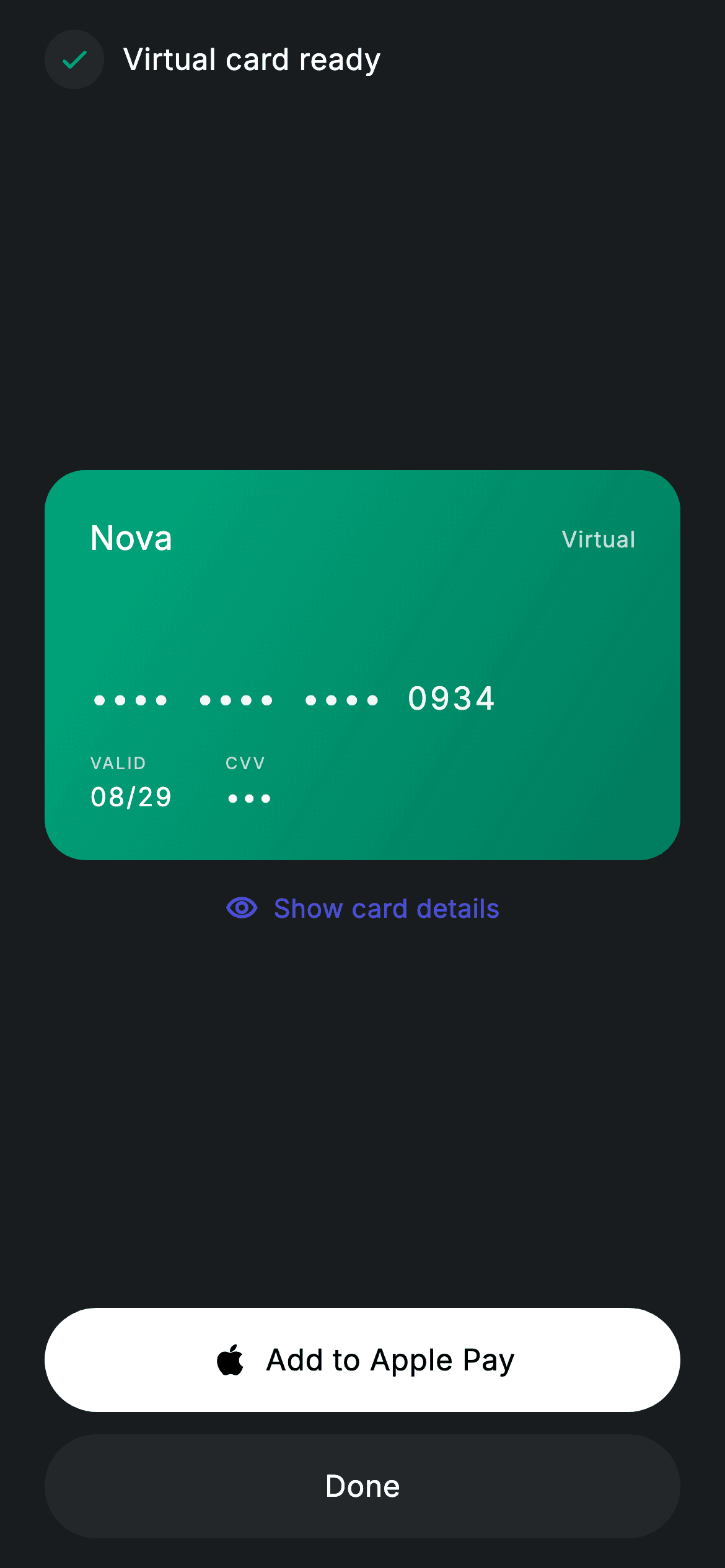
The moment a neobank issues a virtual card, the user wants two things: proof it exists and a way to use it in the next thirty seconds. This tutorial builds that confirmation screen in Flutter as a single `StatefulWidget`: a teal check badge, a gradient 'Nova' card whose number and CVV are masked behind one `_revealed` boolean, a 'Show card details' toggle that flips the mask, and two pill buttons — a white 'Add to Apple Pay' and a muted 'Done' — wired to `onAddToWallet` and `onDone` callbacks you supply.
Watch the Flutter UI walkthrough
A short screen recording of Fintech · Virtual Card running, if you'd rather see it before you read the code. The written tutorial below covers everything in it.
Can't see the video? Watch it on YouTube.
What you'll build
- ✓A 210px gradient card widget (`_card`) that runs from `_teal` to `#007A5C` and shows brand, masked PAN, expiry and CVV
- ✓A single `_revealed` bool that swaps `'•••• •••• •••• 0934'` for the full number and `'•••'` for `'417'` in one `setState`
- ✓A `GestureDetector` toggle whose icon and label both derive from `_revealed` so they can never disagree
- ✓Two 56px `Material` + `InkWell` pill buttons ranked white-on-dark for Apple Pay and `_surface` grey for Done
- ✓A reusable `_field(label, value)` helper for the tiny uppercase VALID / CVV labels
Step-by-step build
Create the file
Add a new file at lib/fintech_virtual_card_created/fintech_virtual_card_created_screen.dart in your Flutter project.
Register the bundled fonts
No external packages — this is pure Flutter. It does bundle its design font (Inter), so drop the font file into fonts/ and declare it in pubspec.yaml:
flutter:
  fonts:
    - family: Inter
      fonts:
- asset: fonts/Inter-Regular.ttfBuild it, piece by piece
Here's how the screen goes together. Each block below is a real slice of the code with a plain-English explanation — paste them in order, or grab the whole file from the next section.
A stateful success screen with two exit callbacks
import 'package:flutter/material.dart';

/// Virtual Card Created — reveal the new virtual card and its details. Self-
/// contained per CONVENTIONS.md: pure Flutter, bundled Inter font, forced dark
/// theme. Stateful: tapping "Show details" reveals the masked number/CVV.
class FintechVirtualCardCreatedScreen extends StatefulWidget {
  const FintechVirtualCardCreatedScreen(
      {super.key, this.onAddToWallet, this.onDone});

  final VoidCallback? onAddToWallet;
  final VoidCallback? onDone;

  @override
  State<FintechVirtualCardCreatedScreen> createState() =>
      _FintechVirtualCardCreatedScreenState();
}

class _FintechVirtualCardCreatedScreenState
    extends State<FintechVirtualCardCreatedScreen> {
  static const String _font = 'Inter';
  static const Color _bg = Color(0xFF191C1F);
  static const Color _surface = Color(0xFF242729);
  static const Color _brand = Color(0xFF494FDF);
  static const Color _teal = Color(0xFF00A87E);

  bool _revealed = false;
Unlike most confirmation pages this one is a `StatefulWidget`, because it owns exactly one piece of mutable state: `bool _revealed = false`, which decides whether the card number and CVV are masked. Everything else is data-free — the two constructor parameters `onAddToWallet` and `onDone` are nullable `VoidCallback`s, so the screen renders fine in a preview with nothing wired and the buttons simply do nothing until you attach provisioning and navigation. The palette is four `static const` colours: `_bg` (`#191C1F`) for the page, `_surface` (`#242729`) one step lighter for the secondary button, `_brand` indigo (`#494FDF`) reserved for the interactive toggle text, and `_teal` (`#00A87E`) for success — the check badge and the card itself. Keeping the brand indigo off the card means the card reads as an object in its own right rather than a UI chrome element.
Forced dark theme and the 'Virtual card ready' header
  @override
  Widget build(BuildContext context) {
    return Theme(
      data: ThemeData.dark(useMaterial3: true),
      child: Scaffold(
        backgroundColor: _bg,
        body: SafeArea(
          child: Padding(
            padding: const EdgeInsets.fromLTRB(24, 16, 24, 16),
            child: Column(
              crossAxisAlignment: CrossAxisAlignment.stretch,
              children: <Widget>[
                Row(
                  children: <Widget>[
                    Container(
                      width: 32,
                      height: 32,
                      decoration: BoxDecoration(
                        shape: BoxShape.circle,
                        color: _teal.withValues(alpha: 0.16),
                      ),
                      child: const Icon(Icons.check_rounded,
                          size: 18, color: _teal),
                    ),
                    const SizedBox(width: 10),
                    const Text(
                      'Virtual card ready',
                      style: TextStyle(
                        fontFamily: _font,
                        fontSize: 16,
                        fontWeight: FontWeight.w500,
                        letterSpacing: 0.24,
                        color: Colors.white,
                      ),
                    ),
                  ],
                ),
                const Spacer(),
                _card(),
`build` wraps the `Scaffold` in `Theme(data: ThemeData.dark(useMaterial3: true))`, so ink splashes, default text colour and the Material 3 shapes all come out dark regardless of the host app's theme — the screen is self-contained by design. Padding is `fromLTRB(24, 16, 24, 16)` and the `Column` uses `CrossAxisAlignment.stretch` so the pill buttons later fill the full width without extra `SizedBox(width: double.infinity)` wrappers. The header is a plain `Row`: a 32px circle filled with `_teal.withValues(alpha: 0.16)` holding an 18px `Icons.check_rounded` in solid teal — the tint-plus-solid pairing that gives a badge look without a border — then 10px of space and the 16px w500 title with `letterSpacing: 0.24`, the same tracking used on every label in the file. A `const Spacer()` follows, and `_card()` is called as the first thing after it, so the header pins to the top and the card floats toward the vertical centre.
The show/hide toggle that drives the whole screen
                const SizedBox(height: 16),
                GestureDetector(
                  onTap: () => setState(() => _revealed = !_revealed),
                  behavior: HitTestBehavior.opaque,
                  child: Row(
                    mainAxisAlignment: MainAxisAlignment.center,
                    children: <Widget>[
                      Icon(
                        _revealed
                            ? Icons.visibility_off_outlined
                            : Icons.visibility_outlined,
                        size: 18,
                        color: _brand,
                      ),
                      const SizedBox(width: 8),
                      Text(
                        _revealed ? 'Hide details' : 'Show card details',
                        style: const TextStyle(
                          fontFamily: _font,
                          fontSize: 14,
                          fontWeight: FontWeight.w500,
                          letterSpacing: 0.24,
                          color: _brand,
                        ),
                      ),
                    ],
                  ),
                ),
                const Spacer(),
The reveal control is a `GestureDetector` rather than a `TextButton`, with `behavior: HitTestBehavior.opaque` so the whole row — including the transparent gaps between icon and text — accepts taps. Its `onTap` is one line: `setState(() => _revealed = !_revealed)`, and everything visual is derived from that flag rather than stored separately. The icon flips between `Icons.visibility_outlined` and `Icons.visibility_off_outlined`, and the label between 'Show card details' and 'Hide details'; because both read `_revealed` in the same build pass, they cannot fall out of sync the way two independent booleans could. Both are painted in `_brand` indigo, the only place that colour appears, which is what makes the row look tappable on an otherwise teal-and-grey screen. A second `const Spacer()` after it balances the first, pushing the button stack to the bottom while the card and toggle sit together in the middle.
Ranked pill buttons: Apple Pay first, Done second
                SizedBox(
                  height: 56,
                  child: Material(
                    color: Colors.white,
                    borderRadius: BorderRadius.circular(9999),
                    child: InkWell(
                      borderRadius: BorderRadius.circular(9999),
                      onTap: widget.onAddToWallet,
                      child: const Center(
                        child: Row(
                          mainAxisSize: MainAxisSize.min,
                          children: <Widget>[
                            Icon(Icons.apple_rounded,
                                size: 22, color: Colors.black),
                            SizedBox(width: 8),
                            Text(
                              'Add to Apple Pay',
                              style: TextStyle(
                                fontFamily: _font,
                                fontSize: 16,
                                fontWeight: FontWeight.w500,
                                letterSpacing: 0.24,
                                color: Colors.black,
                              ),
                            ),
                          ],
                        ),
                      ),
                    ),
                  ),
                ),
                const SizedBox(height: 12),
                SizedBox(
                  height: 56,
                  child: Material(
                    color: _surface,
                    borderRadius: BorderRadius.circular(9999),
                    child: InkWell(
                      borderRadius: BorderRadius.circular(9999),
                      onTap: widget.onDone,
                      child: const Center(
                        child: Text(
                          'Done',
                          style: TextStyle(
                            fontFamily: _font,
                            fontSize: 16,
                            fontWeight: FontWeight.w500,
                            letterSpacing: 0.24,
                            color: Colors.white,
                          ),
                        ),
                      ),
                    ),
                  ),
                ),
              ],
            ),
          ),
        ),
      ),
    );
  }
Both actions are built the same way — a 56px `SizedBox` around a `Material` with `BorderRadius.circular(9999)` (a true pill at any height) and an `InkWell` with the same radius so the ripple is clipped to the pill. The difference is entirely colour, and that is deliberate ranking: 'Add to Apple Pay' is `Colors.white` with black text and a 22px `Icons.apple_rounded`, the brightest thing on a `#191C1F` page, because provisioning to a wallet is the action that turns a virtual card into something spendable. 'Done' uses `_surface` grey with white text so it exists as an escape hatch but doesn't compete. The icon-and-label pair inside the first button is a `Row` with `mainAxisSize: MainAxisSize.min` inside a `Center`, which keeps the pair hugged together instead of spread across the pill. The `onTap`s go straight to `widget.onAddToWallet` and `widget.onDone`; passing `null` disables the ink effect automatically.
The gradient card and its masked number
  Widget _card() {
    return Container(
      height: 210,
      padding: const EdgeInsets.all(24),
      decoration: BoxDecoration(
        borderRadius: BorderRadius.circular(22),
        gradient: const LinearGradient(
          begin: Alignment.topLeft,
          end: Alignment.bottomRight,
          colors: <Color>[_teal, Color(0xFF007A5C)],
        ),
      ),
      child: Column(
        crossAxisAlignment: CrossAxisAlignment.start,
        children: <Widget>[
          Row(
            mainAxisAlignment: MainAxisAlignment.spaceBetween,
            children: <Widget>[
              const Text(
                'Nova',
                style: TextStyle(
                  fontFamily: _font,
                  fontSize: 18,
                  fontWeight: FontWeight.w500,
                  color: Colors.white,
                ),
              ),
              Text(
                'Virtual',
                style: TextStyle(
                  fontFamily: _font,
                  fontSize: 12,
                  letterSpacing: 0.5,
                  color: Colors.white.withValues(alpha: 0.8),
                ),
              ),
            ],
          ),
          const Spacer(),
          Text(
            _revealed ? '5294  8821  6043  0934' : '••••  ••••  ••••  0934',
            style: TextStyle(
              fontFamily: _font,
              fontSize: 17,
              fontWeight: FontWeight.w500,
              letterSpacing: 1.5,
              color: Colors.white.withValues(alpha: 0.95),
            ),
          ),
          const SizedBox(height: 16),
          Row(
            children: <Widget>[
              _field('VALID', '08/29'),
              const SizedBox(width: 28),
              _field('CVV', _revealed ? '417' : '•••'),
            ],
          ),
        ],
      ),
    );
  }
`_card()` is a fixed 210px `Container` with 24px padding, a 22px corner radius and a diagonal `LinearGradient` from `_teal` in the top-left to a darker `#007A5C` bottom-right, matching the check badge so the card reads as the thing just created. Inside, a `spaceBetween` `Row` places the 'Nova' brand name (18px w500) opposite a small 'Virtual' tag at 12px with `letterSpacing: 0.5` and 80% white, then a `Spacer` drops the number to the lower half. The PAN is a ternary on `_revealed`: `'5294 8821 6043 0934'` when shown, `'•••• •••• •••• 0934'` when hidden — note the last four digits stay visible in both states. It is set at 17px with `letterSpacing: 1.5` so the bullets and digits occupy similar widths and the line doesn't jump when toggled. Below, two `_field` calls show 'VALID 08/29' and a CVV that is `'417'` or `'•••'`, separated by a 28px gap.
The `_field` helper for label/value pairs
  Widget _field(String label, String value) {
    return Column(
      crossAxisAlignment: CrossAxisAlignment.start,
      children: <Widget>[
        Text(
          label,
          style: TextStyle(
            fontFamily: _font,
            fontSize: 9,
            letterSpacing: 1.0,
            color: Colors.white.withValues(alpha: 0.7),
          ),
        ),
        const SizedBox(height: 2),
        Text(
          value,
          style: const TextStyle(
            fontFamily: _font,
            fontSize: 14,
            fontWeight: FontWeight.w500,
            letterSpacing: 1.0,
            color: Colors.white,
          ),
        ),
      ],
    );
  }
}
`_field(String label, String value)` is the smallest widget in the file and the reason the expiry and CVV look identical without duplicated style blocks. It returns a start-aligned `Column`: the label at 9px with `letterSpacing: 1.0` and `Colors.white.withValues(alpha: 0.7)` — tiny, tracked-out and slightly dimmed, the classic embossed-card caption style — then a 2px gap and the value at 14px w500 in full white with the same 1.0 tracking so digits align visually with the caption above them. Because the CVV value is computed by the caller (`_revealed ? '417' : '•••'`), the helper itself stays stateless and can be reused for any other pair such as a cardholder name. If you add a third field, drop another `_field` into the `Row` on line 209 with the same 28px `SizedBox` spacer and the layout holds.
Full code
The complete, ready-to-paste source. Free to use in your projects — one click copies it all.
import 'package:flutter/material.dart';

/// Virtual Card Created — reveal the new virtual card and its details. Self-
/// contained per CONVENTIONS.md: pure Flutter, bundled Inter font, forced dark
/// theme. Stateful: tapping "Show details" reveals the masked number/CVV.
class FintechVirtualCardCreatedScreen extends StatefulWidget {
  const FintechVirtualCardCreatedScreen(
      {super.key, this.onAddToWallet, this.onDone});

  final VoidCallback? onAddToWallet;
  final VoidCallback? onDone;

  @override
  State<FintechVirtualCardCreatedScreen> createState() =>
      _FintechVirtualCardCreatedScreenState();
}

class _FintechVirtualCardCreatedScreenState
    extends State<FintechVirtualCardCreatedScreen> {
  static const String _font = 'Inter';
  static const Color _bg = Color(0xFF191C1F);
  static const Color _surface = Color(0xFF242729);
  static const Color _brand = Color(0xFF494FDF);
  static const Color _teal = Color(0xFF00A87E);

  bool _revealed = false;

  @override
  Widget build(BuildContext context) {
    return Theme(
      data: ThemeData.dark(useMaterial3: true),
      child: Scaffold(
        backgroundColor: _bg,
        body: SafeArea(
          child: Padding(
            padding: const EdgeInsets.fromLTRB(24, 16, 24, 16),
            child: Column(
              crossAxisAlignment: CrossAxisAlignment.stretch,
              children: <Widget>[
                Row(
                  children: <Widget>[
                    Container(
                      width: 32,
                      height: 32,
                      decoration: BoxDecoration(
                        shape: BoxShape.circle,
                        color: _teal.withValues(alpha: 0.16),
                      ),
                      child: const Icon(Icons.check_rounded,
                          size: 18, color: _teal),
                    ),
                    const SizedBox(width: 10),
                    const Text(
                      'Virtual card ready',
                      style: TextStyle(
                        fontFamily: _font,
                        fontSize: 16,
                        fontWeight: FontWeight.w500,
                        letterSpacing: 0.24,
                        color: Colors.white,
                      ),
                    ),
                  ],
                ),
                const Spacer(),
                _card(),
                const SizedBox(height: 16),
                GestureDetector(
                  onTap: () => setState(() => _revealed = !_revealed),
                  behavior: HitTestBehavior.opaque,
                  child: Row(
                    mainAxisAlignment: MainAxisAlignment.center,
                    children: <Widget>[
                      Icon(
                        _revealed
                            ? Icons.visibility_off_outlined
                            : Icons.visibility_outlined,
                        size: 18,
                        color: _brand,
                      ),
                      const SizedBox(width: 8),
                      Text(
                        _revealed ? 'Hide details' : 'Show card details',
                        style: const TextStyle(
                          fontFamily: _font,
                          fontSize: 14,
                          fontWeight: FontWeight.w500,
                          letterSpacing: 0.24,
                          color: _brand,
                        ),
                      ),
                    ],
                  ),
                ),
                const Spacer(),
                SizedBox(
                  height: 56,
                  child: Material(
                    color: Colors.white,
                    borderRadius: BorderRadius.circular(9999),
                    child: InkWell(
                      borderRadius: BorderRadius.circular(9999),
                      onTap: widget.onAddToWallet,
                      child: const Center(
                        child: Row(
                          mainAxisSize: MainAxisSize.min,
                          children: <Widget>[
                            Icon(Icons.apple_rounded,
                                size: 22, color: Colors.black),
                            SizedBox(width: 8),
                            Text(
                              'Add to Apple Pay',
                              style: TextStyle(
                                fontFamily: _font,
                                fontSize: 16,
                                fontWeight: FontWeight.w500,
                                letterSpacing: 0.24,
                                color: Colors.black,
                              ),
                            ),
                          ],
                        ),
                      ),
                    ),
                  ),
                ),
                const SizedBox(height: 12),
                SizedBox(
                  height: 56,
                  child: Material(
                    color: _surface,
                    borderRadius: BorderRadius.circular(9999),
                    child: InkWell(
                      borderRadius: BorderRadius.circular(9999),
                      onTap: widget.onDone,
                      child: const Center(
                        child: Text(
                          'Done',
                          style: TextStyle(
                            fontFamily: _font,
                            fontSize: 16,
                            fontWeight: FontWeight.w500,
                            letterSpacing: 0.24,
                            color: Colors.white,
                          ),
                        ),
                      ),
                    ),
                  ),
                ),
              ],
            ),
          ),
        ),
      ),
    );
  }

  Widget _card() {
    return Container(
      height: 210,
      padding: const EdgeInsets.all(24),
      decoration: BoxDecoration(
        borderRadius: BorderRadius.circular(22),
        gradient: const LinearGradient(
          begin: Alignment.topLeft,
          end: Alignment.bottomRight,
          colors: <Color>[_teal, Color(0xFF007A5C)],
        ),
      ),
      child: Column(
        crossAxisAlignment: CrossAxisAlignment.start,
        children: <Widget>[
          Row(
            mainAxisAlignment: MainAxisAlignment.spaceBetween,
            children: <Widget>[
              const Text(
                'Nova',
                style: TextStyle(
                  fontFamily: _font,
                  fontSize: 18,
                  fontWeight: FontWeight.w500,
                  color: Colors.white,
                ),
              ),
              Text(
                'Virtual',
                style: TextStyle(
                  fontFamily: _font,
                  fontSize: 12,
                  letterSpacing: 0.5,
                  color: Colors.white.withValues(alpha: 0.8),
                ),
              ),
            ],
          ),
          const Spacer(),
          Text(
            _revealed ? '5294  8821  6043  0934' : '••••  ••••  ••••  0934',
            style: TextStyle(
              fontFamily: _font,
              fontSize: 17,
              fontWeight: FontWeight.w500,
              letterSpacing: 1.5,
              color: Colors.white.withValues(alpha: 0.95),
            ),
          ),
          const SizedBox(height: 16),
          Row(
            children: <Widget>[
              _field('VALID', '08/29'),
              const SizedBox(width: 28),
              _field('CVV', _revealed ? '417' : '•••'),
            ],
          ),
        ],
      ),
    );
  }

  Widget _field(String label, String value) {
    return Column(
      crossAxisAlignment: CrossAxisAlignment.start,
      children: <Widget>[
        Text(
          label,
          style: TextStyle(
            fontFamily: _font,
            fontSize: 9,
            letterSpacing: 1.0,
            color: Colors.white.withValues(alpha: 0.7),
          ),
        ),
        const SizedBox(height: 2),
        Text(
          value,
          style: const TextStyle(
            fontFamily: _font,
            fontSize: 14,
            fontWeight: FontWeight.w500,
            letterSpacing: 1.0,
            color: Colors.white,
          ),
        ),
      ],
    );
  }
}
Plus bundled 1 binary asset (fonts/images). The CLI and MCP install those for you automatically.
Two faster ways to add it
Copy-paste works, but you can skip it entirely.
1. FlutterKit CLI
One command drops this screen — and its fonts — straight into your project.
$ flutterkit add fintech-virtual-card-created2. AI agent (MCP)
Connect FlutterKit's MCP server in Claude or Cursor and just ask your agent to install fintech-virtual-card-created — it fetches and writes the files for you.
FAQ
Can I use this virtual card screen in a commercial banking app?
Yes. FlutterKit screens are free for personal and commercial projects under MIT-style terms — there is no licence key and no attribution requirement. Copy the code from this page or run `flutterkit add fintech-virtual-card-created` and ship it.
Does it need any pub packages or fonts?
No packages at all — it is pure Flutter using `Theme`, `Material`, `InkWell`, `GestureDetector` and a `LinearGradient`. The only asset is the Inter font, which `flutterkit add fintech-virtual-card-created` bundles and registers in your pubspec for you.
How do I show the real card number instead of the hard-coded '5294 8821 6043 0934'?
Add `pan`, `expiry` and `cvv` parameters to the widget and replace the three literals in `_card()` — the ternaries on `_revealed` stay exactly as they are. Build the masked variant from the last four digits of the real PAN. Keep the CVV out of your state store and fetch it only when `_revealed` flips to true, so the secret is never held longer than the screen is showing it.
Why is the reveal toggle a GestureDetector rather than a TextButton?
A `TextButton` would add Material 3 padding, a minimum size and a ripple in the theme's primary colour, none of which fit a centred, icon-plus-label link on a dark page. `GestureDetector` with `HitTestBehavior.opaque` gives a full-row tap target with no chrome, and the visual state is derived from `_revealed` so the icon and label always agree.
Which Flutter version does this need?
Flutter 3.22 or newer, because the badge, card tag, number and captions use `Color.withValues(alpha: x)` and the constructor uses `super.key`. On an older SDK swap each `withValues(alpha: x)` for `withOpacity(x)` and write the constructor as `{Key? key, ...}) : super(key: key)`.


