How to Build an Add Card Type Picker in Flutter (Full Code + Preview)
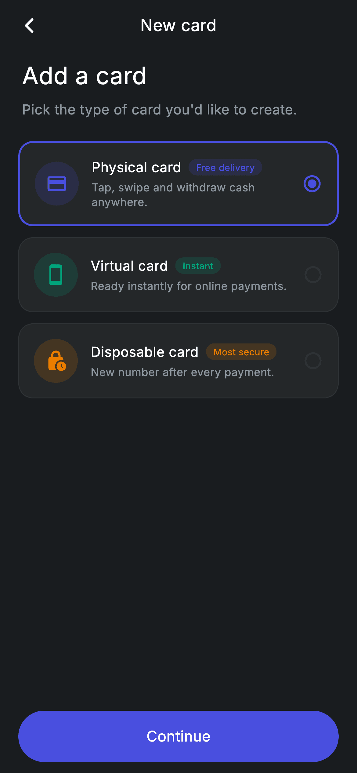
Before a banking app issues a card it has to ask which kind — physical, virtual, or disposable. This tutorial builds that picker in Flutter as a single-select list of three radio cards, each with a tinted icon, a benefit tag, and a one-line explanation. The interesting part is how little state it takes: one `int _selected` drives the border colour, border width, and radio glyph on every card at once, and the card options themselves are stored as Dart records rather than a hand-written model class.
Watch the Flutter UI walkthrough
A short screen recording of Fintech · Add Card running, if you'd rather see it before you read the code. The written tutorial below covers everything in it.
Can't see the video? Watch it on YouTube.
What you'll build
- ✓A single-select list of card-type cards driven by one integer of state
- ✓Selection feedback done with border colour *and* border width, not just a checkmark
- ✓Options modelled as Dart 3 records — a typed list with no boilerplate class
- ✓A colour-tinted leading icon plus a matching benefit pill per option
- ✓A pinned full-width 'Continue' pill button with a proper Material ink ripple
Step-by-step build
Create the file
Add a new file at lib/fintech_card_add/fintech_card_add_screen.dart in your Flutter project.
Register the bundled fonts
No external packages — this is pure Flutter. It does bundle its design font (Inter), so drop the font file into fonts/ and declare it in pubspec.yaml:
flutter:
  fonts:
    - family: Inter
      fonts:
- asset: fonts/Inter-Regular.ttfBuild it, piece by piece
Here's how the screen goes together. Each block below is a real slice of the code with a plain-English explanation — paste them in order, or grab the whole file from the next section.
Records as the option model, and one int of state
class _FintechCardAddScreenState extends State<FintechCardAddScreen> {
  static const String _font = 'Inter';
  static const Color _bg = Color(0xFF191C1F);
  static const Color _surface = Color(0xFF242729);
  static const Color _brand = Color(0xFF494FDF);
  static const Color _teal = Color(0xFF00A87E);
  static const Color _amber = Color(0xFFEC7E00);
  static const Color _muted = Color(0xFF8D969E);
  static const Color _hairline = Color(0xFF2E3235);

  static const List<({IconData icon, Color tint, String title, String sub, String tag})>
      _types = <({IconData icon, Color tint, String title, String sub, String tag})>[
    (icon: Icons.credit_card_rounded, tint: _brand, title: 'Physical card', sub: 'Tap, swipe and withdraw cash anywhere.', tag: 'Free delivery'),
    (icon: Icons.smartphone_rounded, tint: _teal, title: 'Virtual card', sub: 'Ready instantly for online payments.', tag: 'Instant'),
    (icon: Icons.lock_clock_rounded, tint: _amber, title: 'Disposable card', sub: 'New number after every payment.', tag: 'Most secure'),
  ];

  int _selected = 0;
Instead of declaring a `_CardType` class, `_types` is a `const List` of Dart 3 *records*: `({IconData icon, Color tint, String title, String sub, String tag})`. Each entry is written inline as `(icon: ..., tint: ..., title: ...)` and fields are read back by name — full static typing with no class, no constructor, no boilerplate. The whole selection model is the single field below it, `int _selected = 0`, which pre-selects the physical card. That one integer is the entire mutable state of the screen.
Header, list, and a pinned CTA
  @override
  Widget build(BuildContext context) {
    return Theme(
      data: ThemeData.dark(useMaterial3: true),
      child: Scaffold(
        backgroundColor: _bg,
        body: SafeArea(
          child: Column(
            crossAxisAlignment: CrossAxisAlignment.stretch,
            children: <Widget>[
              _appBar(context),
              const Padding(
                padding: EdgeInsets.fromLTRB(24, 8, 24, 0),
                child: Text(
                  'Add a card',
                  style: TextStyle(
                    fontFamily: _font,
                    fontSize: 26,
                    fontWeight: FontWeight.w500,
                    letterSpacing: 0.24,
                    color: Colors.white,
                  ),
                ),
              ),
              const SizedBox(height: 8),
              const Padding(
                padding: EdgeInsets.symmetric(horizontal: 24),
                child: Text(
                  'Pick the type of card you\'d like to create.',
                  style: TextStyle(
                    fontFamily: _font,
                    fontSize: 15,
                    letterSpacing: 0.24,
                    color: _muted,
                  ),
                ),
              ),
              const SizedBox(height: 24),
              Expanded(
                child: ListView(
                  physics: const BouncingScrollPhysics(),
                  padding: const EdgeInsets.symmetric(horizontal: 20),
                  children: <Widget>[
                    for (int i = 0; i < _types.length; i++) ...<Widget>[
                      _typeCard(i),
                      const SizedBox(height: 12),
                    ],
                  ],
                ),
              ),
              Padding(
                padding: const EdgeInsets.fromLTRB(20, 4, 20, 12),
                child: SizedBox(
                  height: 56,
                  child: Material(
                    color: _brand,
                    borderRadius: BorderRadius.circular(9999),
                    child: InkWell(
                      borderRadius: BorderRadius.circular(9999),
                      onTap: widget.onContinue,
                      child: const Center(
                        child: Text(
                          'Continue',
                          style: TextStyle(
                            fontFamily: _font,
                            fontSize: 16,
                            fontWeight: FontWeight.w500,
                            letterSpacing: 0.24,
                            color: Colors.white,
                          ),
                        ),
                      ),
                    ),
                  ),
                ),
              ),
            ],
          ),
        ),
      ),
    );
  }
The body is a `Column` of four parts: the app bar, a 26px 'Add a card' heading with a muted subtitle, an `Expanded` `ListView` of type cards, and the Continue button. Putting the button *after* the `Expanded` rather than inside the scroll view is what pins it to the bottom of the screen — it never scrolls away. The button itself is the `Material` + `InkWell` pair with the same `BorderRadius.circular(9999)` on both: `Material` paints the brand-indigo pill, and the matching radius on `InkWell` is what clips the tap ripple to the pill shape instead of letting it spill into a rectangle.
The app bar and its invisible balance widget
  Widget _appBar(BuildContext context) {
    return Padding(
      padding: const EdgeInsets.fromLTRB(8, 4, 8, 4),
      child: Row(
        children: <Widget>[
          IconButton(
            onPressed: widget.onBack ?? () => Navigator.of(context).maybePop(),
            icon: const Icon(Icons.arrow_back_ios_new_rounded,
                size: 20, color: Colors.white),
          ),
          const Expanded(
            child: Text(
              'New card',
              textAlign: TextAlign.center,
              style: TextStyle(
                fontFamily: _font,
                fontSize: 18,
                fontWeight: FontWeight.w500,
                letterSpacing: 0.24,
                color: Colors.white,
              ),
            ),
          ),
          const SizedBox(width: 48),
        ],
      ),
    );
  }
A `Row` with a back `IconButton`, an `Expanded` centre-aligned 'New card' title, and — importantly — a `const SizedBox(width: 48)` on the right. There is no trailing action here, but without that 48px spacer the `Expanded` title would occupy all the remaining width and appear pushed right. The spacer matches the leading `IconButton`'s footprint so the title sits truly centred. This is the manual equivalent of what `AppBar` does for you with its leading/actions slots.
The selectable type card
  Widget _typeCard(int i) {
    final ({IconData icon, Color tint, String title, String sub, String tag}) t =
        _types[i];
    final bool active = i == _selected;
    return GestureDetector(
      onTap: () => setState(() => _selected = i),
      behavior: HitTestBehavior.opaque,
      child: Container(
        padding: const EdgeInsets.all(16),
        decoration: BoxDecoration(
          color: _surface,
          borderRadius: BorderRadius.circular(16),
          border: Border.all(
            color: active ? _brand : _hairline,
            width: active ? 2 : 1,
          ),
        ),
        child: Row(
          children: <Widget>[
            Container(
              width: 48,
              height: 48,
              decoration: BoxDecoration(
                shape: BoxShape.circle,
                color: t.tint.withValues(alpha: 0.16),
              ),
              child: Icon(t.icon, size: 24, color: t.tint),
            ),
            const SizedBox(width: 14),
            Expanded(
              child: Column(
                crossAxisAlignment: CrossAxisAlignment.start,
                children: <Widget>[
                  Row(
                    children: <Widget>[
                      Text(
                        t.title,
                        style: const TextStyle(
                          fontFamily: _font,
                          fontSize: 15,
                          fontWeight: FontWeight.w500,
                          letterSpacing: 0.24,
                          color: Colors.white,
                        ),
                      ),
                      const SizedBox(width: 8),
                      Container(
                        padding: const EdgeInsets.symmetric(
                            horizontal: 8, vertical: 2),
                        decoration: BoxDecoration(
                          color: t.tint.withValues(alpha: 0.16),
                          borderRadius: BorderRadius.circular(9999),
                        ),
                        child: Text(
                          t.tag,
                          style: TextStyle(
                            fontFamily: _font,
                            fontSize: 10,
                            fontWeight: FontWeight.w500,
                            letterSpacing: 0.24,
                            color: t.tint,
                          ),
                        ),
                      ),
                    ],
                  ),
                  const SizedBox(height: 4),
                  Text(
                    t.sub,
                    style: const TextStyle(
                      fontFamily: _font,
                      fontSize: 12,
                      height: 1.3,
                      letterSpacing: 0.24,
                      color: _muted,
                    ),
                  ),
                ],
              ),
            ),
            const SizedBox(width: 8),
            Icon(
              active
                  ? Icons.radio_button_checked_rounded
                  : Icons.radio_button_unchecked_rounded,
              size: 22,
              color: active ? _brand : _hairline,
            ),
          ],
        ),
      ),
    );
  }
`_typeCard(int i)` destructures its record into `t`, then computes `final bool active = i == _selected`. That one boolean feeds three visual changes: the border colour (`_brand` vs `_hairline`), the border *width* (2 vs 1), and the trailing glyph (`radio_button_checked_rounded` vs `radio_button_unchecked_rounded`). Changing the width as well as the colour is what makes the selected card read at a glance rather than requiring a colour comparison. Tapping calls `setState(() => _selected = i)` — the whole list rebuilds, but because `active` is derived rather than stored per card, the previously selected one deselects itself for free. The leading 48px circle uses the tint recipe (`t.tint.withValues(alpha: 0.16)` behind a full-strength `t.tint` icon), and the same tint colours the benefit pill so each option is colour-coded end to end.
Full code
The complete, ready-to-paste source. Free to use in your projects — one click copies it all.
import 'package:flutter/material.dart';

/// Card Add — choose a new card type. Self-contained per CONVENTIONS.md: pure
/// Flutter, bundled Inter font, forced dark theme. Stateful: the selected type
/// drives the Continue CTA.
class FintechCardAddScreen extends StatefulWidget {
  const FintechCardAddScreen({super.key, this.onBack, this.onContinue});

  final VoidCallback? onBack;
  final VoidCallback? onContinue;

  @override
  State<FintechCardAddScreen> createState() => _FintechCardAddScreenState();
}

class _FintechCardAddScreenState extends State<FintechCardAddScreen> {
  static const String _font = 'Inter';
  static const Color _bg = Color(0xFF191C1F);
  static const Color _surface = Color(0xFF242729);
  static const Color _brand = Color(0xFF494FDF);
  static const Color _teal = Color(0xFF00A87E);
  static const Color _amber = Color(0xFFEC7E00);
  static const Color _muted = Color(0xFF8D969E);
  static const Color _hairline = Color(0xFF2E3235);

  static const List<({IconData icon, Color tint, String title, String sub, String tag})>
      _types = <({IconData icon, Color tint, String title, String sub, String tag})>[
    (icon: Icons.credit_card_rounded, tint: _brand, title: 'Physical card', sub: 'Tap, swipe and withdraw cash anywhere.', tag: 'Free delivery'),
    (icon: Icons.smartphone_rounded, tint: _teal, title: 'Virtual card', sub: 'Ready instantly for online payments.', tag: 'Instant'),
    (icon: Icons.lock_clock_rounded, tint: _amber, title: 'Disposable card', sub: 'New number after every payment.', tag: 'Most secure'),
  ];

  int _selected = 0;

  @override
  Widget build(BuildContext context) {
    return Theme(
      data: ThemeData.dark(useMaterial3: true),
      child: Scaffold(
        backgroundColor: _bg,
        body: SafeArea(
          child: Column(
            crossAxisAlignment: CrossAxisAlignment.stretch,
            children: <Widget>[
              _appBar(context),
              const Padding(
                padding: EdgeInsets.fromLTRB(24, 8, 24, 0),
                child: Text(
                  'Add a card',
                  style: TextStyle(
                    fontFamily: _font,
                    fontSize: 26,
                    fontWeight: FontWeight.w500,
                    letterSpacing: 0.24,
                    color: Colors.white,
                  ),
                ),
              ),
              const SizedBox(height: 8),
              const Padding(
                padding: EdgeInsets.symmetric(horizontal: 24),
                child: Text(
                  'Pick the type of card you\'d like to create.',
                  style: TextStyle(
                    fontFamily: _font,
                    fontSize: 15,
                    letterSpacing: 0.24,
                    color: _muted,
                  ),
                ),
              ),
              const SizedBox(height: 24),
              Expanded(
                child: ListView(
                  physics: const BouncingScrollPhysics(),
                  padding: const EdgeInsets.symmetric(horizontal: 20),
                  children: <Widget>[
                    for (int i = 0; i < _types.length; i++) ...<Widget>[
                      _typeCard(i),
                      const SizedBox(height: 12),
                    ],
                  ],
                ),
              ),
              Padding(
                padding: const EdgeInsets.fromLTRB(20, 4, 20, 12),
                child: SizedBox(
                  height: 56,
                  child: Material(
                    color: _brand,
                    borderRadius: BorderRadius.circular(9999),
                    child: InkWell(
                      borderRadius: BorderRadius.circular(9999),
                      onTap: widget.onContinue,
                      child: const Center(
                        child: Text(
                          'Continue',
                          style: TextStyle(
                            fontFamily: _font,
                            fontSize: 16,
                            fontWeight: FontWeight.w500,
                            letterSpacing: 0.24,
                            color: Colors.white,
                          ),
                        ),
                      ),
                    ),
                  ),
                ),
              ),
            ],
          ),
        ),
      ),
    );
  }

  Widget _appBar(BuildContext context) {
    return Padding(
      padding: const EdgeInsets.fromLTRB(8, 4, 8, 4),
      child: Row(
        children: <Widget>[
          IconButton(
            onPressed: widget.onBack ?? () => Navigator.of(context).maybePop(),
            icon: const Icon(Icons.arrow_back_ios_new_rounded,
                size: 20, color: Colors.white),
          ),
          const Expanded(
            child: Text(
              'New card',
              textAlign: TextAlign.center,
              style: TextStyle(
                fontFamily: _font,
                fontSize: 18,
                fontWeight: FontWeight.w500,
                letterSpacing: 0.24,
                color: Colors.white,
              ),
            ),
          ),
          const SizedBox(width: 48),
        ],
      ),
    );
  }

  Widget _typeCard(int i) {
    final ({IconData icon, Color tint, String title, String sub, String tag}) t =
        _types[i];
    final bool active = i == _selected;
    return GestureDetector(
      onTap: () => setState(() => _selected = i),
      behavior: HitTestBehavior.opaque,
      child: Container(
        padding: const EdgeInsets.all(16),
        decoration: BoxDecoration(
          color: _surface,
          borderRadius: BorderRadius.circular(16),
          border: Border.all(
            color: active ? _brand : _hairline,
            width: active ? 2 : 1,
          ),
        ),
        child: Row(
          children: <Widget>[
            Container(
              width: 48,
              height: 48,
              decoration: BoxDecoration(
                shape: BoxShape.circle,
                color: t.tint.withValues(alpha: 0.16),
              ),
              child: Icon(t.icon, size: 24, color: t.tint),
            ),
            const SizedBox(width: 14),
            Expanded(
              child: Column(
                crossAxisAlignment: CrossAxisAlignment.start,
                children: <Widget>[
                  Row(
                    children: <Widget>[
                      Text(
                        t.title,
                        style: const TextStyle(
                          fontFamily: _font,
                          fontSize: 15,
                          fontWeight: FontWeight.w500,
                          letterSpacing: 0.24,
                          color: Colors.white,
                        ),
                      ),
                      const SizedBox(width: 8),
                      Container(
                        padding: const EdgeInsets.symmetric(
                            horizontal: 8, vertical: 2),
                        decoration: BoxDecoration(
                          color: t.tint.withValues(alpha: 0.16),
                          borderRadius: BorderRadius.circular(9999),
                        ),
                        child: Text(
                          t.tag,
                          style: TextStyle(
                            fontFamily: _font,
                            fontSize: 10,
                            fontWeight: FontWeight.w500,
                            letterSpacing: 0.24,
                            color: t.tint,
                          ),
                        ),
                      ),
                    ],
                  ),
                  const SizedBox(height: 4),
                  Text(
                    t.sub,
                    style: const TextStyle(
                      fontFamily: _font,
                      fontSize: 12,
                      height: 1.3,
                      letterSpacing: 0.24,
                      color: _muted,
                    ),
                  ),
                ],
              ),
            ),
            const SizedBox(width: 8),
            Icon(
              active
                  ? Icons.radio_button_checked_rounded
                  : Icons.radio_button_unchecked_rounded,
              size: 22,
              color: active ? _brand : _hairline,
            ),
          ],
        ),
      ),
    );
  }
}
Plus bundled 1 binary asset (fonts/images). The CLI and MCP install those for you automatically.
Two faster ways to add it
Copy-paste works, but you can skip it entirely.
1. FlutterKit CLI
One command drops this screen — and its fonts — straight into your project.
$ flutterkit add fintech-card-add2. AI agent (MCP)
Connect FlutterKit's MCP server in Claude or Cursor and just ask your agent to install fintech-card-add — it fetches and writes the files for you.
FAQ
Is this card picker free to use?
Yes. The full Dart source is free for personal and commercial projects. Copy it from the code block, install it with the FlutterKit CLI (flutterkit add fintech-card-add), or add it through an AI agent over MCP.
Does it need any packages?
No — it's pure Flutter on the material library, with no third-party dependencies. The only thing to register in pubspec.yaml is the bundled Inter font family, which the CLI and MCP install for you.
How do I read the chosen card type after Continue?
The selection lives in _selected, so change onContinue to a ValueChanged<int> (or pass _types[_selected] back) and call it from the InkWell's onTap. Nothing else needs to change — the record already carries the title and tag you'd send to your API.
Which Flutter version does it target?
Records and named-field record types require Dart 3, and Color.withValues(alpha:) requires Flutter 3.27+. On an older SDK, replace the record list with a small class and swap withValues(alpha: x) for withOpacity(x).


