How to Build a Swipeable Cards Wallet Screen in Flutter (Full Code + Preview)
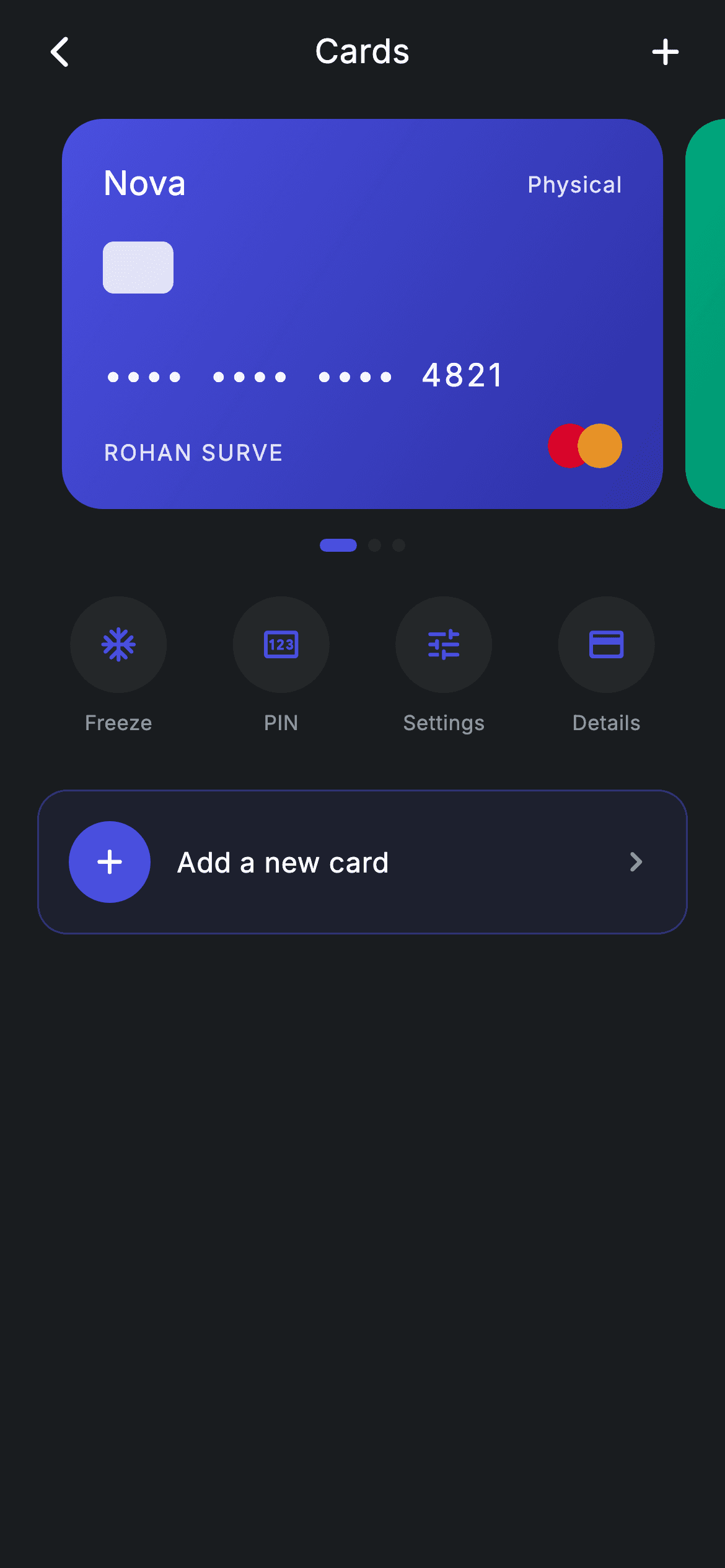
Three cards — physical, virtual and disposable — each a different gradient, and you swipe between them. This tutorial builds that carousel in Flutter using a PageView.builder whose viewportFraction of 0.86 leaves the neighbouring cards peeking in at the edges, an indicator row where the active dot stretches from a 7px circle into a 20px pill, and a four-button quick-action row for Freeze, PIN, Settings and Details. The card face itself — chip, masked number, holder line, scheme dots — is drawn entirely with Containers, so there are no images and no packages.
Watch the Flutter UI walkthrough
A short screen recording of Fintech · Cards running, if you'd rather see it before you read the code. The written tutorial below covers everything in it.
Can't see the video? Watch it on YouTube.
What you'll build
- ✓A swipeable three-card carousel where the next card peeks in from the edge, driven by a single PageController
- ✓A page indicator whose active dot widens to a 20px pill while the inactive ones stay 7px circles
- ✓A gradient 'Nova' card face built from plain Containers: rounded chip, masked •••• number, cardholder line and two overlapping scheme dots
- ✓A row of four circular quick actions plus a tinted 'Add a new card' tile, all wired to optional callbacks
- ✓A forced Material 3 dark theme on a #191C1F canvas using the bundled Inter font
Step-by-step build
Create the file
Add a new file at lib/fintech_cards/fintech_cards_screen.dart in your Flutter project.
Register the bundled fonts
No external packages — this is pure Flutter. It does bundle its design font (Inter), so drop the font file into fonts/ and declare it in pubspec.yaml:
flutter:
  fonts:
    - family: Inter
      fonts:
- asset: fonts/Inter-Regular.ttfBuild it, piece by piece
Here's how the screen goes together. Each block below is a real slice of the code with a plain-English explanation — paste them in order, or grab the whole file from the next section.
Callbacks, dark tokens, and the three mock cards
import 'package:flutter/material.dart';

/// Cards — a swipeable carousel of the user's cards with quick actions. Self-
/// contained per CONVENTIONS.md: pure Flutter, bundled Inter font, forced dark
/// theme. Stateful: a PageView tracks the selected card.
class FintechCardsScreen extends StatefulWidget {
  const FintechCardsScreen({
    super.key,
    this.onBack,
    this.onAdd,
    this.onDetails,
    this.onFreeze,
    this.onSettings,
    this.onPin,
  });

  final VoidCallback? onBack;
  final VoidCallback? onAdd;
  final VoidCallback? onDetails;
  final VoidCallback? onFreeze;
  final VoidCallback? onSettings;
  final VoidCallback? onPin;

  @override
  State<FintechCardsScreen> createState() => _FintechCardsScreenState();
}

class _FintechCardsScreenState extends State<FintechCardsScreen> {
  static const String _font = 'Inter';
  static const Color _bg = Color(0xFF191C1F);
  static const Color _surface = Color(0xFF242729);
  static const Color _brand = Color(0xFF494FDF);
  static const Color _teal = Color(0xFF00A87E);
  static const Color _muted = Color(0xFF8D969E);

  static const List<_CardModel> _cards = <_CardModel>[
    _CardModel('Physical', '4821', <Color>[_brand, Color(0xFF2D31A6)]),
    _CardModel('Virtual', '0934', <Color>[_teal, Color(0xFF007A5C)]),
    _CardModel('Disposable', '7752', <Color>[Color(0xFF2B2E31), Color(0xFF17191B)]),
  ];

  final PageController _controller = PageController(viewportFraction: 0.86);
  int _page = 0;
Only material.dart is imported — nothing else is needed. FintechCardsScreen is a StatefulWidget because the carousel has to remember which card is showing, and it takes six optional VoidCallback? hooks (onBack, onAdd, onDetails, onFreeze, onSettings, onPin) plus super.key, so you can drop it into a route and wire the buttons to your own navigation without editing the file. The state class holds the palette as static consts: _bg (#191C1F) is the near-black canvas, _surface (#242729) the raised circles, _brand (#494FDF) the indigo accent, _teal (#00A87E) the virtual-card green, and _muted (#8D969E) the secondary text. _cards is a const list of three _CardModel entries — 'Physical' / 4821 fading indigo into #2D31A6, 'Virtual' / 0934 fading teal into #007A5C, and 'Disposable' / 7752 in near-black #2B2E31 → #17191B. That's mock data baked into the file; swap it for your API's card list later. Finally the PageController is created with viewportFraction: 0.86, meaning each page takes 86% of the width so the cards either side stay partly visible, and int _page = 0 remembers which dot to highlight.
The dark scaffold, the carousel, and the page dots
  @override
  void dispose() {
    _controller.dispose();
    super.dispose();
  }

  @override
  Widget build(BuildContext context) {
    return Theme(
      data: ThemeData.dark(useMaterial3: true),
      child: Scaffold(
        backgroundColor: _bg,
        body: SafeArea(
          child: Column(
            crossAxisAlignment: CrossAxisAlignment.stretch,
            children: <Widget>[
              _appBar(context),
              Expanded(
                child: ListView(
                  physics: const BouncingScrollPhysics(),
                  padding: const EdgeInsets.only(bottom: 24),
                  children: <Widget>[
                    SizedBox(
                      height: 210,
                      child: PageView.builder(
                        controller: _controller,
                        itemCount: _cards.length,
                        onPageChanged: (int i) => setState(() => _page = i),
                        itemBuilder: (BuildContext context, int i) {
                          return Padding(
                            padding: const EdgeInsets.symmetric(horizontal: 6),
                            child: _NovaCard(model: _cards[i]),
                          );
                        },
                      ),
                    ),
                    const SizedBox(height: 16),
                    Row(
                      mainAxisAlignment: MainAxisAlignment.center,
                      children: <Widget>[
                        for (int i = 0; i < _cards.length; i++)
                          Container(
                            width: i == _page ? 20 : 7,
                            height: 7,
                            margin: const EdgeInsets.symmetric(horizontal: 3),
                            decoration: BoxDecoration(
                              color: i == _page ? _brand : _surface,
                              borderRadius: BorderRadius.circular(9999),
                            ),
                          ),
                      ],
                    ),
                    const SizedBox(height: 24),
dispose() releases the PageController — always do this or the controller leaks when the route is popped. build() wraps the whole Scaffold in Theme(data: ThemeData.dark(useMaterial3: true)) so the screen renders dark even if the host app is in light mode. Inside SafeArea a stretched Column pins _appBar at the top and gives the rest to an Expanded ListView with BouncingScrollPhysics and 24px of bottom padding. The carousel lives in a SizedBox(height: 210) because a PageView has unbounded height and would otherwise blow up inside a scroll view; PageView.builder then builds one _NovaCard per model, each padded 6px horizontally so the peeking cards have a gap, and onPageChanged: (i) => setState(() => _page = i) records the active index. The indicator underneath is a centered Row built with a collection-for over _cards: each dot is a Container 7px tall whose width is 20 when i == _page and 7 otherwise, coloured _brand when active and _surface when not, with borderRadius 9999 to keep it a pill at both widths. Note it's a plain Container, so the dot snaps rather than animates — swap it for an AnimatedContainer with a 200ms duration if you want it to glide.
Quick actions and the 'Add a new card' tile
                    Padding(
                      padding: const EdgeInsets.symmetric(horizontal: 20),
                      child: Row(
                        children: <Widget>[
                          _action(Icons.ac_unit_rounded, 'Freeze', widget.onFreeze),
                          _action(Icons.pin_outlined, 'PIN', widget.onPin),
                          _action(Icons.tune_rounded, 'Settings', widget.onSettings),
                          _action(Icons.credit_card_rounded, 'Details', widget.onDetails),
                        ],
                      ),
                    ),
                    const SizedBox(height: 28),
                    Padding(
                      padding: const EdgeInsets.symmetric(horizontal: 20),
                      child: GestureDetector(
                        onTap: widget.onAdd,
                        behavior: HitTestBehavior.opaque,
                        child: Container(
                          padding: const EdgeInsets.all(16),
                          decoration: BoxDecoration(
                            color: _brand.withValues(alpha: 0.08),
                            borderRadius: BorderRadius.circular(16),
                            border: Border.all(color: _brand.withValues(alpha: 0.4)),
                          ),
                          child: Row(
                            children: <Widget>[
                              Container(
                                width: 44,
                                height: 44,
                                decoration: const BoxDecoration(
                                  shape: BoxShape.circle,
                                  color: _brand,
                                ),
                                child: const Icon(Icons.add_rounded,
                                    size: 22, color: Colors.white),
                              ),
                              const SizedBox(width: 14),
                              const Expanded(
                                child: Text(
                                  'Add a new card',
                                  style: TextStyle(
                                    fontFamily: _font,
                                    fontSize: 15,
                                    fontWeight: FontWeight.w500,
                                    letterSpacing: 0.24,
                                    color: Colors.white,
                                  ),
                                ),
                              ),
                              const Icon(Icons.chevron_right_rounded,
                                  size: 22, color: _muted),
                            ],
                          ),
                        ),
                      ),
                    ),
                  ],
                ),
              ),
            ],
          ),
        ),
      ),
    );
  }
Below the dots, a Padding with 20px horizontal insets holds a Row of four _action(...) calls: ac_unit_rounded → 'Freeze', pin_outlined → 'PIN', tune_rounded → 'Settings', credit_card_rounded → 'Details', each handed the matching widget callback. Because _action returns an Expanded (see the helper below), the four buttons split the row evenly no matter the device width. After a 28px gap comes the add tile: a GestureDetector with behavior: HitTestBehavior.opaque — that's what makes the padding around the text tappable, not just the pixels the children paint. The tile itself is a Container with 16px padding, borderRadius 16, a background of _brand.withValues(alpha: 0.08) and a 40%-alpha _brand border, which gives the tinted 'ghost button' look without a second solid colour. Inside sits a 44px solid indigo circle carrying a white 22px add_rounded icon, a 14px gap, an Expanded 'Add a new card' label at 15px / w500 / letterSpacing 0.24, and a muted chevron_right_rounded to signal it opens something.
The centered app bar and the reusable action button
  Widget _appBar(BuildContext context) {
    return Padding(
      padding: const EdgeInsets.fromLTRB(8, 4, 8, 12),
      child: Row(
        children: <Widget>[
          IconButton(
            onPressed: widget.onBack ?? () => Navigator.of(context).maybePop(),
            icon: const Icon(Icons.arrow_back_ios_new_rounded,
                size: 20, color: Colors.white),
          ),
          const Expanded(
            child: Text(
              'Cards',
              textAlign: TextAlign.center,
              style: TextStyle(
                fontFamily: _font,
                fontSize: 18,
                fontWeight: FontWeight.w500,
                letterSpacing: 0.24,
                color: Colors.white,
              ),
            ),
          ),
          IconButton(
            onPressed: widget.onAdd,
            icon: const Icon(Icons.add_rounded, size: 24, color: Colors.white),
          ),
        ],
      ),
    );
  }

  Widget _action(IconData icon, String label, VoidCallback? onTap) {
    return Expanded(
      child: GestureDetector(
        onTap: onTap,
        behavior: HitTestBehavior.opaque,
        child: Column(
          children: <Widget>[
            Container(
              width: 52,
              height: 52,
              decoration: const BoxDecoration(
                shape: BoxShape.circle,
                color: _surface,
              ),
              child: Icon(icon, size: 22, color: _brand),
            ),
            const SizedBox(height: 8),
            Text(
              label,
              style: const TextStyle(
                fontFamily: _font,
                fontSize: 11,
                letterSpacing: 0.24,
                color: _muted,
              ),
            ),
          ],
        ),
      ),
    );
  }
_appBar is a hand-rolled Row rather than an AppBar, padded fromLTRB(8, 4, 8, 12). The leading IconButton uses widget.onBack ?? () => Navigator.of(context).maybePop() — the null-coalescing fallback means the back arrow still works if you push this screen and pass no callbacks at all. The 'Cards' title is wrapped in Expanded with textAlign: TextAlign.center, so it stays optically centered because the two IconButtons on either side occupy the same width; it's 18px, w500, letterSpacing 0.24. The trailing add_rounded IconButton fires widget.onAdd — the same callback as the tile at the bottom, so both entry points lead to one handler. _action(icon, label, onTap) is the small factory the quick-action row leans on: an Expanded wrapping an opaque GestureDetector and a Column made of a 52×52 circle filled with _surface holding a 22px icon tinted _brand, an 8px gap, and an 11px _muted label. One helper, four buttons, zero duplicated styling.
_CardModel and the gradient Nova card face
class _CardModel {
  const _CardModel(this.type, this.last4, this.colors);

  final String type;
  final String last4;
  final List<Color> colors;
}

/// The Nova card visual — gradient, chip, masked number, holder + scheme dots.
class _NovaCard extends StatelessWidget {
  const _NovaCard({required this.model});

  final _CardModel model;

  @override
  Widget build(BuildContext context) {
    return Container(
      width: double.infinity,
      padding: const EdgeInsets.all(22),
      decoration: BoxDecoration(
        borderRadius: BorderRadius.circular(22),
        gradient: LinearGradient(
          begin: Alignment.topLeft,
          end: Alignment.bottomRight,
          colors: model.colors,
        ),
      ),
      child: Column(
        crossAxisAlignment: CrossAxisAlignment.start,
        children: <Widget>[
          Row(
            mainAxisAlignment: MainAxisAlignment.spaceBetween,
            children: <Widget>[
              const Text(
                'Nova',
                style: TextStyle(
                  fontFamily: _FintechCardsScreenState._font,
                  fontSize: 18,
                  fontWeight: FontWeight.w500,
                  color: Colors.white,
                ),
              ),
              Text(
                model.type,
                style: TextStyle(
                  fontFamily: _FintechCardsScreenState._font,
                  fontSize: 12,
                  fontWeight: FontWeight.w400,
                  letterSpacing: 0.5,
                  color: Colors.white.withValues(alpha: 0.8),
                ),
              ),
            ],
          ),
          const SizedBox(height: 18),
          Container(
            width: 38,
            height: 28,
            decoration: BoxDecoration(
              color: Colors.white.withValues(alpha: 0.85),
              borderRadius: BorderRadius.circular(6),
            ),
          ),
          const Spacer(),
          Text(
            '••••  ••••  ••••  ${model.last4}',
            style: TextStyle(
              fontFamily: _FintechCardsScreenState._font,
              fontSize: 17,
              fontWeight: FontWeight.w500,
              letterSpacing: 1.5,
              color: Colors.white.withValues(alpha: 0.95),
            ),
          ),
_CardModel is a three-field const data class (type, last4, colors) — no logic, just the shape of one card. _NovaCard is stateless and turns that model into the visual: a full-width Container with 22px padding, borderRadius 22, and a LinearGradient running topLeft → bottomRight over model.colors, which is the single line responsible for the three cards looking completely different while sharing one widget. Its top Row uses spaceBetween to put the 'Nova' wordmark (18px, w500, white) opposite the card type (12px, letterSpacing 0.5, white at 80% alpha). After an 18px gap, the EMV chip is nothing more than a 38×28 Container filled with white at 85% alpha and a 6px radius — no asset required. A Spacer then pushes everything after it to the bottom of the card, and the number is a literal string '•••• •••• •••• ${model.last4}' at 17px with letterSpacing 1.5, using double spaces between groups so the masked digits read as four blocks. One detail worth noticing: the text styles reference _FintechCardsScreenState._font, which is legal only because both classes live in the same file — private members are library-private in Dart, not class-private.
Cardholder line, overlapping scheme dots, and the dot helper
          Row(
            mainAxisAlignment: MainAxisAlignment.spaceBetween,
            crossAxisAlignment: CrossAxisAlignment.end,
            children: <Widget>[
              Text(
                'ROHAN SURVE',
                style: TextStyle(
                  fontFamily: _FintechCardsScreenState._font,
                  fontSize: 12,
                  fontWeight: FontWeight.w400,
                  letterSpacing: 1.0,
                  color: Colors.white.withValues(alpha: 0.85),
                ),
              ),
              SizedBox(
                width: 40,
                height: 24,
                child: Stack(
                  children: <Widget>[
                    Positioned(
                      left: 0,
                      child: _schemeDot(const Color(0xFFEB001B)),
                    ),
                    Positioned(
                      right: 0,
                      child: _schemeDot(const Color(0xFFF79E1B)),
                    ),
                  ],
                ),
              ),
            ],
          ),
        ],
      ),
    );
  }

  Widget _schemeDot(Color c) {
    return Container(
      width: 24,
      height: 24,
      decoration: BoxDecoration(
        shape: BoxShape.circle,
        color: c.withValues(alpha: 0.9),
      ),
    );
  }
}
The final Row aligns its children to the bottom with crossAxisAlignment: CrossAxisAlignment.end and separates them with spaceBetween. On the left is the embossed-looking holder name 'ROHAN SURVE' at 12px with letterSpacing 1.0 and white at 85% alpha — change that string, or make it another _CardModel field if each card has a different holder. On the right, a SizedBox(width: 40, height: 24) contains a Stack with two circles Positioned at left: 0 and right: 0; since each _schemeDot is 24px wide inside a 40px box, they overlap by 8px, and the 90% alpha in _schemeDot lets the overlap blend. The colours are the familiar red #EB001B and amber #F79E1B, so it reads as a payment-network mark without shipping anyone's trademarked logo — replace _schemeDot with an Image.asset if you have licensed artwork.
Full code
The complete, ready-to-paste source. Free to use in your projects — one click copies it all.
import 'package:flutter/material.dart';

/// Cards — a swipeable carousel of the user's cards with quick actions. Self-
/// contained per CONVENTIONS.md: pure Flutter, bundled Inter font, forced dark
/// theme. Stateful: a PageView tracks the selected card.
class FintechCardsScreen extends StatefulWidget {
  const FintechCardsScreen({
    super.key,
    this.onBack,
    this.onAdd,
    this.onDetails,
    this.onFreeze,
    this.onSettings,
    this.onPin,
  });

  final VoidCallback? onBack;
  final VoidCallback? onAdd;
  final VoidCallback? onDetails;
  final VoidCallback? onFreeze;
  final VoidCallback? onSettings;
  final VoidCallback? onPin;

  @override
  State<FintechCardsScreen> createState() => _FintechCardsScreenState();
}

class _FintechCardsScreenState extends State<FintechCardsScreen> {
  static const String _font = 'Inter';
  static const Color _bg = Color(0xFF191C1F);
  static const Color _surface = Color(0xFF242729);
  static const Color _brand = Color(0xFF494FDF);
  static const Color _teal = Color(0xFF00A87E);
  static const Color _muted = Color(0xFF8D969E);

  static const List<_CardModel> _cards = <_CardModel>[
    _CardModel('Physical', '4821', <Color>[_brand, Color(0xFF2D31A6)]),
    _CardModel('Virtual', '0934', <Color>[_teal, Color(0xFF007A5C)]),
    _CardModel('Disposable', '7752', <Color>[Color(0xFF2B2E31), Color(0xFF17191B)]),
  ];

  final PageController _controller = PageController(viewportFraction: 0.86);
  int _page = 0;

  @override
  void dispose() {
    _controller.dispose();
    super.dispose();
  }

  @override
  Widget build(BuildContext context) {
    return Theme(
      data: ThemeData.dark(useMaterial3: true),
      child: Scaffold(
        backgroundColor: _bg,
        body: SafeArea(
          child: Column(
            crossAxisAlignment: CrossAxisAlignment.stretch,
            children: <Widget>[
              _appBar(context),
              Expanded(
                child: ListView(
                  physics: const BouncingScrollPhysics(),
                  padding: const EdgeInsets.only(bottom: 24),
                  children: <Widget>[
                    SizedBox(
                      height: 210,
                      child: PageView.builder(
                        controller: _controller,
                        itemCount: _cards.length,
                        onPageChanged: (int i) => setState(() => _page = i),
                        itemBuilder: (BuildContext context, int i) {
                          return Padding(
                            padding: const EdgeInsets.symmetric(horizontal: 6),
                            child: _NovaCard(model: _cards[i]),
                          );
                        },
                      ),
                    ),
                    const SizedBox(height: 16),
                    Row(
                      mainAxisAlignment: MainAxisAlignment.center,
                      children: <Widget>[
                        for (int i = 0; i < _cards.length; i++)
                          Container(
                            width: i == _page ? 20 : 7,
                            height: 7,
                            margin: const EdgeInsets.symmetric(horizontal: 3),
                            decoration: BoxDecoration(
                              color: i == _page ? _brand : _surface,
                              borderRadius: BorderRadius.circular(9999),
                            ),
                          ),
                      ],
                    ),
                    const SizedBox(height: 24),
                    Padding(
                      padding: const EdgeInsets.symmetric(horizontal: 20),
                      child: Row(
                        children: <Widget>[
                          _action(Icons.ac_unit_rounded, 'Freeze', widget.onFreeze),
                          _action(Icons.pin_outlined, 'PIN', widget.onPin),
                          _action(Icons.tune_rounded, 'Settings', widget.onSettings),
                          _action(Icons.credit_card_rounded, 'Details', widget.onDetails),
                        ],
                      ),
                    ),
                    const SizedBox(height: 28),
                    Padding(
                      padding: const EdgeInsets.symmetric(horizontal: 20),
                      child: GestureDetector(
                        onTap: widget.onAdd,
                        behavior: HitTestBehavior.opaque,
                        child: Container(
                          padding: const EdgeInsets.all(16),
                          decoration: BoxDecoration(
                            color: _brand.withValues(alpha: 0.08),
                            borderRadius: BorderRadius.circular(16),
                            border: Border.all(color: _brand.withValues(alpha: 0.4)),
                          ),
                          child: Row(
                            children: <Widget>[
                              Container(
                                width: 44,
                                height: 44,
                                decoration: const BoxDecoration(
                                  shape: BoxShape.circle,
                                  color: _brand,
                                ),
                                child: const Icon(Icons.add_rounded,
                                    size: 22, color: Colors.white),
                              ),
                              const SizedBox(width: 14),
                              const Expanded(
                                child: Text(
                                  'Add a new card',
                                  style: TextStyle(
                                    fontFamily: _font,
                                    fontSize: 15,
                                    fontWeight: FontWeight.w500,
                                    letterSpacing: 0.24,
                                    color: Colors.white,
                                  ),
                                ),
                              ),
                              const Icon(Icons.chevron_right_rounded,
                                  size: 22, color: _muted),
                            ],
                          ),
                        ),
                      ),
                    ),
                  ],
                ),
              ),
            ],
          ),
        ),
      ),
    );
  }

  Widget _appBar(BuildContext context) {
    return Padding(
      padding: const EdgeInsets.fromLTRB(8, 4, 8, 12),
      child: Row(
        children: <Widget>[
          IconButton(
            onPressed: widget.onBack ?? () => Navigator.of(context).maybePop(),
            icon: const Icon(Icons.arrow_back_ios_new_rounded,
                size: 20, color: Colors.white),
          ),
          const Expanded(
            child: Text(
              'Cards',
              textAlign: TextAlign.center,
              style: TextStyle(
                fontFamily: _font,
                fontSize: 18,
                fontWeight: FontWeight.w500,
                letterSpacing: 0.24,
                color: Colors.white,
              ),
            ),
          ),
          IconButton(
            onPressed: widget.onAdd,
            icon: const Icon(Icons.add_rounded, size: 24, color: Colors.white),
          ),
        ],
      ),
    );
  }

  Widget _action(IconData icon, String label, VoidCallback? onTap) {
    return Expanded(
      child: GestureDetector(
        onTap: onTap,
        behavior: HitTestBehavior.opaque,
        child: Column(
          children: <Widget>[
            Container(
              width: 52,
              height: 52,
              decoration: const BoxDecoration(
                shape: BoxShape.circle,
                color: _surface,
              ),
              child: Icon(icon, size: 22, color: _brand),
            ),
            const SizedBox(height: 8),
            Text(
              label,
              style: const TextStyle(
                fontFamily: _font,
                fontSize: 11,
                letterSpacing: 0.24,
                color: _muted,
              ),
            ),
          ],
        ),
      ),
    );
  }
}

class _CardModel {
  const _CardModel(this.type, this.last4, this.colors);

  final String type;
  final String last4;
  final List<Color> colors;
}

/// The Nova card visual — gradient, chip, masked number, holder + scheme dots.
class _NovaCard extends StatelessWidget {
  const _NovaCard({required this.model});

  final _CardModel model;

  @override
  Widget build(BuildContext context) {
    return Container(
      width: double.infinity,
      padding: const EdgeInsets.all(22),
      decoration: BoxDecoration(
        borderRadius: BorderRadius.circular(22),
        gradient: LinearGradient(
          begin: Alignment.topLeft,
          end: Alignment.bottomRight,
          colors: model.colors,
        ),
      ),
      child: Column(
        crossAxisAlignment: CrossAxisAlignment.start,
        children: <Widget>[
          Row(
            mainAxisAlignment: MainAxisAlignment.spaceBetween,
            children: <Widget>[
              const Text(
                'Nova',
                style: TextStyle(
                  fontFamily: _FintechCardsScreenState._font,
                  fontSize: 18,
                  fontWeight: FontWeight.w500,
                  color: Colors.white,
                ),
              ),
              Text(
                model.type,
                style: TextStyle(
                  fontFamily: _FintechCardsScreenState._font,
                  fontSize: 12,
                  fontWeight: FontWeight.w400,
                  letterSpacing: 0.5,
                  color: Colors.white.withValues(alpha: 0.8),
                ),
              ),
            ],
          ),
          const SizedBox(height: 18),
          Container(
            width: 38,
            height: 28,
            decoration: BoxDecoration(
              color: Colors.white.withValues(alpha: 0.85),
              borderRadius: BorderRadius.circular(6),
            ),
          ),
          const Spacer(),
          Text(
            '••••  ••••  ••••  ${model.last4}',
            style: TextStyle(
              fontFamily: _FintechCardsScreenState._font,
              fontSize: 17,
              fontWeight: FontWeight.w500,
              letterSpacing: 1.5,
              color: Colors.white.withValues(alpha: 0.95),
            ),
          ),
          const SizedBox(height: 14),
          Row(
            mainAxisAlignment: MainAxisAlignment.spaceBetween,
            crossAxisAlignment: CrossAxisAlignment.end,
            children: <Widget>[
              Text(
                'ROHAN SURVE',
                style: TextStyle(
                  fontFamily: _FintechCardsScreenState._font,
                  fontSize: 12,
                  fontWeight: FontWeight.w400,
                  letterSpacing: 1.0,
                  color: Colors.white.withValues(alpha: 0.85),
                ),
              ),
              SizedBox(
                width: 40,
                height: 24,
                child: Stack(
                  children: <Widget>[
                    Positioned(
                      left: 0,
                      child: _schemeDot(const Color(0xFFEB001B)),
                    ),
                    Positioned(
                      right: 0,
                      child: _schemeDot(const Color(0xFFF79E1B)),
                    ),
                  ],
                ),
              ),
            ],
          ),
        ],
      ),
    );
  }

  Widget _schemeDot(Color c) {
    return Container(
      width: 24,
      height: 24,
      decoration: BoxDecoration(
        shape: BoxShape.circle,
        color: c.withValues(alpha: 0.9),
      ),
    );
  }
}
Plus bundled 1 binary asset (fonts/images). The CLI and MCP install those for you automatically.
Two faster ways to add it
Copy-paste works, but you can skip it entirely.
1. FlutterKit CLI
One command drops this screen — and its fonts — straight into your project.
$ flutterkit add fintech-cards2. AI agent (MCP)
Connect FlutterKit's MCP server in Claude or Cursor and just ask your agent to install fintech-cards — it fetches and writes the files for you.
FAQ
Can I use this card carousel screen in a commercial app?
Yes. The full Dart for this screen is free to copy and ship in personal or commercial apps. Paste it from this page, install it with the FlutterKit CLI (flutterkit add fintech-cards), or let an AI agent add it for you over MCP. Just remember to swap the placeholder card data — 'ROHAN SURVE' and the mock 4821 / 0934 / 7752 numbers — for your own.
Do I need a carousel package for the swipeable cards?
No. The carousel is Flutter's own PageView.builder with a PageController(viewportFraction: 0.86), the gradients come from LinearGradient, and the chip and scheme dots are plain Containers, so the packages list is empty. The only bundled asset is the Inter font, which you register in pubspec.yaml as shown above — the CLI and MCP copy those font files in for you.
Which Flutter version does this screen need?
It uses Color.withValues(alpha: …) on the card tile, the border, and the white overlays, plus super parameters (super.key) and Material 3 via ThemeData.dark(useMaterial3: true), so target Flutter 3.22+ / Dart 3. On an older SDK, replace each withValues(alpha: 0.08) with withOpacity(0.08) — same for the 0.4, 0.85, 0.9 and 0.95 calls in _NovaCard — and it compiles unchanged.


