How to Build a Card Details Screen in Flutter (Full Code + Preview)
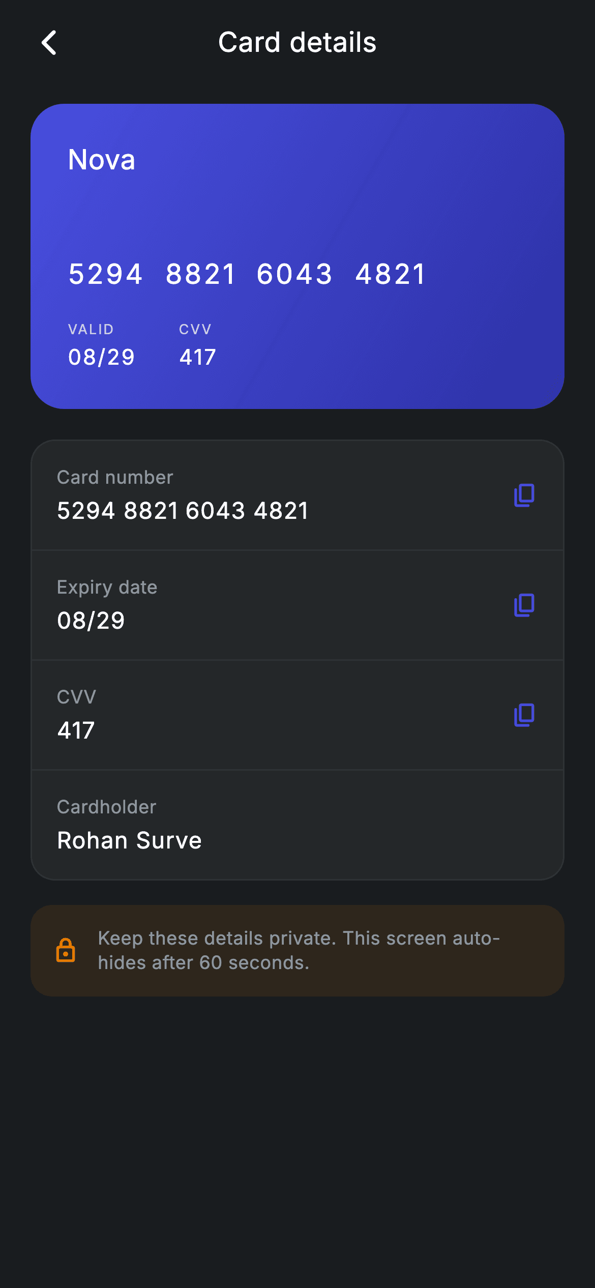
Typing a card number at online checkout means digging the plastic out of your wallet — unless your banking app can show it on screen. This tutorial builds exactly that screen in Flutter: a dark #191C1F route with an indigo gradient card carrying the 'Nova' brand, the number 5294 8821 6043 4821, its VALID date and CVV, then a grouped list that repeats every value with a copy icon beside it, and an amber lock banner about the details auto-hiding. It is one stateless widget, pure Flutter, with mock data you replace.
Watch the Flutter UI walkthrough
A short screen recording of Fintech · Card Details running, if you'd rather see it before you read the code. The written tutorial below covers everything in it.
Can't see the video? Watch it on YouTube.
What you'll build
- ✓A dark, forced-theme card details route that renders standalone without touching your app's global ThemeData
- ✓A 200px gradient card preview built from two indigo stops, with the brand, full PAN, expiry and CVV laid out inside it
- ✓A rounded, hairline-bordered detail list whose four rows come from a single reusable row builder
- ✓Copy icons that appear only on the rows you mark copyable — the cardholder name deliberately has none
- ✓An amber tinted privacy banner with a lock icon, typeset in the bundled Inter font
Step-by-step build
Create the file
Add a new file at lib/fintech_card_secure_details/fintech_card_secure_details_screen.dart in your Flutter project.
Register the bundled fonts
No external packages — this is pure Flutter. It does bundle its design font (Inter), so drop the font file into fonts/ and declare it in pubspec.yaml:
flutter:
  fonts:
    - family: Inter
      fonts:
- asset: fonts/Inter-Regular.ttfBuild it, piece by piece
Here's how the screen goes together. Each block below is a real slice of the code with a plain-English explanation — paste them in order, or grab the whole file from the next section.
The screen class and its dark palette
import 'package:flutter/material.dart';

/// Card Secure Details — the full card number, expiry, CVV and holder, with copy
/// affordances. Self-contained per CONVENTIONS.md: pure Flutter, bundled Inter
/// font, forced dark theme so it renders standalone as a route.
class FintechCardSecureDetailsScreen extends StatelessWidget {
  const FintechCardSecureDetailsScreen({super.key, this.onBack});

  final VoidCallback? onBack;

  static const String _font = 'Inter';
  static const Color _bg = Color(0xFF191C1F);
  static const Color _surface = Color(0xFF242729);
  static const Color _brand = Color(0xFF494FDF);
  static const Color _amber = Color(0xFFEC7E00);
  static const Color _muted = Color(0xFF8D969E);
  static const Color _hairline = Color(0xFF2E3235);
Only material.dart is imported — there is no clipboard or animation package here. FintechCardSecureDetailsScreen is a StatelessWidget because nothing on the page changes at runtime: the card values are hard-coded strings and the copy icons are decoration until you wire them up. The one input is an optional onBack VoidCallback, declared with a super parameter for key. Below it sit seven static const design tokens: _font ('Inter'), _bg (#191C1F) for the page, _surface (#242729) for the detail card, _brand (#494FDF) indigo for the gradient and copy icons, _amber (#EC7E00) for the privacy banner, _muted (#8D969E) for labels, and _hairline (#2E3235) for borders and dividers. Every colour in the file comes from this list, so retheming means editing eight lines.
Forcing dark mode and scrolling the page
  @override
  Widget build(BuildContext context) {
    return Theme(
      data: ThemeData.dark(useMaterial3: true),
      child: Scaffold(
        backgroundColor: _bg,
        body: SafeArea(
          child: Column(
            crossAxisAlignment: CrossAxisAlignment.stretch,
            children: <Widget>[
              _appBar(context),
              Expanded(
                child: ListView(
                  physics: const BouncingScrollPhysics(),
                  padding: const EdgeInsets.fromLTRB(20, 8, 20, 24),
                  children: <Widget>[
build() wraps everything in a Theme with ThemeData.dark(useMaterial3: true). That local override is what lets the screen drop into a light-themed app and still look right — the Scaffold beneath it is painted _bg regardless. SafeArea keeps content off the notch and home indicator, then a Column with crossAxisAlignment.stretch puts the custom app bar at a fixed height on top and hands the rest to an Expanded ListView. Using a ListView rather than a plain Column means the page still scrolls on a small phone instead of overflowing. BouncingScrollPhysics gives it the iOS-style rubber band, and the padding insets the content 20px on each side, 8px above and 24px below.
The gradient card preview
                    Container(
                      height: 200,
                      padding: const EdgeInsets.all(24),
                      decoration: BoxDecoration(
                        borderRadius: BorderRadius.circular(22),
                        gradient: const LinearGradient(
                          begin: Alignment.topLeft,
                          end: Alignment.bottomRight,
                          colors: <Color>[_brand, Color(0xFF2D31A6)],
                        ),
                      ),
                      child: Column(
                        crossAxisAlignment: CrossAxisAlignment.start,
                        children: <Widget>[
                          const Text(
                            'Nova',
                            style: TextStyle(
                              fontFamily: _font,
                              fontSize: 18,
                              fontWeight: FontWeight.w500,
                              color: Colors.white,
                            ),
                          ),
                          const Spacer(),
                          const Text(
                            '5294  8821  6043  4821',
                            style: TextStyle(
                              fontFamily: _font,
                              fontSize: 18,
                              fontWeight: FontWeight.w500,
                              letterSpacing: 1.5,
                              color: Colors.white,
                            ),
                          ),
                          const SizedBox(height: 16),
                          Row(
                            children: <Widget>[
                              _cardField('VALID', '08/29'),
                              const SizedBox(width: 28),
                              _cardField('CVV', '417'),
                            ],
                          ),
                        ],
                      ),
                    ),
The first list child is a fixed 200px-tall Container with 24px of internal padding, a 22px corner radius, and a LinearGradient running topLeft to bottomRight from _brand (#494FDF) into the darker #2D31A6. Inside, a start-aligned Column puts the 'Nova' wordmark at 18px w500 at the top, then a Spacer pushes everything else to the bottom of the card — that single Spacer is what creates the classic bank-card composition without any hard-coded gaps. The PAN is written as a plain string with double spaces between groups, '5294 8821 6043 4821', plus 1.5 letterSpacing so the digits breathe. Under a 16px gap, a Row calls the _cardField helper twice — 'VALID' / '08/29' and 'CVV' / '417' — separated by a 28px SizedBox.
The detail list and the amber privacy banner
                    const SizedBox(height: 20),
                    Container(
                      decoration: BoxDecoration(
                        color: _surface,
                        borderRadius: BorderRadius.circular(16),
                        border: Border.all(color: _hairline),
                      ),
                      child: Column(
                        children: <Widget>[
                          _row('Card number', '5294 8821 6043 4821'),
                          const Divider(color: _hairline, height: 1),
                          _row('Expiry date', '08/29'),
                          const Divider(color: _hairline, height: 1),
                          _row('CVV', '417'),
                          const Divider(color: _hairline, height: 1),
                          _row('Cardholder', 'Rohan Surve', copyable: false),
                        ],
                      ),
                    ),
                    const SizedBox(height: 16),
                    Container(
                      padding: const EdgeInsets.all(14),
                      decoration: BoxDecoration(
                        color: _amber.withValues(alpha: 0.10),
                        borderRadius: BorderRadius.circular(14),
                      ),
                      child: const Row(
                        children: <Widget>[
                          Icon(Icons.lock_outline_rounded,
                              size: 18, color: _amber),
                          SizedBox(width: 12),
                          Expanded(
                            child: Text(
                              'Keep these details private. This screen auto-hides '
                              'after 60 seconds.',
                              style: TextStyle(
                                fontFamily: _font,
                                fontSize: 12,
                                height: 1.35,
                                letterSpacing: 0.24,
                                color: _muted,
                              ),
                            ),
                          ),
                        ],
                      ),
                    ),
                  ],
                ),
              ),
            ],
          ),
        ),
      ),
    );
  }
After a 20px gap comes the grouped list: a _surface Container with a 16px radius and a 1px _hairline border, holding a Column of four _row calls — 'Card number', 'Expiry date', 'CVV' and 'Cardholder' — each separated by a Divider given height: 1 so it draws as a true hairline rather than reserving Material's default 16px of space. The cardholder row passes copyable: false, so it is the only one without a copy icon. Below it, a 14px-padded Container tinted with _amber.withValues(alpha: 0.10) forms the privacy banner: a const Row with a 18px lock_outline_rounded icon, a 12px gap, and an Expanded 12px caption at 1.35 line height reading 'Keep these details private. This screen auto-hides after 60 seconds.' Note that the banner is copy only — there is no Timer in this file, so if you want the auto-hide you add it yourself.
A centred app bar built by hand
  Widget _appBar(BuildContext context) {
    return Padding(
      padding: const EdgeInsets.fromLTRB(8, 4, 8, 8),
      child: Row(
        children: <Widget>[
          IconButton(
            onPressed: onBack ?? () => Navigator.of(context).maybePop(),
            icon: const Icon(Icons.arrow_back_ios_new_rounded,
                size: 20, color: Colors.white),
          ),
          const Expanded(
            child: Text(
              'Card details',
              textAlign: TextAlign.center,
              style: TextStyle(
                fontFamily: _font,
                fontSize: 18,
                fontWeight: FontWeight.w500,
                letterSpacing: 0.24,
                color: Colors.white,
              ),
            ),
          ),
          const SizedBox(width: 48),
        ],
      ),
    );
  }
_appBar returns a padded Row rather than an AppBar, which keeps the height tight and the styling entirely yours. The leading IconButton uses arrow_back_ios_new_rounded at 20px white and falls back gracefully: onBack ?? () => Navigator.of(context).maybePop(), so the screen pops itself when no callback is supplied but a host app can intercept the back press. The title 'Card details' sits in an Expanded with textAlign.center, and the trailing const SizedBox(width: 48) mirrors the IconButton's footprint — that fake spacer is the trick that keeps the title optically centred instead of drifting right.
The two reusable builders: _cardField and _row
  Widget _cardField(String label, String value) {
    return Column(
      crossAxisAlignment: CrossAxisAlignment.start,
      children: <Widget>[
        Text(
          label,
          style: TextStyle(
            fontFamily: _font,
            fontSize: 9,
            letterSpacing: 1.0,
            color: Colors.white.withValues(alpha: 0.7),
          ),
        ),
        const SizedBox(height: 2),
        Text(
          value,
          style: const TextStyle(
            fontFamily: _font,
            fontSize: 14,
            fontWeight: FontWeight.w500,
            letterSpacing: 1.0,
            color: Colors.white,
          ),
        ),
      ],
    );
  }

  Widget _row(String label, String value, {bool copyable = true}) {
    return Padding(
      padding: const EdgeInsets.symmetric(horizontal: 16, vertical: 15),
      child: Row(
        children: <Widget>[
          Expanded(
            child: Column(
              crossAxisAlignment: CrossAxisAlignment.start,
              children: <Widget>[
                Text(
                  label,
                  style: const TextStyle(
                    fontFamily: _font,
                    fontSize: 12,
                    letterSpacing: 0.24,
                    color: _muted,
                  ),
                ),
                const SizedBox(height: 3),
                Text(
                  value,
                  style: const TextStyle(
                    fontFamily: _font,
                    fontSize: 15,
                    fontWeight: FontWeight.w500,
                    letterSpacing: 0.5,
                    color: Colors.white,
                  ),
                ),
              ],
            ),
          ),
          if (copyable)
            const Icon(Icons.copy_rounded, size: 18, color: _brand),
        ],
      ),
    );
  }
}
_cardField(label, value) renders the tiny on-card pairs: a 9px uppercase label at 1.0 letterSpacing in white at 70% opacity via Colors.white.withValues(alpha: 0.7), a 2px gap, then the value at 14px w500 in solid white. The contrast between the faded label and the bright value is what makes 'VALID 08/29' read like an embossed card. _row(label, value, {copyable = true}) builds the list rows: 16px horizontal and 15px vertical padding, an Expanded Column with the _muted 12px label above a 15px w500 white value, and then the conditional `if (copyable)` collection-if that appends a 18px copy_rounded Icon tinted _brand. Because the icon is inside a plain Row and not a button, tapping it does nothing yet — wrap it in an IconButton calling Clipboard.setData(ClipboardData(text: value)) to make it live.
Full code
The complete, ready-to-paste source. Free to use in your projects — one click copies it all.
import 'package:flutter/material.dart';

/// Card Secure Details — the full card number, expiry, CVV and holder, with copy
/// affordances. Self-contained per CONVENTIONS.md: pure Flutter, bundled Inter
/// font, forced dark theme so it renders standalone as a route.
class FintechCardSecureDetailsScreen extends StatelessWidget {
  const FintechCardSecureDetailsScreen({super.key, this.onBack});

  final VoidCallback? onBack;

  static const String _font = 'Inter';
  static const Color _bg = Color(0xFF191C1F);
  static const Color _surface = Color(0xFF242729);
  static const Color _brand = Color(0xFF494FDF);
  static const Color _amber = Color(0xFFEC7E00);
  static const Color _muted = Color(0xFF8D969E);
  static const Color _hairline = Color(0xFF2E3235);

  @override
  Widget build(BuildContext context) {
    return Theme(
      data: ThemeData.dark(useMaterial3: true),
      child: Scaffold(
        backgroundColor: _bg,
        body: SafeArea(
          child: Column(
            crossAxisAlignment: CrossAxisAlignment.stretch,
            children: <Widget>[
              _appBar(context),
              Expanded(
                child: ListView(
                  physics: const BouncingScrollPhysics(),
                  padding: const EdgeInsets.fromLTRB(20, 8, 20, 24),
                  children: <Widget>[
                    Container(
                      height: 200,
                      padding: const EdgeInsets.all(24),
                      decoration: BoxDecoration(
                        borderRadius: BorderRadius.circular(22),
                        gradient: const LinearGradient(
                          begin: Alignment.topLeft,
                          end: Alignment.bottomRight,
                          colors: <Color>[_brand, Color(0xFF2D31A6)],
                        ),
                      ),
                      child: Column(
                        crossAxisAlignment: CrossAxisAlignment.start,
                        children: <Widget>[
                          const Text(
                            'Nova',
                            style: TextStyle(
                              fontFamily: _font,
                              fontSize: 18,
                              fontWeight: FontWeight.w500,
                              color: Colors.white,
                            ),
                          ),
                          const Spacer(),
                          const Text(
                            '5294  8821  6043  4821',
                            style: TextStyle(
                              fontFamily: _font,
                              fontSize: 18,
                              fontWeight: FontWeight.w500,
                              letterSpacing: 1.5,
                              color: Colors.white,
                            ),
                          ),
                          const SizedBox(height: 16),
                          Row(
                            children: <Widget>[
                              _cardField('VALID', '08/29'),
                              const SizedBox(width: 28),
                              _cardField('CVV', '417'),
                            ],
                          ),
                        ],
                      ),
                    ),
                    const SizedBox(height: 20),
                    Container(
                      decoration: BoxDecoration(
                        color: _surface,
                        borderRadius: BorderRadius.circular(16),
                        border: Border.all(color: _hairline),
                      ),
                      child: Column(
                        children: <Widget>[
                          _row('Card number', '5294 8821 6043 4821'),
                          const Divider(color: _hairline, height: 1),
                          _row('Expiry date', '08/29'),
                          const Divider(color: _hairline, height: 1),
                          _row('CVV', '417'),
                          const Divider(color: _hairline, height: 1),
                          _row('Cardholder', 'Rohan Surve', copyable: false),
                        ],
                      ),
                    ),
                    const SizedBox(height: 16),
                    Container(
                      padding: const EdgeInsets.all(14),
                      decoration: BoxDecoration(
                        color: _amber.withValues(alpha: 0.10),
                        borderRadius: BorderRadius.circular(14),
                      ),
                      child: const Row(
                        children: <Widget>[
                          Icon(Icons.lock_outline_rounded,
                              size: 18, color: _amber),
                          SizedBox(width: 12),
                          Expanded(
                            child: Text(
                              'Keep these details private. This screen auto-hides '
                              'after 60 seconds.',
                              style: TextStyle(
                                fontFamily: _font,
                                fontSize: 12,
                                height: 1.35,
                                letterSpacing: 0.24,
                                color: _muted,
                              ),
                            ),
                          ),
                        ],
                      ),
                    ),
                  ],
                ),
              ),
            ],
          ),
        ),
      ),
    );
  }

  Widget _appBar(BuildContext context) {
    return Padding(
      padding: const EdgeInsets.fromLTRB(8, 4, 8, 8),
      child: Row(
        children: <Widget>[
          IconButton(
            onPressed: onBack ?? () => Navigator.of(context).maybePop(),
            icon: const Icon(Icons.arrow_back_ios_new_rounded,
                size: 20, color: Colors.white),
          ),
          const Expanded(
            child: Text(
              'Card details',
              textAlign: TextAlign.center,
              style: TextStyle(
                fontFamily: _font,
                fontSize: 18,
                fontWeight: FontWeight.w500,
                letterSpacing: 0.24,
                color: Colors.white,
              ),
            ),
          ),
          const SizedBox(width: 48),
        ],
      ),
    );
  }

  Widget _cardField(String label, String value) {
    return Column(
      crossAxisAlignment: CrossAxisAlignment.start,
      children: <Widget>[
        Text(
          label,
          style: TextStyle(
            fontFamily: _font,
            fontSize: 9,
            letterSpacing: 1.0,
            color: Colors.white.withValues(alpha: 0.7),
          ),
        ),
        const SizedBox(height: 2),
        Text(
          value,
          style: const TextStyle(
            fontFamily: _font,
            fontSize: 14,
            fontWeight: FontWeight.w500,
            letterSpacing: 1.0,
            color: Colors.white,
          ),
        ),
      ],
    );
  }

  Widget _row(String label, String value, {bool copyable = true}) {
    return Padding(
      padding: const EdgeInsets.symmetric(horizontal: 16, vertical: 15),
      child: Row(
        children: <Widget>[
          Expanded(
            child: Column(
              crossAxisAlignment: CrossAxisAlignment.start,
              children: <Widget>[
                Text(
                  label,
                  style: const TextStyle(
                    fontFamily: _font,
                    fontSize: 12,
                    letterSpacing: 0.24,
                    color: _muted,
                  ),
                ),
                const SizedBox(height: 3),
                Text(
                  value,
                  style: const TextStyle(
                    fontFamily: _font,
                    fontSize: 15,
                    fontWeight: FontWeight.w500,
                    letterSpacing: 0.5,
                    color: Colors.white,
                  ),
                ),
              ],
            ),
          ),
          if (copyable)
            const Icon(Icons.copy_rounded, size: 18, color: _brand),
        ],
      ),
    );
  }
}
Plus bundled 1 binary asset (fonts/images). The CLI and MCP install those for you automatically.
Two faster ways to add it
Copy-paste works, but you can skip it entirely.
1. FlutterKit CLI
One command drops this screen — and its fonts — straight into your project.
$ flutterkit add fintech-card-secure-details2. AI agent (MCP)
Connect FlutterKit's MCP server in Claude or Cursor and just ask your agent to install fintech-card-secure-details — it fetches and writes the files for you.
FAQ
Can I ship this card details screen in a commercial banking app?
Yes. The Dart on this page is free to copy and use in personal or commercial projects, including paid apps. Paste it straight in, run flutterkit add fintech-card-secure-details with the CLI, or let an AI agent install it through MCP. Just swap the mock 'Nova' card and the 5294 8821 6043 4821 number for your real data source.
Do the copy icons need a clipboard package?
No. This file is pure Flutter — material.dart is the only import and there are no pub dependencies at all. The copy_rounded icons in _row are currently static, and clipboard support is built into Flutter itself: import services.dart and call Clipboard.setData when you wire them. The only asset is the bundled Inter font referenced by the _font token, which the CLI and MCP install for you.
What Flutter SDK does this card screen need?
Flutter 3.22 or newer (Dart 3). It uses super parameters in the constructor and Color.withValues in two places — the amber banner's _amber.withValues(alpha: 0.10) and the on-card label's Colors.white.withValues(alpha: 0.7). On an older SDK, change both to withOpacity(0.10) and withOpacity(0.7), and the rest of the file compiles unchanged.


