Fintech
28 views
Fintech · Card Design
Fintech · Card Design is a production-ready Fintech Flutter screen from FlutterKit Pro, installable with flutterkit add fintech-card-design-select.
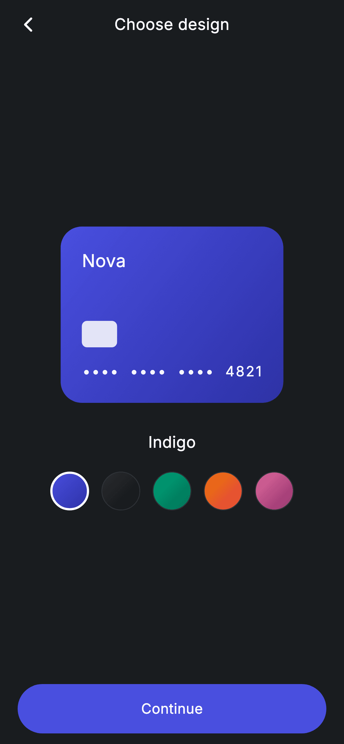
Fintech · Card Design lets users choose a card colourway from five gradient options — Indigo, Obsidian, Emerald, Sunset and Rose — with an animated preview card that recolours as the selected swatch changes. It fits card-personalisation steps in banking and wallet apps. Add it as a route: it bundles the Inter font, applies its own dark theme, and provides onBack and onContinue callbacks to advance once a design is picked.
Reveal the one-line command to drop this screen into your project.
Licensed for unlimited commercial projects · resale prohibited · License
What's included
- ✓AnimatedContainer card preview that recolours its gradient on selection
- ✓Card preview detail with Nova wordmark, chip block and masked '•••• 4821' number
- ✓Row of five circular gradient swatches (Indigo, Obsidian, Emerald, Sunset, Rose) with selected ring
- ✓Selected design name label and a pill-shaped Continue button at the bottom
- ✓Bundled Inter font with a forced dark Material 3 theme and a 'Choose design' app bar
Use cases
- ✓Card personalisation step when ordering a new card in a neobank app
- ✓Colourway picker in a wallet or payments app's card flow
- ✓Design-selection screen inside a fintech super-app onboarding
- ✓Customisation step for branded or premium card tiers