How to Build a Card Detail Screen in Flutter (Full Code + Preview)
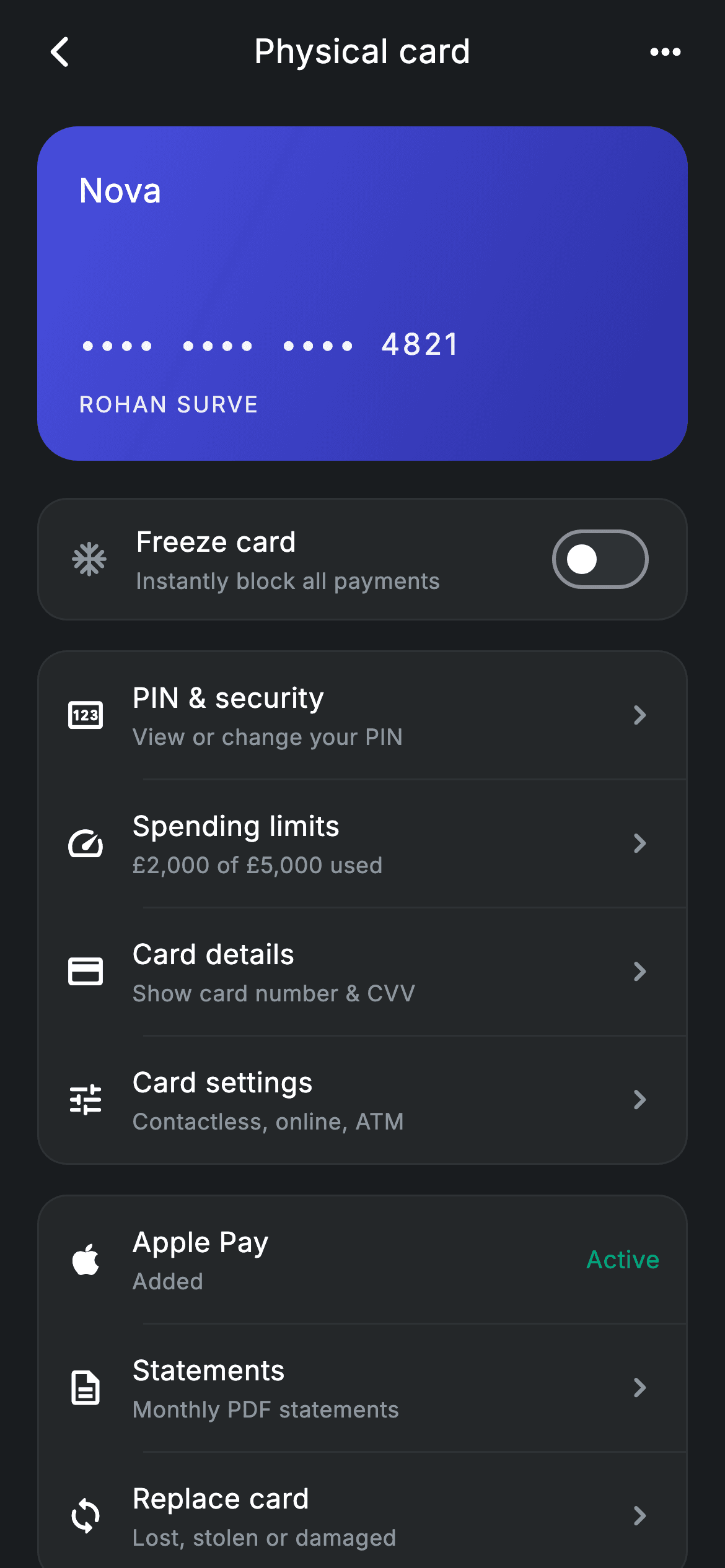
Tap a card in a banking app and you land here: one card, and every control that belongs to it. This tutorial builds that screen in Flutter — a gradient mini-card showing '•••• •••• •••• 4821', a 'Freeze card' switch that fades the card to 45% opacity and stamps a frost icon on it, and two rounded groups of settings rows for PIN, limits, card details and Apple Pay. It's a single StatefulWidget holding one boolean of state, pure Flutter, forcing its own dark theme so it looks right in any app.
Watch the Flutter UI walkthrough
A short screen recording of Fintech · Card Detail running, if you'd rather see it before you read the code. The written tutorial below covers everything in it.
Can't see the video? Watch it on YouTube.
What you'll build
- ✓A 180px gradient mini-card with a masked number and cardholder name that visibly reacts to being frozen
- ✓A working freeze toggle: one bool drives an AnimatedOpacity, a conditional frost icon, and a changing subtitle
- ✓A reusable _group() helper that wraps any list of rows in a rounded surface and inserts indented hairline dividers between them
- ✓A single _settingRow() builder that renders both chevron rows and status rows like Apple Pay's teal 'Active' label
- ✓A self-contained dark screen with its own palette tokens, bundled Inter font, and five optional navigation callbacks
Step-by-step build
Create the file
Add a new file at lib/fintech_card_detail/fintech_card_detail_screen.dart in your Flutter project.
Register the bundled fonts
No external packages — this is pure Flutter. It does bundle its design font (Inter), so drop the font file into fonts/ and declare it in pubspec.yaml:
flutter:
  fonts:
    - family: Inter
      fonts:
- asset: fonts/Inter-Regular.ttfBuild it, piece by piece
Here's how the screen goes together. Each block below is a real slice of the code with a plain-English explanation — paste them in order, or grab the whole file from the next section.
The widget, its callbacks, and the dark palette
import 'package:flutter/material.dart';

/// Card Detail — manage a single card: frozen state, settings and recent
/// activity. Self-contained per CONVENTIONS.md: pure Flutter, bundled Inter
/// font, forced dark theme. Stateful: the Frozen switch toggles live.
class FintechCardDetailScreen extends StatefulWidget {
  const FintechCardDetailScreen({
    super.key,
    this.onBack,
    this.onPin,
    this.onLimits,
    this.onDetails,
    this.onSettings,
  });

  final VoidCallback? onBack;
  final VoidCallback? onPin;
  final VoidCallback? onLimits;
  final VoidCallback? onDetails;
  final VoidCallback? onSettings;

  @override
  State<FintechCardDetailScreen> createState() =>
      _FintechCardDetailScreenState();
}

class _FintechCardDetailScreenState extends State<FintechCardDetailScreen> {
  static const String _font = 'Inter';
  static const Color _bg = Color(0xFF191C1F);
  static const Color _surface = Color(0xFF242729);
  static const Color _brand = Color(0xFF494FDF);
  static const Color _teal = Color(0xFF00A87E);
  static const Color _muted = Color(0xFF8D969E);
  static const Color _hairline = Color(0xFF2E3235);

  bool _frozen = false;
FintechCardDetailScreen is a StatefulWidget because one thing on the page changes: the freeze state. It takes five nullable VoidCallbacks — onBack, onPin, onLimits, onDetails and onSettings — so the screen never imports a router; you decide what each row does when you drop it into your app. The State class then defines the whole visual language as static consts: _bg (#191C1F) is the near-black page, _surface (#242729) the raised card colour, _hairline (#2E3235) the border and divider stroke, _brand (#494FDF) the indigo accent, _teal (#00A87E) the 'Active' status colour and _muted (#8D969E) the secondary text grey. The last line, `bool _frozen = false;`, is the entire mutable state of this screen.
build(): forced dark theme and the scrolling body
  @override
  Widget build(BuildContext context) {
    return Theme(
      data: ThemeData.dark(useMaterial3: true),
      child: Scaffold(
        backgroundColor: _bg,
        body: SafeArea(
          child: Column(
            crossAxisAlignment: CrossAxisAlignment.stretch,
            children: <Widget>[
              _appBar(context),
              Expanded(
                child: ListView(
                  physics: const BouncingScrollPhysics(),
                  padding: const EdgeInsets.fromLTRB(20, 8, 20, 24),
                  children: <Widget>[
                    _miniCard(),
                    const SizedBox(height: 20),
                    _frozenTile(),
                    const SizedBox(height: 16),
                    _group(<Widget>[
                      _settingRow(Icons.pin_outlined, 'PIN & security',
                          'View or change your PIN', widget.onPin),
                      _settingRow(Icons.speed_rounded, 'Spending limits',
                          '£2,000 of £5,000 used', widget.onLimits),
                      _settingRow(Icons.credit_card_rounded, 'Card details',
                          'Show card number & CVV', widget.onDetails),
                      _settingRow(Icons.tune_rounded, 'Card settings',
                          'Contactless, online, ATM', widget.onSettings),
                    ]),
                    const SizedBox(height: 16),
                    _group(<Widget>[
                      _settingRow(Icons.apple_rounded, 'Apple Pay',
                          'Added', null, trailingText: 'Active'),
                      _settingRow(Icons.description_outlined, 'Statements',
                          'Monthly PDF statements', null),
                      _settingRow(Icons.sync_rounded, 'Replace card',
                          'Lost, stolen or damaged', null),
                    ]),
                  ],
                ),
              ),
            ],
          ),
        ),
      ),
    );
  }
Wrapping everything in `Theme(data: ThemeData.dark(useMaterial3: true))` means the screen looks correct even if the host app runs a light theme — the Switch and IconButtons inherit sane dark defaults. Inside, a Scaffold painted _bg and a SafeArea hold a Column with `crossAxisAlignment: stretch`, so children span the full width. The app bar sits at fixed height at the top; below it an Expanded ListView takes the rest, using BouncingScrollPhysics and 20px side padding. Its children read like the page outline: the mini-card, the freeze tile, then two _group() blocks — the first with four tappable rows wired to the widget callbacks (note 'Spending limits' has the hardcoded subtitle '£2,000 of £5,000 used'), the second with Apple Pay, Statements and Replace card. Apple Pay passes `trailingText: 'Active'` and a null onTap, which is what turns it into a status row rather than a link.
A hand-rolled app bar row
  Widget _appBar(BuildContext context) {
    return Padding(
      padding: const EdgeInsets.fromLTRB(8, 4, 8, 8),
      child: Row(
        children: <Widget>[
          IconButton(
            onPressed: widget.onBack ?? () => Navigator.of(context).maybePop(),
            icon: const Icon(Icons.arrow_back_ios_new_rounded,
                size: 20, color: Colors.white),
          ),
          const Expanded(
            child: Text(
              'Physical card',
              textAlign: TextAlign.center,
              style: TextStyle(
                fontFamily: _font,
                fontSize: 18,
                fontWeight: FontWeight.w500,
                letterSpacing: 0.24,
                color: Colors.white,
              ),
            ),
          ),
          IconButton(
            onPressed: () {},
            icon: const Icon(Icons.more_horiz_rounded,
                size: 24, color: Colors.white),
          ),
        ],
      ),
    );
  }
Rather than use AppBar, _appBar builds a plain Row inside a Padding — cheaper and easier to restyle. The leading IconButton uses `widget.onBack ?? () => Navigator.of(context).maybePop()`, a useful pattern: if the parent supplied a handler it wins, otherwise the screen pops itself safely (maybePop won't throw when there's nothing to pop). The title 'Physical card' sits in an Expanded with `textAlign: TextAlign.center`, so it centres in whatever space the two 20–24px icons leave over, styled at 18px w500 Inter with 0.24 letter spacing. The trailing more_horiz_rounded button is a deliberate no-op stub — attach your own bottom sheet there.
The gradient mini-card and its frozen look
  Widget _miniCard() {
    return AnimatedOpacity(
      duration: const Duration(milliseconds: 250),
      opacity: _frozen ? 0.45 : 1,
      child: Container(
        height: 180,
        padding: const EdgeInsets.all(22),
        decoration: BoxDecoration(
          borderRadius: BorderRadius.circular(22),
          gradient: const LinearGradient(
            begin: Alignment.topLeft,
            end: Alignment.bottomRight,
            colors: <Color>[_brand, Color(0xFF2D31A6)],
          ),
        ),
        child: Column(
          crossAxisAlignment: CrossAxisAlignment.start,
          children: <Widget>[
            Row(
              mainAxisAlignment: MainAxisAlignment.spaceBetween,
              children: <Widget>[
                const Text(
                  'Nova',
                  style: TextStyle(
                    fontFamily: _font,
                    fontSize: 18,
                    fontWeight: FontWeight.w500,
                    color: Colors.white,
                  ),
                ),
                if (_frozen)
                  const Icon(Icons.ac_unit_rounded,
                      size: 20, color: Colors.white),
              ],
            ),
            const Spacer(),
            Text(
              '••••  ••••  ••••  4821',
              style: TextStyle(
                fontFamily: _font,
                fontSize: 16,
                fontWeight: FontWeight.w500,
                letterSpacing: 1.5,
                color: Colors.white.withValues(alpha: 0.95),
              ),
            ),
            const SizedBox(height: 12),
            Text(
              'ROHAN SURVE',
              style: TextStyle(
                fontFamily: _font,
                fontSize: 12,
                letterSpacing: 1.0,
                color: Colors.white.withValues(alpha: 0.85),
              ),
            ),
          ],
        ),
      ),
    );
  }
The card is a 180px-tall Container with a 22px radius and a LinearGradient running topLeft → bottomRight from _brand (#494FDF) to a deeper #2D31A6. It's wrapped in an AnimatedOpacity that reads _frozen: opacity drops from 1 to 0.45 over 250ms, so freezing visibly dims the card instead of snapping. Inside, a Column with 22px padding stacks the 'Nova' brand name and — only `if (_frozen)` — a white ac_unit_rounded frost icon at the far end of a spaceBetween Row. A `Spacer()` pushes the rest to the bottom: the masked number '•••• •••• •••• 4821' at 16px with 1.5 letter spacing, and 'ROHAN SURVE' at 12px. Both use `Colors.white.withValues(alpha: …)` at 0.95 and 0.85 to sit slightly back from pure white.
The freeze tile — the only interactive state
  Widget _frozenTile() {
    return Container(
      padding: const EdgeInsets.symmetric(horizontal: 16, vertical: 8),
      decoration: BoxDecoration(
        color: _surface,
        borderRadius: BorderRadius.circular(16),
        border: Border.all(color: _hairline),
      ),
      child: Row(
        children: <Widget>[
          Icon(Icons.ac_unit_rounded,
              size: 22, color: _frozen ? _brand : _muted),
          const SizedBox(width: 14),
          Expanded(
            child: Column(
              crossAxisAlignment: CrossAxisAlignment.start,
              children: <Widget>[
                const Text(
                  'Freeze card',
                  style: TextStyle(
                    fontFamily: _font,
                    fontSize: 15,
                    fontWeight: FontWeight.w500,
                    letterSpacing: 0.24,
                    color: Colors.white,
                  ),
                ),
                const SizedBox(height: 2),
                Text(
                  _frozen ? 'Card is frozen' : 'Instantly block all payments',
                  style: const TextStyle(
                    fontFamily: _font,
                    fontSize: 12,
                    letterSpacing: 0.24,
                    color: _muted,
                  ),
                ),
              ],
            ),
          ),
          Switch(
            value: _frozen,
            activeThumbColor: Colors.white,
            activeTrackColor: _brand,
            inactiveThumbColor: Colors.white,
            inactiveTrackColor: _hairline,
            onChanged: (bool v) => setState(() => _frozen = v),
          ),
        ],
      ),
    );
  }
_frozenTile is the standard surface recipe used throughout the screen: _surface fill, 16px radius, 1px _hairline border. Its Row starts with the same ac_unit_rounded icon, but tinted conditionally — `_frozen ? _brand : _muted` — so it lights up indigo when active. The Expanded middle column shows 'Freeze card' at 15px w500 plus a subtitle that swaps text with the state: 'Instantly block all payments' becomes 'Card is frozen'. On the right, a Material Switch gets explicit colours (white thumb in both states, _brand track when on, _hairline when off) and its onChanged does the one thing that drives this whole page: `setState(() => _frozen = v)`. That single rebuild updates the icon tint, the subtitle, the card opacity and the frost badge at once. Note this is local UI state only — there's no API call behind it.
Grouping rows and the shared row builder
  Widget _group(List<Widget> rows) {
    final List<Widget> children = <Widget>[];
    for (int i = 0; i < rows.length; i++) {
      children.add(rows[i]);
      if (i != rows.length - 1) {
        children.add(const Divider(color: _hairline, height: 1, indent: 56));
      }
    }
    return Container(
      decoration: BoxDecoration(
        color: _surface,
        borderRadius: BorderRadius.circular(16),
        border: Border.all(color: _hairline),
      ),
      child: Column(children: children),
    );
  }

  Widget _settingRow(IconData icon, String title, String sub, VoidCallback? onTap,
      {String? trailingText}) {
    return GestureDetector(
      onTap: onTap,
      behavior: HitTestBehavior.opaque,
      child: Padding(
        padding: const EdgeInsets.all(14),
        child: Row(
          children: <Widget>[
            Icon(icon, size: 22, color: Colors.white),
            const SizedBox(width: 14),
            Expanded(
              child: Column(
                crossAxisAlignment: CrossAxisAlignment.start,
                children: <Widget>[
                  Text(
                    title,
                    style: const TextStyle(
                      fontFamily: _font,
                      fontSize: 15,
                      fontWeight: FontWeight.w500,
                      letterSpacing: 0.24,
                      color: Colors.white,
                    ),
                  ),
                  const SizedBox(height: 2),
                  Text(
                    sub,
                    style: const TextStyle(
                      fontFamily: _font,
                      fontSize: 12,
                      letterSpacing: 0.24,
                      color: _muted,
                    ),
                  ),
                ],
              ),
            ),
            if (trailingText != null)
              Text(
                trailingText,
                style: const TextStyle(
                  fontFamily: _font,
                  fontSize: 13,
                  fontWeight: FontWeight.w500,
                  letterSpacing: 0.24,
                  color: _teal,
                ),
              )
            else
              const Icon(Icons.chevron_right_rounded, size: 22, color: _muted),
          ],
        ),
      ),
    );
  }
}
_group takes a list of rows and interleaves dividers manually: it loops with an index and appends `Divider(color: _hairline, height: 1, indent: 56)` after every row except the last, so no stray line appears at the bottom edge. The 56px indent is deliberate — it equals the 14px padding + 22px icon + 14px gap, so dividers start exactly under the text rather than under the icons. _settingRow then renders one row from an IconData, title, subtitle, optional onTap and an optional trailingText. `HitTestBehavior.opaque` on the GestureDetector makes the entire padded row tappable, including the empty space between text and chevron. The trailing slot is an if/else: when trailingText is supplied it renders that label in 13px _teal (Apple Pay's 'Active'), otherwise it falls back to a muted chevron_right_rounded, which is how the same builder produces both link rows and status rows.
Full code
The complete, ready-to-paste source. Free to use in your projects — one click copies it all.
import 'package:flutter/material.dart';

/// Card Detail — manage a single card: frozen state, settings and recent
/// activity. Self-contained per CONVENTIONS.md: pure Flutter, bundled Inter
/// font, forced dark theme. Stateful: the Frozen switch toggles live.
class FintechCardDetailScreen extends StatefulWidget {
  const FintechCardDetailScreen({
    super.key,
    this.onBack,
    this.onPin,
    this.onLimits,
    this.onDetails,
    this.onSettings,
  });

  final VoidCallback? onBack;
  final VoidCallback? onPin;
  final VoidCallback? onLimits;
  final VoidCallback? onDetails;
  final VoidCallback? onSettings;

  @override
  State<FintechCardDetailScreen> createState() =>
      _FintechCardDetailScreenState();
}

class _FintechCardDetailScreenState extends State<FintechCardDetailScreen> {
  static const String _font = 'Inter';
  static const Color _bg = Color(0xFF191C1F);
  static const Color _surface = Color(0xFF242729);
  static const Color _brand = Color(0xFF494FDF);
  static const Color _teal = Color(0xFF00A87E);
  static const Color _muted = Color(0xFF8D969E);
  static const Color _hairline = Color(0xFF2E3235);

  bool _frozen = false;

  @override
  Widget build(BuildContext context) {
    return Theme(
      data: ThemeData.dark(useMaterial3: true),
      child: Scaffold(
        backgroundColor: _bg,
        body: SafeArea(
          child: Column(
            crossAxisAlignment: CrossAxisAlignment.stretch,
            children: <Widget>[
              _appBar(context),
              Expanded(
                child: ListView(
                  physics: const BouncingScrollPhysics(),
                  padding: const EdgeInsets.fromLTRB(20, 8, 20, 24),
                  children: <Widget>[
                    _miniCard(),
                    const SizedBox(height: 20),
                    _frozenTile(),
                    const SizedBox(height: 16),
                    _group(<Widget>[
                      _settingRow(Icons.pin_outlined, 'PIN & security',
                          'View or change your PIN', widget.onPin),
                      _settingRow(Icons.speed_rounded, 'Spending limits',
                          '£2,000 of £5,000 used', widget.onLimits),
                      _settingRow(Icons.credit_card_rounded, 'Card details',
                          'Show card number & CVV', widget.onDetails),
                      _settingRow(Icons.tune_rounded, 'Card settings',
                          'Contactless, online, ATM', widget.onSettings),
                    ]),
                    const SizedBox(height: 16),
                    _group(<Widget>[
                      _settingRow(Icons.apple_rounded, 'Apple Pay',
                          'Added', null, trailingText: 'Active'),
                      _settingRow(Icons.description_outlined, 'Statements',
                          'Monthly PDF statements', null),
                      _settingRow(Icons.sync_rounded, 'Replace card',
                          'Lost, stolen or damaged', null),
                    ]),
                  ],
                ),
              ),
            ],
          ),
        ),
      ),
    );
  }

  Widget _appBar(BuildContext context) {
    return Padding(
      padding: const EdgeInsets.fromLTRB(8, 4, 8, 8),
      child: Row(
        children: <Widget>[
          IconButton(
            onPressed: widget.onBack ?? () => Navigator.of(context).maybePop(),
            icon: const Icon(Icons.arrow_back_ios_new_rounded,
                size: 20, color: Colors.white),
          ),
          const Expanded(
            child: Text(
              'Physical card',
              textAlign: TextAlign.center,
              style: TextStyle(
                fontFamily: _font,
                fontSize: 18,
                fontWeight: FontWeight.w500,
                letterSpacing: 0.24,
                color: Colors.white,
              ),
            ),
          ),
          IconButton(
            onPressed: () {},
            icon: const Icon(Icons.more_horiz_rounded,
                size: 24, color: Colors.white),
          ),
        ],
      ),
    );
  }

  Widget _miniCard() {
    return AnimatedOpacity(
      duration: const Duration(milliseconds: 250),
      opacity: _frozen ? 0.45 : 1,
      child: Container(
        height: 180,
        padding: const EdgeInsets.all(22),
        decoration: BoxDecoration(
          borderRadius: BorderRadius.circular(22),
          gradient: const LinearGradient(
            begin: Alignment.topLeft,
            end: Alignment.bottomRight,
            colors: <Color>[_brand, Color(0xFF2D31A6)],
          ),
        ),
        child: Column(
          crossAxisAlignment: CrossAxisAlignment.start,
          children: <Widget>[
            Row(
              mainAxisAlignment: MainAxisAlignment.spaceBetween,
              children: <Widget>[
                const Text(
                  'Nova',
                  style: TextStyle(
                    fontFamily: _font,
                    fontSize: 18,
                    fontWeight: FontWeight.w500,
                    color: Colors.white,
                  ),
                ),
                if (_frozen)
                  const Icon(Icons.ac_unit_rounded,
                      size: 20, color: Colors.white),
              ],
            ),
            const Spacer(),
            Text(
              '••••  ••••  ••••  4821',
              style: TextStyle(
                fontFamily: _font,
                fontSize: 16,
                fontWeight: FontWeight.w500,
                letterSpacing: 1.5,
                color: Colors.white.withValues(alpha: 0.95),
              ),
            ),
            const SizedBox(height: 12),
            Text(
              'ROHAN SURVE',
              style: TextStyle(
                fontFamily: _font,
                fontSize: 12,
                letterSpacing: 1.0,
                color: Colors.white.withValues(alpha: 0.85),
              ),
            ),
          ],
        ),
      ),
    );
  }

  Widget _frozenTile() {
    return Container(
      padding: const EdgeInsets.symmetric(horizontal: 16, vertical: 8),
      decoration: BoxDecoration(
        color: _surface,
        borderRadius: BorderRadius.circular(16),
        border: Border.all(color: _hairline),
      ),
      child: Row(
        children: <Widget>[
          Icon(Icons.ac_unit_rounded,
              size: 22, color: _frozen ? _brand : _muted),
          const SizedBox(width: 14),
          Expanded(
            child: Column(
              crossAxisAlignment: CrossAxisAlignment.start,
              children: <Widget>[
                const Text(
                  'Freeze card',
                  style: TextStyle(
                    fontFamily: _font,
                    fontSize: 15,
                    fontWeight: FontWeight.w500,
                    letterSpacing: 0.24,
                    color: Colors.white,
                  ),
                ),
                const SizedBox(height: 2),
                Text(
                  _frozen ? 'Card is frozen' : 'Instantly block all payments',
                  style: const TextStyle(
                    fontFamily: _font,
                    fontSize: 12,
                    letterSpacing: 0.24,
                    color: _muted,
                  ),
                ),
              ],
            ),
          ),
          Switch(
            value: _frozen,
            activeThumbColor: Colors.white,
            activeTrackColor: _brand,
            inactiveThumbColor: Colors.white,
            inactiveTrackColor: _hairline,
            onChanged: (bool v) => setState(() => _frozen = v),
          ),
        ],
      ),
    );
  }

  Widget _group(List<Widget> rows) {
    final List<Widget> children = <Widget>[];
    for (int i = 0; i < rows.length; i++) {
      children.add(rows[i]);
      if (i != rows.length - 1) {
        children.add(const Divider(color: _hairline, height: 1, indent: 56));
      }
    }
    return Container(
      decoration: BoxDecoration(
        color: _surface,
        borderRadius: BorderRadius.circular(16),
        border: Border.all(color: _hairline),
      ),
      child: Column(children: children),
    );
  }

  Widget _settingRow(IconData icon, String title, String sub, VoidCallback? onTap,
      {String? trailingText}) {
    return GestureDetector(
      onTap: onTap,
      behavior: HitTestBehavior.opaque,
      child: Padding(
        padding: const EdgeInsets.all(14),
        child: Row(
          children: <Widget>[
            Icon(icon, size: 22, color: Colors.white),
            const SizedBox(width: 14),
            Expanded(
              child: Column(
                crossAxisAlignment: CrossAxisAlignment.start,
                children: <Widget>[
                  Text(
                    title,
                    style: const TextStyle(
                      fontFamily: _font,
                      fontSize: 15,
                      fontWeight: FontWeight.w500,
                      letterSpacing: 0.24,
                      color: Colors.white,
                    ),
                  ),
                  const SizedBox(height: 2),
                  Text(
                    sub,
                    style: const TextStyle(
                      fontFamily: _font,
                      fontSize: 12,
                      letterSpacing: 0.24,
                      color: _muted,
                    ),
                  ),
                ],
              ),
            ),
            if (trailingText != null)
              Text(
                trailingText,
                style: const TextStyle(
                  fontFamily: _font,
                  fontSize: 13,
                  fontWeight: FontWeight.w500,
                  letterSpacing: 0.24,
                  color: _teal,
                ),
              )
            else
              const Icon(Icons.chevron_right_rounded, size: 22, color: _muted),
          ],
        ),
      ),
    );
  }
}
Plus bundled 1 binary asset (fonts/images). The CLI and MCP install those for you automatically.
Two faster ways to add it
Copy-paste works, but you can skip it entirely.
1. FlutterKit CLI
One command drops this screen — and its fonts — straight into your project.
$ flutterkit add fintech-card-detail2. AI agent (MCP)
Connect FlutterKit's MCP server in Claude or Cursor and just ask your agent to install fintech-card-detail — it fetches and writes the files for you.
FAQ
Can I use this card management screen in a commercial app?
Yes. The full Dart for FintechCardDetailScreen on this page is free to copy into personal or commercial projects. Paste it straight in, run `flutterkit add fintech-card-detail` with the CLI, or let an AI agent install it through MCP.
Do the icons or the Switch need any plugins?
No. Every icon here — ac_unit_rounded, pin_outlined, speed_rounded, credit_card_rounded, tune_rounded, apple_rounded, chevron_right_rounded — is a built-in Material icon, and the freeze toggle is Flutter's own Switch widget. The only bundled asset is the Inter font, which you register in pubspec.yaml as shown in step 2; the CLI and MCP copy the font file for you.
What Flutter SDK does this screen need?
It uses super parameters in the constructor, `Colors.white.withValues(alpha: 0.95)` on the card text, and the newer Switch property `activeThumbColor` — that last one is the strictest requirement, so target Flutter 3.35+. On an older SDK, rename `activeThumbColor` to `activeColor`, drop `inactiveThumbColor`, and swap `withValues(alpha: 0.95)` for `withOpacity(0.95)`; nothing else needs changing.


