How to Build a Wallet Import Method Screen in Flutter (Full Code + Preview)
Every self-custody wallet needs a fork screen where returning users choose how to restore: recovery phrase, private key, or hardware device. Get it wrong and people paste a seed phrase into the wrong flow — or give up. This tutorial builds Aurum's dark import-method picker in Flutter: three tappable tiles with painter-drawn icons in gold, green, and blue, a chevron affordance on each, and a pinned lock-icon note promising keys never leave the device. Pure Flutter, no packages, and every icon is a CustomPainter rather than an asset.
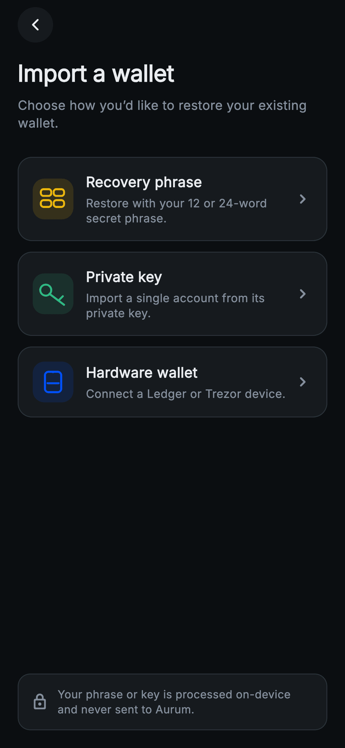
What you'll build
- ✓Three full-width method tiles driven by one reusable `_MethodTile` widget, each with its own accent colour and callback
- ✓Painter-drawn method icons — a 2x2 seed-word grid, a ring-and-stem key, a USB device outline — all from a single `CustomPainter` with an enum switch
- ✓An exchange-style dark palette (near-black #0B0E11 canvas, gold #F0B90B, green #2EBD85, blue #0052FF) forced with a `ThemeData.dark` wrapper so the route renders standalone
- ✓A Spacer-pinned security note card with a lock glyph that reassures at exactly the moment a user is about to type a secret
- ✓A circular surface back button with a properly clipped round ripple
Step-by-step build
Create the file
Add a new file at lib/web3_import_method/web3_import_method_screen.dart in your Flutter project.
Register the bundled fonts
No external packages — this is pure Flutter. It does bundle its design font (Inter), so drop the font file into fonts/ and declare it in pubspec.yaml:
flutter:
  fonts:
    - family: Inter
      fonts:
- asset: fonts/Inter-Regular.ttfBuild it, piece by piece
Here's how the screen goes together. Each block below is a real slice of the code with a plain-English explanation — paste them in order, or grab the whole file from the next section.
Four callbacks and a three-accent palette
import 'package:flutter/material.dart';

/// Web3 import — Import Wallet. Method tiles (recovery phrase / private key /
/// hardware wallet) with painted icons and a security note. Self-contained per
/// CONVENTIONS.md: pure Flutter, bundled Inter font, painted icons (no network
/// image), forced dark theme so it renders standalone as a route.
class Web3ImportMethodScreen extends StatelessWidget {
  const Web3ImportMethodScreen({
    super.key,
    this.onSeedPhrase,
    this.onPrivateKey,
    this.onHardware,
    this.onBack,
  });

  final VoidCallback? onSeedPhrase;
  final VoidCallback? onPrivateKey;
  final VoidCallback? onHardware;
  final VoidCallback? onBack;

  static const String _font = 'Inter';
  static const Color _bg = Color(0xFF0B0E11);
  static const Color _surface = Color(0xFF161A1E);
  static const Color _brand = Color(0xFFF0B90B);
  static const Color _up = Color(0xFF2EBD85);
  static const Color _brandAlt = Color(0xFF0052FF);
  static const Color _text = Color(0xFFEAECEF);
  static const Color _muted = Color(0xFF848E9C);
  static const Color _hairline = Color(0xFF2B3139);
The screen is a `StatelessWidget` exposing four nullable `VoidCallback`s — `onSeedPhrase`, `onPrivateKey`, `onHardware`, `onBack`. There is deliberately no `selectedMethod` state: on this screen tapping a method IS the decision, so each tile routes immediately through its own callback and navigation stays in the parent. The palette is exchange-styled: `_bg` is near-black `#0B0E11`, `_surface` a slightly lifted `#161A1E`, with `#2B3139` hairlines and `#848E9C` muted text. The interesting choice is three accents instead of one — gold `_brand` `#F0B90B`, green `_up` `#2EBD85`, blue `_brandAlt` `#0052FF` — one per import method, so the tiles read as distinct destinations rather than three copies of the same row.
Forcing dark mode, then heading and subtitle
  @override
  Widget build(BuildContext context) {
    return Theme(
      data: ThemeData.dark(useMaterial3: true),
      child: Scaffold(
        backgroundColor: _bg,
        body: SafeArea(
          child: Padding(
            padding: const EdgeInsets.fromLTRB(20, 8, 20, 20),
            child: Column(
              crossAxisAlignment: CrossAxisAlignment.stretch,
              children: <Widget>[
                _CircleButton(
                    icon: Icons.arrow_back_ios_new_rounded, onTap: onBack),
                const SizedBox(height: 16),
                const Text(
                  'Import a wallet',
                  style: TextStyle(
                    fontFamily: _font,
                    fontSize: 26,
                    fontWeight: FontWeight.w700,
                    letterSpacing: -0.3,
                    color: _text,
                  ),
                ),
                const SizedBox(height: 8),
                const Text(
                  'Choose how you’d like to restore your existing wallet.',
                  style: TextStyle(
                    fontFamily: _font,
                    fontSize: 14.5,
                    height: 1.4,
                    color: _muted,
                  ),
                ),
                const SizedBox(height: 28),
`build` wraps everything in `Theme(data: ThemeData.dark(useMaterial3: true))`, which is what lets this screen drop into a light-themed app and still render correctly as a standalone route — ripples, icons and defaults all resolve against dark. The layout is a single `Column` with `crossAxisAlignment: CrossAxisAlignment.stretch`, so every tile becomes full-width for free with no `double.infinity` wrappers. 'Import a wallet' is set at 26px `w700` with `letterSpacing: -0.3` for a tight display feel, and the subtitle — 'Choose how you'd like to restore your existing wallet.' — sits in `_muted` at 14.5px with `height: 1.4`. A 28px gap separates the copy block from the tiles, noticeably larger than the 8px between heading and subtitle, which is what groups them.
Three tiles as data, ranked by likelihood
                _MethodTile(
                  icon: _MethodIcon.seed,
                  accent: _brand,
                  title: 'Recovery phrase',
                  body: 'Restore with your 12 or 24-word secret phrase.',
                  onTap: onSeedPhrase,
                ),
                const SizedBox(height: 12),
                _MethodTile(
                  icon: _MethodIcon.key,
                  accent: _up,
                  title: 'Private key',
                  body: 'Import a single account from its private key.',
                  onTap: onPrivateKey,
                ),
                const SizedBox(height: 12),
                _MethodTile(
                  icon: _MethodIcon.hardware,
                  accent: _brandAlt,
                  title: 'Hardware wallet',
                  body: 'Connect a Ledger or Trezor device.',
                  onTap: onHardware,
                ),
                const Spacer(),
The three `_MethodTile` instances are pure configuration: an `_MethodIcon` enum value, an accent, two lines of copy, and a callback. Their order is an argument — recovery phrase first, because 12/24-word restore is the overwhelmingly common path, and it takes the gold brand accent to reinforce that; private key (green) is the power-user route for importing a single account; hardware wallet (blue, 'Connect a Ledger or Trezor device.') comes last because it needs a physical device present. The body copy does real work too — '12 or 24-word secret phrase' pre-answers the 'which phrase length?' question before the next screen. The `Spacer()` on line 90 shoves everything after it to the bottom of the viewport.
The pinned security note
                Container(
                  padding: const EdgeInsets.all(14),
                  decoration: BoxDecoration(
                    color: _surface,
                    borderRadius: BorderRadius.circular(14),
                    border: Border.all(color: _hairline),
                  ),
                  child: const Row(
                    children: <Widget>[
                      Icon(Icons.lock_outline_rounded,
                          size: 20, color: _muted),
                      SizedBox(width: 10),
                      Expanded(
                        child: Text(
                          'Your phrase or key is processed on-device and never '
                          'sent to Aurum.',
                          style: TextStyle(
                            fontFamily: _font,
                            fontSize: 12.5,
                            height: 1.35,
                            color: _muted,
                          ),
                        ),
                      ),
                    ],
                  ),
                ),
Thanks to the preceding `Spacer`, this card pins to the bottom on tall phones but stays in normal flow — no `Stack` or `bottomNavigationBar` needed. It is a `_surface` Container with a 14px radius and `_hairline` border, holding a 20px `Icons.lock_outline_rounded` and the sentence 'Your phrase or key is processed on-device and never sent to Aurum.' The whole thing is rendered in `_muted` at 12.5px: it should be findable, not loud, because it is reassurance rather than a warning. Placement matters more than styling here — the user is one tap away from typing a seed phrase, which is the single highest-anxiety input in crypto, so the promise lands on the screen where the doubt forms, not after. The text sits in `Expanded` so it wraps to two lines beside the icon.
The tile shell: ripple, border, and tinted icon chip
class _MethodTile extends StatelessWidget {
  const _MethodTile({
    required this.icon,
    required this.accent,
    required this.title,
    required this.body,
    required this.onTap,
  });

  final _MethodIcon icon;
  final Color accent;
  final String title;
  final String body;
  final VoidCallback? onTap;

  @override
  Widget build(BuildContext context) {
    return Material(
      color: Web3ImportMethodScreen._surface,
      borderRadius: BorderRadius.circular(16),
      child: InkWell(
        borderRadius: BorderRadius.circular(16),
        onTap: onTap,
        child: Container(
          padding: const EdgeInsets.all(16),
          decoration: BoxDecoration(
            borderRadius: BorderRadius.circular(16),
            border: Border.all(color: Web3ImportMethodScreen._hairline),
          ),
          child: Row(
            children: <Widget>[
              Container(
                width: 46,
                height: 46,
                decoration: BoxDecoration(
                  color: accent.withValues(alpha: 0.14),
                  borderRadius: BorderRadius.circular(13),
                ),
                child: CustomPaint(painter: _MethodIconPainter(icon, accent)),
              ),
`_MethodTile` layers `Material` → `InkWell` → `Container`, and the 16px `borderRadius` is repeated on all three on purpose: the radius on `Material` and `InkWell` clips the ripple to the rounded corners, while the `_hairline` border has to live on the inner Container because `Material`'s color fill draws no stroke. Private widgets reach the palette as `Web3ImportMethodScreen._surface` and friends — one source of truth, no colour constants duplicated. The icon chip is the screen's signature detail: a fixed 46x46 box filled with `accent.withValues(alpha: 0.14)` at a 13px radius, with the painter drawing on top in the same accent at full strength. That two-layer trick — 14% tint behind a 100% stroke — is what lets gold, green and blue coexist without the screen turning into a carnival.
Tile text and the chevron that says 'this navigates'
              const SizedBox(width: 14),
              Expanded(
                child: Column(
                  crossAxisAlignment: CrossAxisAlignment.start,
                  children: <Widget>[
                    Text(
                      title,
                      style: const TextStyle(
                        fontFamily: Web3ImportMethodScreen._font,
                        fontSize: 16,
                        fontWeight: FontWeight.w600,
                        color: Web3ImportMethodScreen._text,
                      ),
                    ),
                    const SizedBox(height: 4),
                    Text(
                      body,
                      style: const TextStyle(
                        fontFamily: Web3ImportMethodScreen._font,
                        fontSize: 13,
                        height: 1.3,
                        color: Web3ImportMethodScreen._muted,
                      ),
                    ),
                  ],
                ),
              ),
              const Icon(Icons.chevron_right_rounded,
                  color: Web3ImportMethodScreen._muted, size: 22),
            ],
          ),
        ),
      ),
    );
  }
}
The text column sits in `Expanded`, so a longer description wraps instead of overflowing the row, with `CrossAxisAlignment.start` keeping both lines left-aligned beside the chip. Title and body are deliberately close in size — 16px `w600` `_text` over 13px `_muted` with `height: 1.3` and a 4px gap — so the tile scans as one unit. The trailing `Icons.chevron_right_rounded` at 22px `_muted` is small but semantically load-bearing: a chevron marks the row as a link into a deeper flow. Combined with the absence of any radio dot or checkmark, it tells the user no confirm step is coming — which is exactly why the screen needs no selection state or Continue button.
One painter, three glyphs
class _MethodIconPainter extends CustomPainter {
  const _MethodIconPainter(this.icon, this.accent);

  final _MethodIcon icon;
  final Color accent;

  @override
  void paint(Canvas canvas, Size size) {
    final Offset c = Offset(size.width / 2, size.height / 2);
    final Paint stroke = Paint()
      ..style = PaintingStyle.stroke
      ..strokeWidth = 2.2
      ..strokeCap = StrokeCap.round
      ..strokeJoin = StrokeJoin.round
      ..color = accent;
    final double u = size.width * 0.15;
    switch (icon) {
      case _MethodIcon.seed:
        // 2x2 grid of word chips.
        for (int r = 0; r < 2; r++) {
          for (int col = 0; col < 2; col++) {
            final Rect chip = Rect.fromLTWH(
              c.dx - u * 2 + col * (u * 2.1),
              c.dy - u * 1.6 + r * (u * 1.8),
              u * 1.7,
              u * 1.1,
            );
            canvas.drawRRect(
                RRect.fromRectAndRadius(chip, const Radius.circular(3)), stroke);
          }
        }
        break;
      case _MethodIcon.key:
        // Key: ring + stem + teeth.
        canvas.drawCircle(Offset(c.dx - u * 1.2, c.dy - u * 0.6), u * 0.9, stroke);
        canvas.drawLine(
          Offset(c.dx - u * 0.6, c.dy),
          Offset(c.dx + u * 1.8, c.dy + u * 1.8),
          stroke,
        );
        canvas.drawLine(
          Offset(c.dx + u * 1.0, c.dy + u),
          Offset(c.dx + u * 1.6, c.dy + u * 0.4),
          stroke,
        );
        break;
      case _MethodIcon.hardware:
        // USB device outline.
        final Rect body = Rect.fromCenter(
            center: c, width: size.width * 0.4, height: size.height * 0.5);
        canvas.drawRRect(
            RRect.fromRectAndRadius(body, const Radius.circular(4)), stroke);
        canvas.drawLine(Offset(c.dx, body.top), Offset(c.dx, c.dy - u * 1.6),
            stroke);
        canvas.drawLine(
          Offset(c.dx - u * 0.9, c.dy + u * 0.2),
          Offset(c.dx + u * 0.9, c.dy + u * 0.2),
          stroke,
        );
        break;
    }
  }

  @override
  bool shouldRepaint(_MethodIconPainter oldDelegate) =>
      oldDelegate.icon != icon || oldDelegate.accent != accent;
}
`_MethodIconPainter` takes the enum and the accent, builds a single shared stroke `Paint` — 2.2px, `StrokeCap.round`, `StrokeJoin.round` — and switches on the icon. Everything is measured against `u = size.width * 0.15`, a unit derived from the box, so the glyphs rescale cleanly if you resize the chip. The seed glyph is the clever one: a nested `for` loop draws a 2x2 grid of rounded 1.7u x 1.1u chips — literally a miniature seed-word grid, far more specific than a generic document icon. The key is a circle ring offset up-left, a diagonal stem via `drawLine`, and one short tooth; the hardware glyph is an `RRect` body with a stem line rising from its top edge and a horizontal detail line — an unmistakable USB stick. `shouldRepaint` compares both `icon` and `accent`, the only two inputs that change output.
The circular back button
class _CircleButton extends StatelessWidget {
  const _CircleButton({required this.icon, required this.onTap});

  final IconData icon;
  final VoidCallback? onTap;

  @override
  Widget build(BuildContext context) {
    return Align(
      alignment: Alignment.centerLeft,
      child: Material(
        color: Web3ImportMethodScreen._surface,
        shape: const CircleBorder(),
        child: InkWell(
          customBorder: const CircleBorder(),
          onTap: onTap,
          child: SizedBox(
            width: 40,
            height: 40,
            child: Icon(icon, size: 16, color: Web3ImportMethodScreen._text),
          ),
        ),
      ),
    );
  }
}
`_CircleButton` uses `Material` with `shape: const CircleBorder()` plus an `InkWell` given the same shape via `customBorder`, which is the correct way to get a round ripple — a plain `borderRadius` would leave square splash corners on a circle. The tap target is a 40x40 `SizedBox` holding a 16px `arrow_back_ios_new_rounded`, small glyph on a generous target. The outer `Align(alignment: Alignment.centerLeft)` is not decoration: the parent Column stretches its children, and without the Align this button would silently stretch into a full-width pill. Because it renders on `_surface` against `_bg`, the button stays visible without any border.
Full code
The complete, ready-to-paste source. Free to use in your projects — one click copies it all.
import 'package:flutter/material.dart';

/// Web3 import — Import Wallet. Method tiles (recovery phrase / private key /
/// hardware wallet) with painted icons and a security note. Self-contained per
/// CONVENTIONS.md: pure Flutter, bundled Inter font, painted icons (no network
/// image), forced dark theme so it renders standalone as a route.
class Web3ImportMethodScreen extends StatelessWidget {
  const Web3ImportMethodScreen({
    super.key,
    this.onSeedPhrase,
    this.onPrivateKey,
    this.onHardware,
    this.onBack,
  });

  final VoidCallback? onSeedPhrase;
  final VoidCallback? onPrivateKey;
  final VoidCallback? onHardware;
  final VoidCallback? onBack;

  static const String _font = 'Inter';
  static const Color _bg = Color(0xFF0B0E11);
  static const Color _surface = Color(0xFF161A1E);
  static const Color _brand = Color(0xFFF0B90B);
  static const Color _up = Color(0xFF2EBD85);
  static const Color _brandAlt = Color(0xFF0052FF);
  static const Color _text = Color(0xFFEAECEF);
  static const Color _muted = Color(0xFF848E9C);
  static const Color _hairline = Color(0xFF2B3139);

  @override
  Widget build(BuildContext context) {
    return Theme(
      data: ThemeData.dark(useMaterial3: true),
      child: Scaffold(
        backgroundColor: _bg,
        body: SafeArea(
          child: Padding(
            padding: const EdgeInsets.fromLTRB(20, 8, 20, 20),
            child: Column(
              crossAxisAlignment: CrossAxisAlignment.stretch,
              children: <Widget>[
                _CircleButton(
                    icon: Icons.arrow_back_ios_new_rounded, onTap: onBack),
                const SizedBox(height: 16),
                const Text(
                  'Import a wallet',
                  style: TextStyle(
                    fontFamily: _font,
                    fontSize: 26,
                    fontWeight: FontWeight.w700,
                    letterSpacing: -0.3,
                    color: _text,
                  ),
                ),
                const SizedBox(height: 8),
                const Text(
                  'Choose how you’d like to restore your existing wallet.',
                  style: TextStyle(
                    fontFamily: _font,
                    fontSize: 14.5,
                    height: 1.4,
                    color: _muted,
                  ),
                ),
                const SizedBox(height: 28),
                _MethodTile(
                  icon: _MethodIcon.seed,
                  accent: _brand,
                  title: 'Recovery phrase',
                  body: 'Restore with your 12 or 24-word secret phrase.',
                  onTap: onSeedPhrase,
                ),
                const SizedBox(height: 12),
                _MethodTile(
                  icon: _MethodIcon.key,
                  accent: _up,
                  title: 'Private key',
                  body: 'Import a single account from its private key.',
                  onTap: onPrivateKey,
                ),
                const SizedBox(height: 12),
                _MethodTile(
                  icon: _MethodIcon.hardware,
                  accent: _brandAlt,
                  title: 'Hardware wallet',
                  body: 'Connect a Ledger or Trezor device.',
                  onTap: onHardware,
                ),
                const Spacer(),
                Container(
                  padding: const EdgeInsets.all(14),
                  decoration: BoxDecoration(
                    color: _surface,
                    borderRadius: BorderRadius.circular(14),
                    border: Border.all(color: _hairline),
                  ),
                  child: const Row(
                    children: <Widget>[
                      Icon(Icons.lock_outline_rounded,
                          size: 20, color: _muted),
                      SizedBox(width: 10),
                      Expanded(
                        child: Text(
                          'Your phrase or key is processed on-device and never '
                          'sent to Aurum.',
                          style: TextStyle(
                            fontFamily: _font,
                            fontSize: 12.5,
                            height: 1.35,
                            color: _muted,
                          ),
                        ),
                      ),
                    ],
                  ),
                ),
              ],
            ),
          ),
        ),
      ),
    );
  }
}

enum _MethodIcon { seed, key, hardware }

class _MethodTile extends StatelessWidget {
  const _MethodTile({
    required this.icon,
    required this.accent,
    required this.title,
    required this.body,
    required this.onTap,
  });

  final _MethodIcon icon;
  final Color accent;
  final String title;
  final String body;
  final VoidCallback? onTap;

  @override
  Widget build(BuildContext context) {
    return Material(
      color: Web3ImportMethodScreen._surface,
      borderRadius: BorderRadius.circular(16),
      child: InkWell(
        borderRadius: BorderRadius.circular(16),
        onTap: onTap,
        child: Container(
          padding: const EdgeInsets.all(16),
          decoration: BoxDecoration(
            borderRadius: BorderRadius.circular(16),
            border: Border.all(color: Web3ImportMethodScreen._hairline),
          ),
          child: Row(
            children: <Widget>[
              Container(
                width: 46,
                height: 46,
                decoration: BoxDecoration(
                  color: accent.withValues(alpha: 0.14),
                  borderRadius: BorderRadius.circular(13),
                ),
                child: CustomPaint(painter: _MethodIconPainter(icon, accent)),
              ),
              const SizedBox(width: 14),
              Expanded(
                child: Column(
                  crossAxisAlignment: CrossAxisAlignment.start,
                  children: <Widget>[
                    Text(
                      title,
                      style: const TextStyle(
                        fontFamily: Web3ImportMethodScreen._font,
                        fontSize: 16,
                        fontWeight: FontWeight.w600,
                        color: Web3ImportMethodScreen._text,
                      ),
                    ),
                    const SizedBox(height: 4),
                    Text(
                      body,
                      style: const TextStyle(
                        fontFamily: Web3ImportMethodScreen._font,
                        fontSize: 13,
                        height: 1.3,
                        color: Web3ImportMethodScreen._muted,
                      ),
                    ),
                  ],
                ),
              ),
              const Icon(Icons.chevron_right_rounded,
                  color: Web3ImportMethodScreen._muted, size: 22),
            ],
          ),
        ),
      ),
    );
  }
}

class _MethodIconPainter extends CustomPainter {
  const _MethodIconPainter(this.icon, this.accent);

  final _MethodIcon icon;
  final Color accent;

  @override
  void paint(Canvas canvas, Size size) {
    final Offset c = Offset(size.width / 2, size.height / 2);
    final Paint stroke = Paint()
      ..style = PaintingStyle.stroke
      ..strokeWidth = 2.2
      ..strokeCap = StrokeCap.round
      ..strokeJoin = StrokeJoin.round
      ..color = accent;
    final double u = size.width * 0.15;
    switch (icon) {
      case _MethodIcon.seed:
        // 2x2 grid of word chips.
        for (int r = 0; r < 2; r++) {
          for (int col = 0; col < 2; col++) {
            final Rect chip = Rect.fromLTWH(
              c.dx - u * 2 + col * (u * 2.1),
              c.dy - u * 1.6 + r * (u * 1.8),
              u * 1.7,
              u * 1.1,
            );
            canvas.drawRRect(
                RRect.fromRectAndRadius(chip, const Radius.circular(3)), stroke);
          }
        }
        break;
      case _MethodIcon.key:
        // Key: ring + stem + teeth.
        canvas.drawCircle(Offset(c.dx - u * 1.2, c.dy - u * 0.6), u * 0.9, stroke);
        canvas.drawLine(
          Offset(c.dx - u * 0.6, c.dy),
          Offset(c.dx + u * 1.8, c.dy + u * 1.8),
          stroke,
        );
        canvas.drawLine(
          Offset(c.dx + u * 1.0, c.dy + u),
          Offset(c.dx + u * 1.6, c.dy + u * 0.4),
          stroke,
        );
        break;
      case _MethodIcon.hardware:
        // USB device outline.
        final Rect body = Rect.fromCenter(
            center: c, width: size.width * 0.4, height: size.height * 0.5);
        canvas.drawRRect(
            RRect.fromRectAndRadius(body, const Radius.circular(4)), stroke);
        canvas.drawLine(Offset(c.dx, body.top), Offset(c.dx, c.dy - u * 1.6),
            stroke);
        canvas.drawLine(
          Offset(c.dx - u * 0.9, c.dy + u * 0.2),
          Offset(c.dx + u * 0.9, c.dy + u * 0.2),
          stroke,
        );
        break;
    }
  }

  @override
  bool shouldRepaint(_MethodIconPainter oldDelegate) =>
      oldDelegate.icon != icon || oldDelegate.accent != accent;
}

class _CircleButton extends StatelessWidget {
  const _CircleButton({required this.icon, required this.onTap});

  final IconData icon;
  final VoidCallback? onTap;

  @override
  Widget build(BuildContext context) {
    return Align(
      alignment: Alignment.centerLeft,
      child: Material(
        color: Web3ImportMethodScreen._surface,
        shape: const CircleBorder(),
        child: InkWell(
          customBorder: const CircleBorder(),
          onTap: onTap,
          child: SizedBox(
            width: 40,
            height: 40,
            child: Icon(icon, size: 16, color: Web3ImportMethodScreen._text),
          ),
        ),
      ),
    );
  }
}
Plus bundled 1 binary asset (fonts/images). The CLI and MCP install those for you automatically.
Two faster ways to add it
Copy-paste works, but you can skip it entirely.
1. FlutterKit CLI
One command drops this screen — and its fonts — straight into your project.
$ flutterkit add web3-import-method2. AI agent (MCP)
Connect FlutterKit's MCP server in Claude or Cursor and just ask your agent to install web3-import-method — it fetches and writes the files for you.
FAQ
Is this wallet import screen free for commercial projects?
Yes. Copy the code straight from this page and ship it in a client app, a store release, or a paid product. There is no licence key, no sign-up, and no attribution requirement.
Does it pull in any packages or icon assets?
No third-party packages at all — it is pure Flutter. The three method icons are drawn by `_MethodIconPainter` at runtime, so there are no SVGs or image files to bundle. The only asset is the Inter font, which ships with the screen and is referenced as `fontFamily: 'Inter'` throughout.
Which Flutter version do I need?
Flutter 3.22 or later, because the icon chips tint their background with `accent.withValues(alpha: 0.14)` and the constructors use `super.key`. On an older SDK, replace `withValues(alpha: 0.14)` with `withOpacity(0.14)` and expand the constructor to the `{Key? key} : super(key: key)` form.
Why is there no selected state or Continue button on the tiles?
Because choosing a method and proceeding are the same act here. Each tile fires its own callback — `onSeedPhrase`, `onPrivateKey`, or `onHardware` — the moment it is tapped, and the chevron on the right signals that. A select-then-confirm pattern would add a tap and a possible invalid state (Continue with nothing selected) while providing nothing in return, since the choice is trivially reversible with the back button.
How do I add a fourth import method, like a watch-only address?
Three edits: add a case to the `_MethodIcon` enum, draw its glyph in the painter's `switch` (an eye is a circle plus two arcs), and drop another `_MethodTile` into the Column with a new accent and callback. Everything else — the chip tint, ripple, chevron, and typography — comes along automatically because the tile is fully data-driven.


