How to Build a Social App Splash Screen in Flutter (Full Code + Preview)
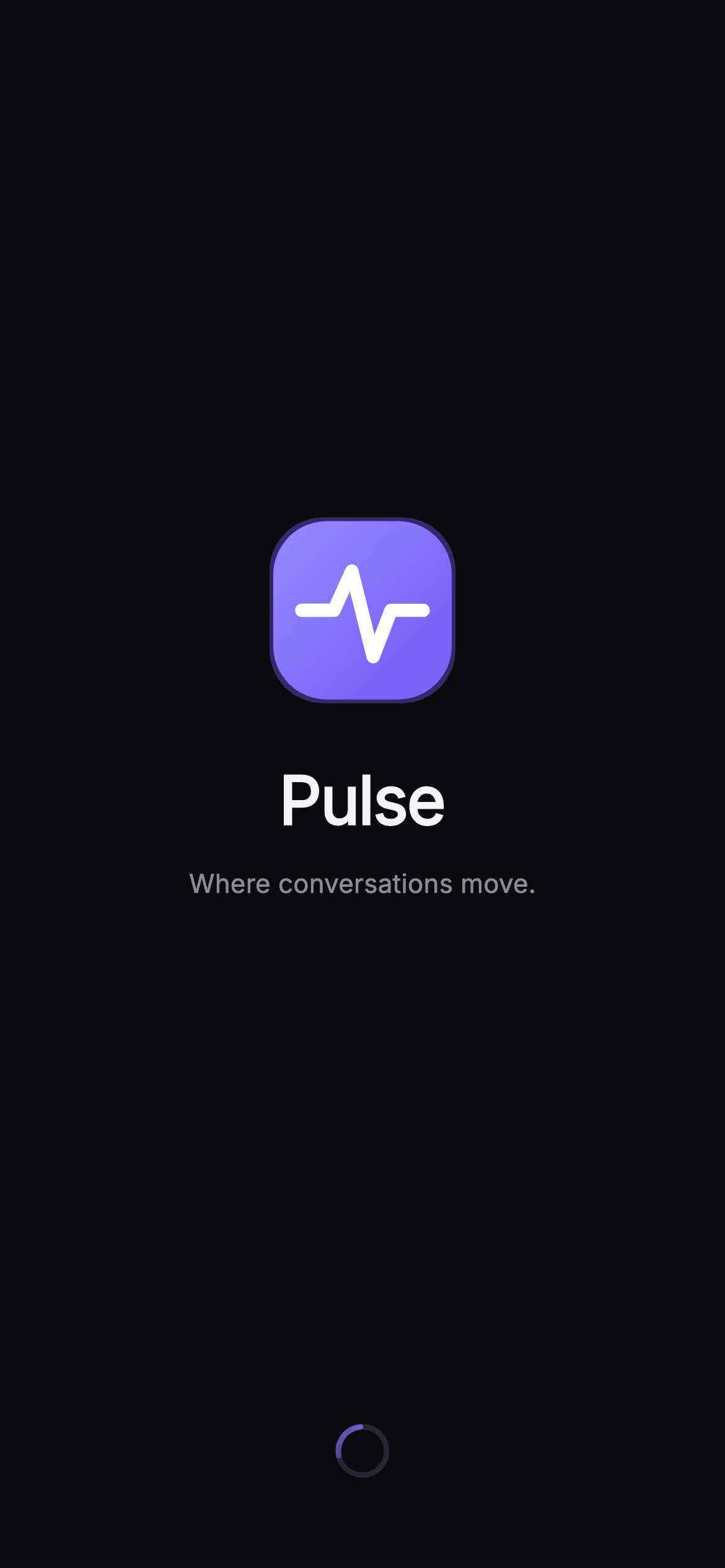
A cold-start splash is the first frame users see, so it should feel like part of the app, not a blank loading gap. This tutorial builds the launch screen for Pulse, a social + chat kit: a near-black canvas, a gradient brandmark with a heartbeat waveform painted right inside it, the 'Pulse' wordmark and tagline, and a continuously spinning ring loader driven by an AnimationController. You'll learn how to paint a logo and a sweeping arc spinner in pure Flutter, and wire a tap-to-continue callback — no image assets, no packages.
Watch the Flutter UI walkthrough
A short screen recording of Pulse · Splash running, if you'd rather see it before you read the code. The written tutorial below covers everything in it.
Can't see the video? Watch it on YouTube.
What you'll build
- ✓A full-bleed dark splash canvas (#0B0B0F) with a forced dark Material 3 theme so it renders standalone on any route
- ✓A 96px gradient rounded-square brandmark with a soft indigo glow and a white pulse waveform drawn by a CustomPainter
- ✓A looping ring loader — a dim track under a SweepGradient arc — animated by a repeating 1500ms AnimationController
- ✓A centered Column balanced by Spacers, with the 'Pulse' wordmark and 'Where conversations move.' tagline
- ✓A tap-anywhere onContinue callback via an opaque GestureDetector for chaining into onboarding
Step-by-step build
Create the file
Add a new file at lib/social_onboarding_splash/social_onboarding_splash_screen.dart in your Flutter project.
Register the bundled fonts
No external packages — this is pure Flutter. It does bundle its design font (Inter), so drop the font file into fonts/ and declare it in pubspec.yaml:
flutter:
  fonts:
    - family: Inter
      fonts:
- asset: fonts/Inter-Regular.ttfBuild it, piece by piece
Here's how the screen goes together. Each block below is a real slice of the code with a plain-English explanation — paste them in order, or grab the whole file from the next section.
Imports, the widget class, and the Pulse palette
import 'package:flutter/material.dart';

/// Splash — branded launch screen for **Pulse**, a premium social + messaging
/// UI kit (Linear / Superhuman aesthetic: sleek, near-mono dark with one
/// electric indigo accent). Self-contained per CONVENTIONS.md: pure Flutter,
/// the exact design font (Inter) is bundled under `fonts/`, and the screen
/// forces its own dark theme so it renders standalone when pushed as a route.
/// The brandmark (a painted pulse wave) and the ring loader are fully painted —
/// no raster logo.
class SocialOnboardingSplashScreen extends StatefulWidget {
  const SocialOnboardingSplashScreen({super.key, this.onContinue});

  /// Optional tap / auto-advance callback used by the gallery to chain the flow.
  final VoidCallback? onContinue;

  static const String _font = 'Inter';

  // ── Pulse token palette (inline, shared across social screens) ──
  static const Color _bg = Color(0xFF0B0B0F);
  static const Color _brand = Color(0xFF6E56F7);
  static const Color _accent = Color(0xFF9B8CFF);
  static const Color _textHi = Color(0xFFF4F4F7);
  static const Color _muted = Color(0xFF8A8A99);
The file imports only Flutter's material library, then declares SocialOnboardingSplashScreen as a StatefulWidget — stateful because the ring loader needs an animation ticker. Its constructor takes an optional onContinue VoidCallback so the gallery (or your app) can advance the flow. A static _font holds 'Inter', and five static const Colors define the near-mono dark palette: _bg (#0B0B0F) is the almost-black canvas, _brand (#6E56F7) and _accent (#9B8CFF) are the two indigo tones, _textHi (#F4F4F7) is the near-white wordmark colour, and _muted (#8A8A99) is the grey tagline. Keeping them as named constants lets every child widget reference the same tokens.
The animation controller lifecycle
  @override
  State<SocialOnboardingSplashScreen> createState() =>
      _SocialOnboardingSplashScreenState();
}

class _SocialOnboardingSplashScreenState
    extends State<SocialOnboardingSplashScreen>
    with SingleTickerProviderStateMixin {
  late final AnimationController _controller;

  @override
  void initState() {
    super.initState();
    _controller = AnimationController(
      vsync: this,
      duration: const Duration(milliseconds: 1500),
    )..repeat();
  }

  @override
  void dispose() {
    _controller.dispose();
    super.dispose();
  }
The State class mixes in SingleTickerProviderStateMixin, which supplies the vsync the AnimationController needs. In initState the controller is created with a 1500ms duration and immediately started with ..repeat(), so it loops from 0.0 to 1.0 forever — that continuous value is what rotates the ring. dispose() releases the controller so the ticker is torn down with the screen; skipping this is a classic Flutter leak, so any controller you start in initState should always be disposed here.
Building the layout: theme, scaffold, and centered column
  @override
  Widget build(BuildContext context) {
    return Theme(
      data: ThemeData.dark(useMaterial3: true),
      child: Scaffold(
        backgroundColor: SocialOnboardingSplashScreen._bg,
        body: GestureDetector(
          onTap: widget.onContinue,
          behavior: HitTestBehavior.opaque,
          child: SafeArea(
            child: SizedBox.expand(
              child: Column(
                crossAxisAlignment: CrossAxisAlignment.center,
                children: <Widget>[
                  const Spacer(),
                  const _PulseMark(size: 96),
                  const SizedBox(height: 28),
                  const Text(
                    'Pulse',
                    style: TextStyle(
                      fontFamily: SocialOnboardingSplashScreen._font,
                      fontSize: 36,
                      fontWeight: FontWeight.w700,
                      letterSpacing: -0.8,
                      color: SocialOnboardingSplashScreen._textHi,
                    ),
                  ),
                  const SizedBox(height: 10),
                  const Text(
                    'Where conversations move.',
                    style: TextStyle(
                      fontFamily: SocialOnboardingSplashScreen._font,
                      fontSize: 14,
                      fontWeight: FontWeight.w500,
                      letterSpacing: 0.1,
                      color: SocialOnboardingSplashScreen._muted,
                    ),
                  ),
                  const Spacer(),
                  SizedBox(
                    width: 30,
                    height: 30,
                    child: AnimatedBuilder(
                      animation: _controller,
                      builder: (BuildContext context, Widget? child) {
                        return CustomPaint(
                          painter: _RingLoaderPainter(progress: _controller.value),
                        );
                      },
                    ),
                  ),
                  const SizedBox(height: 48),
                ],
              ),
            ),
          ),
        ),
      ),
    );
  }
}
build() wraps everything in a Theme with ThemeData.dark(useMaterial3: true) so the splash looks correct even if the host app is light. Inside sits a Scaffold painted with _bg and a GestureDetector using HitTestBehavior.opaque, meaning a tap anywhere — even on empty space — fires widget.onContinue. SafeArea plus SizedBox.expand fill the screen, and a centered Column holds the content: a Spacer, the _PulseMark(size: 96), the 36px w700 'Pulse' wordmark with tight -0.8 letter-spacing, the muted 14px tagline, another Spacer, and a 30x30 AnimatedBuilder that rebuilds the _RingLoaderPainter every frame as _controller.value changes. The two Spacers push the brand group to the vertical center while the loader sits near the bottom above a 48px gap.
The gradient brandmark with an indigo glow
/// The Pulse brandmark — a brand-gradient rounded square with a painted pulse
/// waveform and a soft electric glow.
class _PulseMark extends StatelessWidget {
  const _PulseMark({required this.size});

  final double size;

  @override
  Widget build(BuildContext context) {
    return Container(
      width: size,
      height: size,
      decoration: BoxDecoration(
        borderRadius: BorderRadius.circular(size * 0.3),
        gradient: const LinearGradient(
          begin: Alignment.topLeft,
          end: Alignment.bottomRight,
          colors: <Color>[
            SocialOnboardingSplashScreen._accent,
            SocialOnboardingSplashScreen._brand,
          ],
        ),
        boxShadow: <BoxShadow>[
          BoxShadow(
            color: SocialOnboardingSplashScreen._brand.withValues(alpha: 0.4),
            blurRadius: 36,
            spreadRadius: 2,
          ),
        ],
      ),
      child: CustomPaint(painter: _PulseWavePainter()),
    );
  }
}
_PulseMark is a stateless Container sized by its size parameter. Its BoxDecoration gives it a rounded square (radius = size * 0.3) filled with a LinearGradient running top-left to bottom-right from _accent into _brand. The soft halo comes from a single BoxShadow using _brand.withValues(alpha: 0.4), a 36px blurRadius and 2px spreadRadius — that bleed of colour is what makes the mark glow on the dark canvas. Its child is a CustomPaint that hands drawing of the waveform off to _PulseWavePainter.
Painting the heartbeat waveform
/// Paints a centered white pulse/heartbeat waveform inside the brandmark.
class _PulseWavePainter extends CustomPainter {
  @override
  void paint(Canvas canvas, Size size) {
    final double w = size.width;
    final double h = size.height;
    final Paint paint = Paint()
      ..color = Colors.white
      ..style = PaintingStyle.stroke
      ..strokeWidth = w * 0.075
      ..strokeCap = StrokeCap.round
      ..strokeJoin = StrokeJoin.round;
    final double cy = h * 0.5;
    final Path path = Path()
      ..moveTo(w * 0.16, cy)
      ..lineTo(w * 0.34, cy)
      ..lineTo(w * 0.44, cy - h * 0.22)
      ..lineTo(w * 0.56, cy + h * 0.26)
      ..lineTo(w * 0.66, cy)
      ..lineTo(w * 0.84, cy);
    canvas.drawPath(path, paint);
  }

  @override
  bool shouldRepaint(covariant _PulseWavePainter oldDelegate) => false;
}
_PulseWavePainter draws the white pulse line inside the mark. The Paint is a stroke with strokeWidth scaled to w * 0.075 and round caps and joins so the corners stay smooth. The Path starts flat along the vertical centre (cy), then spikes up (cy - h * 0.22) and down (cy + h * 0.26) before flattening again — the classic ECG heartbeat shape — using coordinates expressed as fractions of the canvas so it scales with any mark size. shouldRepaint returns false because the waveform never changes once drawn.
The sweeping ring loader
/// A sweeping accent arc over a dim track — the splash ring loader.
class _RingLoaderPainter extends CustomPainter {
  const _RingLoaderPainter({required this.progress});

  final double progress;

  @override
  void paint(Canvas canvas, Size size) {
    final Offset center = size.center(Offset.zero);
    final double radius = size.width / 2 - 2;
    canvas.drawCircle(
      center,
      radius,
      Paint()
        ..style = PaintingStyle.stroke
        ..strokeWidth = 3
        ..color = const Color(0xFF26262F),
    );
    final Rect arc = Rect.fromCircle(center: center, radius: radius);
    final double start = progress * 6.2831853;
    canvas.drawArc(
      arc,
      start,
      1.7,
      false,
      Paint()
        ..style = PaintingStyle.stroke
        ..strokeWidth = 3
        ..strokeCap = StrokeCap.round
        ..shader = const SweepGradient(
          colors: <Color>[
            Color(0x006E56F7),
            SocialOnboardingSplashScreen._accent,
          ],
        ).createShader(arc),
    );
  }

  @override
  bool shouldRepaint(covariant _RingLoaderPainter oldDelegate) =>
      oldDelegate.progress != progress;
}
_RingLoaderPainter takes the animation's progress (0.0–1.0) and draws two circles. First a dim full track in #26262F with a 3px stroke, then a 1.7-radian arc on top whose start angle is progress * 2π (6.2831853), so the arc rotates a full turn each loop. The arc's Paint uses a SweepGradient shader running from fully transparent (0x006E56F7) to _accent, giving the spinner its comet-like fade-in tail, with a round strokeCap on the leading edge. shouldRepaint compares the old and new progress so it only repaints when the value actually advances.
Full code
The complete, ready-to-paste source. Free to use in your projects — one click copies it all.
import 'package:flutter/material.dart';

/// Splash — branded launch screen for **Pulse**, a premium social + messaging
/// UI kit (Linear / Superhuman aesthetic: sleek, near-mono dark with one
/// electric indigo accent). Self-contained per CONVENTIONS.md: pure Flutter,
/// the exact design font (Inter) is bundled under `fonts/`, and the screen
/// forces its own dark theme so it renders standalone when pushed as a route.
/// The brandmark (a painted pulse wave) and the ring loader are fully painted —
/// no raster logo.
class SocialOnboardingSplashScreen extends StatefulWidget {
  const SocialOnboardingSplashScreen({super.key, this.onContinue});

  /// Optional tap / auto-advance callback used by the gallery to chain the flow.
  final VoidCallback? onContinue;

  static const String _font = 'Inter';

  // ── Pulse token palette (inline, shared across social screens) ──
  static const Color _bg = Color(0xFF0B0B0F);
  static const Color _brand = Color(0xFF6E56F7);
  static const Color _accent = Color(0xFF9B8CFF);
  static const Color _textHi = Color(0xFFF4F4F7);
  static const Color _muted = Color(0xFF8A8A99);

  @override
  State<SocialOnboardingSplashScreen> createState() =>
      _SocialOnboardingSplashScreenState();
}

class _SocialOnboardingSplashScreenState
    extends State<SocialOnboardingSplashScreen>
    with SingleTickerProviderStateMixin {
  late final AnimationController _controller;

  @override
  void initState() {
    super.initState();
    _controller = AnimationController(
      vsync: this,
      duration: const Duration(milliseconds: 1500),
    )..repeat();
  }

  @override
  void dispose() {
    _controller.dispose();
    super.dispose();
  }

  @override
  Widget build(BuildContext context) {
    return Theme(
      data: ThemeData.dark(useMaterial3: true),
      child: Scaffold(
        backgroundColor: SocialOnboardingSplashScreen._bg,
        body: GestureDetector(
          onTap: widget.onContinue,
          behavior: HitTestBehavior.opaque,
          child: SafeArea(
            child: SizedBox.expand(
              child: Column(
                crossAxisAlignment: CrossAxisAlignment.center,
                children: <Widget>[
                  const Spacer(),
                  const _PulseMark(size: 96),
                  const SizedBox(height: 28),
                  const Text(
                    'Pulse',
                    style: TextStyle(
                      fontFamily: SocialOnboardingSplashScreen._font,
                      fontSize: 36,
                      fontWeight: FontWeight.w700,
                      letterSpacing: -0.8,
                      color: SocialOnboardingSplashScreen._textHi,
                    ),
                  ),
                  const SizedBox(height: 10),
                  const Text(
                    'Where conversations move.',
                    style: TextStyle(
                      fontFamily: SocialOnboardingSplashScreen._font,
                      fontSize: 14,
                      fontWeight: FontWeight.w500,
                      letterSpacing: 0.1,
                      color: SocialOnboardingSplashScreen._muted,
                    ),
                  ),
                  const Spacer(),
                  SizedBox(
                    width: 30,
                    height: 30,
                    child: AnimatedBuilder(
                      animation: _controller,
                      builder: (BuildContext context, Widget? child) {
                        return CustomPaint(
                          painter: _RingLoaderPainter(progress: _controller.value),
                        );
                      },
                    ),
                  ),
                  const SizedBox(height: 48),
                ],
              ),
            ),
          ),
        ),
      ),
    );
  }
}

/// The Pulse brandmark — a brand-gradient rounded square with a painted pulse
/// waveform and a soft electric glow.
class _PulseMark extends StatelessWidget {
  const _PulseMark({required this.size});

  final double size;

  @override
  Widget build(BuildContext context) {
    return Container(
      width: size,
      height: size,
      decoration: BoxDecoration(
        borderRadius: BorderRadius.circular(size * 0.3),
        gradient: const LinearGradient(
          begin: Alignment.topLeft,
          end: Alignment.bottomRight,
          colors: <Color>[
            SocialOnboardingSplashScreen._accent,
            SocialOnboardingSplashScreen._brand,
          ],
        ),
        boxShadow: <BoxShadow>[
          BoxShadow(
            color: SocialOnboardingSplashScreen._brand.withValues(alpha: 0.4),
            blurRadius: 36,
            spreadRadius: 2,
          ),
        ],
      ),
      child: CustomPaint(painter: _PulseWavePainter()),
    );
  }
}

/// Paints a centered white pulse/heartbeat waveform inside the brandmark.
class _PulseWavePainter extends CustomPainter {
  @override
  void paint(Canvas canvas, Size size) {
    final double w = size.width;
    final double h = size.height;
    final Paint paint = Paint()
      ..color = Colors.white
      ..style = PaintingStyle.stroke
      ..strokeWidth = w * 0.075
      ..strokeCap = StrokeCap.round
      ..strokeJoin = StrokeJoin.round;
    final double cy = h * 0.5;
    final Path path = Path()
      ..moveTo(w * 0.16, cy)
      ..lineTo(w * 0.34, cy)
      ..lineTo(w * 0.44, cy - h * 0.22)
      ..lineTo(w * 0.56, cy + h * 0.26)
      ..lineTo(w * 0.66, cy)
      ..lineTo(w * 0.84, cy);
    canvas.drawPath(path, paint);
  }

  @override
  bool shouldRepaint(covariant _PulseWavePainter oldDelegate) => false;
}

/// A sweeping accent arc over a dim track — the splash ring loader.
class _RingLoaderPainter extends CustomPainter {
  const _RingLoaderPainter({required this.progress});

  final double progress;

  @override
  void paint(Canvas canvas, Size size) {
    final Offset center = size.center(Offset.zero);
    final double radius = size.width / 2 - 2;
    canvas.drawCircle(
      center,
      radius,
      Paint()
        ..style = PaintingStyle.stroke
        ..strokeWidth = 3
        ..color = const Color(0xFF26262F),
    );
    final Rect arc = Rect.fromCircle(center: center, radius: radius);
    final double start = progress * 6.2831853;
    canvas.drawArc(
      arc,
      start,
      1.7,
      false,
      Paint()
        ..style = PaintingStyle.stroke
        ..strokeWidth = 3
        ..strokeCap = StrokeCap.round
        ..shader = const SweepGradient(
          colors: <Color>[
            Color(0x006E56F7),
            SocialOnboardingSplashScreen._accent,
          ],
        ).createShader(arc),
    );
  }

  @override
  bool shouldRepaint(covariant _RingLoaderPainter oldDelegate) =>
      oldDelegate.progress != progress;
}
Plus bundled 1 binary asset (fonts/images). The CLI and MCP install those for you automatically.
Two faster ways to add it
Copy-paste works, but you can skip it entirely.
1. FlutterKit CLI
One command drops this screen — and its fonts — straight into your project.
$ flutterkit add social-onboarding-splash2. AI agent (MCP)
Connect FlutterKit's MCP server in Claude or Cursor and just ask your agent to install social-onboarding-splash — it fetches and writes the files for you.
FAQ
Is this Flutter splash screen free to use?
Yes. The full Dart source on this page is free to copy into your own apps, personal or commercial. Paste it directly, install it with the FlutterKit CLI (flutterkit add social-onboarding-splash), or have an AI agent add it for you via MCP.
Does it need any external packages?
No — it's pure Flutter built entirely on the material library, with the logo and ring loader painted in code via CustomPainter, so there are no image assets either. The one extra is the bundled Inter font, which you register in pubspec.yaml as shown in step 2; the CLI and MCP install the font file for you.
Which Flutter version does it target?
It uses the modern Color.withValues() API (in the brandmark's glow shadow) and super parameters, so it targets Flutter 3.22+ (Dart 3). On an older SDK, swap _brand.withValues(alpha: 0.4) for _brand.withOpacity(0.4) and it will compile.


