How to Build an Auth Welcome Screen in Flutter (Full Code + Preview)
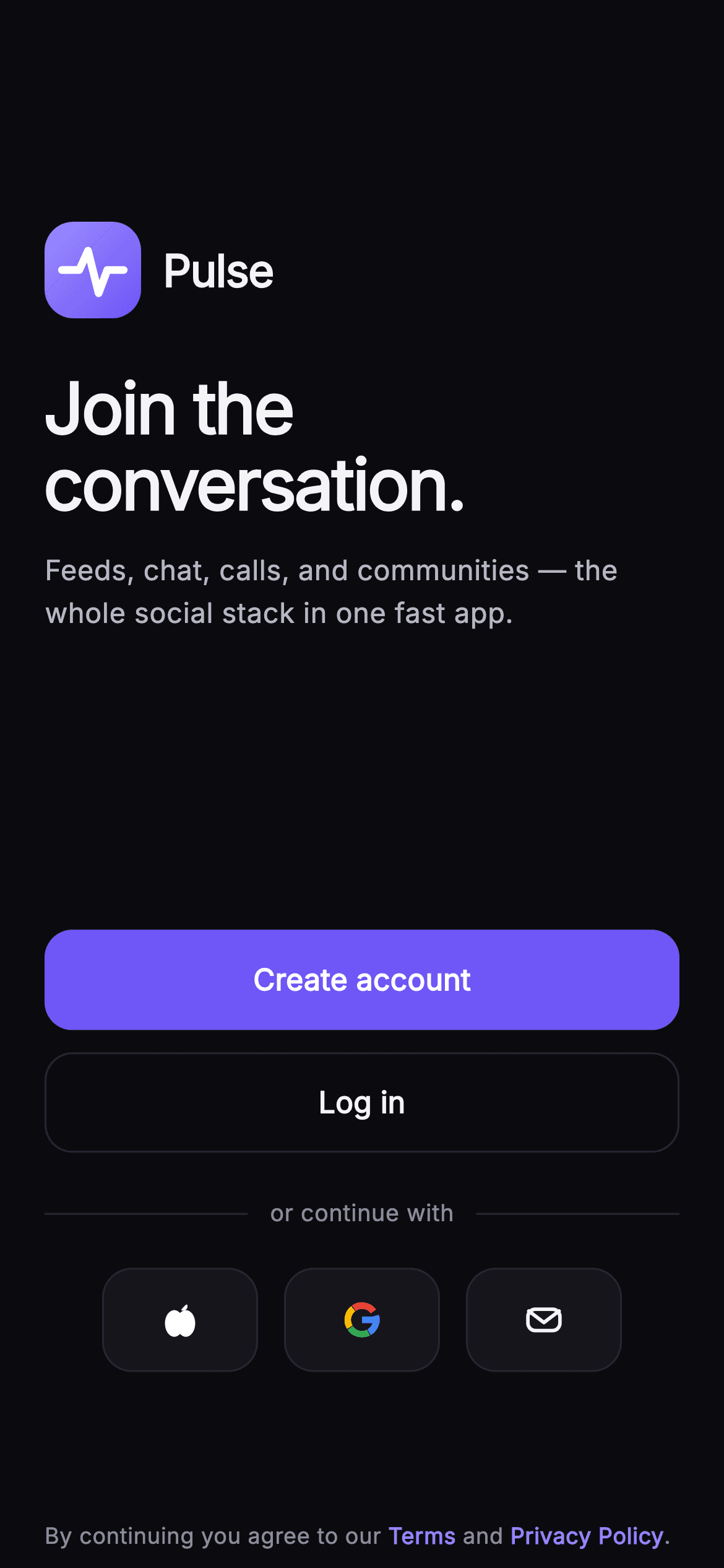
The landing screen of an app has one job: let someone pick how they want to continue, before any form appears. This tutorial builds Pulse's welcome screen in Flutter — a painted gradient brandmark with a stroked waveform, a 38px value headline, and an action stack that ranks Create account above Log in instead of treating them as equals. Under an 'or continue with' divider, three painted provider tiles route Apple, Google and email through a single callback, and weighted Spacers hold the column steady on any phone height.
Watch the Flutter UI walkthrough
A short screen recording of Pulse · Welcome running, if you'd rather see it before you read the code. The written tutorial below covers everything in it.
Can't see the video? Watch it on YouTube.
What you'll build
- ✓A 52px gradient brandmark tile with a white pulse waveform stroked by a CustomPainter
- ✓A Spacer-weighted column (3 / 4 / 2) that keeps the brand group high and the actions in the lower third
- ✓A ranked action pair — indigo FilledButton for Create account, hairline OutlinedButton for Log in
- ✓Three 84x56 provider tiles whose Apple, four-arc Google and envelope glyphs are painted, not imported
- ✓A centred Text.rich terms line with indigo Terms and Privacy Policy spans
Step-by-step build
Create the file
Add a new file at lib/social_auth_welcome/social_auth_welcome_screen.dart in your Flutter project.
Register the bundled fonts
No external packages — this is pure Flutter. It does bundle its design font (Inter), so drop the font file into fonts/ and declare it in pubspec.yaml:
flutter:
  fonts:
    - family: Inter
      fonts:
- asset: fonts/Inter-Regular.ttfBuild it, piece by piece
Here's how the screen goes together. Each block below is a real slice of the code with a plain-English explanation — paste them in order, or grab the whole file from the next section.
Four callbacks and a fixed dark palette
import 'package:flutter/material.dart';

/// Welcome — the auth entry for **Pulse**. Painted brandmark, a bold value line,
/// a primary "Create account" CTA + a secondary "Log in", and a row of painted
/// social-provider buttons under an "or continue with" divider. A terms line
/// anchors the bottom. Self-contained per CONVENTIONS.md: pure Flutter, bundled
/// Inter font, own dark theme, SafeArea, all graphics painted.
class SocialAuthWelcomeScreen extends StatelessWidget {
  const SocialAuthWelcomeScreen({
    super.key,
    this.onCreateAccount,
    this.onLogin,
    this.onProvider,
    this.onTerms,
  });

  final VoidCallback? onCreateAccount;
  final VoidCallback? onLogin;

  /// Tapped a social provider ('apple' | 'google' | 'email').
  final ValueChanged<String>? onProvider;
  final VoidCallback? onTerms;

  static const String _font = 'Inter';
  static const Color _bg = Color(0xFF0B0B0F);
  static const Color _surface = Color(0xFF15151B);
  static const Color _brand = Color(0xFF6E56F7);
  static const Color _accent = Color(0xFF9B8CFF);
  static const Color _hairline = Color(0xFF26262F);
  static const Color _textHi = Color(0xFFF4F4F7);
  static const Color _textLo = Color(0xFFB5B5C2);
  static const Color _muted = Color(0xFF8A8A99);
`SocialAuthWelcomeScreen` is a `StatelessWidget` because a landing screen holds no state — it only routes. The four hooks split by intent: `onCreateAccount` and `onLogin` are plain `VoidCallback`s, while `onProvider` is a `ValueChanged<String>` so all three social tiles funnel into one handler that receives `'apple'`, `'google'` or `'email'`. Three separate callbacks would multiply the wiring for identical work. The palette is declared as `static const` fields rather than pulled from the ambient theme — `_bg` #0B0B0F, `_surface` #15151B, `_brand` #6E56F7 and `_accent` #9B8CFF — so the screen renders identically no matter what theme the host app supplies.
Spacer weights that place the brand group by ratio
  @override
  Widget build(BuildContext context) {
    return Theme(
      data: ThemeData.dark(useMaterial3: true),
      child: Scaffold(
        backgroundColor: _bg,
        body: SafeArea(
          child: Padding(
            padding: const EdgeInsets.symmetric(horizontal: 24),
            child: Column(
              crossAxisAlignment: CrossAxisAlignment.start,
              children: <Widget>[
                const Spacer(flex: 3),
                Row(
                  children: <Widget>[
                    const _BrandMark(size: 52),
                    const SizedBox(width: 12),
                    const Text(
                      'Pulse',
                      style: TextStyle(
                        fontFamily: _font,
                        fontSize: 24,
                        fontWeight: FontWeight.w700,
                        letterSpacing: -0.5,
                        color: _textHi,
                      ),
                    ),
                  ],
                ),
                const SizedBox(height: 28),
                const Text(
                  'Join the\nconversation.',
                  style: TextStyle(
                    fontFamily: _font,
                    fontSize: 38,
                    height: 1.08,
                    fontWeight: FontWeight.w700,
                    letterSpacing: -1.2,
                    color: _textHi,
                  ),
                ),
                const SizedBox(height: 14),
                const Text(
                  'Feeds, chat, calls, and communities — the whole social stack in one fast app.',
                  style: TextStyle(
                    fontFamily: _font,
                    fontSize: 15,
                    height: 1.5,
                    fontWeight: FontWeight.w400,
                    color: _textLo,
                  ),
                ),
                const Spacer(flex: 4),
The whole screen is wrapped in `Theme(data: ThemeData.dark(useMaterial3: true))` so Material defaults stop fighting the near-black canvas even inside a light-themed app. Inside a `SafeArea` and a 24px horizontal `Padding`, a `Column` with `crossAxisAlignment: CrossAxisAlignment.start` left-aligns everything. `Spacer(flex: 3)` above the brand row and `Spacer(flex: 4)` below the copy split the free space 3:4, which parks the brandmark and headline above the optical centre and leaves a bigger gap before the buttons. Fixed `SizedBox` heights would drift badly between a small phone and a tall one; ratios do not. The headline reads 'Join the\nconversation.' at 38px with `height: 1.08` and `letterSpacing: -1.2`, tight enough that the manual line break stays a deliberate two-line shape.
Two actions, deliberately unequal
                SizedBox(
                  width: double.infinity,
                  height: 54,
                  child: FilledButton(
                    onPressed: onCreateAccount,
                    style: FilledButton.styleFrom(
                      backgroundColor: _brand,
                      foregroundColor: Colors.white,
                      shape: RoundedRectangleBorder(
                        borderRadius: BorderRadius.circular(15),
                      ),
                    ),
                    child: const Text(
                      'Create account',
                      style: TextStyle(
                        fontFamily: _font,
                        fontSize: 16,
                        fontWeight: FontWeight.w600,
                        letterSpacing: 0.1,
                      ),
                    ),
                  ),
                ),
                const SizedBox(height: 12),
                SizedBox(
                  width: double.infinity,
                  height: 54,
                  child: OutlinedButton(
                    onPressed: onLogin,
                    style: OutlinedButton.styleFrom(
                      foregroundColor: _textHi,
                      side: const BorderSide(color: _hairline),
                      shape: RoundedRectangleBorder(
                        borderRadius: BorderRadius.circular(15),
                      ),
                    ),
                    child: const Text(
                      'Log in',
                      style: TextStyle(
                        fontFamily: _font,
                        fontSize: 16,
                        fontWeight: FontWeight.w600,
                        letterSpacing: 0.1,
                      ),
                    ),
                  ),
                ),
Both buttons are 54px tall and `width: double.infinity`, but only one is filled. `FilledButton` takes `backgroundColor: _brand` for 'Create account' because new-user acquisition is what this screen is for; 'Log in' gets an `OutlinedButton` with `side: const BorderSide(color: _hairline)` and `foregroundColor: _textHi`, so a returning user still finds it instantly without it competing for the first tap. Two filled buttons would make the choice ambiguous and slow both audiences down. They share a `RoundedRectangleBorder` at radius 15 and 16px `w600` labels with `letterSpacing: 0.1`, so the pair reads as one control stack separated only by weight — plus a 12px gap, tight enough that they group together.
The 'or continue with' divider and provider row
                const SizedBox(height: 24),
                Row(
                  children: <Widget>[
                    const Expanded(child: Divider(color: _hairline, height: 1)),
                    Padding(
                      padding: const EdgeInsets.symmetric(horizontal: 12),
                      child: Text(
                        'or continue with',
                        style: TextStyle(
                          fontFamily: _font,
                          fontSize: 12.5,
                          fontWeight: FontWeight.w500,
                          color: _muted,
                        ),
                      ),
                    ),
                    const Expanded(child: Divider(color: _hairline, height: 1)),
                  ],
                ),
                const SizedBox(height: 20),
                Row(
                  mainAxisAlignment: MainAxisAlignment.center,
                  children: <Widget>[
                    _ProviderButton(
                      glyph: _ProviderGlyph.apple,
                      onTap: () => onProvider?.call('apple'),
                    ),
                    const SizedBox(width: 14),
                    _ProviderButton(
                      glyph: _ProviderGlyph.google,
                      onTap: () => onProvider?.call('google'),
                    ),
                    const SizedBox(width: 14),
                    _ProviderButton(
                      glyph: _ProviderGlyph.email,
                      onTap: () => onProvider?.call('email'),
                    ),
                  ],
                ),
The divider is a `Row` holding `Expanded(child: Divider(color: _hairline, height: 1))` on each side of a 12px-padded label. Two `Expanded` siblings split the remaining width evenly, so the caption stays perfectly centred whatever its length — no hard-coded rule widths to retune. `height: 1` collapses the `Divider`'s default vertical padding so the line sits on the text baseline band. Below it, a centred `Row` of three `_ProviderButton`s separated by 14px gaps closes over the enum value and calls `onProvider?.call('apple')` and friends. The string, not the widget, is what crosses the boundary, which keeps the button reusable and the caller free of private types.
Terms as one tappable rich-text paragraph
                const Spacer(flex: 2),
                Padding(
                  padding: const EdgeInsets.only(bottom: 8),
                  child: GestureDetector(
                    onTap: onTerms,
                    child: Text.rich(
                      TextSpan(
                        text: 'By continuing you agree to our ',
                        style: const TextStyle(
                          fontFamily: _font,
                          fontSize: 12,
                          height: 1.5,
                          color: _muted,
                        ),
                        children: const <TextSpan>[
                          TextSpan(
                            text: 'Terms',
                            style: TextStyle(
                                color: _accent, fontWeight: FontWeight.w600),
                          ),
                          TextSpan(text: ' and '),
                          TextSpan(
                            text: 'Privacy Policy',
                            style: TextStyle(
                                color: _accent, fontWeight: FontWeight.w600),
                          ),
                          TextSpan(text: '.'),
                        ],
                      ),
                      textAlign: TextAlign.center,
                    ),
                  ),
                ),
              ],
            ),
          ),
        ),
      ),
    );
  }
}
A final `Spacer(flex: 2)` keeps the terms line pinned near the bottom without ever colliding with the provider row on a short screen. The copy is a `Text.rich` whose parent `TextSpan` carries the 12px `_muted` style, with 'Terms' and 'Privacy Policy' overriding to `_accent` at `w600` so the two links read as links inside a sentence. Note the wiring: a single `GestureDetector(onTap: onTerms)` wraps the whole paragraph rather than giving each span its own `TapGestureRecognizer`. That is a deliberate simplification — one legal destination, no recognizers to dispose — and if you need separate targets, that is the line to change.
The gradient tile and its painted waveform
class _BrandMark extends StatelessWidget {
  const _BrandMark({required this.size});
  final double size;

  @override
  Widget build(BuildContext context) {
    return Container(
      width: size,
      height: size,
      decoration: BoxDecoration(
        borderRadius: BorderRadius.circular(size * 0.3),
        gradient: const LinearGradient(
          begin: Alignment.topLeft,
          end: Alignment.bottomRight,
          colors: <Color>[
            SocialAuthWelcomeScreen._accent,
            SocialAuthWelcomeScreen._brand,
          ],
        ),
      ),
      child: CustomPaint(painter: _WaveMarkPainter()),
    );
  }
}

class _WaveMarkPainter extends CustomPainter {
  @override
  void paint(Canvas canvas, Size size) {
    final double w = size.width;
    final double h = size.height;
    final Paint paint = Paint()
      ..color = Colors.white
      ..style = PaintingStyle.stroke
      ..strokeWidth = w * 0.08
      ..strokeCap = StrokeCap.round
      ..strokeJoin = StrokeJoin.round;
    final double cy = h * 0.5;
    final Path path = Path()
      ..moveTo(w * 0.18, cy)
      ..lineTo(w * 0.36, cy)
      ..lineTo(w * 0.45, cy - h * 0.2)
      ..lineTo(w * 0.56, cy + h * 0.24)
      ..lineTo(w * 0.65, cy)
      ..lineTo(w * 0.82, cy);
    canvas.drawPath(path, paint);
  }

  @override
  bool shouldRepaint(covariant _WaveMarkPainter oldDelegate) => false;
}
`_BrandMark` is a `Container` sized from one `size` argument, with `BorderRadius.circular(size * 0.3)` so the squircle proportion survives any scale, and a `LinearGradient` running `topLeft` to `bottomRight` from `_accent` into `_brand`. Its child `CustomPaint` runs `_WaveMarkPainter`, which strokes a six-point `Path` — flat lead-in, a spike up `h * 0.2`, a deeper trough down `h * 0.24`, then flat out — at `strokeWidth = w * 0.08` with round caps and joins. Every coordinate is a fraction of the canvas, so a 52px logo here and a 120px one on a splash screen come out identical. `shouldRepaint` returns `false` because the path depends on nothing but size.
A tappable tile with the right ink order
enum _ProviderGlyph { apple, google, email }

class _ProviderButton extends StatelessWidget {
  const _ProviderButton({required this.glyph, this.onTap});
  final _ProviderGlyph glyph;
  final VoidCallback? onTap;

  @override
  Widget build(BuildContext context) {
    return Material(
      color: SocialAuthWelcomeScreen._surface,
      borderRadius: BorderRadius.circular(16),
      child: InkWell(
        onTap: onTap,
        borderRadius: BorderRadius.circular(16),
        child: Container(
          width: 84,
          height: 56,
          decoration: BoxDecoration(
            borderRadius: BorderRadius.circular(16),
            border: Border.all(color: SocialAuthWelcomeScreen._hairline),
          ),
          child: Center(
            child: SizedBox(
              width: 24,
              height: 24,
              child: CustomPaint(painter: _ProviderGlyphPainter(glyph)),
            ),
          ),
        ),
      ),
    );
  }
}
`_ProviderButton` nests `Material` → `InkWell` → `Container` in that order for a reason: `Material` supplies the `_surface` fill that the ripple can paint onto, and the `InkWell` sits above it so the splash is clipped by its own `borderRadius: BorderRadius.circular(16)` rather than spilling past the rounded corner. The `Container` below adds only the `_hairline` border and the 84x56 box — putting the border on `Material` instead would let the ink draw over it. The glyph is boxed to a fixed 24x24 `SizedBox` before painting, so the three marks share one canvas size and appear optically equal despite very different shapes.
Painting Apple, Google and an envelope from scratch
class _ProviderGlyphPainter extends CustomPainter {
  const _ProviderGlyphPainter(this.glyph);
  final _ProviderGlyph glyph;

  @override
  void paint(Canvas canvas, Size size) {
    final double w = size.width;
    final double h = size.height;
    switch (glyph) {
      case _ProviderGlyph.apple:
        _paintApple(canvas, w, h);
        break;
      case _ProviderGlyph.google:
        _paintGoogle(canvas, w, h);
        break;
      case _ProviderGlyph.email:
        _paintEmail(canvas, w, h);
        break;
    }
  }

  void _paintApple(Canvas c, double w, double h) {
    final Paint p = Paint()..color = Colors.white;
    // Body: two overlapping lobes.
    final Path body = Path()
      ..addOval(Rect.fromLTWH(w * 0.16, h * 0.28, w * 0.42, h * 0.6))
      ..addOval(Rect.fromLTWH(w * 0.42, h * 0.28, w * 0.42, h * 0.6));
    c.drawPath(body, p);
    // Leaf.
    final Path leaf = Path()
      ..moveTo(w * 0.52, h * 0.28)
      ..quadraticBezierTo(w * 0.7, h * 0.05, w * 0.66, h * 0.24)
      ..quadraticBezierTo(w * 0.6, h * 0.32, w * 0.52, h * 0.28)
      ..close();
    c.drawPath(leaf, p);
  }

  void _paintGoogle(Canvas c, double w, double h) {
    final Offset center = Offset(w * 0.5, h * 0.5);
    final double r = w * 0.32;
    final double stroke = w * 0.15;
    final Rect rect = Rect.fromCircle(center: center, radius: r);
    final Paint arc = Paint()
      ..style = PaintingStyle.stroke
      ..strokeWidth = stroke
      ..strokeCap = StrokeCap.butt;
    // Ring split into four brand colours, with the opening at 3 o'clock where
    // the blue cross-bar exits — the canonical Google "G".
    c.drawArc(rect, -0.30, 1.35, false, arc..color = const Color(0xFF4285F4));
    c.drawArc(rect, 1.10, 1.45, false, arc..color = const Color(0xFF34A853));
    c.drawArc(rect, 2.60, 1.45, false, arc..color = const Color(0xFFFBBC05));
    c.drawArc(rect, 4.10, 1.55, false, arc..color = const Color(0xFFEA4335));
    // Blue cross-bar from the centre to the inner-right edge.
    c.drawRect(
      Rect.fromLTWH(
        w * 0.5,
        center.dy - stroke / 2,
        r + stroke / 2,
        stroke,
      ),
      Paint()..color = const Color(0xFF4285F4),
    );
  }

  void _paintEmail(Canvas c, double w, double h) {
    final Paint p = Paint()
      ..style = PaintingStyle.stroke
      ..strokeWidth = w * 0.08
      ..strokeJoin = StrokeJoin.round
      ..strokeCap = StrokeCap.round
      ..color = SocialAuthWelcomeScreen._textHi;
    final RRect env = RRect.fromRectAndRadius(
      Rect.fromLTWH(w * 0.14, h * 0.26, w * 0.72, h * 0.48),
      const Radius.circular(4),
    );
    c.drawRRect(env, p);
    final Path flap = Path()
      ..moveTo(w * 0.16, h * 0.3)
      ..lineTo(w * 0.5, h * 0.56)
      ..lineTo(w * 0.84, h * 0.3);
    c.drawPath(flap, p);
  }

  @override
  bool shouldRepaint(covariant _ProviderGlyphPainter oldDelegate) =>
      oldDelegate.glyph != glyph;
}
`_ProviderGlyphPainter` switches on the enum, so one painter serves three tiles. The Apple mark is two overlapping ovals in a single `Path` — union by overlap, no boolean ops — plus a leaf built from two `quadraticBezierTo` curves. The Google 'G' is four `drawArc` calls sharing one `Paint` whose colour is reassigned inline; the sweeps start at -0.30 radians and overlap slightly so no seam shows, with `StrokeCap.butt` keeping the joins square, and a `drawRect` cross-bar from the centre to the inner-right edge finishes it. The envelope strokes an `RRect` and a three-point flap `Path` in `_textHi`. `shouldRepaint` here compares `oldDelegate.glyph`, unlike the wave painter, because this one genuinely varies.
Full code
The complete, ready-to-paste source. Free to use in your projects — one click copies it all.
import 'package:flutter/material.dart';

/// Welcome — the auth entry for **Pulse**. Painted brandmark, a bold value line,
/// a primary "Create account" CTA + a secondary "Log in", and a row of painted
/// social-provider buttons under an "or continue with" divider. A terms line
/// anchors the bottom. Self-contained per CONVENTIONS.md: pure Flutter, bundled
/// Inter font, own dark theme, SafeArea, all graphics painted.
class SocialAuthWelcomeScreen extends StatelessWidget {
  const SocialAuthWelcomeScreen({
    super.key,
    this.onCreateAccount,
    this.onLogin,
    this.onProvider,
    this.onTerms,
  });

  final VoidCallback? onCreateAccount;
  final VoidCallback? onLogin;

  /// Tapped a social provider ('apple' | 'google' | 'email').
  final ValueChanged<String>? onProvider;
  final VoidCallback? onTerms;

  static const String _font = 'Inter';
  static const Color _bg = Color(0xFF0B0B0F);
  static const Color _surface = Color(0xFF15151B);
  static const Color _brand = Color(0xFF6E56F7);
  static const Color _accent = Color(0xFF9B8CFF);
  static const Color _hairline = Color(0xFF26262F);
  static const Color _textHi = Color(0xFFF4F4F7);
  static const Color _textLo = Color(0xFFB5B5C2);
  static const Color _muted = Color(0xFF8A8A99);

  @override
  Widget build(BuildContext context) {
    return Theme(
      data: ThemeData.dark(useMaterial3: true),
      child: Scaffold(
        backgroundColor: _bg,
        body: SafeArea(
          child: Padding(
            padding: const EdgeInsets.symmetric(horizontal: 24),
            child: Column(
              crossAxisAlignment: CrossAxisAlignment.start,
              children: <Widget>[
                const Spacer(flex: 3),
                Row(
                  children: <Widget>[
                    const _BrandMark(size: 52),
                    const SizedBox(width: 12),
                    const Text(
                      'Pulse',
                      style: TextStyle(
                        fontFamily: _font,
                        fontSize: 24,
                        fontWeight: FontWeight.w700,
                        letterSpacing: -0.5,
                        color: _textHi,
                      ),
                    ),
                  ],
                ),
                const SizedBox(height: 28),
                const Text(
                  'Join the\nconversation.',
                  style: TextStyle(
                    fontFamily: _font,
                    fontSize: 38,
                    height: 1.08,
                    fontWeight: FontWeight.w700,
                    letterSpacing: -1.2,
                    color: _textHi,
                  ),
                ),
                const SizedBox(height: 14),
                const Text(
                  'Feeds, chat, calls, and communities — the whole social stack in one fast app.',
                  style: TextStyle(
                    fontFamily: _font,
                    fontSize: 15,
                    height: 1.5,
                    fontWeight: FontWeight.w400,
                    color: _textLo,
                  ),
                ),
                const Spacer(flex: 4),
                SizedBox(
                  width: double.infinity,
                  height: 54,
                  child: FilledButton(
                    onPressed: onCreateAccount,
                    style: FilledButton.styleFrom(
                      backgroundColor: _brand,
                      foregroundColor: Colors.white,
                      shape: RoundedRectangleBorder(
                        borderRadius: BorderRadius.circular(15),
                      ),
                    ),
                    child: const Text(
                      'Create account',
                      style: TextStyle(
                        fontFamily: _font,
                        fontSize: 16,
                        fontWeight: FontWeight.w600,
                        letterSpacing: 0.1,
                      ),
                    ),
                  ),
                ),
                const SizedBox(height: 12),
                SizedBox(
                  width: double.infinity,
                  height: 54,
                  child: OutlinedButton(
                    onPressed: onLogin,
                    style: OutlinedButton.styleFrom(
                      foregroundColor: _textHi,
                      side: const BorderSide(color: _hairline),
                      shape: RoundedRectangleBorder(
                        borderRadius: BorderRadius.circular(15),
                      ),
                    ),
                    child: const Text(
                      'Log in',
                      style: TextStyle(
                        fontFamily: _font,
                        fontSize: 16,
                        fontWeight: FontWeight.w600,
                        letterSpacing: 0.1,
                      ),
                    ),
                  ),
                ),
                const SizedBox(height: 24),
                Row(
                  children: <Widget>[
                    const Expanded(child: Divider(color: _hairline, height: 1)),
                    Padding(
                      padding: const EdgeInsets.symmetric(horizontal: 12),
                      child: Text(
                        'or continue with',
                        style: TextStyle(
                          fontFamily: _font,
                          fontSize: 12.5,
                          fontWeight: FontWeight.w500,
                          color: _muted,
                        ),
                      ),
                    ),
                    const Expanded(child: Divider(color: _hairline, height: 1)),
                  ],
                ),
                const SizedBox(height: 20),
                Row(
                  mainAxisAlignment: MainAxisAlignment.center,
                  children: <Widget>[
                    _ProviderButton(
                      glyph: _ProviderGlyph.apple,
                      onTap: () => onProvider?.call('apple'),
                    ),
                    const SizedBox(width: 14),
                    _ProviderButton(
                      glyph: _ProviderGlyph.google,
                      onTap: () => onProvider?.call('google'),
                    ),
                    const SizedBox(width: 14),
                    _ProviderButton(
                      glyph: _ProviderGlyph.email,
                      onTap: () => onProvider?.call('email'),
                    ),
                  ],
                ),
                const Spacer(flex: 2),
                Padding(
                  padding: const EdgeInsets.only(bottom: 8),
                  child: GestureDetector(
                    onTap: onTerms,
                    child: Text.rich(
                      TextSpan(
                        text: 'By continuing you agree to our ',
                        style: const TextStyle(
                          fontFamily: _font,
                          fontSize: 12,
                          height: 1.5,
                          color: _muted,
                        ),
                        children: const <TextSpan>[
                          TextSpan(
                            text: 'Terms',
                            style: TextStyle(
                                color: _accent, fontWeight: FontWeight.w600),
                          ),
                          TextSpan(text: ' and '),
                          TextSpan(
                            text: 'Privacy Policy',
                            style: TextStyle(
                                color: _accent, fontWeight: FontWeight.w600),
                          ),
                          TextSpan(text: '.'),
                        ],
                      ),
                      textAlign: TextAlign.center,
                    ),
                  ),
                ),
              ],
            ),
          ),
        ),
      ),
    );
  }
}

class _BrandMark extends StatelessWidget {
  const _BrandMark({required this.size});
  final double size;

  @override
  Widget build(BuildContext context) {
    return Container(
      width: size,
      height: size,
      decoration: BoxDecoration(
        borderRadius: BorderRadius.circular(size * 0.3),
        gradient: const LinearGradient(
          begin: Alignment.topLeft,
          end: Alignment.bottomRight,
          colors: <Color>[
            SocialAuthWelcomeScreen._accent,
            SocialAuthWelcomeScreen._brand,
          ],
        ),
      ),
      child: CustomPaint(painter: _WaveMarkPainter()),
    );
  }
}

class _WaveMarkPainter extends CustomPainter {
  @override
  void paint(Canvas canvas, Size size) {
    final double w = size.width;
    final double h = size.height;
    final Paint paint = Paint()
      ..color = Colors.white
      ..style = PaintingStyle.stroke
      ..strokeWidth = w * 0.08
      ..strokeCap = StrokeCap.round
      ..strokeJoin = StrokeJoin.round;
    final double cy = h * 0.5;
    final Path path = Path()
      ..moveTo(w * 0.18, cy)
      ..lineTo(w * 0.36, cy)
      ..lineTo(w * 0.45, cy - h * 0.2)
      ..lineTo(w * 0.56, cy + h * 0.24)
      ..lineTo(w * 0.65, cy)
      ..lineTo(w * 0.82, cy);
    canvas.drawPath(path, paint);
  }

  @override
  bool shouldRepaint(covariant _WaveMarkPainter oldDelegate) => false;
}

enum _ProviderGlyph { apple, google, email }

class _ProviderButton extends StatelessWidget {
  const _ProviderButton({required this.glyph, this.onTap});
  final _ProviderGlyph glyph;
  final VoidCallback? onTap;

  @override
  Widget build(BuildContext context) {
    return Material(
      color: SocialAuthWelcomeScreen._surface,
      borderRadius: BorderRadius.circular(16),
      child: InkWell(
        onTap: onTap,
        borderRadius: BorderRadius.circular(16),
        child: Container(
          width: 84,
          height: 56,
          decoration: BoxDecoration(
            borderRadius: BorderRadius.circular(16),
            border: Border.all(color: SocialAuthWelcomeScreen._hairline),
          ),
          child: Center(
            child: SizedBox(
              width: 24,
              height: 24,
              child: CustomPaint(painter: _ProviderGlyphPainter(glyph)),
            ),
          ),
        ),
      ),
    );
  }
}

/// Paints simple, recognizable provider marks (no raster logos, no emoji).
class _ProviderGlyphPainter extends CustomPainter {
  const _ProviderGlyphPainter(this.glyph);
  final _ProviderGlyph glyph;

  @override
  void paint(Canvas canvas, Size size) {
    final double w = size.width;
    final double h = size.height;
    switch (glyph) {
      case _ProviderGlyph.apple:
        _paintApple(canvas, w, h);
        break;
      case _ProviderGlyph.google:
        _paintGoogle(canvas, w, h);
        break;
      case _ProviderGlyph.email:
        _paintEmail(canvas, w, h);
        break;
    }
  }

  void _paintApple(Canvas c, double w, double h) {
    final Paint p = Paint()..color = Colors.white;
    // Body: two overlapping lobes.
    final Path body = Path()
      ..addOval(Rect.fromLTWH(w * 0.16, h * 0.28, w * 0.42, h * 0.6))
      ..addOval(Rect.fromLTWH(w * 0.42, h * 0.28, w * 0.42, h * 0.6));
    c.drawPath(body, p);
    // Leaf.
    final Path leaf = Path()
      ..moveTo(w * 0.52, h * 0.28)
      ..quadraticBezierTo(w * 0.7, h * 0.05, w * 0.66, h * 0.24)
      ..quadraticBezierTo(w * 0.6, h * 0.32, w * 0.52, h * 0.28)
      ..close();
    c.drawPath(leaf, p);
  }

  void _paintGoogle(Canvas c, double w, double h) {
    final Offset center = Offset(w * 0.5, h * 0.5);
    final double r = w * 0.32;
    final double stroke = w * 0.15;
    final Rect rect = Rect.fromCircle(center: center, radius: r);
    final Paint arc = Paint()
      ..style = PaintingStyle.stroke
      ..strokeWidth = stroke
      ..strokeCap = StrokeCap.butt;
    // Ring split into four brand colours, with the opening at 3 o'clock where
    // the blue cross-bar exits — the canonical Google "G".
    c.drawArc(rect, -0.30, 1.35, false, arc..color = const Color(0xFF4285F4));
    c.drawArc(rect, 1.10, 1.45, false, arc..color = const Color(0xFF34A853));
    c.drawArc(rect, 2.60, 1.45, false, arc..color = const Color(0xFFFBBC05));
    c.drawArc(rect, 4.10, 1.55, false, arc..color = const Color(0xFFEA4335));
    // Blue cross-bar from the centre to the inner-right edge.
    c.drawRect(
      Rect.fromLTWH(
        w * 0.5,
        center.dy - stroke / 2,
        r + stroke / 2,
        stroke,
      ),
      Paint()..color = const Color(0xFF4285F4),
    );
  }

  void _paintEmail(Canvas c, double w, double h) {
    final Paint p = Paint()
      ..style = PaintingStyle.stroke
      ..strokeWidth = w * 0.08
      ..strokeJoin = StrokeJoin.round
      ..strokeCap = StrokeCap.round
      ..color = SocialAuthWelcomeScreen._textHi;
    final RRect env = RRect.fromRectAndRadius(
      Rect.fromLTWH(w * 0.14, h * 0.26, w * 0.72, h * 0.48),
      const Radius.circular(4),
    );
    c.drawRRect(env, p);
    final Path flap = Path()
      ..moveTo(w * 0.16, h * 0.3)
      ..lineTo(w * 0.5, h * 0.56)
      ..lineTo(w * 0.84, h * 0.3);
    c.drawPath(flap, p);
  }

  @override
  bool shouldRepaint(covariant _ProviderGlyphPainter oldDelegate) =>
      oldDelegate.glyph != glyph;
}
Plus bundled 1 binary asset (fonts/images). The CLI and MCP install those for you automatically.
Two faster ways to add it
Copy-paste works, but you can skip it entirely.
1. FlutterKit CLI
One command drops this screen — and its fonts — straight into your project.
$ flutterkit add social-auth-welcome2. AI agent (MCP)
Connect FlutterKit's MCP server in Claude or Cursor and just ask your agent to install social-auth-welcome — it fetches and writes the files for you.
FAQ
Is this welcome screen free to use in a commercial app?
Yes. FlutterKit is free and has no paywall — copy the Dart from this page, install it with the CLI, or pull it through MCP. No account, no licence key and no attribution are needed to ship it. The sign-in flow it demonstrates belongs to the demo app, Pulse; nothing here asks you to sign up for anything.
How do I wire real Google and Apple sign-in to the provider buttons?
The screen never touches auth — it hands you a string. Pass `onProvider: (id) { ... }` and switch on `'apple'`, `'google'` or `'email'`, calling `signInWithProvider` on `firebase_auth`, or `google_sign_in` and `sign_in_with_apple` directly. Because the id is a plain String, you can add a fourth tile and a fourth case without changing the widget's signature at all.
Do I need any packages, icon sets or logo assets?
No packages at all — the imports stop at `package:flutter/material.dart`. Every graphic, including the Google 'G' and the Apple mark, is drawn by a `CustomPainter`, so there are no raster logos, no SVG loader and no emoji. The only asset is the bundled Inter font, referenced as `fontFamily: 'Inter'`; drop that constant and the platform default takes over with no other changes.
Why do the buttons look off-centre on a tablet or a very tall phone?
They are meant to. The three `Spacer` weights (3 above the brand group, 4 below the copy, 2 under the provider row) distribute leftover height by ratio, so a taller viewport grows all three gaps proportionally rather than dumping the slack in one place. If you want the stack pinned instead, swap the last `Spacer` for a fixed `SizedBox` and let the middle one absorb the rest.
Which Flutter version does this screen need?
Flutter 3.16 or newer covers it, and 3.22+ is the comfortable target — the constructor uses `super.key` super-parameters and `ThemeData.dark(useMaterial3: true)`. On an older SDK, expand the constructor to the `{Key? key, ...}) : super(key: key)` form; there is no `Color.withValues` call here, so no `withOpacity` swap is required.


