How to Build a Social App Intro Carousel in Flutter (Full Code + Preview)
A swipeable intro carousel is how a social app sells itself in the first five seconds. This tutorial builds one in Flutter: three horizontally-paged value slides, each topped by a CustomPaint illustration (a feed, a chat, a community graph) drawn entirely in code, so the screen ships with no image files. You'll wire a PageView to a growing dot indicator, handle a Skip shortcut, and swap the primary button's label from 'Next' to 'Get started' on the final slide. It's a dark-themed, pure-Flutter widget with a single bundled Inter font.
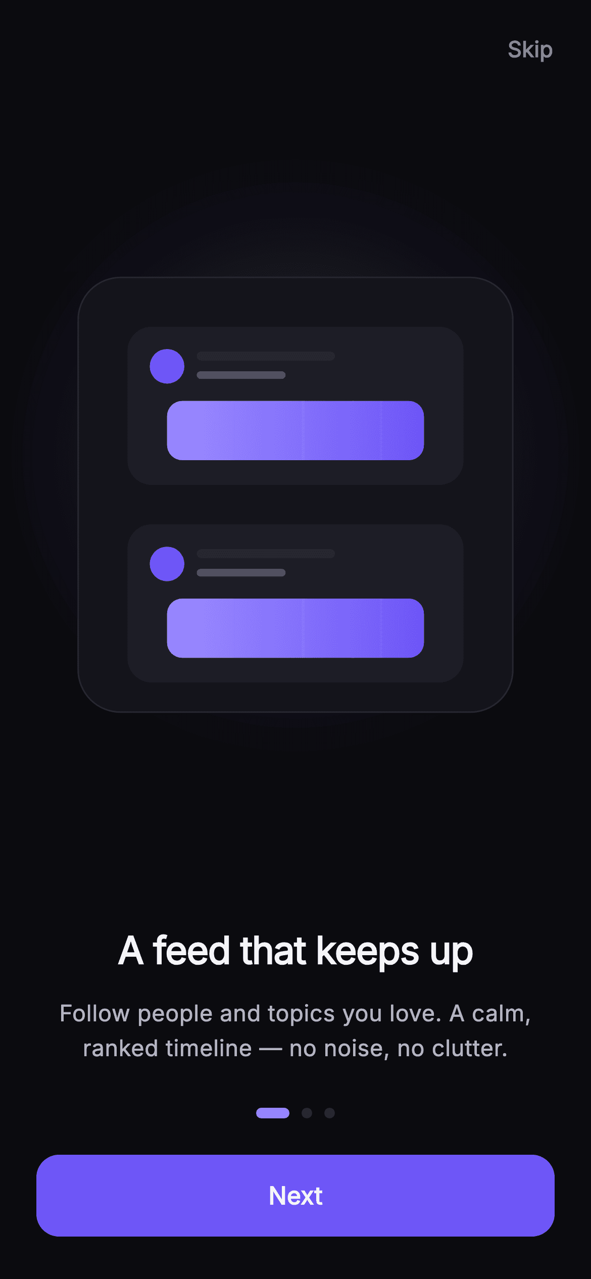
Watch the Flutter UI walkthrough
A short screen recording of Pulse · Intro Carousel running, if you'd rather see it before you read the code. The written tutorial below covers everything in it.
Can't see the video? Watch it on YouTube.
What you'll build
- ✓A three-page horizontal PageView carousel with Skip, Next, and a final 'Get started' button
- ✓An animated dot indicator whose active dot stretches from 7px to 22px as you swipe
- ✓Three vector illustrations (feed cards, chat bubbles, a community node graph) painted with CustomPainter — zero raster assets
- ✓A self-contained dark-theme screen driven by named Color tokens and the bundled Inter font
- ✓onSkip / onDone callbacks so the carousel plugs into your real navigation flow
Step-by-step build
Create the file
Add a new file at lib/social_onboarding_intro/social_onboarding_intro_screen.dart in your Flutter project.
Register the bundled fonts
No external packages — this is pure Flutter. It does bundle its design font (Inter), so drop the font file into fonts/ and declare it in pubspec.yaml:
flutter:
  fonts:
    - family: Inter
      fonts:
- asset: fonts/Inter-Regular.ttfBuild it, piece by piece
Here's how the screen goes together. Each block below is a real slice of the code with a plain-English explanation — paste them in order, or grab the whole file from the next section.
Imports, the widget, callbacks, and dark tokens
import 'package:flutter/material.dart';

/// Intro Carousel — three swipeable value slides that introduce Pulse. Each
/// slide carries a fully painted illustration (feed / chat / communities) so the
/// screen ships with zero raster assets. A segmented dot indicator tracks the
/// page; Skip jumps past onboarding and Next advances (Get Started on the last
/// slide). Self-contained per CONVENTIONS.md: pure Flutter, bundled Inter font,
/// own dark theme, SafeArea.
class SocialOnboardingIntroScreen extends StatefulWidget {
  const SocialOnboardingIntroScreen({
    super.key,
    this.onSkip,
    this.onDone,
  });

  /// Skip onboarding entirely (jumps to Welcome).
  final VoidCallback? onSkip;

  /// Finished the carousel — proceed to Welcome / auth.
  final VoidCallback? onDone;

  static const String _font = 'Inter';
  static const Color _bg = Color(0xFF0B0B0F);
  static const Color _surface = Color(0xFF15151B);
  static const Color _surfaceAlt = Color(0xFF1D1D26);
  static const Color _brand = Color(0xFF6E56F7);
  static const Color _accent = Color(0xFF9B8CFF);
  static const Color _hairline = Color(0xFF26262F);
  static const Color _textHi = Color(0xFFF4F4F7);
  static const Color _textLo = Color(0xFFB5B5C2);
  static const Color _muted = Color(0xFF8A8A99);
The file imports only Flutter's material library, then declares SocialOnboardingIntroScreen as a StatefulWidget because the visible page index changes as the user swipes. Two optional VoidCallback fields, onSkip and onDone, let the parent decide where 'Skip' and finishing the carousel actually navigate — the screen stays reusable. Below them a block of private const Color tokens defines the palette: _bg (#0B0B0F) is the near-black canvas, _surface / _surfaceAlt are the raised card greys, _brand (#6E56F7) is the purple used for the button and highlights, _accent (#9B8CFF) is the lighter violet, and _textHi / _textLo / _muted set the three text brightness levels. Keeping them named makes the dark theme easy to retune.
State: page controller, slide data, and paging logic
class _SocialOnboardingIntroScreenState
    extends State<SocialOnboardingIntroScreen> {
  final PageController _pageController = PageController();
  int _page = 0;

  static const List<_Slide> _slides = <_Slide>[
    _Slide(
      kind: _SlideKind.feed,
      title: 'A feed that keeps up',
      body:
          'Follow people and topics you love. A calm, ranked timeline — no noise, no clutter.',
    ),
    _Slide(
      kind: _SlideKind.chat,
      title: 'Messaging, done right',
      body:
          'Fast 1:1 and group chats, voice notes, and crystal-clear calls — all in one place.',
    ),
    _Slide(
      kind: _SlideKind.community,
      title: 'Find your people',
      body:
          'Join communities, channels, and events around the things you care about most.',
    ),
  ];

  @override
  void dispose() {
    _pageController.dispose();
    super.dispose();
  }

  void _next() {
    if (_page >= _slides.length - 1) {
      widget.onDone?.call();
      return;
    }
    _pageController.nextPage(
      duration: const Duration(milliseconds: 320),
      curve: Curves.easeOutCubic,
    );
  }
The State owns a PageController and an int _page that tracks which slide is showing. The three slides live in a const _slides list — each _Slide pairs a _SlideKind enum (feed, chat, or community) with a title and body string, so the content is data, not hard-coded widgets. dispose() releases the PageController to avoid a leak. The _next() method is the key bit: if you're already on the last slide it calls widget.onDone; otherwise it animates to the next page over 320ms with a Curves.easeOutCubic ease, which is what makes the 'Next' button and a finger-swipe feel consistent.
build(): dark theme, Skip, the PageView, and the CTA
  Widget build(BuildContext context) {
    final bool isLast = _page == _slides.length - 1;
    return Theme(
      data: ThemeData.dark(useMaterial3: true),
      child: Scaffold(
        backgroundColor: SocialOnboardingIntroScreen._bg,
        body: SafeArea(
          child: Column(
            children: <Widget>[
              Align(
                alignment: Alignment.centerRight,
                child: Padding(
                  padding: const EdgeInsets.fromLTRB(0, 8, 8, 0),
                  child: TextButton(
                    onPressed: widget.onSkip,
                    style: TextButton.styleFrom(
                      foregroundColor: SocialOnboardingIntroScreen._muted,
                    ),
                    child: const Text(
                      'Skip',
                      style: TextStyle(
                        fontFamily: SocialOnboardingIntroScreen._font,
                        fontSize: 14.5,
                        fontWeight: FontWeight.w600,
                      ),
                    ),
                  ),
                ),
              ),
              Expanded(
                child: PageView.builder(
                  controller: _pageController,
                  itemCount: _slides.length,
                  onPageChanged: (int i) => setState(() => _page = i),
                  itemBuilder: (BuildContext context, int i) =>
                      _SlideView(slide: _slides[i]),
                ),
              ),
              Padding(
                padding: const EdgeInsets.fromLTRB(24, 8, 24, 28),
                child: Column(
                  children: <Widget>[
                    Row(
                      mainAxisAlignment: MainAxisAlignment.center,
                      children: List<Widget>.generate(
                        _slides.length,
                        (int i) => AnimatedContainer(
                          duration: const Duration(milliseconds: 240),
                          margin: const EdgeInsets.symmetric(horizontal: 4),
                          width: i == _page ? 22 : 7,
                          height: 7,
                          decoration: BoxDecoration(
                            borderRadius: BorderRadius.circular(4),
                            color: i == _page
                                ? SocialOnboardingIntroScreen._accent
                                : SocialOnboardingIntroScreen._hairline,
                          ),
                        ),
                      ),
                    ),
                    const SizedBox(height: 24),
                    SizedBox(
                      width: double.infinity,
                      height: 54,
                      child: FilledButton(
                        onPressed: _next,
                        style: FilledButton.styleFrom(
                          backgroundColor: SocialOnboardingIntroScreen._brand,
                          foregroundColor: Colors.white,
                          shape: RoundedRectangleBorder(
                            borderRadius: BorderRadius.circular(15),
                          ),
                        ),
                        child: Text(
                          isLast ? 'Get started' : 'Next',
                          style: const TextStyle(
                            fontFamily: SocialOnboardingIntroScreen._font,
                            fontSize: 16,
                            fontWeight: FontWeight.w600,
                            letterSpacing: 0.1,
                          ),
                        ),
                      ),
                    ),
                  ],
                ),
              ),
            ],
          ),
        ),
      ),
    );
  }
}
build() wraps everything in a Theme forced to ThemeData.dark(useMaterial3: true) so the screen looks right regardless of the app's own theme, then a Scaffold painted with _bg inside a SafeArea. A top-right TextButton in the _muted grey is the 'Skip' shortcut. The Expanded PageView.builder is the carousel — onPageChanged calls setState to store the new index. Underneath, a Row uses List.generate to build the dot indicator: each dot is an AnimatedContainer that grows to width 22 when it is the active page and shrinks to 7 otherwise, animating over 240ms, and switches colour between _accent and _hairline. Finally a full-width 54px FilledButton in _brand shows 'Get started' when isLast is true and 'Next' otherwise, calling _next on tap.
The slide layout (_SlideView)
  const _SlideView({required this.slide});
  final _Slide slide;

  @override
  Widget build(BuildContext context) {
    return Padding(
      padding: const EdgeInsets.symmetric(horizontal: 32),
      child: Column(
        mainAxisAlignment: MainAxisAlignment.center,
        children: <Widget>[
          Expanded(
            child: Center(
              child: AspectRatio(
                aspectRatio: 1,
                child: CustomPaint(painter: _IllustrationPainter(slide.kind)),
              ),
            ),
          ),
          const SizedBox(height: 12),
          Text(
            slide.title,
            textAlign: TextAlign.center,
            style: const TextStyle(
              fontFamily: SocialOnboardingIntroScreen._font,
              fontSize: 25,
              fontWeight: FontWeight.w700,
              letterSpacing: -0.5,
              color: SocialOnboardingIntroScreen._textHi,
            ),
          ),
          const SizedBox(height: 12),
          Text(
            slide.body,
            textAlign: TextAlign.center,
            style: const TextStyle(
              fontFamily: SocialOnboardingIntroScreen._font,
              fontSize: 15,
              height: 1.5,
              fontWeight: FontWeight.w400,
              color: SocialOnboardingIntroScreen._textLo,
            ),
          ),
          const SizedBox(height: 20),
        ],
      ),
    );
  }
}
_SlideView is the stateless template rendered for every page. An Expanded holds a Center wrapping an AspectRatio(aspectRatio: 1) with a CustomPaint — that forces each illustration into a perfect square and hands the drawing to _IllustrationPainter for this slide's kind. Below the artwork sit two Text widgets: the title at 25px, weight 700, with a tight -0.5 letterSpacing in _textHi, and the body at 15px, weight 400, line-height 1.5 in the dimmer _textLo. Both are centre-aligned, and fixed SizedBox gaps set the vertical rhythm between the art, title, and body.
The painter: card, glow, and kind dispatch
class _IllustrationPainter extends CustomPainter {
  const _IllustrationPainter(this.kind);
  final _SlideKind kind;

  @override
  void paint(Canvas canvas, Size size) {
    final double w = size.width;
    final double h = size.height;
    final RRect card = RRect.fromRectAndRadius(
      Rect.fromLTWH(w * 0.06, h * 0.06, w * 0.88, h * 0.88),
      const Radius.circular(28),
    );
    // Soft brand glow behind the card.
    canvas.drawCircle(
      Offset(w * 0.5, h * 0.42),
      w * 0.42,
      Paint()
        ..color = SocialOnboardingIntroScreen._brand.withValues(alpha: 0.14)
        ..maskFilter = const MaskFilter.blur(BlurStyle.normal, 40),
    );
    canvas.drawRRect(
      card,
      Paint()..color = SocialOnboardingIntroScreen._surface,
    );
    canvas.drawRRect(
      card,
      Paint()
        ..style = PaintingStyle.stroke
        ..strokeWidth = 1
        ..color = SocialOnboardingIntroScreen._hairline,
    );
    switch (kind) {
      case _SlideKind.feed:
        _paintFeed(canvas, w, h);
        break;
      case _SlideKind.chat:
        _paintChat(canvas, w, h);
        break;
      case _SlideKind.community:
        _paintCommunity(canvas, w, h);
        break;
    }
  }
_IllustrationPainter is where the zero-asset illustrations come from. paint() first builds an RRect card inset 6% on each side with a 28px radius. It draws a soft brand-purple glow — a circle filled with _brand at 14% alpha and a 40px MaskFilter.blur — behind the card, then fills the card with _surface and strokes a 1px _hairline border around it. A switch on the painter's kind then calls the matching helper (_paintFeed, _paintChat, or _paintCommunity) so each of the three slides gets its own artwork on the same card backdrop.
Drawing the three illustrations
      Paint()..color = SocialOnboardingIntroScreen._surfaceAlt;
  Paint get _brandFill =>
      Paint()..color = SocialOnboardingIntroScreen._brand;

  void _bar(Canvas c, double x, double y, double w, double h, Color color) {
    c.drawRRect(
      RRect.fromRectAndRadius(
          Rect.fromLTWH(x, y, w, h), Radius.circular(h / 2)),
      Paint()..color = color,
    );
  }

  void _paintFeed(Canvas c, double w, double h) {
    // Two stacked post cards with an avatar + text lines + a media block.
    for (int k = 0; k < 2; k++) {
      final double top = h * (0.16 + k * 0.4);
      c.drawRRect(
        RRect.fromRectAndRadius(
          Rect.fromLTWH(w * 0.16, top, w * 0.68, h * 0.32),
          const Radius.circular(16),
        ),
        _alt,
      );
      c.drawCircle(
          Offset(w * 0.24, top + h * 0.08), w * 0.035, _brandFill);
      _bar(c, w * 0.30, top + h * 0.05, w * 0.28, 6,
          SocialOnboardingIntroScreen._hairline);
      _bar(c, w * 0.30, top + h * 0.09, w * 0.18, 5,
          SocialOnboardingIntroScreen._muted.withValues(alpha: 0.5));
      c.drawRRect(
        RRect.fromRectAndRadius(
          Rect.fromLTWH(w * 0.24, top + h * 0.15, w * 0.52, h * 0.12),
          const Radius.circular(10),
        ),
        Paint()
          ..shader = const LinearGradient(
            colors: <Color>[
              SocialOnboardingIntroScreen._accent,
              SocialOnboardingIntroScreen._brand,
            ],
          ).createShader(
              Rect.fromLTWH(w * 0.24, top + h * 0.15, w * 0.52, h * 0.12)),
      );
    }
  }

  void _paintChat(Canvas c, double w, double h) {
    // Alternating received / sent chat bubbles.
    _bubble(c, w * 0.16, h * 0.2, w * 0.44, h * 0.1, false);
    _bubble(c, w * 0.40, h * 0.36, w * 0.44, h * 0.1, true);
    _bubble(c, w * 0.16, h * 0.52, w * 0.36, h * 0.09, false);
    _bubble(c, w * 0.46, h * 0.66, w * 0.38, h * 0.09, true);
  }

  void _bubble(Canvas c, double x, double y, double w, double h, bool sent) {
    final Rect r = Rect.fromLTWH(x, y, w, h);
    c.drawRRect(
      RRect.fromRectAndRadius(r, Radius.circular(h * 0.42)),
      sent
          ? (Paint()..color = SocialOnboardingIntroScreen._brand)
          : (Paint()..color = SocialOnboardingIntroScreen._surfaceAlt),
    );
  }

  void _paintCommunity(Canvas c, double w, double h) {
    // A cluster of avatar circles connected to a central hub.
    final Offset hub = Offset(w * 0.5, h * 0.5);
    final List<Offset> nodes = <Offset>[
      Offset(w * 0.24, h * 0.28),
      Offset(w * 0.76, h * 0.3),
      Offset(w * 0.22, h * 0.7),
      Offset(w * 0.78, h * 0.68),
      Offset(w * 0.5, h * 0.2),
    ];
    final Paint link = Paint()
      ..style = PaintingStyle.stroke
      ..strokeWidth = 2
      ..color = SocialOnboardingIntroScreen._hairline;
    for (final Offset n in nodes) {
      c.drawLine(hub, n, link);
    }
    for (final Offset n in nodes) {
      c.drawCircle(n, w * 0.06, _alt);
      c.drawCircle(
        n,
        w * 0.06,
        Paint()
          ..style = PaintingStyle.stroke
          ..strokeWidth = 2
          ..color = SocialOnboardingIntroScreen._accent.withValues(alpha: 0.6),
      );
    }
    c.drawCircle(hub, w * 0.1, _brandFill);
    // Success check inside the hub.
    final Paint tick = Paint()
      ..style = PaintingStyle.stroke
      ..strokeWidth = 3
      ..strokeCap = StrokeCap.round
      ..strokeJoin = StrokeJoin.round
      ..color = Colors.white;
    final Path check = Path()
      ..moveTo(hub.dx - w * 0.045, hub.dy)
      ..lineTo(hub.dx - w * 0.01, hub.dy + w * 0.035)
      ..lineTo(hub.dx + w * 0.05, hub.dy - w * 0.04);
    c.drawPath(check, tick);
  }

  @override
  bool shouldRepaint(covariant _IllustrationPainter oldDelegate) =>
      oldDelegate.kind != kind;
}
These helpers draw each scene from primitives, sized relative to the canvas width w and height h so they scale. _bar draws a pill-shaped rounded rect used as a text placeholder. _paintFeed loops twice to stack two post cards, each with a _brand avatar circle, two hairline text bars, and a media block filled with an _accent→_brand LinearGradient shader. _paintChat lays out four alternating bubbles via _bubble, colouring 'sent' ones _brand and received ones _surfaceAlt with a rounded radius. _paintCommunity draws a hub at the centre, five avatar nodes linked to it with hairline strokes, accent-outlined circles, and a white check Path inside the hub. shouldRepaint returns true only when the slide kind changes, so scrolling doesn't repaint needlessly.
Full code
The complete, ready-to-paste source. Free to use in your projects — one click copies it all.
import 'package:flutter/material.dart';

/// Intro Carousel — three swipeable value slides that introduce Pulse. Each
/// slide carries a fully painted illustration (feed / chat / communities) so the
/// screen ships with zero raster assets. A segmented dot indicator tracks the
/// page; Skip jumps past onboarding and Next advances (Get Started on the last
/// slide). Self-contained per CONVENTIONS.md: pure Flutter, bundled Inter font,
/// own dark theme, SafeArea.
class SocialOnboardingIntroScreen extends StatefulWidget {
  const SocialOnboardingIntroScreen({
    super.key,
    this.onSkip,
    this.onDone,
  });

  /// Skip onboarding entirely (jumps to Welcome).
  final VoidCallback? onSkip;

  /// Finished the carousel — proceed to Welcome / auth.
  final VoidCallback? onDone;

  static const String _font = 'Inter';
  static const Color _bg = Color(0xFF0B0B0F);
  static const Color _surface = Color(0xFF15151B);
  static const Color _surfaceAlt = Color(0xFF1D1D26);
  static const Color _brand = Color(0xFF6E56F7);
  static const Color _accent = Color(0xFF9B8CFF);
  static const Color _hairline = Color(0xFF26262F);
  static const Color _textHi = Color(0xFFF4F4F7);
  static const Color _textLo = Color(0xFFB5B5C2);
  static const Color _muted = Color(0xFF8A8A99);

  @override
  State<SocialOnboardingIntroScreen> createState() =>
      _SocialOnboardingIntroScreenState();
}

class _SocialOnboardingIntroScreenState
    extends State<SocialOnboardingIntroScreen> {
  final PageController _pageController = PageController();
  int _page = 0;

  static const List<_Slide> _slides = <_Slide>[
    _Slide(
      kind: _SlideKind.feed,
      title: 'A feed that keeps up',
      body:
          'Follow people and topics you love. A calm, ranked timeline — no noise, no clutter.',
    ),
    _Slide(
      kind: _SlideKind.chat,
      title: 'Messaging, done right',
      body:
          'Fast 1:1 and group chats, voice notes, and crystal-clear calls — all in one place.',
    ),
    _Slide(
      kind: _SlideKind.community,
      title: 'Find your people',
      body:
          'Join communities, channels, and events around the things you care about most.',
    ),
  ];

  @override
  void dispose() {
    _pageController.dispose();
    super.dispose();
  }

  void _next() {
    if (_page >= _slides.length - 1) {
      widget.onDone?.call();
      return;
    }
    _pageController.nextPage(
      duration: const Duration(milliseconds: 320),
      curve: Curves.easeOutCubic,
    );
  }

  @override
  Widget build(BuildContext context) {
    final bool isLast = _page == _slides.length - 1;
    return Theme(
      data: ThemeData.dark(useMaterial3: true),
      child: Scaffold(
        backgroundColor: SocialOnboardingIntroScreen._bg,
        body: SafeArea(
          child: Column(
            children: <Widget>[
              Align(
                alignment: Alignment.centerRight,
                child: Padding(
                  padding: const EdgeInsets.fromLTRB(0, 8, 8, 0),
                  child: TextButton(
                    onPressed: widget.onSkip,
                    style: TextButton.styleFrom(
                      foregroundColor: SocialOnboardingIntroScreen._muted,
                    ),
                    child: const Text(
                      'Skip',
                      style: TextStyle(
                        fontFamily: SocialOnboardingIntroScreen._font,
                        fontSize: 14.5,
                        fontWeight: FontWeight.w600,
                      ),
                    ),
                  ),
                ),
              ),
              Expanded(
                child: PageView.builder(
                  controller: _pageController,
                  itemCount: _slides.length,
                  onPageChanged: (int i) => setState(() => _page = i),
                  itemBuilder: (BuildContext context, int i) =>
                      _SlideView(slide: _slides[i]),
                ),
              ),
              Padding(
                padding: const EdgeInsets.fromLTRB(24, 8, 24, 28),
                child: Column(
                  children: <Widget>[
                    Row(
                      mainAxisAlignment: MainAxisAlignment.center,
                      children: List<Widget>.generate(
                        _slides.length,
                        (int i) => AnimatedContainer(
                          duration: const Duration(milliseconds: 240),
                          margin: const EdgeInsets.symmetric(horizontal: 4),
                          width: i == _page ? 22 : 7,
                          height: 7,
                          decoration: BoxDecoration(
                            borderRadius: BorderRadius.circular(4),
                            color: i == _page
                                ? SocialOnboardingIntroScreen._accent
                                : SocialOnboardingIntroScreen._hairline,
                          ),
                        ),
                      ),
                    ),
                    const SizedBox(height: 24),
                    SizedBox(
                      width: double.infinity,
                      height: 54,
                      child: FilledButton(
                        onPressed: _next,
                        style: FilledButton.styleFrom(
                          backgroundColor: SocialOnboardingIntroScreen._brand,
                          foregroundColor: Colors.white,
                          shape: RoundedRectangleBorder(
                            borderRadius: BorderRadius.circular(15),
                          ),
                        ),
                        child: Text(
                          isLast ? 'Get started' : 'Next',
                          style: const TextStyle(
                            fontFamily: SocialOnboardingIntroScreen._font,
                            fontSize: 16,
                            fontWeight: FontWeight.w600,
                            letterSpacing: 0.1,
                          ),
                        ),
                      ),
                    ),
                  ],
                ),
              ),
            ],
          ),
        ),
      ),
    );
  }
}

enum _SlideKind { feed, chat, community }

class _Slide {
  const _Slide({required this.kind, required this.title, required this.body});
  final _SlideKind kind;
  final String title;
  final String body;
}

class _SlideView extends StatelessWidget {
  const _SlideView({required this.slide});
  final _Slide slide;

  @override
  Widget build(BuildContext context) {
    return Padding(
      padding: const EdgeInsets.symmetric(horizontal: 32),
      child: Column(
        mainAxisAlignment: MainAxisAlignment.center,
        children: <Widget>[
          Expanded(
            child: Center(
              child: AspectRatio(
                aspectRatio: 1,
                child: CustomPaint(painter: _IllustrationPainter(slide.kind)),
              ),
            ),
          ),
          const SizedBox(height: 12),
          Text(
            slide.title,
            textAlign: TextAlign.center,
            style: const TextStyle(
              fontFamily: SocialOnboardingIntroScreen._font,
              fontSize: 25,
              fontWeight: FontWeight.w700,
              letterSpacing: -0.5,
              color: SocialOnboardingIntroScreen._textHi,
            ),
          ),
          const SizedBox(height: 12),
          Text(
            slide.body,
            textAlign: TextAlign.center,
            style: const TextStyle(
              fontFamily: SocialOnboardingIntroScreen._font,
              fontSize: 15,
              height: 1.5,
              fontWeight: FontWeight.w400,
              color: SocialOnboardingIntroScreen._textLo,
            ),
          ),
          const SizedBox(height: 20),
        ],
      ),
    );
  }
}

/// Paints the per-slide vector illustration on a rounded card surface.
class _IllustrationPainter extends CustomPainter {
  const _IllustrationPainter(this.kind);
  final _SlideKind kind;

  @override
  void paint(Canvas canvas, Size size) {
    final double w = size.width;
    final double h = size.height;
    final RRect card = RRect.fromRectAndRadius(
      Rect.fromLTWH(w * 0.06, h * 0.06, w * 0.88, h * 0.88),
      const Radius.circular(28),
    );
    // Soft brand glow behind the card.
    canvas.drawCircle(
      Offset(w * 0.5, h * 0.42),
      w * 0.42,
      Paint()
        ..color = SocialOnboardingIntroScreen._brand.withValues(alpha: 0.14)
        ..maskFilter = const MaskFilter.blur(BlurStyle.normal, 40),
    );
    canvas.drawRRect(
      card,
      Paint()..color = SocialOnboardingIntroScreen._surface,
    );
    canvas.drawRRect(
      card,
      Paint()
        ..style = PaintingStyle.stroke
        ..strokeWidth = 1
        ..color = SocialOnboardingIntroScreen._hairline,
    );
    switch (kind) {
      case _SlideKind.feed:
        _paintFeed(canvas, w, h);
        break;
      case _SlideKind.chat:
        _paintChat(canvas, w, h);
        break;
      case _SlideKind.community:
        _paintCommunity(canvas, w, h);
        break;
    }
  }

  Paint get _alt =>
      Paint()..color = SocialOnboardingIntroScreen._surfaceAlt;
  Paint get _brandFill =>
      Paint()..color = SocialOnboardingIntroScreen._brand;

  void _bar(Canvas c, double x, double y, double w, double h, Color color) {
    c.drawRRect(
      RRect.fromRectAndRadius(
          Rect.fromLTWH(x, y, w, h), Radius.circular(h / 2)),
      Paint()..color = color,
    );
  }

  void _paintFeed(Canvas c, double w, double h) {
    // Two stacked post cards with an avatar + text lines + a media block.
    for (int k = 0; k < 2; k++) {
      final double top = h * (0.16 + k * 0.4);
      c.drawRRect(
        RRect.fromRectAndRadius(
          Rect.fromLTWH(w * 0.16, top, w * 0.68, h * 0.32),
          const Radius.circular(16),
        ),
        _alt,
      );
      c.drawCircle(
          Offset(w * 0.24, top + h * 0.08), w * 0.035, _brandFill);
      _bar(c, w * 0.30, top + h * 0.05, w * 0.28, 6,
          SocialOnboardingIntroScreen._hairline);
      _bar(c, w * 0.30, top + h * 0.09, w * 0.18, 5,
          SocialOnboardingIntroScreen._muted.withValues(alpha: 0.5));
      c.drawRRect(
        RRect.fromRectAndRadius(
          Rect.fromLTWH(w * 0.24, top + h * 0.15, w * 0.52, h * 0.12),
          const Radius.circular(10),
        ),
        Paint()
          ..shader = const LinearGradient(
            colors: <Color>[
              SocialOnboardingIntroScreen._accent,
              SocialOnboardingIntroScreen._brand,
            ],
          ).createShader(
              Rect.fromLTWH(w * 0.24, top + h * 0.15, w * 0.52, h * 0.12)),
      );
    }
  }

  void _paintChat(Canvas c, double w, double h) {
    // Alternating received / sent chat bubbles.
    _bubble(c, w * 0.16, h * 0.2, w * 0.44, h * 0.1, false);
    _bubble(c, w * 0.40, h * 0.36, w * 0.44, h * 0.1, true);
    _bubble(c, w * 0.16, h * 0.52, w * 0.36, h * 0.09, false);
    _bubble(c, w * 0.46, h * 0.66, w * 0.38, h * 0.09, true);
  }

  void _bubble(Canvas c, double x, double y, double w, double h, bool sent) {
    final Rect r = Rect.fromLTWH(x, y, w, h);
    c.drawRRect(
      RRect.fromRectAndRadius(r, Radius.circular(h * 0.42)),
      sent
          ? (Paint()..color = SocialOnboardingIntroScreen._brand)
          : (Paint()..color = SocialOnboardingIntroScreen._surfaceAlt),
    );
  }

  void _paintCommunity(Canvas c, double w, double h) {
    // A cluster of avatar circles connected to a central hub.
    final Offset hub = Offset(w * 0.5, h * 0.5);
    final List<Offset> nodes = <Offset>[
      Offset(w * 0.24, h * 0.28),
      Offset(w * 0.76, h * 0.3),
      Offset(w * 0.22, h * 0.7),
      Offset(w * 0.78, h * 0.68),
      Offset(w * 0.5, h * 0.2),
    ];
    final Paint link = Paint()
      ..style = PaintingStyle.stroke
      ..strokeWidth = 2
      ..color = SocialOnboardingIntroScreen._hairline;
    for (final Offset n in nodes) {
      c.drawLine(hub, n, link);
    }
    for (final Offset n in nodes) {
      c.drawCircle(n, w * 0.06, _alt);
      c.drawCircle(
        n,
        w * 0.06,
        Paint()
          ..style = PaintingStyle.stroke
          ..strokeWidth = 2
          ..color = SocialOnboardingIntroScreen._accent.withValues(alpha: 0.6),
      );
    }
    c.drawCircle(hub, w * 0.1, _brandFill);
    // Success check inside the hub.
    final Paint tick = Paint()
      ..style = PaintingStyle.stroke
      ..strokeWidth = 3
      ..strokeCap = StrokeCap.round
      ..strokeJoin = StrokeJoin.round
      ..color = Colors.white;
    final Path check = Path()
      ..moveTo(hub.dx - w * 0.045, hub.dy)
      ..lineTo(hub.dx - w * 0.01, hub.dy + w * 0.035)
      ..lineTo(hub.dx + w * 0.05, hub.dy - w * 0.04);
    c.drawPath(check, tick);
  }

  @override
  bool shouldRepaint(covariant _IllustrationPainter oldDelegate) =>
      oldDelegate.kind != kind;
}
Plus bundled 1 binary asset (fonts/images). The CLI and MCP install those for you automatically.
Two faster ways to add it
Copy-paste works, but you can skip it entirely.
1. FlutterKit CLI
One command drops this screen — and its fonts — straight into your project.
$ flutterkit add social-onboarding-intro2. AI agent (MCP)
Connect FlutterKit's MCP server in Claude or Cursor and just ask your agent to install social-onboarding-intro — it fetches and writes the files for you.
FAQ
Is this Flutter intro carousel free to use?
Yes. The full Dart source on this page is free to copy into your own apps, personal or commercial. Paste it directly, install it with the FlutterKit CLI (flutterkit add social-onboarding-intro), or have an AI agent add it for you via MCP.
Does it need any external packages?
No — it's pure Flutter, built entirely on the material library, and the illustrations are drawn with CustomPainter so there are no image assets. The only extra is the bundled Inter font, which you register in pubspec.yaml as shown in step 2; the CLI and MCP install the font file for you.
Which Flutter version does it target?
It uses modern APIs like Color.withValues() and super parameters, so it targets Flutter 3.22+ (Dart 3). On an older SDK, swap the withValues(alpha: 0.14) calls for withOpacity(0.14) and it will compile.


