How to Build a Savings Goal Funded Screen with a CustomPainter Ring in Flutter (Full Code + Preview)
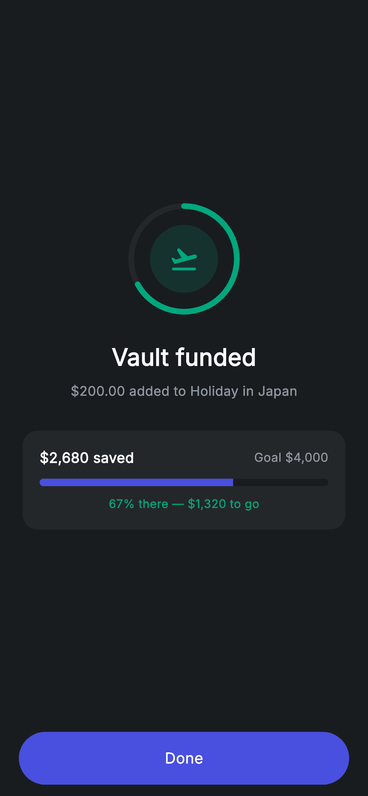
Adding money to a savings goal is only satisfying if you can see the goal move. This tutorial builds Nova's vault-funded screen in Flutter, where the badge is not a check mark but a 120px progress ring drawn with a CustomPainter, wrapped around a themed icon for the goal itself. Below it a card repeats the progress as a rounded LinearProgressIndicator with the amount still to go. You will write the painter from scratch — arc geometry, stroke caps and shouldRepaint included.
Watch the Flutter UI walkthrough
A short screen recording of Vault Funded running, if you'd rather see it before you read the code. The written tutorial below covers everything in it.
Can't see the video? Watch it on YouTube.
What you'll build
- ✓A circular progress ring painted with CustomPaint, drawArc and a rounded stroke cap
- ✓A ring that starts at 12 o'clock by offsetting the arc by minus pi over two
- ✓A LinearProgressIndicator given fully rounded ends with ClipRRect
- ✓A goal card pairing saved-against-target figures with the remaining amount
Step-by-step build
Create the file
Add a new file at lib/fintech_vault_success/fintech_vault_success_screen.dart in your Flutter project.
Register the bundled fonts
No external packages — this is pure Flutter. It does bundle its design font (Inter), so drop the font file into fonts/ and declare it in pubspec.yaml:
flutter:
  fonts:
    - family: Inter
      fonts:
- asset: fonts/Inter-Regular.ttfBuild it, piece by piece
Here's how the screen goes together. Each block below is a real slice of the code with a plain-English explanation — paste them in order, or grab the whole file from the next section.
A confirmation built around a goal
import 'package:flutter/material.dart';

/// Vault success — goal created / funded confirmation (Revolut-inspired).
///
/// Self-contained per CONVENTIONS.md: pure Flutter only, the exact design font
/// (Inter) is bundled under `fonts/`, the badge + progress ring are painted (no
/// emoji/network), and the screen forces its own dark theme. Updated progress
/// makes the confirmation feel complete.
class FintechVaultSuccessScreen extends StatelessWidget {
  const FintechVaultSuccessScreen({super.key, this.onDone});

  final VoidCallback? onDone;

  static const String _font = 'Inter';
  static const Color _bg = Color(0xFF191C1F);
  static const Color _surface = Color(0xFF242729);
  static const Color _brand = Color(0xFF494FDF);
  static const Color _teal = Color(0xFF00A87E);
  static const Color _muted = Color(0xFF8D969E);

  @override
  Widget build(BuildContext context) {
    return Theme(
      data: ThemeData.dark(useMaterial3: true),
      child: Scaffold(
        backgroundColor: _bg,
        body: SafeArea(
          child: Column(
            children: <Widget>[
              Expanded(
                child: Padding(
                  padding: const EdgeInsets.symmetric(horizontal: 24),
                  child: Column(
                    mainAxisAlignment: MainAxisAlignment.center,
                    children: <Widget>[
                      _buildBadge(),
                      const SizedBox(height: 26),
                      const Text(
                        'Vault funded',
                        style: TextStyle(
                          fontFamily: _font,
                          fontSize: 25,
                          fontWeight: FontWeight.w600,
                          letterSpacing: 0.24,
                          color: Colors.white,
                        ),
                      ),
                      const SizedBox(height: 8),
                      const Text(
                        r'$200.00 added to Holiday in Japan',
                        style: TextStyle(
                          fontFamily: _font,
                          fontSize: 14,
                          letterSpacing: 0.24,
                          color: _muted,
                        ),
                      ),
                      const SizedBox(height: 32),
                      _buildProgressCard(),
                    ],
                  ),
                ),
              ),
              _buildButton(),
            ],
          ),
        ),
      ),
    );
  }
The screen is stateless with a single `onDone`. Its copy is what separates a savings confirmation from a payment one: 'Vault funded' as the headline, then `r'$200.00 added to Holiday in Japan'` naming the goal rather than an account number. People fund a vault for a reason, and repeating that reason at the moment of contribution is what makes the deposit feel like progress instead of a transfer. The `r` prefix keeps `$200.00` a literal. Layout is the app's usual success shape — an `Expanded` Column centred on its main axis with the button pinned outside it.
The ring badge
  Widget _buildBadge() {
    return SizedBox(
      width: 120,
      height: 120,
      child: Stack(
        alignment: Alignment.center,
        children: <Widget>[
          CustomPaint(
            size: const Size(120, 120),
            painter: _RingPainter(progress: 0.67),
          ),
          Container(
            width: 72,
            height: 72,
            decoration: BoxDecoration(
              color: _teal.withValues(alpha: 0.16),
              shape: BoxShape.circle,
            ),
            child: const Icon(Icons.flight_takeoff_rounded,
                size: 32, color: _teal),
          ),
        ],
      ),
    );
  }
Instead of the tinted-circle badge used on the other confirmation screens, this one is a 120px `Stack` with `alignment: Alignment.center`, layering a `CustomPaint` ring behind a 72px circle tinted `_teal.withValues(alpha: 0.16)`. The inner icon is `flight_takeoff_rounded` — chosen for 'Holiday in Japan', so the badge names the goal as well as marking the success. Because the painter sits behind a smaller opaque circle, the ring's stroke is fully visible around it with no clipping required. Passing `progress: 0.67` as a constructor argument is what keeps the painter reusable for any goal.
The progress card
  Widget _buildProgressCard() {
    return Container(
      padding: const EdgeInsets.all(18),
      decoration: BoxDecoration(
        color: _surface,
        borderRadius: BorderRadius.circular(16),
      ),
      child: Column(
        children: <Widget>[
          Row(
            mainAxisAlignment: MainAxisAlignment.spaceBetween,
            children: const <Widget>[
              Text(
                r'$2,680 saved',
                style: TextStyle(
                  fontFamily: _font,
                  fontSize: 15,
                  fontWeight: FontWeight.w600,
                  letterSpacing: 0.24,
                  color: Colors.white,
                ),
              ),
              Text(
                r'Goal $4,000',
                style: TextStyle(
                  fontFamily: _font,
                  fontSize: 13,
                  letterSpacing: 0.24,
                  color: _muted,
                ),
              ),
            ],
          ),
          const SizedBox(height: 12),
          ClipRRect(
            borderRadius: BorderRadius.circular(9999),
            child: const LinearProgressIndicator(
              value: 0.67,
              minHeight: 8,
              backgroundColor: _bg,
              valueColor: AlwaysStoppedAnimation<Color>(_brand),
            ),
          ),
          const SizedBox(height: 10),
          const Text(
            '67% there — \$1,320 to go',
            style: TextStyle(
              fontFamily: _font,
              fontSize: 12.5,
              letterSpacing: 0.24,
              color: _teal,
            ),
          ),
        ],
      ),
    );
  }
The card states the goal three ways, which is not redundant — each answers a different question. The top Row gives saved against target ('$2,680 saved' / 'Goal $4,000'), the bar gives the proportion at a glance, and the line below gives what remains ('67% there — $1,320 to go'), which is the number that decides whether someone tops up again today. The bar is a `LinearProgressIndicator` wrapped in `ClipRRect(borderRadius: BorderRadius.circular(9999))`, the standard way to round its ends since the widget itself has no radius property. Its colour comes through `AlwaysStoppedAnimation<Color>(_brand)` — that wrapper is required because `valueColor` takes an Animation, not a Color. Note the last line uses `\$1,320` with a backslash escape rather than an `r` prefix, because that string also contains an em dash and is not declared raw.
Writing the ring painter
/// Paints a circular progress ring over a faint track.
class _RingPainter extends CustomPainter {
  _RingPainter({required this.progress});

  final double progress;

  @override
  void paint(Canvas canvas, Size size) {
    final Offset center = size.center(Offset.zero);
    final double radius = size.width / 2 - 4;
    final Rect rect = Rect.fromCircle(center: center, radius: radius);
    canvas.drawCircle(
      center,
      radius,
      Paint()
        ..color = const Color(0xFF242729)
        ..style = PaintingStyle.stroke
        ..strokeWidth = 6,
    );
    canvas.drawArc(
      rect,
      -1.5708,
      6.2832 * progress.clamp(0, 1),
      false,
      Paint()
        ..color = const Color(0xFF00A87E)
        ..style = PaintingStyle.stroke
        ..strokeWidth = 6
        ..strokeCap = StrokeCap.round,
    );
  }

  @override
  bool shouldRepaint(covariant _RingPainter oldDelegate) =>
      oldDelegate.progress != progress;
}
`_RingPainter` draws two passes. First `drawCircle` lays a full track in `#242729` at `strokeWidth: 6`, with `PaintingStyle.stroke` — without that the Paint would fill the circle solid. Then `drawArc` paints the progress in teal over it. The two magic numbers are radians: `-1.5708` is minus pi over two, rotating the start point from 3 o'clock (Flutter's default) up to 12 o'clock, and `6.2832` is two pi, a full turn, so multiplying it by `progress` gives the sweep. `progress.clamp(0, 1)` protects against a value above 1 wrapping past the start. `strokeCap: StrokeCap.round` is what gives the arc its soft ends. The `radius` subtracts 4 from half the width so the 6px stroke is not clipped by the canvas edge. Finally `shouldRepaint` compares only `progress`, so the ring repaints when the number changes and is skipped when it has not.
Full code
The complete, ready-to-paste source. Free to use in your projects — one click copies it all.
import 'package:flutter/material.dart';

/// Vault success — goal created / funded confirmation (Revolut-inspired).
///
/// Self-contained per CONVENTIONS.md: pure Flutter only, the exact design font
/// (Inter) is bundled under `fonts/`, the badge + progress ring are painted (no
/// emoji/network), and the screen forces its own dark theme. Updated progress
/// makes the confirmation feel complete.
class FintechVaultSuccessScreen extends StatelessWidget {
  const FintechVaultSuccessScreen({super.key, this.onDone});

  final VoidCallback? onDone;

  static const String _font = 'Inter';
  static const Color _bg = Color(0xFF191C1F);
  static const Color _surface = Color(0xFF242729);
  static const Color _brand = Color(0xFF494FDF);
  static const Color _teal = Color(0xFF00A87E);
  static const Color _muted = Color(0xFF8D969E);

  @override
  Widget build(BuildContext context) {
    return Theme(
      data: ThemeData.dark(useMaterial3: true),
      child: Scaffold(
        backgroundColor: _bg,
        body: SafeArea(
          child: Column(
            children: <Widget>[
              Expanded(
                child: Padding(
                  padding: const EdgeInsets.symmetric(horizontal: 24),
                  child: Column(
                    mainAxisAlignment: MainAxisAlignment.center,
                    children: <Widget>[
                      _buildBadge(),
                      const SizedBox(height: 26),
                      const Text(
                        'Vault funded',
                        style: TextStyle(
                          fontFamily: _font,
                          fontSize: 25,
                          fontWeight: FontWeight.w600,
                          letterSpacing: 0.24,
                          color: Colors.white,
                        ),
                      ),
                      const SizedBox(height: 8),
                      const Text(
                        r'$200.00 added to Holiday in Japan',
                        style: TextStyle(
                          fontFamily: _font,
                          fontSize: 14,
                          letterSpacing: 0.24,
                          color: _muted,
                        ),
                      ),
                      const SizedBox(height: 32),
                      _buildProgressCard(),
                    ],
                  ),
                ),
              ),
              _buildButton(),
            ],
          ),
        ),
      ),
    );
  }

  Widget _buildBadge() {
    return SizedBox(
      width: 120,
      height: 120,
      child: Stack(
        alignment: Alignment.center,
        children: <Widget>[
          CustomPaint(
            size: const Size(120, 120),
            painter: _RingPainter(progress: 0.67),
          ),
          Container(
            width: 72,
            height: 72,
            decoration: BoxDecoration(
              color: _teal.withValues(alpha: 0.16),
              shape: BoxShape.circle,
            ),
            child: const Icon(Icons.flight_takeoff_rounded,
                size: 32, color: _teal),
          ),
        ],
      ),
    );
  }

  Widget _buildProgressCard() {
    return Container(
      padding: const EdgeInsets.all(18),
      decoration: BoxDecoration(
        color: _surface,
        borderRadius: BorderRadius.circular(16),
      ),
      child: Column(
        children: <Widget>[
          Row(
            mainAxisAlignment: MainAxisAlignment.spaceBetween,
            children: const <Widget>[
              Text(
                r'$2,680 saved',
                style: TextStyle(
                  fontFamily: _font,
                  fontSize: 15,
                  fontWeight: FontWeight.w600,
                  letterSpacing: 0.24,
                  color: Colors.white,
                ),
              ),
              Text(
                r'Goal $4,000',
                style: TextStyle(
                  fontFamily: _font,
                  fontSize: 13,
                  letterSpacing: 0.24,
                  color: _muted,
                ),
              ),
            ],
          ),
          const SizedBox(height: 12),
          ClipRRect(
            borderRadius: BorderRadius.circular(9999),
            child: const LinearProgressIndicator(
              value: 0.67,
              minHeight: 8,
              backgroundColor: _bg,
              valueColor: AlwaysStoppedAnimation<Color>(_brand),
            ),
          ),
          const SizedBox(height: 10),
          const Text(
            '67% there — \$1,320 to go',
            style: TextStyle(
              fontFamily: _font,
              fontSize: 12.5,
              letterSpacing: 0.24,
              color: _teal,
            ),
          ),
        ],
      ),
    );
  }

  Widget _buildButton() {
    return Padding(
      padding: const EdgeInsets.fromLTRB(20, 0, 20, 12),
      child: SizedBox(
        width: double.infinity,
        height: 56,
        child: Material(
          color: _brand,
          borderRadius: BorderRadius.circular(9999),
          child: InkWell(
            borderRadius: BorderRadius.circular(9999),
            onTap: onDone,
            child: const Center(
              child: Text(
                'Done',
                style: TextStyle(
                  fontFamily: _font,
                  fontSize: 16,
                  fontWeight: FontWeight.w500,
                  letterSpacing: 0.24,
                  color: Colors.white,
                ),
              ),
            ),
          ),
        ),
      ),
    );
  }
}

/// Paints a circular progress ring over a faint track.
class _RingPainter extends CustomPainter {
  _RingPainter({required this.progress});

  final double progress;

  @override
  void paint(Canvas canvas, Size size) {
    final Offset center = size.center(Offset.zero);
    final double radius = size.width / 2 - 4;
    final Rect rect = Rect.fromCircle(center: center, radius: radius);
    canvas.drawCircle(
      center,
      radius,
      Paint()
        ..color = const Color(0xFF242729)
        ..style = PaintingStyle.stroke
        ..strokeWidth = 6,
    );
    canvas.drawArc(
      rect,
      -1.5708,
      6.2832 * progress.clamp(0, 1),
      false,
      Paint()
        ..color = const Color(0xFF00A87E)
        ..style = PaintingStyle.stroke
        ..strokeWidth = 6
        ..strokeCap = StrokeCap.round,
    );
  }

  @override
  bool shouldRepaint(covariant _RingPainter oldDelegate) =>
      oldDelegate.progress != progress;
}
Plus bundled 1 binary asset (fonts/images). The CLI and MCP install those for you automatically.
Two faster ways to add it
Copy-paste works, but you can skip it entirely.
1. FlutterKit CLI
One command drops this screen — and its fonts — straight into your project.
$ flutterkit add fintech-vault-success2. AI agent (MCP)
Connect FlutterKit's MCP server in Claude or Cursor and just ask your agent to install fintech-vault-success — it fetches and writes the files for you.
FAQ
Is this savings goal screen free for commercial use?
Yes. FlutterKit is free and always will be — copy the code from this page, install it with the CLI, or pull it through MCP in your AI editor, then use it in a paid app or client work. No sign-up, no licence key, no attribution.
Why does my progress ring start at 3 o'clock?
Because Flutter's `drawArc` measures angles from the positive x-axis, which points right. Passing `-1.5708` — minus pi over two — as the start angle rotates it to the top. The sweep is then `6.2832 * progress`, two pi being one full revolution.
How do I make the ring show a different percentage?
Pass a different value to `_RingPainter(progress: ...)` and to the `LinearProgressIndicator`. The painter already clamps to 0–1 and its `shouldRepaint` compares the value, so an animated goal works by driving `progress` from an `AnimationController` with no other change.
Why is the progress bar wrapped in ClipRRect?
`LinearProgressIndicator` has no corner-radius property, so the only way to round its ends is to clip it. `ClipRRect(borderRadius: BorderRadius.circular(9999))` with `minHeight: 8` gives a fully rounded capsule that matches the pill buttons elsewhere on the screen.
Which Flutter version does this need?
Flutter 3.22 or newer, because the inner badge uses `Color.withValues(alpha: 0.16)`. On an older SDK use `withOpacity(0.16)` instead and expand the constructor to `const FintechVaultSuccessScreen({Key? key, this.onDone}) : super(key: key);`. The CustomPainter API itself has been stable for years.


