How to Build an App About Screen in Flutter (Full Code + Preview)
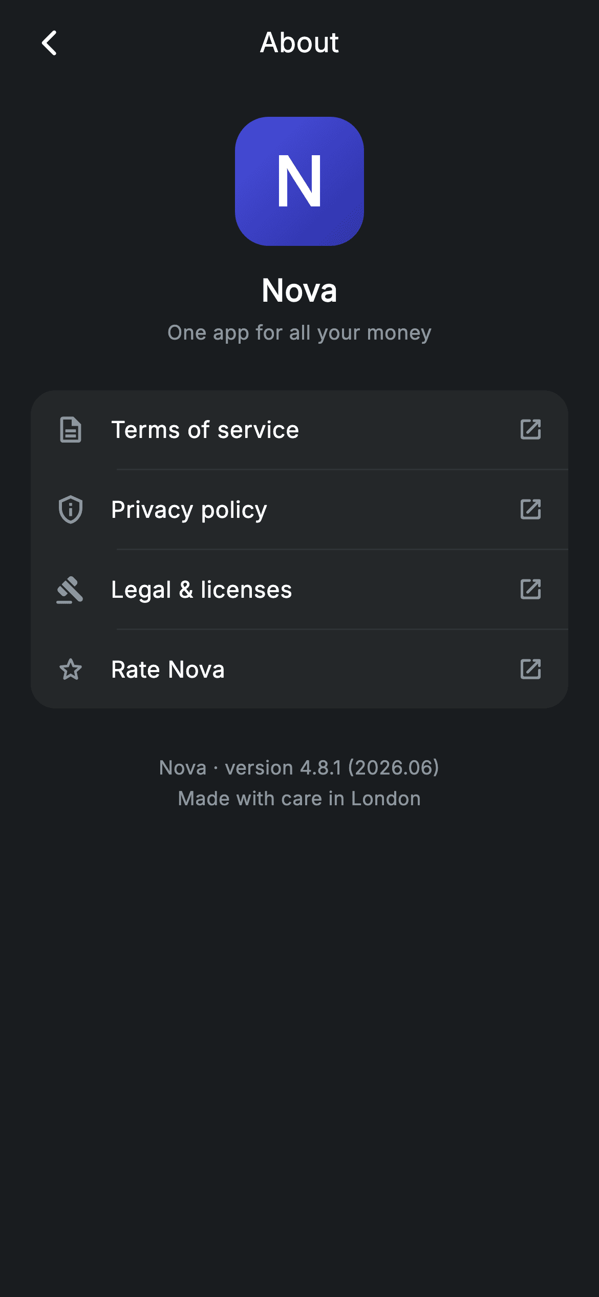
Every app needs an About screen, and most are an afterthought — a version string floating on a blank page. This one is the tidy version a Revolut-style banking app ships: a gradient app mark, a tagline, four legal links grouped in a single rounded card, and a footer that names the build and where it was made. You'll build it as one stateless widget in pure Flutter, with the link list driven by a small table so adding a fifth row is a one-line edit.
Watch the Flutter UI walkthrough
A short screen recording of About running, if you'd rather see it before you read the code. The written tutorial below covers everything in it.
Can't see the video? Watch it on YouTube.
What you'll build
- ✓A gradient app badge drawn from a LinearGradient and a letter — no image asset
- ✓Four legal links generated from a table, hairline-separated inside one rounded card
- ✓A centred app bar title that stays centred using a fixed-width counterweight
- ✓A version footer that carries the build number and the 'made in' line together
- ✓A screen that forces its own dark theme regardless of the host app's setting
Step-by-step build
Create the file
Add a new file at lib/fintech_about/fintech_about_screen.dart in your Flutter project.
Register the bundled fonts
No external packages — this is pure Flutter. It does bundle its design font (Inter), so drop the font file into fonts/ and declare it in pubspec.yaml:
flutter:
  fonts:
    - family: Inter
      fonts:
- asset: fonts/Inter-Regular.ttfBuild it, piece by piece
Here's how the screen goes together. Each block below is a real slice of the code with a plain-English explanation — paste them in order, or grab the whole file from the next section.
The palette and the link table
import 'package:flutter/material.dart';

/// About — app info, legal links & version (Revolut-inspired design system).
///
/// Self-contained per CONVENTIONS.md: pure Flutter only, the exact design font
/// (Inter) is bundled under `fonts/`, the app mark is a painted badge (no
/// network/emoji), and the screen forces its own dark theme.
class FintechAboutScreen extends StatelessWidget {
  const FintechAboutScreen({super.key, this.onBack});

  final VoidCallback? onBack;

  static const String _font = 'Inter';
  static const Color _bg = Color(0xFF191C1F);
  static const Color _surface = Color(0xFF242729);
  static const Color _muted = Color(0xFF8D969E);
  static const Color _hairline = Color(0xFF2E3235);

  static const List<List<dynamic>> _links = <List<dynamic>>[
    <dynamic>[Icons.description_outlined, 'Terms of service'],
    <dynamic>[Icons.privacy_tip_outlined, 'Privacy policy'],
    <dynamic>[Icons.gavel_rounded, 'Legal & licenses'],
    <dynamic>[Icons.star_outline_rounded, 'Rate Nova'],
  ];
The screen is a `StatelessWidget` with a single optional `onBack` callback — an About page displays constants and has nothing to mutate. The four colours are declared once as statics: `_bg` at `0xFF191C1F` for the page, `_surface` at `0xFF242729` for the card, `_muted` for secondary text and `_hairline` for dividers. The interesting bit is `_links`, a `List<List<dynamic>>` where each row is `[IconData, String]`. It is a deliberately compact table rather than a small model class, which is why the build method has to cast at the use site — the trade is fewer lines for one cast.
Forcing dark and building the scroll shell
  @override
  Widget build(BuildContext context) {
    return Theme(
      data: ThemeData.dark(useMaterial3: true),
      child: Scaffold(
        backgroundColor: _bg,
        body: SafeArea(
          child: Column(
            children: <Widget>[
              _buildAppBar(),
              Expanded(
                child: ListView(
                  physics: const BouncingScrollPhysics(),
                  padding: const EdgeInsets.fromLTRB(20, 8, 20, 24),
                  children: <Widget>[
                    const SizedBox(height: 12),
                    _buildLogo(),
                    const SizedBox(height: 28),
`build` wraps everything in `Theme(data: ThemeData.dark(useMaterial3: true))`, so the screen looks the same whether the host app is running light or dark. Inside is a `Scaffold` on `_bg`, a `SafeArea`, then a `Column` of the app bar and an `Expanded` `ListView`. The list uses `BouncingScrollPhysics` and `EdgeInsets.fromLTRB(20, 8, 20, 24)`. A `ListView` for four links looks like overkill until you remember large text settings and small phones — the content scrolls instead of overflowing.
One card, four rows, dividers between
                    Container(
                      decoration: BoxDecoration(
                        color: _surface,
                        borderRadius: BorderRadius.circular(16),
                      ),
                      child: Column(
                        children: <Widget>[
                          for (int i = 0; i < _links.length; i++) ...<Widget>[
                            if (i != 0)
                              const Divider(height: 1, color: _hairline, indent: 56),
                            _linkRow(_links[i][0] as IconData,
                                _links[i][1] as String),
                          ],
                        ],
                      ),
                    ),
The card is a `Container` on `_surface` with `BorderRadius.circular(16)`, and its children come from a collection-for that spreads two widgets per iteration: `if (i != 0) const Divider(...)` followed by `_linkRow(...)`. Because the divider is guarded on `i != 0`, separators land only *between* rows and never above the first or below the last — no trailing line butting against the card's rounded corner. The `Divider` carries `indent: 56`, which starts it just past the 52px icon column so it runs under the labels instead of cutting the whole card in half.
The version footer
                    const SizedBox(height: 28),
                    const Center(
                      child: Text(
                        'Nova · version 4.8.1 (2026.06)\nMade with care in London',
                        textAlign: TextAlign.center,
                        style: TextStyle(
                          fontFamily: _font,
                          fontSize: 12.5,
                          height: 1.6,
                          letterSpacing: 0.24,
                          color: _muted,
                        ),
                      ),
                    ),
                  ],
                ),
              ),
            ],
          ),
        ),
      ),
    );
  }
The footer is a single centred `Text` holding two lines in one string: `'Nova · version 4.8.1 (2026.06)\nMade with care in London'`. Keeping both in one widget with `height: 1.6` gives even line spacing for free, where two stacked `Text` widgets would need a `SizedBox` tuned by eye. The version string carries the marketing version and the build stamp together, which is what a support agent actually asks for. At 12.5px in `_muted` it is legible but clearly the least important thing on the screen.
A centred title that is really centred
  Widget _buildAppBar() {
    return Padding(
      padding: const EdgeInsets.fromLTRB(8, 4, 8, 4),
      child: Row(
        children: <Widget>[
          IconButton(
            onPressed: onBack,
            icon: const Icon(Icons.arrow_back_ios_new_rounded,
                size: 20, color: Colors.white),
          ),
          const Expanded(
            child: Text(
              'About',
              textAlign: TextAlign.center,
              style: TextStyle(
                fontFamily: _font,
                fontSize: 18,
                fontWeight: FontWeight.w500,
                letterSpacing: 0.24,
                color: Colors.white,
              ),
            ),
          ),
          const SizedBox(width: 48),
        ],
      ),
    );
  }
The app bar is a plain `Row`: a back `IconButton`, an `Expanded` title with `textAlign: TextAlign.center`, and — the part that matters — `const SizedBox(width: 48)` on the right. Without that counterweight the `Expanded` would absorb all the space the icon does not use and the centred text would sit visibly right of true centre. 48 is the icon button's own width, so the two ends cancel out. This is why the row does not use `AppBar`: the same result without inheriting the theme's toolbar height and elevation rules.
The app mark, painted not imported
  Widget _buildLogo() {
    return Column(
      children: <Widget>[
        Container(
          width: 84,
          height: 84,
          decoration: BoxDecoration(
            gradient: const LinearGradient(
              begin: Alignment.topLeft,
              end: Alignment.bottomRight,
              colors: <Color>[Color(0xFF494FDF), Color(0xFF2D31A6)],
            ),
            borderRadius: BorderRadius.circular(22),
          ),
          child: const Center(
            child: Text(
              'N',
              style: TextStyle(
                fontFamily: _font,
                fontSize: 44,
                fontWeight: FontWeight.w700,
                color: Colors.white,
              ),
            ),
          ),
        ),
        const SizedBox(height: 14),
        const Text(
          'Nova',
          style: TextStyle(
            fontFamily: _font,
            fontSize: 20,
            fontWeight: FontWeight.w600,
            letterSpacing: 0.24,
            color: Colors.white,
          ),
        ),
        const SizedBox(height: 4),
        const Text(
          'One app for all your money',
          style: TextStyle(
            fontFamily: _font,
            fontSize: 13,
            letterSpacing: 0.24,
            color: _muted,
          ),
        ),
      ],
    );
  }
`_buildLogo` is an 84×84 `Container` filled with a `LinearGradient` running `topLeft` → `bottomRight` from `0xFF494FDF` to `0xFF2D31A6`, rounded at 22 — roughly a quarter of the box, which is what gives the squircle-ish app-icon look rather than a plain rounded square. The mark itself is the letter `N` at 44px `w700`, so the whole badge is vector: no PNG to ship at three densities, and it stays sharp at any size. Below it the name sits at 20px `w600` and the tagline at 13px in `_muted`, spaced 14 and 4 — a tight pair reading as one block.
The link row
  Widget _linkRow(IconData icon, String label) {
    return InkWell(
      onTap: () {},
      child: Padding(
        padding: const EdgeInsets.symmetric(horizontal: 16, vertical: 15),
        child: Row(
          children: <Widget>[
            Icon(icon, size: 20, color: _muted),
            const SizedBox(width: 16),
            Expanded(
              child: Text(
                label,
                style: const TextStyle(
                  fontFamily: _font,
                  fontSize: 15,
                  fontWeight: FontWeight.w500,
                  letterSpacing: 0.24,
                  color: Colors.white,
                ),
              ),
            ),
            const Icon(Icons.open_in_new_rounded, size: 17, color: _muted),
          ],
        ),
      ),
    );
  }
}
`_linkRow` takes the icon and label straight from the table and returns an `InkWell` — so the ripple covers the full row width, including the padding, rather than just the text. Inside, the label is wrapped in `Expanded` so a long translated string wraps instead of overflowing, and the trailing `Icons.open_in_new_rounded` tells the reader these links leave the app for a browser, which a chevron would not. `onTap` is an empty closure in the demo; wire each row to your own launcher and the layout does not change.
Full code
The complete, ready-to-paste source. Free to use in your projects — one click copies it all.
import 'package:flutter/material.dart';

/// About — app info, legal links & version (Revolut-inspired design system).
///
/// Self-contained per CONVENTIONS.md: pure Flutter only, the exact design font
/// (Inter) is bundled under `fonts/`, the app mark is a painted badge (no
/// network/emoji), and the screen forces its own dark theme.
class FintechAboutScreen extends StatelessWidget {
  const FintechAboutScreen({super.key, this.onBack});

  final VoidCallback? onBack;

  static const String _font = 'Inter';
  static const Color _bg = Color(0xFF191C1F);
  static const Color _surface = Color(0xFF242729);
  static const Color _muted = Color(0xFF8D969E);
  static const Color _hairline = Color(0xFF2E3235);

  static const List<List<dynamic>> _links = <List<dynamic>>[
    <dynamic>[Icons.description_outlined, 'Terms of service'],
    <dynamic>[Icons.privacy_tip_outlined, 'Privacy policy'],
    <dynamic>[Icons.gavel_rounded, 'Legal & licenses'],
    <dynamic>[Icons.star_outline_rounded, 'Rate Nova'],
  ];

  @override
  Widget build(BuildContext context) {
    return Theme(
      data: ThemeData.dark(useMaterial3: true),
      child: Scaffold(
        backgroundColor: _bg,
        body: SafeArea(
          child: Column(
            children: <Widget>[
              _buildAppBar(),
              Expanded(
                child: ListView(
                  physics: const BouncingScrollPhysics(),
                  padding: const EdgeInsets.fromLTRB(20, 8, 20, 24),
                  children: <Widget>[
                    const SizedBox(height: 12),
                    _buildLogo(),
                    const SizedBox(height: 28),
                    Container(
                      decoration: BoxDecoration(
                        color: _surface,
                        borderRadius: BorderRadius.circular(16),
                      ),
                      child: Column(
                        children: <Widget>[
                          for (int i = 0; i < _links.length; i++) ...<Widget>[
                            if (i != 0)
                              const Divider(height: 1, color: _hairline, indent: 56),
                            _linkRow(_links[i][0] as IconData,
                                _links[i][1] as String),
                          ],
                        ],
                      ),
                    ),
                    const SizedBox(height: 28),
                    const Center(
                      child: Text(
                        'Nova · version 4.8.1 (2026.06)\nMade with care in London',
                        textAlign: TextAlign.center,
                        style: TextStyle(
                          fontFamily: _font,
                          fontSize: 12.5,
                          height: 1.6,
                          letterSpacing: 0.24,
                          color: _muted,
                        ),
                      ),
                    ),
                  ],
                ),
              ),
            ],
          ),
        ),
      ),
    );
  }

  Widget _buildAppBar() {
    return Padding(
      padding: const EdgeInsets.fromLTRB(8, 4, 8, 4),
      child: Row(
        children: <Widget>[
          IconButton(
            onPressed: onBack,
            icon: const Icon(Icons.arrow_back_ios_new_rounded,
                size: 20, color: Colors.white),
          ),
          const Expanded(
            child: Text(
              'About',
              textAlign: TextAlign.center,
              style: TextStyle(
                fontFamily: _font,
                fontSize: 18,
                fontWeight: FontWeight.w500,
                letterSpacing: 0.24,
                color: Colors.white,
              ),
            ),
          ),
          const SizedBox(width: 48),
        ],
      ),
    );
  }

  Widget _buildLogo() {
    return Column(
      children: <Widget>[
        Container(
          width: 84,
          height: 84,
          decoration: BoxDecoration(
            gradient: const LinearGradient(
              begin: Alignment.topLeft,
              end: Alignment.bottomRight,
              colors: <Color>[Color(0xFF494FDF), Color(0xFF2D31A6)],
            ),
            borderRadius: BorderRadius.circular(22),
          ),
          child: const Center(
            child: Text(
              'N',
              style: TextStyle(
                fontFamily: _font,
                fontSize: 44,
                fontWeight: FontWeight.w700,
                color: Colors.white,
              ),
            ),
          ),
        ),
        const SizedBox(height: 14),
        const Text(
          'Nova',
          style: TextStyle(
            fontFamily: _font,
            fontSize: 20,
            fontWeight: FontWeight.w600,
            letterSpacing: 0.24,
            color: Colors.white,
          ),
        ),
        const SizedBox(height: 4),
        const Text(
          'One app for all your money',
          style: TextStyle(
            fontFamily: _font,
            fontSize: 13,
            letterSpacing: 0.24,
            color: _muted,
          ),
        ),
      ],
    );
  }

  Widget _linkRow(IconData icon, String label) {
    return InkWell(
      onTap: () {},
      child: Padding(
        padding: const EdgeInsets.symmetric(horizontal: 16, vertical: 15),
        child: Row(
          children: <Widget>[
            Icon(icon, size: 20, color: _muted),
            const SizedBox(width: 16),
            Expanded(
              child: Text(
                label,
                style: const TextStyle(
                  fontFamily: _font,
                  fontSize: 15,
                  fontWeight: FontWeight.w500,
                  letterSpacing: 0.24,
                  color: Colors.white,
                ),
              ),
            ),
            const Icon(Icons.open_in_new_rounded, size: 17, color: _muted),
          ],
        ),
      ),
    );
  }
}
Plus bundled 1 binary asset (fonts/images). The CLI and MCP install those for you automatically.
Two faster ways to add it
Copy-paste works, but you can skip it entirely.
1. FlutterKit CLI
One command drops this screen — and its fonts — straight into your project.
$ flutterkit add fintech-about2. AI agent (MCP)
Connect FlutterKit's MCP server in Claude or Cursor and just ask your agent to install fintech-about — it fetches and writes the files for you.
FAQ
Is this About screen free to use in a commercial app?
Yes. Copy it from this page, install it with the CLI, or have an agent pull it through MCP, then ship it in a paid product. There is no attribution requirement and nothing to register.
How do I open the real Terms and Privacy pages?
Replace the empty `onTap: () {}` in `_linkRow` with your own handler. Pass a callback per row — either extend the `_links` table to hold a third entry, or swap the table for a small class with icon, label and onTap fields once you have more than a couple of destinations.
Can I read the version number from the app instead of hard-coding it?
Yes, and you should for a real release. The screen prints a literal string so it stays dependency-free; swap it for a value read at startup and pass it into the widget as a parameter, keeping the same two-line format so the layout is unchanged.
Does this need any packages or fonts?
No packages — it is pure Flutter, only `material.dart`. It does use the Inter font family, which ships bundled with the screen, so register the files under `fonts:` in your pubspec. Drop that and the text falls back to the platform font with slightly different spacing.
Which Flutter version does this need?
Flutter 3.22 or newer is a safe floor: the constructor uses the `super.key` parameter form and the code assumes Material 3 defaults via `ThemeData.dark(useMaterial3: true)`. On an older SDK expand the constructor to `{Key? key}) : super(key: key)`.


