How to Build a Theme and Accent Colour Settings Screen in Flutter (Full Code + Preview)
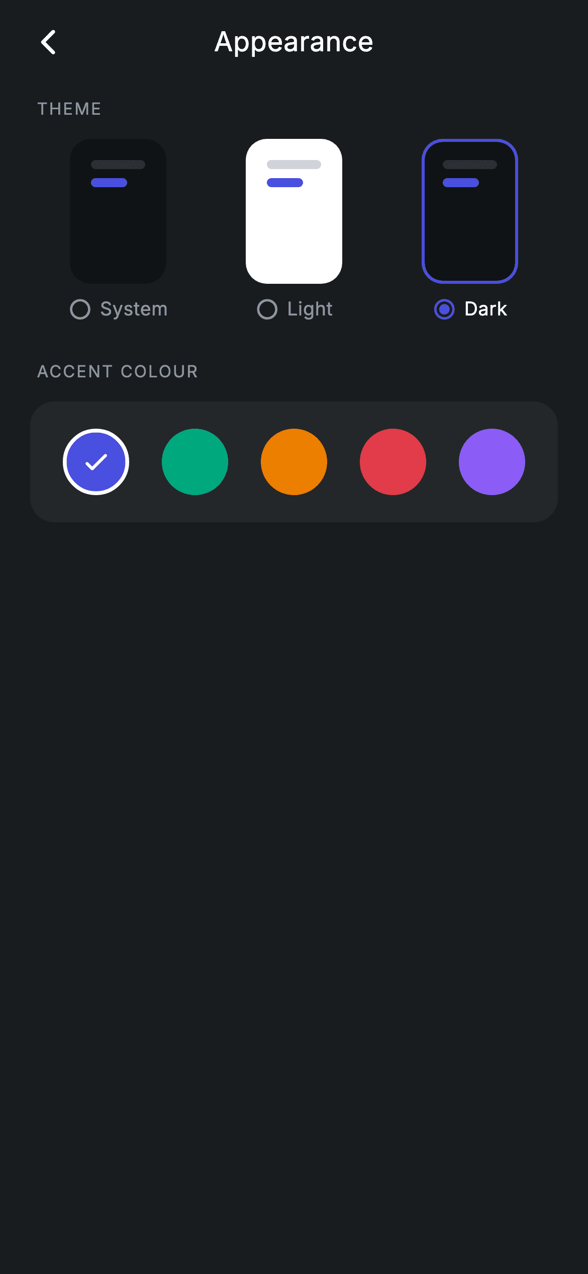
A theme setting is easier to trust when you can see it before you commit. This tutorial builds Nova's Appearance screen in Flutter: three side-by-side miniature phone previews for System, Light and Dark that are drawn with plain Containers rather than screenshots, plus a row of five 44px accent swatches that ring themselves in white when chosen. Both selections update live. Everything is pure Flutter widgets, so there is no image asset to keep in sync when the palette changes.
Watch the Flutter UI walkthrough
A short screen recording of Appearance running, if you'd rather see it before you read the code. The written tutorial below covers everything in it.
Can't see the video? Watch it on YouTube.
What you'll build
- ✓Three miniature theme previews painted from Containers, with the Light card genuinely rendering light
- ✓A radio-and-label row under each preview so the choice is readable without relying on colour
- ✓A five-colour accent picker where selection is a white ring plus a check glyph
- ✓Selection borders that stay transparent when inactive so nothing shifts position on tap
Step-by-step build
Create the file
Add a new file at lib/fintech_appearance/fintech_appearance_screen.dart in your Flutter project.
Register the bundled fonts
No external packages — this is pure Flutter. It does bundle its design font (Inter), so drop the font file into fonts/ and declare it in pubspec.yaml:
flutter:
  fonts:
    - family: Inter
      fonts:
- asset: fonts/Inter-Regular.ttfBuild it, piece by piece
Here's how the screen goes together. Each block below is a real slice of the code with a plain-English explanation — paste them in order, or grab the whole file from the next section.
The two settings this screen actually stores
import 'package:flutter/material.dart';

/// Appearance — theme & accent settings (Revolut-inspired design system).
///
/// Self-contained per CONVENTIONS.md: pure Flutter only, the exact design font
/// (Inter) is bundled under `fonts/`, theme previews are custom-painted swatches
/// (no network/emoji), and the screen forces its own dark theme. Theme mode and
/// accent colour selections update live.
class FintechAppearanceScreen extends StatefulWidget {
  const FintechAppearanceScreen({super.key, this.onBack});

  final VoidCallback? onBack;

  @override
  State<FintechAppearanceScreen> createState() =>
      _FintechAppearanceScreenState();
}

class _FintechAppearanceScreenState extends State<FintechAppearanceScreen> {
  static const String _font = 'Inter';
  static const Color _bg = Color(0xFF191C1F);
  static const Color _surface = Color(0xFF242729);
  static const Color _brand = Color(0xFF494FDF);
  static const Color _muted = Color(0xFF8D969E);

  static const List<String> _modes = <String>['System', 'Light', 'Dark'];
  int _mode = 2;
  int _accent = 0;

  static const List<Color> _accents = <Color>[
    Color(0xFF494FDF),
    Color(0xFF00A87E),
    Color(0xFFEC7E00),
    Color(0xFFE23B4A),
    Color(0xFF8B5CF6),
  ];
For all its visual weight, the screen holds exactly two ints: `_mode`, indexing the `_modes` list of 'System', 'Light' and 'Dark', and `_accent`, indexing `_accents`. `_mode` starts at `2` so Dark is preselected, matching the app's default. `_accents` is five `Color` constants — indigo #494FDF, teal #00A87E, amber #EC7E00, red #E23B4A and violet #8B5CF6 — chosen at similar perceived brightness so no swatch dominates the row. Keeping both as indices rather than as `Color` or `ThemeMode` values means the comparison in the build methods is a cheap `i == _accent` rather than an object equality check.
Two labelled sections in a scrolling list
  @override
  Widget build(BuildContext context) {
    return Theme(
      data: ThemeData.dark(useMaterial3: true),
      child: Scaffold(
        backgroundColor: _bg,
        body: SafeArea(
          child: Column(
            children: <Widget>[
              _buildAppBar(),
              Expanded(
                child: ListView(
                  physics: const BouncingScrollPhysics(),
                  padding: const EdgeInsets.fromLTRB(20, 8, 20, 24),
                  children: <Widget>[
                    _label('Theme'),
                    _buildThemeCards(),
                    const SizedBox(height: 24),
                    _label('Accent colour'),
                    _buildAccents(),
                  ],
                ),
              ),
            ],
          ),
        ),
      ),
    );
  }
The screen forces `ThemeData.dark(useMaterial3: true)` on itself so it looks the same dropped into any host app. Below the app bar the body is a `ListView` rather than a Column — a settings screen usually grows, and a ListView means the fourth and fifth section you add later scroll for free instead of overflowing. `BouncingScrollPhysics` gives the iOS rubber-band on every platform, and the content is laid out as an alternating pattern of `_label(...)` followed by its section widget, with a 24px gap between the two groups.
The back bar and the section header style
  Widget _buildAppBar() {
    return Padding(
      padding: const EdgeInsets.fromLTRB(8, 4, 8, 4),
      child: Row(
        children: <Widget>[
          IconButton(
            onPressed: widget.onBack,
            icon: const Icon(Icons.arrow_back_ios_new_rounded,
                size: 20, color: Colors.white),
          ),
          const Expanded(
            child: Text(
              'Appearance',
              textAlign: TextAlign.center,
              style: TextStyle(
                fontFamily: _font,
                fontSize: 18,
                fontWeight: FontWeight.w500,
                letterSpacing: 0.24,
                color: Colors.white,
              ),
            ),
          ),
          const SizedBox(width: 48),
        ],
      ),
    );
  }

  Widget _label(String text) {
    return Padding(
      padding: const EdgeInsets.only(left: 4, bottom: 12),
      child: Text(
        text.toUpperCase(),
        style: const TextStyle(
          fontFamily: _font,
          fontSize: 11,
          fontWeight: FontWeight.w500,
          letterSpacing: 1.0,
          color: _muted,
        ),
      ),
    );
  }
`_buildAppBar` is a hand-rolled Row: a back `IconButton`, an `Expanded` centred title, and a `SizedBox(width: 48)` on the right that exists only to balance the icon's width so the title is optically centred. `_label` is the small piece worth stealing — it uppercases its text in code with `text.toUpperCase()`, sets `fontSize: 11` with `letterSpacing: 1.0`, and paints it `_muted`. Widening the tracking is what stops all-caps text looking cramped, and it is the single most recognisable convention for a settings section header.
Miniature theme previews drawn with Containers
  Widget _buildThemeCards() {
    return Row(
      children: <Widget>[
        for (int i = 0; i < _modes.length; i++)
          Expanded(
            child: Padding(
              padding: const EdgeInsets.symmetric(horizontal: 5),
              child: GestureDetector(
                onTap: () => setState(() => _mode = i),
                child: Column(
                  children: <Widget>[
                    Container(
                      height: 96,
                      decoration: BoxDecoration(
                        color: i == 1 ? Colors.white : const Color(0xFF101316),
                        borderRadius: BorderRadius.circular(14),
                        border: Border.all(
                          color: _mode == i ? _brand : Colors.transparent,
                          width: 2,
                        ),
                      ),
                      child: Padding(
                        padding: const EdgeInsets.all(12),
                        child: Column(
                          crossAxisAlignment: CrossAxisAlignment.start,
                          children: <Widget>[
                            Container(
                              width: 36,
                              height: 6,
                              decoration: BoxDecoration(
                                color: i == 1
                                    ? const Color(0xFFD0D4D8)
                                    : const Color(0xFF2E3235),
                                borderRadius: BorderRadius.circular(9999),
                              ),
                            ),
                            const SizedBox(height: 6),
                            Container(
                              width: 24,
                              height: 6,
                              decoration: BoxDecoration(
                                color: _brand,
                                borderRadius: BorderRadius.circular(9999),
                              ),
                            ),
                          ],
                        ),
                      ),
                    ),
                    const SizedBox(height: 8),
                    Row(
                      mainAxisAlignment: MainAxisAlignment.center,
                      children: <Widget>[
                        Icon(
                          _mode == i
                              ? Icons.radio_button_checked_rounded
                              : Icons.radio_button_unchecked_rounded,
                          size: 16,
                          color: _mode == i ? _brand : _muted,
                        ),
                        const SizedBox(width: 5),
                        Text(
                          _modes[i],
                          style: TextStyle(
                            fontFamily: _font,
                            fontSize: 12.5,
                            fontWeight: FontWeight.w500,
                            letterSpacing: 0.24,
                            color: _mode == i ? Colors.white : _muted,
                          ),
                        ),
                      ],
                    ),
                  ],
                ),
              ),
            ),
          ),
      ],
    );
  }
Each preview is an `Expanded` inside a Row, so the three cards divide the width evenly whatever the screen size. The card body is a 96px Container whose fill is `i == 1 ? Colors.white : const Color(0xFF101316)` — index 1 is 'Light', so that card genuinely renders as a white surface while System and Dark render near-black. Inside sit two tiny bars standing in for content: a 36x6 neutral bar that also switches between #D0D4D8 and #2E3235 to stay visible on its background, and a 24x6 bar always painted `_brand` to represent the accent. The selection border is `_mode == i ? _brand : Colors.transparent` at a constant `width: 2`. Keeping the width fixed and only changing the colour is important — a border that appears on selection would resize the card and nudge its neighbours.
The accent swatch row
  Widget _buildAccents() {
    return Container(
      padding: const EdgeInsets.symmetric(vertical: 18),
      decoration: BoxDecoration(
        color: _surface,
        borderRadius: BorderRadius.circular(16),
      ),
      child: Row(
        mainAxisAlignment: MainAxisAlignment.spaceEvenly,
        children: <Widget>[
          for (int i = 0; i < _accents.length; i++)
            GestureDetector(
              onTap: () => setState(() => _accent = i),
              child: Container(
                width: 44,
                height: 44,
                decoration: BoxDecoration(
                  color: _accents[i],
                  shape: BoxShape.circle,
                  border: Border.all(
                    color: _accent == i ? Colors.white : Colors.transparent,
                    width: 2.5,
                  ),
                ),
                child: _accent == i
                    ? const Icon(Icons.check_rounded, size: 20, color: Colors.white)
                    : null,
              ),
            ),
        ],
      ),
    );
  }
The swatches live on a single `_surface` panel with `MainAxisAlignment.spaceEvenly`, which distributes equal gaps around all five circles without any manual padding maths. Each swatch is a 44px `Container` with `shape: BoxShape.circle` — comfortably above the 44px minimum tap target, so no extra hit area is needed. Selection is signalled twice: a 2.5px white ring, and a white check icon that is only built when `_accent == i` (the ternary returns `null` otherwise, and a null `child` costs nothing). As with the theme cards, the unselected border is `Colors.transparent` at the same width rather than absent, so the circles never change size as you tap between them.
Full code
The complete, ready-to-paste source. Free to use in your projects — one click copies it all.
import 'package:flutter/material.dart';

/// Appearance — theme & accent settings (Revolut-inspired design system).
///
/// Self-contained per CONVENTIONS.md: pure Flutter only, the exact design font
/// (Inter) is bundled under `fonts/`, theme previews are custom-painted swatches
/// (no network/emoji), and the screen forces its own dark theme. Theme mode and
/// accent colour selections update live.
class FintechAppearanceScreen extends StatefulWidget {
  const FintechAppearanceScreen({super.key, this.onBack});

  final VoidCallback? onBack;

  @override
  State<FintechAppearanceScreen> createState() =>
      _FintechAppearanceScreenState();
}

class _FintechAppearanceScreenState extends State<FintechAppearanceScreen> {
  static const String _font = 'Inter';
  static const Color _bg = Color(0xFF191C1F);
  static const Color _surface = Color(0xFF242729);
  static const Color _brand = Color(0xFF494FDF);
  static const Color _muted = Color(0xFF8D969E);

  static const List<String> _modes = <String>['System', 'Light', 'Dark'];
  int _mode = 2;
  int _accent = 0;

  static const List<Color> _accents = <Color>[
    Color(0xFF494FDF),
    Color(0xFF00A87E),
    Color(0xFFEC7E00),
    Color(0xFFE23B4A),
    Color(0xFF8B5CF6),
  ];

  @override
  Widget build(BuildContext context) {
    return Theme(
      data: ThemeData.dark(useMaterial3: true),
      child: Scaffold(
        backgroundColor: _bg,
        body: SafeArea(
          child: Column(
            children: <Widget>[
              _buildAppBar(),
              Expanded(
                child: ListView(
                  physics: const BouncingScrollPhysics(),
                  padding: const EdgeInsets.fromLTRB(20, 8, 20, 24),
                  children: <Widget>[
                    _label('Theme'),
                    _buildThemeCards(),
                    const SizedBox(height: 24),
                    _label('Accent colour'),
                    _buildAccents(),
                  ],
                ),
              ),
            ],
          ),
        ),
      ),
    );
  }

  Widget _buildAppBar() {
    return Padding(
      padding: const EdgeInsets.fromLTRB(8, 4, 8, 4),
      child: Row(
        children: <Widget>[
          IconButton(
            onPressed: widget.onBack,
            icon: const Icon(Icons.arrow_back_ios_new_rounded,
                size: 20, color: Colors.white),
          ),
          const Expanded(
            child: Text(
              'Appearance',
              textAlign: TextAlign.center,
              style: TextStyle(
                fontFamily: _font,
                fontSize: 18,
                fontWeight: FontWeight.w500,
                letterSpacing: 0.24,
                color: Colors.white,
              ),
            ),
          ),
          const SizedBox(width: 48),
        ],
      ),
    );
  }

  Widget _label(String text) {
    return Padding(
      padding: const EdgeInsets.only(left: 4, bottom: 12),
      child: Text(
        text.toUpperCase(),
        style: const TextStyle(
          fontFamily: _font,
          fontSize: 11,
          fontWeight: FontWeight.w500,
          letterSpacing: 1.0,
          color: _muted,
        ),
      ),
    );
  }

  Widget _buildThemeCards() {
    return Row(
      children: <Widget>[
        for (int i = 0; i < _modes.length; i++)
          Expanded(
            child: Padding(
              padding: const EdgeInsets.symmetric(horizontal: 5),
              child: GestureDetector(
                onTap: () => setState(() => _mode = i),
                child: Column(
                  children: <Widget>[
                    Container(
                      height: 96,
                      decoration: BoxDecoration(
                        color: i == 1 ? Colors.white : const Color(0xFF101316),
                        borderRadius: BorderRadius.circular(14),
                        border: Border.all(
                          color: _mode == i ? _brand : Colors.transparent,
                          width: 2,
                        ),
                      ),
                      child: Padding(
                        padding: const EdgeInsets.all(12),
                        child: Column(
                          crossAxisAlignment: CrossAxisAlignment.start,
                          children: <Widget>[
                            Container(
                              width: 36,
                              height: 6,
                              decoration: BoxDecoration(
                                color: i == 1
                                    ? const Color(0xFFD0D4D8)
                                    : const Color(0xFF2E3235),
                                borderRadius: BorderRadius.circular(9999),
                              ),
                            ),
                            const SizedBox(height: 6),
                            Container(
                              width: 24,
                              height: 6,
                              decoration: BoxDecoration(
                                color: _brand,
                                borderRadius: BorderRadius.circular(9999),
                              ),
                            ),
                          ],
                        ),
                      ),
                    ),
                    const SizedBox(height: 8),
                    Row(
                      mainAxisAlignment: MainAxisAlignment.center,
                      children: <Widget>[
                        Icon(
                          _mode == i
                              ? Icons.radio_button_checked_rounded
                              : Icons.radio_button_unchecked_rounded,
                          size: 16,
                          color: _mode == i ? _brand : _muted,
                        ),
                        const SizedBox(width: 5),
                        Text(
                          _modes[i],
                          style: TextStyle(
                            fontFamily: _font,
                            fontSize: 12.5,
                            fontWeight: FontWeight.w500,
                            letterSpacing: 0.24,
                            color: _mode == i ? Colors.white : _muted,
                          ),
                        ),
                      ],
                    ),
                  ],
                ),
              ),
            ),
          ),
      ],
    );
  }

  Widget _buildAccents() {
    return Container(
      padding: const EdgeInsets.symmetric(vertical: 18),
      decoration: BoxDecoration(
        color: _surface,
        borderRadius: BorderRadius.circular(16),
      ),
      child: Row(
        mainAxisAlignment: MainAxisAlignment.spaceEvenly,
        children: <Widget>[
          for (int i = 0; i < _accents.length; i++)
            GestureDetector(
              onTap: () => setState(() => _accent = i),
              child: Container(
                width: 44,
                height: 44,
                decoration: BoxDecoration(
                  color: _accents[i],
                  shape: BoxShape.circle,
                  border: Border.all(
                    color: _accent == i ? Colors.white : Colors.transparent,
                    width: 2.5,
                  ),
                ),
                child: _accent == i
                    ? const Icon(Icons.check_rounded, size: 20, color: Colors.white)
                    : null,
              ),
            ),
        ],
      ),
    );
  }
}
Plus bundled 1 binary asset (fonts/images). The CLI and MCP install those for you automatically.
Two faster ways to add it
Copy-paste works, but you can skip it entirely.
1. FlutterKit CLI
One command drops this screen — and its fonts — straight into your project.
$ flutterkit add fintech-appearance2. AI agent (MCP)
Connect FlutterKit's MCP server in Claude or Cursor and just ask your agent to install fintech-appearance — it fetches and writes the files for you.
FAQ
Is this Appearance screen free to use commercially?
Yes. FlutterKit is free forever — copy the Dart from this page, install it with the CLI, or pull it through MCP in your AI editor, then ship it in a paid app or client project. Nothing to sign up for and nothing to attribute.
Does tapping Light actually switch my app to light mode?
Not on its own — `_mode` is local state, so the screen only updates its own previews. To make it real, lift that value into your app state and map it to a `ThemeMode`: index 0 to `ThemeMode.system`, 1 to `ThemeMode.light`, 2 to `ThemeMode.dark`, then feed it into `MaterialApp.themeMode`. The same applies to `_accent`, which you would pass into your `ColorScheme.fromSeed`.
Why are the unselected borders transparent instead of just omitted?
Because a border occupies layout space. If the border only existed when selected, every card would grow 4px wider on tap and shove its neighbours around. Declaring `Colors.transparent` at the same width reserves the space permanently, so only the colour changes.
Do I need any packages for the theme previews?
No. The previews are ordinary Containers and BoxDecorations — there are no screenshots, no SVGs and no pub dependencies beyond Flutter itself. Only the bundled Inter font needs registering in your pubspec, and you can drop the `fontFamily` lines if you would rather not.
Which Flutter version does this screen need?
Flutter 3.10 or newer is enough here — the file uses Dart 3's `super.key` shorthand but no `Color.withValues`, so it compiles on any modern SDK. On an older Flutter, expand the constructors to `const FintechAppearanceScreen({Key? key, this.onBack}) : super(key: key);`.


