How to Build an Auto-Save Rules Screen with Progressive Disclosure in Flutter (Full Code + Preview)
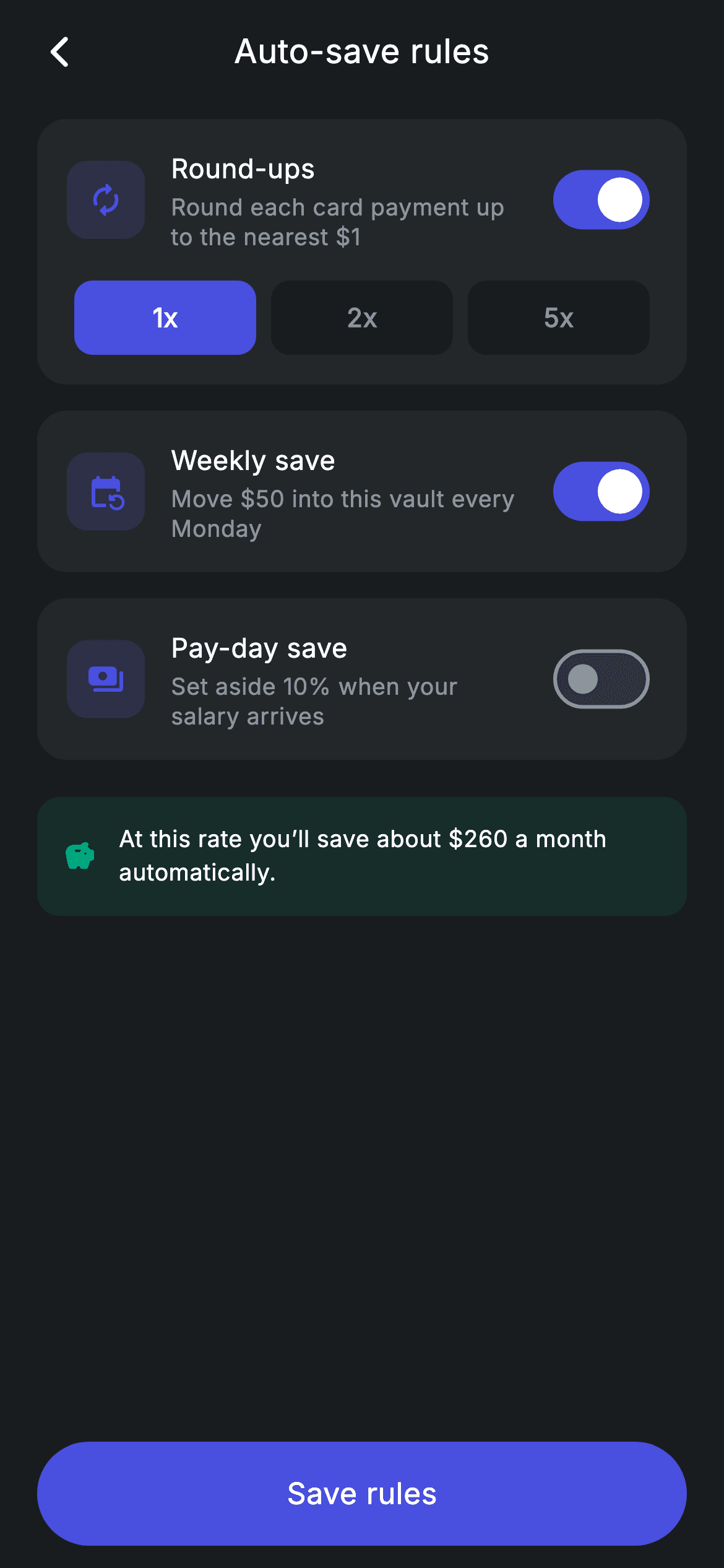
Automatic saving works best when the settings screen stays short until you ask it to grow. This tutorial builds a rules screen in Flutter where three toggles — round-ups, weekly save and pay-day save — each sit in their own card, and turning on round-ups reveals a 1x / 2x / 5x multiplier row underneath it. The reveal is a plain `if` inside a `children` list, which is all Flutter needs for progressive disclosure. A shared `_ruleHeader` builder keeps the three cards visually identical.
Watch the Flutter UI walkthrough
A short screen recording of Vault Rules running, if you'd rather see it before you read the code. The written tutorial below covers everything in it.
Can't see the video? Watch it on YouTube.
What you'll build
- ✓Three switch-tile rule cards driven by four booleans and one integer
- ✓Progressive disclosure: a multiplier selector that appears only when round-ups are on
- ✓A single `_ruleHeader` builder reused by all three rules so they can't drift apart
- ✓A 1x / 2x / 5x selector whose chips sit *darker* than their card, not lighter
- ✓A teal projection callout summarising what the enabled rules add up to
- ✓Material 3 `Switch` styling with `activeThumbColor` and `activeTrackColor`
Step-by-step build
Create the file
Add a new file at lib/fintech_vault_rules/fintech_vault_rules_screen.dart in your Flutter project.
Register the bundled fonts
No external packages — this is pure Flutter. It does bundle its design font (Inter), so drop the font file into fonts/ and declare it in pubspec.yaml:
flutter:
  fonts:
    - family: Inter
      fonts:
- asset: fonts/Inter-Regular.ttfBuild it, piece by piece
Here's how the screen goes together. Each block below is a real slice of the code with a plain-English explanation — paste them in order, or grab the whole file from the next section.
Four fields of state, one per rule
class _FintechVaultRulesScreenState extends State<FintechVaultRulesScreen> {
  static const String _font = 'Inter';
  static const Color _bg = Color(0xFF191C1F);
  static const Color _surface = Color(0xFF242729);
  static const Color _brand = Color(0xFF494FDF);
  static const Color _teal = Color(0xFF00A87E);
  static const Color _muted = Color(0xFF8D969E);

  bool _roundUps = true;
  int _multiplier = 1; // 1x, 2x, 5x
  bool _weekly = true;
  bool _payday = false;

  static const List<int> _mults = <int>[1, 2, 5];
The entire screen is four pieces of state: `_roundUps`, `_weekly` and `_payday` booleans plus `int _multiplier = 1`. Two of the three rules default to on, which is the usual pattern for a savings feature — opt-out beats opt-in for engagement. `_mults` is a `const List<int>` of `[1, 2, 5]` rather than three separate widgets, so adding a 10x option later means editing one list. Note there is no rule model class here: with only three fixed rules, individual named fields are clearer than a list of objects.
Page skeleton with a pinned Save button
  @override
  Widget build(BuildContext context) {
    return Theme(
      data: ThemeData.dark(useMaterial3: true),
      child: Scaffold(
        backgroundColor: _bg,
        body: SafeArea(
          child: Column(
            children: <Widget>[
              _buildAppBar(),
              Expanded(
                child: ListView(
                  physics: const BouncingScrollPhysics(),
                  padding: const EdgeInsets.fromLTRB(20, 8, 20, 24),
                  children: <Widget>[
                    _buildRoundUps(),
                    const SizedBox(height: 14),
                    _buildWeekly(),
                    const SizedBox(height: 14),
                    _buildPayday(),
                    const SizedBox(height: 20),
                    _buildEstimate(),
                  ],
                ),
              ),
              _buildSave(),
            ],
          ),
        ),
      ),
    );
  }
`Theme(data: ThemeData.dark(useMaterial3: true))` forces this screen's own dark theme so it renders correctly wherever it's pushed. The body `Column` puts the app bar at the top, an `Expanded` `ListView` of the three rule cards plus the estimate in the middle, and `_buildSave()` outside the scroll area at the bottom — that placement is what pins the CTA so it stays reachable while the rules scroll. The 14px gaps between cards and the 20px gap before the estimate are deliberate: the larger gap signals that the estimate is a summary, not a fourth rule.
Round-ups and the conditional multiplier row
  Widget _buildRoundUps() {
    return Container(
      padding: const EdgeInsets.all(16),
      decoration: BoxDecoration(
        color: _surface,
        borderRadius: BorderRadius.circular(16),
      ),
      child: Column(
        children: <Widget>[
          _ruleHeader(
            Icons.autorenew_rounded,
            'Round-ups',
            'Round each card payment up to the nearest \$1',
            _roundUps,
            (bool v) => setState(() => _roundUps = v),
          ),
          if (_roundUps) ...<Widget>[
            const SizedBox(height: 16),
            Row(
              children: <Widget>[
                for (final int m in _mults)
                  Expanded(
                    child: Padding(
                      padding: const EdgeInsets.symmetric(horizontal: 4),
                      child: GestureDetector(
                        onTap: () => setState(() => _multiplier = m),
                        child: Container(
                          height: 40,
                          alignment: Alignment.center,
                          decoration: BoxDecoration(
                            color: _multiplier == m ? _brand : _bg,
                            borderRadius: BorderRadius.circular(10),
                          ),
                          child: Text(
                            '${m}x',
                            style: TextStyle(
                              fontFamily: _font,
                              fontSize: 14,
                              fontWeight: FontWeight.w600,
                              letterSpacing: 0.24,
                              color: _multiplier == m ? Colors.white : _muted,
                            ),
                          ),
                        ),
                      ),
                    ),
                  ),
              ],
            ),
          ],
        ],
      ),
    );
  }
This is the progressive-disclosure pattern in its simplest form. The card's `Column` holds the shared `_ruleHeader`, then `if (_roundUps) ...<Widget>[SizedBox, Row]` — a collection-`if` with a spread. When the toggle is off those widgets are never built at all, so the card shrinks back to a single row with no `Visibility`, no `AnimatedContainer`, and no wasted layout. Inside, each multiplier chip is `Expanded` with 4px of horizontal padding and flips between `_brand` and `_bg` when selected. Using `_bg` (the page background, #191C1F) for the *unselected* chips makes them read as recessed wells cut into the lighter `_surface` card — darker-than-parent, rather than the usual lighter-than-parent highlight.
One header builder, three rules
  Widget _ruleHeader(IconData icon, String title, String sub, bool value,
      ValueChanged<bool> onChanged) {
    return Row(
      children: <Widget>[
        Container(
          width: 42,
          height: 42,
          decoration: BoxDecoration(
            color: _brand.withValues(alpha: 0.18),
            borderRadius: BorderRadius.circular(11),
          ),
          child: Icon(icon, size: 20, color: _brand),
        ),
        const SizedBox(width: 14),
        Expanded(
          child: Column(
            crossAxisAlignment: CrossAxisAlignment.start,
            children: <Widget>[
              Text(
                title,
                style: const TextStyle(
                  fontFamily: _font,
                  fontSize: 14.5,
                  fontWeight: FontWeight.w500,
                  letterSpacing: 0.24,
                  color: Colors.white,
                ),
              ),
              const SizedBox(height: 2),
              Text(
                sub,
                style: const TextStyle(
                  fontFamily: _font,
                  fontSize: 12.5,
                  height: 1.3,
                  letterSpacing: 0.24,
                  color: _muted,
                ),
              ),
            ],
          ),
        ),
        const SizedBox(width: 8),
        Switch(
          value: value,
          onChanged: onChanged,
          activeThumbColor: Colors.white,
          activeTrackColor: _brand,
        ),
      ],
    );
  }
`_ruleHeader` takes an icon, title, subtitle, current value and an `onChanged` callback, and returns the `Row` every rule card uses. Because all three call it, the 42px tinted icon tile (11px radius, `_brand.withValues(alpha: 0.18)` behind a full-strength brand icon), the 14.5px title, the 12.5px muted subtitle and the trailing `Switch` are guaranteed identical — a change to spacing here changes all three at once. The text column is `Expanded` so long subtitles wrap instead of squeezing the switch. The `Switch` sets `activeThumbColor: Colors.white` and `activeTrackColor: _brand`, overriding Material 3's default scheme colours to match the screen's palette.
The projection callout and Save button
  Widget _buildEstimate() {
    return Container(
      padding: const EdgeInsets.all(14),
      decoration: BoxDecoration(
        color: _teal.withValues(alpha: 0.12),
        borderRadius: BorderRadius.circular(12),
      ),
      child: Row(
        children: const <Widget>[
          Icon(Icons.savings_rounded, size: 18, color: _teal),
          SizedBox(width: 12),
          Expanded(
            child: Text(
              'At this rate you’ll save about \$260 a month automatically.',
              style: TextStyle(
                fontFamily: _font,
                fontSize: 12.5,
                height: 1.4,
                letterSpacing: 0.24,
                color: Colors.white,
              ),
            ),
          ),
        ],
      ),
    );
  }

  Widget _buildSave() {
    return Padding(
      padding: const EdgeInsets.fromLTRB(20, 0, 20, 12),
      child: SizedBox(
        width: double.infinity,
        height: 56,
        child: Material(
          color: _brand,
          borderRadius: BorderRadius.circular(9999),
          child: InkWell(
            borderRadius: BorderRadius.circular(9999),
            onTap: widget.onSave,
            child: const Center(
              child: Text(
                'Save rules',
                style: TextStyle(
                  fontFamily: _font,
                  fontSize: 16,
                  fontWeight: FontWeight.w500,
                  letterSpacing: 0.24,
                  color: Colors.white,
                ),
              ),
            ),
          ),
        ),
      ),
    );
  }
The estimate uses the same tint recipe as the rest of the design system but in teal: a 12%-alpha `_teal` fill behind a full-strength `savings_rounded` icon, with the message `Expanded` so it wraps at `height: 1.4`. Teal rather than brand indigo marks it as an outcome rather than a control. The Save button is the `Material` + `InkWell` pair sharing `BorderRadius.circular(9999)` — `Material` paints the pill, and the matching radius on `InkWell` clips the tap ripple to it. Note the button is always enabled; there is no invalid state to guard against, since every combination of toggles is a legitimate configuration.
Full code
The complete, ready-to-paste source. Free to use in your projects — one click copies it all.
import 'package:flutter/material.dart';

/// Vault rules — round-ups & auto-save rules (Revolut-inspired design system).
///
/// Self-contained per CONVENTIONS.md: pure Flutter only, the exact design font
/// (Inter) is bundled under `fonts/`, no network/emoji images, and the screen
/// forces its own dark theme. Each rule is a switch tile; enabling round-ups
/// reveals a multiplier selector, and weekly save reveals an amount.
class FintechVaultRulesScreen extends StatefulWidget {
  const FintechVaultRulesScreen({super.key, this.onBack, this.onSave});

  final VoidCallback? onBack;
  final VoidCallback? onSave;

  @override
  State<FintechVaultRulesScreen> createState() =>
      _FintechVaultRulesScreenState();
}

class _FintechVaultRulesScreenState extends State<FintechVaultRulesScreen> {
  static const String _font = 'Inter';
  static const Color _bg = Color(0xFF191C1F);
  static const Color _surface = Color(0xFF242729);
  static const Color _brand = Color(0xFF494FDF);
  static const Color _teal = Color(0xFF00A87E);
  static const Color _muted = Color(0xFF8D969E);

  bool _roundUps = true;
  int _multiplier = 1; // 1x, 2x, 5x
  bool _weekly = true;
  bool _payday = false;

  static const List<int> _mults = <int>[1, 2, 5];

  @override
  Widget build(BuildContext context) {
    return Theme(
      data: ThemeData.dark(useMaterial3: true),
      child: Scaffold(
        backgroundColor: _bg,
        body: SafeArea(
          child: Column(
            children: <Widget>[
              _buildAppBar(),
              Expanded(
                child: ListView(
                  physics: const BouncingScrollPhysics(),
                  padding: const EdgeInsets.fromLTRB(20, 8, 20, 24),
                  children: <Widget>[
                    _buildRoundUps(),
                    const SizedBox(height: 14),
                    _buildWeekly(),
                    const SizedBox(height: 14),
                    _buildPayday(),
                    const SizedBox(height: 20),
                    _buildEstimate(),
                  ],
                ),
              ),
              _buildSave(),
            ],
          ),
        ),
      ),
    );
  }

  Widget _buildAppBar() {
    return Padding(
      padding: const EdgeInsets.fromLTRB(8, 4, 8, 4),
      child: Row(
        children: <Widget>[
          IconButton(
            onPressed: widget.onBack,
            icon: const Icon(Icons.arrow_back_ios_new_rounded,
                size: 20, color: Colors.white),
          ),
          const Expanded(
            child: Text(
              'Auto-save rules',
              textAlign: TextAlign.center,
              style: TextStyle(
                fontFamily: _font,
                fontSize: 18,
                fontWeight: FontWeight.w500,
                letterSpacing: 0.24,
                color: Colors.white,
              ),
            ),
          ),
          const SizedBox(width: 48),
        ],
      ),
    );
  }

  Widget _buildRoundUps() {
    return Container(
      padding: const EdgeInsets.all(16),
      decoration: BoxDecoration(
        color: _surface,
        borderRadius: BorderRadius.circular(16),
      ),
      child: Column(
        children: <Widget>[
          _ruleHeader(
            Icons.autorenew_rounded,
            'Round-ups',
            'Round each card payment up to the nearest \$1',
            _roundUps,
            (bool v) => setState(() => _roundUps = v),
          ),
          if (_roundUps) ...<Widget>[
            const SizedBox(height: 16),
            Row(
              children: <Widget>[
                for (final int m in _mults)
                  Expanded(
                    child: Padding(
                      padding: const EdgeInsets.symmetric(horizontal: 4),
                      child: GestureDetector(
                        onTap: () => setState(() => _multiplier = m),
                        child: Container(
                          height: 40,
                          alignment: Alignment.center,
                          decoration: BoxDecoration(
                            color: _multiplier == m ? _brand : _bg,
                            borderRadius: BorderRadius.circular(10),
                          ),
                          child: Text(
                            '${m}x',
                            style: TextStyle(
                              fontFamily: _font,
                              fontSize: 14,
                              fontWeight: FontWeight.w600,
                              letterSpacing: 0.24,
                              color: _multiplier == m ? Colors.white : _muted,
                            ),
                          ),
                        ),
                      ),
                    ),
                  ),
              ],
            ),
          ],
        ],
      ),
    );
  }

  Widget _buildWeekly() {
    return Container(
      padding: const EdgeInsets.all(16),
      decoration: BoxDecoration(
        color: _surface,
        borderRadius: BorderRadius.circular(16),
      ),
      child: _ruleHeader(
        Icons.event_repeat_rounded,
        'Weekly save',
        'Move \$50 into this vault every Monday',
        _weekly,
        (bool v) => setState(() => _weekly = v),
      ),
    );
  }

  Widget _buildPayday() {
    return Container(
      padding: const EdgeInsets.all(16),
      decoration: BoxDecoration(
        color: _surface,
        borderRadius: BorderRadius.circular(16),
      ),
      child: _ruleHeader(
        Icons.payments_rounded,
        'Pay-day save',
        'Set aside 10% when your salary arrives',
        _payday,
        (bool v) => setState(() => _payday = v),
      ),
    );
  }

  Widget _ruleHeader(IconData icon, String title, String sub, bool value,
      ValueChanged<bool> onChanged) {
    return Row(
      children: <Widget>[
        Container(
          width: 42,
          height: 42,
          decoration: BoxDecoration(
            color: _brand.withValues(alpha: 0.18),
            borderRadius: BorderRadius.circular(11),
          ),
          child: Icon(icon, size: 20, color: _brand),
        ),
        const SizedBox(width: 14),
        Expanded(
          child: Column(
            crossAxisAlignment: CrossAxisAlignment.start,
            children: <Widget>[
              Text(
                title,
                style: const TextStyle(
                  fontFamily: _font,
                  fontSize: 14.5,
                  fontWeight: FontWeight.w500,
                  letterSpacing: 0.24,
                  color: Colors.white,
                ),
              ),
              const SizedBox(height: 2),
              Text(
                sub,
                style: const TextStyle(
                  fontFamily: _font,
                  fontSize: 12.5,
                  height: 1.3,
                  letterSpacing: 0.24,
                  color: _muted,
                ),
              ),
            ],
          ),
        ),
        const SizedBox(width: 8),
        Switch(
          value: value,
          onChanged: onChanged,
          activeThumbColor: Colors.white,
          activeTrackColor: _brand,
        ),
      ],
    );
  }

  Widget _buildEstimate() {
    return Container(
      padding: const EdgeInsets.all(14),
      decoration: BoxDecoration(
        color: _teal.withValues(alpha: 0.12),
        borderRadius: BorderRadius.circular(12),
      ),
      child: Row(
        children: const <Widget>[
          Icon(Icons.savings_rounded, size: 18, color: _teal),
          SizedBox(width: 12),
          Expanded(
            child: Text(
              'At this rate you’ll save about \$260 a month automatically.',
              style: TextStyle(
                fontFamily: _font,
                fontSize: 12.5,
                height: 1.4,
                letterSpacing: 0.24,
                color: Colors.white,
              ),
            ),
          ),
        ],
      ),
    );
  }

  Widget _buildSave() {
    return Padding(
      padding: const EdgeInsets.fromLTRB(20, 0, 20, 12),
      child: SizedBox(
        width: double.infinity,
        height: 56,
        child: Material(
          color: _brand,
          borderRadius: BorderRadius.circular(9999),
          child: InkWell(
            borderRadius: BorderRadius.circular(9999),
            onTap: widget.onSave,
            child: const Center(
              child: Text(
                'Save rules',
                style: TextStyle(
                  fontFamily: _font,
                  fontSize: 16,
                  fontWeight: FontWeight.w500,
                  letterSpacing: 0.24,
                  color: Colors.white,
                ),
              ),
            ),
          ),
        ),
      ),
    );
  }
}
Plus bundled 1 binary asset (fonts/images). The CLI and MCP install those for you automatically.
Two faster ways to add it
Copy-paste works, but you can skip it entirely.
1. FlutterKit CLI
One command drops this screen — and its fonts — straight into your project.
$ flutterkit add fintech-vault-rules2. AI agent (MCP)
Connect FlutterKit's MCP server in Claude or Cursor and just ask your agent to install fintech-vault-rules — it fetches and writes the files for you.
FAQ
Is this auto-save rules screen free to use?
Yes. The full Dart source on this page is free for personal and commercial apps. Copy it from the code block, install it with the FlutterKit CLI (flutterkit add fintech-vault-rules), or add it via an AI agent over MCP.
How do I animate the multiplier row appearing?
Wrap the conditional block in an AnimatedSize (or swap the collection-if for an AnimatedCrossFade). The current version rebuilds instantly on purpose — it keeps the widget tree honest, since the hidden widgets genuinely don't exist when the toggle is off.
Should the projected savings figure be calculated?
In a real app, yes. Right now '$260 a month' is static copy. Derive it from _multiplier, _weekly and _payday inside _buildEstimate — it already rebuilds on every setState, so the number will update the moment you compute it instead of hard-coding it.
Does it need any packages?
No — it's pure Flutter on the material library, with no third-party dependencies. The only asset is the bundled Inter font family registered in pubspec.yaml, which the CLI and MCP install for you.
Which Flutter version does it target?
Switch's activeThumbColor property and Color.withValues(alpha:) both require a recent SDK, so target Flutter 3.27+. On older versions use activeColor instead of activeThumbColor, and replace withValues(alpha: x) with withOpacity(x).


