How to Build a Savings Goal Progress Screen in Flutter (Full Code + Preview)
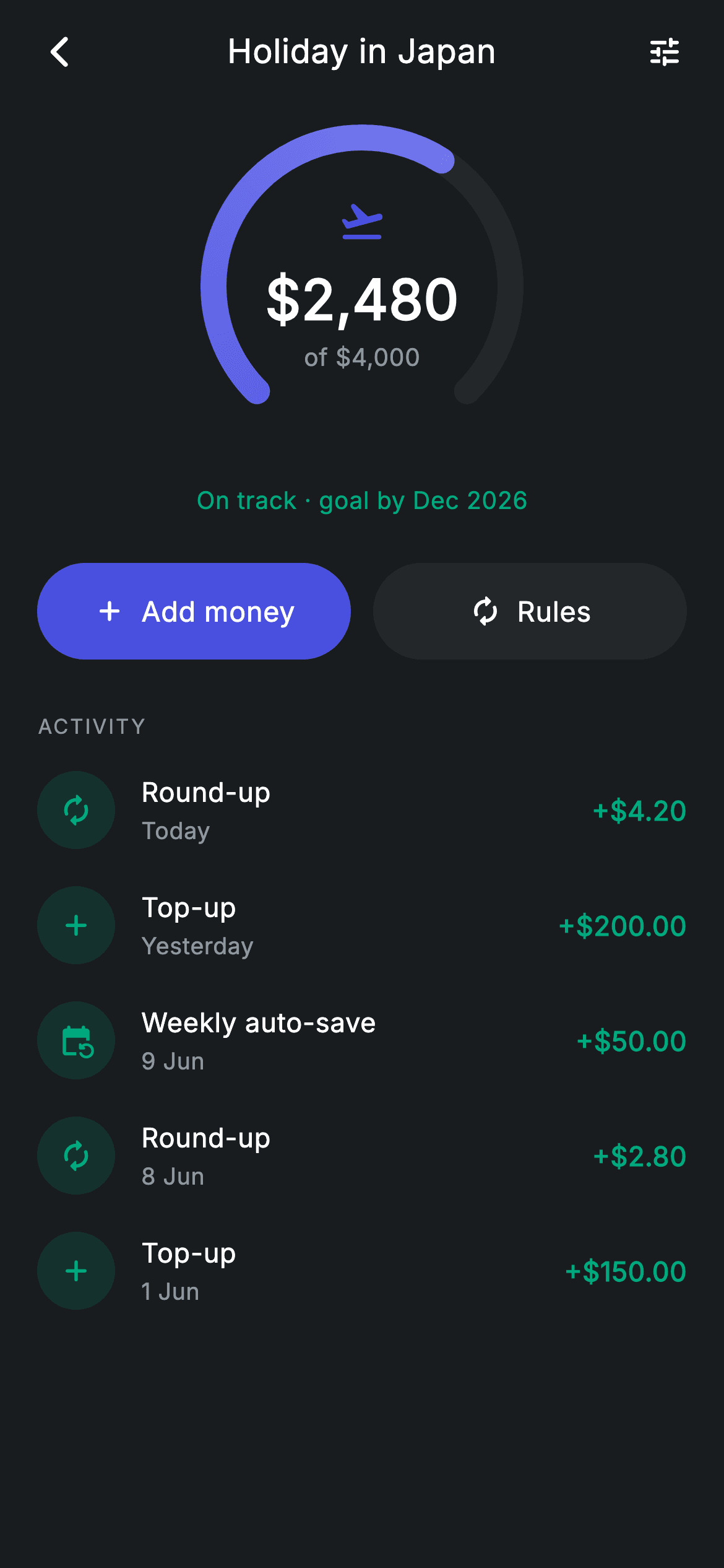
The centrepiece here is a 270° arc gauge — the open-bottom ring every savings app uses to show progress toward a goal. It's twenty lines of `drawArc`: one call for the grey track, one for the sweep, with the progress fraction multiplying the sweep angle and a `SweepGradient` shading it from indigo to a lighter tint. Around it sit an Add money / Rules action pair and a contribution history where round-ups and top-ups share one row widget.
Watch the Flutter UI walkthrough
A short screen recording of Vault Detail running, if you'd rather see it before you read the code. The written tutorial below covers everything in it.
Can't see the video? Watch it on YouTube.
What you'll build
- ✓A 270° arc gauge painted with two `drawArc` calls and a rounded stroke cap
- ✓A `SweepGradient` shader that shades the progress arc along its own sweep
- ✓A `Stack`-centred value block sitting inside the ring — icon, amount, and 'of $4,000' target
- ✓Contribution rows with tinted circular icons and teal `+$4.20` amounts
- ✓A filled/outlined action pair sharing one widget, distinguished by a single `bool`
Step-by-step build
Create the file
Add a new file at lib/fintech_vault_detail/fintech_vault_detail_screen.dart in your Flutter project.
Register the bundled fonts
No external packages — this is pure Flutter. It does bundle its design font (Inter), so drop the font file into fonts/ and declare it in pubspec.yaml:
flutter:
  fonts:
    - family: Inter
      fonts:
- asset: fonts/Inter-Regular.ttfBuild it, piece by piece
Here's how the screen goes together. Each block below is a real slice of the code with a plain-English explanation — paste them in order, or grab the whole file from the next section.
History as data, screen as stateless
class FintechVaultDetailScreen extends StatelessWidget {
  const FintechVaultDetailScreen({
    super.key,
    this.onBack,
    this.onAdd,
    this.onRules,
  });

  final VoidCallback? onBack;
  final VoidCallback? onAdd;
  final VoidCallback? onRules;

  static const String _font = 'Inter';
  static const Color _bg = Color(0xFF191C1F);
  static const Color _surface = Color(0xFF242729);
  static const Color _brand = Color(0xFF494FDF);
  static const Color _teal = Color(0xFF00A87E);
  static const Color _muted = Color(0xFF8D969E);

  static const List<_Entry> _history = <_Entry>[
    _Entry('Round-up', 'Today', 4.20, Icons.autorenew_rounded),
    _Entry('Top-up', 'Yesterday', 200.00, Icons.add_rounded),
    _Entry('Weekly auto-save', '9 Jun', 50.00, Icons.event_repeat_rounded),
    _Entry('Round-up', '8 Jun', 2.80, Icons.autorenew_rounded),
    _Entry('Top-up', '1 Jun', 150.00, Icons.add_rounded),
  ];
A `StatelessWidget` again — the vault's balance and history come from the server, so nothing is held locally. Each `_Entry` carries a label, a human date string, a numeric `amount`, and its own `IconData`. Keeping the amount as a `double` rather than a formatted string matters here: the row formats it with `toStringAsFixed(2)` and prepends a `+`, so every entry is presented identically no matter where the number came from. The three entry types — round-up, top-up, weekly auto-save — each get a distinct icon, which is how a user scans the list for 'did my automation run?' without reading a word.
Shell, actions, and the section label
  @override
  Widget build(BuildContext context) {
    return Theme(
      data: ThemeData.dark(useMaterial3: true),
      child: Scaffold(
        backgroundColor: _bg,
        body: SafeArea(
          child: Column(
            children: <Widget>[
              _buildAppBar(),
              Expanded(
                child: ListView(
                  physics: const BouncingScrollPhysics(),
                  padding: const EdgeInsets.fromLTRB(20, 8, 20, 24),
                  children: <Widget>[
                    _buildGauge(),
                    const SizedBox(height: 24),
                    _buildActions(),
                    const SizedBox(height: 28),
                    _sectionLabel('Activity'),
                    const SizedBox(height: 6),
                    for (final _Entry e in _history) _EntryRow(entry: e),
                  ],
                ),
              ),
            ],
          ),
        ),
      ),
    );
  }

  Widget _buildAppBar() {
    return Padding(
      padding: const EdgeInsets.fromLTRB(8, 4, 8, 4),
      child: Row(
        children: <Widget>[
          IconButton(
            onPressed: onBack,
            icon: const Icon(Icons.arrow_back_ios_new_rounded,
                size: 20, color: Colors.white),
          ),
          const Expanded(
            child: Text(
              'Holiday in Japan',
              textAlign: TextAlign.center,
              style: TextStyle(
                fontFamily: _font,
                fontSize: 18,
                fontWeight: FontWeight.w500,
                letterSpacing: 0.24,
                color: Colors.white,
              ),
            ),
          ),
          IconButton(
            onPressed: onRules,
            icon: const Icon(Icons.tune_rounded, size: 20, color: Colors.white),
          ),
        ],
      ),
    );
  }
The layout is a fixed app bar over `Expanded(child: ListView(...))` with `BouncingScrollPhysics`. The app bar puts the goal's name as the centred title and a `tune_rounded` icon on the trailing side routing to the auto-save rules — sharing the same `onRules` callback as the button below, so both paths lead to one screen. History rows are emitted with a collection-for directly into the children list, which suits a short recent-activity list; a full ledger would want `ListView.builder` for lazy building.
Composing the gauge
  Widget _buildGauge() {
    return Column(
      children: <Widget>[
        SizedBox(
          width: 180,
          height: 180,
          child: Stack(
            alignment: Alignment.center,
            children: <Widget>[
              CustomPaint(
                size: const Size(180, 180),
                painter: _GaugePainter(progress: 0.62),
              ),
              Column(
                mainAxisSize: MainAxisSize.min,
                children: const <Widget>[
                  Icon(Icons.flight_takeoff_rounded, size: 26, color: _brand),
                  SizedBox(height: 8),
                  Text(
                    r'$2,480',
                    style: TextStyle(
                      fontFamily: _font,
                      fontSize: 30,
                      fontWeight: FontWeight.w600,
                      letterSpacing: 0.24,
                      color: Colors.white,
                    ),
                  ),
                  Text(
                    r'of $4,000',
                    style: TextStyle(
                      fontFamily: _font,
                      fontSize: 13,
                      letterSpacing: 0.24,
                      color: _muted,
                    ),
                  ),
                ],
              ),
            ],
          ),
        ),
        const SizedBox(height: 16),
        const Text(
          'On track · goal by Dec 2026',
          style: TextStyle(
            fontFamily: _font,
            fontSize: 13,
            fontWeight: FontWeight.w500,
            letterSpacing: 0.24,
            color: _teal,
          ),
        ),
      ],
    );
  }
The gauge is a 180×180 `SizedBox` holding a `Stack` with `alignment: Alignment.center`. The `CustomPaint` draws the ring, and a `Column` with `MainAxisSize.min` sits on top — the min size is what keeps the text block compact so it centres inside the ring rather than filling the square. Inside it: the goal's icon at 26px in brand, the saved amount at 30px `w600`, and the target as `'of \$4,000'` in muted grey. Splitting current and target across two sizes is what lets the eye read the progress in one glance. Below the ring, 'On track · goal by Dec 2026' in teal turns a raw percentage into a judgement, which is the sentence a user actually wants.
The action pair
  Widget _buildActions() {
    return Row(
      children: <Widget>[
        Expanded(
          child: _ActionBtn(
            label: 'Add money',
            icon: Icons.add_rounded,
            filled: true,
            onTap: onAdd,
          ),
        ),
        const SizedBox(width: 12),
        Expanded(
          child: _ActionBtn(
            label: 'Rules',
            icon: Icons.autorenew_rounded,
            filled: false,
            onTap: onRules,
          ),
        ),
      ],
    );
  }

  Widget _sectionLabel(String text) {
    return Text(
      text.toUpperCase(),
      style: const TextStyle(
        fontFamily: _font,
        fontSize: 11,
        fontWeight: FontWeight.w500,
        letterSpacing: 1.0,
        color: _muted,
      ),
    );
  }
Both buttons are the same `_ActionBtn` widget wrapped in `Expanded` for an even split; only `filled` differs, swapping the `Material` colour between `_brand` and `_surface`. That single boolean is the entire primary/secondary distinction — same 52px height, same 9999 radius, same white label. `_sectionLabel` applies `text.toUpperCase()` in code rather than in the string, at 11px with `letterSpacing: 1.0`, which keeps the call site readable ('Activity') while rendering the small-caps convention used across this design system.
The contribution row
class _EntryRow extends StatelessWidget {
  const _EntryRow({required this.entry});

  final _Entry entry;

  @override
  Widget build(BuildContext context) {
    return Padding(
      padding: const EdgeInsets.symmetric(vertical: 10),
      child: Row(
        children: <Widget>[
          Container(
            width: 42,
            height: 42,
            decoration: BoxDecoration(
              color: FintechVaultDetailScreen._teal.withValues(alpha: 0.15),
              shape: BoxShape.circle,
            ),
            child: Icon(entry.icon,
                size: 19, color: FintechVaultDetailScreen._teal),
          ),
          const SizedBox(width: 14),
          Expanded(
            child: Column(
              crossAxisAlignment: CrossAxisAlignment.start,
              children: <Widget>[
                Text(
                  entry.label,
                  style: const TextStyle(
                    fontFamily: FintechVaultDetailScreen._font,
                    fontSize: 14.5,
                    fontWeight: FontWeight.w500,
                    letterSpacing: 0.24,
                    color: Colors.white,
                  ),
                ),
                const SizedBox(height: 2),
                Text(
                  entry.date,
                  style: const TextStyle(
                    fontFamily: FintechVaultDetailScreen._font,
                    fontSize: 12.5,
                    letterSpacing: 0.24,
                    color: FintechVaultDetailScreen._muted,
                  ),
                ),
              ],
            ),
          ),
          Text(
            '+\$${entry.amount.toStringAsFixed(2)}',
            style: const TextStyle(
              fontFamily: FintechVaultDetailScreen._font,
              fontSize: 14.5,
              fontWeight: FontWeight.w600,
              letterSpacing: 0.24,
              color: FintechVaultDetailScreen._teal,
            ),
          ),
        ],
      ),
    );
  }
}
Every row is teal, because in a savings vault every entry is money coming in — there's no debit case to colour differently, which is why `trend`-style branching is absent here. The icon circle uses `_teal.withValues(alpha: 0.15)` with the icon at full strength, the tint pairing used throughout these screens. The middle column is `Expanded` so it absorbs slack and pushes the amount to the trailing edge, and the amount is built as `'+\$${entry.amount.toStringAsFixed(2)}'` — two decimals always, so `4.20` doesn't render as `4.2` and break the column's alignment.
Painting the 270° arc gauge
class _GaugePainter extends CustomPainter {
  _GaugePainter({required this.progress});

  final double progress;

  static const double _start = 2.3562; // 135°
  static const double _full = 4.7124; // 270°

  @override
  void paint(Canvas canvas, Size size) {
    final Offset center = size.center(Offset.zero);
    final double radius = size.width / 2 - 10;
    final Rect rect = Rect.fromCircle(center: center, radius: radius);
    canvas.drawArc(
      rect,
      _start,
      _full,
      false,
      Paint()
        ..color = const Color(0xFF242729)
        ..style = PaintingStyle.stroke
        ..strokeWidth = 14
        ..strokeCap = StrokeCap.round,
    );
    canvas.drawArc(
      rect,
      _start,
      _full * progress.clamp(0, 1),
      false,
      Paint()
        ..shader = const SweepGradient(
          colors: <Color>[Color(0xFF494FDF), Color(0xFF7C80F0)],
        ).createShader(rect)
        ..style = PaintingStyle.stroke
        ..strokeWidth = 14
        ..strokeCap = StrokeCap.round,
    );
  }

  @override
  bool shouldRepaint(covariant _GaugePainter oldDelegate) =>
      oldDelegate.progress != progress;
The two angle constants do the framing: `_start = 2.3562` radians is 135°, and `_full = 4.7124` is 270°. Because Flutter measures angles clockwise from three o'clock, starting at 135° puts the arc's opening at the bottom — the classic speedometer shape. The radius is `size.width / 2 - 10`, insetting by roughly the stroke width so the 14px band isn't clipped by the box edge. The track is drawn across the whole 270°, then the progress arc reuses the same `Rect` and start angle with a sweep of `_full * progress.clamp(0, 1)`, so a 0.62 progress fills 62% of the arc. The `clamp` guards against out-of-range input. The progress paint uses a `SweepGradient` shader rather than a colour — a sweep gradient runs *around* the circle, so the shading follows the arc's own path from #494FDF to the lighter #7C80F0. `StrokeCap.round` on both gives the band its rounded ends.
Full code
The complete, ready-to-paste source. Free to use in your projects — one click copies it all.
import 'package:flutter/material.dart';

/// Vault detail — goal progress + history (Revolut-inspired design system).
///
/// Self-contained per CONVENTIONS.md: pure Flutter only, the exact design font
/// (Inter) is bundled under `fonts/`, the progress gauge is custom-painted (no
/// charting package, no network/emoji), and the screen forces its own dark
/// theme. Add money / rules actions sit above the contribution history.
class FintechVaultDetailScreen extends StatelessWidget {
  const FintechVaultDetailScreen({
    super.key,
    this.onBack,
    this.onAdd,
    this.onRules,
  });

  final VoidCallback? onBack;
  final VoidCallback? onAdd;
  final VoidCallback? onRules;

  static const String _font = 'Inter';
  static const Color _bg = Color(0xFF191C1F);
  static const Color _surface = Color(0xFF242729);
  static const Color _brand = Color(0xFF494FDF);
  static const Color _teal = Color(0xFF00A87E);
  static const Color _muted = Color(0xFF8D969E);

  static const List<_Entry> _history = <_Entry>[
    _Entry('Round-up', 'Today', 4.20, Icons.autorenew_rounded),
    _Entry('Top-up', 'Yesterday', 200.00, Icons.add_rounded),
    _Entry('Weekly auto-save', '9 Jun', 50.00, Icons.event_repeat_rounded),
    _Entry('Round-up', '8 Jun', 2.80, Icons.autorenew_rounded),
    _Entry('Top-up', '1 Jun', 150.00, Icons.add_rounded),
  ];

  @override
  Widget build(BuildContext context) {
    return Theme(
      data: ThemeData.dark(useMaterial3: true),
      child: Scaffold(
        backgroundColor: _bg,
        body: SafeArea(
          child: Column(
            children: <Widget>[
              _buildAppBar(),
              Expanded(
                child: ListView(
                  physics: const BouncingScrollPhysics(),
                  padding: const EdgeInsets.fromLTRB(20, 8, 20, 24),
                  children: <Widget>[
                    _buildGauge(),
                    const SizedBox(height: 24),
                    _buildActions(),
                    const SizedBox(height: 28),
                    _sectionLabel('Activity'),
                    const SizedBox(height: 6),
                    for (final _Entry e in _history) _EntryRow(entry: e),
                  ],
                ),
              ),
            ],
          ),
        ),
      ),
    );
  }

  Widget _buildAppBar() {
    return Padding(
      padding: const EdgeInsets.fromLTRB(8, 4, 8, 4),
      child: Row(
        children: <Widget>[
          IconButton(
            onPressed: onBack,
            icon: const Icon(Icons.arrow_back_ios_new_rounded,
                size: 20, color: Colors.white),
          ),
          const Expanded(
            child: Text(
              'Holiday in Japan',
              textAlign: TextAlign.center,
              style: TextStyle(
                fontFamily: _font,
                fontSize: 18,
                fontWeight: FontWeight.w500,
                letterSpacing: 0.24,
                color: Colors.white,
              ),
            ),
          ),
          IconButton(
            onPressed: onRules,
            icon: const Icon(Icons.tune_rounded, size: 20, color: Colors.white),
          ),
        ],
      ),
    );
  }

  Widget _buildGauge() {
    return Column(
      children: <Widget>[
        SizedBox(
          width: 180,
          height: 180,
          child: Stack(
            alignment: Alignment.center,
            children: <Widget>[
              CustomPaint(
                size: const Size(180, 180),
                painter: _GaugePainter(progress: 0.62),
              ),
              Column(
                mainAxisSize: MainAxisSize.min,
                children: const <Widget>[
                  Icon(Icons.flight_takeoff_rounded, size: 26, color: _brand),
                  SizedBox(height: 8),
                  Text(
                    r'$2,480',
                    style: TextStyle(
                      fontFamily: _font,
                      fontSize: 30,
                      fontWeight: FontWeight.w600,
                      letterSpacing: 0.24,
                      color: Colors.white,
                    ),
                  ),
                  Text(
                    r'of $4,000',
                    style: TextStyle(
                      fontFamily: _font,
                      fontSize: 13,
                      letterSpacing: 0.24,
                      color: _muted,
                    ),
                  ),
                ],
              ),
            ],
          ),
        ),
        const SizedBox(height: 16),
        const Text(
          'On track · goal by Dec 2026',
          style: TextStyle(
            fontFamily: _font,
            fontSize: 13,
            fontWeight: FontWeight.w500,
            letterSpacing: 0.24,
            color: _teal,
          ),
        ),
      ],
    );
  }

  Widget _buildActions() {
    return Row(
      children: <Widget>[
        Expanded(
          child: _ActionBtn(
            label: 'Add money',
            icon: Icons.add_rounded,
            filled: true,
            onTap: onAdd,
          ),
        ),
        const SizedBox(width: 12),
        Expanded(
          child: _ActionBtn(
            label: 'Rules',
            icon: Icons.autorenew_rounded,
            filled: false,
            onTap: onRules,
          ),
        ),
      ],
    );
  }

  Widget _sectionLabel(String text) {
    return Text(
      text.toUpperCase(),
      style: const TextStyle(
        fontFamily: _font,
        fontSize: 11,
        fontWeight: FontWeight.w500,
        letterSpacing: 1.0,
        color: _muted,
      ),
    );
  }
}

class _Entry {
  const _Entry(this.label, this.date, this.amount, this.icon);
  final String label;
  final String date;
  final double amount;
  final IconData icon;
}

class _EntryRow extends StatelessWidget {
  const _EntryRow({required this.entry});

  final _Entry entry;

  @override
  Widget build(BuildContext context) {
    return Padding(
      padding: const EdgeInsets.symmetric(vertical: 10),
      child: Row(
        children: <Widget>[
          Container(
            width: 42,
            height: 42,
            decoration: BoxDecoration(
              color: FintechVaultDetailScreen._teal.withValues(alpha: 0.15),
              shape: BoxShape.circle,
            ),
            child: Icon(entry.icon,
                size: 19, color: FintechVaultDetailScreen._teal),
          ),
          const SizedBox(width: 14),
          Expanded(
            child: Column(
              crossAxisAlignment: CrossAxisAlignment.start,
              children: <Widget>[
                Text(
                  entry.label,
                  style: const TextStyle(
                    fontFamily: FintechVaultDetailScreen._font,
                    fontSize: 14.5,
                    fontWeight: FontWeight.w500,
                    letterSpacing: 0.24,
                    color: Colors.white,
                  ),
                ),
                const SizedBox(height: 2),
                Text(
                  entry.date,
                  style: const TextStyle(
                    fontFamily: FintechVaultDetailScreen._font,
                    fontSize: 12.5,
                    letterSpacing: 0.24,
                    color: FintechVaultDetailScreen._muted,
                  ),
                ),
              ],
            ),
          ),
          Text(
            '+\$${entry.amount.toStringAsFixed(2)}',
            style: const TextStyle(
              fontFamily: FintechVaultDetailScreen._font,
              fontSize: 14.5,
              fontWeight: FontWeight.w600,
              letterSpacing: 0.24,
              color: FintechVaultDetailScreen._teal,
            ),
          ),
        ],
      ),
    );
  }
}

class _ActionBtn extends StatelessWidget {
  const _ActionBtn({
    required this.label,
    required this.icon,
    required this.filled,
    this.onTap,
  });

  final String label;
  final IconData icon;
  final bool filled;
  final VoidCallback? onTap;

  @override
  Widget build(BuildContext context) {
    return SizedBox(
      height: 52,
      child: Material(
        color: filled
            ? FintechVaultDetailScreen._brand
            : FintechVaultDetailScreen._surface,
        borderRadius: BorderRadius.circular(9999),
        child: InkWell(
          borderRadius: BorderRadius.circular(9999),
          onTap: onTap,
          child: Row(
            mainAxisAlignment: MainAxisAlignment.center,
            children: <Widget>[
              Icon(icon, size: 18, color: Colors.white),
              const SizedBox(width: 8),
              Text(
                label,
                style: const TextStyle(
                  fontFamily: FintechVaultDetailScreen._font,
                  fontSize: 15,
                  fontWeight: FontWeight.w500,
                  letterSpacing: 0.24,
                  color: Colors.white,
                ),
              ),
            ],
          ),
        ),
      ),
    );
  }
}

/// Paints a 270° arc gauge with a rounded progress sweep over a track.
class _GaugePainter extends CustomPainter {
  _GaugePainter({required this.progress});

  final double progress;

  static const double _start = 2.3562; // 135°
  static const double _full = 4.7124; // 270°

  @override
  void paint(Canvas canvas, Size size) {
    final Offset center = size.center(Offset.zero);
    final double radius = size.width / 2 - 10;
    final Rect rect = Rect.fromCircle(center: center, radius: radius);
    canvas.drawArc(
      rect,
      _start,
      _full,
      false,
      Paint()
        ..color = const Color(0xFF242729)
        ..style = PaintingStyle.stroke
        ..strokeWidth = 14
        ..strokeCap = StrokeCap.round,
    );
    canvas.drawArc(
      rect,
      _start,
      _full * progress.clamp(0, 1),
      false,
      Paint()
        ..shader = const SweepGradient(
          colors: <Color>[Color(0xFF494FDF), Color(0xFF7C80F0)],
        ).createShader(rect)
        ..style = PaintingStyle.stroke
        ..strokeWidth = 14
        ..strokeCap = StrokeCap.round,
    );
  }

  @override
  bool shouldRepaint(covariant _GaugePainter oldDelegate) =>
      oldDelegate.progress != progress;
}
Plus bundled 1 binary asset (fonts/images). The CLI and MCP install those for you automatically.
Two faster ways to add it
Copy-paste works, but you can skip it entirely.
1. FlutterKit CLI
One command drops this screen — and its fonts — straight into your project.
$ flutterkit add fintech-vault-detail2. AI agent (MCP)
Connect FlutterKit's MCP server in Claude or Cursor and just ask your agent to install fintech-vault-detail — it fetches and writes the files for you.
FAQ
Is this savings goal screen free to use?
Yes. The full Dart source on this page is free for personal and commercial apps. Copy it from the code block, install it with the FlutterKit CLI (flutterkit add fintech-vault-detail), or add it via an AI agent over MCP.
Does the gauge need a charting or progress package?
No. It's a CustomPainter using two Canvas.drawArc calls — no percent_indicator, no fl_chart, no SVG. The screen is pure Flutter; the only asset to register is the bundled Inter font family.
How do I animate the gauge filling up?
Wrap the CustomPaint in a TweenAnimationBuilder<double> from 0 to your progress value and pass the animated value to _GaugePainter. No painter changes are needed, because shouldRepaint already compares progress and will redraw on every frame of the tween.
How do I change the arc's shape?
Adjust the two constants. _start sets where the arc begins (in radians, clockwise from three o'clock) and _full sets how far it sweeps. For a full ring, use _full = 6.2832 (2π); for a half gauge, use _start = π and _full = π. The progress arc derives from both, so it follows automatically.
Which Flutter version does it target?
It uses Color.withValues(alpha:) and Material 3, so it targets Flutter 3.27+. On an older SDK, replace _teal.withValues(alpha: 0.15) with withOpacity(0.15) and it compiles back to Flutter 3.10.


