How to Build a Savings Vault Top-Up Screen with a Numpad in Flutter (Full Code + Preview)
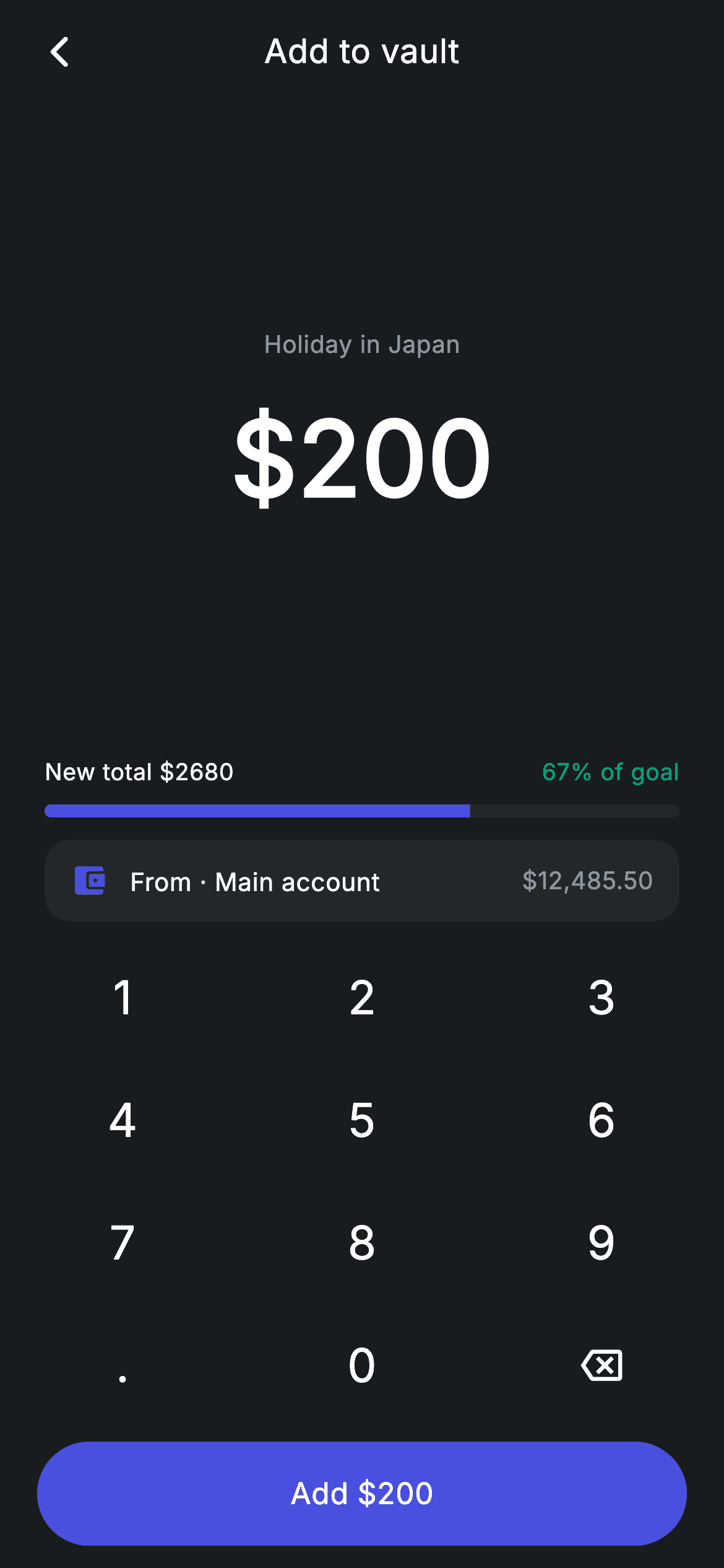
Saving toward a goal works best when you can see the bar move before you commit. This tutorial builds a vault top-up screen in Flutter — a custom numpad driving a 56px amount, a live preview showing the new vault total and percentage of goal, a funding-source row, and a confirm button that disables itself at zero. The numpad's key handler is the real lesson: it guards against leading zeros, duplicate decimal points and more than two decimal places.
Watch the Flutter UI walkthrough
A short screen recording of Add to Vault running, if you'd rather see it before you read the code. The written tutorial below covers everything in it.
Can't see the video? Watch it on YouTube.
What you'll build
- ✓A custom numpad laid out as a four-row grid, with backspace and decimal handled as special keys
- ✓Amount-entry validation that blocks a second decimal point and caps input at two decimal places
- ✓A live goal preview where the progress bar and percentage recompute on every keystroke
- ✓A confirm button that greys itself out and drops its tap handler while the amount is zero
Step-by-step build
Create the file
Add a new file at lib/fintech_vault_add_money/fintech_vault_add_money_screen.dart in your Flutter project.
Register the bundled fonts
No external packages — this is pure Flutter. It does bundle its design font (Inter), so drop the font file into fonts/ and declare it in pubspec.yaml:
flutter:
  fonts:
    - family: Inter
      fonts:
- asset: fonts/Inter-Regular.ttfBuild it, piece by piece
Here's how the screen goes together. Each block below is a real slice of the code with a plain-English explanation — paste them in order, or grab the whole file from the next section.
Goal constants and three derived getters
import 'package:flutter/material.dart';

/// Vault add money — top up a savings goal (Revolut-inspired design system).
///
/// Self-contained per CONVENTIONS.md: pure Flutter only, the exact design font
/// (Inter) is bundled under `fonts/`, no network/emoji images, and the screen
/// forces its own dark theme. The numpad drives the amount; the resulting vault
/// total and progress preview update live.
class FintechVaultAddMoneyScreen extends StatefulWidget {
  const FintechVaultAddMoneyScreen({super.key, this.onBack, this.onAdd});

  final VoidCallback? onBack;
  final VoidCallback? onAdd;

  @override
  State<FintechVaultAddMoneyScreen> createState() =>
      _FintechVaultAddMoneyScreenState();
}

class _FintechVaultAddMoneyScreenState
    extends State<FintechVaultAddMoneyScreen> {
  static const String _font = 'Inter';
  static const Color _bg = Color(0xFF191C1F);
  static const Color _surface = Color(0xFF242729);
  static const Color _brand = Color(0xFF494FDF);
  static const Color _teal = Color(0xFF00A87E);
  static const Color _muted = Color(0xFF8D969E);

  static const double _saved = 2480;
  static const double _goal = 4000;
  String _amount = '200';

  double get _add => double.tryParse(_amount) ?? 0;
  double get _newTotal => _saved + _add;
  double get _newFrac => (_newTotal / _goal).clamp(0, 1);
The screen is stateful for a single String, `_amount`, initialised to '200'. Note it's a String, not a double — that's deliberate, because a numpad has to preserve exactly what was typed, including a trailing '.' that no numeric type can represent. The vault's `_saved` (2480) and `_goal` (4000) are constants, and three getters derive everything else: `_add` parses the string with `double.tryParse` falling back to 0 so a lone '.' can't crash anything, `_newTotal` adds it to what's saved, and `_newFrac` divides by the goal and clamps to 0–1 so overshooting the target can't push the progress bar past full.
The numpad key handler and its guards
  void _onKey(String key) {
    setState(() {
      switch (key) {
        case '⌫':
          _amount = _amount.length <= 1 ? '0' : _amount.substring(0, _amount.length - 1);
        case '.':
          if (!_amount.contains('.')) _amount = '$_amount.';
        default:
          if (_amount == '0') {
            _amount = key;
          } else if (_amount.length < 7) {
            final int dot = _amount.indexOf('.');
            if (dot == -1 || _amount.length - dot <= 2) _amount = '$_amount$key';
          }
      }
    });
  }
This method is the heart of the screen, and every branch exists to stop a malformed amount. It's a Dart 3 switch with no `break` statements — cases don't fall through in the new syntax. Backspace trims the last character, or resets to '0' when only one is left, so the field is never empty. The '.' case is guarded by `if (!_amount.contains('.'))`, blocking a second decimal point. The default case has three guards: replacing a lone '0' rather than producing '0200'; a seven-character cap; and the decimal check `if (dot == -1 || _amount.length - dot <= 2)`, which allows digits freely before a decimal point but only two after it. Together they make it impossible to type an invalid currency amount.
Laying the screen out from the bottom up
  @override
  Widget build(BuildContext context) {
    return Theme(
      data: ThemeData.dark(useMaterial3: true),
      child: Scaffold(
        backgroundColor: _bg,
        body: SafeArea(
          child: Column(
            children: <Widget>[
              _buildAppBar(),
              Expanded(child: _buildAmount()),
              _buildPreview(),
              const SizedBox(height: 12),
              _buildFrom(),
              const SizedBox(height: 8),
              _Numpad(onKey: _onKey),
              const SizedBox(height: 8),
              _buildButton(),
            ],
          ),
        ),
      ),
    );
  }

  Widget _buildAppBar() {
    return Padding(
      padding: const EdgeInsets.fromLTRB(8, 4, 8, 4),
      child: Row(
        children: <Widget>[
          IconButton(
            onPressed: widget.onBack,
            icon: const Icon(Icons.arrow_back_ios_new_rounded,
                size: 20, color: Colors.white),
          ),
          const Expanded(
            child: Text(
              'Add to vault',
              textAlign: TextAlign.center,
              style: TextStyle(
                fontFamily: _font,
                fontSize: 18,
                fontWeight: FontWeight.w500,
                letterSpacing: 0.24,
                color: Colors.white,
              ),
            ),
          ),
          const SizedBox(width: 48),
        ],
      ),
    );
  }
The Column here is worth studying because only one child is `Expanded` — `_buildAmount()`. Everything below it (the preview, the source row, the numpad and the button) has an intrinsic height, so they stack from the bottom and the amount display absorbs all leftover space. That means the layout adapts to any phone height without media queries: on a tall device the amount simply gets more room around it, and nothing overflows on a short one. The app bar centres its title with the usual balancing `SizedBox(width: 48)` matching the leading IconButton's tap target.
The amount display and FittedBox
  Widget _buildAmount() {
    return Center(
      child: Column(
        mainAxisAlignment: MainAxisAlignment.center,
        mainAxisSize: MainAxisSize.min,
        children: <Widget>[
          const Text(
            'Holiday in Japan',
            style: TextStyle(
              fontFamily: _font,
              fontSize: 13,
              letterSpacing: 0.24,
              color: _muted,
            ),
          ),
          const SizedBox(height: 12),
          FittedBox(
            fit: BoxFit.scaleDown,
            child: Text(
              '\$$_amount',
              style: const TextStyle(
                fontFamily: _font,
                fontSize: 56,
                fontWeight: FontWeight.w600,
                letterSpacing: 0.24,
                color: Colors.white,
              ),
            ),
          ),
        ],
      ),
    );
  }
The vault name sits above the amount in muted 13px, then the figure itself renders at 56px w600. The important widget is `FittedBox(fit: BoxFit.scaleDown)`. At 56px, a seven-character amount would overflow a narrow phone — scaleDown means the text shrinks to fit when it would be too wide, but never grows beyond its natural 56px when it's short. That's exactly the behaviour you want for a numpad display, and it's why the key handler's seven-character cap is a nicety rather than a hard requirement. The `\$$_amount` in the string escapes the literal dollar sign before interpolating the field.
The live goal preview
  Widget _buildPreview() {
    return Padding(
      padding: const EdgeInsets.symmetric(horizontal: 24),
      child: Column(
        children: <Widget>[
          Row(
            mainAxisAlignment: MainAxisAlignment.spaceBetween,
            children: <Widget>[
              Text(
                'New total \$${_newTotal.toStringAsFixed(0)}',
                style: const TextStyle(
                  fontFamily: _font,
                  fontSize: 12.5,
                  fontWeight: FontWeight.w500,
                  letterSpacing: 0.24,
                  color: Colors.white,
                ),
              ),
              Text(
                '${(_newFrac * 100).round()}% of goal',
                style: const TextStyle(
                  fontFamily: _font,
                  fontSize: 12.5,
                  letterSpacing: 0.24,
                  color: _teal,
                ),
              ),
            ],
          ),
          const SizedBox(height: 8),
          ClipRRect(
            borderRadius: BorderRadius.circular(9999),
            child: LinearProgressIndicator(
              value: _newFrac,
              minHeight: 7,
              backgroundColor: _surface,
              valueColor: const AlwaysStoppedAnimation<Color>(_brand),
            ),
          ),
        ],
      ),
    );
  }
This is what makes the screen feel responsive. A Row with `MainAxisAlignment.spaceBetween` puts 'New total $2680' on the left and '67% of goal' in teal on the right, both computed from the getters, so every keystroke updates them. Below sits a `LinearProgressIndicator` with `value: _newFrac`, `minHeight: 7`, an `_surface` track and a `_brand` fill via `AlwaysStoppedAnimation` — that wrapper is required because valueColor expects an Animation, and this bar isn't animating between colours. The whole thing is wrapped in a ClipRRect with a 9999 radius, because LinearProgressIndicator draws square ends and clipping is the simplest way to round both the track and the fill together.
The source row and the self-disabling button
  Widget _buildFrom() {
    return Padding(
      padding: const EdgeInsets.symmetric(horizontal: 24),
      child: Container(
        padding: const EdgeInsets.symmetric(horizontal: 14, vertical: 12),
        decoration: BoxDecoration(
          color: _surface,
          borderRadius: BorderRadius.circular(14),
        ),
        child: Row(
          children: const <Widget>[
            Icon(Icons.account_balance_wallet_rounded, size: 20, color: _brand),
            SizedBox(width: 12),
            Text(
              'From · Main account',
              style: TextStyle(
                fontFamily: _font,
                fontSize: 13.5,
                fontWeight: FontWeight.w500,
                letterSpacing: 0.24,
                color: Colors.white,
              ),
            ),
            Spacer(),
            Text(
              r'$12,485.50',
              style: TextStyle(
                fontFamily: _font,
                fontSize: 13,
                letterSpacing: 0.24,
                color: _muted,
              ),
            ),
          ],
        ),
      ),
    );
  }

  Widget _buildButton() {
    final bool valid = _add > 0;
    return Padding(
      padding: const EdgeInsets.fromLTRB(20, 0, 20, 12),
      child: SizedBox(
        width: double.infinity,
        height: 56,
        child: Material(
          color: valid ? _brand : _surface,
          borderRadius: BorderRadius.circular(9999),
          child: InkWell(
            borderRadius: BorderRadius.circular(9999),
            onTap: valid ? widget.onAdd : null,
            child: Center(
              child: Text(
                'Add \$$_amount',
                style: TextStyle(
                  fontFamily: _font,
                  fontSize: 16,
                  fontWeight: FontWeight.w500,
                  letterSpacing: 0.24,
                  color: valid ? Colors.white : _muted,
                ),
              ),
            ),
          ),
        ),
      ),
    );
  }
`_buildFrom` is a compact `_surface` pill showing the funding account and its balance, using a `Spacer()` to push the balance right. The button below computes `valid = _add > 0` once and uses it three times: the Material colour switches from `_brand` to flat `_surface`, the InkWell's `onTap` becomes `null`, and the label colour drops to `_muted`. Passing null to onTap is what actually kills the ripple — styling alone would still leave a button that looks dead but feels tappable. The label reads 'Add $200', restating the amount so the last tap can't be a surprise.
The numpad grid
class _Numpad extends StatelessWidget {
  const _Numpad({required this.onKey});

  final ValueChanged<String> onKey;

  static const List<List<String>> _rows = <List<String>>[
    <String>['1', '2', '3'],
    <String>['4', '5', '6'],
    <String>['7', '8', '9'],
    <String>['.', '0', '⌫'],
  ];

  @override
  Widget build(BuildContext context) {
    return Padding(
      padding: const EdgeInsets.symmetric(horizontal: 32),
      child: Column(
        mainAxisSize: MainAxisSize.min,
        children: <Widget>[
          for (final List<String> row in _rows)
            Padding(
              padding: const EdgeInsets.symmetric(vertical: 5),
              child: Row(
                mainAxisAlignment: MainAxisAlignment.spaceBetween,
                children: <Widget>[
                  for (final String key in row)
                    GestureDetector(
                      onTap: () => onKey(key),
                      behavior: HitTestBehavior.opaque,
                      child: Container(
                        width: 68,
                        height: 56,
                        alignment: Alignment.center,
                        child: key == '⌫'
                            ? const Icon(Icons.backspace_outlined,
                                size: 22, color: Colors.white)
                            : Text(
                                key,
                                style: const TextStyle(
                                  fontFamily:
                                      _FintechVaultAddMoneyScreenState._font,
                                  fontSize: 25,
                                  fontWeight: FontWeight.w500,
                                  letterSpacing: 0.24,
                                  color: Colors.white,
                                ),
                              ),
                      ),
                    ),
                ],
              ),
            ),
        ],
      ),
    );
  }
}
_Numpad is a stateless widget that owns no amount at all — it just reports keys through a `ValueChanged<String>`, which keeps all the validation in one place. Its layout is a nested collection-for: an outer loop over `_rows` and an inner loop over each row's keys, with `MainAxisAlignment.spaceBetween` distributing the three keys evenly. Each key is a fixed 68×56 Container, and `behavior: HitTestBehavior.opaque` on the GestureDetector is essential — without it, taps landing on the transparent space around a digit would be ignored, making the pad feel unreliable. The backspace key is stored as the '⌫' character in the data but rendered as a `backspace_outlined` icon, so the handler can switch on a readable string while the UI shows a proper glyph.
Full code
The complete, ready-to-paste source. Free to use in your projects — one click copies it all.
import 'package:flutter/material.dart';

/// Vault add money — top up a savings goal (Revolut-inspired design system).
///
/// Self-contained per CONVENTIONS.md: pure Flutter only, the exact design font
/// (Inter) is bundled under `fonts/`, no network/emoji images, and the screen
/// forces its own dark theme. The numpad drives the amount; the resulting vault
/// total and progress preview update live.
class FintechVaultAddMoneyScreen extends StatefulWidget {
  const FintechVaultAddMoneyScreen({super.key, this.onBack, this.onAdd});

  final VoidCallback? onBack;
  final VoidCallback? onAdd;

  @override
  State<FintechVaultAddMoneyScreen> createState() =>
      _FintechVaultAddMoneyScreenState();
}

class _FintechVaultAddMoneyScreenState
    extends State<FintechVaultAddMoneyScreen> {
  static const String _font = 'Inter';
  static const Color _bg = Color(0xFF191C1F);
  static const Color _surface = Color(0xFF242729);
  static const Color _brand = Color(0xFF494FDF);
  static const Color _teal = Color(0xFF00A87E);
  static const Color _muted = Color(0xFF8D969E);

  static const double _saved = 2480;
  static const double _goal = 4000;
  String _amount = '200';

  double get _add => double.tryParse(_amount) ?? 0;
  double get _newTotal => _saved + _add;
  double get _newFrac => (_newTotal / _goal).clamp(0, 1);

  void _onKey(String key) {
    setState(() {
      switch (key) {
        case '⌫':
          _amount = _amount.length <= 1 ? '0' : _amount.substring(0, _amount.length - 1);
        case '.':
          if (!_amount.contains('.')) _amount = '$_amount.';
        default:
          if (_amount == '0') {
            _amount = key;
          } else if (_amount.length < 7) {
            final int dot = _amount.indexOf('.');
            if (dot == -1 || _amount.length - dot <= 2) _amount = '$_amount$key';
          }
      }
    });
  }

  @override
  Widget build(BuildContext context) {
    return Theme(
      data: ThemeData.dark(useMaterial3: true),
      child: Scaffold(
        backgroundColor: _bg,
        body: SafeArea(
          child: Column(
            children: <Widget>[
              _buildAppBar(),
              Expanded(child: _buildAmount()),
              _buildPreview(),
              const SizedBox(height: 12),
              _buildFrom(),
              const SizedBox(height: 8),
              _Numpad(onKey: _onKey),
              const SizedBox(height: 8),
              _buildButton(),
            ],
          ),
        ),
      ),
    );
  }

  Widget _buildAppBar() {
    return Padding(
      padding: const EdgeInsets.fromLTRB(8, 4, 8, 4),
      child: Row(
        children: <Widget>[
          IconButton(
            onPressed: widget.onBack,
            icon: const Icon(Icons.arrow_back_ios_new_rounded,
                size: 20, color: Colors.white),
          ),
          const Expanded(
            child: Text(
              'Add to vault',
              textAlign: TextAlign.center,
              style: TextStyle(
                fontFamily: _font,
                fontSize: 18,
                fontWeight: FontWeight.w500,
                letterSpacing: 0.24,
                color: Colors.white,
              ),
            ),
          ),
          const SizedBox(width: 48),
        ],
      ),
    );
  }

  Widget _buildAmount() {
    return Center(
      child: Column(
        mainAxisAlignment: MainAxisAlignment.center,
        mainAxisSize: MainAxisSize.min,
        children: <Widget>[
          const Text(
            'Holiday in Japan',
            style: TextStyle(
              fontFamily: _font,
              fontSize: 13,
              letterSpacing: 0.24,
              color: _muted,
            ),
          ),
          const SizedBox(height: 12),
          FittedBox(
            fit: BoxFit.scaleDown,
            child: Text(
              '\$$_amount',
              style: const TextStyle(
                fontFamily: _font,
                fontSize: 56,
                fontWeight: FontWeight.w600,
                letterSpacing: 0.24,
                color: Colors.white,
              ),
            ),
          ),
        ],
      ),
    );
  }

  Widget _buildPreview() {
    return Padding(
      padding: const EdgeInsets.symmetric(horizontal: 24),
      child: Column(
        children: <Widget>[
          Row(
            mainAxisAlignment: MainAxisAlignment.spaceBetween,
            children: <Widget>[
              Text(
                'New total \$${_newTotal.toStringAsFixed(0)}',
                style: const TextStyle(
                  fontFamily: _font,
                  fontSize: 12.5,
                  fontWeight: FontWeight.w500,
                  letterSpacing: 0.24,
                  color: Colors.white,
                ),
              ),
              Text(
                '${(_newFrac * 100).round()}% of goal',
                style: const TextStyle(
                  fontFamily: _font,
                  fontSize: 12.5,
                  letterSpacing: 0.24,
                  color: _teal,
                ),
              ),
            ],
          ),
          const SizedBox(height: 8),
          ClipRRect(
            borderRadius: BorderRadius.circular(9999),
            child: LinearProgressIndicator(
              value: _newFrac,
              minHeight: 7,
              backgroundColor: _surface,
              valueColor: const AlwaysStoppedAnimation<Color>(_brand),
            ),
          ),
        ],
      ),
    );
  }

  Widget _buildFrom() {
    return Padding(
      padding: const EdgeInsets.symmetric(horizontal: 24),
      child: Container(
        padding: const EdgeInsets.symmetric(horizontal: 14, vertical: 12),
        decoration: BoxDecoration(
          color: _surface,
          borderRadius: BorderRadius.circular(14),
        ),
        child: Row(
          children: const <Widget>[
            Icon(Icons.account_balance_wallet_rounded, size: 20, color: _brand),
            SizedBox(width: 12),
            Text(
              'From · Main account',
              style: TextStyle(
                fontFamily: _font,
                fontSize: 13.5,
                fontWeight: FontWeight.w500,
                letterSpacing: 0.24,
                color: Colors.white,
              ),
            ),
            Spacer(),
            Text(
              r'$12,485.50',
              style: TextStyle(
                fontFamily: _font,
                fontSize: 13,
                letterSpacing: 0.24,
                color: _muted,
              ),
            ),
          ],
        ),
      ),
    );
  }

  Widget _buildButton() {
    final bool valid = _add > 0;
    return Padding(
      padding: const EdgeInsets.fromLTRB(20, 0, 20, 12),
      child: SizedBox(
        width: double.infinity,
        height: 56,
        child: Material(
          color: valid ? _brand : _surface,
          borderRadius: BorderRadius.circular(9999),
          child: InkWell(
            borderRadius: BorderRadius.circular(9999),
            onTap: valid ? widget.onAdd : null,
            child: Center(
              child: Text(
                'Add \$$_amount',
                style: TextStyle(
                  fontFamily: _font,
                  fontSize: 16,
                  fontWeight: FontWeight.w500,
                  letterSpacing: 0.24,
                  color: valid ? Colors.white : _muted,
                ),
              ),
            ),
          ),
        ),
      ),
    );
  }
}

class _Numpad extends StatelessWidget {
  const _Numpad({required this.onKey});

  final ValueChanged<String> onKey;

  static const List<List<String>> _rows = <List<String>>[
    <String>['1', '2', '3'],
    <String>['4', '5', '6'],
    <String>['7', '8', '9'],
    <String>['.', '0', '⌫'],
  ];

  @override
  Widget build(BuildContext context) {
    return Padding(
      padding: const EdgeInsets.symmetric(horizontal: 32),
      child: Column(
        mainAxisSize: MainAxisSize.min,
        children: <Widget>[
          for (final List<String> row in _rows)
            Padding(
              padding: const EdgeInsets.symmetric(vertical: 5),
              child: Row(
                mainAxisAlignment: MainAxisAlignment.spaceBetween,
                children: <Widget>[
                  for (final String key in row)
                    GestureDetector(
                      onTap: () => onKey(key),
                      behavior: HitTestBehavior.opaque,
                      child: Container(
                        width: 68,
                        height: 56,
                        alignment: Alignment.center,
                        child: key == '⌫'
                            ? const Icon(Icons.backspace_outlined,
                                size: 22, color: Colors.white)
                            : Text(
                                key,
                                style: const TextStyle(
                                  fontFamily:
                                      _FintechVaultAddMoneyScreenState._font,
                                  fontSize: 25,
                                  fontWeight: FontWeight.w500,
                                  letterSpacing: 0.24,
                                  color: Colors.white,
                                ),
                              ),
                      ),
                    ),
                ],
              ),
            ),
        ],
      ),
    );
  }
}
Plus bundled 1 binary asset (fonts/images). The CLI and MCP install those for you automatically.
Two faster ways to add it
Copy-paste works, but you can skip it entirely.
1. FlutterKit CLI
One command drops this screen — and its fonts — straight into your project.
$ flutterkit add fintech-vault-add-money2. AI agent (MCP)
Connect FlutterKit's MCP server in Claude or Cursor and just ask your agent to install fintech-vault-add-money — it fetches and writes the files for you.
FAQ
Is this Flutter numpad top-up screen free to use?
Yes. The complete Dart source on this page is free for personal and commercial projects. Copy it directly, install it with the FlutterKit CLI (flutterkit add fintech-vault-add-money), or have an AI agent add it for you over MCP.
Why use a custom numpad instead of a TextField with a number keyboard?
Two reasons. A system keyboard takes over a large, variable part of the screen and would hide the live goal preview, which is the whole point of this layout. And the platform numeric keyboards differ — iOS and Android disagree on whether a decimal point or a done key is present — whereas this pad is identical everywhere and its rules live in one readable method.
Does it need any external packages?
No — it's pure Flutter on the material library, and the progress bar is Flutter's own LinearProgressIndicator rather than a charting dependency. There are no images. The only bundled asset is the Inter font, registered in pubspec.yaml as shown in step 2, which the CLI and MCP install for you.
Which Flutter version does it target?
The `_onKey` method uses Dart 3 switch statements without break, and the file uses super parameters, so it needs Dart 3 — Flutter 3.10+ at minimum, and 3.22+ to match the rest of this kit. There are no withValues calls in this file, so no colour-API swaps are needed on older 3.x SDKs.


