How to Build a Transfer Success Screen in Flutter (Full Code + Preview)
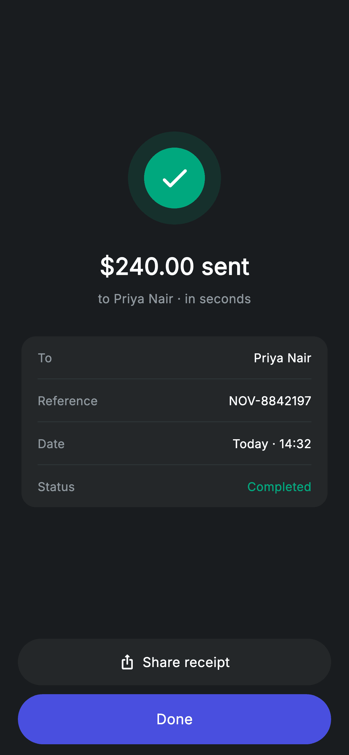
A money transfer only feels finished when the app says so — this screen is that moment. You'll build a Revolut-style confirmation in Flutter: a teal check badge, a large "$240.00 sent" headline, a 'to Priya Nair · in seconds' subline, and a rounded receipt card listing To, Reference, Date and a green Completed status. Two pill buttons anchor the bottom — a grey 'Share receipt' and a brand-blue 'Done'. It's a pure-Flutter StatelessWidget with hard-coded demo values and two callbacks, so you swap in your own data.
Watch the Flutter UI walkthrough
A short screen recording of Transfer Success running, if you'd rather see it before you read the code. The written tutorial below covers everything in it.
Can't see the video? Watch it on YouTube.
What you'll build
- ✓A two-ring success badge drawn entirely with Containers — a 104px teal-tinted halo around a 68px solid teal circle with a white check
- ✓A centered confirmation block: 26px sent-amount headline plus a muted recipient/speed subline
- ✓A #242729 receipt card with four label/value rows separated by 1px hairline dividers, with 'Completed' tinted teal
- ✓A bottom action stack: a surface-grey 'Share receipt' pill with a share icon and a full-width brand-blue 'Done' pill, both with ink ripples
- ✓A screen that forces its own dark theme, so it looks identical no matter what theme your app ships
Step-by-step build
Create the file
Add a new file at lib/fintech_transfer_success/fintech_transfer_success_screen.dart in your Flutter project.
Register the bundled fonts
No external packages — this is pure Flutter. It does bundle its design font (Inter), so drop the font file into fonts/ and declare it in pubspec.yaml:
flutter:
  fonts:
    - family: Inter
      fonts:
- asset: fonts/Inter-Regular.ttfBuild it, piece by piece
Here's how the screen goes together. Each block below is a real slice of the code with a plain-English explanation — paste them in order, or grab the whole file from the next section.
The stateless class, its two callbacks, and the colour tokens
import 'package:flutter/material.dart';

/// Transfer success — sent confirmation (Revolut-inspired design system).
///
/// Self-contained per CONVENTIONS.md: pure Flutter only, the exact design font
/// (Inter) is bundled under `fonts/`, no network images, and the screen forces
/// its own dark theme. A custom-painted success badge, the sent amount and a
/// small receipt summary make the confirmation feel premium.
class FintechTransferSuccessScreen extends StatelessWidget {
  const FintechTransferSuccessScreen({
    super.key,
    this.onDone,
    this.onShare,
  });

  final VoidCallback? onDone;
  final VoidCallback? onShare;

  static const String _font = 'Inter';
  static const Color _bg = Color(0xFF191C1F);
  static const Color _surface = Color(0xFF242729);
  static const Color _brand = Color(0xFF494FDF);
  static const Color _teal = Color(0xFF00A87E);
  static const Color _muted = Color(0xFF8D969E);
  static const Color _hairline = Color(0xFF2E3235);
Only the material library is imported — no packages at all. FintechTransferSuccessScreen is a StatelessWidget because nothing on the screen ever changes: the amount, recipient and receipt values are fixed strings. The two constructor fields, onDone and onShare, are nullable VoidCallbacks, which is what makes the screen backend-agnostic — it never navigates or shares by itself, it just tells the parent a button was tapped. Below them sit six static consts that form the palette: _bg (#191C1F) for the canvas, _surface (#242729) for the receipt card and secondary button, _brand (#494FDF) for the primary CTA, _teal (#00A87E) for the success badge and the Completed status, _muted (#8D969E) for secondary text, and _hairline (#2E3235) for the dividers. _font holds the string 'Inter', reused by every TextStyle in the file.
Forcing dark mode and splitting the screen into content and footer
  @override
  Widget build(BuildContext context) {
    return Theme(
      data: ThemeData.dark(useMaterial3: true),
      child: Scaffold(
        backgroundColor: _bg,
        body: SafeArea(
          child: Column(
            children: <Widget>[
              Expanded(
                child: Padding(
                  padding: const EdgeInsets.symmetric(horizontal: 24),
                  child: Column(
                    mainAxisAlignment: MainAxisAlignment.center,
                    children: <Widget>[
                      _buildBadge(),
                      const SizedBox(height: 28),
                      const Text(
                        r'$240.00 sent',
                        style: TextStyle(
                          fontFamily: _font,
                          fontSize: 26,
                          fontWeight: FontWeight.w600,
                          letterSpacing: 0.24,
                          color: Colors.white,
                        ),
                      ),
                      const SizedBox(height: 8),
                      const Text(
                        'to Priya Nair · in seconds',
                        style: TextStyle(
                          fontFamily: _font,
                          fontSize: 14,
                          letterSpacing: 0.24,
                          color: _muted,
                        ),
                      ),
                      const SizedBox(height: 32),
                      _buildReceipt(),
                    ],
                  ),
                ),
              ),
              _buildButtons(),
            ],
          ),
        ),
      ),
    );
  }
build() wraps everything in a Theme with ThemeData.dark(useMaterial3: true). That's deliberate: the screen owns its look, so it renders the same dark confirmation even if the surrounding app is in light mode. Inside, a Scaffold painted with _bg and a SafeArea host one outer Column with exactly two children — an Expanded and _buildButtons(). Expanded is what pins the buttons to the bottom while letting the confirmation block claim all remaining height; inside it, a second Column with mainAxisAlignment.center vertically centers the badge, the amount and the receipt in that leftover space, inset 24px on each side. The headline is a raw string, r'$240.00 sent', at 26px w600 with 0.24 letter spacing — the r prefix stops Dart treating the dollar sign as string interpolation. Under it, 'to Priya Nair · in seconds' at 14px in _muted, then a 32px gap before the receipt card.
Painting the success badge with two nested circles
  Widget _buildBadge() {
    return Container(
      width: 104,
      height: 104,
      decoration: BoxDecoration(
        color: _teal.withValues(alpha: 0.14),
        shape: BoxShape.circle,
      ),
      child: Center(
        child: Container(
          width: 68,
          height: 68,
          decoration: const BoxDecoration(
            color: _teal,
            shape: BoxShape.circle,
          ),
          child: const Icon(Icons.check_rounded, size: 38, color: Colors.white),
        ),
      ),
    );
  }
No image asset and no CustomPainter here — the badge is just two Containers. The outer one is 104×104 with shape: BoxShape.circle and a colour of _teal.withValues(alpha: 0.14), which is the same green at 14% opacity, giving the soft halo. Centered inside it is a 68×68 circle filled with solid _teal, and inside that an Icons.check_rounded at size 38 in white. The 104/68 pair leaves an 18px ring of tinted glow all the way around, and because both use BoxShape.circle rather than a border radius they stay perfectly round at any size you change them to.
The receipt card, its rows, and the hairline dividers
  Widget _buildReceipt() {
    return Container(
      padding: const EdgeInsets.symmetric(horizontal: 18),
      decoration: BoxDecoration(
        color: _surface,
        borderRadius: BorderRadius.circular(16),
      ),
      child: Column(
        children: <Widget>[
          _row('To', 'Priya Nair'),
          _divider(),
          _row('Reference', 'NOV-8842197'),
          _divider(),
          _row('Date', 'Today · 14:32'),
          _divider(),
          _row('Status', 'Completed', valueColor: _teal),
        ],
      ),
    );
  }

  Widget _row(String label, String value, {Color? valueColor}) {
    return Padding(
      padding: const EdgeInsets.symmetric(vertical: 14),
      child: Row(
        mainAxisAlignment: MainAxisAlignment.spaceBetween,
        children: <Widget>[
          Text(
            label,
            style: const TextStyle(
              fontFamily: _font,
              fontSize: 13.5,
              letterSpacing: 0.24,
              color: _muted,
            ),
          ),
          Text(
            value,
            style: TextStyle(
              fontFamily: _font,
              fontSize: 13.5,
              fontWeight: FontWeight.w500,
              letterSpacing: 0.24,
              color: valueColor ?? Colors.white,
            ),
          ),
        ],
      ),
    );
  }

  Widget _divider() => const Divider(height: 1, color: _hairline);
_buildReceipt() is a _surface-coloured Container with a 16px corner radius and 18px of horizontal padding, holding a Column of four _row() calls interleaved with three _divider()s. The rows are the receipt data: To → 'Priya Nair', Reference → 'NOV-8842197', Date → 'Today · 14:32', and Status → 'Completed', where the last one passes valueColor: _teal so the status reads green. _row() is the reusable piece: 14px vertical padding, then a Row with mainAxisAlignment.spaceBetween that pushes the muted label left and the value right. Both texts are 13.5px Inter with 0.24 letter spacing; the value adds FontWeight.w500 and falls back to white via valueColor ?? Colors.white. Note the padding lives on the row, not the card, so the dividers stretch edge to edge under each entry. _divider() is a one-liner: a Divider with height 1 and the _hairline colour.
The Share receipt and Done pill buttons
  Widget _buildButtons() {
    return Padding(
      padding: const EdgeInsets.fromLTRB(20, 0, 20, 12),
      child: Column(
        children: <Widget>[
          SizedBox(
            width: double.infinity,
            height: 52,
            child: Material(
              color: _surface,
              borderRadius: BorderRadius.circular(9999),
              child: InkWell(
                borderRadius: BorderRadius.circular(9999),
                onTap: onShare,
                child: Row(
                  mainAxisAlignment: MainAxisAlignment.center,
                  children: const <Widget>[
                    Icon(Icons.ios_share_rounded, size: 18, color: Colors.white),
                    SizedBox(width: 8),
                    Text(
                      'Share receipt',
                      style: TextStyle(
                        fontFamily: _font,
                        fontSize: 15,
                        fontWeight: FontWeight.w500,
                        letterSpacing: 0.24,
                        color: Colors.white,
                      ),
                    ),
                  ],
                ),
              ),
            ),
          ),
          const SizedBox(height: 10),
          SizedBox(
            width: double.infinity,
            height: 56,
            child: Material(
              color: _brand,
              borderRadius: BorderRadius.circular(9999),
              child: InkWell(
                borderRadius: BorderRadius.circular(9999),
                onTap: onDone,
                child: const Center(
                  child: Text(
                    'Done',
                    style: TextStyle(
                      fontFamily: _font,
                      fontSize: 16,
                      fontWeight: FontWeight.w500,
                      letterSpacing: 0.24,
                      color: Colors.white,
                    ),
                  ),
                ),
              ),
            ),
          ),
        ],
      ),
    );
  }
}
_buildButtons() is a Column of two full-width SizedBoxes inside 20px side padding and 12px of bottom breathing room. Both buttons are built the same way — a Material with a colour and borderRadius wrapping an InkWell with the *same* radius — which is the standard trick for getting a ripple that stays clipped inside a rounded shape. The radius is BorderRadius.circular(9999), an intentionally huge value that always resolves to a perfect pill. The secondary action is 52px tall in _surface and centers an Icons.ios_share_rounded at size 18 next to the 15px 'Share receipt' label with an 8px gap, firing onShare. The primary is slightly taller at 56px, filled with _brand, and centers a 16px 'Done' label that fires onDone. Since both callbacks are nullable, passing null leaves the button visible but inert — handy while you're still wiring navigation.
Full code
The complete, ready-to-paste source. Free to use in your projects — one click copies it all.
import 'package:flutter/material.dart';

/// Transfer success — sent confirmation (Revolut-inspired design system).
///
/// Self-contained per CONVENTIONS.md: pure Flutter only, the exact design font
/// (Inter) is bundled under `fonts/`, no network images, and the screen forces
/// its own dark theme. A custom-painted success badge, the sent amount and a
/// small receipt summary make the confirmation feel premium.
class FintechTransferSuccessScreen extends StatelessWidget {
  const FintechTransferSuccessScreen({
    super.key,
    this.onDone,
    this.onShare,
  });

  final VoidCallback? onDone;
  final VoidCallback? onShare;

  static const String _font = 'Inter';
  static const Color _bg = Color(0xFF191C1F);
  static const Color _surface = Color(0xFF242729);
  static const Color _brand = Color(0xFF494FDF);
  static const Color _teal = Color(0xFF00A87E);
  static const Color _muted = Color(0xFF8D969E);
  static const Color _hairline = Color(0xFF2E3235);

  @override
  Widget build(BuildContext context) {
    return Theme(
      data: ThemeData.dark(useMaterial3: true),
      child: Scaffold(
        backgroundColor: _bg,
        body: SafeArea(
          child: Column(
            children: <Widget>[
              Expanded(
                child: Padding(
                  padding: const EdgeInsets.symmetric(horizontal: 24),
                  child: Column(
                    mainAxisAlignment: MainAxisAlignment.center,
                    children: <Widget>[
                      _buildBadge(),
                      const SizedBox(height: 28),
                      const Text(
                        r'$240.00 sent',
                        style: TextStyle(
                          fontFamily: _font,
                          fontSize: 26,
                          fontWeight: FontWeight.w600,
                          letterSpacing: 0.24,
                          color: Colors.white,
                        ),
                      ),
                      const SizedBox(height: 8),
                      const Text(
                        'to Priya Nair · in seconds',
                        style: TextStyle(
                          fontFamily: _font,
                          fontSize: 14,
                          letterSpacing: 0.24,
                          color: _muted,
                        ),
                      ),
                      const SizedBox(height: 32),
                      _buildReceipt(),
                    ],
                  ),
                ),
              ),
              _buildButtons(),
            ],
          ),
        ),
      ),
    );
  }

  Widget _buildBadge() {
    return Container(
      width: 104,
      height: 104,
      decoration: BoxDecoration(
        color: _teal.withValues(alpha: 0.14),
        shape: BoxShape.circle,
      ),
      child: Center(
        child: Container(
          width: 68,
          height: 68,
          decoration: const BoxDecoration(
            color: _teal,
            shape: BoxShape.circle,
          ),
          child: const Icon(Icons.check_rounded, size: 38, color: Colors.white),
        ),
      ),
    );
  }

  Widget _buildReceipt() {
    return Container(
      padding: const EdgeInsets.symmetric(horizontal: 18),
      decoration: BoxDecoration(
        color: _surface,
        borderRadius: BorderRadius.circular(16),
      ),
      child: Column(
        children: <Widget>[
          _row('To', 'Priya Nair'),
          _divider(),
          _row('Reference', 'NOV-8842197'),
          _divider(),
          _row('Date', 'Today · 14:32'),
          _divider(),
          _row('Status', 'Completed', valueColor: _teal),
        ],
      ),
    );
  }

  Widget _row(String label, String value, {Color? valueColor}) {
    return Padding(
      padding: const EdgeInsets.symmetric(vertical: 14),
      child: Row(
        mainAxisAlignment: MainAxisAlignment.spaceBetween,
        children: <Widget>[
          Text(
            label,
            style: const TextStyle(
              fontFamily: _font,
              fontSize: 13.5,
              letterSpacing: 0.24,
              color: _muted,
            ),
          ),
          Text(
            value,
            style: TextStyle(
              fontFamily: _font,
              fontSize: 13.5,
              fontWeight: FontWeight.w500,
              letterSpacing: 0.24,
              color: valueColor ?? Colors.white,
            ),
          ),
        ],
      ),
    );
  }

  Widget _divider() => const Divider(height: 1, color: _hairline);

  Widget _buildButtons() {
    return Padding(
      padding: const EdgeInsets.fromLTRB(20, 0, 20, 12),
      child: Column(
        children: <Widget>[
          SizedBox(
            width: double.infinity,
            height: 52,
            child: Material(
              color: _surface,
              borderRadius: BorderRadius.circular(9999),
              child: InkWell(
                borderRadius: BorderRadius.circular(9999),
                onTap: onShare,
                child: Row(
                  mainAxisAlignment: MainAxisAlignment.center,
                  children: const <Widget>[
                    Icon(Icons.ios_share_rounded, size: 18, color: Colors.white),
                    SizedBox(width: 8),
                    Text(
                      'Share receipt',
                      style: TextStyle(
                        fontFamily: _font,
                        fontSize: 15,
                        fontWeight: FontWeight.w500,
                        letterSpacing: 0.24,
                        color: Colors.white,
                      ),
                    ),
                  ],
                ),
              ),
            ),
          ),
          const SizedBox(height: 10),
          SizedBox(
            width: double.infinity,
            height: 56,
            child: Material(
              color: _brand,
              borderRadius: BorderRadius.circular(9999),
              child: InkWell(
                borderRadius: BorderRadius.circular(9999),
                onTap: onDone,
                child: const Center(
                  child: Text(
                    'Done',
                    style: TextStyle(
                      fontFamily: _font,
                      fontSize: 16,
                      fontWeight: FontWeight.w500,
                      letterSpacing: 0.24,
                      color: Colors.white,
                    ),
                  ),
                ),
              ),
            ),
          ),
        ],
      ),
    );
  }
}
Plus bundled 1 binary asset (fonts/images). The CLI and MCP install those for you automatically.
Two faster ways to add it
Copy-paste works, but you can skip it entirely.
1. FlutterKit CLI
One command drops this screen — and its fonts — straight into your project.
$ flutterkit add fintech-transfer-success2. AI agent (MCP)
Connect FlutterKit's MCP server in Claude or Cursor and just ask your agent to install fintech-transfer-success — it fetches and writes the files for you.
FAQ
Can I ship this transfer confirmation in a commercial payments app?
Yes. The full Dart for the transfer success screen on this page is free to copy and use in personal or commercial projects. Paste it straight in, run flutterkit add fintech-transfer-success, or let an AI agent install it for you over MCP.
Do the badge and receipt card need any plugins?
No — the packages list is empty. The badge is two plain Containers, the dividers are Flutter's own Divider, and the buttons are Material + InkWell, all from the material library. The only bundled asset is the Inter font, referenced by the _font constant in every TextStyle; register it in pubspec.yaml as shown in the dependencies step, or let the CLI and MCP copy the font files for you.
What SDK does it need, and how do I run it on an older one?
It uses super parameters (super.key) and _teal.withValues(alpha: 0.14) for the badge halo, so it targets Flutter 3.22+ on Dart 3. On an older SDK, change that one call to _teal.withOpacity(0.14) and rewrite the constructor to the classic Key? key form — nothing else in the file uses a newer API.


