How to Build a Transfer Review Screen in Flutter (Full Code + Preview)
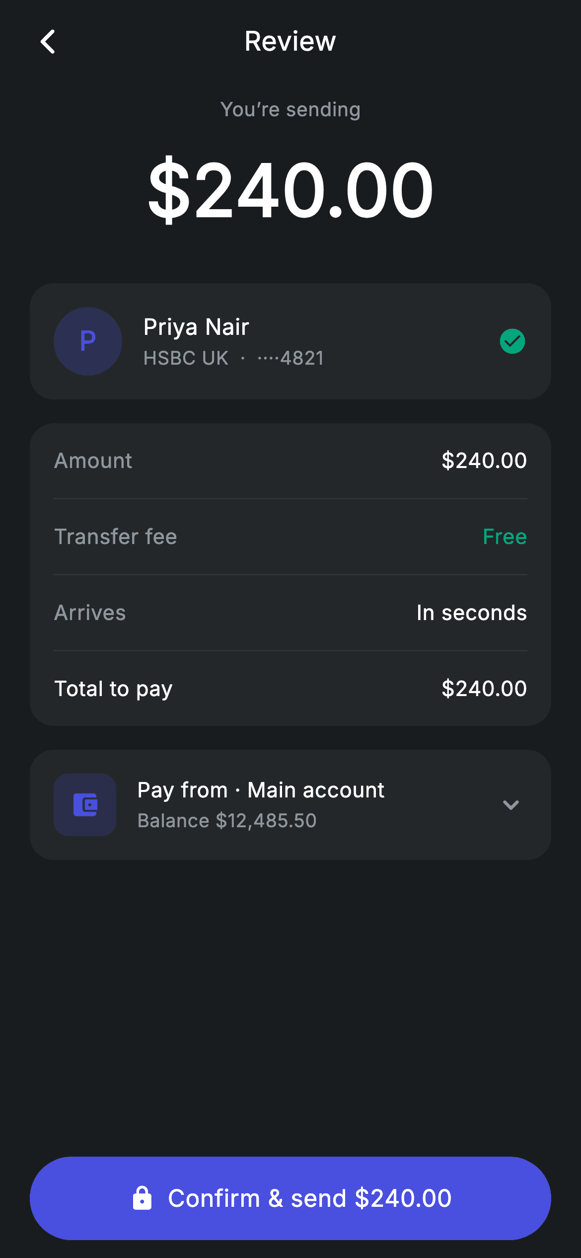
The moment before money leaves an account is the one screen users actually read. This tutorial builds that step in Flutter: a dark #191C1F review page with a $240.00 headline, a recipient card for Priya Nair showing a masked HSBC account and a teal verified check, a four-row breakdown ending in a bold Total to pay, a Pay from account row, and a pinned pill button reading Confirm & send $240.00. It's one StatelessWidget with two callbacks, pure Flutter, no packages.
Watch the Flutter UI walkthrough
A short screen recording of Transfer Review running, if you'd rather see it before you read the code. The written tutorial below covers everything in it.
Can't see the video? Watch it on YouTube.
What you'll build
- ✓A confirmation layout where the amount, recipient and fees scroll while the confirm button stays pinned to the bottom
- ✓A reusable _row(label, value) helper that renders every breakdown line, with bold and coloured variants for Total and a free fee
- ✓A recipient card with a tinted initial-letter avatar and a teal check_circle to signal a verified payee
- ✓A source-account row with a wallet icon, live balance text and a chevron, ready to open an account picker
- ✓A six-token dark palette (background, surface, brand, teal, muted, hairline) you can retheme in one place
Step-by-step build
Create the file
Add a new file at lib/fintech_transfer_review/fintech_transfer_review_screen.dart in your Flutter project.
Register the bundled fonts
No external packages — this is pure Flutter. It does bundle its design font (Inter), so drop the font file into fonts/ and declare it in pubspec.yaml:
flutter:
  fonts:
    - family: Inter
      fonts:
- asset: fonts/Inter-Regular.ttfBuild it, piece by piece
Here's how the screen goes together. Each block below is a real slice of the code with a plain-English explanation — paste them in order, or grab the whole file from the next section.
Design tokens and a self-contained dark theme
import 'package:flutter/material.dart';

/// Transfer review — confirm amount / recipient / fee (Revolut-inspired design).
///
/// Self-contained per CONVENTIONS.md: pure Flutter only, the exact design font
/// (Inter) is bundled under `fonts/`, no network images, and the screen forces
/// its own dark theme. A clear amount summary, itemised fee breakdown and a
/// source-account row make the confirmation read like a real product.
class FintechTransferReviewScreen extends StatelessWidget {
  const FintechTransferReviewScreen({
    super.key,
    this.onBack,
    this.onConfirm,
  });

  final VoidCallback? onBack;
  final VoidCallback? onConfirm;

  static const String _font = 'Inter';
  static const Color _bg = Color(0xFF191C1F);
  static const Color _surface = Color(0xFF242729);
  static const Color _brand = Color(0xFF494FDF);
  static const Color _teal = Color(0xFF00A87E);
  static const Color _muted = Color(0xFF8D969E);
  static const Color _hairline = Color(0xFF2E3235);

  @override
  Widget build(BuildContext context) {
    return Theme(
      data: ThemeData.dark(useMaterial3: true),
      child: Scaffold(
        backgroundColor: _bg,
        body: SafeArea(
          child: Column(
            children: <Widget>[
              _buildAppBar(),
              Expanded(
                child: ListView(
                  physics: const BouncingScrollPhysics(),
                  padding: const EdgeInsets.fromLTRB(20, 8, 20, 24),
                  children: <Widget>[
                    _buildAmount(),
                    const SizedBox(height: 28),
                    _buildRecipientCard(),
                    const SizedBox(height: 16),
                    _buildBreakdown(),
                    const SizedBox(height: 16),
                    _buildSource(),
                  ],
                ),
              ),
              _buildConfirm(),
            ],
          ),
        ),
      ),
    );
  }
FintechTransferReviewScreen is a StatelessWidget — nothing on this screen changes on its own, so there is no setState anywhere. It takes two optional callbacks, onBack and onConfirm, so the parent decides what tapping the arrow or the CTA actually does. Six private const Colors act as the palette: _bg (#191C1F) is the canvas, _surface (#242729) is every card, _brand (#494FDF) is the indigo CTA and avatar tint, _teal (#00A87E) marks 'verified' and 'Free', _muted (#8D969E) is secondary text, and _hairline (#2E3235) is the divider. build() wraps everything in Theme(data: ThemeData.dark(useMaterial3: true)) so the screen looks correct even when dropped into a light-themed app. The body is a Column with three parts: a fixed app bar, an Expanded ListView holding the amount, recipient card, breakdown and source rows, and _buildConfirm() outside the Expanded — that placement is why the button stays pinned while the middle scrolls.
A centred title bar with balanced edges
  Widget _buildAppBar() {
    return Padding(
      padding: const EdgeInsets.fromLTRB(8, 4, 8, 4),
      child: Row(
        children: <Widget>[
          IconButton(
            onPressed: onBack,
            icon: const Icon(Icons.arrow_back_ios_new_rounded,
                size: 20, color: Colors.white),
          ),
          const Expanded(
            child: Text(
              'Review',
              textAlign: TextAlign.center,
              style: TextStyle(
                fontFamily: _font,
                fontSize: 18,
                fontWeight: FontWeight.w500,
                letterSpacing: 0.24,
                color: Colors.white,
              ),
            ),
          ),
          const SizedBox(width: 48),
        ],
      ),
    );
  }
_buildAppBar() is a plain Row, not an AppBar widget, which keeps it flush with the ListView padding. The back IconButton uses Icons.arrow_back_ios_new_rounded at size 20 and fires the onBack callback. The 'Review' Text is wrapped in Expanded with textAlign: TextAlign.center so it centres in the leftover space — and the const SizedBox(width: 48) on the right is the trick that makes that centring honest: it mirrors the width the IconButton occupies on the left, so the title sits at the true middle of the screen rather than slightly right of it.
The amount headline
  Widget _buildAmount() {
    return Column(
      children: const <Widget>[
        Text(
          'You’re sending',
          style: TextStyle(
            fontFamily: _font,
            fontSize: 13,
            letterSpacing: 0.24,
            color: _muted,
          ),
        ),
        SizedBox(height: 10),
        Text(
          r'$240.00',
          style: TextStyle(
            fontFamily: _font,
            fontSize: 48,
            fontWeight: FontWeight.w600,
            letterSpacing: 0.24,
            color: Colors.white,
          ),
        ),
      ],
    );
  }
_buildAmount() is a two-line Column and the visual anchor of the page. The label 'You’re sending' is 13px in _muted, then a 10px gap, then the figure itself at fontSize 48 with FontWeight.w600 in white. Note the r'$240.00' raw string — the r prefix stops Dart from reading $240 as string interpolation, which is why every dollar amount in this file is a raw string. The whole Column is a const list of children, so Flutter builds these two Texts once and reuses them on every rebuild.
The verified recipient card
  Widget _buildRecipientCard() {
    return Container(
      padding: const EdgeInsets.all(16),
      decoration: BoxDecoration(
        color: _surface,
        borderRadius: BorderRadius.circular(16),
      ),
      child: Row(
        children: <Widget>[
          Container(
            width: 46,
            height: 46,
            alignment: Alignment.center,
            decoration: BoxDecoration(
              color: _brand.withValues(alpha: 0.22),
              shape: BoxShape.circle,
            ),
            child: const Text(
              'P',
              style: TextStyle(
                fontFamily: _font,
                fontSize: 18,
                fontWeight: FontWeight.w600,
                color: _brand,
              ),
            ),
          ),
          const SizedBox(width: 14),
          Expanded(
            child: Column(
              crossAxisAlignment: CrossAxisAlignment.start,
              children: const <Widget>[
                Text(
                  'Priya Nair',
                  style: TextStyle(
                    fontFamily: _font,
                    fontSize: 15,
                    fontWeight: FontWeight.w500,
                    letterSpacing: 0.24,
                    color: Colors.white,
                  ),
                ),
                SizedBox(height: 2),
                Text(
                  'HSBC UK  ·  ····4821',
                  style: TextStyle(
                    fontFamily: _font,
                    fontSize: 12.5,
                    letterSpacing: 0.24,
                    color: _muted,
                  ),
                ),
              ],
            ),
          ),
          const Icon(Icons.check_circle_rounded, size: 20, color: _teal),
        ],
      ),
    );
  }
_buildRecipientCard() is a _surface Container with 16px padding and a 16px radius holding a Row of three parts. The avatar is a 46×46 circle filled with _brand.withValues(alpha: 0.22) — the brand indigo at 22% opacity — with the initial 'P' centred in full-strength _brand; that tinted-circle-plus-initial pattern avoids needing any image asset. The middle Column is wrapped in Expanded so the name 'Priya Nair' (15px, w500, white) and the subtitle 'HSBC UK · ····4821' (12.5px, _muted) take the remaining width and truncate gracefully on narrow devices. The masking is just literal dot characters in the string, not logic. On the right sits a teal Icons.check_circle_rounded, the one-glance signal that this payee has been confirmed before.
The fee breakdown and its reusable row helper
  Widget _buildBreakdown() {
    return Container(
      padding: const EdgeInsets.symmetric(horizontal: 16),
      decoration: BoxDecoration(
        color: _surface,
        borderRadius: BorderRadius.circular(16),
      ),
      child: Column(
        children: <Widget>[
          _row('Amount', r'$240.00'),
          _divider(),
          _row('Transfer fee', 'Free', valueColor: _teal),
          _divider(),
          _row('Arrives', 'In seconds'),
          _divider(),
          _row('Total to pay', r'$240.00', bold: true),
        ],
      ),
    );
  }

  Widget _row(String label, String value,
      {bool bold = false, Color? valueColor}) {
    return Padding(
      padding: const EdgeInsets.symmetric(vertical: 15),
      child: Row(
        mainAxisAlignment: MainAxisAlignment.spaceBetween,
        children: <Widget>[
          Text(
            label,
            style: TextStyle(
              fontFamily: _font,
              fontSize: 14,
              fontWeight: bold ? FontWeight.w500 : FontWeight.w400,
              letterSpacing: 0.24,
              color: bold ? Colors.white : _muted,
            ),
          ),
          Text(
            value,
            style: TextStyle(
              fontFamily: _font,
              fontSize: 14,
              fontWeight: FontWeight.w500,
              letterSpacing: 0.24,
              color: valueColor ?? Colors.white,
            ),
          ),
        ],
      ),
    );
  }

  Widget _divider() => const Divider(height: 1, color: _hairline);
_buildBreakdown() renders four lines — Amount, Transfer fee, Arrives and Total to pay — separated by _divider(), a Divider with height 1 in _hairline. The Container only has horizontal padding because each row supplies its own 15px vertical padding, which is what keeps the dividers running edge to edge inside the card. All four lines come from one helper, _row(label, value, {bold, valueColor}). Two optional flags do all the styling work: bold: true (used only on 'Total to pay') switches the label from _muted w400 to white w500, and valueColor overrides the default white — passing _teal is how 'Free' reads as a positive rather than just another value. The Row uses MainAxisAlignment.spaceBetween to push label left and value right. Adding a fifth line, say an FX rate, is a single _row call.
The source account row and the pinned confirm button
  Widget _buildSource() {
    return Container(
      padding: const EdgeInsets.all(16),
      decoration: BoxDecoration(
        color: _surface,
        borderRadius: BorderRadius.circular(16),
      ),
      child: Row(
        children: <Widget>[
          Container(
            width: 42,
            height: 42,
            alignment: Alignment.center,
            decoration: BoxDecoration(
              color: _brand.withValues(alpha: 0.18),
              borderRadius: BorderRadius.circular(10),
            ),
            child: const Icon(Icons.account_balance_wallet_rounded,
                size: 20, color: _brand),
          ),
          const SizedBox(width: 14),
          Expanded(
            child: Column(
              crossAxisAlignment: CrossAxisAlignment.start,
              children: const <Widget>[
                Text(
                  'Pay from · Main account',
                  style: TextStyle(
                    fontFamily: _font,
                    fontSize: 14,
                    fontWeight: FontWeight.w500,
                    letterSpacing: 0.24,
                    color: Colors.white,
                  ),
                ),
                SizedBox(height: 2),
                Text(
                  r'Balance $12,485.50',
                  style: TextStyle(
                    fontFamily: _font,
                    fontSize: 12.5,
                    letterSpacing: 0.24,
                    color: _muted,
                  ),
                ),
              ],
            ),
          ),
          const Icon(Icons.keyboard_arrow_down_rounded,
              size: 22, color: _muted),
        ],
      ),
    );
  }

  Widget _buildConfirm() {
    return Padding(
      padding: const EdgeInsets.fromLTRB(20, 8, 20, 12),
      child: SizedBox(
        width: double.infinity,
        height: 56,
        child: Material(
          color: _brand,
          borderRadius: BorderRadius.circular(9999),
          child: InkWell(
            borderRadius: BorderRadius.circular(9999),
            onTap: onConfirm,
            child: Center(
              child: Row(
                mainAxisAlignment: MainAxisAlignment.center,
                children: const <Widget>[
                  Icon(Icons.lock_rounded, size: 18, color: Colors.white),
                  SizedBox(width: 8),
                  Text(
                    r'Confirm & send $240.00',
                    style: TextStyle(
                      fontFamily: _font,
                      fontSize: 16,
                      fontWeight: FontWeight.w500,
                      letterSpacing: 0.24,
                      color: Colors.white,
                    ),
                  ),
                ],
              ),
            ),
          ),
        ),
      ),
    );
  }
}
_buildSource() mirrors the recipient card's structure but swaps the circular avatar for a 42×42 rounded square (10px radius) tinted with _brand.withValues(alpha: 0.18) around Icons.account_balance_wallet_rounded, and ends with Icons.keyboard_arrow_down_rounded in _muted — the chevron that hints an account picker would open here. The balance '$12,485.50' is hard-coded display text, so wire it to your own account model when you integrate. _buildConfirm() is a SizedBox of width: double.infinity, height: 56 containing a Material coloured _brand with borderRadius 9999 (an effectively infinite radius, giving a full pill) and an InkWell using the same radius so the ripple is clipped to the pill instead of splashing into the corners. Inside, a centred Row pairs an 18px Icons.lock_rounded with the label 'Confirm & send $240.00' — restating the amount on the button itself is what stops accidental sends. onTap simply calls onConfirm; there is no network call in this screen.
Full code
The complete, ready-to-paste source. Free to use in your projects — one click copies it all.
import 'package:flutter/material.dart';

/// Transfer review — confirm amount / recipient / fee (Revolut-inspired design).
///
/// Self-contained per CONVENTIONS.md: pure Flutter only, the exact design font
/// (Inter) is bundled under `fonts/`, no network images, and the screen forces
/// its own dark theme. A clear amount summary, itemised fee breakdown and a
/// source-account row make the confirmation read like a real product.
class FintechTransferReviewScreen extends StatelessWidget {
  const FintechTransferReviewScreen({
    super.key,
    this.onBack,
    this.onConfirm,
  });

  final VoidCallback? onBack;
  final VoidCallback? onConfirm;

  static const String _font = 'Inter';
  static const Color _bg = Color(0xFF191C1F);
  static const Color _surface = Color(0xFF242729);
  static const Color _brand = Color(0xFF494FDF);
  static const Color _teal = Color(0xFF00A87E);
  static const Color _muted = Color(0xFF8D969E);
  static const Color _hairline = Color(0xFF2E3235);

  @override
  Widget build(BuildContext context) {
    return Theme(
      data: ThemeData.dark(useMaterial3: true),
      child: Scaffold(
        backgroundColor: _bg,
        body: SafeArea(
          child: Column(
            children: <Widget>[
              _buildAppBar(),
              Expanded(
                child: ListView(
                  physics: const BouncingScrollPhysics(),
                  padding: const EdgeInsets.fromLTRB(20, 8, 20, 24),
                  children: <Widget>[
                    _buildAmount(),
                    const SizedBox(height: 28),
                    _buildRecipientCard(),
                    const SizedBox(height: 16),
                    _buildBreakdown(),
                    const SizedBox(height: 16),
                    _buildSource(),
                  ],
                ),
              ),
              _buildConfirm(),
            ],
          ),
        ),
      ),
    );
  }

  Widget _buildAppBar() {
    return Padding(
      padding: const EdgeInsets.fromLTRB(8, 4, 8, 4),
      child: Row(
        children: <Widget>[
          IconButton(
            onPressed: onBack,
            icon: const Icon(Icons.arrow_back_ios_new_rounded,
                size: 20, color: Colors.white),
          ),
          const Expanded(
            child: Text(
              'Review',
              textAlign: TextAlign.center,
              style: TextStyle(
                fontFamily: _font,
                fontSize: 18,
                fontWeight: FontWeight.w500,
                letterSpacing: 0.24,
                color: Colors.white,
              ),
            ),
          ),
          const SizedBox(width: 48),
        ],
      ),
    );
  }

  Widget _buildAmount() {
    return Column(
      children: const <Widget>[
        Text(
          'You’re sending',
          style: TextStyle(
            fontFamily: _font,
            fontSize: 13,
            letterSpacing: 0.24,
            color: _muted,
          ),
        ),
        SizedBox(height: 10),
        Text(
          r'$240.00',
          style: TextStyle(
            fontFamily: _font,
            fontSize: 48,
            fontWeight: FontWeight.w600,
            letterSpacing: 0.24,
            color: Colors.white,
          ),
        ),
      ],
    );
  }

  Widget _buildRecipientCard() {
    return Container(
      padding: const EdgeInsets.all(16),
      decoration: BoxDecoration(
        color: _surface,
        borderRadius: BorderRadius.circular(16),
      ),
      child: Row(
        children: <Widget>[
          Container(
            width: 46,
            height: 46,
            alignment: Alignment.center,
            decoration: BoxDecoration(
              color: _brand.withValues(alpha: 0.22),
              shape: BoxShape.circle,
            ),
            child: const Text(
              'P',
              style: TextStyle(
                fontFamily: _font,
                fontSize: 18,
                fontWeight: FontWeight.w600,
                color: _brand,
              ),
            ),
          ),
          const SizedBox(width: 14),
          Expanded(
            child: Column(
              crossAxisAlignment: CrossAxisAlignment.start,
              children: const <Widget>[
                Text(
                  'Priya Nair',
                  style: TextStyle(
                    fontFamily: _font,
                    fontSize: 15,
                    fontWeight: FontWeight.w500,
                    letterSpacing: 0.24,
                    color: Colors.white,
                  ),
                ),
                SizedBox(height: 2),
                Text(
                  'HSBC UK  ·  ····4821',
                  style: TextStyle(
                    fontFamily: _font,
                    fontSize: 12.5,
                    letterSpacing: 0.24,
                    color: _muted,
                  ),
                ),
              ],
            ),
          ),
          const Icon(Icons.check_circle_rounded, size: 20, color: _teal),
        ],
      ),
    );
  }

  Widget _buildBreakdown() {
    return Container(
      padding: const EdgeInsets.symmetric(horizontal: 16),
      decoration: BoxDecoration(
        color: _surface,
        borderRadius: BorderRadius.circular(16),
      ),
      child: Column(
        children: <Widget>[
          _row('Amount', r'$240.00'),
          _divider(),
          _row('Transfer fee', 'Free', valueColor: _teal),
          _divider(),
          _row('Arrives', 'In seconds'),
          _divider(),
          _row('Total to pay', r'$240.00', bold: true),
        ],
      ),
    );
  }

  Widget _row(String label, String value,
      {bool bold = false, Color? valueColor}) {
    return Padding(
      padding: const EdgeInsets.symmetric(vertical: 15),
      child: Row(
        mainAxisAlignment: MainAxisAlignment.spaceBetween,
        children: <Widget>[
          Text(
            label,
            style: TextStyle(
              fontFamily: _font,
              fontSize: 14,
              fontWeight: bold ? FontWeight.w500 : FontWeight.w400,
              letterSpacing: 0.24,
              color: bold ? Colors.white : _muted,
            ),
          ),
          Text(
            value,
            style: TextStyle(
              fontFamily: _font,
              fontSize: 14,
              fontWeight: FontWeight.w500,
              letterSpacing: 0.24,
              color: valueColor ?? Colors.white,
            ),
          ),
        ],
      ),
    );
  }

  Widget _divider() => const Divider(height: 1, color: _hairline);

  Widget _buildSource() {
    return Container(
      padding: const EdgeInsets.all(16),
      decoration: BoxDecoration(
        color: _surface,
        borderRadius: BorderRadius.circular(16),
      ),
      child: Row(
        children: <Widget>[
          Container(
            width: 42,
            height: 42,
            alignment: Alignment.center,
            decoration: BoxDecoration(
              color: _brand.withValues(alpha: 0.18),
              borderRadius: BorderRadius.circular(10),
            ),
            child: const Icon(Icons.account_balance_wallet_rounded,
                size: 20, color: _brand),
          ),
          const SizedBox(width: 14),
          Expanded(
            child: Column(
              crossAxisAlignment: CrossAxisAlignment.start,
              children: const <Widget>[
                Text(
                  'Pay from · Main account',
                  style: TextStyle(
                    fontFamily: _font,
                    fontSize: 14,
                    fontWeight: FontWeight.w500,
                    letterSpacing: 0.24,
                    color: Colors.white,
                  ),
                ),
                SizedBox(height: 2),
                Text(
                  r'Balance $12,485.50',
                  style: TextStyle(
                    fontFamily: _font,
                    fontSize: 12.5,
                    letterSpacing: 0.24,
                    color: _muted,
                  ),
                ),
              ],
            ),
          ),
          const Icon(Icons.keyboard_arrow_down_rounded,
              size: 22, color: _muted),
        ],
      ),
    );
  }

  Widget _buildConfirm() {
    return Padding(
      padding: const EdgeInsets.fromLTRB(20, 8, 20, 12),
      child: SizedBox(
        width: double.infinity,
        height: 56,
        child: Material(
          color: _brand,
          borderRadius: BorderRadius.circular(9999),
          child: InkWell(
            borderRadius: BorderRadius.circular(9999),
            onTap: onConfirm,
            child: Center(
              child: Row(
                mainAxisAlignment: MainAxisAlignment.center,
                children: const <Widget>[
                  Icon(Icons.lock_rounded, size: 18, color: Colors.white),
                  SizedBox(width: 8),
                  Text(
                    r'Confirm & send $240.00',
                    style: TextStyle(
                      fontFamily: _font,
                      fontSize: 16,
                      fontWeight: FontWeight.w500,
                      letterSpacing: 0.24,
                      color: Colors.white,
                    ),
                  ),
                ],
              ),
            ),
          ),
        ),
      ),
    );
  }
}
Plus bundled 1 binary asset (fonts/images). The CLI and MCP install those for you automatically.
Two faster ways to add it
Copy-paste works, but you can skip it entirely.
1. FlutterKit CLI
One command drops this screen — and its fonts — straight into your project.
$ flutterkit add fintech-transfer-review2. AI agent (MCP)
Connect FlutterKit's MCP server in Claude or Cursor and just ask your agent to install fintech-transfer-review — it fetches and writes the files for you.
FAQ
Can I ship this transfer review screen in a commercial banking app?
Yes. The Dart on this page is free to copy and use in personal or commercial projects, including paid apps. Paste it in, run flutterkit add fintech-transfer-review, or let an AI agent install it for you over MCP.
Does the fee breakdown or the confirm button pull in any packages?
No — the whole screen is pure Flutter material. The dividers are Divider, the avatar is a Container, the CTA is a Material + InkWell, and every icon is a built-in Icons constant. The only bundled asset is the Inter font used by the _font constant, which the CLI and MCP install and register for you.
What Flutter SDK does this screen need?
It targets Flutter 3.22+ (Dart 3): it uses super parameters in the constructor, ThemeData.dark(useMaterial3: true), and Color.withValues for the avatar tints. On an older SDK, replace _brand.withValues(alpha: 0.22) and _brand.withValues(alpha: 0.18) with _brand.withOpacity(0.22) and _brand.withOpacity(0.18), and change super.key back to Key? key with : super(key: key).


