How to Build a Top-Up Success Confirmation Screen in Flutter (Full Code + Preview)
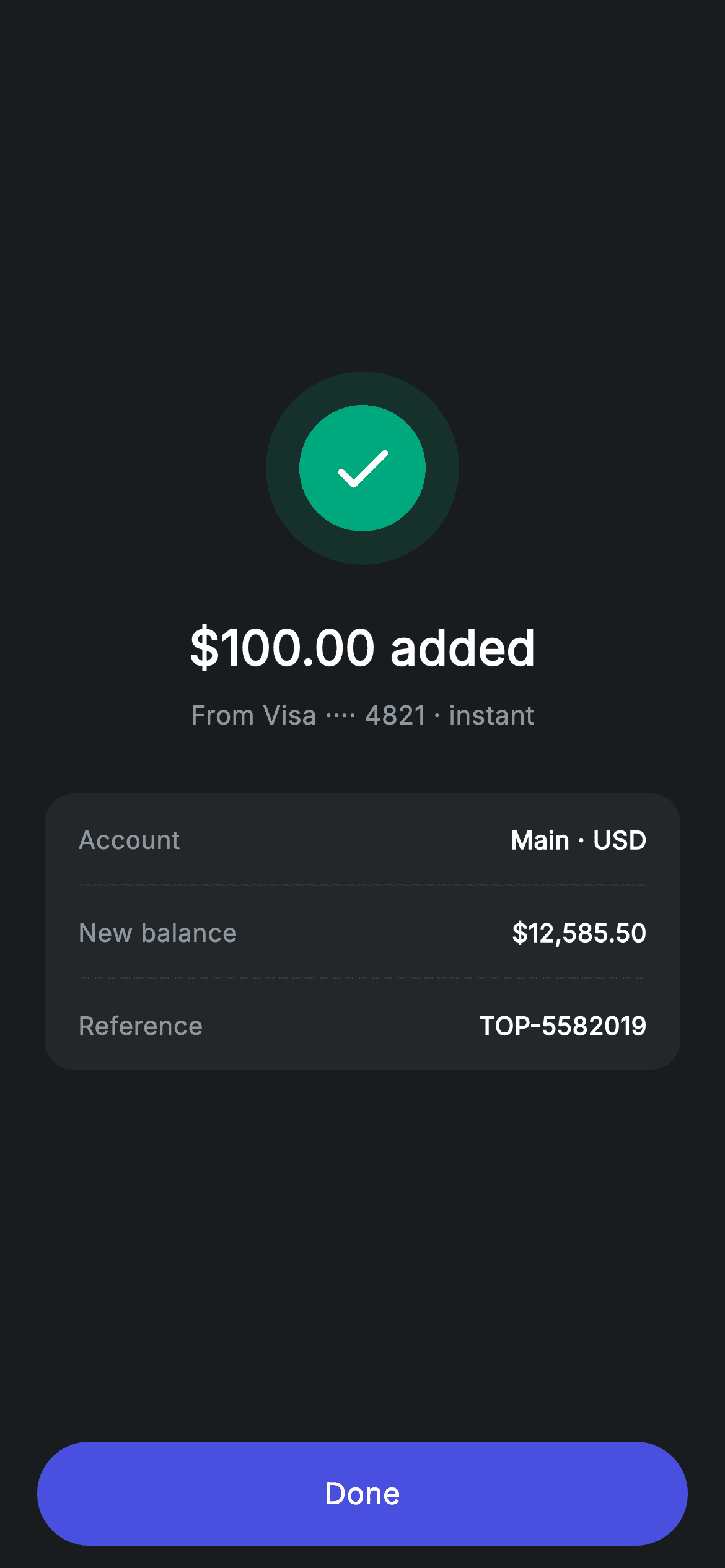
A payment confirmation that only says 'success' leaves people checking their balance elsewhere. This tutorial builds a Revolut-style top-up confirmation in Flutter — a two-ring teal check badge, the amount added, the funding source, and a card stating the destination account, the new balance and a reference number. At 171 lines it's the shortest screen in this fintech set, and it shows how a concentric badge and a flush-divider card are built with no packages at all.
Watch the Flutter UI walkthrough
A short screen recording of Top-up Success running, if you'd rather see it before you read the code. The written tutorial below covers everything in it.
Can't see the video? Watch it on YouTube.
What you'll build
- ✓A concentric success badge made from a tinted outer circle wrapping a solid inner one
- ✓A confirmation card that reports the resulting balance, not just that the payment worked
- ✓A reference number row so the transaction can be quoted to support later
- ✓A centred layout that stays balanced above a pinned Done button using a single Expanded
Step-by-step build
Create the file
Add a new file at lib/fintech_topup_success/fintech_topup_success_screen.dart in your Flutter project.
Register the bundled fonts
No external packages — this is pure Flutter. It does bundle its design font (Inter), so drop the font file into fonts/ and declare it in pubspec.yaml:
flutter:
  fonts:
    - family: Inter
      fonts:
- asset: fonts/Inter-Regular.ttfBuild it, piece by piece
Here's how the screen goes together. Each block below is a real slice of the code with a plain-English explanation — paste them in order, or grab the whole file from the next section.
A stateless confirmation and its palette
import 'package:flutter/material.dart';

/// Top-up success — money added confirmation (Revolut-inspired design system).
///
/// Self-contained per CONVENTIONS.md: pure Flutter only, the exact design font
/// (Inter) is bundled under `fonts/`, the badge is painted (no emoji/network),
/// and the screen forces its own dark theme. The new balance makes the
/// confirmation feel complete.
class FintechTopupSuccessScreen extends StatelessWidget {
  const FintechTopupSuccessScreen({super.key, this.onDone});

  final VoidCallback? onDone;

  static const String _font = 'Inter';
  static const Color _bg = Color(0xFF191C1F);
  static const Color _surface = Color(0xFF242729);
  static const Color _brand = Color(0xFF494FDF);
  static const Color _teal = Color(0xFF00A87E);
  static const Color _muted = Color(0xFF8D969E);
  static const Color _hairline = Color(0xFF2E3235);
This is as simple as a screen gets: a StatelessWidget with one `onDone` callback. Nothing here can change, so there's no state, no controllers and no dispose. The palette is a trimmed version of the shared fintech dark set — `_bg`, `_surface`, `_hairline` for structure, `_brand` indigo for the button, `_teal` for the success badge and `_muted` for captions. Six tokens is all a confirmation needs, and leaving out the unused red and amber keeps it obvious that nothing on this screen represents a failure state.
The centred confirmation stack
  @override
  Widget build(BuildContext context) {
    return Theme(
      data: ThemeData.dark(useMaterial3: true),
      child: Scaffold(
        backgroundColor: _bg,
        body: SafeArea(
          child: Column(
            children: <Widget>[
              Expanded(
                child: Padding(
                  padding: const EdgeInsets.symmetric(horizontal: 24),
                  child: Column(
                    mainAxisAlignment: MainAxisAlignment.center,
                    children: <Widget>[
                      _buildBadge(),
                      const SizedBox(height: 26),
                      const Text(
                        r'$100.00 added',
                        style: TextStyle(
                          fontFamily: _font,
                          fontSize: 26,
                          fontWeight: FontWeight.w600,
                          letterSpacing: 0.24,
                          color: Colors.white,
                        ),
                      ),
                      const SizedBox(height: 8),
                      const Text(
                        'From Visa ···· 4821 · instant',
                        style: TextStyle(
                          fontFamily: _font,
                          fontSize: 14,
                          letterSpacing: 0.24,
                          color: _muted,
                        ),
                      ),
                      const SizedBox(height: 32),
                      _buildBalanceCard(),
                    ],
                  ),
                ),
              ),
              _buildButton(),
            ],
          ),
        ),
      ),
    );
  }
The body is a Column of one `Expanded` and the pinned button. Inside the Expanded, `mainAxisAlignment: MainAxisAlignment.center` floats the whole group vertically, so it stays balanced on a small phone and a tall one alike without any measurement. The order is deliberate: badge, then the amount at 26px w600, then the source line, then the card. Note the amount is written as `r'$100.00 added'` — the raw-string prefix stops Dart trying to interpolate the `$`, which would otherwise be a compile error, and it's why every money literal in this fintech set carries an `r`. The subtitle 'From Visa ···· 4821 · instant' packs the source and the speed into one muted line.
The concentric success badge
  Widget _buildBadge() {
    return Container(
      width: 104,
      height: 104,
      decoration: BoxDecoration(
        color: _teal.withValues(alpha: 0.14),
        shape: BoxShape.circle,
      ),
      child: Center(
        child: Container(
          width: 68,
          height: 68,
          decoration: const BoxDecoration(color: _teal, shape: BoxShape.circle),
          child: const Icon(Icons.check_rounded, size: 38, color: Colors.white),
        ),
      ),
    );
  }
The badge is two nested circles rather than one, and the nesting is what gives it depth without a shadow or a painter. The outer 104px circle is filled `_teal.withValues(alpha: 0.14)` — a faint wash that reads as a glow on the dark background. Centred inside it, a solid 68px `_teal` circle carries a 38px white check. Because the outer ring is the same hue at low opacity, the two read as one object lit from within, and the whole thing is two Containers and an Icon: no CustomPainter needed for a badge this simple.
The balance and reference card
  Widget _buildBalanceCard() {
    return Container(
      padding: const EdgeInsets.symmetric(horizontal: 18),
      decoration: BoxDecoration(
        color: _surface,
        borderRadius: BorderRadius.circular(16),
      ),
      child: Column(
        children: <Widget>[
          _row('Account', 'Main · USD'),
          const Divider(height: 1, color: _hairline),
          _row('New balance', r'$12,585.50', valueColor: Colors.white),
          const Divider(height: 1, color: _hairline),
          _row('Reference', 'TOP-5582019'),
        ],
      ),
    );
  }

  Widget _row(String label, String value, {Color? valueColor}) {
    return Padding(
      padding: const EdgeInsets.symmetric(vertical: 15),
      child: Row(
        mainAxisAlignment: MainAxisAlignment.spaceBetween,
        children: <Widget>[
          Text(
            label,
            style: const TextStyle(
              fontFamily: _font,
              fontSize: 13.5,
              letterSpacing: 0.24,
              color: _muted,
            ),
          ),
          Text(
            value,
            style: TextStyle(
              fontFamily: _font,
              fontSize: 13.5,
              fontWeight: FontWeight.w600,
              letterSpacing: 0.24,
              color: valueColor ?? Colors.white,
            ),
          ),
        ],
      ),
    );
  }
The card sets only horizontal padding, so each `_row` supplies its own 15px vertical inset and a `Divider(height: 1)` between rows occupies exactly one pixel with no extra spacing. The three rows are chosen carefully: the account confirms *where* the money landed, the new balance is the number people would otherwise leave the screen to check, and the reference gives them something to quote if it ever needs chasing. `_row` takes an optional `valueColor`, though the new-balance row passes `Colors.white`, which is already the default — a harmless redundancy that makes the intent explicit at the call site if you later tint the other rows.
The pinned Done button
  Widget _buildButton() {
    return Padding(
      padding: const EdgeInsets.fromLTRB(20, 0, 20, 12),
      child: SizedBox(
        width: double.infinity,
        height: 56,
        child: Material(
          color: _brand,
          borderRadius: BorderRadius.circular(9999),
          child: InkWell(
            borderRadius: BorderRadius.circular(9999),
            onTap: onDone,
            child: const Center(
              child: Text(
                'Done',
                style: TextStyle(
                  fontFamily: _font,
                  fontSize: 16,
                  fontWeight: FontWeight.w500,
                  letterSpacing: 0.24,
                  color: Colors.white,
                ),
              ),
            ),
          ),
        ),
      ),
    );
  }
The button lives outside the Expanded so it sits at the bottom regardless of how tall the content above is. It's built from Material plus InkWell rather than a FilledButton, with `BorderRadius.circular(9999)` on both — a radius deliberately far larger than half the 56px height, the common shorthand for 'as round as possible' that stays correct if the height changes. Passing the radius to the InkWell as well as the Material is what clips the ripple to the pill; without it the splash would spread into the square bounds. A single 'Done' is the right label here: a confirmation screen with two competing actions makes people hesitate over a transaction that has already completed.
Full code
The complete, ready-to-paste source. Free to use in your projects — one click copies it all.
import 'package:flutter/material.dart';

/// Top-up success — money added confirmation (Revolut-inspired design system).
///
/// Self-contained per CONVENTIONS.md: pure Flutter only, the exact design font
/// (Inter) is bundled under `fonts/`, the badge is painted (no emoji/network),
/// and the screen forces its own dark theme. The new balance makes the
/// confirmation feel complete.
class FintechTopupSuccessScreen extends StatelessWidget {
  const FintechTopupSuccessScreen({super.key, this.onDone});

  final VoidCallback? onDone;

  static const String _font = 'Inter';
  static const Color _bg = Color(0xFF191C1F);
  static const Color _surface = Color(0xFF242729);
  static const Color _brand = Color(0xFF494FDF);
  static const Color _teal = Color(0xFF00A87E);
  static const Color _muted = Color(0xFF8D969E);
  static const Color _hairline = Color(0xFF2E3235);

  @override
  Widget build(BuildContext context) {
    return Theme(
      data: ThemeData.dark(useMaterial3: true),
      child: Scaffold(
        backgroundColor: _bg,
        body: SafeArea(
          child: Column(
            children: <Widget>[
              Expanded(
                child: Padding(
                  padding: const EdgeInsets.symmetric(horizontal: 24),
                  child: Column(
                    mainAxisAlignment: MainAxisAlignment.center,
                    children: <Widget>[
                      _buildBadge(),
                      const SizedBox(height: 26),
                      const Text(
                        r'$100.00 added',
                        style: TextStyle(
                          fontFamily: _font,
                          fontSize: 26,
                          fontWeight: FontWeight.w600,
                          letterSpacing: 0.24,
                          color: Colors.white,
                        ),
                      ),
                      const SizedBox(height: 8),
                      const Text(
                        'From Visa ···· 4821 · instant',
                        style: TextStyle(
                          fontFamily: _font,
                          fontSize: 14,
                          letterSpacing: 0.24,
                          color: _muted,
                        ),
                      ),
                      const SizedBox(height: 32),
                      _buildBalanceCard(),
                    ],
                  ),
                ),
              ),
              _buildButton(),
            ],
          ),
        ),
      ),
    );
  }

  Widget _buildBadge() {
    return Container(
      width: 104,
      height: 104,
      decoration: BoxDecoration(
        color: _teal.withValues(alpha: 0.14),
        shape: BoxShape.circle,
      ),
      child: Center(
        child: Container(
          width: 68,
          height: 68,
          decoration: const BoxDecoration(color: _teal, shape: BoxShape.circle),
          child: const Icon(Icons.check_rounded, size: 38, color: Colors.white),
        ),
      ),
    );
  }

  Widget _buildBalanceCard() {
    return Container(
      padding: const EdgeInsets.symmetric(horizontal: 18),
      decoration: BoxDecoration(
        color: _surface,
        borderRadius: BorderRadius.circular(16),
      ),
      child: Column(
        children: <Widget>[
          _row('Account', 'Main · USD'),
          const Divider(height: 1, color: _hairline),
          _row('New balance', r'$12,585.50', valueColor: Colors.white),
          const Divider(height: 1, color: _hairline),
          _row('Reference', 'TOP-5582019'),
        ],
      ),
    );
  }

  Widget _row(String label, String value, {Color? valueColor}) {
    return Padding(
      padding: const EdgeInsets.symmetric(vertical: 15),
      child: Row(
        mainAxisAlignment: MainAxisAlignment.spaceBetween,
        children: <Widget>[
          Text(
            label,
            style: const TextStyle(
              fontFamily: _font,
              fontSize: 13.5,
              letterSpacing: 0.24,
              color: _muted,
            ),
          ),
          Text(
            value,
            style: TextStyle(
              fontFamily: _font,
              fontSize: 13.5,
              fontWeight: FontWeight.w600,
              letterSpacing: 0.24,
              color: valueColor ?? Colors.white,
            ),
          ),
        ],
      ),
    );
  }

  Widget _buildButton() {
    return Padding(
      padding: const EdgeInsets.fromLTRB(20, 0, 20, 12),
      child: SizedBox(
        width: double.infinity,
        height: 56,
        child: Material(
          color: _brand,
          borderRadius: BorderRadius.circular(9999),
          child: InkWell(
            borderRadius: BorderRadius.circular(9999),
            onTap: onDone,
            child: const Center(
              child: Text(
                'Done',
                style: TextStyle(
                  fontFamily: _font,
                  fontSize: 16,
                  fontWeight: FontWeight.w500,
                  letterSpacing: 0.24,
                  color: Colors.white,
                ),
              ),
            ),
          ),
        ),
      ),
    );
  }
}
Plus bundled 1 binary asset (fonts/images). The CLI and MCP install those for you automatically.
Two faster ways to add it
Copy-paste works, but you can skip it entirely.
1. FlutterKit CLI
One command drops this screen — and its fonts — straight into your project.
$ flutterkit add fintech-topup-success2. AI agent (MCP)
Connect FlutterKit's MCP server in Claude or Cursor and just ask your agent to install fintech-topup-success — it fetches and writes the files for you.
FAQ
Is this Flutter top-up success screen free to use?
Yes. The complete Dart source on this page is free for personal and commercial projects. Copy it directly, install it with the FlutterKit CLI (flutterkit add fintech-topup-success), or have an AI agent add it for you over MCP.
How do I pass real values in instead of the hard-coded strings?
Every figure is a literal so the screen runs standalone. Add constructor fields for the amount, the source description, the account label, the new balance and the reference, then interpolate them — remembering to keep the `\$` escaped or the currency symbol will be read as an interpolation. `_row` already takes its label and value as arguments, so only the two build methods change.
Should the back gesture be blocked on a confirmation screen?
Usually yes — swiping back from a success screen can land the user on the amount-entry step they just completed, which invites a duplicate top-up. Wrap the Scaffold in a `PopScope` with `canPop: false` (it's built into Flutter, no package needed) and let the Done button do the navigating, replacing the route rather than pushing onto it.
Which Flutter version does it target?
It uses Color.withValues() and super parameters, so Flutter 3.22+ (Dart 3). On an older SDK, change the single withValues(alpha: 0.14) call on the badge's outer circle to withOpacity(0.14). The only bundled asset is the Inter font, registered in pubspec.yaml as shown in step 2.


