How to Build a Top-Up Amount Screen with a Numpad in Flutter (Full Code + Preview)
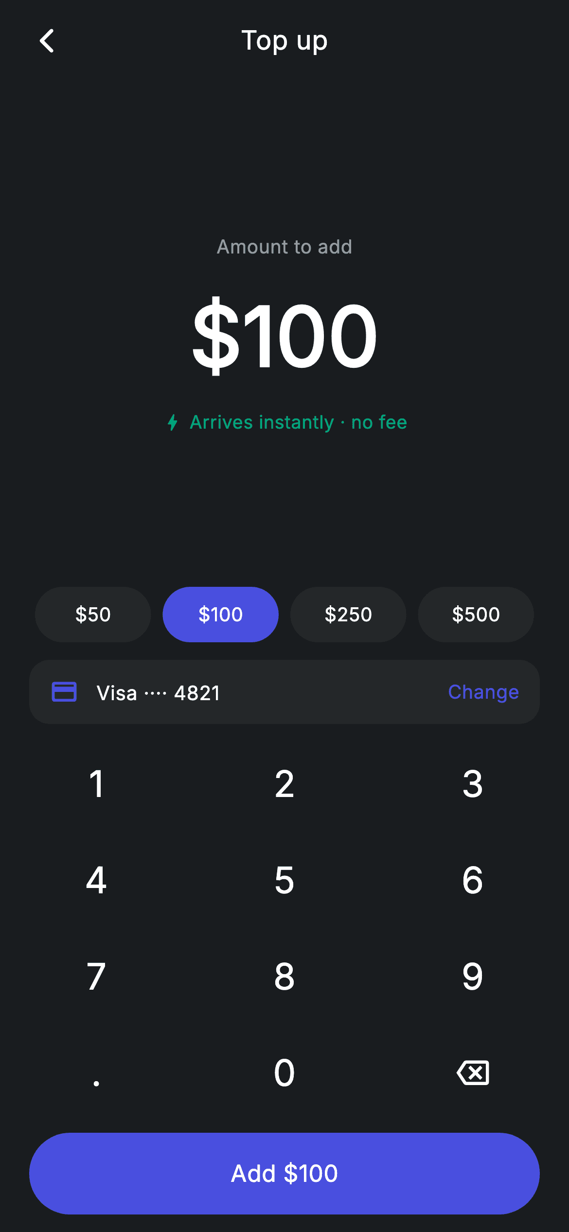
Adding money to a wallet is a three-decision screen: how much, from where, and confirm. This tutorial builds it in Flutter with a 56px live amount, four quick-amount chips that *stay highlighted* when they match the current value, a linked-card source row, and a custom numpad. The CTA is the detail worth copying — its label is `'Add \$$_amount'`, so the button restates the exact figure the user is committing to and updates on every keypress.
Watch the Flutter UI walkthrough
A short screen recording of Top-up Card running, if you'd rather see it before you read the code. The written tutorial below covers everything in it.
Can't see the video? Watch it on YouTube.
What you'll build
- ✓A large `FittedBox` amount that shrinks instead of overflowing as digits are added
- ✓Quick-amount chips that light up when the typed amount matches them
- ✓A funding-source row using `Spacer()` to push an inline 'Change' action right
- ✓A CTA whose label reads back the live amount — 'Add \$100', not just 'Continue'
- ✓A numpad reducer enforcing one decimal point, two decimals and a 7-character cap
- ✓A teal 'Arrives instantly · no fee' reassurance line under the amount
Step-by-step build
Create the file
Add a new file at lib/fintech_topup_card/fintech_topup_card_screen.dart in your Flutter project.
Register the bundled fonts
No external packages — this is pure Flutter. It does bundle its design font (Inter), so drop the font file into fonts/ and declare it in pubspec.yaml:
flutter:
  fonts:
    - family: Inter
      fonts:
- asset: fonts/Inter-Regular.ttfBuild it, piece by piece
Here's how the screen goes together. Each block below is a real slice of the code with a plain-English explanation — paste them in order, or grab the whole file from the next section.
One string of state and a defensive parse
class _FintechTopupCardScreenState extends State<FintechTopupCardScreen> {
  static const String _font = 'Inter';
  static const Color _bg = Color(0xFF191C1F);
  static const Color _surface = Color(0xFF242729);
  static const Color _brand = Color(0xFF494FDF);
  static const Color _teal = Color(0xFF00A87E);
  static const Color _muted = Color(0xFF8D969E);

  String _amount = '100';

  double get _val => double.tryParse(_amount) ?? 0;

  void _onKey(String key) {
    setState(() {
      switch (key) {
        case '⌫':
          _amount = _amount.length <= 1 ? '0' : _amount.substring(0, _amount.length - 1);
        case '.':
          if (!_amount.contains('.')) _amount = '$_amount.';
        default:
          if (_amount == '0') {
            _amount = key;
          } else if (_amount.length < 7) {
            final int dot = _amount.indexOf('.');
            if (dot == -1 || _amount.length - dot <= 2) _amount = '$_amount$key';
          }
      }
    });
  }
`String _amount = '100'` is the whole model, with `double get _val => double.tryParse(_amount) ?? 0` deriving the number. Keeping the amount as text is what lets the display show the half-finished '100.' a user passes through while typing; `tryParse` returning null for that string is exactly why the `?? 0` fallback exists. `_onKey` then reduces keypresses over that string: backspace floors at `'0'` so the field never blanks, `'.'` is ignored when a dot already exists, and the default branch replaces a leading zero, caps the length at 7, and refuses a third digit after the decimal via `_amount.length - dot <= 2`. All validation, no `TextEditingController`.
Stacking amount, chips, source and numpad
  @override
  Widget build(BuildContext context) {
    return Theme(
      data: ThemeData.dark(useMaterial3: true),
      child: Scaffold(
        backgroundColor: _bg,
        body: SafeArea(
          child: Column(
            children: <Widget>[
              _buildAppBar(),
              Expanded(child: _buildAmount()),
              _buildQuick(),
              const SizedBox(height: 12),
              _buildCard(),
              const SizedBox(height: 8),
              _Numpad(onKey: _onKey),
              const SizedBox(height: 8),
              _buildButton(),
            ],
          ),
        ),
      ),
    );
  }
The body is a single `Column` read top to bottom: app bar, then `Expanded(child: _buildAmount())` which absorbs all the leftover height and vertically centres the figure, then the quick chips, the linked card, the numpad, and the CTA. Only the amount is `Expanded`, so on a small phone it's the amount block that compresses while the numpad keys keep their full 56px height — the right trade-off, since a shrunken key is much worse to hit than a slightly tighter headline.
The live amount and its reassurance line
  Widget _buildAmount() {
    return Center(
      child: Column(
        mainAxisAlignment: MainAxisAlignment.center,
        mainAxisSize: MainAxisSize.min,
        children: <Widget>[
          const Text(
            'Amount to add',
            style: TextStyle(
              fontFamily: _font,
              fontSize: 13,
              letterSpacing: 0.24,
              color: _muted,
            ),
          ),
          const SizedBox(height: 12),
          FittedBox(
            fit: BoxFit.scaleDown,
            child: Text(
              '\$$_amount',
              style: const TextStyle(
                fontFamily: _font,
                fontSize: 56,
                fontWeight: FontWeight.w600,
                letterSpacing: 0.24,
                color: Colors.white,
              ),
            ),
          ),
          const SizedBox(height: 10),
          Row(
            mainAxisSize: MainAxisSize.min,
            children: const <Widget>[
              Icon(Icons.bolt_rounded, size: 15, color: _teal),
              SizedBox(width: 4),
              Text(
                'Arrives instantly · no fee',
                style: TextStyle(
                  fontFamily: _font,
                  fontSize: 12.5,
                  letterSpacing: 0.24,
                  color: _teal,
                ),
              ),
            ],
          ),
        ],
      ),
    );
  }
`FittedBox(fit: BoxFit.scaleDown)` wraps the 56px `'\$$_amount'` text: `scaleDown` only ever shrinks, never enlarges, so short amounts stay at full size and a seven-digit amount quietly scales to fit rather than throwing an overflow. Beneath it, a `Row` with `mainAxisSize: MainAxisSize.min` centres the `bolt_rounded` icon and 'Arrives instantly · no fee' as a unit — without `min`, the row would stretch full width and the pair would drift apart. Rendering that line in `_teal` rather than muted grey is what makes it read as a benefit rather than fine print.
Quick chips that reflect the current amount
  Widget _buildQuick() {
    return Padding(
      padding: const EdgeInsets.symmetric(horizontal: 20),
      child: Row(
        children: <Widget>[
          for (final String v in <String>['50', '100', '250', '500'])
            Expanded(
              child: Padding(
                padding: const EdgeInsets.symmetric(horizontal: 4),
                child: GestureDetector(
                  onTap: () => setState(() => _amount = v),
                  child: Container(
                    height: 38,
                    alignment: Alignment.center,
                    decoration: BoxDecoration(
                      color: _amount == v ? _brand : _surface,
                      borderRadius: BorderRadius.circular(9999),
                    ),
                    child: Text(
                      '\$$v',
                      style: const TextStyle(
                        fontFamily: _font,
                        fontSize: 13,
                        fontWeight: FontWeight.w500,
                        letterSpacing: 0.24,
                        color: Colors.white,
                      ),
                    ),
                  ),
                ),
              ),
            ),
        ],
      ),
    );
  }
Four chips are generated by a collection-for over `['50', '100', '250', '500']`, each `Expanded` with 4px of side padding so they split the width evenly. The line that matters is `color: _amount == v ? _brand : _surface` — the chip compares itself against the live amount rather than tracking its own selected flag. Type 100 on the numpad and the \$100 chip lights up on its own; press backspace and it goes dark again. Because the comparison is on the *string*, '100.' won't match '100' — a small quirk that keeps the highlight honest about what's actually in the field.
Funding source and the self-labelling CTA
  Widget _buildCard() {
    return Padding(
      padding: const EdgeInsets.symmetric(horizontal: 20),
      child: Container(
        padding: const EdgeInsets.symmetric(horizontal: 14, vertical: 12),
        decoration: BoxDecoration(
          color: _surface,
          borderRadius: BorderRadius.circular(14),
        ),
        child: Row(
          children: const <Widget>[
            Icon(Icons.credit_card_rounded, size: 20, color: _brand),
            SizedBox(width: 12),
            Text(
              'Visa ···· 4821',
              style: TextStyle(
                fontFamily: _font,
                fontSize: 13.5,
                fontWeight: FontWeight.w500,
                letterSpacing: 0.24,
                color: Colors.white,
              ),
            ),
            Spacer(),
            Text(
              'Change',
              style: TextStyle(
                fontFamily: _font,
                fontSize: 13,
                fontWeight: FontWeight.w500,
                letterSpacing: 0.24,
                color: _brand,
              ),
            ),
          ],
        ),
      ),
    );
  }

  Widget _buildButton() {
    final bool valid = _val > 0;
    return Padding(
      padding: const EdgeInsets.fromLTRB(20, 0, 20, 12),
      child: SizedBox(
        width: double.infinity,
        height: 56,
        child: Material(
          color: valid ? _brand : _surface,
          borderRadius: BorderRadius.circular(9999),
          child: InkWell(
            borderRadius: BorderRadius.circular(9999),
            onTap: valid ? widget.onAdd : null,
            child: Center(
              child: Text(
                'Add \$$_amount',
                style: TextStyle(
                  fontFamily: _font,
                  fontSize: 16,
                  fontWeight: FontWeight.w500,
                  letterSpacing: 0.24,
                  color: valid ? Colors.white : _muted,
                ),
              ),
            ),
          ),
        ),
      ),
    );
  }
The source row is a `Row` of `const` children with a `Spacer()` between the card label and the brand-coloured 'Change' text — `Spacer` is the cheapest way to pin one item left and one right without an `Expanded` wrapper. The CTA computes `final bool valid = _val > 0` and applies it three ways: the `Material` colour falls back to `_surface`, the label to `_muted`, and `onTap` becomes `null`, which is what genuinely disables the `InkWell` (ripple included) rather than just greying it. Its label is built from the live value — `'Add \$$_amount'` — so the button always restates the exact commitment.
The numpad widget
class _Numpad extends StatelessWidget {
  const _Numpad({required this.onKey});

  final ValueChanged<String> onKey;

  static const List<List<String>> _rows = <List<String>>[
    <String>['1', '2', '3'],
    <String>['4', '5', '6'],
    <String>['7', '8', '9'],
    <String>['.', '0', '⌫'],
  ];

  @override
  Widget build(BuildContext context) {
    return Padding(
      padding: const EdgeInsets.symmetric(horizontal: 32),
      child: Column(
        mainAxisSize: MainAxisSize.min,
        children: <Widget>[
          for (final List<String> row in _rows)
            Padding(
              padding: const EdgeInsets.symmetric(vertical: 5),
              child: Row(
                mainAxisAlignment: MainAxisAlignment.spaceBetween,
                children: <Widget>[
                  for (final String key in row)
                    GestureDetector(
                      onTap: () => onKey(key),
                      behavior: HitTestBehavior.opaque,
                      child: Container(
                        width: 68,
                        height: 56,
                        alignment: Alignment.center,
                        child: key == '⌫'
                            ? const Icon(Icons.backspace_outlined,
                                size: 22, color: Colors.white)
                            : Text(
                                key,
                                style: const TextStyle(
                                  fontFamily: _FintechTopupCardScreenState._font,
                                  fontSize: 25,
                                  fontWeight: FontWeight.w500,
                                  letterSpacing: 0.24,
                                  color: Colors.white,
                                ),
                              ),
                      ),
                    ),
                ],
              ),
            ),
        ],
      ),
    );
  }
}
`_Numpad` is stateless and knows nothing about money: it takes a `ValueChanged<String> onKey` and reports which key was pressed, leaving all interpretation to the parent's `_onKey`. Its layout is a `const List<List<String>>` walked by nested collection-fors, with `MainAxisAlignment.spaceBetween` spreading each row's three keys. Every key is a fixed 68×56 `GestureDetector` with `HitTestBehavior.opaque`, so the full rectangle is tappable rather than just the glyph. The backspace key travels as the '⌫' character but renders as `Icons.backspace_outlined`, keeping the data model plain strings.
Full code
The complete, ready-to-paste source. Free to use in your projects — one click copies it all.
import 'package:flutter/material.dart';

/// Top up via card — enter an amount to add from a linked card (Revolut-style).
///
/// Self-contained per CONVENTIONS.md: pure Flutter only, the exact design font
/// (Inter) is bundled under `fonts/`, no network/emoji images, and the screen
/// forces its own dark theme. The numpad drives the amount; quick chips jump to
/// common values and the linked card is shown as the source.
class FintechTopupCardScreen extends StatefulWidget {
  const FintechTopupCardScreen({super.key, this.onBack, this.onAdd});

  final VoidCallback? onBack;
  final VoidCallback? onAdd;

  @override
  State<FintechTopupCardScreen> createState() => _FintechTopupCardScreenState();
}

class _FintechTopupCardScreenState extends State<FintechTopupCardScreen> {
  static const String _font = 'Inter';
  static const Color _bg = Color(0xFF191C1F);
  static const Color _surface = Color(0xFF242729);
  static const Color _brand = Color(0xFF494FDF);
  static const Color _teal = Color(0xFF00A87E);
  static const Color _muted = Color(0xFF8D969E);

  String _amount = '100';

  double get _val => double.tryParse(_amount) ?? 0;

  void _onKey(String key) {
    setState(() {
      switch (key) {
        case '⌫':
          _amount = _amount.length <= 1 ? '0' : _amount.substring(0, _amount.length - 1);
        case '.':
          if (!_amount.contains('.')) _amount = '$_amount.';
        default:
          if (_amount == '0') {
            _amount = key;
          } else if (_amount.length < 7) {
            final int dot = _amount.indexOf('.');
            if (dot == -1 || _amount.length - dot <= 2) _amount = '$_amount$key';
          }
      }
    });
  }

  @override
  Widget build(BuildContext context) {
    return Theme(
      data: ThemeData.dark(useMaterial3: true),
      child: Scaffold(
        backgroundColor: _bg,
        body: SafeArea(
          child: Column(
            children: <Widget>[
              _buildAppBar(),
              Expanded(child: _buildAmount()),
              _buildQuick(),
              const SizedBox(height: 12),
              _buildCard(),
              const SizedBox(height: 8),
              _Numpad(onKey: _onKey),
              const SizedBox(height: 8),
              _buildButton(),
            ],
          ),
        ),
      ),
    );
  }

  Widget _buildAppBar() {
    return Padding(
      padding: const EdgeInsets.fromLTRB(8, 4, 8, 4),
      child: Row(
        children: <Widget>[
          IconButton(
            onPressed: widget.onBack,
            icon: const Icon(Icons.arrow_back_ios_new_rounded,
                size: 20, color: Colors.white),
          ),
          const Expanded(
            child: Text(
              'Top up',
              textAlign: TextAlign.center,
              style: TextStyle(
                fontFamily: _font,
                fontSize: 18,
                fontWeight: FontWeight.w500,
                letterSpacing: 0.24,
                color: Colors.white,
              ),
            ),
          ),
          const SizedBox(width: 48),
        ],
      ),
    );
  }

  Widget _buildAmount() {
    return Center(
      child: Column(
        mainAxisAlignment: MainAxisAlignment.center,
        mainAxisSize: MainAxisSize.min,
        children: <Widget>[
          const Text(
            'Amount to add',
            style: TextStyle(
              fontFamily: _font,
              fontSize: 13,
              letterSpacing: 0.24,
              color: _muted,
            ),
          ),
          const SizedBox(height: 12),
          FittedBox(
            fit: BoxFit.scaleDown,
            child: Text(
              '\$$_amount',
              style: const TextStyle(
                fontFamily: _font,
                fontSize: 56,
                fontWeight: FontWeight.w600,
                letterSpacing: 0.24,
                color: Colors.white,
              ),
            ),
          ),
          const SizedBox(height: 10),
          Row(
            mainAxisSize: MainAxisSize.min,
            children: const <Widget>[
              Icon(Icons.bolt_rounded, size: 15, color: _teal),
              SizedBox(width: 4),
              Text(
                'Arrives instantly · no fee',
                style: TextStyle(
                  fontFamily: _font,
                  fontSize: 12.5,
                  letterSpacing: 0.24,
                  color: _teal,
                ),
              ),
            ],
          ),
        ],
      ),
    );
  }

  Widget _buildQuick() {
    return Padding(
      padding: const EdgeInsets.symmetric(horizontal: 20),
      child: Row(
        children: <Widget>[
          for (final String v in <String>['50', '100', '250', '500'])
            Expanded(
              child: Padding(
                padding: const EdgeInsets.symmetric(horizontal: 4),
                child: GestureDetector(
                  onTap: () => setState(() => _amount = v),
                  child: Container(
                    height: 38,
                    alignment: Alignment.center,
                    decoration: BoxDecoration(
                      color: _amount == v ? _brand : _surface,
                      borderRadius: BorderRadius.circular(9999),
                    ),
                    child: Text(
                      '\$$v',
                      style: const TextStyle(
                        fontFamily: _font,
                        fontSize: 13,
                        fontWeight: FontWeight.w500,
                        letterSpacing: 0.24,
                        color: Colors.white,
                      ),
                    ),
                  ),
                ),
              ),
            ),
        ],
      ),
    );
  }

  Widget _buildCard() {
    return Padding(
      padding: const EdgeInsets.symmetric(horizontal: 20),
      child: Container(
        padding: const EdgeInsets.symmetric(horizontal: 14, vertical: 12),
        decoration: BoxDecoration(
          color: _surface,
          borderRadius: BorderRadius.circular(14),
        ),
        child: Row(
          children: const <Widget>[
            Icon(Icons.credit_card_rounded, size: 20, color: _brand),
            SizedBox(width: 12),
            Text(
              'Visa ···· 4821',
              style: TextStyle(
                fontFamily: _font,
                fontSize: 13.5,
                fontWeight: FontWeight.w500,
                letterSpacing: 0.24,
                color: Colors.white,
              ),
            ),
            Spacer(),
            Text(
              'Change',
              style: TextStyle(
                fontFamily: _font,
                fontSize: 13,
                fontWeight: FontWeight.w500,
                letterSpacing: 0.24,
                color: _brand,
              ),
            ),
          ],
        ),
      ),
    );
  }

  Widget _buildButton() {
    final bool valid = _val > 0;
    return Padding(
      padding: const EdgeInsets.fromLTRB(20, 0, 20, 12),
      child: SizedBox(
        width: double.infinity,
        height: 56,
        child: Material(
          color: valid ? _brand : _surface,
          borderRadius: BorderRadius.circular(9999),
          child: InkWell(
            borderRadius: BorderRadius.circular(9999),
            onTap: valid ? widget.onAdd : null,
            child: Center(
              child: Text(
                'Add \$$_amount',
                style: TextStyle(
                  fontFamily: _font,
                  fontSize: 16,
                  fontWeight: FontWeight.w500,
                  letterSpacing: 0.24,
                  color: valid ? Colors.white : _muted,
                ),
              ),
            ),
          ),
        ),
      ),
    );
  }
}

class _Numpad extends StatelessWidget {
  const _Numpad({required this.onKey});

  final ValueChanged<String> onKey;

  static const List<List<String>> _rows = <List<String>>[
    <String>['1', '2', '3'],
    <String>['4', '5', '6'],
    <String>['7', '8', '9'],
    <String>['.', '0', '⌫'],
  ];

  @override
  Widget build(BuildContext context) {
    return Padding(
      padding: const EdgeInsets.symmetric(horizontal: 32),
      child: Column(
        mainAxisSize: MainAxisSize.min,
        children: <Widget>[
          for (final List<String> row in _rows)
            Padding(
              padding: const EdgeInsets.symmetric(vertical: 5),
              child: Row(
                mainAxisAlignment: MainAxisAlignment.spaceBetween,
                children: <Widget>[
                  for (final String key in row)
                    GestureDetector(
                      onTap: () => onKey(key),
                      behavior: HitTestBehavior.opaque,
                      child: Container(
                        width: 68,
                        height: 56,
                        alignment: Alignment.center,
                        child: key == '⌫'
                            ? const Icon(Icons.backspace_outlined,
                                size: 22, color: Colors.white)
                            : Text(
                                key,
                                style: const TextStyle(
                                  fontFamily: _FintechTopupCardScreenState._font,
                                  fontSize: 25,
                                  fontWeight: FontWeight.w500,
                                  letterSpacing: 0.24,
                                  color: Colors.white,
                                ),
                              ),
                      ),
                    ),
                ],
              ),
            ),
        ],
      ),
    );
  }
}
Plus bundled 1 binary asset (fonts/images). The CLI and MCP install those for you automatically.
Two faster ways to add it
Copy-paste works, but you can skip it entirely.
1. FlutterKit CLI
One command drops this screen — and its fonts — straight into your project.
$ flutterkit add fintech-topup-card2. AI agent (MCP)
Connect FlutterKit's MCP server in Claude or Cursor and just ask your agent to install fintech-topup-card — it fetches and writes the files for you.
FAQ
Is this top-up screen free to use?
Yes. The complete Dart source on this page is free for personal and commercial projects. Copy it from the code block, install it with the FlutterKit CLI (flutterkit add fintech-topup-card), or add it through an AI agent over MCP.
How do I add a minimum or maximum top-up amount?
Both live in one place. Change valid in _buildButton to something like _val >= 5 && _val <= 2000, and the button will disable itself outside that range. Add a muted hint line under the amount reading the same bounds so the user knows why.
Can I let the user pick a different card?
Yes — the source row is already shaped for it. Wrap _buildCard's Container in a GestureDetector or InkWell, show a modal bottom sheet of saved cards, and store the chosen one in state alongside _amount. The 'Change' label is the affordance users will tap.
Does it need any packages?
No. It's pure Flutter on the material library with no third-party dependencies. The only asset is the bundled Inter font family, registered in pubspec.yaml — the CLI and MCP install it automatically.
Which Flutter version does it target?
It uses break-less switch cases (Dart 3), super parameters and Material 3, so target Flutter 3.19+. There are no colour-API calls needing withValues in this screen, so nothing else needs changing on slightly older SDKs beyond adding break to the switch.


