How to Build a Bank Transfer Details Screen in Flutter (Full Code + Preview)
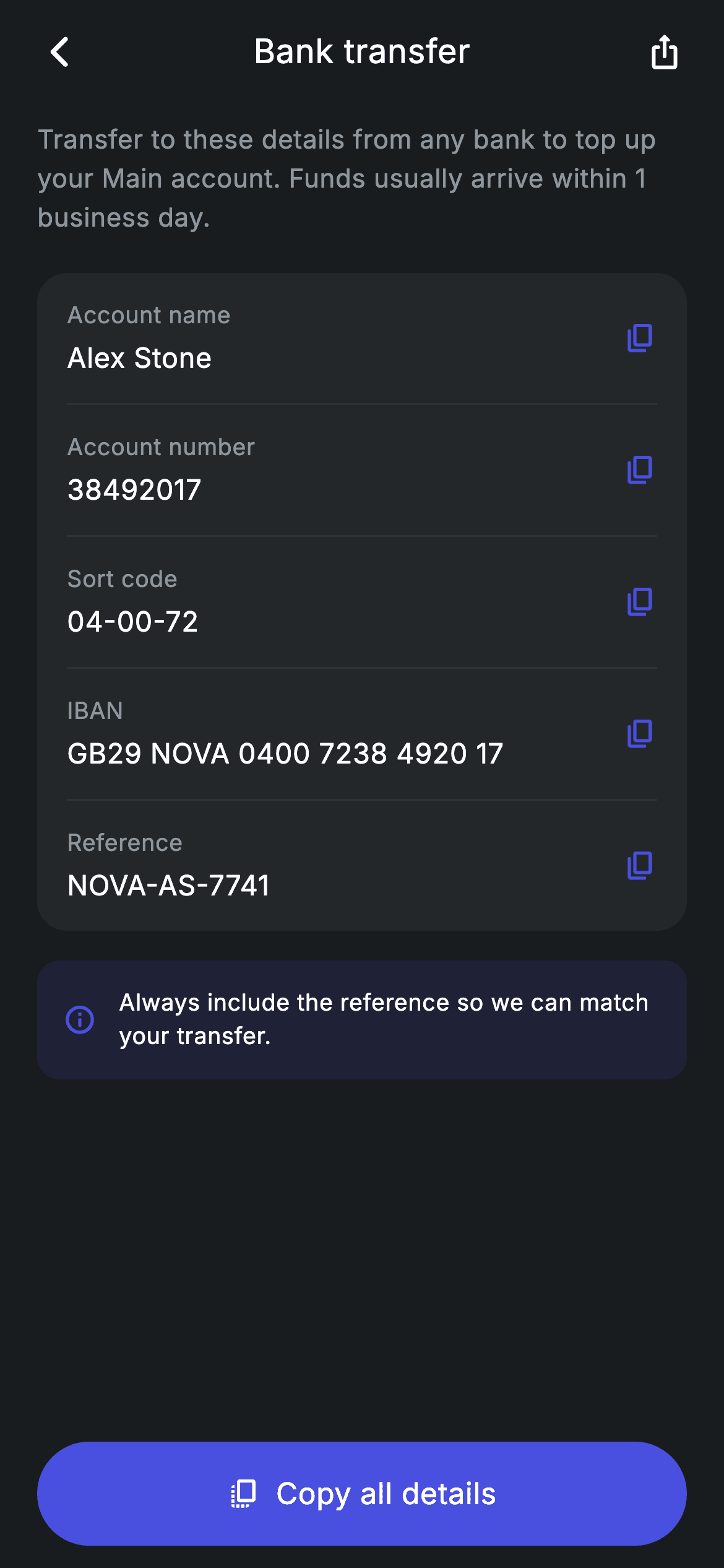
This screen exists to be copied from, which changes every design decision on it. This tutorial builds Nova's transfer-in details page in Flutter: five account fields driven from a nested String list, each row carrying its own copy icon and stacking a small grey label above a larger white value, a tinted note explaining why the reference matters, and a Copy all details button that grabs the lot in one press. The label-above-value stacking is what makes an IBAN readable without truncating.
Watch the Flutter UI walkthrough
A short screen recording of Top-up Bank Details running, if you'd rather see it before you read the code. The written tutorial below covers everything in it.
Can't see the video? Watch it on YouTube.
What you'll build
- ✓Five detail rows generated from a List<List<String>> with dividers placed by the loop
- ✓A stacked label-and-value layout that lets a long IBAN wrap instead of truncating
- ✓A tinted advisory note built from the brand colour at 12% alpha with no border
- ✓A Copy all button with an icon and label centred together inside the pill
Step-by-step build
Create the file
Add a new file at lib/fintech_topup_bank_details/fintech_topup_bank_details_screen.dart in your Flutter project.
Register the bundled fonts
No external packages — this is pure Flutter. It does bundle its design font (Inter), so drop the font file into fonts/ and declare it in pubspec.yaml:
flutter:
  fonts:
    - family: Inter
      fonts:
- asset: fonts/Inter-Regular.ttfBuild it, piece by piece
Here's how the screen goes together. Each block below is a real slice of the code with a plain-English explanation — paste them in order, or grab the whole file from the next section.
The bank details as a nested list
import 'package:flutter/material.dart';

/// Top up — bank transfer-in details (Revolut-inspired design system).
///
/// Self-contained per CONVENTIONS.md: pure Flutter only, the exact design font
/// (Inter) is bundled under `fonts/`, no network/emoji images, and the screen
/// forces its own dark theme. Each detail row has a copy affordance; a note
/// explains how to use the reference.
class FintechTopupBankDetailsScreen extends StatelessWidget {
  const FintechTopupBankDetailsScreen({super.key, this.onBack, this.onDone});

  final VoidCallback? onBack;
  final VoidCallback? onDone;

  static const String _font = 'Inter';
  static const Color _bg = Color(0xFF191C1F);
  static const Color _surface = Color(0xFF242729);
  static const Color _brand = Color(0xFF494FDF);
  static const Color _muted = Color(0xFF8D969E);
  static const Color _hairline = Color(0xFF2E3235);

  static const List<List<String>> _rows = <List<String>>[
    <String>['Account name', 'Alex Stone'],
    <String>['Account number', '38492017'],
    <String>['Sort code', '04-00-72'],
    <String>['IBAN', 'GB29 NOVA 0400 7238 4920 17'],
    <String>['Reference', 'NOVA-AS-7741'],
  ];
The five fields live in a `static const List<List<String>>`, each inner list a `[label, value]` pair. It is the simplest structure that keeps content out of the layout — adding a BIC or a bank address later is one line, not a new widget. A record or small class would be more expressive, but for a fixed pair of strings the nested list keeps the file short. The screen is stateless with `onBack` and `onDone` callbacks, and the palette is the app's usual dark set.
Generating rows and their dividers in one loop
  @override
  Widget build(BuildContext context) {
    return Theme(
      data: ThemeData.dark(useMaterial3: true),
      child: Scaffold(
        backgroundColor: _bg,
        body: SafeArea(
          child: Column(
            children: <Widget>[
              _buildAppBar(),
              Expanded(
                child: ListView(
                  physics: const BouncingScrollPhysics(),
                  padding: const EdgeInsets.fromLTRB(20, 8, 20, 24),
                  children: <Widget>[
                    _buildIntro(),
                    const SizedBox(height: 20),
                    Container(
                      padding: const EdgeInsets.symmetric(horizontal: 16),
                      decoration: BoxDecoration(
                        color: _surface,
                        borderRadius: BorderRadius.circular(16),
                      ),
                      child: Column(
                        children: <Widget>[
                          for (int i = 0; i < _rows.length; i++) ...<Widget>[
                            if (i != 0)
                              const Divider(height: 1, color: _hairline),
                            _DetailRow(
                              label: _rows[i][0],
                              value: _rows[i][1],
                            ),
                          ],
                        ],
                      ),
                    ),
                    const SizedBox(height: 16),
                    _buildNote(),
                  ],
                ),
              ),
              _buildButton(),
            ],
          ),
        ),
      ),
    );
  }
The details card is built by a collection-for that emits *two* widgets per iteration using a spread: `for (int i = 0; i < _rows.length; i++) ...<Widget>[if (i != 0) const Divider(...), _DetailRow(...)]`. The `if (i != 0)` guard is what prevents a stray line above the first row, and the spread is what lets a single loop iteration contribute both the separator and the row. This pattern replaces the usual hand-written alternation of Row, Divider, Row, Divider that breaks as soon as you reorder anything. The card wraps it all with horizontal padding only, leaving the vertical rhythm to each row, and the whole thing sits in a `ListView` so a longer detail set scrolls.
An app bar with a share action
  Widget _buildAppBar() {
    return Padding(
      padding: const EdgeInsets.fromLTRB(8, 4, 8, 4),
      child: Row(
        children: <Widget>[
          IconButton(
            onPressed: onBack,
            icon: const Icon(Icons.arrow_back_ios_new_rounded,
                size: 20, color: Colors.white),
          ),
          const Expanded(
            child: Text(
              'Bank transfer',
              textAlign: TextAlign.center,
              style: TextStyle(
                fontFamily: _font,
                fontSize: 18,
                fontWeight: FontWeight.w500,
                letterSpacing: 0.24,
                color: Colors.white,
              ),
            ),
          ),
          IconButton(
            onPressed: () {},
            icon: const Icon(Icons.ios_share_rounded,
                size: 20, color: Colors.white),
          ),
        ],
      ),
    );
  }
The bar is the app's usual Row but with a real `IconButton` on the right instead of the balancing `SizedBox(width: 48)` used elsewhere — because both sides now hold an icon of the same width, the `Expanded` title still centres correctly with no counterweight needed. The share icon belongs here specifically: people frequently need these details on a laptop or inside a banking app on another device, and a share sheet is the fastest route off the phone. Below it, `_buildIntro` sets expectations in two sentences at `height: 1.5` in `_muted`, including the arrival time, which is the single most common support question about a transfer.
The advisory note
  Widget _buildIntro() {
    return const Text(
      'Transfer to these details from any bank to top up your Main account. '
      'Funds usually arrive within 1 business day.',
      style: TextStyle(
        fontFamily: _font,
        fontSize: 14,
        height: 1.5,
        letterSpacing: 0.24,
        color: _muted,
      ),
    );
  }

  Widget _buildNote() {
    return Container(
      padding: const EdgeInsets.all(14),
      decoration: BoxDecoration(
        color: _brand.withValues(alpha: 0.12),
        borderRadius: BorderRadius.circular(12),
      ),
      child: Row(
        children: const <Widget>[
          Icon(Icons.info_outline_rounded, size: 18, color: _brand),
          SizedBox(width: 12),
          Expanded(
            child: Text(
              'Always include the reference so we can match your transfer.',
              style: TextStyle(
                fontFamily: _font,
                fontSize: 12.5,
                height: 1.4,
                letterSpacing: 0.24,
                color: Colors.white,
              ),
            ),
          ),
        ],
      ),
    );
  }
`_buildNote` is styled differently from every card above it: no `_surface` fill and no border, but `_brand.withValues(alpha: 0.12)` with the icon in full `_brand` and the text in plain white. A tinted panel rather than a bordered one reads as a highlight instead of another data card, which is right for the one line on the page that changes whether the transfer actually works. Its message — always include the reference — is the failure mode that generates support tickets, so it is worth the visual weight. The text sits in an `Expanded` so it wraps at `height: 1.4` rather than overflowing beside the icon.
Copy all, with an icon inside the pill
  Widget _buildButton() {
    return Padding(
      padding: const EdgeInsets.fromLTRB(20, 0, 20, 12),
      child: SizedBox(
        width: double.infinity,
        height: 56,
        child: Material(
          color: _brand,
          borderRadius: BorderRadius.circular(9999),
          child: InkWell(
            borderRadius: BorderRadius.circular(9999),
            onTap: onDone,
            child: Row(
              mainAxisAlignment: MainAxisAlignment.center,
              children: const <Widget>[
                Icon(Icons.copy_all_rounded, size: 18, color: Colors.white),
                SizedBox(width: 8),
                Text(
                  'Copy all details',
                  style: TextStyle(
                    fontFamily: _font,
                    fontSize: 16,
                    fontWeight: FontWeight.w500,
                    letterSpacing: 0.24,
                    color: Colors.white,
                  ),
                ),
              ],
            ),
          ),
        ),
      ),
    );
  }
Unlike the other pill buttons in this app, this one holds a Row rather than a single `Center(child: Text(...))`. Setting `mainAxisAlignment: MainAxisAlignment.center` on that Row with an 8px gap between the `copy_all_rounded` icon and the label centres the pair as a unit, which is the correct way to put a glyph next to button text — using a `Spacer` or `spaceBetween` would pin them to the edges instead. The label promises 'all details', matching the reality that someone pasting into a bank form needs every field, not the one row they happened to tap.
The stacked detail row
class _DetailRow extends StatelessWidget {
  const _DetailRow({required this.label, required this.value});

  final String label;
  final String value;

  @override
  Widget build(BuildContext context) {
    return Padding(
      padding: const EdgeInsets.symmetric(vertical: 14),
      child: Row(
        children: <Widget>[
          Expanded(
            child: Column(
              crossAxisAlignment: CrossAxisAlignment.start,
              children: <Widget>[
                Text(
                  label,
                  style: const TextStyle(
                    fontFamily: FintechTopupBankDetailsScreen._font,
                    fontSize: 12.5,
                    letterSpacing: 0.24,
                    color: FintechTopupBankDetailsScreen._muted,
                  ),
                ),
                const SizedBox(height: 3),
                Text(
                  value,
                  style: const TextStyle(
                    fontFamily: FintechTopupBankDetailsScreen._font,
                    fontSize: 15,
                    fontWeight: FontWeight.w500,
                    letterSpacing: 0.24,
                    color: Colors.white,
                  ),
                ),
              ],
            ),
          ),
          const SizedBox(width: 12),
          const Icon(Icons.copy_rounded,
              size: 18, color: FintechTopupBankDetailsScreen._brand),
        ],
      ),
    );
  }
`_DetailRow` is a private `StatelessWidget` that stacks its label above its value — 12.5px `_muted` on top, 15px white `w500` below — rather than putting them on one line. That vertical arrangement is the reason the IBAN works: a label-left/value-right row would leave a 28-character IBAN competing for half the width and force truncation, while stacking gives the value the full column and lets it wrap. The whole text block sits in `Expanded` with a fixed 12px gap before the `copy_rounded` icon in `_brand`, so the icon holds its position however long the value runs. The row reaches into `FintechTopupBankDetailsScreen._font` and the colour constants directly, which works because both classes live in the same library file.
Full code
The complete, ready-to-paste source. Free to use in your projects — one click copies it all.
import 'package:flutter/material.dart';

/// Top up — bank transfer-in details (Revolut-inspired design system).
///
/// Self-contained per CONVENTIONS.md: pure Flutter only, the exact design font
/// (Inter) is bundled under `fonts/`, no network/emoji images, and the screen
/// forces its own dark theme. Each detail row has a copy affordance; a note
/// explains how to use the reference.
class FintechTopupBankDetailsScreen extends StatelessWidget {
  const FintechTopupBankDetailsScreen({super.key, this.onBack, this.onDone});

  final VoidCallback? onBack;
  final VoidCallback? onDone;

  static const String _font = 'Inter';
  static const Color _bg = Color(0xFF191C1F);
  static const Color _surface = Color(0xFF242729);
  static const Color _brand = Color(0xFF494FDF);
  static const Color _muted = Color(0xFF8D969E);
  static const Color _hairline = Color(0xFF2E3235);

  static const List<List<String>> _rows = <List<String>>[
    <String>['Account name', 'Alex Stone'],
    <String>['Account number', '38492017'],
    <String>['Sort code', '04-00-72'],
    <String>['IBAN', 'GB29 NOVA 0400 7238 4920 17'],
    <String>['Reference', 'NOVA-AS-7741'],
  ];

  @override
  Widget build(BuildContext context) {
    return Theme(
      data: ThemeData.dark(useMaterial3: true),
      child: Scaffold(
        backgroundColor: _bg,
        body: SafeArea(
          child: Column(
            children: <Widget>[
              _buildAppBar(),
              Expanded(
                child: ListView(
                  physics: const BouncingScrollPhysics(),
                  padding: const EdgeInsets.fromLTRB(20, 8, 20, 24),
                  children: <Widget>[
                    _buildIntro(),
                    const SizedBox(height: 20),
                    Container(
                      padding: const EdgeInsets.symmetric(horizontal: 16),
                      decoration: BoxDecoration(
                        color: _surface,
                        borderRadius: BorderRadius.circular(16),
                      ),
                      child: Column(
                        children: <Widget>[
                          for (int i = 0; i < _rows.length; i++) ...<Widget>[
                            if (i != 0)
                              const Divider(height: 1, color: _hairline),
                            _DetailRow(
                              label: _rows[i][0],
                              value: _rows[i][1],
                            ),
                          ],
                        ],
                      ),
                    ),
                    const SizedBox(height: 16),
                    _buildNote(),
                  ],
                ),
              ),
              _buildButton(),
            ],
          ),
        ),
      ),
    );
  }

  Widget _buildAppBar() {
    return Padding(
      padding: const EdgeInsets.fromLTRB(8, 4, 8, 4),
      child: Row(
        children: <Widget>[
          IconButton(
            onPressed: onBack,
            icon: const Icon(Icons.arrow_back_ios_new_rounded,
                size: 20, color: Colors.white),
          ),
          const Expanded(
            child: Text(
              'Bank transfer',
              textAlign: TextAlign.center,
              style: TextStyle(
                fontFamily: _font,
                fontSize: 18,
                fontWeight: FontWeight.w500,
                letterSpacing: 0.24,
                color: Colors.white,
              ),
            ),
          ),
          IconButton(
            onPressed: () {},
            icon: const Icon(Icons.ios_share_rounded,
                size: 20, color: Colors.white),
          ),
        ],
      ),
    );
  }

  Widget _buildIntro() {
    return const Text(
      'Transfer to these details from any bank to top up your Main account. '
      'Funds usually arrive within 1 business day.',
      style: TextStyle(
        fontFamily: _font,
        fontSize: 14,
        height: 1.5,
        letterSpacing: 0.24,
        color: _muted,
      ),
    );
  }

  Widget _buildNote() {
    return Container(
      padding: const EdgeInsets.all(14),
      decoration: BoxDecoration(
        color: _brand.withValues(alpha: 0.12),
        borderRadius: BorderRadius.circular(12),
      ),
      child: Row(
        children: const <Widget>[
          Icon(Icons.info_outline_rounded, size: 18, color: _brand),
          SizedBox(width: 12),
          Expanded(
            child: Text(
              'Always include the reference so we can match your transfer.',
              style: TextStyle(
                fontFamily: _font,
                fontSize: 12.5,
                height: 1.4,
                letterSpacing: 0.24,
                color: Colors.white,
              ),
            ),
          ),
        ],
      ),
    );
  }

  Widget _buildButton() {
    return Padding(
      padding: const EdgeInsets.fromLTRB(20, 0, 20, 12),
      child: SizedBox(
        width: double.infinity,
        height: 56,
        child: Material(
          color: _brand,
          borderRadius: BorderRadius.circular(9999),
          child: InkWell(
            borderRadius: BorderRadius.circular(9999),
            onTap: onDone,
            child: Row(
              mainAxisAlignment: MainAxisAlignment.center,
              children: const <Widget>[
                Icon(Icons.copy_all_rounded, size: 18, color: Colors.white),
                SizedBox(width: 8),
                Text(
                  'Copy all details',
                  style: TextStyle(
                    fontFamily: _font,
                    fontSize: 16,
                    fontWeight: FontWeight.w500,
                    letterSpacing: 0.24,
                    color: Colors.white,
                  ),
                ),
              ],
            ),
          ),
        ),
      ),
    );
  }
}

class _DetailRow extends StatelessWidget {
  const _DetailRow({required this.label, required this.value});

  final String label;
  final String value;

  @override
  Widget build(BuildContext context) {
    return Padding(
      padding: const EdgeInsets.symmetric(vertical: 14),
      child: Row(
        children: <Widget>[
          Expanded(
            child: Column(
              crossAxisAlignment: CrossAxisAlignment.start,
              children: <Widget>[
                Text(
                  label,
                  style: const TextStyle(
                    fontFamily: FintechTopupBankDetailsScreen._font,
                    fontSize: 12.5,
                    letterSpacing: 0.24,
                    color: FintechTopupBankDetailsScreen._muted,
                  ),
                ),
                const SizedBox(height: 3),
                Text(
                  value,
                  style: const TextStyle(
                    fontFamily: FintechTopupBankDetailsScreen._font,
                    fontSize: 15,
                    fontWeight: FontWeight.w500,
                    letterSpacing: 0.24,
                    color: Colors.white,
                  ),
                ),
              ],
            ),
          ),
          const SizedBox(width: 12),
          const Icon(Icons.copy_rounded,
              size: 18, color: FintechTopupBankDetailsScreen._brand),
        ],
      ),
    );
  }
}
Plus bundled 1 binary asset (fonts/images). The CLI and MCP install those for you automatically.
Two faster ways to add it
Copy-paste works, but you can skip it entirely.
1. FlutterKit CLI
One command drops this screen — and its fonts — straight into your project.
$ flutterkit add fintech-topup-bank-details2. AI agent (MCP)
Connect FlutterKit's MCP server in Claude or Cursor and just ask your agent to install fintech-topup-bank-details — it fetches and writes the files for you.
FAQ
Is this bank details screen free to use commercially?
Yes — the whole of FlutterKit is free and stays that way. Grab this screen from the code block, through the CLI, or via MCP in your editor, and ship it inside a real banking or wallet app. No key, no sign-up, no attribution line.
Do the copy icons actually copy to the clipboard?
Not yet — they are the affordance, and no handler is wired. Add `import 'package:flutter/services.dart';` and wrap each icon in a `GestureDetector` calling `Clipboard.setData(ClipboardData(text: value))`, then show a SnackBar. Do the same in `onDone` for the Copy all button, joining the rows into one string.
Why is the label stacked above the value instead of beside it?
Because of the IBAN. A label-left/value-right row splits the width in half, and a 28-character IBAN would truncate in that space. Stacking gives the value the full column width so it wraps cleanly, and the same layout then works for every shorter field too.
How do I add another field, such as a BIC?
Add one entry to `_rows` — `<String>['BIC', 'NOVAGB21']`. The loop generates the row and its divider automatically, and the `if (i != 0)` guard keeps the separators correct wherever you insert it. No layout code changes.
Which Flutter version does this need?
Flutter 3.22 or newer, because the note panel uses `Color.withValues(alpha: 0.12)`. On an older SDK swap that for `withOpacity(0.12)` and expand the constructor to `const FintechTopupBankDetailsScreen({Key? key, this.onBack, this.onDone}) : super(key: key);`.


