How to Build a Support Chat Screen in Flutter (Full Code + Preview)
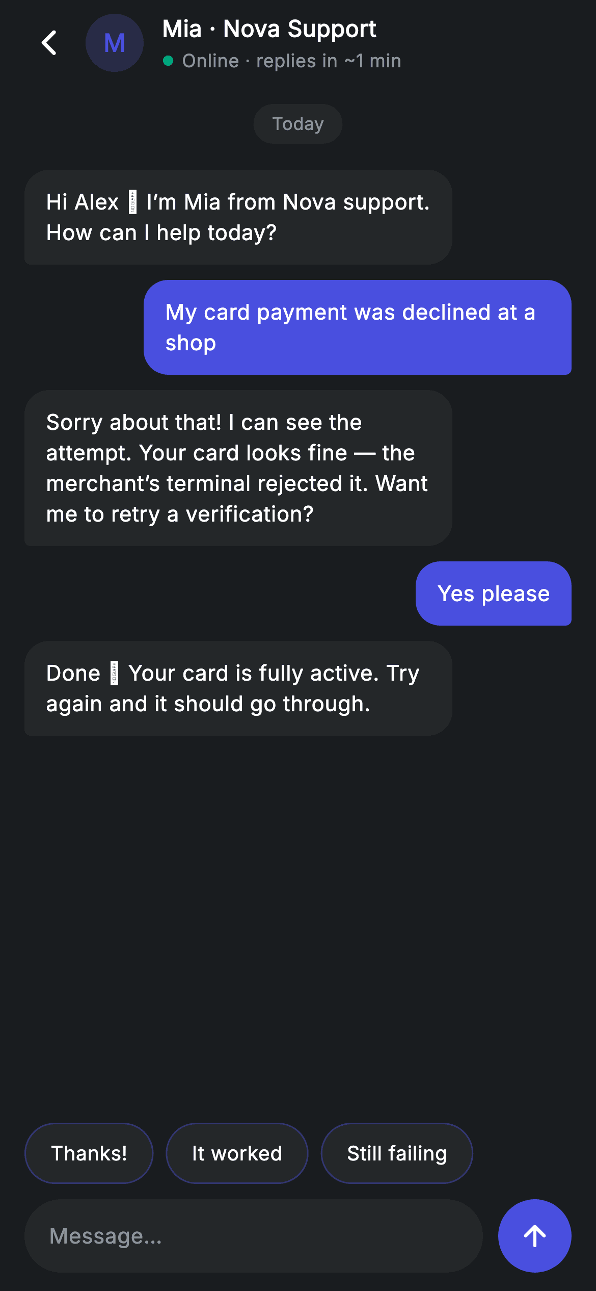
Chat bubbles look simple until you build them: they have to hug short messages, wrap long ones without touching the screen edge, align left or right by sender, and point at their author with an asymmetric corner. This screen solves all four with one `_Bubble` widget — `Flexible` plus a `maxWidth` constraint for the sizing, `MainAxisAlignment` for the side, and a `BorderRadius.only` whose two bottom corners flip on a boolean. Around it sit an agent header with a presence dot, quick-reply chips, and an input bar.
Watch the Flutter UI walkthrough
A short screen recording of Support Chat running, if you'd rather see it before you read the code. The written tutorial below covers everything in it.
Can't see the video? Watch it on YouTube.
What you'll build
- ✓Chat bubbles that hug short text, wrap long text, and cap at 280px
- ✓A tail corner that flips sides — 4px bottom-right for you, 4px bottom-left for the agent
- ✓An agent header with a monogram avatar, a teal presence dot, and a response-time line
- ✓A horizontally scrolling quick-reply row with outlined pills
- ✓A centred day chip separating the conversation by date
Step-by-step build
Create the file
Add a new file at lib/fintech_support_chat/fintech_support_chat_screen.dart in your Flutter project.
Register the bundled fonts
No external packages — this is pure Flutter. It does bundle its design font (Inter), so drop the font file into fonts/ and declare it in pubspec.yaml:
flutter:
  fonts:
    - family: Inter
      fonts:
- asset: fonts/Inter-Regular.ttfBuild it, piece by piece
Here's how the screen goes together. Each block below is a real slice of the code with a plain-English explanation — paste them in order, or grab the whole file from the next section.
Messages as a list of pairs
class FintechSupportChatScreen extends StatelessWidget {
  const FintechSupportChatScreen({super.key, this.onBack});

  final VoidCallback? onBack;

  static const String _font = 'Inter';
  static const Color _bg = Color(0xFF191C1F);
  static const Color _surface = Color(0xFF242729);
  static const Color _brand = Color(0xFF494FDF);
  static const Color _teal = Color(0xFF00A87E);
  static const Color _muted = Color(0xFF8D969E);

  static const List<List<dynamic>> _messages = <List<dynamic>>[
    <dynamic>[false, 'Hi Alex 👋 I’m Mia from Nova support. How can I help today?'],
    <dynamic>[true, 'My card payment was declined at a shop'],
    <dynamic>[false, 'Sorry about that! I can see the attempt. Your card '
        'looks fine — the merchant’s terminal rejected it. Want me to retry a '
        'verification?'],
    <dynamic>[true, 'Yes please'],
    <dynamic>[false, 'Done ✅ Your card is fully active. Try again and it '
        'should go through.'],
  ];
The transcript is stored as a `List<List<dynamic>>`, each entry a `[bool fromUser, String text]` pair — a compact literal that keeps a demo transcript readable inline. Note the trade-off: `dynamic` means the builder has to cast with `m[0] as bool` and `m[1] as String`, and a typo would only surface at runtime. In production you'd promote this to a small `_Message` class with named fields, exactly like the other screens in this set do. Worth keeping either way is the shape of the conversation itself — greeting, problem, diagnosis, confirmation, resolution — which is what makes the screenshot read as a real support thread rather than lorem ipsum.
The three-part chat shell
  @override
  Widget build(BuildContext context) {
    return Theme(
      data: ThemeData.dark(useMaterial3: true),
      child: Scaffold(
        backgroundColor: _bg,
        body: SafeArea(
          child: Column(
            children: <Widget>[
              _buildAppBar(),
              Expanded(
                child: ListView(
                  physics: const BouncingScrollPhysics(),
                  padding: const EdgeInsets.fromLTRB(16, 12, 16, 12),
                  children: <Widget>[
                    const _DayChip(label: 'Today'),
                    for (final List<dynamic> m in _messages)
                      _Bubble(fromUser: m[0] as bool, text: m[1] as String),
                  ],
                ),
              ),
              _buildQuickReplies(),
              _buildInput(),
            ],
          ),
        ),
      ),
    );
  }
A `Column` of app bar, `Expanded` message list, quick replies, and input bar. Keeping the last two outside the scroll view is what pins them above the keyboard while the transcript scrolls behind. The `_DayChip` is emitted as the first child, then a collection-for walks the messages. One thing a production build would add here: a `ScrollController` with `reverse: true` (or an auto-scroll to the bottom on new messages), since a real chat should open at the most recent line rather than the oldest.
The agent header
  Widget _buildAppBar() {
    return Padding(
      padding: const EdgeInsets.fromLTRB(8, 4, 16, 4),
      child: Row(
        children: <Widget>[
          IconButton(
            onPressed: onBack,
            icon: const Icon(Icons.arrow_back_ios_new_rounded,
                size: 20, color: Colors.white),
          ),
          Container(
            width: 38,
            height: 38,
            alignment: Alignment.center,
            decoration: BoxDecoration(
              color: _brand.withValues(alpha: 0.22),
              shape: BoxShape.circle,
            ),
            child: const Text('M',
                style: TextStyle(
                  fontFamily: _font,
                  fontSize: 16,
                  fontWeight: FontWeight.w600,
                  color: _brand,
                )),
          ),
          const SizedBox(width: 12),
          const Expanded(
            child: Column(
              crossAxisAlignment: CrossAxisAlignment.start,
              children: <Widget>[
                Text(
                  'Mia · Nova Support',
                  style: TextStyle(
                    fontFamily: _font,
                    fontSize: 15,
                    fontWeight: FontWeight.w600,
                    letterSpacing: 0.24,
                    color: Colors.white,
                  ),
                ),
                SizedBox(height: 2),
                Row(
                  children: <Widget>[
                    Icon(Icons.circle, size: 8, color: _teal),
                    SizedBox(width: 5),
                    Text(
                      'Online · replies in ~1 min',
                      style: TextStyle(
                        fontFamily: _font,
                        fontSize: 12,
                        letterSpacing: 0.24,
                        color: _muted,
                      ),
                    ),
                  ],
                ),
              ],
            ),
          ),
        ],
      ),
    );
  }
The avatar is a 38px circle filled `_brand.withValues(alpha: 0.22)` with a single 'M' at full brand strength — a monogram that needs no image asset and no network request, and renders identically in screenshot tests. Beside it, two lines do a lot of reassurance work: the agent's name and org, then a presence row pairing an 8px teal `Icons.circle` with 'Online · replies in ~1 min'. Setting an expectation about response time is the single most useful thing a support header can say, and it costs two widgets. The text column is `Expanded` so long agent names truncate rather than overflow.
Quick-reply chips
  Widget _buildQuickReplies() {
    return SizedBox(
      height: 40,
      child: ListView(
        scrollDirection: Axis.horizontal,
        padding: const EdgeInsets.symmetric(horizontal: 16),
        physics: const BouncingScrollPhysics(),
        children: <Widget>[
          for (final String q in <String>['Thanks!', 'It worked', 'Still failing'])
            Padding(
              padding: const EdgeInsets.only(right: 8),
              child: Container(
                alignment: Alignment.center,
                padding: const EdgeInsets.symmetric(horizontal: 16),
                decoration: BoxDecoration(
                  color: _surface,
                  borderRadius: BorderRadius.circular(9999),
                  border: Border.all(color: _brand.withValues(alpha: 0.4)),
                ),
                child: Text(
                  q,
                  style: const TextStyle(
                    fontFamily: _font,
                    fontSize: 13,
                    fontWeight: FontWeight.w500,
                    letterSpacing: 0.24,
                    color: Colors.white,
                  ),
                ),
              ),
            ),
        ],
      ),
    );
  }
A 40px-tall `SizedBox` bounds a horizontal `ListView` — a horizontal list always needs a bounded height from its parent. The chips are outlined rather than filled: `_surface` background with a `_brand.withValues(alpha: 0.4)` border, a half-strength accent that marks them as tappable suggestions without competing with the send button. Each chip carries its own `EdgeInsets.only(right: 8)` rather than using a separator, which is fine here because the trailing gap doubles as the list's end padding. The three canned replies map to the likely outcomes of the conversation above, which is what makes them feel generated rather than generic.
The input bar
  Widget _buildInput() {
    return Padding(
      padding: const EdgeInsets.fromLTRB(16, 10, 16, 12),
      child: Row(
        children: <Widget>[
          Expanded(
            child: Container(
              height: 48,
              padding: const EdgeInsets.symmetric(horizontal: 16),
              decoration: BoxDecoration(
                color: _surface,
                borderRadius: BorderRadius.circular(9999),
              ),
              child: const Align(
                alignment: Alignment.centerLeft,
                child: Text(
                  'Message…',
                  style: TextStyle(
                    fontFamily: _font,
                    fontSize: 14,
                    letterSpacing: 0.24,
                    color: _muted,
                  ),
                ),
              ),
            ),
          ),
          const SizedBox(width: 10),
          Container(
            width: 48,
            height: 48,
            decoration: const BoxDecoration(
              color: _brand,
              shape: BoxShape.circle,
            ),
            child: const Icon(Icons.arrow_upward_rounded,
                size: 22, color: Colors.white),
          ),
        ],
      ),
    );
  }
The field is presentational — an `Align(centerLeft)` holding placeholder text inside a pill-shaped `_surface` container, not a real `TextField`. That's a deliberate choice for a preview screen (see the FAQ for making it live), and the container is already sized and padded to accept one. Next to it, a 48×48 brand circle with `arrow_upward_rounded` is the send button; an upward arrow rather than a paper plane is the current convention for chat and assistant inputs. The field is `Expanded` and the button fixed, so the layout holds at any width.
The bubble: sizing, side, and tail
class _Bubble extends StatelessWidget {
  const _Bubble({required this.fromUser, required this.text});

  final bool fromUser;
  final String text;

  @override
  Widget build(BuildContext context) {
    return Padding(
      padding: const EdgeInsets.symmetric(vertical: 5),
      child: Row(
        mainAxisAlignment:
            fromUser ? MainAxisAlignment.end : MainAxisAlignment.start,
        children: <Widget>[
          Flexible(
            child: Container(
              padding: const EdgeInsets.symmetric(horizontal: 14, vertical: 11),
              constraints: const BoxConstraints(maxWidth: 280),
              decoration: BoxDecoration(
                color: fromUser
                    ? FintechSupportChatScreen._brand
                    : FintechSupportChatScreen._surface,
                borderRadius: BorderRadius.only(
                  topLeft: const Radius.circular(16),
                  topRight: const Radius.circular(16),
                  bottomLeft: Radius.circular(fromUser ? 16 : 4),
                  bottomRight: Radius.circular(fromUser ? 4 : 16),
                ),
              ),
              child: Text(
                text,
                style: const TextStyle(
                  fontFamily: FintechSupportChatScreen._font,
                  fontSize: 14,
                  height: 1.4,
                  letterSpacing: 0.24,
                  color: Colors.white,
                ),
              ),
            ),
          ),
        ],
      ),
    );
  }
}
Three mechanisms, each doing one job. Sizing: `Flexible` lets the bubble shrink to its text, while `constraints: BoxConstraints(maxWidth: 280)` stops a long message spanning the full screen — together they produce the hug-short/wrap-long behaviour, and neither works alone. Side: `mainAxisAlignment` is `end` for the user and `start` for the agent, which is what pushes each bubble to its author's edge. Tail: `BorderRadius.only` keeps both top corners at 16px and flips the bottom pair — `bottomLeft: fromUser ? 16 : 4` and `bottomRight: fromUser ? 4 : 16` — so the squared-off corner always points down toward its sender. The fill follows the same boolean, brand indigo for you and `_surface` for the agent, and `height: 1.4` on the text keeps multi-line messages readable.
Full code
The complete, ready-to-paste source. Free to use in your projects — one click copies it all.
import 'package:flutter/material.dart';

/// Support chat — live chat with an agent (Revolut-inspired design system).
///
/// Self-contained per CONVENTIONS.md: pure Flutter only, the exact design font
/// (Inter) is bundled under `fonts/`, the agent avatar is a painted monogram (no
/// network/emoji), and the screen forces its own dark theme. Sample bubbles +
/// quick replies + an input bar read like a real chat.
class FintechSupportChatScreen extends StatelessWidget {
  const FintechSupportChatScreen({super.key, this.onBack});

  final VoidCallback? onBack;

  static const String _font = 'Inter';
  static const Color _bg = Color(0xFF191C1F);
  static const Color _surface = Color(0xFF242729);
  static const Color _brand = Color(0xFF494FDF);
  static const Color _teal = Color(0xFF00A87E);
  static const Color _muted = Color(0xFF8D969E);

  static const List<List<dynamic>> _messages = <List<dynamic>>[
    <dynamic>[false, 'Hi Alex 👋 I’m Mia from Nova support. How can I help today?'],
    <dynamic>[true, 'My card payment was declined at a shop'],
    <dynamic>[false, 'Sorry about that! I can see the attempt. Your card '
        'looks fine — the merchant’s terminal rejected it. Want me to retry a '
        'verification?'],
    <dynamic>[true, 'Yes please'],
    <dynamic>[false, 'Done ✅ Your card is fully active. Try again and it '
        'should go through.'],
  ];

  @override
  Widget build(BuildContext context) {
    return Theme(
      data: ThemeData.dark(useMaterial3: true),
      child: Scaffold(
        backgroundColor: _bg,
        body: SafeArea(
          child: Column(
            children: <Widget>[
              _buildAppBar(),
              Expanded(
                child: ListView(
                  physics: const BouncingScrollPhysics(),
                  padding: const EdgeInsets.fromLTRB(16, 12, 16, 12),
                  children: <Widget>[
                    const _DayChip(label: 'Today'),
                    for (final List<dynamic> m in _messages)
                      _Bubble(fromUser: m[0] as bool, text: m[1] as String),
                  ],
                ),
              ),
              _buildQuickReplies(),
              _buildInput(),
            ],
          ),
        ),
      ),
    );
  }

  Widget _buildAppBar() {
    return Padding(
      padding: const EdgeInsets.fromLTRB(8, 4, 16, 4),
      child: Row(
        children: <Widget>[
          IconButton(
            onPressed: onBack,
            icon: const Icon(Icons.arrow_back_ios_new_rounded,
                size: 20, color: Colors.white),
          ),
          Container(
            width: 38,
            height: 38,
            alignment: Alignment.center,
            decoration: BoxDecoration(
              color: _brand.withValues(alpha: 0.22),
              shape: BoxShape.circle,
            ),
            child: const Text('M',
                style: TextStyle(
                  fontFamily: _font,
                  fontSize: 16,
                  fontWeight: FontWeight.w600,
                  color: _brand,
                )),
          ),
          const SizedBox(width: 12),
          const Expanded(
            child: Column(
              crossAxisAlignment: CrossAxisAlignment.start,
              children: <Widget>[
                Text(
                  'Mia · Nova Support',
                  style: TextStyle(
                    fontFamily: _font,
                    fontSize: 15,
                    fontWeight: FontWeight.w600,
                    letterSpacing: 0.24,
                    color: Colors.white,
                  ),
                ),
                SizedBox(height: 2),
                Row(
                  children: <Widget>[
                    Icon(Icons.circle, size: 8, color: _teal),
                    SizedBox(width: 5),
                    Text(
                      'Online · replies in ~1 min',
                      style: TextStyle(
                        fontFamily: _font,
                        fontSize: 12,
                        letterSpacing: 0.24,
                        color: _muted,
                      ),
                    ),
                  ],
                ),
              ],
            ),
          ),
        ],
      ),
    );
  }

  Widget _buildQuickReplies() {
    return SizedBox(
      height: 40,
      child: ListView(
        scrollDirection: Axis.horizontal,
        padding: const EdgeInsets.symmetric(horizontal: 16),
        physics: const BouncingScrollPhysics(),
        children: <Widget>[
          for (final String q in <String>['Thanks!', 'It worked', 'Still failing'])
            Padding(
              padding: const EdgeInsets.only(right: 8),
              child: Container(
                alignment: Alignment.center,
                padding: const EdgeInsets.symmetric(horizontal: 16),
                decoration: BoxDecoration(
                  color: _surface,
                  borderRadius: BorderRadius.circular(9999),
                  border: Border.all(color: _brand.withValues(alpha: 0.4)),
                ),
                child: Text(
                  q,
                  style: const TextStyle(
                    fontFamily: _font,
                    fontSize: 13,
                    fontWeight: FontWeight.w500,
                    letterSpacing: 0.24,
                    color: Colors.white,
                  ),
                ),
              ),
            ),
        ],
      ),
    );
  }

  Widget _buildInput() {
    return Padding(
      padding: const EdgeInsets.fromLTRB(16, 10, 16, 12),
      child: Row(
        children: <Widget>[
          Expanded(
            child: Container(
              height: 48,
              padding: const EdgeInsets.symmetric(horizontal: 16),
              decoration: BoxDecoration(
                color: _surface,
                borderRadius: BorderRadius.circular(9999),
              ),
              child: const Align(
                alignment: Alignment.centerLeft,
                child: Text(
                  'Message…',
                  style: TextStyle(
                    fontFamily: _font,
                    fontSize: 14,
                    letterSpacing: 0.24,
                    color: _muted,
                  ),
                ),
              ),
            ),
          ),
          const SizedBox(width: 10),
          Container(
            width: 48,
            height: 48,
            decoration: const BoxDecoration(
              color: _brand,
              shape: BoxShape.circle,
            ),
            child: const Icon(Icons.arrow_upward_rounded,
                size: 22, color: Colors.white),
          ),
        ],
      ),
    );
  }
}

class _DayChip extends StatelessWidget {
  const _DayChip({required this.label});

  final String label;

  @override
  Widget build(BuildContext context) {
    return Center(
      child: Container(
        margin: const EdgeInsets.only(bottom: 12),
        padding: const EdgeInsets.symmetric(horizontal: 12, vertical: 5),
        decoration: BoxDecoration(
          color: FintechSupportChatScreen._surface,
          borderRadius: BorderRadius.circular(9999),
        ),
        child: Text(
          label,
          style: const TextStyle(
            fontFamily: FintechSupportChatScreen._font,
            fontSize: 11.5,
            letterSpacing: 0.24,
            color: FintechSupportChatScreen._muted,
          ),
        ),
      ),
    );
  }
}

class _Bubble extends StatelessWidget {
  const _Bubble({required this.fromUser, required this.text});

  final bool fromUser;
  final String text;

  @override
  Widget build(BuildContext context) {
    return Padding(
      padding: const EdgeInsets.symmetric(vertical: 5),
      child: Row(
        mainAxisAlignment:
            fromUser ? MainAxisAlignment.end : MainAxisAlignment.start,
        children: <Widget>[
          Flexible(
            child: Container(
              padding: const EdgeInsets.symmetric(horizontal: 14, vertical: 11),
              constraints: const BoxConstraints(maxWidth: 280),
              decoration: BoxDecoration(
                color: fromUser
                    ? FintechSupportChatScreen._brand
                    : FintechSupportChatScreen._surface,
                borderRadius: BorderRadius.only(
                  topLeft: const Radius.circular(16),
                  topRight: const Radius.circular(16),
                  bottomLeft: Radius.circular(fromUser ? 16 : 4),
                  bottomRight: Radius.circular(fromUser ? 4 : 16),
                ),
              ),
              child: Text(
                text,
                style: const TextStyle(
                  fontFamily: FintechSupportChatScreen._font,
                  fontSize: 14,
                  height: 1.4,
                  letterSpacing: 0.24,
                  color: Colors.white,
                ),
              ),
            ),
          ),
        ],
      ),
    );
  }
}
Plus bundled 1 binary asset (fonts/images). The CLI and MCP install those for you automatically.
Two faster ways to add it
Copy-paste works, but you can skip it entirely.
1. FlutterKit CLI
One command drops this screen — and its fonts — straight into your project.
$ flutterkit add fintech-support-chat2. AI agent (MCP)
Connect FlutterKit's MCP server in Claude or Cursor and just ask your agent to install fintech-support-chat — it fetches and writes the files for you.
FAQ
Is this support chat screen free to use?
Yes. The full Dart source on this page is free for personal and commercial apps. Copy it from the code block, install it with the FlutterKit CLI (flutterkit add fintech-support-chat), or add it via an AI agent over MCP.
Does it need a chat package?
No — it's pure Flutter on material.dart, with no flutter_chat_ui or messaging SDK. The agent avatar is a painted monogram rather than a downloaded image. The only asset to register in pubspec.yaml is the bundled Inter font family.
How do I make it a working chat?
Convert the screen to a StatefulWidget, move the transcript into a mutable List (ideally of a typed _Message class rather than List<dynamic>), swap the placeholder for a real TextField with a controller, and append a message on submit inside setState. Add a ScrollController and jump to the bottom after each append so new messages are visible.
Why do bubbles need both Flexible and maxWidth?
They solve different halves of the problem. Flexible lets the bubble shrink below the row's full width so a two-word message doesn't stretch across the screen; the 280px maxWidth stops a long paragraph from filling edge to edge on a wide device. Remove either one and the bubbles misbehave in one direction.
Which Flutter version does it target?
It uses Color.withValues(alpha:) and Material 3, so it targets Flutter 3.27+. On an older SDK, replace the two withValues(alpha: x) calls — the avatar and the chip borders — with withOpacity(x), and it compiles back to Flutter 3.10.


